Vue Bullet - tooltip
Configures the tooltip.
A tooltip is a miniature rectangle displaying UI component data. The tooltip appears when the end-user hovers the cursor over the UI component. You can enable/disable the tooltip, change its appearance and format its text using fields of the tooltip configuration object.
color
Colors all tooltips.
This property supports the following colors:
- Hexadecimal colors
- RGB colors
- RGBA colors
- Predefined/cross-browser color names
- Predefined SVG colors
- Paint server address
This property sets one color for all tooltips. You can specify a particular tooltip's color in the tooltip.customizeTooltip function.
container
Specifies the container in which to draw tooltips. The default container is the HTML DOM <body> element.
contentTemplate
Specifies a custom template for tooltips.
Information on the points that belong to the series that is pressed or hovered over.
You can access the following pointsInfo fields.
| Field name | Description |
|---|---|
originalValue |
The primary bullet value assigned to the value property. |
value |
The primary bullet value with applied formatting if the format property is specified. |
originalTarget |
The target bullet value assigned to the target property. |
target |
The target bullet value with applied formatting if the format property is specified. |
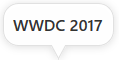
cornerRadius
Makes all the tooltip's corners rounded.
The following table demonstrates how the corner's curvature depends on the cornerRadius value:
| cornerRadius | Result |
|---|---|
cornerRadius: 0 |
 |
cornerRadius: 15 |
 |
cornerRadius: 35 |
 |
customizeTooltip
Allows you to change tooltip appearance.
Information on the point being pressed or hovered over with the mouse pointer.
The tooltip's text or markup and appearance settings.
Assign a function to this property that returns an object with the following fields:
| Field name | Description |
|---|---|
text |
Tooltip text. The component evaluates inline HTML and CSS in this field's value to style rendered text. Bullet transforms evaluated HTML elements into tspan SVG elements and does not render inline HTML directly. The component also discards all attributes except style and class.To encode and render this field's value as plain text, enable encodeHtml. |
html |
The HTML markup displayed in a tooltip. Bullet evaluates the markup. Make sure that it does not contain malicious code. Refer to the following help topic for more information: Potentially Vulnerable API - customizeTooltip. To use external resources (images, etc.) in the markup, specify the size of the area they occupy beforehand. |
color |
Tooltip color. |
fontColor |
Tooltip text color. |
borderColor |
Tooltip border color. |
The function's parameter has the following fields:
| Field name | Description |
|---|---|
originalValue |
The primary bullet value as it is assigned to the value property. |
value |
The primary bullet value with applied formatting if the format property is specified. |
originalTarget |
The target bullet value as it is assigned to the target property. |
target |
The target bullet value with applied formatting if the format property is specified. |
this keyword.See Also
format
Formats a value before it is displayed it in a tooltip.
opacity
Specifies tooltips' transparency.
This property accepts a value from 0 to 1, where 0 makes tooltips completely transparent, and 1 makes them opaque.
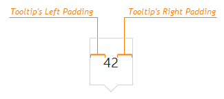
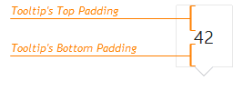
paddingLeftRight
Generates an empty space, measured in pixels, between a tooltip's left/right border and its text.

 Select one or more answers