Vue Form - Getting Started
jQuery
Angular
Vue
React
The Form component creates a data entry UI for the underlying data object. The interface consists of automatically-arranged label-editor pairs that correspond to data fields. You can change data values, validate user input, and send the resulting data to the server.
This tutorial shows basic Form component configuration.
Each section in this tutorial describes a single configuration step. The complete source code is available in the following GitHub repository:
Create a Form
jQuery
Add DevExtreme to your jQuery application and use the following code to create a Form:
$(function() {
    $("#form").dxForm({
        // Configuration goes here
    });
});
<html>
    <head>
        <!-- ... -->
        <script type="text/javascript" src="https://code.jquery.com/jquery-3.5.1.min.js"></script>

        <link rel="stylesheet" href="https://unpkg.com/devextreme@26.2-next/dist/css/dx.light.css">
        <link rel="stylesheet" href="index.css">

        <script type="text/javascript" src="https://unpkg.com/devextreme@26.2-next/dist/js/dx.all.js"></script>
        <script type="text/javascript" src="index.js"></script>
    </head>
    <body class="dx-viewport">
        <div id="form"></div>
    </body>
</html>
ASP.NET Core Controls
Add DevExtreme to your ASP.NET Core application and use the following code snippet to create a Form:
@(Html.DevExtreme().Form()
    .ID("form")
)
Angular
Add DevExtreme to your Angular application and use the following code to create a Form:
<dx-form id="form">
    <!-- Configuration goes here -->
</dx-form>
import { DxFormModule } from 'devextreme-angular';

@Component({
    imports: [DxFormModule, /* ... */],
    // ...
})
export class AppComponent {

}
Vue
Add DevExtreme to your Vue application and use the following code to create a Form:
<template>
    <div id="app-container">
        <DxForm id="form">
            <!-- Configuration goes here -->
        </DxForm>
    </div>
</template>

<script setup lang="ts">
import 'devextreme/dist/css/dx.fluent.blue.light.css';
import { DxForm } from 'devextreme-vue/form';

</script>
React
Add DevExtreme to your React application and use the following code to create a Form:
import React from 'react';
import 'devextreme/dist/css/dx.fluent.blue.light.css';
import { Form } from 'devextreme-react/form';

export default function App() {
    return (
        <div className="App">
            <Form id="form">
                {/* Configuration goes here */}
            </Form>
        </div>
    );
}
Populate the Form Fields
The Form creates a data entry UI when you assign an object to the formData property. The Form creates a simple item (a label-editor pair) for each field in the formData object.
The Form chooses default editors based on value types: a TextBox for string values, a NumberBox for numbers, and a DateBox for dates. You can use the editorType property to specify an editor explicitly. In the following example, the Form uses default editors:
jQuery
$(function() {
    $("#form").dxForm({
        formData: {
            name: "John Heart",
            officeNumber: 901,
            hireDate: new Date(2012, 4, 13)
        }
    });
});
ASP.NET Core Controls
@(Html.DevExtreme().Form()
    .FormData(new {
        Name = "John Heart",
        OfficeNumber = 901,
        HireDate = new DateOnly(2012, 4, 13)
    })
)
Angular
<dx-form
    [formData]="employee">
</dx-form>
// ...
export class AppComponent {
    employee = {
        name: 'John Heart',
        officeNumber: 901,
        hireDate: new Date(2012, 4, 13)
    }
}
Vue
<template>
    <DxForm
        :form-data="employee">
    </DxForm>
</template>

<script setup lang="ts">
import { DxForm } from 'devextreme-vue/form';

const employee = {
    name: 'John Heart',
    officeNumber: 901,
    hireDate: new Date(2012, 4, 13)
};
</script>
React
import { Form } from 'devextreme-react/form';

const employee = {
    name: 'John Heart',
    officeNumber: 901,
    hireDate: new Date(2012, 4, 13)
};

export default function App() {
    return (
        <Form
            formData={employee}>
        </Form>
    );
}
When you implement this code, the Form creates the following simple items: a TextBox for name, a NumberBox for officeNumber, and a DateBox for the hireDate data field.
Configure Simple Items
Use the items[] array to configure all form items. This array can contain strings (formData field names) and objects (item configurations). Use a string to create a label-editor pair (a simple item) with default configuration. To change the default settings, declare an item configuration object: specify the dataField and other properties. The following example configures the HireDate item:
jQuery
$(function() {
    $("#form").dxForm({
        formData: {
            name: "John Heart",
            officeNumber: 901,
            hireDate: new Date(2012, 4, 13)
        },
        items: ["name", "officeNumber", {
            dataField: "hireDate",
            editorOptions: {
                disabled: true
            }
        }]
    });
});
ASP.NET Core Controls
@(Html.DevExtreme().Form()
    .FormData(new {
        Name = "John Heart",
        OfficeNumber = 901,
        HireDate = new DateOnly(2012, 4, 13)
    })
    .Items(i => {
        i.AddSimple().DataField("Name");
        i.AddSimple().DataField("OfficeNumber");
        i.AddSimple().DataField("HireDate").Editor(e => e
            .DateBox()
            .Disabled(true)
        );
    })
)
Angular
<dx-form
    [formData]="employee">
    <dxi-form-item dataField="name"></dxi-form-item>
    <dxi-form-item dataField="officeNumber"></dxi-form-item>
    <dxi-form-item
        dataField="hireDate"
        [editorOptions]="hireDateOptions">
    </dxi-form-item>
</dx-form>
// ...
export class AppComponent {
    employee = {
        name: 'John Heart',
        officeNumber: 901,
        hireDate: new Date(2012, 4, 13)
    }

    hireDateOptions = {
        disabled: true
    }
}
Vue
<template>
    <DxForm
        :form-data="employee">
        <DxSimpleItem data-field="name"/>
        <DxSimpleItem data-field="officeNumber"/>
        <DxSimpleItem
            data-field="hireDate"
            :editor-options="hireDateOptions"
        />
    </DxForm>
</template>

<script setup lang="ts">
import { DxForm, DxSimpleItem } from 'devextreme-vue/form';

const employee = {
    name: 'John Heart',
    officeNumber: 901,
    hireDate: new Date(2012, 4, 13)
};

const hireDateOptions = {
    disabled: true
};
</script>
React
import { Form, SimpleItem } from 'devextreme-react/form';

const employee = {
    name: 'John Heart',
    officeNumber: 901,
    hireDate: new Date(2012, 4, 13)
};

const hireDateOptions = {
    disabled: true
};

export default function App() {
    return (
        <Form formData={employee}>
            <SimpleItem dataField="name" />
            <SimpleItem dataField="officeNumber" />
            <SimpleItem
                dataField="hireDate"
                editorOptions={hireDateOptions}
            />
        </Form>
    );
}In Columns
The Form can organize items into a fixed number of columns or automatically adjust the layout based on the screen width. Initialize the colCount property as done in the following code to keep a fixed number of columns. To create an adaptive layout instead, configure the screenByWidth and colCountByScreen properties.
An item can span multiple columns. The following example sets the colSpan property for the Notes item to 2 so that it spans two columns.
jQuery
$(function() {
    $("#form").dxForm({
        formData: {
            name: "John Heart",
            position: "CEO",
            hireDate: new Date(2012, 4, 13),
            officeNumber: 901,
            notes: "John has been in the Audio/Video industry since 1990."
        },
        colCount: 2,
        items: ["name", "position", "hireDate", "officeNumber", {
            dataField: "notes",
            colSpan: 2
        }]
    });
});
ASP.NET Core Controls
@(Html.DevExtreme().Form()
    .FormData(new {
        Name = "John Heart",
        Position = "CEO",
        HireDate = new DateOnly(2012, 4, 13),
        OfficeNumber = 901,
        Notes = "John has been in the Audio/Video industry since 1990."
    })
    .ColCount(2)
    .Items(i => {
        i.AddSimple().DataField("Name");
        i.AddSimple().DataField("Position");
        i.AddSimple().DataField("HireDate");
        i.AddSimple().DataField("OfficeNumber");
        i.AddSimple().DataField("Notes")
            .ColSpan("2")
    })
)
Angular
<dx-form
    [formData]="employee"
    [colCount]="2">
    <dxi-form-item dataField="name"></dxi-form-item>
    <dxi-form-item dataField="position"></dxi-form-item>
    <dxi-form-item dataField="hireDate"></dxi-form-item>
    <dxi-form-item dataField="officeNumber"></dxi-form-item>
    <dxi-form-item
        dataField="notes"
        [colSpan]="2">
    </dxi-form-item>
</dx-form>
// ...
export class AppComponent {
    employee = {
        name: 'John Heart',
        position: 'CEO',
        hireDate: new Date(2012, 4, 13),
        officeNumber: 901,
        notes: 'John has been in the Audio/Video industry since 1990.'
    }
}
Vue
<template>
    <DxForm
        :form-data="employee"
        :col-count="2">
        <DxSimpleItem data-field="name"/>
        <DxSimpleItem data-field="position"/>
        <DxSimpleItem data-field="hireDate"/>
        <DxSimpleItem data-field="officeNumber"/>
        <DxSimpleItem
            data-field="notes"
            :col-span="2"
        />
    </DxForm>
</template>

<script setup lang="ts">
import { DxForm, DxSimpleItem } from 'devextreme-vue/form';

const employee = {
    name: 'John Heart',
    position: 'CEO',
    hireDate: new Date(2012, 4, 13),
    officeNumber: 901,
    notes: 'John has been in the Audio/Video industry since 1990.'
};
</script>
React
import { Form, SimpleItem } from 'devextreme-react/form';

const employee = {
    name: 'John Heart',
    position: 'CEO',
    hireDate: new Date(2012, 4, 13),
    officeNumber: 901,
    notes: 'John has been in the Audio/Video industry since 1990.'
};

export default function App() {
    return (
        <Form
            formData={employee}
            colCount={2}>
            <SimpleItem dataField="name" />
            <SimpleItem dataField="position" />
            <SimpleItem dataField="hireDate" />
            <SimpleItem dataField="officeNumber" />
            <SimpleItem
                dataField="notes"
                colSpan={2}
            />
        </Form>
    );
}
In Groups
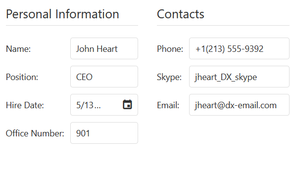
You can use groups to organize data entry forms. Create a group item and nest other items within to add a group. You can nest items of any type in a group, including other group items. You can configure each group's layout separately.
The following code snippet creates two groups. Each group occupies a separate column. The resulting layout looks as follows:
jQuery
$(function() {
    $("#form").dxForm({
        formData: {
            name: "John Heart",
            position: "CEO",
            hireDate: new Date(2012, 4, 13),
            officeNumber: 901,
            phone: "+1(213) 555-9392",
            skype: "jheart_DX_skype",
            email: "jheart@dx-email.com"
        },
        colCount: 2,
        items: [{
            itemType: "group",
            caption: "Personal Information",
            items: ["name", "position", "hireDate", "officeNumber"]
        }, {
            itemType: "group",
            caption: "Contacts",
            items: ["phone", "skype", "email"]
        }]
    });
});
ASP.NET Core Controls
@(Html.DevExtreme().Form()
    .FormData(new {
        Name = "John Heart",
        Position = "CEO",
        HireDate = new DateOnly(2012, 4, 13),
        OfficeNumber = 901,
        Phone = "+1(213) 555-9392",
        Skype = "jheart_DX_skype",
        Email = "jheart@dx-email.com"
    })
    .ColCount(2)
    .Items(FormItems => {
        FormItems.AddGroup().Caption("Personal Information").Items(PersonalInfoItems => {
            PersonalInfoItems.AddSimple().DataField("Name");
            PersonalInfoItems.AddSimple().DataField("Position");
            PersonalInfoItems.AddSimple().DataField("HireDate");
            PersonalInfoItems.AddSimple().DataField("OfficeNumber");
        });
        FormItems.AddGroup().Caption("Contacts").Items(ContactsItems => {
            ContactsItems.AddSimple().DataField("Phone");
            ContactsItems.AddSimple().DataField("Skype");
            ContactsItems.AddSimple().DataField("Email");
        });
    })
)
Angular
<dx-form
    [formData]="employee"
    [colCount]="2">
    <dxi-form-item
        itemType="group"
        caption="Personal Information">
        <dxi-form-item dataField="name"></dxi-form-item>
        <dxi-form-item dataField="position"></dxi-form-item>
        <dxi-form-item dataField="hireDate"></dxi-form-item>
        <dxi-form-item dataField="officeNumber"></dxi-form-item>
    </dxi-form-item>
    <dxi-form-item itemType="group" caption="Contacts">
        <dxi-form-item dataField="phone"></dxi-form-item>
        <dxi-form-item dataField="skype"></dxi-form-item>
        <dxi-form-item dataField="email"></dxi-form-item>
    </dx-item>
</dx-form>
// ...
export class AppComponent {
    employee = {
        name: 'John Heart',
        position: 'CEO',
        hireDate: new Date(2012, 4, 13),
        officeNumber: 901,
        phone: '+1(213) 555-9392',
        skype: 'jheart_DX_skype',
        email: 'jheart@dx-email.com'
    }
}
Vue
<template>
    <DxForm
        :form-data="employee"
        :col-count="2">
        <DxGroupItem
            caption="Personal Information">
            <DxSimpleItem data-field="name"/>
            <DxSimpleItem data-field="position"/>
            <DxSimpleItem data-field="hireDate"/>
            <DxSimpleItem data-field="officeNumber"/>
        </DxGroupItem>
        <DxGroupItem caption="Contacts">
            <DxSimpleItem data-field="phone"/>
            <DxSimpleItem data-field="skype"/>
            <DxSimpleItem data-field="email"/>
        </DxGroupItem>
    </DxForm>
</template>

<script setup lang="ts">
import { DxForm, DxSimpleItem, DxGroupItem } from 'devextreme-vue/form';

const employee = {
    name: 'John Heart',
    position: 'CEO',
    hireDate: new Date(2012, 4, 13),
    officeNumber: 901,
    phone: '+1(213) 555-9392',
    skype: 'jheart_DX_skype',
    email: 'jheart@dx-email.com'
};
</script>
React
import { Form, SimpleItem, GroupItem } from 'devextreme-react/form';

const employee = {
    name: 'John Heart',
    position: 'CEO',
    hireDate: new Date(2012, 4, 13),
    officeNumber: 901,
    phone: '+1(213) 555-9392',
    skype: 'jheart_DX_skype',
    email: 'jheart@dx-email.com'
};

export default function App() {
    return (
        <Form
            formData={employee}
            colCount={2}>
            <GroupItem
                caption="Personal Information">
                <SimpleItem dataField="name" />
                <SimpleItem dataField="position" />
                <SimpleItem dataField="hireDate" />
                <SimpleItem dataField="officeNumber" />
            </GroupItem>
            <GroupItem caption="Contacts">
                <SimpleItem dataField="phone" />
                <SimpleItem dataField="skype" />
                <SimpleItem dataField="email" />
            </GroupItem>
        </Form>
    );
}
In Tabs
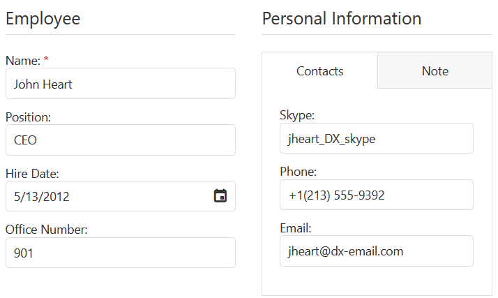
The Form uses the TabPanel component to display tabbed items. You can specify tab panel settings in the tabPanelOptions object. A tab can contain any item type.
The following example nests a tabbed item in the Personal Information group and configures the tab panel's height property. The resulting Form looks as follows:
jQuery
$(function() {
    $("#form").dxForm({
        formData: {
            name: 'John Heart',
            position: 'CEO',
            hireDate: new Date(2012, 4, 13),
            officeNumber: 901,
            phone: '+1(213) 555-9392',
            skype: 'jheart_DX_skype',
            email: 'jheart@dx-email.com',
            notes: 'John has been in the Audio/Video industry since 1990.'
        },
        items: [{
            itemType: "group",
            colCount: 2,
            items: [{
                itemType: "group",
                caption: "Employee",
                items: ["name", "position", "hireDate", "officeNumber"]
            }, {
                itemType: "group",
                caption: "Personal Information",
                items: [{
                    itemType: "tabbed",
                    tabPanelOptions: {
                        height: 280
                    },
                    tabs: [{
                        title: "Contacts",
                        items: ["skype", "phone",  "email"]
                    }, {
                        title: "Note",
                        items: ["notes"]
                    }]
                }]
            }]
        }]
    });
});
ASP.NET Core Controls
@(Html.DevExtreme().Form()
    .FormData(new {
        Name = "John Heart",
        Position = "CEO",
        HireDate = new DateOnly(2012, 4, 13),
        OfficeNumber = 901,
        Phone = "+1(213) 555-9392",
        Skype = "jheart_DX_skype",
        Email = "jheart@dx-email.com",
        Notes = "John has been in the Audio/Video industry since 1990."
    })
    .ColCount(2)
    .Items(FormItems => {
        FormItems.AddGroup().ColCount(2).Items(MainGroupItems => {
            MainGroupItems.AddGroup().Caption("Employee").Items(EmployeeItems);
            MainGroupItems.AddGroup().Caption("Personal Information").Items(PersonalInfoItems);
        });
    })
)

@functions {
    void EmployeeItems(FormItemsFactory<object> Items) {
        Items.AddSimple().DataField("Name").IsRequired(true);
        Items.AddSimple().DataField("Position");
        Items.AddSimple().DataField("HireDate");
        Items.AddSimple().DataField("OfficeNumber");
    }

    void PersonalInfoItems(FormItemsFactory<object> Items) {
        Items.AddTabbed().TabPanelOptions(Options =>
            Options.Height(280)
        ).Tabs(Tabs => {
            Tabs.Add().Title("Contacts").Items(ContactsItems => {
                ContactsItems.AddSimple().DataField("Skype");
                ContactsItems.AddSimple().DataField("Phone");
                ContactsItems.AddSimple().DataField("Email");
            });
            Tabs.Add().Title("Note").Items(NoteItems =>
                NoteItems.AddSimple().DataField("Notes")
            );
        });
    }
}
Angular
<dx-form
    [formData]="employee"
    [colCount]="2">
    <dxi-form-item
        itemType="group"
        caption="Employee">
        <dxi-form-item dataField="name"></dxi-form-item>
        <dxi-form-item dataField="position"></dxi-form-item>
        <dxi-form-item dataField="hireDate"></dxi-form-item>
        <dxi-form-item dataField="officeNumber"></dxi-form-item>
    </dxi-form-item>
    <dxi-form-item itemType="group" caption="Personal Information">
        <dxi-form-item itemType="tabbed">
            <dxo-form-tab-panel-options [height]="280">
            </dxo-form-tab-panel-options>
            <dxi-form-tab title="Contacts">
                <dxi-form-item dataField="skype"></dxi-form-item>
                <dxi-form-item dataField="phone"></dxi-form-item>
                <dxi-form-item dataField="email"></dxi-form-item>
            </dxi-form-tab>
            <dxi-form-tab title="Note">
                <dxi-form-item dataField="notes"></dxi-form-item>
            </dxi-form-tab>
        </dxi-form-item>
    </dxi-form-item>
</dx-form>
// ...
export class AppComponent {
    employee = {
        name: 'John Heart',
        position: 'CEO',
        hireDate: new Date(2012, 4, 13),
        officeNumber: 901,
        phone: '+1(213) 555-9392',
        skype: 'jheart_DX_skype',
        email: 'jheart@dx-email.com',
        notes: 'John has been in the Audio/Video industry since 1990.'
    }
}
Vue
<template>
    <DxForm
        :form-data="employee"
        :col-count="2">
        <DxGroupItem caption="Employee">
            <DxSimpleItem data-field="name"/>
            <DxSimpleItem data-field="position"/>
            <DxSimpleItem data-field="hireDate"/>
            <DxSimpleItem data-field="officeNumber"/>
        </DxGroupItem>
        <DxGroupItem caption="Personal Information">
            <DxTabbedItem>
                <DxTabPanelOptions :height="280"/>
                <DxTab title="Contacts">
                    <DxSimpleItem data-field="skype"/>
                    <DxSimpleItem data-field="phone"/>
                    <DxSimpleItem data-field="email"/>
                </DxTab>
                <DxTab title="Note">
                    <DxSimpleItem data-field="notes"/>
                </DxTab>
            </DxTabbedItem>
        </DxGroupItem>
    </DxForm>
</template>

<script setup lang="ts">
import { DxForm, DxSimpleItem, DxGroupItem, DxTabbedItem, DxTab, DxTabPanelOptions } from 'devextreme-vue/form';

const employee = {
    name: 'John Heart',
    position: 'CEO',
    hireDate: new Date(2012, 4, 13),
    officeNumber: 901,
    phone: '+1(213) 555-9392',
    skype: 'jheart_DX_skype',
    email: 'jheart@dx-email.com',
    notes: 'John has been in the Audio/Video industry since 1990.'
};
</script>
React
import { Form, SimpleItem, GroupItem, TabbedItem, Tab, TabPanelOptions } from 'devextreme-react/form';

const employee = {
    name: 'John Heart',
    position: 'CEO',
    hireDate: new Date(2012, 4, 13),
    officeNumber: 901,
    phone: '+1(213) 555-9392',
    skype: 'jheart_DX_skype',
    email: 'jheart@dx-email.com',
    notes: 'John has been in the Audio/Video industry since 1990.'
};

export default function App() {
    return (
        <Form
            formData={employee}
            colCount={2}>
            <GroupItem caption="Employee">
                <SimpleItem dataField="name" />
                <SimpleItem dataField="position" />
                <SimpleItem dataField="hireDate" />
                <SimpleItem dataField="officeNumber" />
            </GroupItem>
            <GroupItem caption="Personal Information">
                <TabbedItem>
                    <TabPanelOptions height={280} />
                    <Tab title="Contacts">
                        <SimpleItem dataField="phone" />
                        <SimpleItem dataField="skype" />
                        <SimpleItem dataField="email" />
                    </Tab>
                    <Tab title="Note">
                        <SimpleItem dataField="notes" />
                    </Tab>
                </TabbedItem>
            </GroupItem>
        </Form>
    );
}
Add an Empty Space
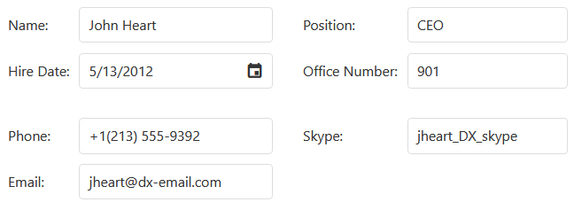
Use an empty item to add an empty space between neighboring items. Assign "empty" to the itemType property to create an empty item, and specify the colSpan property to define how many columns the empty item should span. For a list of available properties, refer to the Empty Item section.
In the following example, the empty item spans two columns. The resulting layout looks as follows:
jQuery
$(function() {
    $("#form").dxForm({
        formData: {
            // ...
        },
        colCount: 2,
        items: ["name", "position", "hireDate", "officeNumber", {
            itemType: "empty",
            colSpan: 2
        }, "phone", "skype", "email"]
    });
});
ASP.NET Core Controls
@(Html.DevExtreme().Form()
    .ColCount(2)
    .Items(FormItems => {
        FormItems.AddSimple().DataField("Name");
        FormItems.AddSimple().DataField("Position");
        FormItems.AddSimple().DataField("HireDate");
        FormItems.AddSimple().DataField("OfficeNumber");
        FormItems.AddEmpty().ColSpan(2);
        FormItems.AddSimple().DataField("Skype");
        FormItems.AddSimple().DataField("Phone");
        FormItems.AddSimple().DataField("Email");
    })
)
Angular
<dx-form
    [formData]="employee"
    [colCount]="2">
    <dxi-form-item dataField="name"></dxi-form-item>
    <dxi-form-item dataField="position"></dxi-form-item>
    <dxi-form-item dataField="hireDate"></dxi-form-item>
    <dxi-form-item dataField="officeNumber"></dxi-form-item>
    <dxi-form-item
        itemType="empty"
        [colSpan]="2">
    </dxi-form-item>
    <dxi-form-item dataField="skype"></dxi-form-item>
    <dxi-form-item dataField="phone"></dxi-form-item>
    <dxi-form-item dataField="email"></dxi-form-item>
</dx-form>
// ...
export class AppComponent {
    employee = {
        // ...
    }
}
Vue
<template>
    <DxForm
        :form-data="employee"
        :col-count="2">
        <DxSimpleItem data-field="name"/>
        <DxSimpleItem data-field="position"/>
        <DxSimpleItem data-field="hireDate"/>
        <DxSimpleItem data-field="officeNumber"/>
        <DxEmptyItem
            :col-span="2"
        />
        <DxSimpleItem dataField="skype"/>
        <DxSimpleItem dataField="phone"/>
        <DxSimpleItem dataField="email"/>
    </DxForm>
</template>

<script setup lang="ts">
import { DxForm, DxSimpleItem, DxEmptyItem } from 'devextreme-vue/form';

const employee = {
    // ...
};
</script>
React
import { Form, SimpleItem, EmptyItem } from 'devextreme-react/form';

const employee = {
    // ...
};

export default function App() {
    return (
        <Form
            formData={employee}
            colCount={2}>
            <SimpleItem dataField="name" />
            <SimpleItem dataField="position" />
            <SimpleItem dataField="hireDate" />
            <SimpleItem dataField="officeNumber" />
            <EmptyItem
                colSpan={2}
            />
            <SimpleItem dataField="phone" />
            <SimpleItem dataField="skype" />
            <SimpleItem dataField="email" />
        </Form>
    );
}
Configure Item Labels
You can configure individual labels in the label object. This object's section lists all available properties.
The following properties apply to all labels in the Form:
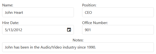
The following code configures the labelLocation property to place labels on top of editors. The example also configures the Notes item's label.alignment property to position label text in the center:
jQuery
$(function() {
    $("#form").dxForm({
        formData: {
            // ...
        },
        labelLocation: "top",
        colCount: 2,
        items: ["name", "position", "hireDate", "officeNumber", {
            dataField: "notes",
            colSpan: 2,
            label: {
                alignment: "center"
            }
        }]
    });
});
ASP.NET Core Controls
@(Html.DevExtreme().Form()
    .LabelLocation(FormLabelLocation.Top)
    .ColCount(2)
    .Items(i => {
        i.AddSimple().DataField("Name");
        i.AddSimple().DataField("Position");
        i.AddSimple().DataField("HireDate");
        i.AddSimple().DataField("OfficeNumber");
        i.AddSimple().DataField("Notes")
            .ColSpan(2)
            .Label(l => l
                .Alignment(HorizontalAlignment.Center)
            );
    })
)
Angular
<dx-form
    [formData]="employee"
    [colCount]="2"
    labelLocation="top">
    <dxi-form-item dataField="name"></dxi-form-item>
    <dxi-form-item dataField="position"></dxi-form-item>
    <dxi-form-item dataField="hireDate"></dxi-form-item>
    <dxi-form-item dataField="officeNumber"></dxi-form-item>
    <dxi-form-item
        dataField="notes"
        [colSpan]="2">
        <dxo-form-label alignment="center">
        </dxo-form-label>
    </dxi-form-item>
</dx-form>
Vue
<template>
    <DxForm
        :form-data="employee"
        :col-count="2"
        label-location="top">
        <DxSimpleItem data-field="name"/>
        <DxSimpleItem data-field="position"/>
        <DxSimpleItem data-field="hireDate"/>
        <DxSimpleItem data-field="officeNumber"/>
        <DxSimpleItem
            data-field="notes"
            :col-span="2">
            <DxLabel alignment="center"/>
        </DxSimpleItem>
    </DxForm>
</template>

<script>
import { DxForm, DxSimpleItem, DxLabel } from 'devextreme-vue/form';

const employee = {
    // ...
};
</script>
React
import { Form, SimpleItem, Label } from 'devextreme-react/form';

const employee = {
    // ...
};

export default function App() {
    return (
        <Form
            formData={employee}
            colCount={2}
            labelLocation="top">
            <SimpleItem dataField="name" />
            <SimpleItem dataField="position" />
            <SimpleItem dataField="hireDate" />
            <SimpleItem dataField="officeNumber" />
            <SimpleItem
                dataField="notes"
                colSpan={2}>
                <Label alignment="center" />
            </SimpleItem>
        </Form>
    );
}
Modify the Form at Runtime
jQuery
You can change any properties of the form, its items, or editors at runtime. Use the option(optionName, optionValue) method to update a Form property, and the itemOption(id, option, value) method to update an item property's value. The following code modifies the readOnly property's value:
Angular
You can change any properties of the form, its items, or editors at runtime. To update a property value, bind it to a component property. The following code modifies the readOnly property's value:
Vue
You can change any properties of the form, its items, or editors at runtime. To update a property value, bind it to a component property. The following code modifies the readOnly property's value:
React
You can change any properties of the form, its items, or editors at runtime. To update a property value, bind it to a component property. The following code modifies the readOnly property's value:
jQuery
$(function() {
    const form = $("#form").dxForm({
        formData: {
            // ...
        },
        items: [
            // ...
        ]
    }).dxForm("instance");

    $("#checkBox").dxCheckBox({
        text: "Enable read-only mode",
        value: false,
        onValueChanged: function (e) {
            form.option("readOnly", e.value);
        }
    });
});
ASP.NET Core Controls
@(Html.DevExtreme().Form()
    .ID("form")
)

@(Html.DevExtreme().CheckBox()
    .Text("Enable read-only mode")
    .OnValueChanged("handleCheckBoxValueChanged")
)

<script>
    function handleCheckBoxValueChanged(e) {
        $('#form').dxForm('instance').option('readOnly', e.value);
    }
</script>
Angular
<dx-form
    [formData]="employee"
    [readOnly]="isFormReadOnly"
>
    <!-- ... -->
</dx-form>

<dx-check-box
    text="Enable read-only mode"
    [(value)]="isFormReadOnly">
</dx-check-box>
import { DxFormModule, DxCheckBoxModule } from 'devextreme-angular';

// ...
export class AppComponent {
    employee = {
        // ...
    };

    isFormReadOnly = false;
}
Vue
<template>
    <div>
        <DxForm
            :form-data="employee"
            :read-only="isFormReadOnly"
        >
            <!-- ... -->
        </DxForm>
        <DxCheckBox
            text="Enable read-only mode"
            v-model:value="isFormReadOnly"
        />
    </div>
</template>

<script setup lang="ts">
import { ref } from 'vue';
import { DxForm } from 'devextreme-vue/form';
import { DxCheckBox } from 'devextreme-vue/check-box';

const employee = {
    // ...
};

const isFormReadOnly = ref<boolean>(false);
</script>
React
import React, {useState, useCallback } from 'react';
import { Form } from 'devextreme-react/form';
import { CheckBox, type CheckBoxTypes } from 'devextreme-react/check-box';

const employee = {
    // ...
};

export default function App() {
    const [isFormReadOnly, setIsFormReadOnly] = useState<boolean>(false);

    const onCheckBoxValueChanged = useCallback((e: CheckBoxTypes.ValueChangedEvent) => {
        setIsFormReadOnly(e.value);
    }, []);

    return (
        <div>
            <Form
                formData={employee}
                readOnly={isFormReadOnly}>
                {/* ... */}
            </Form>
            <CheckBox
                text="Enable read-only mode"
                value={isFormReadOnly}
                onValueChanged={onCheckBoxValueChanged}
            />
        </div>
    );
}
Validate the Form Data
DevExtreme includes a validation engine that checks edited values before they are saved. This engine supports different validation rule types.
Specify validation rules for a simple item in the validationRules[] array. You can specify an item's isRequired property to implicitly apply the RequiredRule.
The following example sets the isRequired property for the Name item. It also adds the NumericRule for officeNumber and the EmailRule for Email.
jQuery
$(function() {
    $("#form").dxForm({
        formData: {
            // ...
        },
        colCount: 2,
        items: [{
            dataField: "name",
            isRequired: true
        }, {
            dataField: "officeNumber",
            validationRules: [{
                type: "numeric"
            }]
        }, {
            dataField: "email",
            validationRules: [{
                type: "email"
            }]
        }]
    });
});
ASP.NET Core Controls
@(Html.DevExtreme().Form()
    .ColCount(2)
    .Items(i => {
        i.AddSimple().DataField("Name")
            .IsRequired(true);
        i.AddSimple().DataField("OfficeNumber").ValidationRules(r =>
            r.AddNumeric()
        );
        i.AddSimple().DataField("Email").ValidationRules(r =>
            r.AddEmail()
        );
    })
)
Angular
<dx-form
    [formData]="employee"
    [colCount]="2">
    <dxi-form-item dataField="name" [isRequired]="true">
    </dxi-form-item>
    <dxi-form-item dataField="officeNumber">
        <dxi-form-validation-rule type="numeric">
        </dxi-form-validation-rule>
    </dxi-form-item>
    <dxi-form-item dataField="email">
        <dxi-form-validation-rule type="email">
        </dxi-form-validation-rule>
    </dxi-form-item>
</dx-form>
Vue
<template>
    <DxForm
        :form-data="employee"
        :col-count="2">
        <DxSimpleItem data-field="name :is-required="true"/>
        <DxSimpleItem data-field="officeNumber">
            <DxNumericRule/>
        </DxSimpleItem>
        <DxSimpleItem data-field="email">
            <DxEmailRule/>
        </DxSimpleItem>
    </DxForm>
</template>

<script setup lang="ts">
import { DxForm, DxSimpleItem, DxNumericRule, DxEmailRule } from 'devextreme-vue/form';

</script>
React
import { Form, SimpleItem, NumericRule, EmailRule } from 'devextreme-react/form';

// ...
export default function App() {
    return (
        <Form
            formData={employee}
            colCount={2}>
            <SimpleItem dataField="name" isRequired={true} />
            <SimpleItem dataField="officeNumber">
                <NumericRule />
            </SimpleItem>
            <SimpleItem dataField="email">
                <EmailRule />
            </SimpleItem>
        </Form>
    );
}
You can also call the Form's validate() method to validate all editors simultaneously.
Submit the Form
Add a Button Item and set its useSubmitBehavior property to true to submit a form. You can submit the Form to a server only if input validation is successful.
The useSubmitBehavior property requires that you wrap the dxForm in the HTML form element. You should also set the preventDefault property to true to override the HTML form submit event.
The following code snippet adds a submit button but does not implement the backend. The example displays a confirmation message after a timeout:
jQuery
$(function() {
    $("#form").dxForm({
        formData: {
            // ...
        },
        colCount: 2,
        items: [{
            itemType: "group",
            caption: "Personal Information",
            colCount: 2,
            items: [{
                dataField: "name",
                isRequired: "true"
            }, {
                dataField: "officeNumber",
                validationRules: [{
                    type: "numeric"
                }]
            }, {
                dataField: "email",
                validationRules: [{
                    type: "email"
                }]
            }]
        }, {
            itemType: "button",
            buttonOptions: {
                text: "Submit the Form",
                useSubmitBehavior: true
            }
        }]
    });

    $("#form-container").on("submit", function(e) {
        setTimeout(function () {
            DevExpress.ui.notify('Submitted', 'success', 2000);
        }, 1000);

        e.preventDefault();
    });
});
<form action="/employee-page" id="form-container">
    <div id="form"></div>
</form>
ASP.NET Core Controls
<form action="/employee-page" id="form-container">
    @(Html.DevExtreme().Form()
        .ColCount(2)
        .Items(FormItems => {
            FormItems.AddGroup().ColCount(2).Caption("Personal Information").Items(MainGroupItems => {
                MainGroupItems.AddSimple().DataField("Name")
                    .IsRequired(true);
                MainGroupItems.AddSimple().DataField("OfficeNumber").ValidationRules(r =>
                    Rules.AddNumeric()
                );
                MainGroupItems.AddSimple().DataField("Email").ValidationRules(r =>
                    Rules.AddEmail()
                );
            });
            FormItems.AddButton().ButtonOptions(Button =>
                Button.Text("Submit the Form").UseSubmitBehavior(true)
            );
        })
    )
</form>

<script>
    $('#form-container').on('submit', (e) => {
        setTimeout(() => {
            DevExpress.ui.notify('Submitted', 'success', 2000);
        }, 1000);

        e.preventDefault();
    });
</script>
Angular
<form action="/employee-page" (submit)="handleSubmit($event)">
    <dx-form
        [formData]="employee"
        [colCount]="2">
        <dxi-form-item
            itemType="group"
            caption="Personal Information"
            [colCount]="2">
            <dxi-form-item dataField="name" [isRequired]="true">
            </dxi-form-item>
            <dxi-form-item dataField="officeNumber">
                <dxi-form-validation-rule type="numeric">
                </dxi-form-validation-rule>
            </dxi-form-item>
            <dxi-form-item dataField="email">
                <dxi-form-validation-rule type="email">
                </dxi-form-validation-rule>
            </dxi-form-item>
        </dxi-form-item>
        <dxi-form-item
            itemType="button"
            [buttonOptions]="submitButtonOptions">
        </dxi-form-item>
    </dx-form>
</form>
import notify from 'devextreme/ui/notify';

// ...
export class AppComponent {
    employee = {
        // ...
    }

    submitButtonOptions = {
        text: "Submit the Form",
        useSubmitBehavior: true
    }

    handleSubmit = function(e: Event) {
        setTimeout(() => {
            notify('Submitted', 'success', 2000);
        }, 1000);

        e.preventDefault();
    }
}
Vue
<template>
    <form action="/employee-page" @submit="handleSubmit">
        <DxForm
            :form-data="employee"
            :col-count="2">
            <DxGroupItem
                caption="Personal Information"
                :col-count="2">
                <DxSimpleItem data-field="name" :is-required="true"/>
                <DxSimpleItem data-field="officeNumber">
                    <DxNumericRule/>
                </DxSimpleItem>
                <DxSimpleItem data-field="email">
                    <DxEmailRule/>
                </DxSimpleItem>
            </DxGroupItem>
            <DxButtonItem :button-options="submitButtonOptions"/>
        </DxForm>
    </form>
</template>

<script setup lang="ts">
import { DxForm, DxSimpleItem, DxGroupItem, DxButtonItem, DxNumericRule, DxEmailRule } from 'devextreme-vue/form';
import notify from 'devextreme/ui/notify';

const employee = {
    // ...
};

const submitButtonOptions = {
    text: "Submit the Form",
    useSubmitBehavior: true
};

const handleSubmit = (e: Event): void => {
    setTimeout(() => {
        notify('Submitted', 'success', 2000);
    }, 1000);

    e.preventDefault();
};
</script>
React
import React, { useCallback } from 'react';
import { Form, SimpleItem, GroupItem, ButtonItem, NumericRule, EmailRule } from 'devextreme-react/form';
import notify from 'devextreme/ui/notify';

const employee = {
    // ...
};

const submitButtonOptions = {
    text: "Submit the Form",
    useSubmitBehavior: true
};

export default function App() {
    const handleSubmit = useCallback((e: React.FormEvent<HTMLFormElement>) => {
        setTimeout(() => {
            notify('Submitted', 'success', 2000);
        }, 1000);

        e.preventDefault();
    }, []);

    return (
        <form action="/employee-page" onSubmit={handleSubmit}>
            <Form
                formData={employee}
                colCount={2}>
                <GroupItem
                    caption="Personal Information"
                    colCount={2}>
                    <SimpleItem dataField="name" isRequired={true} />
                    <SimpleItem dataField="officeNumber">
                        <NumericRule />
                    </SimpleItem>
                    <SimpleItem dataField="email">
                        <EmailRule />
                    </SimpleItem>
                </GroupItem>
                <ButtonItem buttonOptions={submitButtonOptions} />
            </Form>
        </form>
    );
}
Alternatively, if you want to implement custom validation logic, handle the Button click event:
jQuery
$(function() {
    $("#form").dxForm({
        // ...
        items: [{
            itemType: "button",
            buttonOptions: {
                text: "Submit the Form",
                onClick: function() {
                    const validationResult = formInstance.validate(); // get Form instance beforehand
                    if (validationResult.isValid)
                        document.getElementById("form-container").submit();
                    else
                        DevExpress.ui.notify('Form is Invalid', 'error', 2000);
                }
            }
        }]
    });
});
<form action="/employee-page" id="form-container">
    <div id="form"></div>
</form>
ASP.NET Core Controls
<form action="/employee-page" id="form-container">
    @(Html.DevExtreme().Form()
        .ColCount(2)
        .Items(FormItems => {
            @* ... *@
            FormItems.AddButton().ButtonOptions(Button =>
                Button
                    .Text("Submit the Form")
                    .UseSubmitBehavior(true)
                    .OnClick("handleSubmitButtonClick")
            );
        })
    )
</form>

<script>
    function handleSubmitButtonClick() {
        const validationResult = formInstance.validate(); // get Form instance beforehand
        if (validationResult.isValid)
            document.getElementById("form-container").submit();
        else
            DevExpress.ui.notify('Form is Invalid', 'error', 2000);
    }
</script>
Angular
<form action="/employee-page" id="form-container">
    <dx-form>
        <dxi-form-item
            itemType="button"
            [buttonOptions]="submitButtonOptions">
        </dxi-form-item>
    </dx-form>
</form>
import notify from 'devextreme/ui/notify';

// ...
export class AppComponent {
    submitButtonOptions = {
        text: "Submit the Form",
        onClick: function() {
            const validationResult = formInstance.validate(); // get Form instance beforehand
            if (validationResult.isValid)
                document.getElementById("form-container").submit();
            else
                notify('Form is Invalid', 'error', 2000);
        }
    };
}
Vue
<template>
    <form action="/employee-page" id="form-container">
        <DxForm>
            <DxButtonItem :button-options="submitButtonOptions"/>
        </DxForm>
    </form>
</template>

<script setup lang="ts">
import { DxForm, DxButtonItem } from 'devextreme-vue/form';
import notify from 'devextreme/ui/notify';

const submitButtonOptions = {
    text: "Submit the Form",
    onClick: function() {
        const validationResult = formInstance.validate(); // get Form instance beforehand
        if (validationResult.isValid)
            document.getElementById("form-container").submit();
        else
            notify('Form is Invalid', 'error', 2000);
    }
};
</script>
React
import { Form, ButtonItem } from 'devextreme-react/form';
import notify from 'devextreme/ui/notify';

const submitButtonOptions = {
    text: "Submit the Form",
    onClick: function() {
        const validationResult = formInstance.validate(); // get Form instance beforehand
        if (validationResult.isValid)
            document.getElementById("form-container").submit();
        else
            notify('Form is Invalid', 'error', 2000);
    }
};

export default function App() {
    return (
        <form action="/employee-page" id="form-container">
            <Form ... >
                <ButtonItem buttonOptions={submitButtonOptions} />
            </Form>
        </form>
    );
}To use the DevExtreme Form with the useActionState hook, call clear() at the start of the reducerAction function:
import React, { useActionState, useRef } from "react";
import { Form, SimpleItem, GroupItem, ButtonItem, NumericRule, EmailRule } from "devextreme-react/form";

const employee = {
    // ...
};

const submitButtonOptions = {
    text: "Submit the form",
    useSubmitBehavior: true,
};

export default function App() {
    const form = useRef(null);

    const [error, submitAction, isPending] = useActionState(
        async (previousState, formData) => {
            form?.current?.instance?.().clear?.(); // Clear the form
            await new Promise((resolve) =>
                // Resolve the promise
            );
            if ( ... ) { // Configure when to return an error
                return new Error("Submitting failed!");
            }
            const fieldValues = Object.fromEntries(formData);
            return fieldValues;
        },
        null
    );

    return (
        <form action={submitAction}>
            <Form ref={form} formData={employee} colCount={1}>
                <GroupItem caption="Personal Information" colCount={1}>
                    <SimpleItem dataField="name" isRequired={true} />
                    <SimpleItem dataField="officeNumber">
                        <NumericRule />
                    </SimpleItem>
                    <SimpleItem dataField="email">
                        <EmailRule />
                    </SimpleItem>
                </GroupItem>
                <ButtonItem
                    horizontalAlignment="left"
                    buttonOptions={{ ...submitButtonOptions, disabled: isPending }}
                />
            </Form>
        </form>
    );
}
For more information on the Form UI component, refer to the following resources:

 Select one or more answers