Vue TreeList - Load Panel
The load panel is displayed while the UI component loads data. It consists of a loading indicator and text, both placed on a pane.
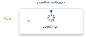
The load panel is shown only for remote data sources by default. To show it regardless of the data source type, assign true to the loadPanel.enabled property. Setting the same property to false disables the load panel completely.
jQuery
$(function() {
    $("#treeListContainer").dxTreeList({
        loadPanel: {
            enabled: true
        }
    });
});
Angular
<dx-tree-list>
    <dxo-tree-list-load-panel
        [enabled]="true">
    </dxo-tree-list-load-panel>
</dx-tree-list>
import { Component } from '@angular/core';
import { DxTreeListModule } from 'devextreme-angular';

@Component({
    selector: 'app-root',
    templateUrl: './app.component.html',
    styleUrls: ['./app.component.css'],
    standalone: true,
    imports: [DxTreeListModule]
})
export class AppComponent {
    // ...
}
Vue
<template>
    <DxTreeList>
        <DxLoadPanel :enabled="true" />
    </DxTreeList>
</template>

<script setup>
import 'devextreme/dist/css/dx.fluent.blue.light.css';

import DxTreeList, {
    DxLoadPanel
} from 'devextreme-vue/tree-list';
</script>
React
import React from 'react';
import 'devextreme/dist/css/dx.fluent.blue.light.css';

import TreeList, {
    LoadPanel
} from 'devextreme-react/tree-list';

export default function App() {
    return (
        <TreeList>
            <LoadPanel enabled />
        </TreeList>
    );
}
You can also control the load panel programmatically using the beginCustomLoading(messageText) and endCustomLoading() methods.
jQuery
var treeList = $("#treeListContainer").dxTreeList("instance");
treeList.beginCustomLoading();
// ...
treeList.endCustomLoading();
Angular
import { Component, ViewChild } from '@angular/core';
import { DxTreeListModule, DxTreeListComponent } from 'devextreme-angular';

@Component({
    selector: 'app-root',
    templateUrl: './app.component.html',
    styleUrls: ['./app.component.css'],
    standalone: true,
    imports: [DxTreeListModule]
})
export class AppComponent {
    @ViewChild(DxTreeListComponent, { static: false }) treeList: DxTreeListComponent;

    performLongOperation() {
        this.treeList.instance.beginCustomLoading();
        // ...
        this.treeList.instance.endCustomLoading();
    }
}
Vue
<template>
    <DxTreeList ref="treeListRef">
        <!-- ... -->
    </DxTreeList>
</template>

<script setup>
import { ref } from 'vue';
import 'devextreme/dist/css/dx.fluent.blue.light.css';

import DxTreeList, {
    // ...
} from 'devextreme-vue/tree-list';

const treeListRef = ref(null);

function performLongOperation() {
    treeListRef.value.instance.beginCustomLoading();
    // ...
    treeListRef.value.instance.endCustomLoading();
}
</script>
React
import React, { useRef, useCallback } from 'react';
import 'devextreme/dist/css/dx.fluent.blue.light.css';

import TreeList, {
    // ...
} from 'devextreme-react/tree-list';

export default function App() {
    const treeList = useRef(null);
    const performLongOperation = useCallback(() => {
        treeList.current.instance().beginCustomLoading();
        // ...
        treeList.current.instance().endCustomLoading();
    }, []);

    return (
        <TreeList ref={treeList}>
            {/* ... */}
        </TreeList>
    );
}
Since the load panel is a DevExtreme LoadPanel UI component, you can declare any properties of this UI component in the TreeList's loadPanel object. For example, you can change the panel's size with the height and width properties, or employ another loading indicator using the indicatorOptions.src property.
jQuery
$(function() {
    $("#treeListContainer").dxTreeList({
        loadPanel: {
            height: 100,
            width: 250,
            indicatorOptions: {
                src: "https://js.devexpress.com/Content/data/loadingIcons/rolling.svg"
            }
        }
    });
});
Angular
<dx-tree-list>
    <dxo-tree-list-load-panel
        [height]="100"
        [width]="250">
        <dxo-tree-list-indicator-options
            src="https://js.devexpress.com/Content/data/loadingIcons/rolling.svg">
        </dxo-tree-list-indicator-options>
    </dxo-tree-list-load-panel>
</dx-tree-list>
import { Component } from '@angular/core';
import { DxTreeListModule } from 'devextreme-angular';

@Component({
    selector: 'app-root',
    templateUrl: './app.component.html',
    styleUrls: ['./app.component.css'],
    standalone: true,
    imports: [DxTreeListModule]
})
export class AppComponent {
    // ...
}
Vue
<template>
    <DxTreeList>
        <DxLoadPanel
            :height="100"
            :width="250">
            <DxIndicatorOptions
                src="https://js.devexpress.com/Content/data/loadingIcons/rolling.svg"
            />
        </DxLoadPanel>
    </DxTreeList>
</template>

<script setup>
import 'devextreme/dist/css/dx.fluent.blue.light.css';

import DxTreeList, {
    DxLoadPanel,
    DxIndicatorOptions
} from 'devextreme-vue/tree-list';
</script>
React
import React from 'react';
import 'devextreme/dist/css/dx.fluent.blue.light.css';

import TreeList, {
    LoadPanel,
    IndicatorOptions
} from 'devextreme-react/tree-list';

export default function App() {
    return (
        <TreeList>
            <LoadPanel
                height={100}
                width={250}>
                <IndicatorOptions
                    src="https://js.devexpress.com/Content/data/loadingIcons/rolling.svg"
                />
            </LoadPanel>
        </TreeList>
    );
}
See Also

 Select one or more answers