Vue CardView - ToolbarItem
Configures toolbar items.
The toolbar can contain the following elements as items:
Predefined controls
Predefined controls appear on the toolbar depending on whether a specific CardView feature is enabled. The following table illustrates the dependency:Control Name Image Prerequisites addCardButton 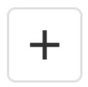
editing.allowAdding is true columnChooserButton 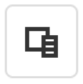
columnChooser.enabled is true searchPanel 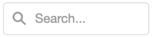
searchPanel.visible is true selectAllButton 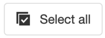
selection.allowSelectAll is true and selection.mode is 'multiple' clearSelectionButton 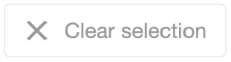
selection.mode is 'single' or 'multiple' If you need to customize a predefined control, add an object to the items[] array. This object must contain the control's name and properties that you want to customize. If a control does not need customization, simply include its name in the toolbar.items[] array.
The example below customizes the Column Chooser button, adds an Add Card button, and enables the corresponding CardView features:
jQuery
index.js$(function(){ $("#CardViewContainer").dxCardView({ // ... editing: { allowAdding: true }, columnChooser: { enabled: true }, toolbar: { items: [ "addCardButton", { name: "columnChooserButton", locateInMenu: "auto", location: "after" }] } }); });Angular
app.component.htmlapp.module.ts<dx-card-view ... > <dxo-card-view-editing [allowAdding]="true"></dxo-card-view-editing> <dxo-card-view-column-chooser [enabled]="true"></dxo-card-view-column-chooser> <dxo-card-view-toolbar> <dxi-card-view-item name="addCardButton"></dxi-card-view-item> <dxi-card-view-item name="columnChooserButton" locateInMenu="auto" location="after"> </dxi-card-view-item> </dxo-card-view-toolbar> </dx-card-view>import { BrowserModule } from '@angular/platform-browser'; import { NgModule } from '@angular/core'; import { AppComponent } from './app.component'; import { DxCardViewModule } from 'devextreme-angular'; @NgModule({ declarations: [ AppComponent ], imports: [ BrowserModule, DxCardViewModule, ], providers: [ ], bootstrap: [AppComponent] }) export class AppModule { }Vue
App.vue<template> <DxCardView ... > <DxEditing :allow-adding="true" /> <DxColumnChooser :enabled="true"/> <DxToolbar> <DxItem name="addCardButton" /> <DxItem name="columnChooserButton" locate-in-menu="auto" location="after" /> </DxToolbar> </DxCardView> </template> <script setup lang="ts"> import { DxCardView, DxEditing, DxColumnChooser, DxToolbar, DxItem } from 'devextreme-vue/card-view'; </script>React
App.jsimport CardView, { Editing, Toolbar, Item, ColumnChooser } from 'devextreme-react/card-view'; // ... function App() { return ( <CardView ... > <Editing allowAdding={true} /> <ColumnChooser enabled={true} /> <Toolbar> <Item name="addCardButton" /> <Item name="columnChooserButton" locateInMenu="auto" location="after" /> </Toolbar> </CardView> ); }IMPORTANTCardView does not display controls missing from the items[] array. Ensure that this array includes controls for all enabled features.DevExtreme components
jQuery
You can use DevExtreme components as toolbar items. Set the widget property to specify the component that you want to use and configure the component's options:
index.js$(function(){ $("#CardViewContainer").dxCardView({ // ... toolbar: { items: [{ widget: "dxSelectBox", options: { // SelectBox properties are specified here } }] } }); });Angular
You can use DevExtreme components as toolbar items. Declare a
dxi-card-view-itemelement to add a supported component:app.component.htmlapp.module.ts<dx-card-view ... > <dxo-card-view-toolbar> <dxi-card-view-toolbar-item> <dx-select-box> <!-- SelectBox properties are specified here --> </dx-select-box> </dxi-card-view-toolbar-item> </dxo-card-view-toolbar> </dx-card-view>import { BrowserModule } from '@angular/platform-browser'; import { NgModule } from '@angular/core'; import { AppComponent } from './app.component'; import { DxCardViewModule, DxSelectBoxModule } from 'devextreme-angular'; @NgModule({ declarations: [ AppComponent ], imports: [ BrowserModule, DxCardViewModule, DxSelectBoxModule, ], providers: [ ], bootstrap: [AppComponent] }) export class AppModule { }Vue
You can use DevExtreme components as toolbar items. Declare a
DxItemelement to add a supported component:App.vue<template> <DxCardView ... > <DxToolbar> <DxItem> <DxSelectBox> <!-- SelectBox properties are specified here --> </DxSelectBox> </DxItem> </DxToolbar> </DxCardView> </template> <script setup lang="ts"> import { DxCardView, DxToolbar, DxItem } from 'devextreme-vue/card-view'; import { DxSelectBox } from 'devextreme-vue/select-box'; </script>React
You can use DevExtreme components as toolbar items. Declare an
Itemelement to add a supported component:App.jsimport { SelectBox } from 'devextreme-react/select-box'; import CardView, { Toolbar, Item } from 'devextreme-react/card-view'; // ... function App() { return ( <CardView ... > <Toolbar> <Item> <SelectBox> {/* SelectBox properties are specified here */} </SelectBox> </Item> </Toolbar> </CardView> ); }Custom controls
To use a custom control, specify a template.
cssClass
Specifies a CSS class to be applied to the item.
disabled
Specifies whether the UI component item responds to user interaction.
html
Specifies the HTML markup to be inserted into the item element.
The CardView component evaluates the html property's value. This evaluation, however, makes the CardView potentially vulnerable to XSS attacks. To guard against these attacks, encode the HTML markup before you assign it to the html property. Refer to the following help topic for more information: Potentially Vulnerable API - html.
You can use the text property as a safe alternative.
locateInMenu
Specifies when to display an item in the toolbar's overflow menu.
menuItemTemplate
Specifies a template that should be used to render a menu item.
The following types of the specified value are available.
- Assign a string containing the name of the required template.
- Assign a jQuery object of the template's container.
- Assign a DOM Node of the template's container.
- Assign a function that returns the jQuery object or a DOM Node of the template's container.
jQuery
$(function() {
    $("#toolbar").dxToolbar({
        items: [{
            // ...
            menuItemTemplate (data, index) {
                return $(`<div><i class='dx-icon-favorites'></i>${data.options.text}</div>`);
            }
        }],
    });
});
Angular
<dx-toolbar>
    <dxi-toolbar-item ...
        menuItemTemplate="menu-item"
    >
    </dxi-toolbar-item>
    <div *dxTemplate="let data of 'menu-item'">
        <i class="dx-icon-favorites"></i> {{data.options.text}}
    </div>
</dx-toolbar>
Vue
<template>
    <DxToolbar>
        <dxItem ...
            menu-item-template="menu-item"
        >
        </dxItem>
        <template #menu-item="{ data }">
            <i class="dx-icon-favorites"></i> {{data.options.text}}
        </template>
    </DxToolbar>
</template>

<script>
// ...
</script>
React
import React from 'react';
import Toolbar, { Item } from 'devextreme-react/toolbar';

const renderMenuItem = (data) => {
    return <div><i class="dx-icon-favorites"></i> {data.options.text}</div>;
}

function App() {
    return (
        <Toolbar>
            <Item ...
                menuItemRender={renderMenuItem}
            >
            </Item>
        </Toolbar>
    );
}

export default App;
See Also
options
Configures the DevExtreme UI component used as a toolbar item.
jQuery
$('#toolbar').dxToolbar({
    items: [{
        // ...
        widget: 'dxCheckBox',
        options: {
            text: 'Show IDs'
        },
    }]
});
Angular
options should contain the properties of the DevExtreme UI component specified in the widget property. Because of this dependency, options cannot be typed and are not implemented as nested configuration components. Specify options with an object.
<dx-toolbar ... >
    <dxi-toolbar-item
        widget="dxCheckBox"
        [options]="{ text: 'Show IDs' }">
    </dxi-toolbar-item>
</dx-toolbar>
import { BrowserModule } from '@angular/platform-browser';
import { NgModule } from '@angular/core';
import { AppComponent } from './app.component';

import { DxToolbarModule } from 'devextreme-angular';

@NgModule({
    declarations: [
        AppComponent
    ],
    imports: [
        BrowserModule,
        DxToolbarModule
    ],
    providers: [ ],
    bootstrap: [AppComponent]
})
export class AppModule { }
Vue
options should contain the properties of the DevExtreme UI component specified in the widget property. Because of this dependency, options cannot be typed and are not implemented as nested configuration components. Specify options with an object. We recommend that you declare the object outside the configuration component to prevent possible issues caused by unnecessary re-rendering.
<template>
    <DxToolbar ... >
        <DxItem ...
            widget="dxCheckBox"
            :options="checkBoxOptions"
        />
    </DxToolbar>
</template>

<script>
import 'devextreme/dist/css/dx.fluent.blue.light.css';

import DxToolbar, {
    DxItem
} from 'devextreme-vue/toolbar';

export default {
    components: {
        DxToolbar,
        DxItem
    },
    data() {
        return {
            checkBoxOptions: { text: 'Show IDs' }
        }
    }
}
</script>
React
options should contain the properties of the DevExtreme UI component specified in the widget property. Because of this dependency, options cannot be typed and are not implemented as nested configuration components. Specify options with an object. We recommend that you declare the object outside the configuration component to prevent possible issues caused by unnecessary re-rendering.
import React from 'react';

import 'devextreme/dist/css/dx.fluent.blue.light.css';

import Toolbar, {
    Item
} from 'devextreme-react/toolbar';

class App extends React.Component {
    checkBoxOptions = { text: 'Show IDs' };

    render() {
        return (
            <Toolbar ... >
                <Item
                    widget="dxCheckBox"
                    options={this.checkBoxOptions}
                />
            </Toolbar>
        );
    }
}
export default App;See Also
showText
Specifies when to display the text for the UI component item.
template
Specifies a template that should be used to render this item only.
jQuery
The following types of the specified value are available.
- Assign a string containing the name of the required template.
- Assign a jQuery object of the template's container.
- Assign a DOM Node of the template's container.
- Assign a function that returns the jQuery object or a DOM Node of the template's container.
The following example adds a custom item to the component.
$(function() {
    $("#cardViewContainer").dxCardView({
        // ...
        items: [
            {
                // ...
                template: '<div>Custom Item</div>'
            }
        ]
    });
});
Angular
The following types of the specified value are available.
- Assign a string containing the name of the required template.
- Assign a DOM Node of the template's container.
The following example adds a custom item to the component. Note that Angular uses custom templates instead of the template property.
<dx-card-view ... >
    <dxi-card-view-item ... >
        <div *dxTemplate>
            <div>Custom Item</div>
        </div>
    </dxi-card-view-item>
</dx-card-view>
import { Component } from '@angular/core';

@Component({
    selector: 'app-root',
    templateUrl: './app.component.html',
    styleUrls: ['./app.component.css']
})
export class AppComponent {
    // ...
}
import { BrowserModule } from '@angular/platform-browser';
import { NgModule } from '@angular/core';
import { AppComponent } from './app.component';

import { DxCardViewModule } from 'devextreme-angular';

@NgModule({
    declarations: [
        AppComponent
    ],
    imports: [
        BrowserModule,
        DxCardViewModule
    ],
    providers: [ ],
    bootstrap: [AppComponent]
})
export class AppModule { }
Vue
The following types of the specified value are available.
- Assign a string containing the name of the required template.
- Assign a DOM Node of the template's container.
The following example adds a custom item to the component. Note that Vue uses custom templates instead of the template property.
<template>
    <DxCardView ... >
        <dxItem ... >
            <div>Custom Item</div>
        </dxItem>
    </DxCardView>
</template>

<script>

import DxCardView, {
    DxItem
} from 'devextreme-vue/card-view';

export default {
    components: {
        DxCardView,
        DxItem
    },
    // ...
}
</script>
React
The following types of the specified value are available.
- Assign a string containing the name of the required template.
- Assign a DOM Node of the template's container.
The following example adds a custom item to the component. In React, specify the render or component properties.
import React from 'react';

import CardView, {
    Item
} from 'devextreme-react/card-view';

const renderCustomItem = () => {
    return <div>Custom Item</div>;
}

const App() = () => {
    return (
        <CardView ... >
            <Item ...
                render={renderCustomItem}
            >
            </Item>
        </CardView>
    );
}
export default App;
See Also
text
Specifies text displayed for the UI component item.
If you use both this property and a template, the template overrides the text.
widget
The DevExtreme component to use as a Toolbar item.
To configure this component, use the options object.
jQuery
If you use DevExtreme modules, import the specified editor's module from the devextreme folder:
import 'devextreme/ui/tag_box';
Angular
To use this property, import the specified editor's module from the
devextremefolder:Codeimport 'devextreme/ui/tag_box';
To update the item component's state/options at runtime, configure the component in a template instead of using this property.
Vue
To use this property, import the specified editor's module from the
devextremefolder:Codeimport 'devextreme/ui/tag_box';
To update the item component's state/options at runtime, configure the component in a template instead of using this property.
React
See Also

 Select one or more answers