Vue TextBox - Overview
DevExtreme TextBox is a UI component that allows users to enter and edit a single line of text.
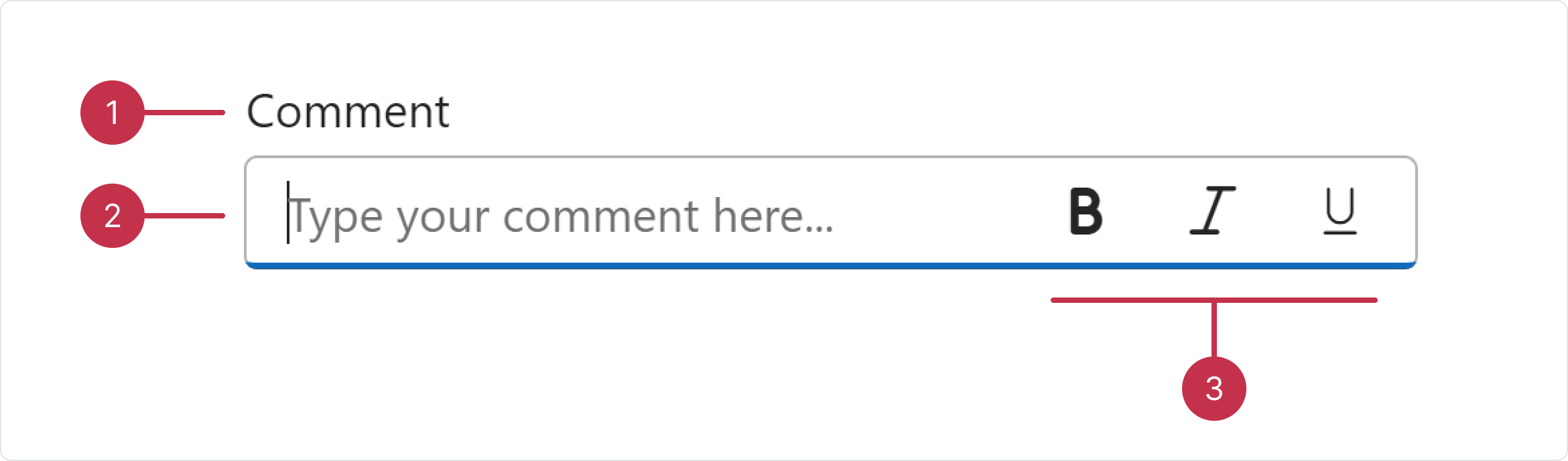
In this overview, you can find a map of TextBox elements, information about key features, and what to explore next.
Key Features
Styling
You can select a styling mode for DevExtreme TextBox, specify label placement, and define a placeholder for an empty editor.Data Validation and Spellcheck
TextBox supports spellcheck functionality. The component includes various validation rules and real-time validation feedback. Adjust error message position as needed.Input Masking
Select from a range of predefined mask types. For instance, use the password mode to conceal characters in TextBox. Alternatively, create and configure custom masks.Button Integration
Integrate custom buttons inside the input field. You can also enable predefined buttons like a clear button.Text Length Limitation
You can specify the maxLength property to limit the text length.

 Select one or more answers