JavaScript/jQuery Chart - commonAxisSettings
Defines common settings for both the argument and value axis in a chart.
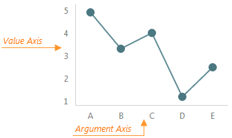
The commonAxisSettings object, which is described here, specifies common settings for all axes in a chart. To configure a particular axis, use the argumentAxis or valueAxis object. Axis-specific settings override common settings.
aggregatedPointsPosition
Specifies the start position of the aggregated series points in the aggregation interval. Applies only to axes of continuous and logarithmic types.
jQuery
$(function() {
    $("#chartContainer").dxChart({
        // ...
        commonAxisSettings: {
            aggregatedPointsPosition: 'crossTicks',
        },
    });
});
Angular
<dx-chart ... >
    <dxo-chart-common-axis-settings [aggregatedPointsPosition]="crossTicks" >
    </dxo-common-series-settings>
</dx-chart>
import { Component } from '@angular/core';

@Component({
    selector: 'app-root',
    templateUrl: './app.component.html',
    styleUrls: ['./app.component.css']
})
export class AppComponent {
    // ...
}
import { BrowserModule } from '@angular/platform-browser';
import { NgModule } from '@angular/core';
import { AppComponent } from './app.component';

import { DxChartModule } from 'devextreme-angular';

@NgModule({
    declarations: [
        AppComponent
    ],
    imports: [
        BrowserModule,
        DxChartModule
    ],
    providers: [ ],
    bootstrap: [AppComponent]
})
export class AppModule { }
Vue
<template>
    <DxChart ... >
        <DxCommonAxisSettings :aggregated-points-position="crooTicks" />
    </DxChart>
</template>

<script>
import DxChart, {
    DxCommonAxisSettings
} from 'devextreme-vue/chart';

export default {
    components: {
        DxChart,
        DxCommonAxisSettings,
    },
    // ...
}
</script>
React
import React from 'react';

import Chart, {
    CommonAxisSettings
} from 'devextreme-react/chart';

class App extends React.Component {
    render() {
        return (
            <Chart ... >
                <CommonAxisSettings aggregatedPointsPosition="crossTicks" />
            </Chart>
        );
    }
}
export default App;
ASP.NET Core Controls
@(Html.DevExtreme().Chart()
    .AggregatedPointsPosition(AggregatedPointsPosition.CrossTicks)
    // ...
)
ASP.NET MVC Controls
@(Html.DevExtreme().Chart()
    .AggregatedPointsPosition(AggregatedPointsPosition.CrossTicks)
    // ...
)
See Also
allowDecimals
Specifies whether to allow decimal values on the axis. When false, the axis contains integer values only.
breakStyle
Configures scale break appearance.
The following code snippet configures commonAxisSettings.breakStyle to customize items in valueAxis.breaks[] and argumentAxis.breaks[].
jQuery
$(() => {
    $("#chartContainer").dxChart({
        commonAxisSettings: {
            breakStyle: {
                color: "red",
                line: "straight",
                width: 15,
            },
        },
        argumentAxis: {
            breaks: [{ startValue: 1998, endValue: 2003 }],
        },
        valueAxis: {
            breaks: [{ startValue: 250, endValue: 350 }],
        },
    })
})
Angular
<dx-chart>
    <dxo-chart-common-axis-settings>
        <dxo-chart-break-style
            color="red"
            line="straight"
            [width]="15"
        ></dxo-chart-break-style>
    </dxo-chart-common-axis-settings>
    <dxo-chart-argument-axis>
        <dxi-chart-break startValue="1998" endValue="2003"></dxi-chart-break>
    </dxo-chart-argument-axis>
    <dxo-value-axis>
        <dxi-chart-break startValue="250" endValue="350"></dxi-chart-break>
    <dxo-value-axis>
</dx-chart>
Vue
<template>
    <DxChart>
        <DxCommonAxisSettings>
            <DxBreakStyle
                color="red"
                line="straight"
                :width="15"
            />
        </DxCommonAxisSettings>
        <DxArgumentAxis>
            <DxBreak startValue="1998" endValue="2003" />
        </DxArgumentAxis>
        <DxValueAxis>
            <DxBreak startValue="250" endValue="350" />
        </DxValueAxis>
    </DxChart>
</template>
React
function App() {
    return (
        <Chart>
            <CommonAxisSettings>
                <BreakStyle
                    color="red"
                    line="straight"
                    width={15}
                />
            </CommonAxisSettings>
            <ArgumentAxis>
                <Break startValue="1998" endValue="2003" />
            </ArgumentAxis>
            <ValueAxis>
                <Break startValue="250" endValue="350" />
            </ValueAxis>
        </Chart>
    )
}
color
Specifies the color of the axis line.
This property supports the following colors:
- Hexadecimal colors
- RGB colors
- RGBA colors
- Predefined/cross-browser color names
- Predefined SVG colors
- Paint server address
constantLineStyle
Configures the appearance of all constant lines in the UI component.
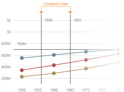
The commonAxisSettings.constantLineStyle object, which is described here, specifies common settings for all constant lines in the chart. To configure only those constant lines that belong to a particular axis, use the following objects.
- argumentAxis.constantLineStyle
- valueAxis.constantLineStyle
To configure individual constant lines, use the following arrays of objects.
- argumentAxis.constantLines[]
- valueAxis.constantLines[]
Individual settings override axis-specific settings which, in their turn, override common settings.
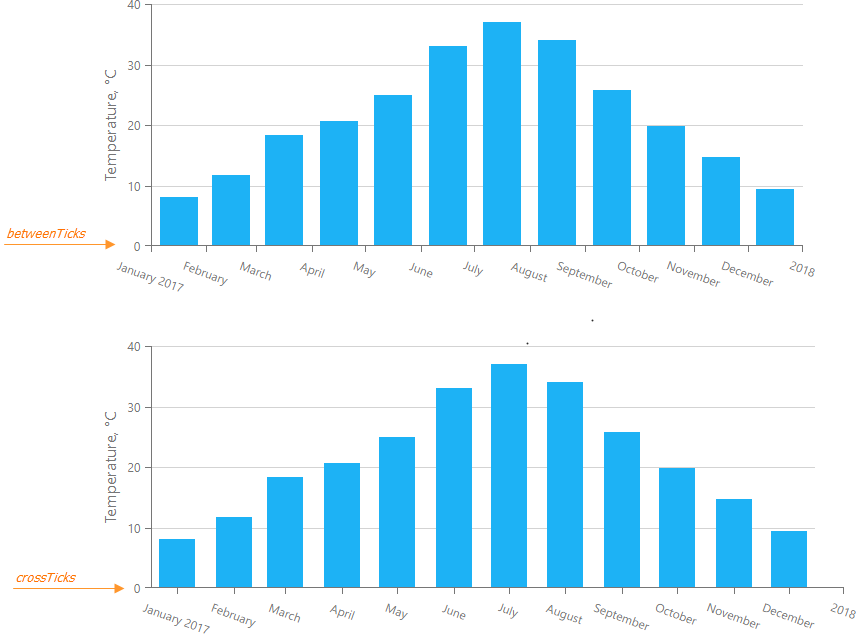
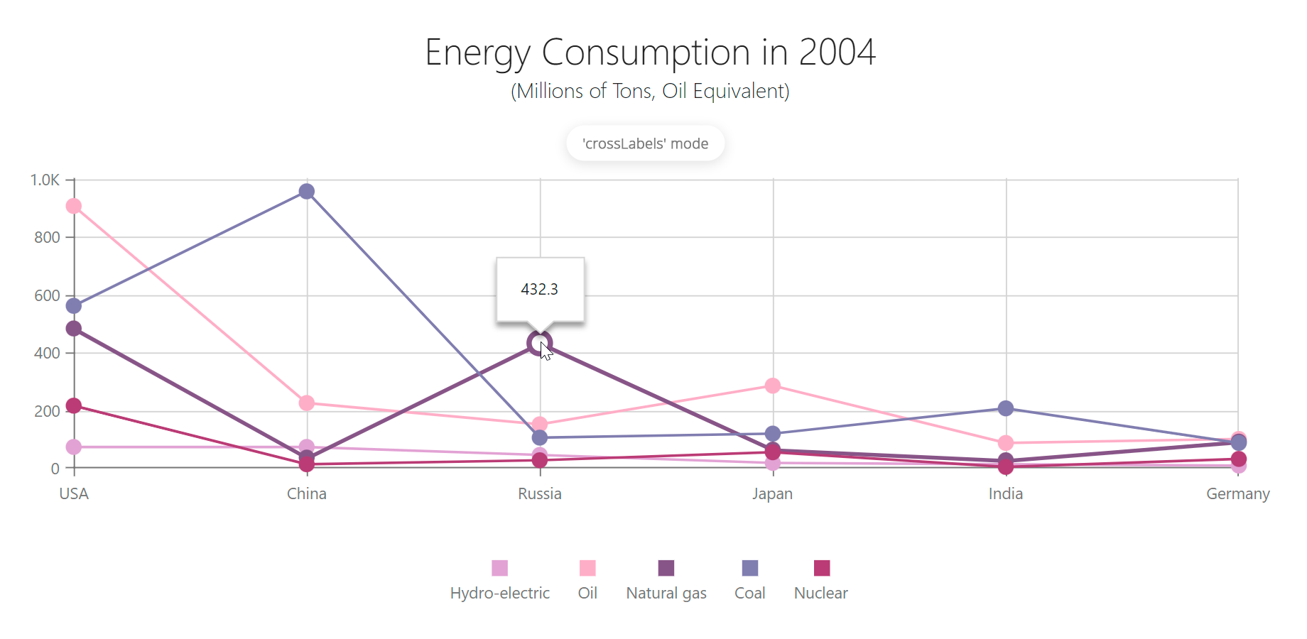
discreteAxisDivisionMode
Specifies whether ticks and grid lines should cross axis labels or lie between them. Applies only to the axes of the "discrete" type.

endOnTick
Specifies whether to force the axis to start and end on ticks.
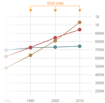
grid
Configures the grid.
Gridlines can be considered extensions of ticks.
jQuery
$('#chart').dxChart({
    commonAxisSettings: {
        grid: {
            visible: true,
            color: 'blue',
            opacity: 0.25,
            width: 2,
        },
    },
})
Angular
<dx-chart ... >
    <dxo-chart-common-axis-settings>
        <dxo-chart-grid
            [visible]="true"
            color="blue"
            [opacity]="0.25"
            [width]="2"
        ></dxo-chart-grid>
    </dxo-chart-common-axis-settings>
</dx-chart>
Vue
<template>
    <DxChart ... >
        <DxCommonAxisSettings>
            <DxGrid
                :visible="true"
                color="blue"
                :opacity="0.25"
                :width="2"
            />
        </DxCommonAxisSettings>
    </DxChart>
</template>

<script setup lang="ts">
import { DxChart, DxCommonAxisSettings, DxGrid } from 'devextreme-vue/chart';

</script>
React
import { Chart, CommonAxisSettings, Grid } from 'devextreme-react/chart';

function App() {
    return (
        <Chart ... >
            <CommonAxisSettings>
                <Grid
                    visible={true}
                    color="blue"
                    opacity={0.25}
                    width={2}
                />
            </CommonAxisSettings>
        </Chart>
    )
}
The commonAxisSettings.grid object specifies common settings for all gridlines on a chart. To configure only those grid lines that descend from a particular axis, use the following objects:
Axis-specific settings override common settings.
See Also
- commonAxisSettings.minorGrid - configures the minor grid built on minor ticks.
inverted
Inverts the axis.
When an axis is inverted (that is, when this property is set to true), its maximum and minimum values swap their places. As a result, axis values ascend in the opposite direction. Along with the axis, series also become inverted.
See Also
- rotated - rotates the chart.
label
Configures axis labels.
Axis labels display the values of major axis ticks.
The commonAxisSettings.label object, which is described here, specifies common settings for all axis labels in the chart. To configure only those labels that belong to a particular axis, use the following objects.
Axis-specific settings override common settings.
maxValueMargin
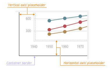
Controls the empty space between the maximum series points and the axis. Applies only to the axes of the "continuous" and "logarithmic" type.
The Chart component adds a space at the end of the axis data range to avoid cutting off the largest values. You can specify the size of this space with maxValueMargin, which is a ratio applied to the axis range. The following formula shows how it works:
axisEndValue = maxDataValue + (maxDataValue - minDataValue) * maxValueMargin
The following expression calculates the axis end value with a minimum data value of 1960, a maximum data value of 2010, and maxValueMargin of 0.1:
axisEndValue = 2010 + (2010 - 1960) * 0.1 = 2010 + 50 * 0.1 = 2010 + 5 = 2015
See Also
- commonAxisSettings.valueMarginsEnabled - enables/disables margins for axes.
- commonAxisSettings.minValueMargin
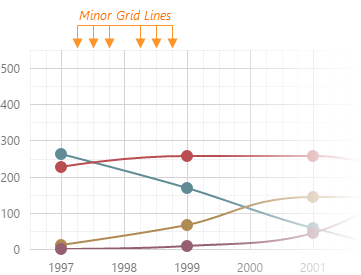
minorGrid
Configures the minor grid.
In addition to the major grid, DevExtreme Chart can display a minor grid following the placement of minor ticks.
jQuery
$('#chart').dxChart({
    // ...
    commonAxisSettings: {
        minorGrid: {
            visible: true,
            color: 'blue',
            opacity: 0.1,
            width: 1,
        },
    },
})
Angular
<dx-chart ... >
    <dxo-chart-common-axis-settings>
        <dxo-chart-minor-grid
            [visible]="true"
            color="blue"
            [opacity]="0.1"
            [width]="1"
        ></dxo-chart-minor-grid>
    </dxo-chart-common-axis-settings>
</dx-chart>
Vue
<template>
    <DxChart ... >
        <DxCommonAxisSettings>
            <DxMinorGrid
                :visible="true"
                color="blue"
                :opacity="0.1"
                :width="1"
            />
        </DxCommonAxisSettings>
    </DxChart>
</template>

<script setup lang="ts">
import { DxChart, DxCommonAxisSettings, DxMinorGrid } from 'devextreme-vue/chart';

</script>
React
import { Chart, CommonAxisSettings, MinorGrid } from 'devextreme-react/chart';

function App() {
    return (
        <Chart ... >
            <CommonAxisSettings>
                <MinorGrid
                    visible={true}
                    color="blue"
                    opacity={0.1}
                    width={1}
                />
            </CommonAxisSettings>
        </Chart>
    )
}
The commonAxisSettings.minorGrid object specifies common settings for all minor gridlines in a chart. To configure only those gridlines that descend from an axis of your choice, use the following objects:
Axis-specific settings override common settings.
- If you display the minor grid alone, it may impair chart readability. We recommend you implement the minor grid in conjunction with the major grid.
- The component does not display the minor grid on "discrete" axes.
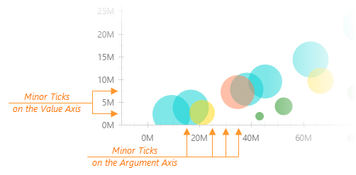
minorTick
Configures the appearance of minor axis ticks.
In addition to major ticks, the DevExtreme Chart can display minor ticks. This component places minor ticks between major ticks.
jQuery
$('#chart').dxChart({
    commonAxisSettings: {
        minorTick: {
            visible: true,
            color: "blue",
            length: 10,
            opacity: 0.5,
            shift: 0,
            width: 1,
        },
    },
})
Angular
<dx-chart ... >
    <dxo-chart-common-axis-settings>
        <dxo-chart-minor-tick
            [visible]="true"
            color="blue"
            [length]="10"
            [opacity]="0.5"
            [shift]="0"
            [width]="1"
        ></dxo-chart-minor-tick>
    </dxo-chart-common-axis-settings>
</dx-chart>
Vue
<template>
    <DxChart ... >
        <DxCommonAxisSettings>
            <DxMinorTick
                :visible="true"
                color="blue"
                :length="10"
                :opacity="0.5"
                :shift="0"
                :width="1"
            />
        </DxCommonAxisSettings>
    </DxChart>
</template>

<script setup lang="ts">
import { DxChart, DxCommonAxisSettings, DxMinorTick } from 'devextreme-vue/chart';

</script>
React
import { Chart, CommonAxisSettings, MinorTick } from 'devextreme-react/chart';

function App() {
    return (
        <Chart ... >
            <CommonAxisSettings>
                <MinorTick
                    visible={true}
                    color="blue"
                    length={10}
                    opacity={0.5}
                    shift={0}
                    width={1}
                />
            </CommonAxisSettings>
        </Chart>
    )
}
The commonAxisSettings.minorTick object specifies common settings for all minor ticks in a chart. To configure only those minor ticks that belong to a particular axis, use the following objects:
Axis-specific settings override common settings.
See Also
- argumentAxis.minorTickInterval - specifies the minor tick interval of the argument axis.
- valueAxis.minorTickInterval - specifies the minor tick interval of the value axis.
minValueMargin
Controls the empty space between the minimum series points and the axis. Applies only to the axes of the "continuous" and "logarithmic" type.
The Chart component adds a space at the start of the axis data range to avoid cutting off the smallest values. You can specify the size of this space with minValueMargin, which is a ratio applied to the axis range. The following formula shows how it works:
axisStartValue = minDataValue - (maxDataValue - minDataValue) * minValueMargin
The following expression calculates the axis start value with a minimum data value of 1960, a maximum data value of 2010, and minValueMargin of 0.1:
axisStartValue = 1960 - (2010 - 1960) * 0.1 = 1960 - 50 * 0.1 = 1960 - 5 = 1955
See Also
- commonAxisSettings.valueMarginsEnabled - enables/disables margins for axes.
- commonAxisSettings.maxValueMargin
opacity
Specifies how transparent the axis line should be.
This property accepts a value from 0 to 1, where 0 makes the axis line completely transparent, and 1 makes it opaque.
placeholderSize
Reserves a pixel-measured space for the axis.
The reserved space will be occupied by the axis line and axis labels.
See Also
- margin - generates space around the UI component.
stripStyle
Configures the appearance of strips.
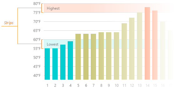
The commonAxisSettings.stripStyle object specifies common settings for all strips in the chart. To configure only those strips that belong to a particular axis, use the following objects.
- argumentAxis.stripStyle
- valueAxis.stripStyle
To configure individual strips, use the following arrays of objects.
Individual settings override axis-specific settings which, in their turn, override common settings.
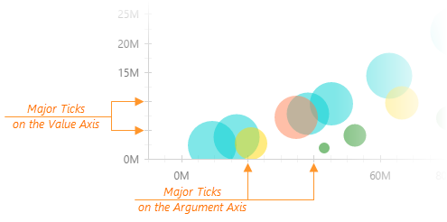
tick
Configures major axis tick appearance.
Ticks help you align values with their corresponding data points on an axis. The tick object configures major ticks that are placed in relation to value labels.
jQuery
$('#chart').dxChart({
    commonAxisSettings: {
        tick: {
            visible: true,
            color: "blue",
            length: 20,
            opacity: 0.75,
            shift: 0,
            width: 2,
        },
    },
})
Angular
<dx-chart ... >
    <dxo-chart-common-axis-settings>
        <dxo-chart-tick
            [visible]="true"
            color="blue"
            [length]="20"
            [opacity]="0.75"
            [shift]="0"
            [width]="2"
        ></dxo-chart-tick>
    </dxo-chart-common-axis-settings>
</dx-chart>
Vue
<template>
    <DxChart ... >
        <DxCommonAxisSettings>
            <DxTick
                :visible="true"
                color="blue"
                :length="20"
                :opacity="0.75"
                :shift="0"
                :width="2"
            />
        </DxCommonAxisSettings>
    </DxChart>
</template>

<script setup lang="ts">
import { DxChart, DxCommonAxisSettings, DxTick } from 'devextreme-vue/chart';

</script>
React
import { Chart, CommonAxisSettings, Tick } from 'devextreme-react/chart';

function App() {
    return (
        <Chart ... >
            <CommonAxisSettings>
                <Tick
                    visible={true}
                    color="blue"
                    length={20}
                    opacity={0.75}
                    shift={0}
                    width={2}
                />
            </CommonAxisSettings>
        </Chart>
    )
}
The commonAxisSettings.tick object specifies common settings for all major ticks in a chart. To configure only those major ticks that belong to a particular axis, use the following objects:
Axis-specific settings override common settings.
See Also
- argumentAxis.tickInterval - specifies the tick interval of the argument axis.
- valueAxis.tickInterval - specifies the tick interval of the value axis.
- commonAxisSettings.minorTick - customizes minor tick appearance.
title
Configures axis titles.
Usually, an axis title displays units of measurement for values displayed by an axis. However, you can display any needed text in the axis title.
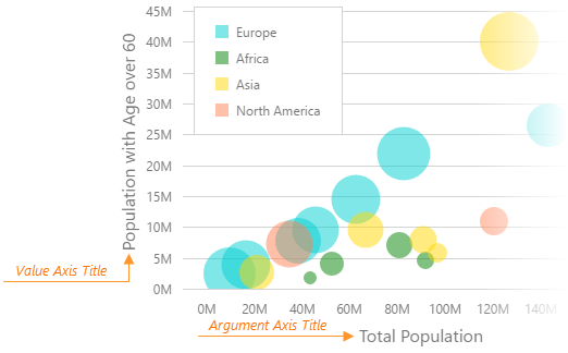
The commonAxisSettings.title object, which is described here, specifies common settings for all axis titles in the chart. To configure only the axis title that belongs to a particular axis, use the following objects.
Axis-specific settings override common settings.
See Also
valueMarginsEnabled
Adds an empty space between axis ends and minimum/maximum series points.
When valueMarginsEnabled is true, the component extends axes to prevent cutting off minimum/maximum series points if necessary. To specify persistent margins, configure the minValueMargin and maxValueMargin properties.

 Select one or more answers