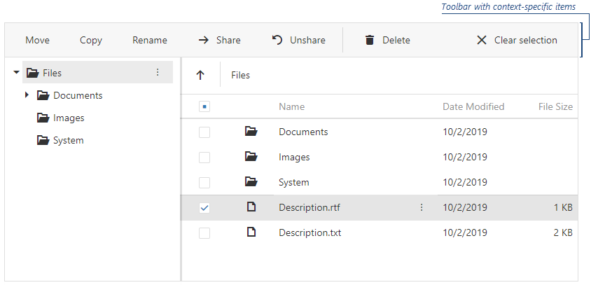
JavaScript/jQuery FileManager - toolbar.fileSelectionItems
Configures settings of the toolbar items that are visible when users select files.
jQuery
$(function () {
    $("#file-manager").dxFileManager({
        toolbar: {
            fileSelectionItems: [
                "move", "copy", "rename",
                {
                    widget: "dxButton",
                    options: {
                        text: "Share",
                        icon: "arrowright"
                    },
                    location: "before",
                    onClick: shareItem
                },
                // ...
                "separator", "delete", "refresh", "clear"
            ]
        }
    });
});
cssClass
Specifies a CSS class to be applied to the item.
disabled
Specifies whether the UI component item responds to user interaction.
icon
Specifies the icon to be displayed on the toolbar item.
This property accepts one of the following:
- The icon's URL
- The icon's name if the icon is from the DevExtreme icon library
- The icon's CSS class if the icon is from an external icon library (see External Icon Libraries)
- The icon in the Base64 format
- The icon in the SVG format. Ensure that the source is reliable.
locateInMenu
Specifies when to display an item in the toolbar's overflow menu.
location
Specifies the toolbar item's location.
Whatever template you use for UI component items (default or a custom) will be located according to the value specified for the location field in the item data source object.
See Also
options
Configures the DevExtreme UI component used as a toolbar item.
Angular
options should contain the properties of the DevExtreme UI component specified in the widget property. Because of this dependency, options cannot be typed and are not implemented as nested configuration components. Specify options with an object.
<dx-file-manager ... >
    <dxo-file-manager-toolbar>
        <dxi-file-manager-file-selection-item
            widget="dxCheckBox"
            [options]="{ text: 'Show IDs' }">
        </dxi-file-manager-file-selection-item>
    </dxo-file-manager-toolbar>
</dx-file-manager>
import { BrowserModule } from '@angular/platform-browser';
import { NgModule } from '@angular/core';
import { AppComponent } from './app.component';

import { DxFileManagerModule } from 'devextreme-angular';

@NgModule({
    declarations: [
        AppComponent
    ],
    imports: [
        BrowserModule,
        DxFileManagerModule
    ],
    providers: [ ],
    bootstrap: [AppComponent]
})
export class AppModule { }
Vue
options should contain the properties of the DevExtreme UI component specified in the widget property. Because of this dependency, options cannot be typed and are not implemented as nested configuration components. Specify options with an object. We recommend that you declare the object outside the configuration component to prevent possible issues caused by unnecessary re-rendering.
<template>
    <DxFileManager ... >
        <DxToolbar>
            <DxFileSelectionItem
                widget="dxCheckBox"
                :options="checkBoxOptions"
            />
        </DxToolbar>
    </DxFileManager>
</template>

<script>
import 'devextreme/dist/css/dx.light.css';

import DxFileManager, {
    DxToolbar,
    DxFileSelectionItem
} from 'devextreme-vue/file-manager';

export default {
    components: {
        DxFileManager,
        DxToolbar,
        DxFileSelectionItem
    },
    data() {
        return {
            checkBoxOptions: { text: 'Show IDs' }
        }
    }
}
</script>
React
options should contain the properties of the DevExtreme UI component specified in the widget property. Because of this dependency, options cannot be typed and are not implemented as nested configuration components. Specify options with an object. We recommend that you declare the object outside the configuration component to prevent possible issues caused by unnecessary re-rendering.
import React from 'react';

import 'devextreme/dist/css/dx.light.css';

import FileManager, {
    Toolbar,
    FileSelectionItem
} from 'devextreme-react/file-manager';

class App extends React.Component {
    checkBoxOptions = { text: 'Show IDs' };

    render() {
        return (
            <FileManager ... >
                <Toolbar>
                    <FileSelectionItem
                        widget="dxCheckBox"
                        options={this.checkBoxOptions}
                    />
                </Toolbar>
            </FileManager>
        );
    }
}
export default App;showText
Specifies when to display the text for the UI component item.
text
Specifies text displayed for the UI component item.
If you use both this property and a template, the template overrides the text.
widget
A UI component that presents a toolbar item. To configure it, use the options object.
Import the specified UI component's module when using DevExtreme modules.
You can specify the widget option for custom toolbar items only.

 Select one or more answers