JavaScript/jQuery PivotGridFieldChooser Options
This section describes the configuration properties of the PivotGridFieldChooser UI component.
See Also
accessKey
Specifies the shortcut key that sets focus on the UI component.
The value of this property will be passed to the accesskey attribute of the HTML element that underlies the UI component.
activeStateEnabled
Specifies whether the UI component changes its visual state as a result of user interaction.
The UI component switches to the active state when users press down the primary mouse button. When this property is set to true, the CSS rules for the active state apply. You can change these rules to customize the component.
Use this property when you display the component on a platform whose guidelines include the active state change for UI components.
allowSearch
Specifies whether the field chooser allows search operations in the "All Fields" section.
applyChangesMode
Specifies when to apply changes made in the UI component to the PivotGrid.
The following modes are available:
"instantly"
Applies changes immediately."onDemand"
Applies or cancels changes only when this is requested from the API - by calling the applyChanges() or cancelChanges() method or by changing the state object.
dataSource
The data source of a PivotGrid UI component.
It is important for the data source of the PivotGridFieldChooser to be the same as the data source of its PivotGrid UI component. This will allow the field chooser to manage data in the pivot grid. Use the PivotGrid's getDataSource method to acquire its data source.
disabled
Specifies whether the UI component responds to user interaction.
elementAttr
Specifies the global attributes to be attached to the UI component's container element.
jQuery
$(function(){
    $("#pivotGridFieldChooserContainer").dxPivotGridFieldChooser({
        // ...
        elementAttr: {
            id: "elementId",
            class: "class-name"
        }
    });
});
Angular
<dx-pivot-grid-field-chooser ...
    [elementAttr]="{ id: 'elementId', class: 'class-name' }">
</dx-pivot-grid-field-chooser>
import { DxPivotGridFieldChooserModule } from "devextreme-angular";
// ...
export class AppComponent {
    // ...
}
@NgModule({
    imports: [
        // ...
        DxPivotGridFieldChooserModule
    ],
    // ...
})
Vue
<template>
    <DxPivotGridFieldChooser ...
        :element-attr="pivotGridFieldChooserAttributes">
    </DxPivotGridFieldChooser>
</template>

<script>
import DxPivotGridFieldChooser from 'devextreme-vue/pivot-grid-field-chooser';

export default {
    components: {
        DxPivotGridFieldChooser
    },
    data() {
        return {
            pivotGridFieldChooserAttributes: {
                id: 'elementId',
                class: 'class-name'
            }
        }
    }
}
</script>
React
import React from 'react';

import PivotGridFieldChooser from 'devextreme-react/pivot-grid-field-chooser';

class App extends React.Component {
    pivotGridFieldChooserAttributes = {
        id: 'elementId',
        class: 'class-name'
    }

    render() {
        return (
            <PivotGridFieldChooser ...
                elementAttr={this.pivotGridFieldChooserAttributes}>
            </PivotGridFieldChooser>
        );
    }
}
export default App;
encodeHtml
Specifies whether HTML tags are displayed as plain text or applied to the values of the header filter.
When true, the component displays HTML tags as plain text; when false, the component applies them to the header filter values. If you disable this property, malicious code can be executed. Refer to the following help topic for more information: Potentially Vulnerable API - encodeHtml.
focusStateEnabled
Specifies whether the UI component can be focused using keyboard navigation.
headerFilter
Configures the header filter feature.
A header filter allows a user to filter individual field's values by including or excluding them from the applied filter. Cicking a header filter icon invokes a popup menu displaying all the unique field values.
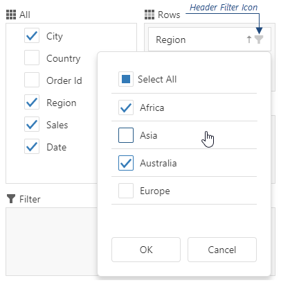
Assign true to the allowFiltering property to make the icons visible.
The user's filtering preferences are saved in the filterValues property. The header filter's Select All checkbox changes the filterType property.
height
Specifies the UI component's height.
This property accepts a value of one of the following types:
Number
The height in pixels.String
A CSS-accepted measurement of height. For example,"55px","20vh","80%","inherit".
hint
Specifies text for a hint that appears when a user pauses on the UI component.
hoverStateEnabled
Specifies whether the UI component changes its state when a user pauses on it.
layout
Specifies the field chooser layout.
The image below shows different layout types.
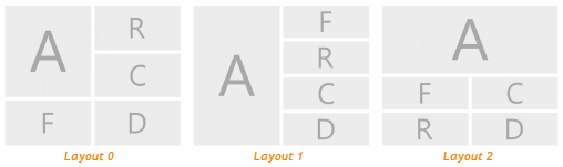
The following abbreviations are used on the image.
- A — All Fields
- F — Filter Fields
- R — Row Fields
- C — Column Fields
- D — Data Fields
onContentReady
A function that is executed when the UI component is rendered and each time the component is repainted.
Information about the event.
| Name | Type | Description |
|---|---|---|
| element |
The UI component's container. It is an HTML Element or a jQuery Element when you use jQuery. |
|
| component |
The UI component's instance. |
onContextMenuPreparing
A function that is executed before the context menu is rendered.
Information about the event.
| Name | Type | Description |
|---|---|---|
| area |
The clicked area's type. |
|
| component |
The UI component's instance. |
|
| element |
The UI component's container. It is an HTML Element or a jQuery Element when you use jQuery. |
|
| event | Event (jQuery or EventObject) |
The event that caused the function to execute. It is an EventObject or a jQuery.Event when you use jQuery. |
| field |
The configuration of the field on which the context menu is invoked. |
|
| items |
Items to be displayed in the context menu. Their structure is described in the items property description. |
onDisposing
A function that is executed before the UI component is disposed of.
Information about the event.
| Name | Type | Description |
|---|---|---|
| element |
The UI component's container. It is an HTML Element or a jQuery Element when you use jQuery. |
|
| component |
The UI component's instance. |
onInitialized
A function used in JavaScript frameworks to save the UI component instance.
Information about the event.
| Name | Type | Description |
|---|---|---|
| element |
The UI component's container. It is an HTML Element or a jQuery Element when you use jQuery. |
|
| component |
The UI component's instance. |
Angular
<dx-pivot-grid-field-chooser ...
    (onInitialized)="saveInstance($event)">
</dx-pivot-grid-field-chooser>
import { Component } from "@angular/core";
import PivotGridFieldChooser from "devextreme/ui/data_grid";
// ...
export class AppComponent {
    pivotGridFieldChooserInstance: PivotGridFieldChooser;
    saveInstance (e) {
        this.pivotGridFieldChooserInstance = e.component;
    }
}
Vue
<template>
    <div>
        <DxPivotGridFieldChooser ...
            @initialized="saveInstance">
        </DxPivotGridFieldChooser>
    </div>
</template>

<script>
import DxPivotGridFieldChooser from 'devextreme-vue/pivot-grid-field-chooser';

export default {
    components: {
        DxPivotGridFieldChooser
    },
    data: function() {
        return {
            pivotGridFieldChooserInstance: null
        };
    },
    methods: {
        saveInstance: function(e) {
            this.pivotGridFieldChooserInstance = e.component;
        }
    }
};
</script>
<template>
    <div>
        <DxPivotGridFieldChooser ...
            @initialized="saveInstance">
        </DxPivotGridFieldChooser>
    </div>
</template>

<script setup>
import DxPivotGridFieldChooser from 'devextreme-vue/pivot-grid-field-chooser';

let pivotGridFieldChooserInstance = null;

const saveInstance = (e) => {
    pivotGridFieldChooserInstance = e.component;
}
</script>
React
import PivotGridFieldChooser from 'devextreme-react/pivot-grid-field-chooser';

class App extends React.Component {
    constructor(props) {
        super(props);

        this.saveInstance = this.saveInstance.bind(this);
    }

    saveInstance(e) {
        this.pivotGridFieldChooserInstance = e.component;
    }

    render() {
        return (
            <div>
                <PivotGridFieldChooser onInitialized={this.saveInstance} />
            </div>
        );
    }
}
See Also
onOptionChanged
A function that is executed after a UI component property is changed.
Information about the event.
| Name | Type | Description |
|---|---|---|
| value | any |
The modified property's new value. |
| previousValue | any |
The UI component's previous value. |
| name |
The modified property if it belongs to the first level. Otherwise, the first-level property it is nested into. |
|
| fullName |
The path to the modified property that includes all parent properties. |
|
| element |
The UI component's container. It is an HTML Element or a jQuery Element when you use jQuery. |
|
| component |
The UI component's instance. |
The following example shows how to subscribe to component property changes:
jQuery
$(function() {
    $("#pivotGridFieldChooserContainer").dxPivotGridFieldChooser({
        // ...
        onOptionChanged: function(e) {
            if(e.name === "changedProperty") {
                // handle the property change here
            }
        }
    });
});
Angular
<dx-pivot-grid-field-chooser ...
    (onOptionChanged)="handlePropertyChange($event)">
</dx-pivot-grid-field-chooser>
import { Component } from '@angular/core';

@Component({
    selector: 'app-root',
    templateUrl: './app.component.html',
    styleUrls: ['./app.component.css']
})

export class AppComponent {
    // ...
    handlePropertyChange(e) {
        if(e.name === "changedProperty") {
            // handle the property change here
        }
    }
}
import { BrowserModule } from '@angular/platform-browser';
import { NgModule } from '@angular/core';
import { AppComponent } from './app.component';
import { DxPivotGridFieldChooserModule } from 'devextreme-angular';

@NgModule({
    declarations: [
        AppComponent
    ],
    imports: [
        BrowserModule,
        DxPivotGridFieldChooserModule
    ],
    providers: [ ],
    bootstrap: [AppComponent]
})

export class AppModule { }
Vue
<template>
    <DxPivotGridFieldChooser ...
        @option-changed="handlePropertyChange"
    />
</template>

<script>
import 'devextreme/dist/css/dx.light.css';
import DxPivotGridFieldChooser from 'devextreme-vue/pivot-grid-field-chooser';

export default {
    components: {
        DxPivotGridFieldChooser
    },
    // ...
    methods: {
        handlePropertyChange: function(e) {
            if(e.name === "changedProperty") {
                // handle the property change here
            }
        }
    }
}
</script>
React
import React from 'react';
import 'devextreme/dist/css/dx.light.css';

import PivotGridFieldChooser from 'devextreme-react/pivot-grid-field-chooser';

const handlePropertyChange = (e) => {
    if(e.name === "changedProperty") {
        // handle the property change here
    }
}

export default function App() {
    return (
        <PivotGridFieldChooser ...
            onOptionChanged={handlePropertyChange}
        />
    );
}
rtlEnabled
Switches the UI component to a right-to-left representation.
When this property is set to true, the UI component text flows from right to left, and the layout of elements is reversed. To switch the entire application/site to the right-to-left representation, assign true to the rtlEnabled field of the object passed to the DevExpress.config(config) method.
DevExpress.config({
    rtlEnabled: true
});searchTimeout
Specifies a delay in milliseconds between when a user finishes typing in the field chooser's search panel, and when the search is executed.
state
The UI component's state.
The state includes field configurations, expanded headers, and other settings. The following code shows how to use the state to cancel or apply the settings to the PivotGrid UI component:
jQuery
$(function () {
    var pivotGridDataSource = new DevExpress.data.PivotGridDataSource({
        // ...
    });
    $("#pivotGridContainer").dxPivotGrid({
        dataSource: pivotGridDataSource,
        // ...
    });
    var fieldChooser = $("#fieldChooserContainer").dxPivotGridFieldChooser({
        dataSource: pivotGridDataSource,
        applyChangesMode: "onDemand",
        // ...
    }).dxPivotGridFieldChooser("instance");
    $("#apply").dxButton({
        text: "Apply Changes",
        onClick: function () {
            var state = fieldChooser.option("state");
            pivotGridDataSource.state(state);
        }
    });
    $("#cancel").dxButton({
        text: "Cancel Changes",
        onClick: function () {
            fieldChooser.option("state", pivotGridDataSource.state());
        }
    });
});
Angular
import {
    DxPivotGridModule,
    DxPivotGridFieldChooserModule,
    DxButtonModule
} from "devextreme-angular";
import PivotGridDataSource from "devextreme/ui/pivot_grid/data_source";
// ...
export class AppComponent {
    pivotGridDataSource: any;
    state: any;
    constructor() {
        this.pivotGridDataSource = new PivotGridDataSource({ ... });
    }
    applyChanges() {
        this.pivotGridDataSource.state(this.state);
    }
    cancelChanges() {
        this.state = this.pivotGridDataSource.state();
    }
}
@NgModule({
    imports: [
        DxPivotGridModule,
        DxPivotGridFieldChooserModule,
        DxButtonModule,
        // ...
    ],
    // ...
})
<dx-pivot-grid
    ...
    [dataSource]="pivotGridDataSource">
</dx-pivot-grid>
<dx-pivot-grid-field-chooser
    ...
    [dataSource]="pivotGridDataSource"
    applyChangesMode="onDemand"
    [(state)]="state">
</dx-pivot-grid-field-chooser>
<dx-button
    text="Apply Changes"
    (onClick)="applyChanges()">
</dx-button>
<dx-button
    text="Cancel Changes"
    (onClick)="cancelChanges()">
</dx-button>See Also
tabIndex
Specifies the number of the element when the Tab key is used for navigating.
The value of this property will be passed to the tabindex attribute of the HTML element that underlies the UI component.

 Select one or more answers