JavaScript/jQuery Scheduler Options
An object defining configuration properties for the UI component.
See Also
accessKey
Specifies the shortcut key that sets focus on the UI component.
The value of this property will be passed to the accesskey attribute of the HTML element that underlies the UI component.
adaptivityEnabled
Specifies whether the UI component adapts to small screens.
allDayExpr
Specifies the name of the data source item field whose value defines whether or not the corresponding appointment is an all-day appointment.
allDayPanelMode
Specifies the display mode for the All day panel.
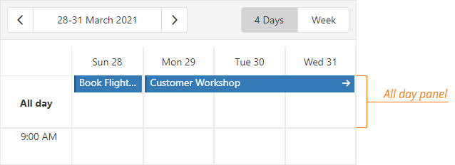
To hide the All day panel, set this property to hidden.
If you set the allDayPanelMode property to allDay, the All day panel displays only the appointments whose allDay property is set to true.
To also display appointments that have a duration equal to or more than 24 hours, assign all to this property.
jQuery
$(function() {
    $("#schedulerContainer").dxScheduler({
        // ...
        allDayPanelMode: 'all',
    });
});
Angular
<dx-scheduler ...
    allDayPanelMode="all">
</dx-scheduler>
import { BrowserModule } from '@angular/platform-browser';
import { NgModule } from '@angular/core';
import { AppComponent } from './app.component';

import { DxSchedulerModule } from 'devextreme-angular';

@NgModule({
    declarations: [
        AppComponent
    ],
    imports: [
        BrowserModule,
        DxSchedulerModule
    ],
    providers: [],
    bootstrap: [AppComponent]
})
export class AppModule { }
Vue
<template>
    <DxScheduler ...
        all-day-panel-mode="all">
    </DxScheduler>
</template>

<script>
import 'devextreme/dist/css/dx.light.css';

import { DxScheduler } from 'devextreme-vue/scheduler';

export default {
    components: {
        DxScheduler
    },
    data() {
        return {
            // ...
        }
    }
}
</script>
React
import React from 'react';

import 'devextreme/dist/css/dx.light.css';

import { Scheduler } from 'devextreme-react/scheduler';

class App extends React.Component {
    render() {
        return (
            <Scheduler ...
                allDayPanelMode="all"
            />
        );
    }
}

export default App;
appointmentCollectorTemplate
Specifies a custom template for cell overflow indicators.
| Name | Type | Description |
|---|---|---|
| appointmentCount |
The count of hidden appointments. |
|
| isCompact |
Indicates whether the overflow indicator is compact. |
|
| items |
Initially hidden appointments that are displayed after a user clicks an overflow indicator. |
jQuery
$(function() {
    $("#schedulerContainer").dxScheduler({
        // ...
        appointmentCollectorTemplate: function(data, $indicatorElement) {
            $indicatorElement.append(
                // Custom jQuery elements go here
            )
            // ===== or =====
            return /* your markup goes here */
        }
    });
});
Angular
<dx-scheduler ...
    appointmentCollectorTemplate="myTemplate">
    <div *dxTemplate="let data of 'myTemplate'">
        <!-- your markup goes here -->
    </div>
</dx-scheduler>
import { BrowserModule } from '@angular/platform-browser';
import { NgModule } from '@angular/core';
import { AppComponent } from './app.component';

import { DxSchedulerModule } from 'devextreme-angular';

@NgModule({
    declarations: [
        AppComponent
    ],
    imports: [
        BrowserModule,
        DxSchedulerModule
    ],
    providers: [],
    bootstrap: [AppComponent]
})
export class AppModule { }
Vue
<template>
    <DxScheduler ...
        appointment-collector-template="myTemplate">
        <template #myTemplate="{ data }">
            <!-- your markup goes here -->
        </template>
    </DxScheduler>
</template>

<script>
import 'devextreme/dist/css/dx.light.css';

import { DxScheduler } from 'devextreme-vue/scheduler';

export default {
    components: {
        DxScheduler
    },
    data() {
        return {
            // ...
        }
    }
}
</script>
React
import React from 'react';

import 'devextreme/dist/css/dx.light.css';

import { Scheduler } from 'devextreme-react/scheduler';

const renderCellOverflowIndicator = (data) => {
    return (
        {/* your markup goes here */}
    );
}

class App extends React.Component {
    render() {
        return (
            <Scheduler ...
                appointmentCollectorRender={renderCellOverflowIndicator}
            />
        );
    }
}

export default App;
See Also
- views[].appointmentCollectorTemplate
appointmentTemplate
Specifies a custom template for appointments.
| Name | Type | Description |
|---|---|---|
| appointmentData |
The appointment's data object. |
|
| targetedAppointmentData |
The appointment's data object. |
appointmentTooltipTemplate
Specifies a custom template for tooltips displayed when users click an appointment or cell overflow indicator.
| Name | Type | Description |
|---|---|---|
| appointmentData |
The appointment's data object. |
|
| targetedAppointmentData |
The clicked appointment's data object. |
|
| isButtonClicked |
Specifies whether you click a button or an appointment element. |
If you want to change tooltip appearance, implement a custom template with the appointmentTooltipTemplate property. Refer to the Customize Appointment Tooltip section for details.
To learn how to implement appointment layouts with appointment templates, refer to the following example:
See Also
cellDuration
Specifies cell duration in minutes. This property's value should divide the interval between startDayHour and endDayHour into even parts.
crossScrollingEnabled
Specifies whether or not an end user can scroll the view in both directions at the same time.
This property is useful when displaying Scheduler on narrow screens.
currentDate
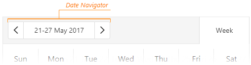
Specifies the current date.
Users can change the current date in the Date Navigator:
To subscribe to changes of the current date, use the onOptionChanged handler.
currentView
When more than one view matches the currentView value, the Scheduler displays the first matching view.
To subscribe to changes of the current view, use the onOptionChanged handler.
- Be sure to include the currentView value in the views array.
- If the views array is empty or contains a single item, Scheduler hides the view switcher.
See Also
customizeDateNavigatorText
Customizes the date navigator's text.
The text that should be displayed.
In the following code, the customizeDateNavigatorText function is used to show dates in the mm/dd/yyyy format (mm/yyyy for the "month" view):
jQuery
$(function() {
    var scheduler;
    $("#schedulerContainer").dxScheduler({
        // ...
        onInitialized: function(e) { scheduler = e.component; },
        customizeDateNavigatorText: function(e) {
            var formatOptions = {
                year: 'numeric',
                month: 'numeric',
                day: 'numeric'
            };
            var formattedStartDate = e.startDate.toLocaleString("en", formatOptions);
            var formattedEndDate = e.endDate.toLocaleString("en", formatOptions);
            var view = scheduler.option("currentView");
            if(view === "day" | "timelineDay")
                return formattedStartDate;
            if(view === "month" )
                return e.startDate.toLocaleString("en", { year: 'numeric', month: 'numeric' });
            return formattedStartDate + " - " + formattedEndDate;
        }
    });
})
Angular
import { DxSchedulerModule } from "devextreme-angular";
// ...
export class AppComponent  {
    currentView: string = "day";

    customizeDateNavigatorText = (e) => {
        let formatOptions = {
            year: 'numeric',
            month: 'numeric',
            day: 'numeric'
        };
        var formattedStartDate = e.startDate.toLocaleString("en", formatOptions);
        var formattedEndDate = e.endDate.toLocaleString("en", formatOptions);
        if(this.currentView === "day" | "timelineDay")
            return formattedStartDate;
        if(this.currentView === "month" )
            return e.startDate.toLocaleString("en", { year: 'numeric', month: 'numeric' });
        return formattedStartDate + " - " + formattedEndDate;
    }
}
@NgModule({
    imports: [
        // ...
        DxSchedulerModule
    ],
    // ...
})
<dx-scheduler ...
    [(currentView)]="currentView"
    [customizeDateNavigatorText]="customizeDateNavigatorText">
</dx-scheduler>
Vue
<template>
    <DxScheduler ...
        v-model:current-view="currentView"
        :customize-date-navigator-text="customizeDateNavigatorText">
    </DxScheduler>
</template>

<script>
import 'devextreme/dist/css/dx.light.css';

import { DxScheduler } from 'devextreme-vue/scheduler';

export default {
    components: {
        DxScheduler
    },
    data() {
        return {
            currentView: 'day',
            // ...
        }
    },
    methods: {
        customizeDateNavigatorText(e) {
            const formatOptions = {
                year: 'numeric',
                month: 'numeric',
                day: 'numeric'
            };
            const formattedStartDate = e.startDate.toLocaleString('en', formatOptions);
            const formattedEndDate = e.endDate.toLocaleString('en', formatOptions);
            if(this.currentView === 'day' | 'timelineDay')
                return formattedStartDate;
            if(this.currentView === 'month' )
                return e.startDate.toLocaleString('en', { year: 'numeric', month: 'numeric' });
            return formattedStartDate + ' - ' + formattedEndDate;
        }
    }
}
</script>
React
import React, { useCallback, useState } from 'react';

import 'devextreme/dist/css/dx.light.css';

import Scheduler from 'devextreme-react/scheduler';

const App = () => {
    const [currentView, setCurrentView] = useState('day');

    const onOptionChanged = useCallback((e) => {
        if(e.name === 'currentView') {
            setCurrentView(e.value);
        }
    }, [setCurrentView]);

    const customizeDateNavigatorText = useCallback((e) => {
        const formatOptions = {
            year: 'numeric',
            month: 'numeric',
            day: 'numeric'
        };
        const formattedStartDate = e.startDate.toLocaleString('en', formatOptions);
        const formattedEndDate = e.endDate.toLocaleString('en', formatOptions);
        if(currentView === 'day' | 'timelineDay')
            return formattedStartDate;
        if(currentView === 'month' )
            return e.startDate.toLocaleString('en', { year: 'numeric', month: 'numeric' });
        return formattedStartDate + ' - ' + formattedEndDate;
    }, [currentView]);

    return (
        <Scheduler ...
            currentView={currentView}
            onOptionChanged={onOptionChanged}
            customizeDateNavigatorText={customizeDateNavigatorText}
        />
    );
}

export default App;
dataCellTemplate
Specifies a custom template for table cells.
The following image shows the difference between Scheduler cell types:
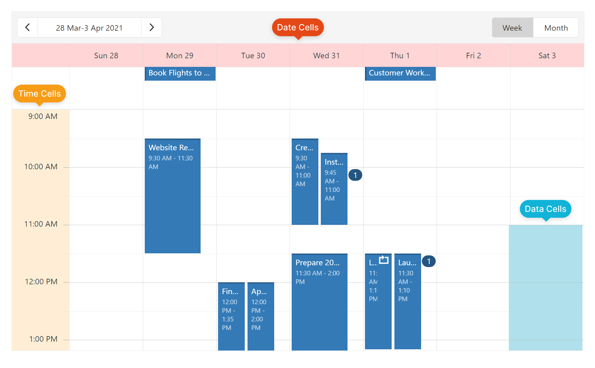
Use this template for data cells only.
The data of this template consists of the following fields:
| Field name | Description |
|---|---|
startDate |
Start date of the data cell. |
endDate |
End date of the data cell. |
allDay |
Specifies whether the appointment in cell lasts all day. |
groups |
A group object to which data cell belongs. |
groupIndex |
Index of a group to which data cell belongs. |
text |
Text of data cell. |
See Also
dataSource
Binds the UI component to data.
The Scheduler works with collections of objects.
Depending on your data source, bind Scheduler to data as follows. In each case, also specify the UI component's startDateExpr and endDateExpr properties. Optionally, set other properties with the Expr postfix.
Data Array
Assign the array to the dataSource option. View DemoRead-Only Data in JSON Format
Set the dataSource property to the URL of a JSON file or service that returns JSON data.OData
Implement an ODataStore.Web API, PHP, MongoDB
Use one of the following extensions to enable the server to process data according to the protocol DevExtreme UI components use:Then, use the createStore method to configure access to the server on the client as shown below. This method is part of DevExtreme.AspNet.Data.
jQuery
JavaScript$(function() { let serviceUrl = "https://url/to/my/service"; $("#schedulerContainer").dxScheduler({ // ... dataSource: DevExpress.data.AspNet.createStore({ key: "ID", loadUrl: serviceUrl + "/GetAction", insertUrl: serviceUrl + "/InsertAction", updateUrl: serviceUrl + "/UpdateAction", deleteUrl: serviceUrl + "/DeleteAction" }) }) });Angular
app.component.tsapp.component.htmlapp.module.tsimport { Component } from '@angular/core'; import CustomStore from 'devextreme/data/custom_store'; import { createStore } from 'devextreme-aspnet-data-nojquery'; @Component({ selector: 'app-root', templateUrl: './app.component.html', styleUrls: ['./app.component.css'] }) export class AppComponent { store: CustomStore; constructor() { let serviceUrl = "https://url/to/my/service"; this.store = createStore({ key: "ID", loadUrl: serviceUrl + "/GetAction", insertUrl: serviceUrl + "/InsertAction", updateUrl: serviceUrl + "/UpdateAction", deleteUrl: serviceUrl + "/DeleteAction" }) } }<dx-scheduler ... [dataSource]="store"> </dx-scheduler>import { BrowserModule } from '@angular/platform-browser'; import { NgModule } from '@angular/core'; import { AppComponent } from './app.component'; import { DxSchedulerModule } from 'devextreme-angular'; @NgModule({ declarations: [ AppComponent ], imports: [ BrowserModule, DxSchedulerModule ], providers: [], bootstrap: [AppComponent] }) export class AppModule { }Vue
App.vue<template> <DxScheduler ... :data-source="store" /> </template> <script> import 'devextreme/dist/css/dx.light.css'; import CustomStore from 'devextreme/data/custom_store'; import { createStore } from 'devextreme-aspnet-data-nojquery'; import { DxScheduler } from 'devextreme-vue/scheduler'; export default { components: { DxScheduler }, data() { const serviceUrl = "https://url/to/my/service"; const store = createStore({ key: "ID", loadUrl: serviceUrl + "/GetAction", insertUrl: serviceUrl + "/InsertAction", updateUrl: serviceUrl + "/UpdateAction", deleteUrl: serviceUrl + "/DeleteAction" }); return { store } } } </script>React
App.jsimport React from 'react'; import 'devextreme/dist/css/dx.light.css'; import CustomStore from 'devextreme/data/custom_store'; import { createStore } from 'devextreme-aspnet-data-nojquery'; import Scheduler from 'devextreme-react/scheduler'; const serviceUrl = "https://url/to/my/service"; const store = createStore({ key: "ID", loadUrl: serviceUrl + "/GetAction", insertUrl: serviceUrl + "/InsertAction", updateUrl: serviceUrl + "/UpdateAction", deleteUrl: serviceUrl + "/DeleteAction" }); class App extends React.Component { render() { return ( <Scheduler ... dataSource={store} /> ); } } export default App;Any other data source
Implement a CustomStore. View Demo
Regardless of the data source on the input, the Scheduler always wraps it in the DataSource object. This object allows you to sort, filter, group, and perform other data shaping operations. To get its instance, call the getDataSource() method.
Review the following notes about data binding:
If you wrap the store into the DataSource object explicitly, set the paginate property to false to prevent data from partitioning.
Field names cannot be equal to
thisand should not contain the following characters:.,:,[, and].Scheduler does not execute dataSource.sort functions. To implement custom sorting logic, implement columns[].calculateSortValue.
jQuery
- The stores are immutable. You cannot change their configurations at runtime. Instead, create a new store or DataSource and assign it to the dataSource property as shown in the following help topic: Get and Set Properties.
Angular
- The stores are immutable. You cannot change their configurations at runtime. Instead, create a new store or DataSource and assign it to the dataSource property as shown in the following help topic: Two-Way Property Binding.
Vue
- The stores are immutable. You cannot change their configurations at runtime. Instead, create a new store or DataSource and assign it to the dataSource property as shown in the following help topic: Two-Way Property Binding.
React
- The stores are immutable. You cannot change their configurations at runtime. Instead, create a new store or DataSource and assign it to the dataSource property as shown in the following help topic: Controlled Mode.
dateCellTemplate
Specifies a custom template for day scale items.
The following image shows the difference between Scheduler cell types:
Use this template for date cells only.
The data of this template consists of the following fields:
| Field name | Description |
|---|---|
date |
Date of the cell. |
groups |
A group object to which date cell belongs. |
groupIndex |
Index of a group to which date cell belongs. |
text |
Text of date cell. |
See Also
dateSerializationFormat
Specifies the format in which date-time values should be sent to the server.
Specify this property in the following cases:
The dataSource is empty or not set at design time. The dateSerializationFormat is needed, because the Scheduler cannot detect it automatically without a data source.
You use the createStore method from the DevExtreme.AspNet.Data extension and remote date-time values are specified in UTC. DevExtreme.AspNet.Data requires the dateSerializationFormat to correctly serialize these values.
Use one of the following values to specify the dateSerializationFormat property:
"yyyy-MM-dd"- local date"yyyy-MM-ddTHH:mm:ss"- local date and time"yyyy-MM-ddTHH:mm:ssZ"- UTC date and time"yyyy-MM-ddTHH:mm:ssx","yyyy-MM-ddTHH:mm:ssxx","yyyy-MM-ddTHH:mm:ssxxx"- date and time with a timezone
This property applies only if the forceIsoDateParsing field is set to true in the global configuration object.
Web API Service Demo SignalR Service Demo
See Also
descriptionExpr
Specifies the name of the data source item field whose value holds the description of the corresponding appointment.
disabled
Specifies whether the UI component responds to user interaction.
elementAttr
Specifies the global attributes to be attached to the UI component's container element.
jQuery
$(function(){
    $("#schedulerContainer").dxScheduler({
        // ...
        elementAttr: {
            id: "elementId",
            class: "class-name"
        }
    });
});
Angular
<dx-scheduler ...
    [elementAttr]="{ id: 'elementId', class: 'class-name' }">
</dx-scheduler>
import { DxSchedulerModule } from "devextreme-angular";
// ...
export class AppComponent {
    // ...
}
@NgModule({
    imports: [
        // ...
        DxSchedulerModule
    ],
    // ...
})
Vue
<template>
    <DxScheduler ...
        :element-attr="schedulerAttributes">
    </DxScheduler>
</template>

<script>
import DxScheduler from 'devextreme-vue/scheduler';

export default {
    components: {
        DxScheduler
    },
    data() {
        return {
            schedulerAttributes: {
                id: 'elementId',
                class: 'class-name'
            }
        }
    }
}
</script>
React
import React from 'react';

import Scheduler from 'devextreme-react/scheduler';

class App extends React.Component {
    schedulerAttributes = {
        id: 'elementId',
        class: 'class-name'
    }

    render() {
        return (
            <Scheduler ...
                elementAttr={this.schedulerAttributes}>
            </Scheduler>
        );
    }
}
export default App;
endDateExpr
Specifies the name of the data source item field that defines the ending of an appointment.
endDateTimeZoneExpr
Specifies the name of the data source item field that defines the timezone of the appointment end date.
endDayHour
Specifies the last hour on the time scale. Accepts integer values from 0 to 24.
This property applies to all views at once. To override it for a specific view, set the same property in the view's configuration object.
firstDayOfWeek
Specifies the first day of a week. Does not apply to the agenda view.
This property can accept a value from 0 to 6:
- 0 - Sunday
- 1 - Monday
- 2 - Tuesday
- 3 - Wednesday
- 4 - Thursday
- 5 - Friday
- 6 - Saturday
The value provided by the culture settings is used by default.
focusStateEnabled
Specifies whether the UI component can be focused using keyboard navigation.
groupByDate
If true, appointments are grouped by date first and then by resource; opposite if false. Applies only if appointments are grouped and groupOrientation is "horizontal".
groups
Specifies the resource kinds by which the scheduler's appointments are grouped in a timetable.
This array should contain one or more values that correspond to the fieldExpr values of resource kinds:
jQuery
var resources = [
    { fieldExpr: "room", dataSource: roomsDataSource },
    { fieldExpr: "teacher", dataSource: teachersDataSource }
];
var schedulerOptions = {
    dataSource: appointments,
    resources: resources,
    groups: ["room", "teacher"]
    // ...
}
Angular
<dx-scheduler
    [dataSource]="appointments"
    [resources]="resources"
    [groups]="['room', 'teacher']">
</dx-scheduler>
import { DxSchedulerModule } from "devextreme-angular";
// ...
export class AppComponent  {
    // ...
    resources = [
        { fieldExpr: "room", dataSource: this.roomsDataSource },
        { fieldExpr: "teacher", dataSource: this.teachersDataSource }
    ];
}
@NgModule({
    imports: [
        // ...
        DxSchedulerModule
    ],
    // ...
})
Vue
<template>
    <DxScheduler ...
        :data-source="appointments"
        :groups="groups">
        <DxResource
            :data-source="roomsDataSource"
            field-expr="room"
        />
        <DxResource
            :data-source="teachersDataSource"
            field-expr="teacher"
        />
    </DxScheduler>
</template>

<script>
import 'devextreme/dist/css/dx.light.css';

import { DxScheduler } from 'devextreme-vue/scheduler';

export default {
    components: {
        DxScheduler
    },
    data() {
        return {
            dataSource: [ ... ],
            groups: ['room', 'teacher'],
            roomsDataSource: [ ... ],
            teachersDataSource: [ ... ]
            // ...
        }
    }
}
</script>
React
import React from 'react';

import 'devextreme/dist/css/dx.light.css';

import Scheduler, { Resource } from 'devextreme-react/scheduler';

const App = () => {
    const appointments = [ ... ];
    const roomsDataSource = [ ... ];
    const teachersDataSource = [ ... ];
    const groups = ['room', 'teacher'];

    return (
        <Scheduler ...
            dataSource={appointments}
            groups={groups}>
            <Resource
                dataSource={roomsDataSource}
                fieldExpr="room"
            />
            <Resource
                dataSource={teachersDataSource}
                fieldExpr="teacher"
            />
        </Scheduler>
    );
}

export default App;
To group appointments in the agenda view or by one type of resource, for instance, to group appointments that use a particular room in an office, assign an array with a single element to the groups property. To group appointments by several resource types, assign an array of elements. Each element represents a resource by which appointments are grouped. Each resource is nested in the resource represented by the previous element in the groups array.
height
Specifies the UI component's height.
This property accepts a value of one of the following types:
Number
The height in pixels.String
A CSS-accepted measurement of height. For example,"55px","20vh","80%","inherit".
hint
Specifies text for a hint that appears when a user pauses on the UI component.
indicatorUpdateInterval
Specifies the time interval between when the date-time indicator changes its position, in milliseconds.
maxAppointmentsPerCell
Specifies the limit of full-sized appointments displayed per cell. Applies to all views except "agenda".
When you set this property to "auto", appointments shrink to a predefined size that depends on the view type. Appointments that do not fit into the cell are hidden, and the cell displays an overflow indicator. Users can click the indicator to display the hidden appointments in a tooltip. The "unlimited" value shrinks appointments without a limit to fit into a cell.
To specify the maximum number of appointments allowed in a single cell, set the property to Number. Appointments that exceed this number are hidden, and the cell displays an overflow indicator. Users can click the indicator to display the hidden appointments in a tooltip.
noDataText
Specifies the text or HTML markup displayed by the UI component if the item collection is empty. Available for the Agenda view only.
The Scheduler component evaluates the noDataText property's value. This evaluation, however, makes the Scheduler potentially vulnerable to XSS attacks. To guard against these attacks, encode the HTML markup before you assign it to the noDataText property. Refer to the following help topic for more information: Potentially Vulnerable API - noDataText.
offset
Specifies the minute offset applied to configured day durations in all views.
This property shifts the interval between startDayHour and endDayHour. The offset value can range from -1440 (24 hours behind) to 1440 (24 hours ahead).
You can implement offset along with different startDayHour, endDayHour, and cellDuration combinations to customize views. The following code snippet integrates these properties to configure days from 4:40 AM to 11:40 AM and a 40-minute cell duration:
jQuery
$(() => {
    $('#scheduler').dxScheduler({
        // ...
        offset: -20,
        startDayHour: 5,
        endDayHour: 12,
        cellDuration: 40,
    });
});
Angular
<dx-scheduler ...
    [offset]="-20"
    [startDayHour]="5"
    [endDayHour]="12"
    [cellDuration]="40"
>
</dx-scheduler>
Vue
<template>
    <DxScheduler ...
        offset="-20"
        start-day-hour="5"
        end-day-hour="12"
        cell-duration="40"
    />
</template>
React
import { Scheduler } from 'devextreme-react/scheduler';

function App() {
    return (
        <Scheduler ...
            offset="-20"
            startDayHour="5"
            endDayHour="12"
            cellDuration="40"
        />
    )
}- This property has no effect in the agenda view.
- The offset value must be a multiple of 5.
onAppointmentAdded
A function that is executed after an appointment is added to the data source.
Information about the event.
| Name | Type | Description |
|---|---|---|
| appointmentData |
The added appointment's data. |
|
| component |
The UI component's instance. |
|
| element |
The UI component's container. It is an HTML Element or a jQuery Element when you use jQuery. |
|
| error |
The standard Error object that defines the occurred error. |
onAppointmentAdding
A function that is executed before an appointment is added to the data source.
Information about the event.
| Name | Type | Description |
|---|---|---|
| appointmentData |
The data of the appointment to be added. |
|
| cancel | | |
Allows you to cancel appointment adding. |
| component |
The UI component's instance. |
|
| element |
The UI component's container. It is an HTML Element or a jQuery Element when you use jQuery. |
onAppointmentClick
A function that is executed when an appointment is clicked or tapped.
Information about the event.
| Name | Type | Description |
|---|---|---|
| appointmentData |
The initial appointment. |
|
| appointmentElement |
The clicked's container. It is an HTML Element or a jQuery Element when you use jQuery. |
|
| cancel |
If true, hides the appointment tooltip. |
|
| component |
The UI component's instance. |
|
| element |
The UI component's container. It is an HTML Element or a jQuery Element when you use jQuery. |
|
| event | Event (jQuery or EventObject) |
The event that caused the function to execute. It is an EventObject or a jQuery.Event when you use jQuery. |
| targetedAppointmentData |
The clicked appointment. |
In case of recurring appointments or appointments with multiple resources, you may need the data object of the clicked appointment, not the initial appointment. For this purpose, use the targetedAppointmentData field of the function's parameter. Otherwise, use the appointmentData field.
For example, the data source contains the following data object:
var appointments = [{
    startDate: new Date(2016, 6, 18, 8),
    endDate: new Date(2016, 6, 18, 9),
    ownerId: [1, 2],
    recurrenceRule: "FREQ=DAILY"
}];
This object describes a series of appointments that belong to two owners and repeat every day. If a user clicks an appointment from this series (for example, the second appointment that belongs to the second owner), appointmentData and targetedAppointmentData will then contain the following data objects:
onAppointmentClick: function(e) {
    console.log(e.appointmentData);
    /* {
        startDate: new Date(2016, 6, 18, 8),
        endDate: new Date(2016, 6, 18, 9),
        ownerId: [1, 2],
        recurrenceRule: "FREQ=DAILY"
    } */

    console.log(e.targetedAppointmentData);
    /* {
        startDate: new Date(2016, 6, 19, 8),
        endDate: new Date(2016, 6, 19, 9),
        ownerId: 2,
        recurrenceRule: "FREQ=DAILY"
    } */
}
Additionally, the targetedAppointmentData field has the displayStartDate and displayEndDate date objects. These objects contain time-zone adjusted dates if you specify the timeZone property. If the latter property is not specified, the date objects mentioned above have the same values as the startDate and endDate objects.
onAppointmentClick: function(e) {
    console.log(e.targetedAppointmentData);
    /* {
        startDate: new Date(2016, 6, 19, 8),
        endDate: new Date(2016, 6, 19, 9),
        displayStartDate: new Date(2016, 6, 19, 10),
        displayEndDate: new Date(2016, 6, 19, 11),
        ownerId: 2,
        recurrenceRule: "FREQ=DAILY"
    } */
}
onAppointmentContextMenu
A function that is executed when a user attempts to open the browser's context menu for an appointment. Allows you to replace this context menu with a custom context menu.
Information about the event.
| Name | Type | Description |
|---|---|---|
| appointmentData |
The initial appointment. |
|
| appointmentElement |
The appointment's container. It is an HTML Element or a jQuery Element when you use jQuery. |
|
| component |
The UI component's instance. |
|
| element |
The UI component's container. It is an HTML Element or a jQuery Element when you use jQuery. |
|
| event | Event (jQuery or EventObject) |
The event that caused the function to execute. It is an EventObject or a jQuery.Event when you use jQuery. |
| targetedAppointmentData |
The appointment's data object. |
onAppointmentDblClick
A function that is executed when an appointment is double-clicked or double-tapped.
Information about the event.
| Name | Type | Description |
|---|---|---|
| appointmentData |
The initial appointment. |
|
| appointmentElement |
The clicked's container. It is an HTML Element or a jQuery Element when you use jQuery. |
|
| cancel |
If true, does not allow the user to open the appointment edit form with double click. |
|
| component |
The UI component's instance. |
|
| element |
The UI component's container. It is an HTML Element or a jQuery Element when you use jQuery. |
|
| event | Event (jQuery or EventObject) |
The event that caused the function to execute. It is an EventObject or a jQuery.Event when you use jQuery. |
| targetedAppointmentData |
The appointment's data object. |
onAppointmentDeleted
A function that is executed after an appointment is deleted from the data source.
Information about the event.
| Name | Type | Description |
|---|---|---|
| appointmentData |
The deleted appointment's data. |
|
| component |
The UI component's instance. |
|
| element |
The UI component's container. It is an HTML Element or a jQuery Element when you use jQuery. |
|
| error |
The standard Error object that defines the occurred error. |
onAppointmentDeleting
A function that is executed before an appointment is deleted from the data source.
Information about the event.
| Name | Type | Description |
|---|---|---|
| appointmentData |
The data of the appointment to be deleted. |
|
| cancel | | |
Allows you to prevent the appointment from being deleted. |
| component |
The UI component's instance. |
|
| element |
The UI component's container. It is an HTML Element or a jQuery Element when you use jQuery. |
onAppointmentFormOpening
A function that is executed before Scheduler displays the appointment edit form.
Information about the event.
| Name | Type | Description |
|---|---|---|
| appointmentData |
Data of the appointment edit form's target appointment. |
|
| cancel |
Allows you to cancel opening the appointment edit form. |
|
| component |
The UI component's instance. |
|
| element |
The UI component's container. It is an HTML Element or a jQuery Element when you use jQuery. |
|
| form |
Instance of the appointment edit form's Form component. |
|
| popup |
Instance of the appointment edit form's Popup component. |
To customize individual appointment edit form items, implement this handler. The following code snippet uses AppointmentFormOpeningEvent.form to disable the subjectEditor input and enable isRequired for the descriptionEditor item:
jQuery
$('#scheduler').dxScheduler({
    onAppointmentFormOpening(e) {
        e.form.getEditor('subjectEditor').option('disabled', true);
        e.form.itemOption('mainGroup.descriptionGroup.descriptionEditor', 'isRequired', true);
    },
});
Angular
<dx-scheduler ...
    (onAppointmentFormOpening)="handleAppointmentFormOpening($event)"
></dx-scheduler>
import { type DxSchedulerTypes } from "devextreme-angular/ui/scheduler";
// ...
export class AppComponent {
    handleAppointmentFormOpening(e: DxSchedulerTypes.AppointmentFormOpeningEvent) {
        e.form.getEditor('subjectEditor').option('disabled', true);
        e.form.itemOption('mainGroup.descriptionGroup.descriptionEditor', 'isRequired', true);
    }
}
Vue
<template>
    <DxScheduler ...
        @appointment-form-opening="handleAppointmentFormOpening"
    />
</template>

<script setup lang="ts">
import { DxScheduler, type DxSchedulerTypes } from 'devextreme-vue/scheduler';

function handleAppointmentFormOpening(e: DxSchedulerTypes.AppointmentFormOpeningEvent) {
    e.form.getEditor('subjectEditor').option('disabled', true);
    e.form.itemOption('mainGroup.descriptionGroup.descriptionEditor', 'isRequired', true);
}

</script>
React
import { Scheduler, type SchedulerTypes } from 'devextreme-react/scheduler';

function handleAppointmentFormOpening(e: SchedulerTypes.AppointmentFormOpeningEvent) {
    e.form.getEditor('subjectEditor').option('disabled', true);
    e.form.itemOption('mainGroup.descriptionGroup.descriptionEditor', 'isRequired', true);
}

function App() {
    return (
        <Scheduler ...
            onAppointmentFormOpening={handleAppointmentFormOpening}
        />
    );
};See Also
onAppointmentRendered
A function that is executed when an appointment is rendered.
Information about the event.
| Name | Type | Description |
|---|---|---|
| appointmentData |
The initial appointment's data. |
|
| appointmentElement |
The appointment's container. It is an HTML Element or a jQuery Element when you use jQuery. |
|
| component |
The UI component's instance. |
|
| element |
The UI component's container. It is an HTML Element or a jQuery Element when you use jQuery. |
|
| targetedAppointmentData |
The appointment's data object. |
onAppointmentTooltipShowing
Occurs before showing an appointment's tooltip.
Information about the event.
| Name | Type | Description |
|---|---|---|
| appointments |
An array of appointments. |
|
| cancel |
Allows you to prevent a tooltip from showing. |
|
| component |
The UI component's instance. |
|
| element |
The UI component's container. It is an HTML Element or a jQuery Element when you use jQuery. |
|
| targetElement |
The target element of the tooltip. |
onAppointmentUpdated
A function that is executed after an appointment is updated in the data source.
Information about the event.
| Name | Type | Description |
|---|---|---|
| appointmentData |
The updated appointment's data. |
|
| component |
The UI component's instance. |
|
| element |
The UI component's container. It is an HTML Element or a jQuery Element when you use jQuery. |
|
| error |
The standard Error object that defines the occurred error. |
onAppointmentUpdating
A function that is executed before an appointment is updated in the data source.
Information about the event.
| Name | Type | Description |
|---|---|---|
| cancel | | |
Allows you to prevent an appointment update. |
| component |
The UI component's instance. |
|
| element |
The UI component's container. It is an HTML Element or a jQuery Element when you use jQuery. |
|
| newData |
The appointment with new data. |
|
| oldData |
The data of the appointment to be updated. |
onCellClick
A function that is executed when a view cell is clicked.
Information about the event.
| Name | Type | Description |
|---|---|---|
| cancel |
Allows you to cancel execution of the default cell click handler. |
|
| cellData |
The clicked cell's data. |
|
| cellElement |
The clicked cell's container. It is an HTML Element or a jQuery Element when you use jQuery. |
|
| component |
The UI component's instance. |
|
| element |
The UI component's container. It is an HTML Element or a jQuery Element when you use jQuery. |
|
| event | Event (jQuery or EventObject) |
The event that caused the function to execute. It is an EventObject or a jQuery.Event when you use jQuery. |
onCellContextMenu
A function that is executed when a user attempts to open the browser's context menu for a cell. Allows you to replace this context menu with a custom context menu.
Information about the event.
| Name | Type | Description |
|---|---|---|
| cellData |
The data of the cell on which the context menu is invoked. |
|
| cellElement |
The cell's container. It is an HTML Element or a jQuery Element when you use jQuery. |
|
| component |
The UI component's instance. |
|
| element |
The UI component's container. It is an HTML Element or a jQuery Element when you use jQuery. |
|
| event | Event (jQuery or EventObject) |
The event that caused the function to execute. It is an EventObject or a jQuery.Event when you use jQuery. |
onContentReady
A function that is executed when the UI component is rendered and each time the component is repainted.
Information about the event.
| Name | Type | Description |
|---|---|---|
| element |
The UI component's container. It is an HTML Element or a jQuery Element when you use jQuery. |
|
| component |
The UI component's instance. |
onDisposing
A function that is executed before the UI component is disposed of.
Information about the event.
| Name | Type | Description |
|---|---|---|
| element |
The UI component's container. It is an HTML Element or a jQuery Element when you use jQuery. |
|
| component |
The UI component's instance. |
onInitialized
A function used in JavaScript frameworks to save the UI component instance.
Information about the event.
| Name | Type | Description |
|---|---|---|
| element |
The UI component's container. It is an HTML Element or a jQuery Element when you use jQuery. |
|
| component |
The UI component's instance. |
Angular
<dx-scheduler ...
    (onInitialized)="saveInstance($event)">
</dx-scheduler>
import { Component } from "@angular/core";
import Scheduler from "devextreme/ui/data_grid";
// ...
export class AppComponent {
    schedulerInstance: Scheduler;
    saveInstance (e) {
        this.schedulerInstance = e.component;
    }
}
Vue
<template>
    <div>
        <DxScheduler ...
            @initialized="saveInstance">
        </DxScheduler>
    </div>
</template>

<script>
import DxScheduler from 'devextreme-vue/scheduler';

export default {
    components: {
        DxScheduler
    },
    data: function() {
        return {
            schedulerInstance: null
        };
    },
    methods: {
        saveInstance: function(e) {
            this.schedulerInstance = e.component;
        }
    }
};
</script>
<template>
    <div>
        <DxScheduler ...
            @initialized="saveInstance">
        </DxScheduler>
    </div>
</template>

<script setup>
import DxScheduler from 'devextreme-vue/scheduler';

let schedulerInstance = null;

const saveInstance = (e) => {
    schedulerInstance = e.component;
}
</script>
React
import Scheduler from 'devextreme-react/scheduler';

class App extends React.Component {
    constructor(props) {
        super(props);

        this.saveInstance = this.saveInstance.bind(this);
    }

    saveInstance(e) {
        this.schedulerInstance = e.component;
    }

    render() {
        return (
            <div>
                <Scheduler onInitialized={this.saveInstance} />
            </div>
        );
    }
}
See Also
onOptionChanged
A function that is executed after a UI component property is changed.
Information about the event.
| Name | Type | Description |
|---|---|---|
| value | any |
The modified property's new value. |
| previousValue | any |
The UI component's previous value. |
| name |
The modified property if it belongs to the first level. Otherwise, the first-level property it is nested into. |
|
| fullName |
The path to the modified property that includes all parent properties. |
|
| element |
The UI component's container. It is an HTML Element or a jQuery Element when you use jQuery. |
|
| component |
The UI component's instance. |
The following example shows how to subscribe to component property changes:
jQuery
$(function() {
    $("#schedulerContainer").dxScheduler({
        // ...
        onOptionChanged: function(e) {
            if(e.name === "changedProperty") {
                // handle the property change here
            }
        }
    });
});
Angular
<dx-scheduler ...
    (onOptionChanged)="handlePropertyChange($event)">
</dx-scheduler>
import { Component } from '@angular/core';

@Component({
    selector: 'app-root',
    templateUrl: './app.component.html',
    styleUrls: ['./app.component.css']
})

export class AppComponent {
    // ...
    handlePropertyChange(e) {
        if(e.name === "changedProperty") {
            // handle the property change here
        }
    }
}
import { BrowserModule } from '@angular/platform-browser';
import { NgModule } from '@angular/core';
import { AppComponent } from './app.component';
import { DxSchedulerModule } from 'devextreme-angular';

@NgModule({
    declarations: [
        AppComponent
    ],
    imports: [
        BrowserModule,
        DxSchedulerModule
    ],
    providers: [ ],
    bootstrap: [AppComponent]
})

export class AppModule { }
Vue
<template>
    <DxScheduler ...
        @option-changed="handlePropertyChange"
    />
</template>

<script>
import 'devextreme/dist/css/dx.light.css';
import DxScheduler from 'devextreme-vue/scheduler';

export default {
    components: {
        DxScheduler
    },
    // ...
    methods: {
        handlePropertyChange: function(e) {
            if(e.name === "changedProperty") {
                // handle the property change here
            }
        }
    }
}
</script>
React
import React from 'react';
import 'devextreme/dist/css/dx.light.css';

import Scheduler from 'devextreme-react/scheduler';

const handlePropertyChange = (e) => {
    if(e.name === "changedProperty") {
        // handle the property change here
    }
}

export default function App() {
    return (
        <Scheduler ...
            onOptionChanged={handlePropertyChange}
        />
    );
}
recurrenceEditMode
Specifies the edit mode for recurring appointments.
This property accepts the following values:
"series"
Enables a user to edit only entire appointment series."occurrence"
Enables a user to edit only individual appointment instances."dialog"
Displays a dialog that suggests a user to choose between editing the entire series or only the individual instance.
The Scheduler handles changes made to an instance and a series differently. If a user edits a recurring appointment instance, two actions are performed on the data objects:
The series' data object is updated. The Scheduler updates the field specified by recurrenceExceptionExpr, thus adding the edited instance to exceptions. The onAppointmentUpdating and onAppointmentUpdated event handlers are executed.
A new data object is created. This object contains the edited instance's data. The onAppointmentAdding and onAppointmentAdded event handlers are executed.
When a user deletes an instance, the Scheduler adds it to series' exceptions by updating the field specified in recurrenceExceptionExpr. Because this is an update, the onAppointmentUpdating and onAppointmentUpdated event handlers are executed instead of onAppointmentDeleting and onAppointmentDeleted.
If a user edits a whole series, only the series data object is updated. When a whole series is deleted, its object is removed.
recurrenceExceptionExpr
Specifies the name of the data source item field that defines exceptions for the current recurring appointment.
recurrenceRuleExpr
Specifies the name of the data source item field that defines a recurrence rule for generating recurring appointments.
See Also
remoteFiltering
Specifies whether filtering is performed on the server or client side.
Web API Service Demo SignalR Service Demo
resources[]
Specifies an array of resources available in the scheduler.
Each element of this array is an object that defines a resource kind - a room, a car or any other resource kind. A resource kind object must have at least the following fields.
dataSource
Specify the available resources of this kind (room1, room2, etc.).fieldExpr
The name of the appointment object field that specifies a resource of this kind (e.g., "room").
There are more fields that can be specified within a resource kind object. They are listed below. For details on how to define a resource and assign it to scheduler appointments, refer to the Resources article. The Scheduler does not support grouping resources by multiple data fields in the agenda view.
rtlEnabled
Switches the UI component to a right-to-left representation.
When this property is set to true, the UI component text flows from right to left, and the layout of elements is reversed. To switch the entire application/site to the right-to-left representation, assign true to the rtlEnabled field of the object passed to the DevExpress.config(config) method.
DevExpress.config({
    rtlEnabled: true
});scrolling
Configures scrolling.
Scrolling allows a user to browse data outside the current viewport. Information about the available scrolling modes is in the mode property description.
See Also
selectedCellData
The data of the currently selected cells.
This array contains objects with the following structure:
{
    startDate: Date,
    endDate: Date,
    allDay: Boolean,
    groups: { // present if grouping is enabled
        resourceKind: "resourceValue" // for example, room: "101"
    }
}
You can implement the onOptionChanged function to track all user actions that change selection. The following code logs the selectedCellData value in the browser console.
const onOptionChanged = ({ name, value }) => {
    if (name === "selectedCellData") {
        console.log(value);
    }
};
See Also
shadeUntilCurrentTime
Specifies whether to apply shading to cover the timetable up to the current time.
showAllDayPanel
Specifies the "All-day" panel's visibility. Setting this property to false hides the panel along with the all-day appointments.
showCurrentTimeIndicator
Specifies the current date-time indicator's visibility.
startDateExpr
Specifies the name of the data source item field that defines the start of an appointment.
startDateTimeZoneExpr
Specifies the name of the data source item field that defines the timezone of the appointment start date.
startDayHour
Specifies the first hour on the time scale. Accepts integer values from 0 to 24.
This property applies to all views at once. To override it for a specific view, set the same property in the view's configuration object.
tabIndex
Specifies the number of the element when the Tab key is used for navigating.
The value of this property will be passed to the tabindex attribute of the HTML element that underlies the UI component.
textExpr
Specifies the name of the data source item field that holds the subject of an appointment.
timeCellTemplate
Specifies a custom template for time scale items.
The following image shows the difference between Scheduler cell types:
Use this template for time cells only.
| Field name | Description |
|---|---|
date |
Date of the cell. |
groups |
A group object to which time cell belongs. |
groupIndex |
Index of a group to which time cell belongs. |
text |
Text of time cell. |
See Also
timeZone
Specifies the time zone for the Scheduler's grid. Accepts values from the IANA time zone database.
If no time zone is specified, the grid displays appointments in the client's time zone.
See Also
useDropDownViewSwitcher
Specifies whether a user can switch views using tabs or a drop-down menu.
Using a drop-down menu makes the view switcher more compact.
views[]
Specifies and configures the views to be available in the view switcher.
This property accepts an array of strings and objects:
String
A view name. Use a string if the view does not need customization, but should be available in the view switcher.Object
An individual view's configuration. Set the type property to specify the view to customize. Properties set for an individual view override their corresponding component configuration properties.JavaScriptviews: [{ type: 'workWeek', name: 'Vertical Grouping', groupOrientation: 'vertical', cellDuration: 60, intervalCount: 2, }, { type: 'workWeek', name: 'Horizontal Grouping', groupOrientation: 'horizontal', cellDuration: 30, intervalCount: 2, }, 'agenda' ]For more information about how to customize an individual view, refer to the following topic: Customize Individual Views.
To specify the current view, configure the currentView property.
- Be sure to include the currentView value in the views array.
- If the views array is empty or contains a single item, Scheduler hides the view switcher.

 Select one or more answers