JavaScript/jQuery Diagram - Custom Shapes
The Diagram UI component provides a collection of built-in shapes. Use the customShapes property to extend this collection with custom shapes.
The toolbox property allows you to add the custom shapes to the toolbox.
A custom shape can be created based on a default shape type or with a custom background image. The type property identifies custom shapes and should be unique.
Shapes with Base Type
Shapes with Base Type
Use the baseType property to specify a base type for a shape. The built-in shape types are shown in the Shape Types section.
jQuery
var diagram = $("#diagram").dxDiagram({
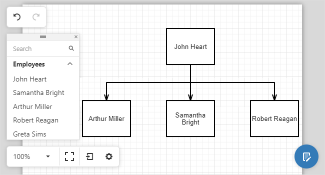
customShapes: employees.map(
function(emp) {
return {
category: "employees",
type: "employee" + emp.ID,
baseType: "rectangle",
defaultText: emp.Full_Name,
allowEditText: false
}
}
),
toolbox: {
groups: [{ category: "employees", title: "Employees", displayMode: "texts" }]
}
}).dxDiagram("instance");Angular
<dx-diagram #diagram id="diagram">
    <dxi-diagram-custom-shape *ngFor="let emp of employees"
        category="employees"
        [type]='"employee" + emp.ID'
        baseType="rectangle"
        [defaultText]="emp.Full_Name"
        [allowEditText]="false">
    </dxi-diagram-custom-shape>
    <dxo-diagram-toolbox>
        <dxi-diagram-group category="employees" title="Employees" displayMode="texts"></dxi-diagram-group>
    </dxo-diagram-toolbox>
</dx-diagram>
Vue
<template>
    <DxDiagram
        id="diagram"
        ref="diagram"
    >
        <DxCustomShape
        v-for="employee in employees"
        :category="'employees'"
        :type="'employee' + employee.ID"
        :base-type="'rectangle'"
        :default-text="employee.Full_Name"
        :allow-edit-text="false"
        :key="employee.ID"
        />
        <DxToolbox :visible="true">
            <DxGroup
                :category="'employees'"
                :title="'Employees'"
                :display-mode="'texts'"
            />
        </DxToolbox>
    </DxDiagram>
</template>
<script>
/ ...
data() {
    return {
    employees: service.getEmployees()
    };
},
</script>
React
class App extends React.Component {
// ...
    render() {
        return (
            <Diagram id="diagram" ref={this.diagramRef}>
                {this.employees.map(function(employee, index) {
                    return <CustomShape category="employees" type={`employee${employee.ID}`} baseType="rectangle"
                        defaultText={employee.Full_Name} allowEditText={false} key={index} />;
                })}
                <Toolbox>
                    <Group category="employees" title="Employees" displayMode="texts" />
                </Toolbox>
            </Diagram>
        );
    }
}
You can use the style and textStyle properties to specify the default style settings for a shape and a shape’s text.
jQuery
var diagram = $("#diagram").dxDiagram({
    defaultItemProperties: {
        style: "fill: yellow;",
        textStyle: "font-size: 14pt;"
    },
    // ...
}).dxDiagram("instance");
Angular
<dx-diagram #diagram id="diagram">
    <dxo-diagram-default-item-properties
        style="fill: yellow;"
        textStyle="font-size: 14pt;">
    </dxo-diagram-default-item-properties>
    <!-- ... -->
</dx-diagram>
Vue
<DxDiagram
    id="diagram"
    ref="diagram"
>
    <DxDefaultItemProperties
        :style="'fill: yellow;'"
        :textStyle="'font-size: 14pt;'"
    />
    <!-- ... -->
</DxDiagram>
React
class App extends React.Component {
// ...
    render() {
        return (
            <Diagram id="diagram" ref={this.diagramRef}>
                <DefaultItemProperties style="fill: yellow;" textStyle="font-size: 14pt;"/>
                <!-- ... -->
            </Diagram>
        );
    }
}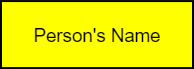
Shapes with Custom Background Images
Use the backgroundImageUrl property to specify the custom shape's background image in SVG format.
<svg xmlns="http://www.w3.org/2000/svg" x="0px" y="0px" viewBox="0 0 48 26">
<g><rect rx="5" ry="5" x="0.5" y="0.5" width="47" height="25"
    style="fill:#FFFFFF;stroke:#000000;stroke-width:1px;"/></g>
</svg>
jQuery
var diagram = $("#diagram").dxDiagram({
    customShapes: [{
        type: "Rounded Rectangle",
        backgroundImageUrl: "images/shapes/roundedRectangle.svg"
    }],
}).dxDiagram("instance");
Angular
<dx-diagram #diagram id="diagram">
    <dxi-diagram-custom-shape
        type="Rounded Rectangle"
        backgroundImageUrl="images/shapes/roundedRectangle.svg"
    </dxi-custom-shape>
</dx-diagram>
Vue
<DxDiagram
    id="diagram"
    ref="diagram"
>
    <DxCustomShape
        :type="'Rounded Rectangle'"
        :background-image-url="'images/shapes/roundedRectangle.svg'"
    >
    </DxCustomShape>
</DxDiagram>
React
<Diagram id="diagram" ref={this.diagramRef}>
    <CustomShape
        type="Rounded Rectangle"
        backgroundImageUrl="images/shapes/roundedRectangle.svg">
    </CustomShape>
</Diagram>
The image below shows the result:

The following properties allow you to customize the image size and position:
Shape Size
Use the following properties to specify the shape size settings:
jQuery
var diagram = $("#diagram").dxDiagram({
    customShapes: [{
        // ...
        defaultWidth: 2,
        defaultHeight: 1,
    }],
}).dxDiagram("instance");
Angular
<dx-diagram #diagram id="diagram">
    <dxi-diagram-custom-shape
        <!-- ... -->
        [defaultWidth]="2"
        [defaultHeight]="1"
    </dxi-diagram-custom-shape>
</dx-diagram>
Vue
<DxDiagram
    id="diagram"
    ref="diagram"
>
    <DxCustomShape
        <!-- ... -->
        :default-width="2"
        :default-height="1"
    >
    </DxCustomShape>
</DxDiagram>
React
<Diagram id="diagram" ref={this.diagramRef}>
    <CustomShape
        // ...
        defaultWidth={2}
        defaultHeight={1}>
    </CustomShape>
</Diagram>
The image below shows the result:

Shape Inner Image
A custom shape can display an inner image. Use the defaultImageUrl property to specify the image URL.
The following properties allow you to specify the image size and position:
jQuery
var diagram = $("#diagram").dxDiagram({
    customShapes: [{
        // ...
        defaultImageUrl: "images/photo.png",
        imageHeight: 0.8,
        imageWidth: 0.3,
        imageTop: 0.1,
        imageLeft: 0.1,
    }],
}).dxDiagram("instance");
Angular
<dx-diagram #diagram id="diagram">
    <dxi-diagram-custom-shape
        <!-- ... -->
        defaultImageUrl="images/photo.png"
        [imageHeight]="0.8"
        [imageWidth]="0.3"
        [imageTop]="0.1"
        [imageLeft]="0.1"
    </dxi-diagram-custom-shape>
</dx-diagram>
Vue
<DxDiagram
    id="diagram"
    ref="diagram"
>
    <DxCustomShape
        <!-- ... -->
        :default-image-url="'images/photo.png'"
        :image-height="0.8"
        :image-width="0.3"
        :image-top="0.1"
        :image-left="0.1"
    >
    </DxCustomShape>
</DxDiagram>
React
<Diagram id="diagram" ref={this.diagramRef}>
    <CustomShape
        // ...
        defaultImageUrl="images/photo.png"
        imageHeight={0.8}
        imageWidth={0.3}
        imageTop={0.1}
        imageLeft={0.1}>
    </CustomShape>
</Diagram>
The image below shows the result:

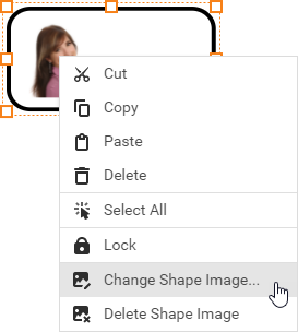
If the allowEditImage property is set to true, the Diagram context menu displays commands that allow users to change the image.
Shape Text
The defaultText property specifies the shape text. Users can change the text if the allowEditText property is set to true.
Use the following properties to specify the size and position of the text container:
jQuery
var diagram = $("#diagram").dxDiagram({
    customShapes: [{
        // ...
        defaultText: "Employee",
        textLeft: 0.4,
        textWidth: 0.6
    }],
}).dxDiagram("instance");
Angular
<dx-diagram #diagram id="diagram">
    <dxi-diagram-custom-shape
        <!-- ... -->
        defaultText="Employee"
        [textLeft]="0.4"
        [textWidth]="0.6">
    </dxi-diagram-custom-shape>
</dx-diagram>
Vue
<DxDiagram
    id="diagram"
    ref="diagram"
>
    <DxCustomShape
        <!-- ... -->
        :default-text="'Employee'"
        :text-left="0.4"
        :text-width="0.6"
    >
    </DxCustomShape>
</DxDiagram>
React
<Diagram id="diagram" ref={this.diagramRef}>
    <CustomShape
        // ...
        defaultText="Employee"
        textLeft={0.4}
        textWidth={0.6}>
    </CustomShape>
</Diagram>
The image below shows the result:

You can use the textStyle property to specify the default style settings for a shape's text.
jQuery
var diagram = $("#diagram").dxDiagram({
    defaultItemProperties: {
        textStyle: "font-size: 14pt;"
    },
    // ...
}).dxDiagram("instance");
Angular
<dx-diagram #diagram id="diagram">
    <dxo-diagram-default-item-properties
        textStyle="font-size: 14pt;">
    </dxo-diagram-default-item-properties>
    <!-- ... -->
</dx-diagram>
Vue
<DxDiagram
    id="diagram"
    ref="diagram"
>
    <DxDefaultItemProperties
        :textStyle="'font-size: 14pt;'"
    />
    <!-- ... -->
</DxDiagram>
React
class App extends React.Component {
// ...
    render() {
        return (
            <Diagram id="diagram" ref={this.diagramRef}>
                <DefaultItemProperties textStyle="font-size: 14pt;"/>
                <!-- ... -->
            </Diagram>
        );
    }
}
The image below shows the result:

Connection Points
Use the connectionPoints property to specify a collection of custom connection points for a shape. If the property is not specified, the shape displays the default connection points.
jQuery
var diagram = $("#diagram").dxDiagram({
    customShapes: [{
        // ...
        connectionPoints: [
                { x: 0.5, y: 0 },
                { x: 0.5, y: 1 },
        ]
    }],
}).dxDiagram("instance");
Angular
<dx-diagram #diagram id="diagram">
    <dxi-diagram-custom-shape
        <!-- ... -->
        <dxi-diagram-connection-point [x]="0.5" [y]="0"></dxi-diagram-connection-point>
        <dxi-diagram-connection-point [x]="0.5" [y]="1"></dxi-diagram-connection-point>
    </dxi-diagram-custom-shape>
</dx-diagram>
Vue
<DxDiagram
    id="diagram"
    ref="diagram"
>
    <DxCustomShape
        <!-- ... -->
        <DxConnectionPoint
            :x="0.5"
            :y="0"
        />
        <DxConnectionPoint
            :x="0.5"
            :y="1"
        />
    >
    </DxCustomShape>
</DxDiagram>
React
<Diagram id="diagram" ref={this.diagramRef}>
    <CustomShape
        // ...
        <ConnectionPoint x={0.5} y={0} />
        <ConnectionPoint x={0.5} y={1} />
    </CustomShape>
</Diagram>
The image below shows the result:


 Select one or more answers