Angular CircularGauge - RectangleNeedle
An object that defines a gauge indicator of the rectangleNeedle type.
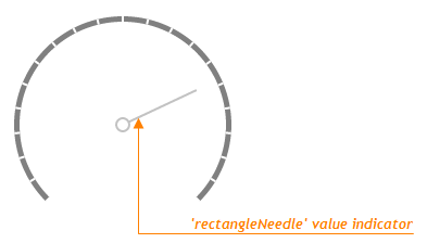
Value Indicator
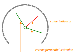
Subvalue Indicator
beginAdaptingAtRadius
Specifies a radius small enough for the indicator to begin adapting.
When adapting, the indicator adjusts its parts and surroundings proportionally to the changing widget size. The adjustments affect the incidator's indent from the center, the offset from the scale, and the spindle's size and gap.
indentFromCenter
Specifies the distance between the needle and the center of a gauge for the indicator of a needle-like type.
palette
Sets the array of colors to be used for coloring subvalue indicators.
Use this option to color subvalue indicators. If the number of colors in the specified array is less than the number of subvalue indicators, the colors are repeated, but slightly modified.
If you need to draw all subvalue indicators in one color, specify the subvalueIndicator.color option.
When using the widget as an ASP.NET MVC Control, you can specify this option using the VizPalette enum. This enum accepts the following values: Default, SoftPastel, HarmonyLight, Pastel, Bright, Soft, Ocean, Vintage, Violet, Carmine, DarkMoon, SoftBlue, DarkViolet and GreenMist.
spindleGapSize
Specifies the inner diameter in pixels, so that the spindle has the shape of a ring.
Set this property to 0 so that the spindle has the shape of a circle.

 Select one or more answers