Angular PivotGridFieldChooser Properties
This section describes the configuration options of the PivotGridFieldChooser widget.
accessKey
Specifies the shortcut key that sets focus on the widget.
The value of this option will be passed to the accesskey attribute of the HTML element that underlies the widget.
activeStateEnabled
Specifies whether or not the widget changes its state when interacting with a user.
This option is used when the widget is displayed on a platform whose guidelines include the active state change for widgets.
allowSearch
Specifies whether the field chooser allows searching in the "All Fields" section.
dataSource
The data source of a PivotGrid widget.
It is important for the data source of the PivotGridFieldChooser to be the same as the data source of its PivotGrid widget. This will allow the field chooser to manage data in the pivot grid. Use the PivotGrid's getDataSource method to acquire its data source.
elementAttr
Specifies the attributes to be attached to the widget's root element.
You can configure this option in an ASP.NET MVC Control as follows:
@(Html.DevExtreme().WidgetName()
    .ElementAttr("class", "class-name")
    // ===== or =====
    .ElementAttr(new {
        @id = "elementId",
        @class = "class-name"
    })
    // ===== or =====
    .ElementAttr(new Dictionary<string, object>() {
        { "id", "elementId" },
        { "class", "class-name" }
    })

)
@(Html.DevExtreme().WidgetName() _
.ElementAttr("class", "class-name")
' ===== or =====
.ElementAttr(New With {
.id = "elementId",
.class = "class-name"
})
' ===== or =====
.ElementAttr(New Dictionary(Of String, Object) From {
{ "id", "elementId" },
{ "class", "class-name" }
})
)focusStateEnabled
Specifies whether the widget can be focused using keyboard navigation.
headerFilter
Configures the header filter feature.
A header filter allows a user to filter individual field's values by including or excluding them from the applied filter. Cicking a header filter icon invokes a popup menu displaying all the unique field values.
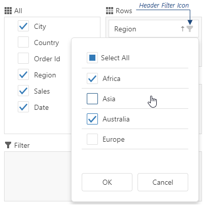
Assign true to the allowFiltering option to make the icons visible.
height
Specifies the widget's height.
This option accepts a value of one of the following types:
Number
The height in pixels.String
A CSS-accepted measurement of height. For example,"55px","80%","auto","inherit".Function
A function returning either of the above. For example:JavaScriptheight: function() { return window.innerHeight / 1.5; }
hint
Specifies text for a hint that appears when a user pauses on the widget.
hoverStateEnabled
Specifies whether the widget changes its state when a user pauses on it.
layout
Specifies the field chooser layout.
The image below shows different layout types.

The following abbreviations are used on the image.
- A — All Fields
- F — Filter Fields
- R — Row Fields
- C — Column Fields
- D — Data Fields
onContentReady
A handler for the contentReady event. Executed when the widget's content is ready. This handler may be executed multiple times during the widget's lifetime depending on the number of times its content changes.
Information about the event.
| Name | Type | Description |
|---|---|---|
| component |
The widget's instance. |
|
| element |
The widget's container. It is an HTML Element or a jQuery Element when you use jQuery. |
|
| model |
The model data. Available only when using Knockout. |
onContextMenuPreparing
A handler for the contextMenuPreparing event.
Information about the event.
| Name | Type | Description |
|---|---|---|
| component |
The widget's instance. |
|
| element |
The widget's container. It is an HTML Element or a jQuery Element when you use jQuery. |
|
| model |
The model data. Available only if Knockout is used. |
|
| items |
Items to be displayed in the context menu. Their structure is described in the Default Item Template section. |
|
| area |
The clicked area's type. |
|
| field |
The configuration of the field on which the context menu is invoked. |
|
| jQueryEvent |
Use 'event' instead. The jQuery event that caused the handler execution. Deprecated in favor of the event field. |
|
| event | Event (jQuery or EventObject) |
The event that caused the handler execution. It is a dxEvent or a jQuery.Event when you use jQuery. |
Assign a function to perform a custom action before a context menu is displayed in the field chooser. For instance, you can change the set of items in the menu.
onDisposing
A handler for the disposing event. Executed when the widget is removed from the DOM using the remove(), empty(), or html() jQuery methods only.
Information about the event.
| Name | Type | Description |
|---|---|---|
| component |
The widget's instance. |
|
| element |
The widget's container. It is an HTML Element or a jQuery Element when you use jQuery. |
|
| model |
The model data. Available only if you use Knockout. |
onInitialized
A handler for the initialized event. Executed only once, after the widget is initialized.
Information about the event.
| Name | Type | Description |
|---|---|---|
| component |
The widget's instance. |
|
| element |
The widget's container. It is an HTML Element or a jQuery Element when you use jQuery. |
You cannot access widget elements in this handler because it is executed before they are ready. Use the onContentReady handler instead.
onOptionChanged
A handler for the optionChanged event. Executed after an option of the widget is changed.
Information about the event.
| Name | Type | Description |
|---|---|---|
| name |
The option's short name. |
|
| model |
The model data. Available only if you use Knockout. |
|
| element |
The widget's container. It is an HTML Element or a jQuery Element when you use jQuery. |
|
| component |
The widget's instance. |
|
| fullName |
The option's full name. |
|
| value | any |
The option's new value. |
rtlEnabled
Switches the widget to a right-to-left representation.
When this option is set to true, the widget text flows from right to left, and the layout of elements is reversed. To switch the entire application/site to the right-to-left representation, assign true to the rtlEnabled field of the object passed to the DevExpress.config(config) method.
DevExpress.config({
    rtlEnabled: true
});
See Also
- Right-to-Left Support Demo: DataGrid | Navigation Widgets | Editors
searchTimeout
Specifies a delay in milliseconds between when a user finishes typing in the field chooser's search panel, and when the search is executed.
tabIndex
Specifies the number of the element when the Tab key is used for navigating.
The value of this option will be passed to the tabindex attribute of the HTML element that underlies the widget.
width
Specifies the widget's width.
This option accepts a value of one of the following types:
Number
The width in pixels.String
A CSS-accepted measurement of width. For example,"55px","80%","auto","inherit".Function
A function returning either of the above. For example:JavaScriptwidth: function() { return window.innerWidth / 1.5; }

 Select one or more answers