JavaScript/jQuery Chart Options
This section describes properties that configure the contents, behavior and appearance of the Chart widget.
See Also
- Configure a Widget: Angular | Vue | React | jQuery | AngularJS | Knockout | ASP.NET MVC 5 | ASP.NET Core
adaptiveLayout
Specifies adaptive layout options.
The adaptive layout enables the widget to hide optional elements if they do not fit in the container. Elements are hidden in the following sequence:
- Title
- Export menu icon
- Legend
- Axis titles
- Axis labels
- Point labels (can be saved by setting the adaptiveLayout.keepLabels option to true)
Use the height and width options in the adaptiveLayout object to specify the minimum container size at which the layout begins to adapt.
See Also
adjustOnZoom
Specifies whether to adjust the value axis's visualRange when the argument axis is being zoomed or panned.
When a user zooms or pans the argument axis, the range of displayed series values changes accordingly. To display this entire range without unused space on the value axis, the value axis's visual range gets widened or narrowed.
Set this option to false if the visual range should be constant and equal to the series values' maximum range.
See Also
animation
Specifies animation options.
The widget animates its elements at the beginning of its lifetime and when the data source changes.
jQuery
$(function() {
    $("#chartContainer").dxChart({
        // ...
        animation: {
            easing: "linear",
            duration: 500,
            maxPointCountSupported: 100
        }
    });
});
Angular
<dx-chart ... >
    <dxo-animation
        easing="linear"
        [duration]="500"
        [maxPointCountSupported]="100">
    </dxo-animation>
</dx-chart>
import { Component } from '@angular/core';

@Component({
    selector: 'app-root',
    templateUrl: './app.component.html',
    styleUrls: ['./app.component.css']
})
export class AppComponent {
    // ...
}
import { BrowserModule } from '@angular/platform-browser';
import { NgModule } from '@angular/core';
import { AppComponent } from './app.component';

import { DxChartModule } from 'devextreme-angular';

@NgModule({
    declarations: [
        AppComponent
    ],
    imports: [
        BrowserModule,
        DxChartModule
    ],
    providers: [ ],
    bootstrap: [AppComponent]
})
export class AppModule { }
Vue
<template>
    <DxChart ... >
        <DxAnimation
            easing="linear"
            :duration="500"
            :max-point-count-supported="100"
        />
    </DxChart>
</template>

<script>
import 'devextreme/dist/css/dx.common.css';
import 'devextreme/dist/css/dx.light.css';

import DxChart, {
    DxAnimation
} from 'devextreme-vue/chart';

export default {
    components: {
        DxChart,
        DxAnimation
    },
    // ...
}
</script>
React
import React from 'react';

import 'devextreme/dist/css/dx.common.css';
import 'devextreme/dist/css/dx.light.css';

import Chart, {
    Animation
} from 'devextreme-react/chart';

class App extends React.Component {
    render() {
        return (
            <Chart ... >
                <Animation
                    easing="linear"
                    duration={500}
                    maxPointCountSupported={100}
                />
            </Chart>
        );
    }
}
export default App;
annotations[]
Specifies the annotation collection.
Annotations are images and text blocks that provide additional information on the visualized data. The image below demonstrates their appearance:

To configure annotations, assign an array of objects to the annotations[] option. Each object should have the type field set to "text" or "image". Depending on the type, specify the annotation's text or image option:
jQuery
$(function() {
    $("chartContainer").dxChart({
        annotations: [{
            type: "text",
            text: "Annotation text"
        }, {
            type: "image",
            image: "http://image/url/myimage.png"
        }]
    });
});
Angular
<dx-chart ... >
    <dxi-annotation
        type="text"
        text="Annotation text">
    </dxi-annotation>
    <dxi-annotation
        type="image"
        image="http://image/url/myimage.png">
    </dxi-annotation>
</dx-chart>
import { Component } from '@angular/core';
@Component({
    selector: 'app-root',
    templateUrl: './app.component.html',
    styleUrls: ['./app.component.css']
})
export class AppComponent {
    // ...
}
import { BrowserModule } from '@angular/platform-browser';
import { NgModule } from '@angular/core';
import { AppComponent } from './app.component';

import { DxChartModule } from 'devextreme-angular';

@NgModule({
    declarations: [
        AppComponent
    ],
    imports: [
        BrowserModule,
        DxChartModule
    ],
    providers: [ ],
    bootstrap: [AppComponent]
})
export class AppModule { }
Vue
<template>
    <DxChart ... >
        <DxAnnotation
            type="text"
            text="Annotation text"
        />
        <DxAnnotation
            type="image"
            image="http://image/url/myimage.png"
        />
    </DxChart>
</template>

<script>
import 'devextreme/dist/css/dx.common.css';
import 'devextreme/dist/css/dx.light.css';

import DxChart, {
    DxAnnotation
} from 'devextreme-vue/chart';

export default {
    components: {
        DxChart,
        DxAnnotation
    },
    data() {
        // ...
    }
}
</script>
React
import React from 'react';

import 'devextreme/dist/css/dx.common.css';
import 'devextreme/dist/css/dx.light.css';

import Chart, {
    Annotation
} from 'devextreme-react/chart';

class App extends React.Component {
    render() {
        return (
            <Chart ... >
                <Annotation
                    type="text"
                    text="Annotation text"
                />
                <Annotation
                    type="image"
                    image="http://image/url/myimage.png"
                />
            </Chart>
        );
    }
}

export default App;
Annotations can be unattached or anchored to a chart element. The following list shows how to position them. Chart coordinates (argument, value, axis, series) specify the element that the annotation's arrow points to; pixel coordinates (x and y) specify the position of the annotation's center.
Unanchored annotation
Codeannotations: [{ x: 100, y: 200 }]Annotation anchored to a chart coordinate
Codeannotations: [{ argument: new Date(2019, 1, 16), value: 15, axis: "Value axis 2" // in a chart with multiple value axes }]Annotation anchored to a series point
Codeannotations: [{ argument: new Date(2019, 1, 16), series: "Series 1" }]Annotation displayed on an axis
Codeannotations: [{ // An annotation on the argument axis argument: new Date(2019, 1, 16) }, { // An annotation on the value axis value: 15, axis: "Value axis 2" // in a chart with multiple value axes }]Mixed anchoring (pixel and chart coordinates used simultaneously)
Codeannotations: [{ argument: new Date(2019, 1, 16), y: 200 }]
When a user long-presses an annotation or hovers the mouse pointer over it, the Chart displays a tooltip.
Objects in the annotations[] array configure individual annotations. To specify options common for all annotations, use the commonAnnotationSettings object. Individual settings take precedence over common settings.
See Also
argumentAxis
Configures the argument axis.

The argumentAxis object, which is described here, configures the argument axis individually. To specify common settings for all axes in a chart, use the commonAxisSettings object. Axis-specific settings override common settings.
autoHidePointMarkers
Specifies whether to hide series point markers automatically to reduce visual clutter.
Point markers are hidden when:
- In a single-series chart, at least half of all point markers are overlapped by adjacent markers.
- In a multi-series chart, all point markers of a series are overlapped by adjacent markers and markers of other series.
See Also
- series.aggregation
barGroupPadding
Controls the padding and consequently the width of a group of bars with the same argument using relative units. Ignored if the barGroupWidth option is set.
This option accepts a value from 0 to 1 that specifies the correlation between the empty space on a bar group's sides and the group's width: 0 - the bar group occupies the whole allocated space; 1 - virtually hides the bar group creating a lot of empty space.
See Also
barGroupWidth
Specifies a fixed width for groups of bars with the same argument, measured in pixels. Takes precedence over the barGroupPadding option.
A bar's maximum width is limited. In single-series charts, it cannot be greater than the interval between two major ticks. In multi-series charts, it depends on the number of bars in the parent group and this group's actual width. See the Specify the Bar Width article for more information.
See Also
barWidth
Use the barPadding property instead.
Controls the width of bars in the widget. Applies only to bar-like series and when the equalBarWidth option is true.
This option accepts values from 0 to 1 excluding 0. The assigned value specifies the correlation between a bar and the empty space around it. A value close to 0 makes the bar very thin leaving a lot of space, and 1, conversely, makes the bar very thick leaving no space.
commonAnnotationSettings
Specifies settings common for all annotations in the chart.
Settings specified here can be ignored in favor of individual annotation settings specified in the annotations[] array. Refer to the array's description for information on how to configure annotations.
The following code shows the commonAnnotationSettings declaration syntax:
jQuery
$(function() {
    $("#chartContainer").dxChart({
        // ...
        commonAnnotationSettings: {
            tooltipEnabled: false
        }
    });
});
Angular
<dx-chart ... >
    <dx-common-annotation-settings
        [tooltipEnabled]="false">
    </dx-common-annotation-settings>
</dx-chart>
import { Component } from '@angular/core';

@Component({
    selector: 'app-root',
    templateUrl: './app.component.html',
    styleUrls: ['./app.component.css']
})
export class AppComponent {
    // ...
}
import { BrowserModule } from '@angular/platform-browser';
import { NgModule } from '@angular/core';
import { AppComponent } from './app.component';

import { DxChartModule } from 'devextreme-angular';

@NgModule({
    declarations: [
        AppComponent
    ],
    imports: [
        BrowserModule,
        DxChartModule
    ],
    providers: [ ],
    bootstrap: [AppComponent]
})
export class AppModule { }
Vue
<template>
    <DxChart ... >
        <DxCommonAnnotationSettings
            :tooltip-enabled="false"
        />
    </DxChart>
</template>

<script>
import 'devextreme/dist/css/dx.common.css';
import 'devextreme/dist/css/dx.light.css';

import DxChart, {
    DxCommonAnnotationSettings
} from 'devextreme-vue/chart';

export default {
    components: {
        DxChart,
        DxCommonAnnotationSettings
    },
    data() {
        // ...
    }
}
</script>
React
import React from 'react';

import 'devextreme/dist/css/dx.common.css';
import 'devextreme/dist/css/dx.light.css';

import Chart, {
    CommonAnnotationSettings
} from 'devextreme-react/chart';

class App extends React.Component {
    render() {
        return (
            <Chart ... >
                <CommonAnnotationSettings
                    tooltipEnabled={false}
                />
            </Chart>
        );
    }
}
export default App;See Also
commonAxisSettings
Defines common settings for both the argument and value axis in a chart.
The commonAxisSettings object, which is described here, specifies common settings for all axes in a chart. To configure a particular axis, use the argumentAxis or valueAxis object. Axis-specific settings override common settings.
commonPaneSettings
Defines common settings for all panes in a chart.
A pane is a chart area containing series. If there are many series an a chart, they can be distributed between multiple panes.
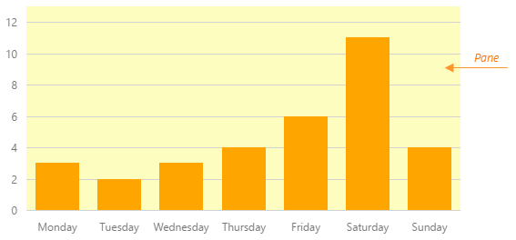
The commonPaneSettings object, which is described here, specifies common settings for all panes in the chart. To specify options of an individual pane, use the objects of the panes array. Individual settings override common settings.
commonSeriesSettings
Specifies settings common for all series in the chart.
There are three ways to configure a series.
The commonSeriesSettings object
Specifies settings for all series in a chart.The commonSeriesSettings.%seriesType% (area, line, etc.) object
Specifies settings for all series of the seriesType.An object in the series array
Specifies settings for an individual series.
containerBackgroundColor
Colors the background of the chart container.
If the background of your page has a color different from white, assign this color to the containerBackgroundColor option to ensure that the widget will blend smoothly into your page. Certain widget elements, such as series points in the hovered state, will use this color when coordinating with the page.
See Also
- panes.backgroundColor - colors the background of the chart plot.
crosshair
Configures the crosshair feature.
Crosshair is a pointer represented by two mutually-crossing lines stretched over the entire chart plot. The crosshair helps a user identify the values of the series points precisely. When enabled, the crosshair follows the cursor and snaps to the nearest series point.

To enable the crosshair, set the crosshair.enabled option to true. Assign true to the crosshair.label.visible option as well to make the crosshair labels visible.
Settings specified in the crosshair object apply to both the crosshair lines. If you specify the same settings within the horizontalLine or verticalLine object, they will apply to the particular crosshair line only. Note that individual settings override common ones.
customizeAnnotation
Customizes an individual annotation.
The annotation before customizations.
The annotation after customizations.
The following code shows how to use the customizeAnnotation function to apply different settings to text and image annotations:
jQuery
$(function() {
    $("#chartContainer").dxChart({
        // ...
        customizeAnnotation: function(annotationItem) {
            if(annotationItem.text) {
                annotationItem.color = "red";
            }
            if(annotationItem.image) {
                annotationItem.color = "blue";
            }
            return annotationItem;
        }
    });
});
Angular
<dx-chart ...
    [customizeAnnotation]="customizeAnnotation">
</dx-chart>
// ...
export class AppComponent {
    customizeAnnotation(annotationItem) {
        if(annotationItem.text) {
            annotationItem.color = "red";
        }
        if(annotationItem.image) {
            annotationItem.color = "blue";
        }
        return annotationItem;
    }
}
import { DxChartModule } from 'devextreme-angular';
// ...
@NgModule({
    imports: [
        // ...
        DxChartModule
    ],
    // ...
})
export class AppModule { }
Vue
<template>
    <DxChart ...
        :customize-annotation="customizeAnnotation">
    </DxChart>
</template>

<script>
import DxChart from 'devextreme-vue/chart';

export default {
    components: {
        DxChart
    },
    methods: {
        customizeAnnotation(annotationItem) {
            if(annotationItem.text) {
                annotationItem.color = "red";
            }
            if(annotationItem.image) {
                annotationItem.color = "blue";
            }
            return annotationItem;
        }
    }
}
</script>
React
import React from 'react';
import Chart from 'devextreme-react/chart';

class App extends React.Component {
    render() {
        return (
            <Chart ...
                customizeAnnotation={this.customizeAnnotation}>
            </Chart>
        );
    }

    customizeAnnotation(annotationItem) {
        if(annotationItem.text) {
            annotationItem.color = "red";
        }
        if(annotationItem.image) {
            annotationItem.color = "blue";
        }
        return annotationItem;
    }
}

export default App;
ASP.NET MVC Controls
@(Html.DevExtreme().Chart()
    @* ... *@
    .CustomizeAnnotation("customizeAnnotation")
)

<script type="text/javascript">
    function customizeAnnotation(annotationItem) {
        if(annotationItem.text) {
            annotationItem.color = "red";
        }
        if(annotationItem.image) {
            annotationItem.color = "blue";
        }
        return annotationItem;
    }
</script>
See Also
customizeLabel
Customizes the appearance of an individual point label.
Information on the series point.
The label's configuration.
All point labels in a chart are identical by default, but you can specify a unique appearance for individual labels using the customizeLabel function. This function should return an object with options that will be changed for a certain label. See the label object for information about all options available for changing.
The customizeLabel function accepts an object providing information about the series point that the label belongs to. This object contains the following fields.
| Field | Description |
|---|---|
| argument | The argument of the series point. |
| value | The value of the series point. |
| tag | The tag of the series point. |
| series | The series that includes the series point. |
| index | The index of the series point in the points array. |
In the range bar and range area series, the value field is replaced by the following fields.
| Field | Description |
|---|---|
| rangeValue1 | The first value of the series point. |
| rangeValue2 | The second value of the series point. |
In the financial series (candlestick and stock), the value field is replaced by the following fields.
| Field | Description |
|---|---|
| openValue | The open value of the series point. |
| closeValue | The close value of the series point. |
| lowValue | The low value of the series point. |
| highValue | The high value of the series point. |
| reductionValue | The reduction value of the series point. |
customizePoint
Customizes the appearance of an individual series point.
Information on the series point.
The point's configuration.
By default, all series points in a chart are identical, but you can specify a unique appearance for individual points using the customizePoint function. This function should return an object with options that will be changed for a certain point. See the point object for information about all options available for changing.
The customizePoint function accepts an object providing information about the series point. This object contains the following fields.
| Field | Description |
|---|---|
| argument | The argument of the series point. |
| value | The value of the series point. |
| tag | The tag of the series point. |
| seriesName | The name of the series that includes the series point. |
| index | The index of the series point in the points array. |
In the range bar and range area series, the value field is replaced by the following fields.
| Field | Description |
|---|---|
| rangeValue1 | The first value of the series point. |
| rangeValue2 | The second value of the series point. |
In the financial series (candlestick and stock), the value field is replaced by the following fields.
| Field | Description |
|---|---|
| openValue | The open value of the series point. |
| closeValue | The close value of the series point. |
| lowValue | The low value of the series point. |
| highValue | The high value of the series point. |
| reductionValue | The reduction value of the series point. |
this keyword.dataPrepareSettings
Processes data before visualizing it.
The following code shows the dataPrepareSettings declaration syntax:
jQuery
$(function() {
    $("#chartContainer").dxChart({
        // ...
        dataPrepareSettings: {
            sortingMethod: false
        }
    });
});
Angular
<dx-chart ... >
    <dxo-data-prepare-settings
        [sortingMethod]="false">
    </dxo-data-prepare-settings>
</dx-chart>
import { Component } from '@angular/core';

@Component({
    selector: 'app-root',
    templateUrl: './app.component.html',
    styleUrls: ['./app.component.css']
})
export class AppComponent {
    // ...
}
import { BrowserModule } from '@angular/platform-browser';
import { NgModule } from '@angular/core';
import { AppComponent } from './app.component';

import { DxChartModule } from 'devextreme-angular';

@NgModule({
    declarations: [
        AppComponent
    ],
    imports: [
        BrowserModule,
        DxChartModule
    ],
    providers: [ ],
    bootstrap: [AppComponent]
})
export class AppModule { }
Vue
<template>
    <DxChart ... >
        <DxDataPrepareSettings
            :sorting-method="false"
        />
    </DxChart>
</template>

<script>
import 'devextreme/dist/css/dx.common.css';
import 'devextreme/dist/css/dx.light.css';

import DxChart, {
    DxDataPrepareSettings
} from 'devextreme-vue/chart';

export default {
    components: {
        DxChart,
        DxDataPrepareSettings
    },
    data() {
        // ...
    }
}
</script>
React
import React from 'react';

import 'devextreme/dist/css/dx.common.css';
import 'devextreme/dist/css/dx.light.css';

import Chart, {
    DataPrepareSettings
} from 'devextreme-react/chart';

class App extends React.Component {
    render() {
        return (
            <Chart ... >
                <DataPrepareSettings
                    sortingMethod={false}
                />
            </Chart>
        );
    }
}
export default App;
dataSource
Binds the widget to data.
If you use DevExtreme ASP.NET MVC Controls, refer to the Bind Controls to Data article.
The Chart works with collections of objects.
Depending on your data source, bind the Chart to data as follows.
Data Array
Assign the array to the dataSource option. View DemoRead-Only Data in JSON Format
Set the dataSource option to the URL of a JSON file or service that returns JSON data. View DemoOData
Implement an ODataStore.Web API, PHP, MongoDB
Use one of the following extensions to enable the server to process data according to the protocol DevExtreme widgets use:Then, use the createStore method to configure access to the server on the client as shown below. This method is part of DevExtreme.AspNet.Data.
jQuery
JavaScript$(function() { let serviceUrl = "https://url/to/my/service"; $("#chartContainer").dxChart({ // ... dataSource: DevExpress.data.AspNet.createStore({ key: "ID", loadUrl: serviceUrl + "/GetAction", insertUrl: serviceUrl + "/InsertAction", updateUrl: serviceUrl + "/UpdateAction", deleteUrl: serviceUrl + "/DeleteAction" }) }) });Angular
app.component.tsapp.component.htmlapp.module.tsimport { Component } from '@angular/core'; import CustomStore from 'devextreme/data/custom_store'; import { createStore } from 'devextreme-aspnet-data-nojquery'; @Component({ selector: 'app-root', templateUrl: './app.component.html', styleUrls: ['./app.component.css'] }) export class AppComponent { store: CustomStore; constructor() { let serviceUrl = "https://url/to/my/service"; this.store = createStore({ key: "ID", loadUrl: serviceUrl + "/GetAction", insertUrl: serviceUrl + "/InsertAction", updateUrl: serviceUrl + "/UpdateAction", deleteUrl: serviceUrl + "/DeleteAction" }) } }<dx-chart ... [dataSource]="store"> </dx-chart>import { BrowserModule } from '@angular/platform-browser'; import { NgModule } from '@angular/core'; import { AppComponent } from './app.component'; import { DxChartModule } from 'devextreme-angular'; @NgModule({ declarations: [ AppComponent ], imports: [ BrowserModule, DxChartModule ], providers: [], bootstrap: [AppComponent] }) export class AppModule { }Vue
App.vue<template> <DxChart ... :data-source="store" /> </template> <script> import 'devextreme/dist/css/dx.common.css'; import 'devextreme/dist/css/dx.light.css'; import CustomStore from 'devextreme/data/custom_store'; import { createStore } from 'devextreme-aspnet-data-nojquery'; import { DxChart } from 'devextreme-vue/chart'; export default { components: { DxChart }, data() { const serviceUrl = "https://url/to/my/service"; const store = createStore({ key: "ID", loadUrl: serviceUrl + "/GetAction", insertUrl: serviceUrl + "/InsertAction", updateUrl: serviceUrl + "/UpdateAction", deleteUrl: serviceUrl + "/DeleteAction" }); return { store } } } </script>React
App.jsimport React from 'react'; import 'devextreme/dist/css/dx.common.css'; import 'devextreme/dist/css/dx.light.css'; import CustomStore from 'devextreme/data/custom_store'; import { createStore } from 'devextreme-aspnet-data-nojquery'; import Chart from 'devextreme-react/chart'; const serviceUrl = "https://url/to/my/service"; const store = createStore({ key: "ID", loadUrl: serviceUrl + "/GetAction", insertUrl: serviceUrl + "/InsertAction", updateUrl: serviceUrl + "/UpdateAction", deleteUrl: serviceUrl + "/DeleteAction" }); class App extends React.Component { render() { return ( <Chart ... dataSource={store} /> ); } } export default App;Any other data source
Implement a CustomStore.
Regardless of the data source on the input, the Chart always wraps it in the DataSource object. This object allows you to sort, filter, group, and otherwise shape data. To get its instance, call the getDataSource() method.
After providing data, bind series to it.
Please review the following notes about data binding:
If you wrap the store into the DataSource object explicitly, set the paginate option to false to prevent data from partitioning.
Data field names should not contain the following characters:
.,,,:,[, and].DataSource and stores provide methods to process and update data. However, the methods do not allow you to perform particular tasks (for example, replace the entire dataset, reconfigure data access at runtime). For such tasks, create a new array, store, or DataSource and assign it to the dataSource option as shown in the articles about changing options in jQuery, Angular, React, and Vue.
elementAttr
Specifies the attributes to be attached to the widget's root element.
jQuery
$(function(){
    $("#chartContainer").dxChart({
        // ...
        elementAttr: {
            id: "elementId",
            class: "class-name"
        }
    });
});
Angular
<dx-chart ...
    [elementAttr]="{ id: 'elementId', class: 'class-name' }">
</dx-chart>
import { DxChartModule } from "devextreme-angular";
// ...
export class AppComponent {
    // ...
}
@NgModule({
    imports: [
        // ...
        DxChartModule
    ],
    // ...
})
ASP.NET MVC Controls
@(Html.DevExtreme().Chart()
    .ElementAttr("class", "class-name")
    // ===== or =====
    .ElementAttr(new {
        @id = "elementId",
        @class = "class-name"
    })
    // ===== or =====
    .ElementAttr(new Dictionary<string, object>() {
        { "id", "elementId" },
        { "class", "class-name" }
    })

)
@(Html.DevExtreme().Chart() _
.ElementAttr("class", "class-name")
' ===== or =====
.ElementAttr(New With {
.id = "elementId",
.class = "class-name"
})
' ===== or =====
.ElementAttr(New Dictionary(Of String, Object) From {
{ "id", "elementId" },
{ "class", "class-name" }
})
)equalBarWidth
Use the ignoreEmptyPoints property instead.
Specifies whether all bars should have equal width, even if some values are missing from a series. Applies only to bar-like series.
If a value in a series equals to zero or is undefined, the bar visualizing this value will not be displayed on the chart making an empty space. If you need to fill this space by extending the neighbouring bars, set the equalBarWidth option to false.
export
Configures the exporting and printing features.
These features allow a user to export your widget into a document or print it. When exporting is enabled, the "Exporting/Printing" button appears in the widget. A click on it invokes a drop-down menu that lists exporting and printing commands. The following formats are supported for exporting into: PNG, PDF, JPEG, SVG and GIF.
See Also
legend
Specifies the options of a chart's legend.
The Chart widget can include a legend - an explanatory component that helps you identify a series. Each series is represented by an item on a Legend. An item marker identifies the series color. An item label displays the series title. To set the required position for a legend and its items, to customize the font settings for item labels, and to specify the size of item markers, use the properties of the legend configuration object. To learn more on the legend and its options, refer to the Legend topic.
loadingIndicator
Configures the loading indicator.
When the widget is bound to a remote data source, it can display a loading indicator while data is loading.

To enable the automatic loading indicator, set the enabled option to true.
If you want to change the loading indicator's visibility, use the show option or the showLoadingIndicator() and hideLoadingIndicator() methods.
margin
Generates space around the widget.

jQuery
$(function() {
    $("#chartContainer").dxChart({
        // ...
        margin: {
            top: 20,
            bottom: 20,
            left: 30,
            right: 30
        }
    });
});
Angular
<dx-chart ... >
    <dxo-margin
        [top]="20"
        [bottom]="20"
        [left]="30"
        [right]="30">
    </dxo-margin>
</dx-chart>
import { Component } from '@angular/core';

@Component({
    selector: 'app-root',
    templateUrl: './app.component.html',
    styleUrls: ['./app.component.css']
})
export class AppComponent {
    // ...
}
import { BrowserModule } from '@angular/platform-browser';
import { NgModule } from '@angular/core';
import { AppComponent } from './app.component';

import { DxChartModule } from 'devextreme-angular';

@NgModule({
    declarations: [
        AppComponent
    ],
    imports: [
        BrowserModule,
        DxChartModule
    ],
    providers: [ ],
    bootstrap: [AppComponent]
})
export class AppModule { }
Vue
<template>
    <DxChart ... >
        <DxMargin
            :top="20"
            :bottom="20"
            :left="30"
            :right="30"
        />
    </DxChart>
</template>

<script>
import 'devextreme/dist/css/dx.common.css';
import 'devextreme/dist/css/dx.light.css';

import DxChart, {
    DxMargin
} from 'devextreme-vue/chart';

export default {
    components: {
        DxChart,
        DxMargin
    },
    // ...
}
</script>
React
import React from 'react';

import 'devextreme/dist/css/dx.common.css';
import 'devextreme/dist/css/dx.light.css';

import Chart, {
    Margin
} from 'devextreme-react/chart';

class App extends React.Component {
    render() {
        return (
            <Chart ... >
                <Margin
                    top={20}
                    bottom={20}
                    left={30}
                    right={30}
                />
            </Chart>
        );
    }
}
export default App;
maxBubbleSize
Specifies a coefficient determining the diameter of the largest bubble.
When defining a bubble series, you are required to specify a size field. The largest size value will be represented on the chart by the largest bubble. Its visual diameter will be calculated by the following formula.
d = maxBubbleSize * min(height, width)
Normally, the height and width from this formula equal the size of the widget container. However, when several panes are used in the widget, the height and width equal the pane size.
minBubbleSize
Specifies the diameter of the smallest bubble measured in pixels.
When defining a bubble series, you are required to specify a size field. The smallest size value will be represented on the chart by the smallest bubble. To set its visual diameter, specify the minBubbleSize option.
negativesAsZeroes
Forces the widget to treat negative values as zeroes. Applies to stacked-like series only.
Oftentimes, series data contains negative values. Visualizing such data using stacked-like series may lead to unexpected results. To prevent situations of this kind, assign true to the negativesAsZeroes option, and the widget will count all negative values as zeroes.
onArgumentAxisClick
A function that is executed when a label on the argument axis is clicked or tapped.
Information about the event.
| Name | Type | Description |
|---|---|---|
| argument | | | |
The clicked label's value. |
| component |
The widget's instance. |
|
| element |
The widget's container. It is an HTML Element or a jQuery Element when you use jQuery. |
|
| event | Event (jQuery or EventObject) |
The event that caused the function to execute. It is a dxEvent or a jQuery.Event when you use jQuery. |
| jQueryEvent |
Use 'event' instead. The jQuery event that caused the handler execution. Deprecated in favor of the event field. |
|
| model |
The model data. Available only if you use Knockout. |
onDisposing
A function that is executed before the widget is disposed of.
Information about the event.
| Name | Type | Description |
|---|---|---|
| component |
The widget's instance. |
|
| element |
The widget's container. It is an HTML Element or a jQuery Element when you use jQuery. |
|
| model |
The model data. Available only if you use Knockout. |
onDone
A function that is executed when all series are ready.
Information about the event.
| Name | Type | Description |
|---|---|---|
| component |
The widget's instance. |
|
| element |
The widget's container. It is an HTML Element or a jQuery Element when you use jQuery. |
|
| model |
The model data. Available only if you use Knockout. |
onDrawn
A function that is executed when the widget's rendering has finished.
Information about the event.
| Name | Type | Description |
|---|---|---|
| component |
The widget's instance. |
|
| element |
The widget's container. It is an HTML Element or a jQuery Element when you use jQuery. |
|
| model |
The model data. Available only if you use Knockout. |
onExported
A function that is executed after the widget is exported.
Information about the event.
| Name | Type | Description |
|---|---|---|
| component |
The widget's instance. |
|
| element |
The widget's container. It is an HTML Element or a jQuery Element when you use jQuery. |
|
| model |
The model data. Available only if you use Knockout. |
See Also
onExporting
A function that is executed before the widget is exported.
Information about the event.
| Name | Type | Description |
|---|---|---|
| cancel |
Allows you to prevent exporting. |
|
| component |
The widget's instance. |
|
| element |
The widget's container. It is an HTML Element or a jQuery Element when you use jQuery. |
|
| fileName |
The name of the file to which the widget is about to be exported. |
|
| format |
The resulting file format. One of PNG, PDF, JPEG, SVG and GIF. |
|
| model |
The model data. Available only if you use Knockout. |
See Also
onFileSaving
A function that is executed before a file with exported widget is saved to the user's local storage.
Information about the event.
| Name | Type | Description |
|---|---|---|
| cancel |
Allows you to prevent file saving. |
|
| component |
The widget's instance. |
|
| data |
Exported data as a BLOB. |
|
| element |
The widget's container. It is an HTML Element or a jQuery Element when you use jQuery. |
|
| fileName |
The name of the file to be saved. |
|
| format |
The format of the file to be saved. |
See Also
onIncidentOccurred
A function that is executed when an error or warning occurs.
Information about the event.
| Name | Type | Description |
|---|---|---|
| component |
The widget's instance. |
|
| element |
The widget's container. It is an HTML Element or a jQuery Element when you use jQuery. |
|
| model |
The model data. Available only if you use Knockout. |
|
| target | any |
Information on the occurred incident. |
The widget notifies you of errors and warnings by passing messages to the browser console. Each message contains the incident's ID, a brief description, and a link to the Errors and Warnings section where further information about this incident can be found.
The onIncidentOccurred function allows you to handle errors and warnings the way you require. The object passed to it contains the target field. This field provides information about the occurred incident and contains the following properties:
- id
The incident's ID. The full list of IDs can be found in the Errors and Warnings section. - type
The incident's type: "error" or "warning". - args
The argument of the incident's message. Depends on the incident. For example, it may be the name of the data source field that was specified incorrectly, or the name of the option that was not set properly. - text
The text passed to the browser's console. Includes the args content, if there is any. - widget
The name of the widget that produced the error or warning. - version
The used DevExtreme version.
onInitialized
A function used in JavaScript frameworks to save the widget instance.
Information about the event.
| Name | Type | Description |
|---|---|---|
| component |
The widget's instance. |
|
| element |
The widget's container. It is an HTML Element or a jQuery Element when you use jQuery. |
onLegendClick
A function that is executed when a legend item is clicked or tapped.
Information about the event.
| Name | Type | Description |
|---|---|---|
| component |
The widget's instance. |
|
| element |
The widget's container. It is an HTML Element or a jQuery Element when you use jQuery. |
|
| event | Event (jQuery or EventObject) |
The event that caused the function to execute. It is a dxEvent or a jQuery.Event when you use jQuery. |
| jQueryEvent |
Use 'event' instead. The jQuery event that caused the handler execution. Deprecated in favor of the event field. |
|
| model |
The model data. Available only if you use Knockout. |
|
| target |
The series that corresponds to the clicked legend item; described in the Series section. |
The onSeriesClick function is executed after this function. The following code shows how to prevent this:
jQuery
$(function () {
    $("#chartContainer").dxChart({
        // ...
        onLegendClick: function (e) {
            e.event.cancel = true;
        }
    });
});
Angular
import { DxChartModule } from "devextreme-angular";
// ...
export class AppComponent {
    chart_onLegendClick (e) {
        e.event.cancel = true;
    }
}
@NgModule({
    imports: [
        // ...
        DxChartModule
    ],
    // ...
})
<dx-chart ...
(onLegendClick)="chart_onLegendClick($event)">
</dx-chart>onOptionChanged
A function that is executed after a widget option is changed.
Information about the event.
| Name | Type | Description |
|---|---|---|
| model |
The model data. Available only if you use Knockout. |
|
| fullName |
The path to the modified option that includes all parent options. |
|
| element |
The widget's container. It is an HTML Element or a jQuery Element when you use jQuery. |
|
| component |
The widget's instance. |
|
| name |
The modified option if it belongs to the first level. Otherwise, the first-level option it is nested into. |
|
| value | any |
The modified option's new value. |
onPointClick
A function that is executed when a series point is clicked or tapped.
Information about the event.
| Name | Type | Description |
|---|---|---|
| component |
The widget's instance. |
|
| element |
The widget's container. It is an HTML Element or a jQuery Element when you use jQuery. |
|
| event | Event (jQuery or EventObject) |
The event that caused the function to execute. It is a dxEvent or a jQuery.Event when you use jQuery. |
| jQueryEvent |
Use 'event' instead. The jQuery event that caused the handler execution. Deprecated in favor of the event field. |
|
| model |
The model data. Available only if you use Knockout. |
|
| target |
The clicked series point; described in the Point section. |
The onSeriesClick function is executed after this function. The following code shows how to prevent this:
jQuery
$(function () {
    $("#chartContainer").dxChart({
        // ...
        onPointClick: function (e) {
            e.event.cancel = true;
        }
    });
});
Angular
import { DxChartModule } from "devextreme-angular";
// ...
export class AppComponent {
    chart_onPointClick (e) {
        e.event.cancel = true;
    }
}
@NgModule({
    imports: [
        // ...
        DxChartModule
    ],
    // ...
})
<dx-chart ...
(onPointClick)="chart_onPointClick($event)">
</dx-chart>onPointHoverChanged
A function that is executed after the pointer enters or leaves a series point.
To identify whether the pointer has entered or left the series point, call the point's isHovered() method.
onPointSelectionChanged
A function that is executed when a series point is selected or selection is canceled.
To identify whether the selection has been applied or canceled, call the point's isSelected() method.
onSeriesClick
A function that is executed when a series is clicked or tapped.
Information about the event.
| Name | Type | Description |
|---|---|---|
| component |
The widget's instance. |
|
| element |
The widget's container. It is an HTML Element or a jQuery Element when you use jQuery. |
|
| event | Event (jQuery or EventObject) |
The event that caused the function to execute. It is a dxEvent or a jQuery.Event when you use jQuery. |
| jQueryEvent |
Use 'event' instead. The jQuery event that caused the handler execution. Deprecated in favor of the event field. |
|
| model |
The model data. Available only if you use Knockout. |
|
| target |
The clicked series. |
onSeriesHoverChanged
A function that is executed after the pointer enters or leaves a series.
Information about the event.
| Name | Type | Description |
|---|---|---|
| component |
The widget's instance. |
|
| element |
The widget's container. It is an HTML Element or a jQuery Element when you use jQuery. |
|
| model |
The model data. Available only if you use Knockout. |
|
| target |
The series whose hover state has been changed. |
To identify whether the pointer has entered or left the series, call the series' isHovered() method.
onSeriesSelectionChanged
A function that is executed when a series is selected or selection is canceled.
Information about the event.
| Name | Type | Description |
|---|---|---|
| component |
The widget's instance. |
|
| element |
The widget's container. It is an HTML Element or a jQuery Element when you use jQuery. |
|
| model |
The model data. Available only if you use Knockout. |
|
| target |
The series whose selection state has been changed. |
To identify whether the selection has been applied or canceled, call the series' isSelected() method.
onTooltipHidden
A function that is executed when a tooltip becomes hidden.
Information about the event.
| Name | Type | Description |
|---|---|---|
| component |
The widget's instance. |
|
| element |
The widget's container. It is an HTML Element or a jQuery Element when you use jQuery. |
|
| model |
The model data. Available only if you use Knockout. |
|
| target | | | any |
The series point whose tooltip is hidden; described in the Point section. |
See Also
- hideTooltip()
- Point.hideTooltip()
onTooltipShown
A function that is executed when a tooltip appears.
Information about the event.
| Name | Type | Description |
|---|---|---|
| component |
The widget's instance. |
|
| element |
The widget's container. It is an HTML Element or a jQuery Element when you use jQuery. |
|
| model |
The model data. Available only if you use Knockout. |
|
| target | | | any |
The series point whose tooltip is shown; described in the Point section. |
See Also
- Point.showTooltip()
onZoomEnd
A function that is executed when zooming or panning ends.
Information about the event.
| Name | Type | Description |
|---|---|---|
| actionType | 'zoom' | 'pan' |
Indicates whether the user has zoomed or panned the chart. |
| axis |
The zoomed/panned axis. |
|
| cancel |
Allows you to cancel zooming or panning. |
|
| component |
The widget's instance. |
|
| element |
The widget's container. It is an HTML Element or a jQuery Element when you use jQuery. |
|
| event | Event (jQuery or EventObject) |
The event that caused the function to execute. It is a dxEvent or a jQuery.Event when you use jQuery. |
| model |
The model data. Available only if you use Knockout. |
|
| previousRange |
The visual range when zooming or panning starts. |
|
| range |
The visual range when zooming or panning ends. |
|
| rangeEnd | | |
Use 'range' instead. The argument axis' end value after zooming or panning. Deprecated in favor of the range field. |
| rangeStart | | |
Use 'range' instead. The argument axis' start value after zooming or panning. Deprecated in favor of the range field. |
| shift |
The visual range's shift from the previous position, measured in numeric values or milliseconds (for date-time axes). |
|
| zoomFactor |
The zoom factor. |
See Also
onZoomStart
A function that is executed when zooming or panning begins.
Information about the event.
| Name | Type | Description |
|---|---|---|
| actionType | 'zoom' | 'pan' |
Indicates whether the user is zooming or panning the chart. |
| axis |
The zoomed/panned axis. |
|
| cancel |
Allows you to cancel zooming or panning. |
|
| component |
The widget's instance. |
|
| element |
The widget's container. It is an HTML Element or a jQuery Element when you use jQuery. |
|
| event | Event (jQuery or EventObject) |
The event that caused the function to execute. It is a dxEvent or a jQuery.Event when you use jQuery. |
| model |
The model data. Available only if you use Knockout. |
|
| range |
The visual range when zooming or panning starts. |
See Also
palette
Sets the palette to be used for colorizing series and their elements.
This option accepts either the name of a predefined palette or an array of colors. The array can include the following colors:
- Hexadecimal colors
- RGB colors
- RGBA colors
- Predefined/cross-browser color names
- Predefined SVG colors
Use the VizPalette enum to specify this option when the widget is used as an ASP.NET MVC 5 Control or a DevExtreme-Based ASP.NET Core Control. This enum accepts the following values: Default, SoftPastel, HarmonyLight, Pastel, Bright, Soft, Ocean, Vintage, Violet, Carmine, DarkMoon, SoftBlue, DarkViolet, and GreenMist.
See Also
paletteExtensionMode
Specifies what to do with colors in the palette when their number is less than the number of series (in the Chart widget) or points in a series (in the PieChart widget).
The following variants are available:
"blend"
Create a blend of two neighboring colors and insert it between these colors in the palette."alternate"
Repeat the full set of palette colors, alternating their normal, lightened, and darkened shades in that order."extrapolate"
Repeat the full set of palette colors, changing their shade gradually from dark to light.
Use the VizPaletteExtensionMode enum to specify this option when the widget is used as an ASP.NET MVC 5 Control or a DevExtreme-Based ASP.NET Core Control. This enum accepts the following values: Blend, Alternate, and Extrapolate.
panes
Declares a collection of panes.
A pane is a chart area containing series. If there are many series an a chart, they can be distributed between multiple panes.

Each object in the panes array configures a single pane. If you have several panes, we recommend you to name each pane in order to be able to refer to them afterwards.
See Also
- commonPaneSettings - specifies common settings for all panes in a chart.
- series.pane - binds a series to a pane.
- defaultPane - specifies which pane must be used by default.
pathModified
Notifies the widget that it is embedded into an HTML page that uses a tag modifying the path.
pointSelectionMode
Specifies whether a single point or multiple points can be selected in the chart.
To set the points to highlight along with the selected point, set the series.point.selectionMode option.
To learn how to select a point, refer to the Selection Handling topic.
Use the ChartElementSelectionMode enum to specify this option when the widget is used as an ASP.NET MVC 5 Control or a DevExtreme-Based ASP.NET Core Control. This enum accepts the following values: Single and Multiple.
redrawOnResize
Specifies whether to redraw the widget when the size of the parent browser window changes or a mobile device rotates.
When this option is set to true, the widget will be redrawn automatically in case the size of its parent window changes.
resolveLabelOverlapping
Specifies how the chart must behave when series point labels overlap.
Series point labels display series point values. If your chart contains several series with a large number of points in each, point labels may overlap. In this case, specify how the chart must resolve overlapping using the resolveLabelOverlapping option. To hide certain labels, set this option to 'hide'. Labels to be hidden will be determined automatically. If labels that overlap belong to series points that have the same argument, you can arrange these labels in a stack. For this purpose, set the resolveLabelOverlapping option to 'stack'.
Use the ChartResolveLabelOverlapping enum to specify this option when the widget is used as an ASP.NET MVC 5 Control or a DevExtreme-Based ASP.NET Core Control. This enum accepts the following values: None, Hide, and Stack.
rotated
Swaps the axes around making the value axis horizontal and the argument axis vertical.
See Also
- commonAxisSettings.inverted - inverts the axes.
rtlEnabled
Switches the widget to a right-to-left representation.
When this option is set to true, the widget text flows from right to left, and the layout of elements is reversed. To switch the entire application/site to the right-to-left representation, assign true to the rtlEnabled field of the object passed to the DevExpress.config(config) method.
DevExpress.config({
    rtlEnabled: true
});
scrollBar
Specifies the settings of the scroll bar.
The scroll bar allows a user to pan the chart. To use it, you need to enable zooming and panning in your chart.
By default, the scroll bar is hidden. To make it visible, set the visible field of the scrollBar object to true. Using other fields of this object you can adjust the scroll bar appearance settings, including color, width and opacity.
scrollingMode
Use the zoomAndPan property instead.
Enables scrolling in your chart.
This option allows you to control the scrolling capability in your chart. By default, this capability is off. To make scrolling available on touch-enabled devices only, assign 'touch' to the scrollingMode option. In that case, a user will be able to scroll the chart using the flick gesture. If your chart is not supposed to be viewed on touch-enabled devices, but you still need scrolling to be enabled, assign 'mouse' to the scrollingMode option. In that case, a user will be able to scroll the chart by dragging. To enable scrolling for all devices, assign 'all' to the scrollingMode option.
Scrolling may also be performed using the scroll bar. To make it visible assign true to the visible option of the scrollBar object.
Use the ChartPointerType enum to specify this option when the widget is used as an ASP.NET MVC 5 Control or a DevExtreme-Based ASP.NET Core Control. This enum accepts the following values: Mouse, Touch, All, and None.
See Also
series
Specifies options for Chart widget series.
A series represents a grouping of related data points. The most important characteristic of a series is its type, which determines a particular visual representation of data. You can find more details on each series type in the corresponding topics in the Series help section.
To define a single series, assign an object defining the series to the series configuration object. In the series' object, specify the series type, data source fields, the appearance of the series points and other options.
To show several series, specify series as an array of objects defining series. If you need to set similar values to properties of several series, use the commonSeriesSettings configuration object. It exposes the properties that can be specified for all series at once and for all series of a particular type at once. Note that the values specified for a series individually (in the series array) override the values that are specified for all series (in the commonSeriesSettings object).
seriesSelectionMode
Specifies whether a single series or multiple series can be selected in the chart.
To set the series elements to highlight when a series is selected, set the series selectionMode option.
To learn how to select a point, refer to the Selection Handling topic.
Use the ChartElementSelectionMode enum to specify this option when the widget is used as an ASP.NET MVC 5 Control or a DevExtreme-Based ASP.NET Core Control. This enum accepts the following values: Single and Multiple.
seriesTemplate
Defines options for the series template.
In most cases, you can organize the array that is assigned to the chart's dataSource option in the following way.
[
    {arg: arg1Value, series1Value: val11, series2Value: val12, ...}
    {arg: arg2Value, series1Value: val21, series2Value: val22, ...}
    ...
    {arg: argNValue, series1Value: valN1, series2Value: valN2, ...}
]
Each object that is included in the array represents an argument value and the values of all series for this argument.
However, there are some scenarios in which you do not know exactly how many series will be added. In these cases, you will not be able to define the data source in the manner detailed above. Instead, define it in the following way.
[
    {seriesName: series1, arg: arg11Value, val: value11 }
    {seriesName: series1, arg: arg12Value, val: value12 }
    ...
    {seriesName: seriesM, arg: argM1Value, val: valueM1 }
    {seriesName: seriesM, arg: argM2Value, val: valueM2 }
    ...
]
If you define a data source in this manner, set the argument and value fields using the argumentField and valueField properties of the commonSeriesSettings configuration object (for all series at once). Then, define a template for the series using the seriesTemplate configuration object. Within this object, set the data source field that specifies the series name to the nameField option.
If you need to specify individual values for options of a particular series, assign a callback function to the customizeSeries option of the seriesTemplate object.
size
Specifies the widget's size in pixels.
The widget occupies its container's entire area by default. Use the size object to specify the widget's size if it should be different from that of its container. Assign 0 to size object's height and width options to hide the widget.
jQuery
$(function() {
    $("#chartContainer").dxChart({
        // ...
        size: {
            height: 300,
            width: 600
        }
    });
});
Angular
<dx-chart ... >
    <dxo-size
        [height]="300"
        [width]="600">
    </dxo-size>
</dx-chart>
import { Component } from '@angular/core';

@Component({
    selector: 'app-root',
    templateUrl: './app.component.html',
    styleUrls: ['./app.component.css']
})
export class AppComponent {
    // ...
}
import { BrowserModule } from '@angular/platform-browser';
import { NgModule } from '@angular/core';
import { AppComponent } from './app.component';

import { DxChartModule } from 'devextreme-angular';

@NgModule({
    declarations: [
        AppComponent
    ],
    imports: [
        BrowserModule,
        DxChartModule
    ],
    providers: [ ],
    bootstrap: [AppComponent]
})
export class AppModule { }
Vue
<template>
    <DxChart ... >
        <DxSize
            :height="300"
            :width="600"
        />
    </DxChart>
</template>

<script>
import 'devextreme/dist/css/dx.common.css';
import 'devextreme/dist/css/dx.light.css';

import DxChart, {
    DxSize
} from 'devextreme-vue/chart';

export default {
    components: {
        DxChart,
        DxSize
    },
    // ...
}
</script>
React
import React from 'react';

import 'devextreme/dist/css/dx.common.css';
import 'devextreme/dist/css/dx.light.css';

import Chart, {
    Size
} from 'devextreme-react/chart';

class App extends React.Component {
    render() {
        return (
            <Chart ... >
                <Size
                    height={300}
                    width={600}
                />
            </Chart>
        );
    }
}
export default App;
stickyHovering
Specifies whether a point should remain in the hover state when the mouse pointer moves away.
synchronizeMultiAxes
Indicates whether or not to synchronize value axes when they are displayed on a single pane.
When synchronized, the ticks (or grid lines) of all the value axes in a pane are located on the same line.
theme
Sets the name of the theme the widget uses.
A theme is a widget configuration that gives the widget a distinctive appearance. Use can use one of the predefined themes or create a custom one. Changing the option values in the widget's configuration object overrides the theme's corresponding values.
Use the VizTheme enum to specify this option when the widget is used as an ASP.NET MVC 5 Control or a DevExtreme-Based ASP.NET Core Control. This enum accepts the following values: GenericLight, GenericDark, GenericContrast, GenericCarmine, GenericDarkMoon, GenericSoftBlue, GenericDarkViolet, GenericGreenMist, MaterialBlueLight, MaterialLimeLight, MaterialOrangeLight, MaterialPurpleLight, MaterialTealLight.
title
Configures the widget's title.
The widget's title is a short text that usually indicates what is visualized. If you need to specify the title's text only, assign it directly to the title option. Otherwise, set this option to an object with the text and other fields specified.
The title can be accompanied by a subtitle elaborating on the visualized subject using the title.subtitle object.
tooltip
Configures tooltips.
A tooltip is a miniature rectangle displaying values of a series point. A tooltip appears when the end-user hovers the cursor over a series point. You can enable/disable tooltips, change their appearance and format their text using fields of the tooltip configuration object.
useAggregation
Use the enabled property instead.
Specifies whether or not to filter the series points depending on their quantity.
By default, a chart displays all series points. But there may be situations when displaying all the series points may affect chart performance. In this case, it is better to aggregate the series points rather than display all of them. For this purpose, set the useAggregation option to true. The aggregation is based on the median filter algorithm.
valueAxis
Configures the value axis.
The valueAxis object, which is described here, configures the value axis individually. To specify common settings for all axes in a chart, use the commonAxisSettings object. Axis-specific settings override common settings.
zoomAndPan
Configures zooming and panning.
You can enable zooming and panning for the argument and value axes independently. Set the argumentAxis and valueAxis options to enable zooming, panning, or both for a specific axis.
Users can use the mouse and touch gestures to zoom and pan. The following table illustrates user interaction:
| Device | Zooming Gestures | Panning Gestures |
|---|---|---|
| Touch-enabled | Spread and pinch | Vertical or horizontal drag |
| Mouse-equipped | Mouse Wheel | Vertical or horizontal drag |
You can use the allowTouchGestures or allowMouseWheel option to disable touch or mouse support.
Users can also use the mouse to zoom the chart by selecting an area with the drag gesture. Refer the dragToZoom option for more information.
Zooming and panning are related to the visual/whole range concept. Refer to the Visual and Whole Ranges article for more information.
See Also
- Zooming and Panning
- onZoomStart | onZoomEnd
- argumentAxis.visualRange | valueAxis.visualRange
zoomingMode
Use the zoomAndPan property instead.
Enables zooming in your chart.
This option allows you to control the zooming capability in your chart. By default, this capability is off. To make zooming available on touch-enabled devices only, assign 'touch' to the zoomingMode option. In that case, a user will be able to zoom in/out of the chart using the spread/pinch gesture. If your chart is not supposed to be viewed on touch-enabled devices, but you still need zooming to be enabled, assign 'mouse' to the zoomingMode option. In this case, a user will be able to zoom the chart by rolling the mouse wheel. To enable zooming for all devices, assign 'all' to the zoomingMode option.
Use the ChartPointerType enum to specify this option when the widget is used as an ASP.NET MVC 5 Control or a DevExtreme-Based ASP.NET Core Control. This enum accepts the following values: Mouse, Touch, All, and None.
See Also
- argumentAxis.visualRange | valueAxis.visualRange
- Axis.visualRange(visualRange)
- onZoomStart | onZoomEnd

 Select one or more answers