JavaScript/jQuery Button Options
An object defining configuration properties for the Button UI component.
accessKey
Specifies the shortcut key that sets focus on the UI component.
The value of this property will be passed to the accesskey attribute of the HTML element that underlies the UI component.
activeStateEnabled
A Boolean value specifying whether or not the UI component changes its state when interacting with a user.
This property is used when the UI component is displayed on a platform whose guidelines include the active state change for UI components.
component
An alias for the template property specified in React. Accepts a custom component. Refer to Using a Custom Component for more information.
disabled
Specifies whether the UI component responds to user interaction.
elementAttr
Specifies the global attributes to be attached to the UI component's container element.
jQuery
$(function(){
    $("#buttonContainer").dxButton({
        // ...
        elementAttr: {
            id: "elementId",
            class: "class-name"
        }
    });
});
Angular
<dx-button ...
    [elementAttr]="{ id: 'elementId', class: 'class-name' }">
</dx-button>
import { DxButtonModule } from "devextreme-angular";
// ...
export class AppComponent {
    // ...
}
@NgModule({
    imports: [
        // ...
        DxButtonModule
    ],
    // ...
})
Vue
<template>
    <DxButton ...
        :element-attr="buttonAttributes">
    </DxButton>
</template>

<script>
import DxButton from 'devextreme-vue/button';

export default {
    components: {
        DxButton
    },
    data() {
        return {
            buttonAttributes: {
                id: 'elementId',
                class: 'class-name'
            }
        }
    }
}
</script>
React
import React from 'react';

import Button from 'devextreme-react/button';

class App extends React.Component {
    buttonAttributes = {
        id: 'elementId',
        class: 'class-name'
    }

    render() {
        return (
            <Button ...
                elementAttr={this.buttonAttributes}>
            </Button>
        );
    }
}
export default App;
focusStateEnabled
Specifies whether the UI component can be focused using keyboard navigation.
height
Specifies the UI component's height.
This property accepts a value of one of the following types:
Number
The height in pixels.String
A CSS-accepted measurement of height. For example,"55px","80%","inherit".Function
A function returning either of the above. For example:JavaScriptheight: function() { return window.innerHeight / 1.5; }
hint
Specifies text for a hint that appears when a user pauses on the UI component.
hoverStateEnabled
Specifies whether the UI component changes its state when a user pauses on it.
icon
Specifies the icon to be displayed on the button.
This property accepts one of the following:
- The icon's URL
- The icon's name if the icon is from the DevExtreme icon library
- The icon's CSS class if the icon is from an external icon library (see External Icon Libraries)
- The icon in the Base64 format
- The icon in the SVG format. Ensure that the source is reliable.
onClick
A function that is executed when the Button is clicked or tapped.
Information about the event.
| Name | Type | Description |
|---|---|---|
| component |
The UI component's instance. |
|
| element |
The UI component's container. It is an HTML Element or a jQuery Element when you use jQuery. |
|
| event | Event (jQuery or EventObject) |
The event that caused the function to execute. It is a dxEvent or a jQuery.Event when you use jQuery. |
| model |
Model data. Available only if you use Knockout. |
|
| validationGroup |
The validation group to which the button is related. |
To validate the editors that are related to the validation group specified for this button, use the validationGroup field of the object passed as the event handler's parameter. The validationGroup object has the following structure.
- group
The name or object of the validation group that is assigned to the button's validationGroup property. - validators
An array of Validator UI components that are included to the validation group. - validate()
The method that allows you to validate the UI components included in the validation group. - validated
The event that occurs after the group is validated. You can attach/detach a handler using the on(eventName, eventHandler)/off(eventName) methods of the group.
onContentReady
A function that is executed when the UI component's content is ready and each time the content is changed.
Information about the event.
| Name | Type | Description |
|---|---|---|
| component |
The UI component's instance. |
|
| element |
The UI component's container. It is an HTML Element or a jQuery Element when you use jQuery. |
|
| model |
Model data. Available only when using Knockout. |
onDisposing
A function that is executed before the UI component is disposed of.
Information about the event.
| Name | Type | Description |
|---|---|---|
| component |
The UI component's instance. |
|
| element |
The UI component's container. It is an HTML Element or a jQuery Element when you use jQuery. |
|
| model |
Model data. Available only if you use Knockout. |
onInitialized
A function used in JavaScript frameworks to save the UI component instance.
Information about the event.
| Name | Type | Description |
|---|---|---|
| component |
The UI component's instance. |
|
| element |
The UI component's container. It is an HTML Element or a jQuery Element when you use jQuery. |
onOptionChanged
A function that is executed after a UI component property is changed.
Information about the event.
| Name | Type | Description |
|---|---|---|
| model |
Model data. Available only if you use Knockout. |
|
| fullName |
The path to the modified property that includes all parent properties. |
|
| element |
The UI component's container. It is an HTML Element or a jQuery Element when you use jQuery. |
|
| component |
The UI component's instance. |
|
| name |
The modified property if it belongs to the first level. Otherwise, the first-level property it is nested into. |
|
| value | any |
The modified property's new value. |
The following example shows how to subscribe to component property changes:
jQuery
$(function() {
    $("#buttonContainer").dxButton({
        // ...
        onOptionChanged: function(e) {
            if(e.name === "changedProperty") {
                // handle the property change here
            }
        }
    });
});
Angular
<dx-button ...
    (onOptionChanged)="handlePropertyChange($event)">
</dx-button>
import { Component } from '@angular/core';

@Component({
    selector: 'app-root',
    templateUrl: './app.component.html',
    styleUrls: ['./app.component.css']
})

export class AppComponent {
    // ...
    handlePropertyChange(e) {
        if(e.name === "changedProperty") {
            // handle the property change here
        }
    }
}
import { BrowserModule } from '@angular/platform-browser';
import { NgModule } from '@angular/core';
import { AppComponent } from './app.component';
import { DxButtonModule } from 'devextreme-angular';

@NgModule({
    declarations: [
        AppComponent
    ],
    imports: [
        BrowserModule,
        DxButtonModule
    ],
    providers: [ ],
    bootstrap: [AppComponent]
})

export class AppModule { }
Vue
<template>
    <DxButton ...
        @option-changed="handlePropertyChange"
    />
</template>

<script>
import 'devextreme/dist/css/dx.common.css';
import 'devextreme/dist/css/dx.light.css';
import DxButton from 'devextreme-vue/button';

export default {
    components: {
        DxButton
    },
    // ...
    methods: {
        handlePropertyChange: function(e) {
            if(e.name === "changedProperty") {
                // handle the property change here
            }
        }
    }
}
</script>
React
import React from 'react';
import 'devextreme/dist/css/dx.common.css';
import 'devextreme/dist/css/dx.light.css';

import Button from 'devextreme-react/button';

const handlePropertyChange = (e) => {
    if(e.name === "changedProperty") {
        // handle the property change here
    }
}

export default function App() {
    return (
        <Button ...
            onOptionChanged={handlePropertyChange}
        />
    );
}
render
An alias for the template property specified in React. Accepts a rendering function. Refer to Using a Rendering Function for more information.
rtlEnabled
Switches the UI component to a right-to-left representation.
When this property is set to true, the UI component text flows from right to left, and the layout of elements is reversed. To switch the entire application/site to the right-to-left representation, assign true to the rtlEnabled field of the object passed to the DevExpress.config(config) method.
DevExpress.config({
    rtlEnabled: true
});
tabIndex
Specifies the number of the element when the Tab key is used for navigating.
The value of this property will be passed to the tabindex attribute of the HTML element that underlies the UI component.
template
Specifies a custom template for the Button UI component.
See Also
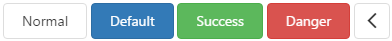
type
Specifies the button type.
useSubmitBehavior
Specifies whether the button submits an HTML form.
If this property is set to true, users can click the button to validate the validation group and submit the HTML form. If the group contains async rules, the form is not submitted until they are checked.
If the onClick event handler is specified, it is executed before validation and form submission.
validationGroup
Specifies the name of the validation group to be accessed in the click event handler.
When using a button to validate several editors on a page, the button must "know" in which validation group these editors are located. If the Knockout or AngularJS approach is used, add the button to the div element that represents the target validation group. When using the jQuery approach, specify the validationGroup configuration property for the button. Assign the validation group name specified for the validationGroup property of the validators that extend the editors to be validated.
See Also
width
Specifies the UI component's width.
This property accepts a value of one of the following types:
Number
The width in pixels.String
A CSS-accepted measurement of width. For example,"55px","80%","auto","inherit".Function
A function returning either of the above. For example:JavaScriptwidth: function() { return window.innerWidth / 1.5; }

 Select one or more answers