UI Components
Accordion
The Accordion UI component contains several panels displayed one under another. These panels can be collapsed or expanded by an end user, which makes this UI component very useful for presenting information in a limited amount of space.
See Also
jQuery
Angular
Vue
React
ActionSheet
The ActionSheet UI component is a sheet containing a set of buttons located one under the other. These buttons usually represent several choices relating to a single task.
See Also
jQuery
Angular
Vue
React
Autocomplete
The AutoComplete UI component is a textbox that provides suggestions while a user types into it.
See Also
jQuery
Angular
Vue
React
BarGauge
The BarGauge UI component contains several circular bars that each indicates a single value.
See Also
jQuery
Angular
Vue
React
Box
The Box UI component allows you to arrange various elements within it. Separate and adaptive, the Box UI component acts as a building block for the layout.
See Also
jQuery
Angular
Vue
React
Bullet
The Bullet UI component is useful when you need to compare a single measure to a target value. The UI component comprises a horizontal bar indicating the measure and a vertical line indicating the target value.
See Also
jQuery
Angular
Vue
React
Button
The Button UI component is a simple button that performs specified commands when a user clicks it.
See Also
jQuery
Angular
Vue
React
ButtonGroup
The ButtonGroup is a UI component that contains a set of toggle buttons and can be used as a mode switcher.
See Also
jQuery
Angular
Vue
React
Calendar
The Calendar is a UI component that displays a calendar and allows an end user to select the required date within a specified date range.
See Also
jQuery
Angular
Vue
React
CardView
CardView is a UI component that uses a "card" layout to present information.
See Also
jQuery
Angular
Vue
React
Chart
The Chart is a UI component that visualizes data from a local or remote storage using a great variety of series types along with different interactive elements, such as tooltips, crosshair pointer, legend, etc.
See Also
jQuery
Angular
Vue
React
Chat
The Chat UI component is an interactive interface that allows users to send and receive messages in real time.
See Also
jQuery
Angular
Vue
React
CheckBox
The CheckBox is a small box, which when selected by the end user, shows that a particular feature has been enabled or a specific property has been chosen.
See Also
jQuery
Angular
Vue
React
CircularGauge
The CircularGauge is a UI component that indicates values on a circular numeric scale.
See Also
jQuery
Angular
Vue
React
ColorBox
The ColorBox is a UI component that allows an end user to enter a color or pick it out from the drop-down editor.
See Also
jQuery
Angular
Vue
React
ContextMenu
The ContextMenu UI component displays a single- or multi-level context menu. An end user invokes this menu by a right click or a long press.
See Also
jQuery
Angular
Vue
React
DataGrid
The DataGrid is a UI component that represents data from a local or remote source in the form of a grid. This UI component offers such basic features as sorting, grouping, filtering, as well as more advanced capabilities, like state storing, client-side exporting, master-detail interface, and many others.
See Also
jQuery
Angular
Vue
React
DateBox
The DateBox is a UI component that displays date and time in a specified format, and enables a user to pick or type in the required date/time value.
See Also
jQuery
Angular
Vue
React
DateRangeBox
DateRangeBox is a UI component that allows a user to select a date range (pick or enter start and end dates).
Diagram
The Diagram UI component provides a visual interface to help you design new and modify existing diagrams.
See Also
jQuery
Angular
Vue
React
Draggable
Draggable is a user interface utility that allows UI component elements to be dragged and dropped.
Drawer
The Drawer is a dismissible or permanently visible panel used for navigation in responsive web application layouts.
See Also
jQuery
Angular
Vue
React
DropDownBox
The DropDownBox UI component consists of a text field, which displays the current value, and a drop-down field, which can contain any UI element.
See Also
jQuery
Angular
Vue
React
DropDownButton
The DropDownButton is a button that opens a drop-down menu.
See Also
jQuery
Angular
Vue
React
FileManager
The FileManager is a UI component that allows users to upload, select, and manage files and directories in different file storages.
FileUploader
The FileUploader UI component enables an end user to upload files to the server. An end user can select files in the file explorer or drag and drop files to the FileUploader area on the page.
See Also
jQuery
Angular
Vue
React
FilterBuilder
The FilterBuilder UI component allows a user to build complex filter expressions with an unlimited number of filter conditions, combined by logical operations using the UI.
See Also
jQuery
Angular
Vue
React
Form
The Form UI component represents fields of a data object as a collection of label-editor pairs. These pairs can be arranged in several groups, tabs and columns.
See Also
jQuery
Angular
Vue
React
Funnel
The Funnel is a UI component that visualizes a value at different stages. It helps assess value changes throughout these stages and identify potential issues. The Funnel UI component conveys information using different interactive elements (tooltips, labels, legend) and enables you to create not only a funnel, but also a pyramid chart.
See Also
jQuery
Angular
Vue
React
Gallery
The Gallery is a UI component that displays a collection of images in a carousel. The UI component is supplied with various navigation controls that allow a user to switch between images.
See Also
jQuery
Angular
Vue
React
Gantt
The Gantt is a UI component that displays the task flow and dependencies between tasks.
See Also
jQuery
Angular
Vue
React
HtmlEditor
HTML Editor is a WYSIWYG editor that allows you to format textual and visual content and to output it in HTML. HTML Editor is built on top of and requires the DevExtreme Quill.
See Also
jQuery
Angular
Vue
React
LinearGauge
The LinearGauge is a UI component that indicates values on a linear numeric scale.
See Also
jQuery
Angular
Vue
React
List
The List is a UI component that represents a collection of items in a scrollable list.
See Also
jQuery
Angular
Vue
React
LoadIndicator
The LoadIndicator is a UI element notifying the viewer that a process is in progress.
See Also
jQuery
Angular
Vue
React
LoadPanel
The LoadPanel is an overlay UI component notifying the viewer that loading is in progress.
See Also
jQuery
Angular
Vue
React
Lookup
The Lookup is a UI component that allows an end user to search for an item in a collection shown in a drop-down menu.
See Also
jQuery
Angular
Vue
React
Map
The Map is an interactive UI component that displays a geographic map with markers and routes.
See Also
jQuery
Angular
Vue
React
Menu
The Menu UI component is a panel with clickable items. A click on an item opens a drop-down menu, which can contain several submenus.
See Also
jQuery
Angular
Vue
React
MultiView
The MultiView is a UI component that contains several views. An end user navigates through the views by swiping them in the horizontal direction.
See Also
jQuery
Angular
Vue
React
NumberBox
The NumberBox is a UI component that displays a numeric value and allows a user to modify it by typing in a value, and incrementing or decrementing it using the keyboard or mouse.
See Also
jQuery
Angular
Vue
React
Pagination
Pagination is a UI component that allows users to navigate through pages and change page size at runtime. Pagination UI includes a page navigator and several optional elements: a page size selector, navigation buttons, and page information.
See Also
jQuery
Angular
Vue
React
PieChart
The PieChart is a UI component that visualizes data as a circle divided into sectors that each represents a portion of the whole.
See Also
jQuery
Angular
Vue
React
PivotGrid
The PivotGrid is a UI component that allows you to display and analyze multi-dimensional data from a local storage or an OLAP cube.
See Also
jQuery
Angular
Vue
React
PivotGridFieldChooser
A complementary UI component for the PivotGrid that allows you to manage data displayed in the PivotGrid. The field chooser is already integrated in the PivotGrid and can be invoked using the context menu. If you need to continuously display the field chooser near the PivotGrid UI component, use the PivotGridFieldChooser UI component.
Both the PivotGridFieldChooser and the PivotGrid must be bound to one and the same instance of the PivotGridDataSource. Create the PivotGridDataSource individually and then assign it to both UI components as shown in the code above.
See Also
jQuery
Angular
Vue
React
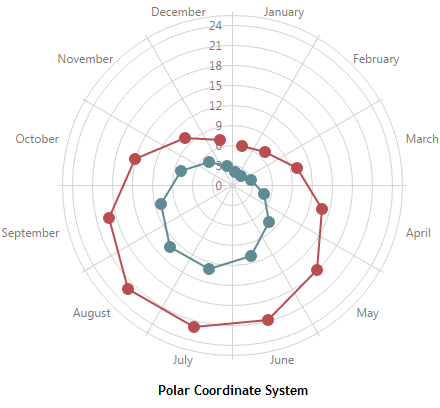
PolarChart
The PolarChart is a UI component that visualizes data in a polar coordinate system.
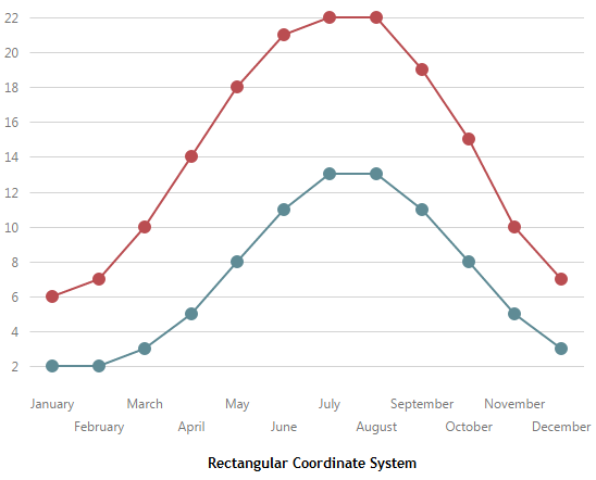
The PolarChart UI component visualizes data in a polar coordinate system. In this system, each point on a plane is determined by the distance from the center (the point's value) and the angle from a fixed direction (the point's argument). To understand how a chart is displayed in a polar coordinate system, imagine how it would be displayed in a rectangular coordinate system and then round off the argument axis in your mind.
See Also
jQuery
Angular
Vue
React
Popover
The Popover is a UI component that shows notifications within a box with an arrow pointing to a specified UI element.
See Also
jQuery
Angular
Vue
React
Popup
The Popup UI component is a pop-up window overlaying the current view.
See Also
jQuery
Angular
Vue
React
ProgressBar
The ProgressBar is a UI component that shows current progress.
See Also
jQuery
Angular
Vue
React
RadioGroup
The RadioGroup is a UI component that contains a set of radio buttons and allows an end user to make a single selection from the set.
See Also
jQuery
Angular
Vue
React
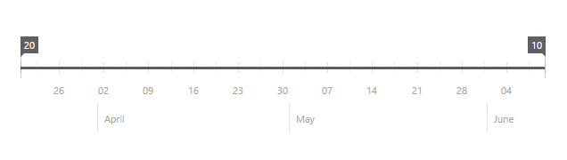
RangeSelector
The RangeSelector is a UI component that allows a user to select a range of values on a scale.
This UI component represents a scale (numeric or date-time) and two sliders. A user selects the required range by moving the sliders.
A chart can be displayed in the background of the RangeSelector UI component. This allows end users to select the required range in a chart series. You can also integrate the RangeSelector UI component with a stand-alone Chart UI component to emulate chart zooming and scrolling.
See Also
jQuery
Angular
Vue
React
RangeSlider
The RangeSlider is a UI component that allows an end user to choose a range of numeric values.
See Also
jQuery
Angular
Vue
React
Resizable
The Resizable UI component enables its content to be resizable in the UI.
See Also
jQuery
Angular
Vue
React
ResponsiveBox
The ResponsiveBox UI component allows you to create an application or a website with a layout adapted to different screen sizes.
See Also
jQuery
Angular
Vue
React
Sankey
The Sankey is a UI component that visualizes the flow magnitude between value sets. The values being connected are called nodes; the connections - links. The higher the flow magnitude, the wider the link is.
See Also
jQuery
Angular
Vue
React
Scheduler
The Scheduler is a UI component that represents scheduled data and allows a user to manage and edit it.
See Also
jQuery
Angular
Vue
React
ScrollView
The ScrollView is a UI component that enables a user to scroll its content.
See Also
jQuery
Angular
Vue
React
SelectBox
The SelectBox UI component is an editor that allows an end user to select an item from a drop-down list.
See Also
jQuery
Angular
Vue
React
Slider
The Slider is a UI component that allows an end user to set a numeric value on a continuous range of possible values.
See Also
jQuery
Angular
Vue
React
Sortable
Sortable is a user interface utility that allows a UI component's items to be reordered via drag and drop gestures.
Sparkline
The Sparkline UI component is a compact chart that contains only one series. Owing to their size, sparklines occupy very little space and can be easily collected in a table or embedded straight in text.
See Also
jQuery
Angular
Vue
React
SpeedDialAction
The SpeedDialAction is a button that performs a custom action. It can be represented by a Floating Action Button (FAB) or a button in a speed dial menu opened with the FAB.
When there is only one SpeedDialAction on a page, it is represented by a Floating Action Button (FAB).
When there are multiple SpeedDialActions, they are collected in a speed dial menu that can contain multiple actions. In this case, the FAB opens the menu. You can use the floatingActionButtonConfig object to change the maximum number of actions, the FAB's position, and icons in the open and closed states.
See Also
jQuery
Angular
Vue
React
Splitter
Splitter is a UI component that allows you to divide a page or section into multiple adjustable panes.
Stepper
A Stepper is a UI component that displays progress as a user moves through a sequence of steps.
Switch
The Switch is a UI component that can be in two states: "On" and "Off".
See Also
jQuery
Angular
Vue
React
TabPanel
The TabPanel is a UI component consisting of the Tabs and MultiView UI components. It automatically synchronizes the selected tab with the currently displayed view, and vice versa.
See Also
jQuery
Angular
Vue
React
Tabs
The Tabs component is a tab strip used to switch between pages or views. This UI component is included in the TabPanel UI component, but you can use Tabs separately as well.
See Also
jQuery
Angular
Vue
React
TagBox
The TagBox UI component is an editor that allows an end user to select multiple items from a drop-down list.
See Also
jQuery
Angular
Vue
React
TextArea
The TextArea is a UI component that enables a user to enter and edit a multi-line text.
See Also
jQuery
Angular
Vue
React
TextBox
The TextBox is a UI component that enables a user to enter and edit a single line of text.
See Also
jQuery
Angular
Vue
React
TileView
The TileView UI component contains a collection of tiles. Tiles can store much more information than ordinary buttons, that is why they are very popular in apps designed for touch devices.
See Also
jQuery
Angular
Vue
React
Toast
The Toast is a UI component that provides pop-up notifications.
See Also
jQuery
Angular
Vue
React
Toolbar
The Toolbar is a UI component containing items that usually manage screen content. Those items can be plain text or UI components.
See Also
jQuery
Angular
Vue
React
Tooltip
The Tooltip UI component displays a tooltip for a specified element on the page.
See Also
jQuery
Angular
Vue
React
TreeList
The TreeList is a UI component that represents data from a local or remote source in the form of a multi-column tree view. This UI component offers such features as sorting, filtering, editing, selection, etc.
See Also
jQuery
Angular
Vue
React
TreeMap
The TreeMap is a UI component that displays hierarchical data by using nested rectangles.
In the TreeMap UI component, hierarchical data is represented by a set of nested rectangles whose sizes are proportional to the visualized values. TreeMap operates with plain and hierarchical data sources. Also, it can visualize a hierarchy reconstructed from a flat data source.
TreeMap provides three layout algorithms out-of-the-box along with the capability to implement your own algorithm. In addition, the UI component includes API methods that enable you to implement the drill down feature. Moreover, TreeMap supports all interactive features available in other DevExtreme Data Visualization Widgets: click, hover and selection.
See Also
jQuery
Angular
Vue
React
TreeView
The TreeView UI component is a tree-like representation of textual data.
See Also
jQuery
Angular
Vue
React
ValidationGroup
The ValidationGroup is a UI component that allows you to validate several editors simultaneously.
See Also
jQuery
Angular
Vue
React
ValidationSummary
A UI component for displaying the result of checking validation rules for editors.
See Also
jQuery
Angular
Vue
React
Validator
A UI component that is used to validate the associated DevExtreme editors against the defined validation rules.
See Also
jQuery
Angular
Vue
React
VectorMap
The VectorMap is a UI component that visualizes geographical locations. This UI component represents a geographical map that contains areas and markers. Areas embody continents and countries. Markers flag specific points on the map, for example, towns, cities or capitals.
See Also
jQuery
Angular
Vue
React
Errors and Warnings
This section lists errors and warnings that may occur in UI components.
Markup Components
This section describes components that can be used when defining a UI component markup.
UI Events
The events used to handle user interaction with UI elements.
DevExtreme provides UI events for processing a user's interaction with a specific UI element. The DevExpress.events namespace exposes an API to work with the UI events.
The following code shows how to attach, trigger and then detach a dxhold event handler from a page element with the target ID. The timeout parameter specifies how long the target should be held to allow the handler to execute:
jQuery
var dxholdHandler = function(jQueryEvent) {
    alert(`The ${$(jQueryEvent.target).text()} element is being held for ${jQueryEvent.data.timeout} ms.`);
};

$("#target").on("dxhold", { timeout: 1000 }, dxholdHandler);
$("#target").trigger("dxhold");
$("#target").off("dxhold", dxholdHandler);
See jQuery documentation for details.
Angular
import { on, trigger, off } from "devextreme/events";
// ...
export class AppComponent implements AfterViewInit {
    ngAfterViewInit() {
        const dxholdHandler = (event) => {
            alert(`The ${event.target.textContent} element is being held for ${event.data.timeout} ms.`);
            return true; // true - continues event propagation, false - stops
        }
        const target: HTMLElement = document.getElementById("target");

        on(target, "dxhold", { timeout: 1000 }, dxholdHandler);
        trigger(target, "dxhold");
        off(target, "dxhold", dxholdHandler);
    }
}
CSS Classes
This section describes the DevExtreme CSS classes you can use to define the appearance of an element.

 Select one or more answers