JavaScript/jQuery BarGauge Options
An object that defines configuration properties for the BarGauge UI component.
See Also
animation
Specifies animation properties.
To make your gauge "live", enable animation for it by setting the enabled property of the animation object to true. In this instance, the gauge indicators will appear in motion. In addition, within the animation object, you can set an appropriate easing mode using the easing property and specify how long the animation should run using the duration property.
jQuery
$(function() {
    $("#barGaugeContainer").dxBarGauge({
        // ...
        animation: {
            easing: "linear",
            duration: 500
        }
    });
});
Angular
<dx-bar-gauge ... >
    <dxo-bar-gauge-animation
        easing="linear"
        [duration]="500">
    </dxo-bar-gauge-animation>
</dx-bar-gauge>
import { Component } from '@angular/core';

@Component({
    selector: 'app-root',
    templateUrl: './app.component.html',
    styleUrls: ['./app.component.css']
})
export class AppComponent {
    // ...
}
import { BrowserModule } from '@angular/platform-browser';
import { NgModule } from '@angular/core';
import { AppComponent } from './app.component';

import { DxBarGaugeModule } from 'devextreme-angular';

@NgModule({
    declarations: [
        AppComponent
    ],
    imports: [
        BrowserModule,
        DxBarGaugeModule
    ],
    providers: [ ],
    bootstrap: [AppComponent]
})
export class AppModule { }
Vue
<template>
    <DxBarGauge ... >
        <DxAnimation
            easing="linear"
            :duration="500"
        />
    </DxBarGauge>
</template>

<script>
import 'devextreme/dist/css/dx.fluent.blue.light.css';

import DxBarGauge, {
    DxAnimation
} from 'devextreme-vue/bar-gauge';

export default {
    components: {
        DxBarGauge,
        DxAnimation
    },
    // ...
}
</script>
React
import React from 'react';

import 'devextreme/dist/css/dx.fluent.blue.light.css';

import BarGauge, {
    Animation
} from 'devextreme-react/bar-gauge';

class App extends React.Component {
    render() {
        return (
            <BarGauge ... >
                <Animation
                    easing="linear"
                    duration={500}
                />
            </BarGauge>
        );
    }
}
export default App;
ASP.NET MVC Controls
@(Html.DevExtreme().BarGauge()
    // ...
    .Animation(a => a
        .Easing(VizAnimationEasing.Linear)
        .Duration(500)
    )
)
backgroundColor
Specifies a color for the remaining segment of the bar's track.
BarGauge displays values in the form of several circular bars each placed on a separate track. Since a bar indicates a value, it occupies only a segment of this track. The remaining segment is drawn in the color specified by the backgroundColor property.
This property supports the following colors:
- Hexadecimal colors
- RGB colors
- RGBA colors
- Predefined/cross-browser color names
- Predefined SVG colors
- Paint server address
baseValue
Specifies a base value for bars.
By default, all bars start from the beginning of the gauge's scale. If you need to draw them starting from a specific scale value, assign the required value to the baseValue property. In this instance, each bar will display the range from the baseValue to the corresponding value specified to this bar.
centerTemplate
Specifies a custom template for content in the component's center.
The UI component's instance.
An empty SVGGElement that acts as a container for the template content.
One of the following:
- SVG markup as a string
- An SVGElement
- SVG markup wrapped in a jQuery element
You need to render template content as an SVG element. The following code snippet shows how to specify a custom template for content in the BarGauge's center:
jQuery
$(function(){
    $("#barGaugeContainer").dxBarGauge({
        // ...
        centerTemplate: (gauge, container) => {
            const rect = createRect(50, 50, 'transparent');
            const text = createText(10, 200, 12, 'start', gauge.value());

            container.appendChild(rect);
            container.appendChild(text);
        },
    });
});

function createRect(width, height, fill) {
    const rect = document.createElementNS('http://www.w3.org/2000/svg', 'rect');

    rect.setAttribute('x', 0);
    rect.setAttribute('y', 0);
    rect.setAttribute('width', width);
    rect.setAttribute('height', height);
    rect.setAttribute('fill', fill);

    return rect;
}

function createText(x, y, fontSize, textAnchor, content) {
    const text = document.createElementNS('http://www.w3.org/2000/svg', 'text');

    text.setAttribute('x', x);
    text.setAttribute('y', y);
    text.setAttribute('fill', '#000');
    text.setAttribute('text-anchor', textAnchor);
    text.setAttribute('font-size', fontSize);

    text.textContent = content;

    return text;
}
Angular
<dx-bar-gauge centerTemplate="centerTemplate" ... >
    <svg *dxTemplate="let gauge of 'centerTemplate'">
        <rect x="0" y="0" width="50" height="50" fill="transparent"></rect>
        <text text-anchor="start" y="200" x="10" fill="#000" font-size="12">
           {{gauge.value()}}
        </text>
    </svg>
</dx-bar-gauge>
import { BrowserModule } from '@angular/platform-browser';
import { NgModule } from '@angular/core';
import { AppComponent } from './app.component';
import { DxBarGaugeModule } from 'devextreme-angular';

@NgModule({
    declarations: [
        AppComponent
    ],
    imports: [
        BrowserModule,
        DxBarGaugeModule
    ],
    providers: [ ],
    bootstrap: [AppComponent]
})

export class AppModule { }
Vue
<template>
    <DxBarGauge center-template="centerTemplate" ... >
        <template #centerTemplate="data">
            <svg>
                <rect x="0" y="0" width="50" height="50" fill="transparent"></rect>
                <text text-anchor="start" y="200" x="10" fill="#000" font-size="12">
                    {{data.data.value()}}
                </text>
            </svg>
        </template>
    >
    </DxBarGauge>
</template>

<script>
import DxBarGauge from 'devextreme-vue/bar-gauge';

export default {
    components: {
        DxBarGauge
    },
    data() {
        return {
            // ...
        }
    }
}
</script>
<template>
    <DxBarGauge center-template="centerTemplate" ... >
        <template #centerTemplate="data">
            <svg>
                <rect x="0" y="0" width="50" height="50" fill="transparent"></rect>
                <text text-anchor="start" y="200" x="10" fill="#000" font-size="12">
                    {{data.data.value()}}
                </text>
            </svg>
        </template>
    >
    </DxBarGauge>
</template>

<script setup>
import DxBarGauge from 'devextreme-vue/bar-gauge';

const data = { ... };
// ...
</script>
React
import BarGauge from 'devextreme-react/bar-gauge';

const CenterTemplate = (gauge) => {
    return (
        <svg>
            <rect x="0" y="0" width="50" height="50" fill="transparent"></rect>
            <text text-anchor="start" y="200" x="10" fill="#000" font-size="12">
                {gauge.value()}
            </text>
        </svg>
    );
}

export default function App() {
    return (
        <BarGauge centerRender={CenterTemplate} ... >
            { /* ... */ }
        </BarGauge>
    );
} elementAttr
Specifies the global attributes to be attached to the UI component's container element.
jQuery
$(function(){
    $("#barGaugeContainer").dxBarGauge({
        // ...
        elementAttr: {
            id: "elementId",
            class: "class-name"
        }
    });
});
Angular
<dx-bar-gauge ...
    [elementAttr]="{ id: 'elementId', class: 'class-name' }">
</dx-bar-gauge>
import { DxBarGaugeModule } from "devextreme-angular";
// ...
export class AppComponent {
    // ...
}
@NgModule({
    imports: [
        // ...
        DxBarGaugeModule
    ],
    // ...
})
Vue
<template>
    <DxBarGauge ...
        :element-attr="barGaugeAttributes">
    </DxBarGauge>
</template>

<script>
import DxBarGauge from 'devextreme-vue/bar-gauge';

export default {
    components: {
        DxBarGauge
    },
    data() {
        return {
            barGaugeAttributes: {
                id: 'elementId',
                class: 'class-name'
            }
        }
    }
}
</script>
React
import React from 'react';

import BarGauge from 'devextreme-react/bar-gauge';

class App extends React.Component {
    barGaugeAttributes = {
        id: 'elementId',
        class: 'class-name'
    }

    render() {
        return (
            <BarGauge ...
                elementAttr={this.barGaugeAttributes}>
            </BarGauge>
        );
    }
}
export default App;export
Configures the exporting and printing features.
These features allow a user to export your UI component into a document or print it. When exporting is enabled, the "Exporting/Printing" button appears in the UI component. A click on it invokes a drop-down menu that lists exporting and printing commands. The following formats are supported for exporting into: PNG, PDF, JPEG, SVG and GIF.
See Also
geometry
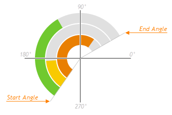
Defines the shape of the gauge's arc.
Specify the startAngle and endAngle properties of the geometry configuration object to customize the shape of the bar gauge's arc. This arc is drawn from the startAngle to the endAngle as illustrated by the following image.
label
Specifies the properties of the labels that accompany gauge bars.
Each gauge bar is accompanied by a label that usually displays the value of the bar. Use the properties of the label object to customize the label's text, specify its format, font, and distance between the label and the bar.
To hide labels, use the label.visible property or assign false straight to the label property.
See Also
legend
Configures the legend.
The legend is a component that helps a user identify bars. The legend contains several items, one per bar, each consisting of a colored marker and text showing the bar's argument.
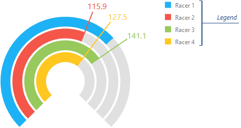
You can make the legend visible by setting the legend.visible property to true.
loadingIndicator
Configures the loading indicator.
When the UI component is bound to a remote data source, it can display a loading indicator while data is loading.
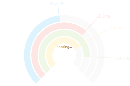
To change the loading indicator's visibility, use the show property or the showLoadingIndicator() and hideLoadingIndicator() methods.
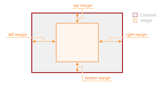
margin
Generates space around the UI component.
jQuery
$(function() {
    $("#barGaugeContainer").dxBarGauge({
        // ...
        margin: {
            top: 20,
            bottom: 20,
            left: 30,
            right: 30
        }
    });
});
Angular
<dx-bar-gauge ... >
    <dxo-bar-gauge-margin
        [top]="20"
        [bottom]="20"
        [left]="30"
        [right]="30">
    </dxo-bar-gauge-margin>
</dx-bar-gauge>
import { Component } from '@angular/core';

@Component({
    selector: 'app-root',
    templateUrl: './app.component.html',
    styleUrls: ['./app.component.css']
})
export class AppComponent {
    // ...
}
import { BrowserModule } from '@angular/platform-browser';
import { NgModule } from '@angular/core';
import { AppComponent } from './app.component';

import { DxBarGaugeModule } from 'devextreme-angular';

@NgModule({
    declarations: [
        AppComponent
    ],
    imports: [
        BrowserModule,
        DxBarGaugeModule
    ],
    providers: [ ],
    bootstrap: [AppComponent]
})
export class AppModule { }
Vue
<template>
    <DxBarGauge ... >
        <DxMargin
            :top="20"
            :bottom="20"
            :left="30"
            :right="30"
        />
    </DxBarGauge>
</template>

<script>
import 'devextreme/dist/css/dx.fluent.blue.light.css';

import DxBarGauge, {
    DxMargin
} from 'devextreme-vue/bar-gauge';

export default {
    components: {
        DxBarGauge,
        DxMargin
    },
    // ...
}
</script>
React
import React from 'react';

import 'devextreme/dist/css/dx.fluent.blue.light.css';

import BarGauge, {
    Margin
} from 'devextreme-react/bar-gauge';

class App extends React.Component {
    render() {
        return (
            <BarGauge ... >
                <Margin
                    top={20}
                    bottom={20}
                    left={30}
                    right={30}
                />
            </BarGauge>
        );
    }
}
export default App;
onDisposing
A function that is executed before the UI component is disposed of.
Information about the event.
| Name | Type | Description |
|---|---|---|
| element |
The UI component's container. It is an HTML Element or a jQuery Element when you use jQuery. |
|
| component |
The UI component's instance. |
onDrawn
A function that is executed when the UI component's rendering has finished.
Information about the event.
| Name | Type | Description |
|---|---|---|
| element |
The UI component's container. It is an HTML Element or a jQuery Element when you use jQuery. |
|
| component |
The UI component's instance. |
onExported
A function that is executed after the UI component is exported.
Information about the event.
| Name | Type | Description |
|---|---|---|
| element |
The UI component's container. It is an HTML Element or a jQuery Element when you use jQuery. |
|
| component |
The UI component's instance. |
See Also
onExporting
A function that is executed before the UI component is exported.
Information about the event.
| Name | Type | Description |
|---|---|---|
| format |
The resulting file format. One of PNG, PDF, JPEG, SVG and GIF. |
|
| fileName |
The name of the file to which the UI component is about to be exported. |
|
| element |
The UI component's container. It is an HTML Element or a jQuery Element when you use jQuery. |
|
| component |
The UI component's instance. |
See Also
onFileSaving
A function that is executed before a file with exported UI component is saved to the user's local storage.
Information about the event.
| Name | Type | Description |
|---|---|---|
| format |
The format of the file to be saved. |
|
| fileName |
The name of the file to be saved. |
|
| element |
The UI component's container. It is an HTML Element or a jQuery Element when you use jQuery. |
|
| data |
Exported data as a BLOB. |
|
| component |
The UI component's instance. |
|
| cancel |
Allows you to prevent file saving. |
See Also
onIncidentOccurred
A function that is executed when an error or warning occurs.
Information about the event.
| Name | Type | Description |
|---|---|---|
| target | any |
Information on the occurred incident. |
| element |
The UI component's container. It is an HTML Element or a jQuery Element when you use jQuery. |
|
| component |
The UI component's instance. |
The UI component notifies you of errors and warnings by passing messages to the browser console. Each message contains the incident's ID, a brief description, and a link to the Errors and Warnings section where further information about this incident can be found.
The onIncidentOccurred function allows you to handle errors and warnings the way you require. The object passed to it contains the target field. This field provides information about the occurred incident and contains the following properties:
- id
The incident's ID. The full list of IDs can be found in the Errors and Warnings section. - type
The incident's type: "error" or "warning". - args
The argument of the incident's message. Depends on the incident. For example, it may be the name of the data source field that was specified incorrectly, or the name of the property that was not set properly. - text
The text passed to the browser's console. Includes the args content, if there is any. - widget
The name of the UI component that produced the error or warning. - version
The used DevExtreme version.
onInitialized
A function used in JavaScript frameworks to save the UI component instance.
Information about the event.
| Name | Type | Description |
|---|---|---|
| element |
The UI component's container. It is an HTML Element or a jQuery Element when you use jQuery. |
|
| component |
The UI component's instance. |
Angular
<dx-bar-gauge ...
    (onInitialized)="saveInstance($event)">
</dx-bar-gauge>
import { Component } from "@angular/core";
import BarGauge from "devextreme/ui/data_grid";
// ...
export class AppComponent {
    barGaugeInstance: BarGauge;
    saveInstance (e) {
        this.barGaugeInstance = e.component;
    }
}
Vue
<template>
    <div>
        <DxBarGauge ...
            @initialized="saveInstance">
        </DxBarGauge>
    </div>
</template>

<script>
import DxBarGauge from 'devextreme-vue/bar-gauge';

export default {
    components: {
        DxBarGauge
    },
    data: function() {
        return {
            barGaugeInstance: null
        };
    },
    methods: {
        saveInstance: function(e) {
            this.barGaugeInstance = e.component;
        }
    }
};
</script>
<template>
    <div>
        <DxBarGauge ...
            @initialized="saveInstance">
        </DxBarGauge>
    </div>
</template>

<script setup>
import DxBarGauge from 'devextreme-vue/bar-gauge';

let barGaugeInstance = null;

const saveInstance = (e) => {
    barGaugeInstance = e.component;
}
</script>
React
import BarGauge from 'devextreme-react/bar-gauge';

class App extends React.Component {
    constructor(props) {
        super(props);

        this.saveInstance = this.saveInstance.bind(this);
    }

    saveInstance(e) {
        this.barGaugeInstance = e.component;
    }

    render() {
        return (
            <div>
                <BarGauge onInitialized={this.saveInstance} />
            </div>
        );
    }
}
See Also
onOptionChanged
A function that is executed after a UI component property is changed.
Information about the event.
| Name | Type | Description |
|---|---|---|
| value | any |
The modified property's new value. |
| previousValue | any |
The UI component's previous value. |
| name |
The modified property if it belongs to the first level. Otherwise, the first-level property it is nested into. |
|
| fullName |
The path to the modified property that includes all parent properties. |
|
| element |
The UI component's container. It is an HTML Element or a jQuery Element when you use jQuery. |
|
| component |
The UI component's instance. |
The following example shows how to subscribe to component property changes:
jQuery
$(function() {
    $("#barGaugeContainer").dxBarGauge({
        // ...
        onOptionChanged: function(e) {
            if(e.name === "changedProperty") {
                // handle the property change here
            }
        }
    });
});
Angular
<dx-bar-gauge ...
    (onOptionChanged)="handlePropertyChange($event)">
</dx-bar-gauge>
import { Component } from '@angular/core';

@Component({
    selector: 'app-root',
    templateUrl: './app.component.html',
    styleUrls: ['./app.component.css']
})

export class AppComponent {
    // ...
    handlePropertyChange(e) {
        if(e.name === "changedProperty") {
            // handle the property change here
        }
    }
}
import { BrowserModule } from '@angular/platform-browser';
import { NgModule } from '@angular/core';
import { AppComponent } from './app.component';
import { DxBarGaugeModule } from 'devextreme-angular';

@NgModule({
    declarations: [
        AppComponent
    ],
    imports: [
        BrowserModule,
        DxBarGaugeModule
    ],
    providers: [ ],
    bootstrap: [AppComponent]
})

export class AppModule { }
Vue
<template>
    <DxBarGauge ...
        @option-changed="handlePropertyChange"
    />
</template>

<script>
import 'devextreme/dist/css/dx.fluent.blue.light.css';
import DxBarGauge from 'devextreme-vue/bar-gauge';

export default {
    components: {
        DxBarGauge
    },
    // ...
    methods: {
        handlePropertyChange: function(e) {
            if(e.name === "changedProperty") {
                // handle the property change here
            }
        }
    }
}
</script>
React
import React from 'react';
import 'devextreme/dist/css/dx.fluent.blue.light.css';

import BarGauge from 'devextreme-react/bar-gauge';

const handlePropertyChange = (e) => {
    if(e.name === "changedProperty") {
        // handle the property change here
    }
}

export default function App() {
    return (
        <BarGauge ...
            onOptionChanged={handlePropertyChange}
        />
    );
}
onTooltipHidden
A function that is executed when a tooltip becomes hidden.
Information about the event.
| Name | Type | Description |
|---|---|---|
| component |
The UI component's instance. |
|
| element |
The UI component's container. It is an HTML Element or a jQuery Element when you use jQuery. |
|
| target |
Information on the bar being pressed or hovered over with the mouse pointer. Contains the index field. |
onTooltipShown
A function that is executed when a tooltip appears.
Information about the event.
| Name | Type | Description |
|---|---|---|
| component |
The UI component's instance. |
|
| element |
The UI component's container. It is an HTML Element or a jQuery Element when you use jQuery. |
|
| target |
Information on the bar being pressed or hovered over with the mouse pointer. Contains the index field. |
palette
Sets the palette to be used for colorizing bars in the gauge.
This property accepts either the name of a predefined palette or an array of colors. The array can include the following colors:
- Hexadecimal colors
- RGB colors
- RGBA colors
- Predefined/cross-browser color names
- Predefined SVG colors
See Also
paletteExtensionMode
Specifies what to do with colors in the palette when their number is less than the number of bars in the gauge.
The following variants are available:
"blend"
Create a blend of two neighboring colors and insert it between these colors in the palette."alternate"
Repeat the full set of palette colors, alternating their normal, lightened, and darkened shades in that order."extrapolate"
Repeat the full set of palette colors, changing their shade gradually from dark to light.
pathModified
Notifies the UI component that it is embedded into an HTML page that uses a tag modifying the path.
redrawOnResize
Specifies whether to redraw the UI component when the size of the container changes or a mobile device rotates.
When this property is set to true, the UI component will be redrawn automatically in case the size of its container changes.
relativeInnerRadius
Defines the radius of the bar that is closest to the center relatively to the radius of the topmost bar.
This property accepts values from the (0, 1) range.
resolveLabelOverlapping
Specifies how the UI component should behave when bar labels overlap.
If a BarGauge displays several values close to each other, the corresponding labels may overlap. If you want to avoid overlapped labels, use the resolveLabelOverlapping property to specify how the gauge adjusts label position or visibility. The following values are available:
'hide'
The gauge hides labels with smaller values except for the label with the smallest value.'shift'
The gauge shifts labels. If the component's size is not big enough to accommodate all labels, the BarGauge hides labels with the smallest values.'none'
Labels overlap.
rtlEnabled
Switches the UI component to a right-to-left representation.
When this property is set to true, the UI component text flows from right to left, and the layout of elements is reversed. To switch the entire application/site to the right-to-left representation, assign true to the rtlEnabled field of the object passed to the DevExpress.config(config) method.
DevExpress.config({
    rtlEnabled: true
});size
Specifies the UI component's size in pixels.
You can specify a custom width and height for the component:
| Fixed | Relative |
|---|---|
| Assign values to the size object's height and width properties or specify a container for the component. | Specify a container for the component. The component occupies the container area. |
jQuery
$(function() {
    $("#barGaugeContainer").dxBarGauge({
        // ...
        size: {
            height: 300,
            width: 600
        }
    });
});
Angular
<dx-bar-gauge ... >
    <dxo-bar-gauge-size
        [height]="300"
        [width]="600">
    </dxo-bar-gauge-size>
</dx-bar-gauge>
import { Component } from '@angular/core';

@Component({
    selector: 'app-root',
    templateUrl: './app.component.html',
    styleUrls: ['./app.component.css']
})
export class AppComponent {
    // ...
}
import { BrowserModule } from '@angular/platform-browser';
import { NgModule } from '@angular/core';
import { AppComponent } from './app.component';

import { DxBarGaugeModule } from 'devextreme-angular';

@NgModule({
    declarations: [
        AppComponent
    ],
    imports: [
        BrowserModule,
        DxBarGaugeModule
    ],
    providers: [ ],
    bootstrap: [AppComponent]
})
export class AppModule { }
Vue
<template>
    <DxBarGauge ... >
        <DxSize
            :height="300"
            :width="600"
        />
    </DxBarGauge>
</template>

<script>

import DxBarGauge, {
    DxSize
} from 'devextreme-vue/bar-gauge';

export default {
    components: {
        DxBarGauge,
        DxSize
    },
    // ...
}
</script>
React
import React from 'react';

import BarGauge, {
    Size
} from 'devextreme-react/bar-gauge';

class App extends React.Component {
    render() {
        return (
            <BarGauge ... >
                <Size
                    height={300}
                    width={600}
                />
            </BarGauge>
        );
    }
}
export default App;
Alternatively, you can use CSS to style the UI component's container:
jQuery
$(function() {
    $("#barGauge").dxBarGauge({
        // ...
    });
});
#barGauge {
    width: 85%;
    height: 70%;
}
Angular
<dx-bar-gauge ...
    id="barGauge">
</dx-bar-gauge>
#barGauge {
    width: 85%;
    height: 70%;
}
Vue
<template>
    <DxBarGauge ...
        id="barGauge">
    </DxBarGauge>
</template>

<script>
import DxBarGauge from 'devextreme-vue/bar-gauge';

export default {
    components: {
        DxBarGauge
    },
    // ...
}
</script>

<style>
#barGauge {
    width: 85%;
    height: 70%;
}
</style>
React
import React from 'react';

import BarGauge from 'devextreme-react/bar-gauge';

class App extends React.Component {
    render() {
        return (
            <BarGauge ...
                id="barGauge">
            </BarGauge>
        );
    }
}
export default App;
#barGauge {
    width: 85%;
    height: 70%;
}theme
Sets the name of the theme the UI component uses.
A theme is a UI component configuration that gives the UI component a distinctive appearance. You can use one of the predefined themes or create a custom one. Changing the property values in the UI component's configuration object overrides the theme's corresponding values.
title
Configures the UI component's title.
The UI component's title is a short text that usually indicates what is visualized. If you need to specify the title's text only, assign it directly to the title property. Otherwise, set this property to an object with the text and other fields specified.
The title can be accompanied by a subtitle elaborating on the visualized subject using the title.subtitle object.
tooltip
Configures tooltips.
A tooltip is a miniature rectangle displaying the value of a gauge's bar. A tooltip appears when the end-user hovers the cursor over a bar. You can enable/disable tooltips, change their appearance and format their text using fields of the tooltip configuration object.
values
Specifies the array of values to be indicated on a bar gauge.
Apart from specifying an array of values when configuring the BarGauge UI component, you can obtain this array at runtime using the values() method, and change it using the values(newValues) method.

 Select one or more answers