JavaScript/jQuery PieChart - commonAnnotationSettings
Specifies settings common for all annotations in the PieChart.
Settings specified here can be ignored in favor of individual annotation settings specified in the annotations[] array. Refer to the array's description for information on how to configure annotations.
The following code shows the commonAnnotationSettings declaration syntax:
jQuery
$(function() {
    $("#pieChart").dxPieChart({
        // ...
        commonAnnotationSettings: {
            tooltipEnabled: false
        }
    });
});
Angular
<dx-pie-chart ... >
    <dx-common-annotation-settings
        [tooltipEnabled]="false">
    </dx-common-annotation-settings>
</dx-pie-chart>
import { Component } from '@angular/core';

@Component({
    selector: 'app-root',
    templateUrl: './app.component.html',
    styleUrls: ['./app.component.css']
})
export class AppComponent {
    // ...
}
import { BrowserModule } from '@angular/platform-browser';
import { NgModule } from '@angular/core';
import { AppComponent } from './app.component';

import { DxPieChartModule } from 'devextreme-angular';

@NgModule({
    declarations: [
        AppComponent
    ],
    imports: [
        BrowserModule,
        DxPieChartModule
    ],
    providers: [ ],
    bootstrap: [AppComponent]
})
export class AppModule { }
Vue
<template>
    <DxPieChart ... >
        <DxCommonAnnotationSettings
            :tooltip-enabled="false"
        />
    </DxPieChart>
</template>

<script>
import DxPieChart, {
    DxCommonAnnotationSettings
} from 'devextreme-vue/pie-chart';

export default {
    components: {
        DxPieChart,
        DxCommonAnnotationSettings
    },
    data() {
        // ...
    }
}
</script>
React
import React from 'react';

import PieChart, {
    CommonAnnotationSettings
} from 'devextreme-react/pie-chart';

class App extends React.Component {
    render() {
        return (
            <PieChart ... >
                <CommonAnnotationSettings
                    tooltipEnabled={false}
                />
            </PieChart>
        );
    }
}
export default App;See Also
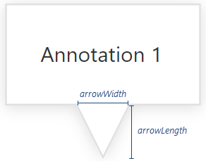
arrowWidth
Specifies the width of the annotation's arrow at its junction with the annotation rectangle.

color
Specifies the color that fills the annotation.
This property supports the following colors:
- Hexadecimal colors
- RGB colors
- RGBA colors
- Predefined/cross-browser color names
- Predefined SVG colors
- Paint server address
customizeTooltip
Customizes the text and appearance of the annotation's tooltip.
The annotation's configuration object.
The tooltip's text or markup and appearance settings.
This property should be assigned a function that returns an object with the following fields:
| Field name | Description |
|---|---|
text |
The tooltip's text. |
html |
The HTML markup displayed in a tooltip. The PieChart evaluates the markup. Make sure that it does not contain malicious code. Refer to the following help topic for more information: Potentially Vulnerable API - customizeTooltip. To use external resources (for example, images) in the markup, specify the size of the area they occupy beforehand. |
color |
The tooltip's color. |
fontColor |
The color of the tooltip's text. |
borderColor |
The color of the tooltip's border. |
this keyword.See Also
description
Specifies the annotation's description in the tooltip.
image
Configures the image to be displayed in the annotation. Applies only if the type is "image".
To display an image, assign its URL to the url property and use the height and width properties to resize the image. Otherwise, assign the URL directly to the image property.
location
Specifies an annotation's position on the surface of a specific argument.
offsetX
Moves the annotation horizontally.
The number assigned to this property specifies the shift in pixels. A negative number shifts the annotation to the left and a positive number shifts it to the right.
See Also
offsetY
Moves the annotation vertically.
The number assigned to this property specifies the shift in pixels. A negative number shifts the annotation up and a positive number shifts it down.
See Also
opacity
Specifies the annotation's opacity.
This property accepts a value from 0 to 1: 0 makes the annotation transparent; 1 makes it opaque.
paddingLeftRight
Used with paddingTopBottom to generate an empty space around the annotation's text or image (specified in pixels).
paddingTopBottom
Along with paddingLeftRight, generates an empty space around the annotation's text or image; specified in pixels.
series
Anchors the annotation to a series point. Accepts the name of the point's series.
template
Specifies a custom template for the annotation. Applies only if the type is "custom".
The annotation's configuration object.
A container for the template content.
One of the following:
- HTML markup as a string
- A DOM node
- A DOM node wrapped in a jQuery element
Template content must be presented as SVG elements.
We recommend that you do not use the foreignObject element to define template content (Safari does not support this element).
text
Specifies the annotation's text. Applies only if the type is "text".
See Also
textOverflow
Specifies what to do with the annotation's text when it overflows the allocated space after applying wordWrap: hide, truncate it and display an ellipsis, or do nothing.
tooltipEnabled
Specifies whether the annotation tooltip is enabled.
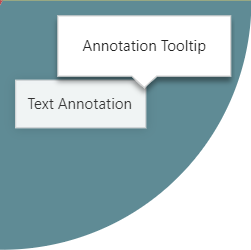
A tooltip is a miniature rectangle that appears when a user long-presses an annotation or hovers the mouse pointer over it.

The tooltip displays the contents of the description field or the text or markup returned from the customizeTooltip function. If the description is empty, and customizeTooltip returns nothing, the tooltip does not appear.
Tooltips for annotations and series points have the same appearance as specified in the tooltip object. You can use the annotation's customizeTooltip function to customize the annotation tooltip.
tooltipTemplate
Specifies a custom template for an annotation's tooltip.
The annotation's configuration object.
The tooltip's container. It is an HTML Element or a jQuery Element when you use jQuery.
type
Specifies whether the annotation displays text, an image, or a template. This is a required setting.
wordWrap
Specifies how to wrap the annotation's text if it does not fit into a single line.
The following modes are available:
"normal"
Text breaks only at allowed breakpoints (for example, a space between two words)."breakWord"
Words can be broken if there are no available breakpoints in the line."none"
Word wrap is disabled.
If the text overflows the container even after word wrap, the UI component applies the textOverflow property.
x
Used with y to position the annotation's center at a specific pixel coordinate. (0, 0) is the upper left corner of the UI component.

 Select one or more answers