JavaScript/jQuery TreeList - columnChooser
Configures the column chooser.
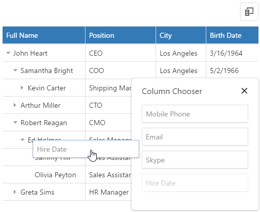
The column chooser allows a user to hide columns at runtime. To enable it, assign true to the columnChooser.enabled property.
See Also
- Column Chooser
- columns[].allowHiding
allowSearch
Use search.enabled instead.
Specifies whether searching is enabled in the column chooser.
container
Specifies a container in which the column chooser should be rendered.
Use this property if you need to change the element in which the column chooser is rendered. For example, if your component is inside the Popup, set this property to 'popup container'.
jQuery
$(function(){
    $("#treeList").dxTreeList({
        // ...
        columnChooser: {
            // ...
            container: "#popupContainer"
        },
    })
});
Angular
<dx-tree-list ... >
    <dxo-tree-list-column-chooser container="#popupContainer" >
    </dxo-tree-list-column-chooser>
</dx-tree-list>
Vue
<template>
    <DxTreeList ... >
        <DxColumnChooser container="#popupContainer" />
    </DxTreeList>
</template>

<script>
import 'devextreme/dist/css/dx.fluent.blue.light.css';
import DxTreeList, {
    DxColumnChooser
    // ...
} from 'devextreme-vue/tree-list';

export default {
    components: {
        DxTreeList,
        DxColumnChooser
    }
}
</script>
<template>
    <DxTreeList ... >
        <DxColumnChooser container="#popupContainer" />
    </DxTreeList>
</template>

<script setup>
import 'devextreme/dist/css/dx.fluent.blue.light.css';
import DxTreeList, {
    DxColumnChooser
    // ...
} from 'devextreme-vue/tree-list';

// ...
</script>
React
import React from 'react';
import 'devextreme/dist/css/dx.fluent.blue.light.css';

import TreeList, {
    ColumnChooser
    // ...
} from 'devextreme-react/data-grid';

export default function App() {
    return (
        <TreeList ... >
            <ColumnChooser container="#popupContainer" />
        </TreeList>
    );
}
emptyPanelText
Specifies text displayed by the column chooser when it is empty.
enabled
Specifies whether a user can open the column chooser.
When this property is set to true, a user can open the column chooser with a click on the "Column Chooser" icon. Otherwise, this icon is hidden, but you still can open the column chooser from code by calling the showColumnChooser() method.
mode
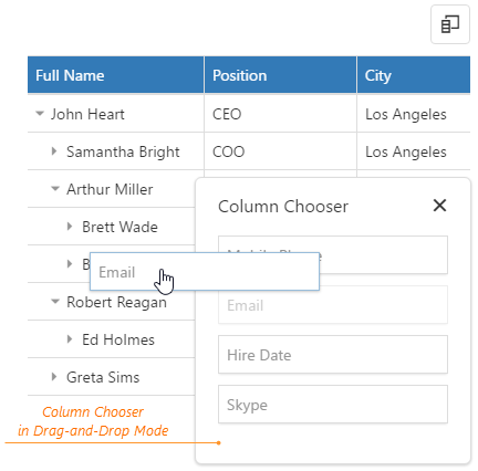
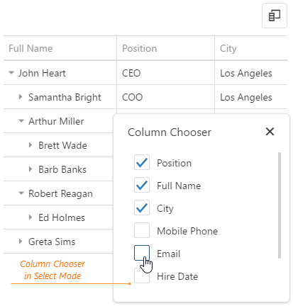
Specifies how a user manages columns using the column chooser.
In drag and drop mode, a user moves column headers to and from the column chooser by drag and drop. In select mode, the user selects column headers in the column chooser using check boxes. The select mode is designed primarily for touch-enabled devices. On mouse-equipped platforms, either mode is suitable.
position
Configures the column chooser's position.
You can specify the my, at, and of properties to position a column chooser. Set the position property to undefined to display the column chooser at the bottom right corner (default position).
jQuery
$(function(){
    $("#treeList").dxTreeList({
        // ...
        columnChooser: {
            // ...
            position: {
                my: "right top",
                at: "right bottom",
                of: ".dx-treelist-column-chooser-button"
            }
        },
    })
});
Angular
<dx-tree-list ... >
    <dxo-tree-list-column-chooser ... >
        <dxo-tree-list-position
            my="right top"
            at="right bottom"
            of=".dx-treelist-column-chooser-button">
        </dxo-tree-list-position>
    </dxo-tree-list-column-chooser>
</dx-tree-list>
import { Component } from '@angular/core';

@Component({
    selector: 'app-root',
    templateUrl: './app.component.html',
    styleUrls: ['./app.component.css']
})

export class AppComponent {}
import { BrowserModule } from '@angular/platform-browser';
import { NgModule } from '@angular/core';
import { AppComponent } from './app.component';
import { DxTreeListModule } from 'devextreme-angular';

@NgModule({
    declarations: [
        AppComponent
    ],
    imports: [
        BrowserModule,
        DxTreeListModule
    ],
    providers: [ ],
    bootstrap: [AppComponent]
})

export class AppModule { }
Vue
<template>
    <DxTreeList ... >
        <DxColumnChooser ... >
            <DxPosition
                my="right top"
                at="right bottom"
                of=".dx-treelist-column-chooser-button"
            />
        </DxColumnChooser>
    </DxTreeList>
</template>

<script>
import 'devextreme/dist/css/dx.fluent.blue.light.css';
import DxTreeList, {
    DxColumnChooser,
    DxPosition
    // ...
} from 'devextreme-vue/tree-list';

export default {
    components: {
        DxTreeList,
        DxColumnChooser,
        DxPosition
    }
}
</script>
<template>
    <DxTreeList ... >
        <DxColumnChooser ... >
            <DxPosition
                my="right top"
                at="right bottom"
                of=".dx-treelist-column-chooser-button"
            />
        </DxColumnChooser>
    </DxTreeList>
</template>

<script setup>
import 'devextreme/dist/css/dx.fluent.blue.light.css';
import DxTreeList, {
    DxColumnChooser,
    DxPosition
    // ...
} from 'devextreme-vue/tree-list';

// ...
</script>
React
import React from 'react';
import 'devextreme/dist/css/dx.fluent.blue.light.css';

import TreeList, {
    ColumnChooser,
    Position,
    // ...
} from 'devextreme-react/data-grid';

export default function App() {
    return (
        <TreeList ... >
            <ColumnChooser ... >
                <Position
                    my="right top"
                    at="right bottom"
                    of=".dx-treelist-column-chooser-button"
                />
            </ColumnChooser>
        </TreeList>
    );
} search
Configures the column chooser's search functionality.
jQuery
$(function(){
    $("#treeList").dxTreeList({
        // ...
        columnChooser: {
            // ...
            search: {
                editorOptions: {
                    placeholder: 'Search column',
                    mode: 'text'
                },
                enabled: true,
                timeout: 800
            },
        },
    })
});
Angular
<dx-tree-list ... >
    <dxo-tree-list-column-chooser ... >
        <dxo-tree-list-search
            [editorOptions]="searchEditorOptions"
            [enabled]="true"
            [timeout]="800"
        ></dxo-tree-list-search>
    </dxo-tree-list-column-chooser>
</dx-tree-list>
import { Component } from '@angular/core';

@Component({
    selector: 'app-root',
    templateUrl: './app.component.html',
    styleUrls: ['./app.component.css']
})

export class AppComponent {
    searchEditorOptions;
    constructor() {
        this.searchEditorOptions = {
            placeholder: 'Search column',
            mode: 'text'
        };
        // ...
    }
    // ...
}
import { BrowserModule } from '@angular/platform-browser';
import { NgModule } from '@angular/core';
import { AppComponent } from './app.component';
import { DxTreeListModule } from 'devextreme-angular';

@NgModule({
    declarations: [
        AppComponent
    ],
    imports: [
        BrowserModule,
        DxTreeListModule
    ],
    providers: [ ],
    bootstrap: [AppComponent]
})

export class AppModule { }
Vue
<template>
    <DxTreeList ... >
        <DxColumnChooser ... >
            <DxColumnChooserSearch
                :editor-options="searchEditorOptions"
                :enabled="true"
                :timeout="800"
            />
        </DxColumnChooser>
    </DxTreeList>
</template>

<script>
import 'devextreme/dist/css/dx.fluent.blue.light.css';
import DxTreeList, {
    DxColumnChooser,
    DxColumnChooserSearch,
    // ...
} from 'devextreme-vue/tree-list';

export default {
    components: {
        DxTreeList,
        DxColumnChooser,
        DxColumnChooserSearch,
    },
    data() {
        return {
            searchEditorOptions: {
                placeholder: 'Search column',
                mode: 'text'
            }
        };
    }
}
</script>
<template>
    <DxTreeList ... >
        <DxColumnChooser ... >
            <DxColumnChooserSearch
                :editor-options="searchEditorOptions"
                :enabled="true"
                :timeout="800"
            />
        </DxColumnChooser>
    </DxTreeList>
</template>

<script setup>
import 'devextreme/dist/css/dx.fluent.blue.light.css';
import DxTreeList, {
    DxColumnChooser,
    DxColumnChooserSearch,
    // ...
} from 'devextreme-vue/tree-list';

const searchEditorOptions = {
    placeholder: 'Search column',
    mode: 'text'
};

// ...
</script>
React
import React from 'react';
import 'devextreme/dist/css/dx.fluent.blue.light.css';

import TreeList, {
    ColumnChooser,
    ColumnChooserSearch,
    // ...
} from 'devextreme-react/data-grid';

const searchEditorOptions = {
    placeholder: 'Search column',
    mode: 'text'
};

export default function App() {
    return (
        <TreeList ... >
            <ColumnChooser ... >
                <ColumnChooserSearch
                    editorOptions={searchEditorOptions}
                    enabled={true}
                    timeout={800}
                />
            </ColumnChooser>
        </TreeList>
    );
}
searchTimeout
Use search.timeout instead.
Specifies a delay in milliseconds between when a user finishes typing in the column chooser's search panel, and when the search is executed.
sortOrder
Specifies the sort order of column headers.
If not set, the order is the same as in the columns[] array.

 Select one or more answers