React Diagram - contextToolbox

Configures the context toolbox's settings.

Type:

Object

Default Value: {}

View Demo

The context toolbox appears when you draw a connector from a shape and release it without it being connected to another shape. The toolbox allows you to create a shape at the end of the connector.
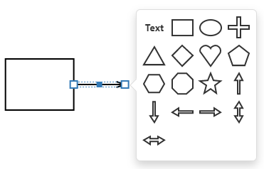
Diagram context toolbox

category

Specifies the category of shapes that are displayed in the context toolbox.

Type:

String

Accepted Values: 'general' | 'flowchart' | 'orgChart' | 'containers' | 'custom'

The category property is not in effect if the shapes property is specified.

displayMode

Specifies how shapes are displayed in the context toolbox.

Type:

String

Accepted Values: 'icons' | 'texts'

enabled

Specifies the context toolbox's availability.

Type:

Boolean

Default Value: true

shapeIconsPerRow

Specifies the number of shape icons in a row.

Type:

Number

Default Value: 4

shapes

Lists the shapes that are displayed in the context toolbox. The built-in shape types are shown in the Shape Types section.

Type:

Array<String>

|

Array<String>

Accepted Values: 'text' | 'rectangle' | 'ellipse' | 'cross' | 'triangle' | 'diamond' | 'heart' | 'pentagon' | 'hexagon' | 'octagon' | 'star' | 'arrowLeft' | 'arrowTop' | 'arrowRight' | 'arrowBottom' | 'arrowNorthSouth' | 'arrowEastWest' | 'process' | 'decision' | 'terminator' | 'predefinedProcess' | 'document' | 'multipleDocuments' | 'manualInput' | 'preparation' | 'data' | 'database' | 'hardDisk' | 'internalStorage' | 'paperTape' | 'manualOperation' | 'delay' | 'storedData' | 'display' | 'merge' | 'connector' | 'or' | 'summingJunction' | 'verticalContainer' | 'horizontalContainer' | 'cardWithImageOnLeft' | 'cardWithImageOnTop' | 'cardWithImageOnRight'

width

Specifies the context toolbox's width in pixels.

Type:

Number

Default Value: 152