React DateBox - Overview
DateBox is a UI component that allows users to enter or modify date and time values. The component ships with three entry modes that eliminate the need for separate date, time, and date/time selection components. DateBox supports date and time entry through built-in dropdown pickers, as well as in the component text field.
This overview highlights DateBox elements, key features, and what to explore next.
Elements
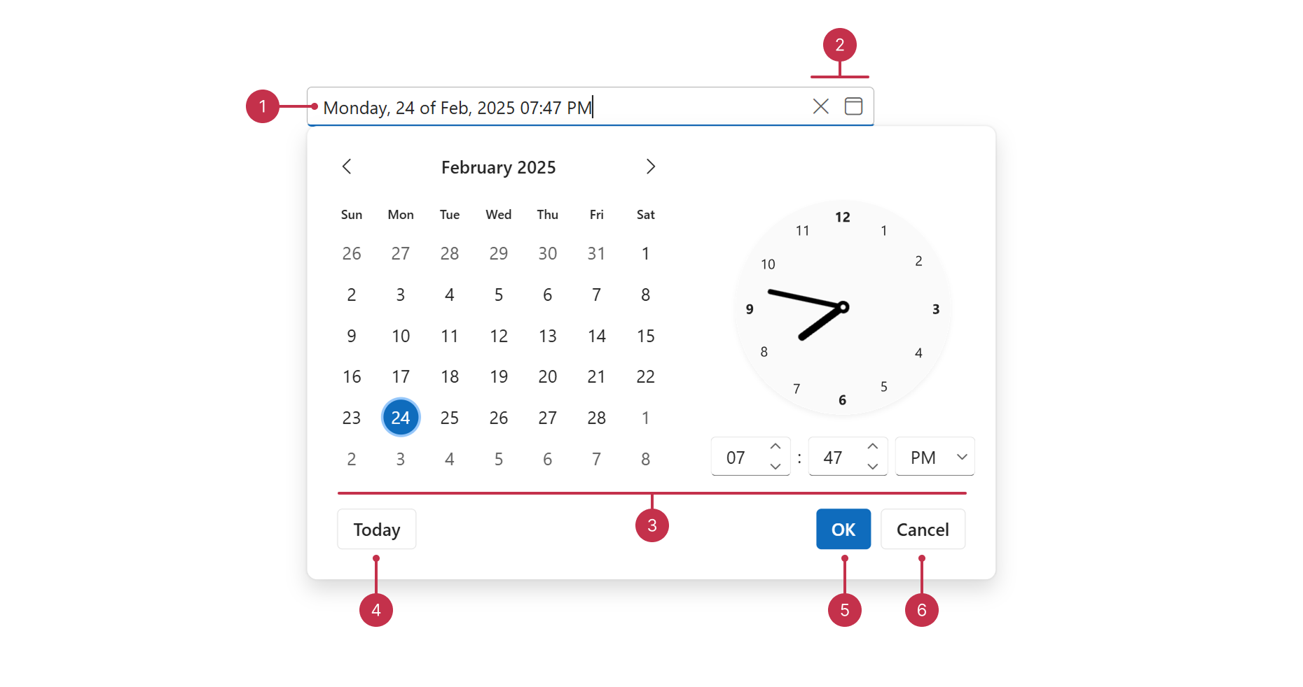
- Label ("outside" label mode)
- Value display format
- Drop-down button ("date" type)
- Label ("static" label mode)
- Clear button
- Drop-down button ("datetime" type)
- Placeholder
- Custom button
- Drop-down button ("time" type)
- Drop-down area ("date" type)
- Today button
- Drop-down area ("datetime" type)
- Apply button
- Cancel button
- Drop-down area ("time" type)
Key Features
DateBox Types
You can configure the DateBox type to integrate the component as a date, time, or date and time picker.Picker Configuration
DateBox supports multiple picker types, including calendar, list, and roller pickers. You can also implement native pickers that vary depending on the user's device and platforms.Formatting
The DateBox component automatically formats values based on your application locale. You can also specify display formats, including predefined, Intl, and custom formats.Masked Input
DateBox supports masked input. When enabled, the component allows users to input only characters supported by the DateBox display format.Configurable Date and Time Ranges
You can limit DateBox selection to a specific date and time range. For instance, you can specify a new Date object as the minimum to disable date and time values in the past.Disabled Dates
DateBox allows you to disable individual dates. You can implement this feature to disable days such as holidays.Drop-Down Calendar Configuration
You can customize DateBox Calendar options such as zoom level and week numbers.Validation
The DateBox component ships with data validation capabilities. You can implement custom logic to validate the component value and display a validation status. You can also validate DateBox values within a DevExtreme Form component.Adaptivity
You can enable adaptive rendering to adapt DateBox to small screens. In this mode, the component displays compact visual elements.Accessibility and Keyboard Navigation
DateBox conforms to WCAG 2.x, European Accessibility Act (EAA), and Americans with Disabilities Act (ADA) standards. The component supports keyboard navigation and custom key handlers. DateBox also ships with right-to-left (RTL) representation support.Customization
You can customize DateBox elements such as the text field and drop-down area. The component supports label and placeholder configration, as well as custom text field buttons.

 Select one or more answers