React Slider Props
An object defining configuration properties for the Slider UI component.
See Also
accessKey
Specifies the shortcut key that sets focus on the UI component.
The value of this property will be passed to the accesskey attribute of the HTML element that underlies the UI component.
activeStateEnabled
Specifies whether the UI component changes its visual state as a result of user interaction.
The UI component switches to the active state when users press down the primary mouse button. When this property is set to true, the CSS rules for the active state apply. You can change these rules to customize the component.
Use this property when you display the component on a platform whose guidelines include the active state change for UI components.
disabled
Specifies whether the UI component responds to user interaction.
elementAttr
Specifies the global attributes to be attached to the UI component's container element.
jQuery
$(function(){
    $("#sliderContainer").dxSlider({
        // ...
        elementAttr: {
            id: "elementId",
            class: "class-name"
        }
    });
});
Angular
<dx-slider ...
    [elementAttr]="{ id: 'elementId', class: 'class-name' }">
</dx-slider>
import { DxSliderModule } from "devextreme-angular";
// ...
export class AppComponent {
    // ...
}
@NgModule({
    imports: [
        // ...
        DxSliderModule
    ],
    // ...
})
Vue
<template>
    <DxSlider ...
        :element-attr="sliderAttributes">
    </DxSlider>
</template>

<script>
import DxSlider from 'devextreme-vue/slider';

export default {
    components: {
        DxSlider
    },
    data() {
        return {
            sliderAttributes: {
                id: 'elementId',
                class: 'class-name'
            }
        }
    }
}
</script>
React
import React from 'react';

import Slider from 'devextreme-react/slider';

class App extends React.Component {
    sliderAttributes = {
        id: 'elementId',
        class: 'class-name'
    }

    render() {
        return (
            <Slider ...
                elementAttr={this.sliderAttributes}>
            </Slider>
        );
    }
}
export default App;
focusStateEnabled
Specifies whether the UI component can be focused using keyboard navigation.
height
Specifies the UI component's height.
This property accepts a value of one of the following types:
Number
The height in pixels.String
A CSS-accepted measurement of height. For example,"55px","20vh","80%","inherit".
hint
Specifies text for a hint that appears when a user pauses on the UI component.
hoverStateEnabled
Specifies whether the UI component changes its state when a user pauses on it.
isDirty
Specifies whether the component's current value differs from the initial value.
This property is a read-only flag. You can use it to check if the editor value changed.
jQuery
$(() => {
    const slider = $('#slider').dxSlider({
        // ...
    }).dxSlider('instance');

    $('#button').dxButton({
        // ...
        onClick () {
            if (slider.option('isDirty')) {
                DevExpress.ui.notify("Do not forget to save changes", "warning", 500);
            }
        }
    });
});
Angular
import { Component, ViewChild } from '@angular/core';
import { DxSliderComponent, DxButtonModule } from 'devextreme-angular';
import notify from 'devextreme/ui/notify';

@Component({
    selector: 'app-root',
    templateUrl: './app.component.html',
    styleUrls: ['./app.component.css']
})
export class AppComponent {
    @ViewChild('sliderRef', { static: false }) slider: DxSliderComponent;

    onClick () {
        if (this.slider.instance.option('isDirty')) {
            notify("Do not forget to save changes", "warning", 500);
        }
    }
}
<dx-slider ...
    #sliderRef
>
</dx-slider>
<dx-button ...
    (onClick)="onClick($event)"
>
</dx-button>
Vue
<template>
    <DxSlider ...
        :ref="sliderRef"
    >
    </DxSlider>
    <DxButton ...
        @click="onClick"
    />
</template>

<script>
import 'devextreme/dist/css/dx.fluent.blue.light.css';
import DxSlider from 'devextreme-vue/slider';
import DxButton from 'devextreme-vue/button';
import notify from 'devextreme/ui/notify';

export default {
    components: {
        DxSlider,
        DxButton
    },

    data() {
        return {
            sliderRef
        }
    },

    methods: {
        onClick () {
            if (this.slider.option('isDirty')) {
                notify("Do not forget to save changes", "warning", 500);
            }
        }
    },

    computed: {
        slider: function() {
            return this.$refs[sliderRef].instance;
        }
    }
}
</script>
React
import React, { useRef } from 'react';
import Slider from 'devextreme-react/slider';
import Button from 'devextreme-react/button';
import 'devextreme/dist/css/dx.fluent.blue.light.css';

const App = () => {
    const sliderRef = useRef(null);

    const onClick = () => {
        if (this.sliderRef.current.instance().option('isDirty')) {
            notify("Do not forget to save changes", "warning", 500);
        }
    };

    return (
        <Slider ...
            ref={sliderRef}
        >
        </Slider>
        <Button ...
            onClick={onClick}
        />
    );
};

export default App;
See Also
isValid
Specifies or indicates whether the editor's value is valid.
See Also
keyStep
Specifies the step by which a handle moves when a user presses Page Up or Page Down.
name
The value to be assigned to the name attribute of the underlying HTML element.
Specify this property if the UI component lies within an HTML form that will be submitted.
onContentReady
A function that is executed when the UI component is rendered and each time the component is repainted.
Information about the event.
| Name | Type | Description |
|---|---|---|
| element |
The UI component's container. It is an HTML Element or a jQuery Element when you use jQuery. |
|
| component |
The UI component's instance. |
onDisposing
A function that is executed before the UI component is disposed of.
Information about the event.
| Name | Type | Description |
|---|---|---|
| element |
The UI component's container. It is an HTML Element or a jQuery Element when you use jQuery. |
|
| component |
The UI component's instance. |
onInitialized
A function used in JavaScript frameworks to save the UI component instance.
Information about the event.
| Name | Type | Description |
|---|---|---|
| element |
The UI component's container. It is an HTML Element or a jQuery Element when you use jQuery. |
|
| component |
The UI component's instance. |
Angular
<dx-slider ...
    (onInitialized)="saveInstance($event)">
</dx-slider>
import { Component } from "@angular/core";
import Slider from "devextreme/ui/data_grid";
// ...
export class AppComponent {
    sliderInstance: Slider;
    saveInstance (e) {
        this.sliderInstance = e.component;
    }
}
Vue
<template>
    <div>
        <DxSlider ...
            @initialized="saveInstance">
        </DxSlider>
    </div>
</template>

<script>
import DxSlider from 'devextreme-vue/slider';

export default {
    components: {
        DxSlider
    },
    data: function() {
        return {
            sliderInstance: null
        };
    },
    methods: {
        saveInstance: function(e) {
            this.sliderInstance = e.component;
        }
    }
};
</script>
<template>
    <div>
        <DxSlider ...
            @initialized="saveInstance">
        </DxSlider>
    </div>
</template>

<script setup>
import DxSlider from 'devextreme-vue/slider';

let sliderInstance = null;

const saveInstance = (e) => {
    sliderInstance = e.component;
}
</script>
React
import Slider from 'devextreme-react/slider';

class App extends React.Component {
    constructor(props) {
        super(props);

        this.saveInstance = this.saveInstance.bind(this);
    }

    saveInstance(e) {
        this.sliderInstance = e.component;
    }

    render() {
        return (
            <div>
                <Slider onInitialized={this.saveInstance} />
            </div>
        );
    }
}
See Also
onOptionChanged
A function that is executed after a UI component property is changed.
Information about the event.
| Name | Type | Description |
|---|---|---|
| value | any |
The modified property's new value. |
| previousValue | any |
The UI component's previous value. |
| name |
The modified property if it belongs to the first level. Otherwise, the first-level property it is nested into. |
|
| fullName |
The path to the modified property that includes all parent properties. |
|
| element |
The UI component's container. It is an HTML Element or a jQuery Element when you use jQuery. |
|
| component |
The UI component's instance. |
The following example shows how to subscribe to component property changes:
jQuery
$(function() {
    $("#sliderContainer").dxSlider({
        // ...
        onOptionChanged: function(e) {
            if(e.name === "changedProperty") {
                // handle the property change here
            }
        }
    });
});
Angular
<dx-slider ...
    (onOptionChanged)="handlePropertyChange($event)">
</dx-slider>
import { Component } from '@angular/core';

@Component({
    selector: 'app-root',
    templateUrl: './app.component.html',
    styleUrls: ['./app.component.css']
})

export class AppComponent {
    // ...
    handlePropertyChange(e) {
        if(e.name === "changedProperty") {
            // handle the property change here
        }
    }
}
import { BrowserModule } from '@angular/platform-browser';
import { NgModule } from '@angular/core';
import { AppComponent } from './app.component';
import { DxSliderModule } from 'devextreme-angular';

@NgModule({
    declarations: [
        AppComponent
    ],
    imports: [
        BrowserModule,
        DxSliderModule
    ],
    providers: [ ],
    bootstrap: [AppComponent]
})

export class AppModule { }
Vue
<template>
    <DxSlider ...
        @option-changed="handlePropertyChange"
    />
</template>

<script>
import 'devextreme/dist/css/dx.fluent.blue.light.css';
import DxSlider from 'devextreme-vue/slider';

export default {
    components: {
        DxSlider
    },
    // ...
    methods: {
        handlePropertyChange: function(e) {
            if(e.name === "changedProperty") {
                // handle the property change here
            }
        }
    }
}
</script>
React
import React from 'react';
import 'devextreme/dist/css/dx.fluent.blue.light.css';

import Slider from 'devextreme-react/slider';

const handlePropertyChange = (e) => {
    if(e.name === "changedProperty") {
        // handle the property change here
    }
}

export default function App() {
    return (
        <Slider ...
            onOptionChanged={handlePropertyChange}
        />
    );
}
onValueChanged
A function that is executed after the UI component's value is changed.
Information about the event.
| Name | Type | Description |
|---|---|---|
| value |
The UI component's new value. |
|
| previousValue |
The UI component's previous value. |
|
| event | Event (jQuery or EventObject) |
The event that caused the function to execute. It is an EventObject or a jQuery.Event when you use jQuery. This field is undefined if the value is changed programmatically. |
| element |
The UI component's container. It is an HTML Element or a jQuery Element when you use jQuery. |
|
| component |
The UI component's instance. |
rtlEnabled
Switches the UI component to a right-to-left representation.
When this property is set to true, the UI component text flows from right to left, and the layout of elements is reversed. To switch the entire application/site to the right-to-left representation, assign true to the rtlEnabled field of the object passed to the DevExpress.config(config) method.
DevExpress.config({
    rtlEnabled: true
});step
Specifies the step by which the UI component's value changes when a user drags a handler.
tabIndex
Specifies the number of the element when the Tab key is used for navigating.
The value of this property will be passed to the tabindex attribute of the HTML element that underlies the UI component.
validationError
Information on the broken validation rule. Contains the first item from the validationErrors array.
See Also
validationErrors
An array of validation errors.
Array<any>
Slider updates this property automatically as it validates values. You can also update validationErrors manually to display custom errors and implement custom validation logic. The following code snippet demonstrates how to define items in this array:
jQuery
$('#slider').dxSlider({
    isValid: false,
    validationErrors: [{ message: "Custom validation error" }],
})
Angular
<dx-slider
    [isValid]="false"
    [validationErrors]="validationErrors"
></dx-slider>
import { DxSliderComponent } from 'devextreme-angular/ui/slider'

export class AppComponent {
    validationErrors = [
        { message: 'Custom validation error' }
    ];
}
Vue
<script setup lang="ts">
import { DxSlider } from 'devextreme-vue/slider';

const validationErrors = [
    { message: 'Custom validation error' }
];
</script>

<template>
    <DxSlider
        :is-valid="false"
        :validation-errors="validationErrors"
    />
</template>
React
import { Slider } from 'devextreme-react/slider';

const validationErrors = [
    { message: 'Custom validation error' }
];

function App(): JSX.Element {
    return (
        <Slider
            isValid={false}
            validationErrors={validationErrors}
        />
    )
}
validationMessageMode
Specifies how the message about the validation rules that are not satisfied by this editor's value is displayed.
The following property values are possible:
- auto
The tooltip with the message is displayed when the editor is in focus. - always
The tooltip with the message is not hidden when the editor loses focus.
validationMessagePosition
Specifies the position of a validation message relative to the component. The validation message describes the validation rules that this component's value does not satisfy.
The following example positions a validation message at the component's right:
jQuery
$(function() {
    $("#sliderContainer").dxSlider({
        // ...
        validationMessagePosition: 'right'
    }).dxValidator({
        validationRules: [{
            type: 'required',
            message: 'Required',
        }],
    });
});
Angular
<dx-slider ...
    validationMessagePosition="right">
    <dx-validator>
        <dxi-validator-validation-rule
            type="required"
            message="Required"
        >
        </dxi-validator-validation-rule>
    </dx-validator>
</dx-slider>
Vue
<template>
    <DxSlider ...
        validation-message-position="right"
    >
        <DxValidator>
            <DxRequiredRule message="Required" />
        </DxValidator>
    </DxSlider>
</template>

<script>
    // ...
</script>
React
import React from 'react';
// ...
function App() {
return (
<Slider ...
validationMessagePosition="right"
>
<Validator>
<RequiredRule message="Required" />
</Validator>
</Slider>
);
};
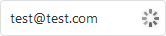
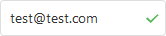
export default App;validationStatus
Indicates or specifies the current validation status.
The following table illustrates the validation status indicators:
| validationStatus | Indicator |
|---|---|
"pending" |
 |
"valid" |
 |
"invalid" |
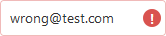 |
When you assign "invalid" to validationStatus, you can also use the validationErrors array to set an error message as shown below:
jQuery
$(function() {
    const slider = $("#sliderContainer").dxSlider({
        // ...
    }).dxSlider("instance");

    function setInvalidStatus(message) {
        slider.option({
            validationStatus: "invalid",
            validationErrors: [{ message: message }]
        });
    }
});
Angular
<dx-slider
    [validationStatus]="validationStatus"
    [validationErrors]="validationErrors">
</dx-slider>
// ...
export class AppComponent {
    validationStatus: string = "valid";
    validationErrors: any;
    // ...
    setInvalidStatus(message) {
        this.validationStatus = "invalid";
        this.validationErrors = [{ message: message }];
    }
}
Vue
<template>
    <DxSlider ...
        :validation-status="validationStatus"
        :validation-errors="validationErrors"
    />
</template>

<script>
    // ...
    export default {
        // ...
        data() {
            return {
                validationStatus: "valid",
                validationErrors: []
            }
        },
        methods: {
            setInvalidStatus(message) {
                this.validationStatus = "invalid";
                this.validationErrors = [{ message: message }];
            }
        }
    }
</script>
React
import React, { useState } from 'react';
// ...

function App() {
    const [validationStatus, setValidationStatus] = useState("valid");
    const [validationErrors, setValidationErrors] = useState([]);

    const setInvalidStatus = message => {
        setValidationStatus("invalid");
        setValidationErrors([{ message: message }]);
    }

    return (
        <Slider
            validationStatus={validationStatus}
            validationErrors={validationErrors}
        />
    );

};
export default App;valueChangeMode
Specifies when to change the component's value.
If you want to change the component's value after a user releases the component's handle, set this property to onHandleRelease. The moment when the onValueChanged function is called depends on this property:
jQuery
$(function() {
    $("#sliderContainer").dxSlider({
        // ...
        valueChangeMode: 'onHandleRelease',
        onValueChanged: function (e) {
            const previousValue = e.previousValue;
            const newValue = e.value;
            // Event handling commands go here
        }
    });
});
Angular
<dx-slider
    [(value)]="value"
    valueChangeMode="onHandleRelease"
    (onValueChanged)="handleValueChange($event)">
</dx-slider>
import { Component } from '@angular/core';

@Component({
    selector: 'app-root',
    templateUrl: './app.component.html',
    styleUrls: ['./app.component.css']
})

export class AppComponent {
    value = 25;

    handleValueChange (e) {
        const previousValue = e.previousValue;
        const newValue = e.value;
        // Event handling commands go here
    };
}
import { BrowserModule } from '@angular/platform-browser';
import { NgModule } from '@angular/core';
import { AppComponent } from './app.component';

import { DxSliderModule } from 'devextreme-angular';

@NgModule({
    declarations: [
        AppComponent
    ],
    imports: [
        BrowserModule,
        DxSliderModule
    ],
    providers: [ ],
    bootstrap: [AppComponent]
})
export class AppModule { }
Vue
<template>
    <DxSlider
        v-model:value="value"
        value-change-mode="onHandleRelease"
        @value-changed="handleValueChange"
    />
</template>

<script>
import 'devextreme/dist/css/dx.fluent.blue.light.css';

import { DxSlider } from 'devextreme-vue/slider';

export default {
    components: {
        DxSlider
    },
    data() {
        return {
            value: 25
        };
    },
    methods: {
        handleValueChange(e) {
            const previousValue = e.previousValue;
            const newValue = e.value;
            // Event handling commands go here
        }
    }
}
</script>
React
import React, { useState, useCallback } from 'react';
import 'devextreme/dist/css/dx.fluent.blue.light.css';

import { Slider } from 'devextreme-react/slider';

function App () {
    const [value, setValue] = useState(25);

    const handleValueChange = useCallback((e) => {
        const previousValue = e.previousValue;
        const newValue = e.value;
        // Event handling commands go here
        setValue(newValue);
    }, [value]);

    render() {
        return (
            <Slider
                value={value}
                valueChangeMode="onHandleRelease"
                onValueChanged={handleValueChange}
            />
        );
    }
}

export default App;
 Select one or more answers