React Splitter Props
An object that defines configuration properties for the Splitter UI component.
See Also
allowKeyboardNavigation
Specifies whether to allow the Splitter to take focus and allow keyboard navigation.
dataSource
Binds the UI component to data.
Splitter works with collections of objects.
Depending on your data source, bind Splitter to data as follows.
Data Array
Assign the array to the dataSource option.Read-Only Data in JSON Format
Set the dataSource property to the URL of a JSON file or service that returns JSON data.OData
Implement an ODataStore.Web API, PHP, MongoDB
Use one of the following extensions to enable the server to process data according to the protocol DevExtreme UI components use:Then, use the createStore method to configure access to the server on the client as shown below. This method is part of DevExtreme.AspNet.Data.
jQuery
JavaScript$(function() { let serviceUrl = "https://url/to/my/service"; $("#splitterContainer").dxSplitter({ // ... dataSource: DevExpress.data.AspNet.createStore({ key: "ID", loadUrl: serviceUrl + "/GetAction", insertUrl: serviceUrl + "/InsertAction", updateUrl: serviceUrl + "/UpdateAction", deleteUrl: serviceUrl + "/DeleteAction" }) }) });Angular
app.component.tsapp.component.htmlapp.module.tsimport { Component } from '@angular/core'; import CustomStore from 'devextreme/data/custom_store'; import { createStore } from 'devextreme-aspnet-data-nojquery'; @Component({ selector: 'app-root', templateUrl: './app.component.html', styleUrls: ['./app.component.css'] }) export class AppComponent { store: CustomStore; constructor() { let serviceUrl = "https://url/to/my/service"; this.store = createStore({ key: "ID", loadUrl: serviceUrl + "/GetAction", insertUrl: serviceUrl + "/InsertAction", updateUrl: serviceUrl + "/UpdateAction", deleteUrl: serviceUrl + "/DeleteAction" }) } }<dx-splitter ... [dataSource]="store"> </dx-splitter>import { BrowserModule } from '@angular/platform-browser'; import { NgModule } from '@angular/core'; import { AppComponent } from './app.component'; import { DxSplitterModule } from 'devextreme-angular'; @NgModule({ declarations: [ AppComponent ], imports: [ BrowserModule, DxSplitterModule ], providers: [], bootstrap: [AppComponent] }) export class AppModule { }Vue
App.vue<template> <DxSplitter ... :data-source="store" /> </template> <script> import 'devextreme/dist/css/dx.light.css'; import CustomStore from 'devextreme/data/custom_store'; import { createStore } from 'devextreme-aspnet-data-nojquery'; import { DxSplitter } from 'devextreme-vue/splitter'; export default { components: { DxSplitter }, data() { const serviceUrl = "https://url/to/my/service"; const store = createStore({ key: "ID", loadUrl: serviceUrl + "/GetAction", insertUrl: serviceUrl + "/InsertAction", updateUrl: serviceUrl + "/UpdateAction", deleteUrl: serviceUrl + "/DeleteAction" }); return { store } } } </script>React
App.jsimport React from 'react'; import 'devextreme/dist/css/dx.light.css'; import CustomStore from 'devextreme/data/custom_store'; import { createStore } from 'devextreme-aspnet-data-nojquery'; import Splitter from 'devextreme-react/splitter'; const serviceUrl = "https://url/to/my/service"; const store = createStore({ key: "ID", loadUrl: serviceUrl + "/GetAction", insertUrl: serviceUrl + "/InsertAction", updateUrl: serviceUrl + "/UpdateAction", deleteUrl: serviceUrl + "/DeleteAction" }); class App extends React.Component { render() { return ( <Splitter ... dataSource={store} /> ); } } export default App;Any other data source
Implement a CustomStore.
Regardless of the data source on the input, the Splitter always wraps it in the DataSource object. This object allows you to sort, filter, group, and perform other data shaping operations. To get its instance, call the getDataSource() method.
Review the following notes about data binding:
Do not specify the items property if you specified the dataSource, and vice versa.
Field names cannot be equal to
thisand should not contain the following characters:.,:,[, and].Splitter does not execute dataSource.sort functions. To implement custom sorting logic, implement columns[].calculateSortValue.
jQuery
- The stores are immutable. You cannot change their configurations at runtime. Instead, create a new store or DataSource and assign it to the dataSource property as shown in the following help topic: Get and Set Properties.
Angular
- The stores are immutable. You cannot change their configurations at runtime. Instead, create a new store or DataSource and assign it to the dataSource property as shown in the following help topic: Two-Way Property Binding.
Vue
- The stores are immutable. You cannot change their configurations at runtime. Instead, create a new store or DataSource and assign it to the dataSource property as shown in the following help topic: Two-Way Property Binding.
React
- The stores are immutable. You cannot change their configurations at runtime. Instead, create a new store or DataSource and assign it to the dataSource property as shown in the following help topic: Controlled Mode.
disabled
Specifies whether the UI component responds to user interaction.
elementAttr
Specifies the global attributes to be attached to the UI component's container element.
jQuery
$(function(){
    $("#splitterContainer").dxSplitter({
        // ...
        elementAttr: {
            id: "elementId",
            class: "class-name"
        }
    });
});
Angular
<dx-splitter ...
    [elementAttr]="{ id: 'elementId', class: 'class-name' }">
</dx-splitter>
import { DxSplitterModule } from "devextreme-angular";
// ...
export class AppComponent {
    // ...
}
@NgModule({
    imports: [
        // ...
        DxSplitterModule
    ],
    // ...
})
Vue
<template>
    <DxSplitter ...
        :element-attr="splitterAttributes">
    </DxSplitter>
</template>

<script>
import DxSplitter from 'devextreme-vue/splitter';

export default {
    components: {
        DxSplitter
    },
    data() {
        return {
            splitterAttributes: {
                id: 'elementId',
                class: 'class-name'
            }
        }
    }
}
</script>
React
import React from 'react';

import Splitter from 'devextreme-react/splitter';

class App extends React.Component {
    splitterAttributes = {
        id: 'elementId',
        class: 'class-name'
    }

    render() {
        return (
            <Splitter ...
                elementAttr={this.splitterAttributes}>
            </Splitter>
        );
    }
}
export default App;
height
Specifies the UI component's height.
This property accepts a value of one of the following types:
Number
The height in pixels.String
A CSS-accepted measurement of height. For example,"55px","20vh","80%","inherit".
hoverStateEnabled
Specifies whether the UI component changes its state when a user pauses on it.
itemComponent
An alias for the itemTemplate property specified in React. Accepts a custom component. Refer to Using a Custom Component for more information.
itemRender
An alias for the itemTemplate property specified in React. Accepts a rendering function. Refer to Using a Rendering Function for more information.
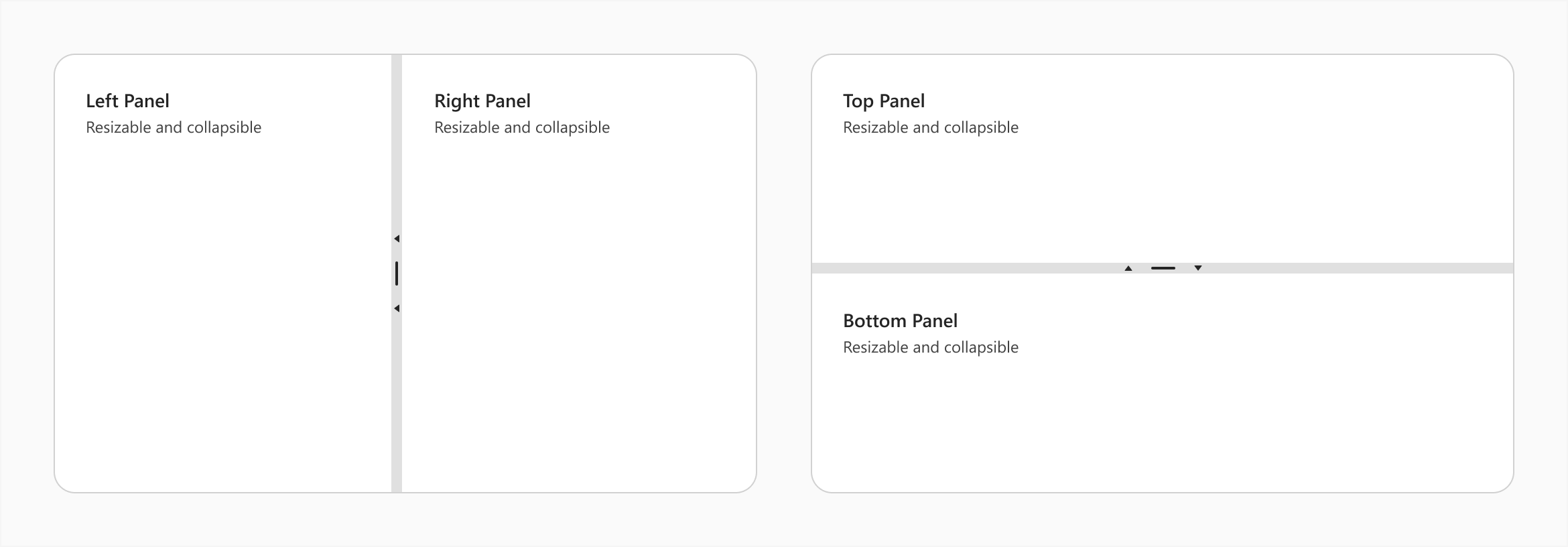
items[]
An array of items (panes) displayed by the UI component.
The items array can contain:
- Objects with fields described in this section.
- Objects with any other fields. In this case, specify the itemTemplate.
As an alternative to items, you can use the dataSource property. It accepts the DataSource object, whose underlying stores supply an API that allows you to update individual items without reassigning the entire item collection.
itemTemplate
Specifies a custom template for items.
The following code snippet demonstrates itemTemplate usage. Panes have random background colors, and their content includes an order number.
jQuery
$(() => {
    $("#splitter").dxSplitter({
        items: [
            // ...
        ],
        itemTemplate: function (data, index, element) {
            let randomColor = "#" + Math.floor(Math.random()*16777215).toString(16);
            $(element).css('background-color', randomColor);
            return index + 1;
        }
    });
});
Angular
<dx-splitter itemTemplate="item">
    <dxi-splitter-item ...></dxi-splitter-item>
    <dxi-splitter-item ...></dxi-splitter-item>
    <div
        *dxTemplate="let data of 'item'; let index = index"
        [style.background-color]="getRandomColor()"
    >
        {{index + 1}}
    </div>
</dx-splitter>
export class AppComponent {
    constructor() {
        // ...
    }

    getRandomColor() {
        return "#" + Math.floor(Math.random() * 16777215).toString(16);
    }
}
Vue
<template>
    <DxSplitter item-template="item">
        <DxItem ... />
        <DxItem ... />
        <template #item="{ data, index }">
            <div :style="{ backgroundColor: getRandomColor() }">{{ index + 1 }}</div>
        </template>
    </DxSplitter>
</template>

<script setup>
import { DxSplitter, DxItem } from "devextreme-vue/splitter";
const getRandomColor = () => {
    return "#" + Math.floor(Math.random() * 16777215).toString(16);
};
</script>
React
import React from "react";
import Splitter, { Item } from "devextreme-react/splitter";

const itemRender = (data, index) => {
    return (
        <div style={{ backgroundColor: getRandomColor(), height: "100%" }}>
            {index + 1}
        </div>
    );
};

const getRandomColor = () => {
    return "#" + Math.floor(Math.random() * 16777215).toString(16);
};

const App = () => (
    <React.Fragment>
        <Splitter itemRender={itemRender}>
            <Item ... />
            <Item ... />
        </Splitter>
    </React.Fragment>
);

export default App;
See Also
onContentReady
A function that is executed when the UI component is rendered and each time the component is repainted.
Information about the event.
| Name | Type | Description |
|---|---|---|
| element |
The UI component's container. It is an HTML Element or a jQuery Element when you use jQuery. |
|
| component | Splitter |
The UI component's instance. |
onDisposing
A function that is executed before the UI component is disposed of.
Information about the event.
| Name | Type | Description |
|---|---|---|
| element |
The UI component's container. It is an HTML Element or a jQuery Element when you use jQuery. |
|
| component | Splitter |
The UI component's instance. |
onInitialized
A function used to save the UI component instance.
Information about the event.
| Name | Type | Description |
|---|---|---|
| element |
The UI component's container. It is an HTML Element or a jQuery Element when you use jQuery. |
|
| component | Splitter |
The UI component's instance. |
Angular
<dx-splitter ...
    (onInitialized)="saveInstance($event)">
</dx-splitter>
import { Component } from "@angular/core";
import Splitter from "devextreme/ui/data_grid";
// ...
export class AppComponent {
    splitterInstance: Splitter;
    saveInstance (e) {
        this.splitterInstance = e.component;
    }
}
Vue
<template>
    <div>
        <DxSplitter ...
            @initialized="saveInstance">
        </DxSplitter>
    </div>
</template>

<script>
import DxSplitter from 'devextreme-vue/splitter';

export default {
    components: {
        DxSplitter
    },
    data: function() {
        return {
            splitterInstance: null
        };
    },
    methods: {
        saveInstance: function(e) {
            this.splitterInstance = e.component;
        }
    }
};
</script>
<template>
    <div>
        <DxSplitter ...
            @initialized="saveInstance">
        </DxSplitter>
    </div>
</template>

<script setup>
import DxSplitter from 'devextreme-vue/splitter';

let splitterInstance = null;

const saveInstance = (e) => {
    splitterInstance = e.component;
}
</script>
React
import Splitter from 'devextreme-react/splitter';

class App extends React.Component {
    constructor(props) {
        super(props);

        this.saveInstance = this.saveInstance.bind(this);
    }

    saveInstance(e) {
        this.splitterInstance = e.component;
    }

    render() {
        return (
            <div>
                <Splitter onInitialized={this.saveInstance} />
            </div>
        );
    }
}
See Also
onItemClick
A function that is executed when an item (pane) is clicked or tapped.
Information about the event.
| Name | Type | Description |
|---|---|---|
| itemIndex |
The clicked item's index. |
|
| itemElement |
The item's container. It is an HTML Element or a jQuery Element when you use jQuery. |
|
| itemData |
The clicked item's data. |
|
| event | Event (jQuery or EventObject) |
The event that caused the function to execute. It is an EventObject or a jQuery.Event when you use jQuery. |
| element |
The UI component's container. |
|
| component | Splitter |
The UI component's instance. |
onItemCollapsed
A function that is executed after an item (pane) is collapsed.
Information about the event.
| Name | Type | Description |
|---|---|---|
| component | Splitter |
The UI component's instance. |
| element |
The UI component's container. |
|
| event | Event (jQuery or EventObject) |
The event that caused the function to execute. It is an EventObject or a jQuery.Event when you use jQuery. |
| itemData |
The collapsed item's data. |
|
| itemElement |
The item's container. It is an HTML Element or a jQuery Element when you use jQuery. |
|
| itemIndex |
The collapsed item's index. |
onItemContextMenu
A function that is executed when an item (pane) is right-clicked or pressed.
Information about the event.
| Name | Type | Description |
|---|---|---|
| itemIndex |
The item's index. |
|
| itemElement |
The item's container. It is an HTML Element or a jQuery Element when you use jQuery. |
|
| itemData |
The item's data. |
|
| event | Event (jQuery or EventObject) |
The event that caused the function to execute. It is an EventObject or a jQuery.Event when you use jQuery. |
| element |
The UI component's container. It is an HTML Element or a jQuery Element when you use jQuery. |
|
| component | Splitter |
The UI component's instance. |
onItemExpanded
A function that is executed after an item (pane) is expanded.
Information about the event.
| Name | Type | Description |
|---|---|---|
| component | Splitter |
The UI component's instance. |
| element |
The UI component's container. |
|
| event | Event (jQuery or EventObject) |
The event that caused the function to execute. It is an EventObject or a jQuery.Event when you use jQuery. |
| itemData |
The expanded item's data. |
|
| itemElement |
The item's container. It is an HTML Element or a jQuery Element when you use jQuery. |
|
| itemIndex |
The expanded item's index. |
onItemRendered
A function that is executed after an item (pane) is rendered.
Information about the event.
| Name | Type | Description |
|---|---|---|
| itemIndex |
The rendered item's index. |
|
| itemElement |
The item's container. It is an HTML Element or a jQuery Element when you use jQuery. |
|
| itemData |
The rendered item's data. |
|
| element |
The UI component's container. |
|
| component | Splitter |
The UI component's instance. |
onOptionChanged
A function that is executed after a UI component property is changed.
Information about the event.
| Name | Type | Description |
|---|---|---|
| value | any |
The modified property's new value. |
| previousValue | any |
The UI component's previous value. |
| name |
The modified property if it belongs to the first level. Otherwise, the first-level property it is nested into. |
|
| fullName |
The path to the modified property that includes all parent properties. |
|
| element |
The UI component's container. It is an HTML Element or a jQuery Element when you use jQuery. |
|
| component | Splitter |
The UI component's instance. |
The following code snippet shows how to subscribe to component property changes:
jQuery
$(function() {
    $("#splitterContainer").dxSplitter({
        // ...
        onOptionChanged: function(e) {
            if(e.name === "changedProperty") {
                // handle the property change here
            }
        }
    });
});
Angular
<dx-splitter ...
    (onOptionChanged)="handlePropertyChange($event)">
</dx-splitter>
import { Component } from '@angular/core';

@Component({
    selector: 'app-root',
    templateUrl: './app.component.html',
    styleUrls: ['./app.component.css']
})

export class AppComponent {
    // ...
    handlePropertyChange(e) {
        if(e.name === "changedProperty") {
            // handle the property change here
        }
    }
}
import { BrowserModule } from '@angular/platform-browser';
import { NgModule } from '@angular/core';
import { AppComponent } from './app.component';
import { DxSplitterModule } from 'devextreme-angular';

@NgModule({
    declarations: [
        AppComponent
    ],
    imports: [
        BrowserModule,
        DxSplitterModule
    ],
    providers: [ ],
    bootstrap: [AppComponent]
})

export class AppModule { }
Vue
<template>
    <DxSplitter ...
        @option-changed="handlePropertyChange"
    />
</template>

<script>
import 'devextreme/dist/css/dx.light.css';
import DxSplitter from 'devextreme-vue/splitter';

export default {
    components: {
        DxSplitter
    },
    // ...
    methods: {
        handlePropertyChange: function(e) {
            if(e.name === "changedProperty") {
                // handle the property change here
            }
        }
    }
}
</script>
React
import React from 'react';
import 'devextreme/dist/css/dx.light.css';

import Splitter from 'devextreme-react/splitter';

const handlePropertyChange = (e) => {
    if(e.name === "changedProperty") {
        // handle the property change here
    }
}

export default function App() {
    return (
        <Splitter ...
            onOptionChanged={handlePropertyChange}
        />
    );
}
onResize
A function that is executed each time an item (pane) is resized by one pixel.
Information about the event.
| Name | Type | Description |
|---|---|---|
| cancel |
Allows you to cancel the resize operation. |
|
| component | Splitter |
The UI component's instance. |
| element |
The UI component's container. It is an HTML Element or a jQuery Element when you use jQuery. |
|
| event | Event (jQuery or EventObject) |
The event that caused the function to execute. It is an EventObject or a jQuery.Event when you use jQuery. |
| handleElement |
A resize handle element. |
onResizeEnd
A function that is called when resizing ends.
Information about the event.
| Name | Type | Description |
|---|---|---|
| component | Splitter |
The UI component's instance. |
| element |
The UI component's container. It is an HTML Element or a jQuery Element when you use jQuery. |
|
| event | Event (jQuery or EventObject) |
The event that caused the function to execute. It is an EventObject or a jQuery.Event when you use jQuery. |
| handleElement |
A resize handle element. |
onResizeStart
A function that is called when resizing starts.
Information about the event.
| Name | Type | Description |
|---|---|---|
| cancel |
Allows you to cancel resize operation. |
|
| component | Splitter |
The UI component's instance. |
| element |
The UI component's container. It is an HTML Element or a jQuery Element when you use jQuery. |
|
| event | Event (jQuery or EventObject) |
The event that caused the function to execute. It is an EventObject or a jQuery.Event when you use jQuery. |
| handleElement |
A resize handle element. |
rtlEnabled
Switches the UI component to a right-to-left representation.
When this property is set to true, the UI component text flows from right to left, and the layout of elements is reversed. To switch the entire application/site to the right-to-left representation, assign true to the rtlEnabled field of the object passed to the DevExpress.config(config) method.
DevExpress.config({
    rtlEnabled: true
});
 Select one or more answers