React Splitter - items
An array of items (panes) displayed by the UI component.
Array<dxSplitterItem>
The items array can contain:
- Objects with fields described in this section.
- Objects with any other fields. In this case, specify the itemTemplate.
As an alternative to items, you can use the dataSource property. It accepts the DataSource object, whose underlying stores supply an API that allows you to update individual items without reassigning the entire item collection.
collapsed
Specifies whether an item (pane) is initially collapsed.
collapsedSize
Specifies the size of a collapsible item (pane) when collapsed in pixels or as a percentage.
jQuery
$(() => {
    $("#splitter").dxSplitter({
        items: [
            {
                // ...
                collapsedSize: "20px",
            }
        ],
    });
});
Angular
<dx-splitter ... >
    <dxi-splitter-item ...
        collapsedSize="20px"
    >
    </dxi-splitter-item>
</dx-splitter>
Vue
<template>
    <DxSplitter ... >
        <DxItem ...
            collapsedSize="20px"
        />
    </DxSplitter>
</template>

<script setup>
import { DxSplitter, DxItem } from "devextreme-vue/splitter";
</script>
React
import React from "react";
import Splitter, { Item } from "devextreme-react/splitter";

const App = () => (
    <React.Fragment>
        <Splitter ... >
            <Item ...
                collapsedSize="20px"
            />
        </Splitter>
    </React.Fragment>
);

export default App;collapsible
Specifies whether an item (pane) is collapsible.
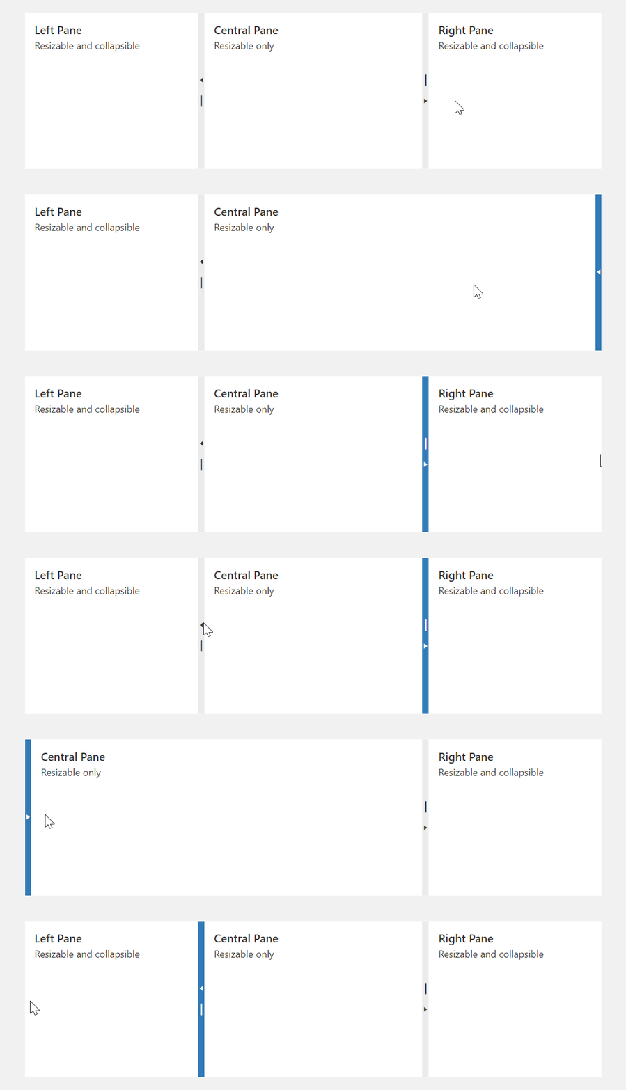
To collapse a pane, you can also double-click the separator bar.
component
An alias for the template property specified in React. Accepts a custom component. Refer to Using a Custom Component for more information.
maxSize
Specifies the maximum size of an item (pane) in pixels or as a percentage.
jQuery
$(() => {
    $("#splitter").dxSplitter({
        items: [
            {
                // ...
                maxSize: "500px",
            }
        ],
    });
});
Angular
<dx-splitter ... >
    <dxi-splitter-item ...
        maxSize="500px"
    >
    </dxi-splitter-item>
</dx-splitter>
Vue
<template>
    <DxSplitter ... >
        <DxItem ...
            maxSize="500px"
        />
    </DxSplitter>
</template>

<script setup>
import { DxSplitter, DxItem } from "devextreme-vue/splitter";
</script>
React
import React from "react";
import Splitter, { Item } from "devextreme-react/splitter";

const App = () => (
    <React.Fragment>
        <Splitter ... >
            <Item ...
                maxSize="500px"
            />
        </Splitter>
    </React.Fragment>
);

export default App;minSize
Specifies the minimum size of an item (pane) in pixels or as a percentage.
jQuery
$(() => {
    $("#splitter").dxSplitter({
        items: [
            {
                // ...
                minSize: "30%",
            }
        ],
    });
});
Angular
<dx-splitter ... >
    <dxi-splitter-item ...
        minSize="30%"
    >
    </dxi-splitter-item>
</dx-splitter>
Vue
<template>
    <DxSplitter ... >
        <DxItem ...
            minSize="30%"
        />
    </DxSplitter>
</template>

<script setup>
import { DxSplitter, DxItem } from "devextreme-vue/splitter";
</script>
React
import React from "react";
import Splitter, { Item } from "devextreme-react/splitter";

const App = () => (
    <React.Fragment>
        <Splitter ... >
            <Item ...
                minSize="30%"
            />
        </Splitter>
    </React.Fragment>
);

export default App;render
An alias for the template property specified in React. Accepts a rendering function. Refer to Using a Rendering Function for more information.
size
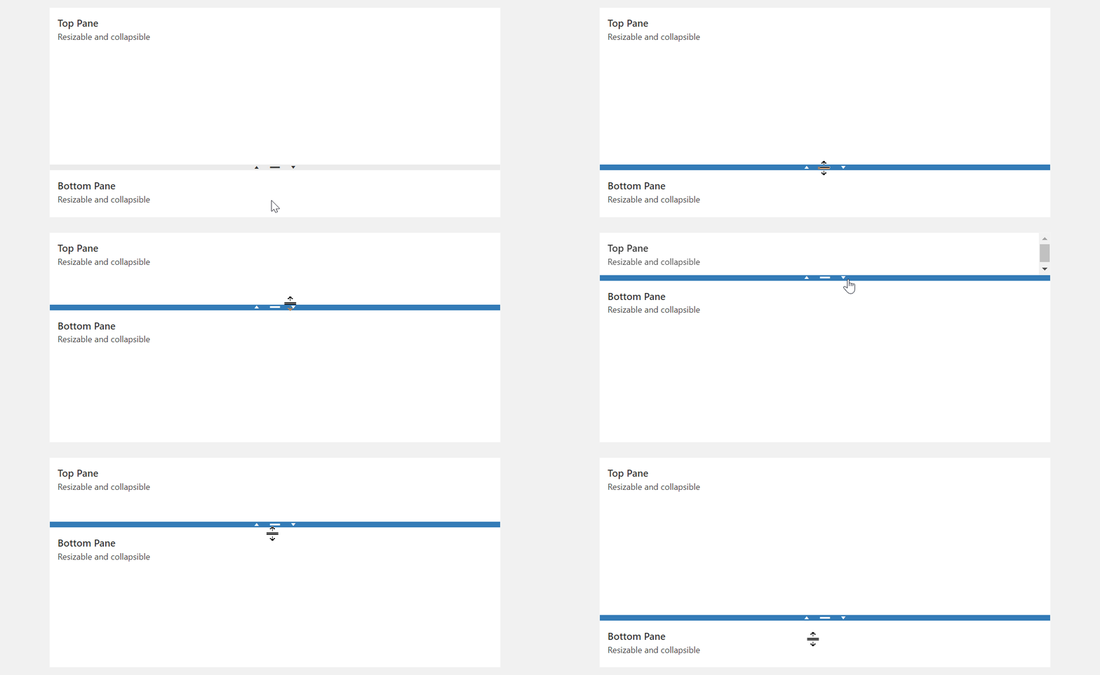
Specifies the initial size of an item (pane) in pixels or as a percentage of the component's total size. The Splitter initializes panes with equal sizes when this property is undefined (default).
Splitter preserves configured pane sizes across UI layout changes. If you update the component layout programmatically (modify an item's size property using option()), Splitter recalculates the sizes of all panes. This may shift the entire component layout. To prevent unintended changes to other panes, define size for every pane and reassign all pane sizes when you update the layout.
jQuery
$("#splitter").dxSplitter({
    items: [{
        size: "50%",
    }, /* ... */ ],
});
Angular
<dx-splitter>
    <dxi-splitter-item
        size="50%"
    ></dxi-splitter-item>
</dx-splitter>
Vue
<template>
    <DxSplitter>
        <DxItem
            size="50%"
        />
    </DxSplitter>
</template>

<script setup lang="ts">
import { DxSplitter, DxItem } from "devextreme-vue/splitter";
</script>
React
import React from "react";
import { Splitter, Item } from "devextreme-react/splitter";

export default function App() {
    return (
        <Splitter>
            <Item
                size="50%"
            />
        </Splitter>
    );
}splitter
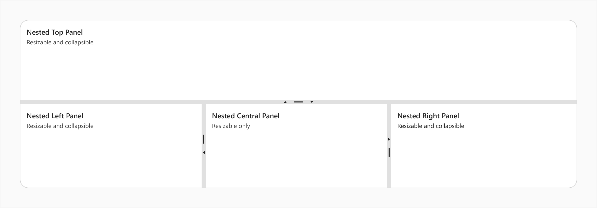
Specifies a splitter inside an item (pane).
Use this property to make the item a nested Splitter UI component.
jQuery
$(() => {
    $("#splitter").dxSplitter({
        orientation: "vertical",
        items: [{
                text: "Top Panel"
            },
            {
                splitter: {
                    items: [{
                            text: "Nested Left Panel"
                        },{
                            text: "Nested Central Panel"
                        },{
                            text: "Nested Right Panel"
                        }
                    ]
                }
            }
        ]
    });
});
Angular
<dx-splitter id="splitter" orientation="vertical">
    <dxi-splitter-item text="Top Panel"></dxi-splitter-item>
    <dxi-splitter-item>
        <dx-splitter>
            <dxi-splitter-item text="Nested Left Panel"></dxi-splitter-item>
            <dxi-splitter-item text="Nested Central Panel"></dxi-splitter-item>
            <dxi-splitter-item text="Nested Right Panel"></dxi-splitter-item>
        </dx-splitter>
    </dxi-splitter-item>
</dx-splitter>
Vue
<template>
    <DxSplitter class="splitter" orientation="vertical">
        <DxItem text="Top Panel" />
        <DxItem>
            <DxSplitter>
                <DxItem text="Nested Left Panel" />
                <DxItem text="Nested Central Panel" />
                <DxItem text="Nested Right Panel" />
            </DxSplitter>
        </DxItem>
    </DxSplitter>
</template>

<script setup>
import { DxSplitter, DxItem } from "devextreme-vue/splitter";
</script>
React
import React from "react";
import Splitter, { Item } from "devextreme-react/splitter";

const App = () => (
    <React.Fragment>
        <Splitter orientation="vertical">
            <Item text="Top Panel" />
            <Item>
                <Splitter>
                    <Item text="Nested Left Panel" />
                    <Item text="Nested Central Panel" />
                    <Item text="Nested Right Panel" />
                </Splitter>
            </Item>
        </Splitter>
    </React.Fragment>
);

export default App;template
Specifies a template that should be used to render this item only.
jQuery
This property supports the following values:
- A template container as a jQuery object or DOM Node
- A function that returns a template container (as a jQuery object or DOM node)
For more information about templates, refer to the following help topic: DevExtreme React - Custom Templates.
$(function() {
    $("#splitterContainer").dxSplitter({
        // ...
        items: [
            {
                // ...
                template: '<div>Custom Item</div>'
            }
        ]
    });
});
Angular
For more information about templates, refer to the following help topic: DevExtreme React - Custom Templates.
<dx-splitter ... >
    <dxi-splitter-item ... >
        <div *dxTemplate>
            <div>Custom Item</div>
        </div>
    </dxi-splitter-item>
</dx-splitter>
import { Component } from '@angular/core';

@Component({
    selector: 'app-root',
    templateUrl: './app.component.html',
    styleUrls: ['./app.component.css']
})
export class AppComponent {
    // ...
}
import { BrowserModule } from '@angular/platform-browser';
import { NgModule } from '@angular/core';
import { AppComponent } from './app.component';

import { DxSplitterModule } from 'devextreme-angular';

@NgModule({
    declarations: [
        AppComponent
    ],
    imports: [
        BrowserModule,
        DxSplitterModule
    ],
    providers: [ ],
    bootstrap: [AppComponent]
})
export class AppModule { }
Vue
For more information about templates, refer to the following help topic: DevExtreme React - Custom Templates.
<template>
    <DxSplitter ... >
        <DxItem ... >
            <div>Custom Item</div>
        </DxItem>
    </DxSplitter>
</template>

<script>

import DxSplitter, {
    DxItem
} from 'devextreme-vue/splitter';

export default {
    components: {
        DxSplitter,
        DxItem
    },
    // ...
}
</script>
React
For more information about templates, refer to the following help topic: DevExtreme React - Custom Templates.
import React from 'react';

import Splitter, {
    Item
} from 'devextreme-react/splitter';

const renderCustomItem = () => {
    return <div>Custom Item</div>;
}

const App() = () => {
    return (
        <Splitter ... >
            <Item ...
                render={renderCustomItem}
            >
            </Item>
        </Splitter>
    );
}
export default App;
See Also
text
Specifies text displayed for the UI component item.
If you use both this property and a template, the template overrides the text.

 Select one or more answers