React CardView - Overview
DevExtreme CardView is a responsive grid that displays data in cards. It supports data editing with validation, search, filtering, layout customization, and more.
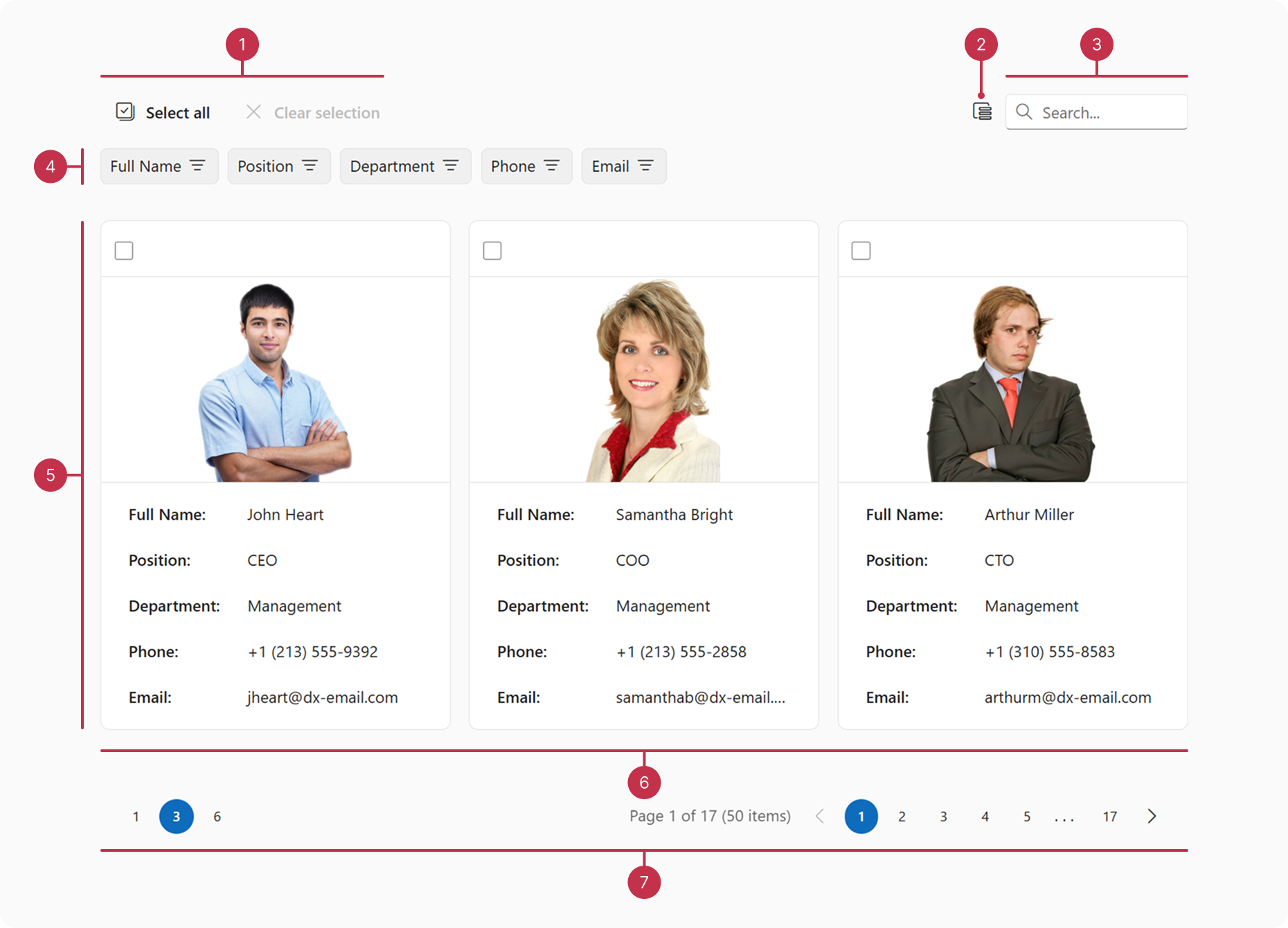
This overview highlights CardView elements, key features, and what to explore next.
Key Features
Data Binding
CardView supports different data source types, including local and remote data stores.Editing Operations
CardView allows users to add, update, and delete cards.Adaptability
CardView supports screens of all sizes. To adapt the component to your needs, you can specify maximum/minimum card widths and the number of cards per row.Filtering, Sorting, and Searching
You can configure header filters or the filter panel to allow users to filter CardView data. The component also supports sorting by single or multiple fields and searching.Selection
CardView supports single and multiple card selection. You can enable selection options such as checkboxes and selection of all cards.Column Hiding and Reordering
You can change column visibility in the CardView column chooser. To reorder columns, rearrange column headers in the header panel.Accessibility and Keyboard Navigation
CardView conforms to WCAG 2.x, European Accessibility Act (EAA), and Americans with Disabilities Act (ADA) standards. The component supports keyboard navigation and custom key handlers. CardView also ships with right-to-left (RTL) representation support.Card Customization
You can customize the appearance of card visual elements such as the cover, header, footer, and content. To implement further customizations, you can specify a card template.Component Customization
To customize the appearance and functionality of the CardView component, configure elements such as the toolbar, header panel, and pager.

 Select one or more answers