Vue Chart - commonSeriesSettings.selectionStyle
Configures the appearance adopted by the series when a user selects it.
Declared in commonSeriesSettings, selectionStyle applies to all series in the chart. Declared in a series configuration object, selectionStyle applies to this particular series only. The series-specific selectionStyle overrides the common one.
border
Configures the appearance adopted by the series border (in area-like series) or the series point border (in bar-like and bubble series) when a user selects the series.
color
Specifies the color of the series in the selected state.
This option supports the following colors:
- Hexadecimal colors
- RGB colors
- RGBA colors
- Predefined/cross-browser color names
- Predefined SVG colors
- Paint server address
dashStyle
Specifies the dash style of the series line when the series is in the selected state. Applies only to line-like series.
The following dash styles are available:
solid
The border is a solid, continuous line.longDash
The border is displayed using long dashes.dash
The border is displayed using dashes.dot
The border is displayed using dots.Any combination of 'longDash', 'dash' and 'dot'
The border is displayed by repeating the specified combination. For instance, 'dashdotdash'.
Use the DashStyle enum to specify this option when the widget is used as an ASP.NET MVC 5 Control or a DevExtreme-Based ASP.NET Core Control. This enum accepts the following values: Solid, LongDash, Dash, and Dot.
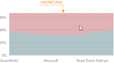
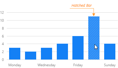
hatching
Configures hatching that applies when a user selects the series.
Hatching is filling an area or a bar (depending on the series type) with parallel diagonal lines. In the Chart widget, it applies when a user selects a series.

 Select one or more answers