DevExtreme jQuery/JS - Command Columns
Command columns are used for interaction. The DataGrid provides the following command columns:
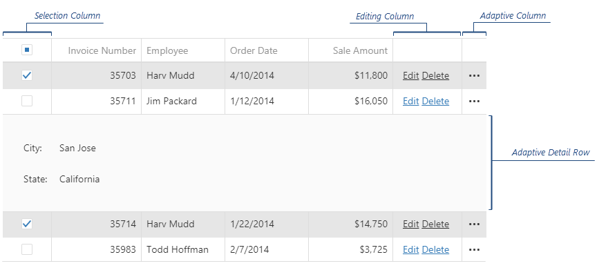
Editing Column
Contains editing controls. Appears when editing is allowed and depends on the editing mode.Adaptive Column
Contains the ellipsis buttons that expand/collapse adaptive detail rows. Appears if columnHidingEnabled is true or hidingPriority is set for at least one column and only when certain columns do not fit into the screen or container size.Selection Column
Contains check boxes that select rows. Appears if selection.mode is "multiple" and showCheckBoxesMode differs from "none".Expand Column
Contains the arrow buttons that expand/collapse groups and detail sections.
You can relocate or resize the command columns by changing their visibleIndex and width options. For this, call the columnOption(id, optionName, optionValue) method as shown by the following code:
jQuery
var dataGrid = $("#dataGridContainer").dxDataGrid("instance");

// places the selection column after all columns
dataGrid.columnOption("command:select", "visibleIndex", 999);

// changes the width of the selection column to 50 pixels
dataGrid.columnOption("command:select", "width", 50);

// places the editing column before all others
dataGrid.columnOption("command:edit", "visibleIndex", -2);

// changes the width of the editing column to 200 pixels
dataGrid.columnOption("command:edit", "width", 200);

// places the adaptive column before all data columns, but after the editing column
dataGrid.columnOption("command:adaptive", "visibleIndex", -1);

// changes the width of the adaptive column to 80 pixels
dataGrid.columnOption("command:adaptive", "width", 80);

// changes the width of the expand column to 70 pixels
dataGrid.columnOption("command:expand", "width", 70);
Angular
import { ..., ViewChild } from "@angular/core";
import { DxDataGridModule, DxDataGridComponent } from "devextreme-angular";
// ...
export class AppComponent {
    @ViewChild(DxDataGridComponent) dataGrid: DxDataGridComponent;
    modifySelectionColumn () {
        // places the selection column after all columns
        this.dataGrid.instance.columnOption("command:select", "visibleIndex", 999);

        // changes the width of the selection column to 50 pixels
        this.dataGrid.instance.columnOption("command:select", "width", 50);
    }
    modifyEditingColumn () {
        // places the editing column before all others
        this.dataGrid.instance.columnOption("command:edit", "visibleIndex", -2);

        // changes the width of the editing column to 200 pixels
        this.dataGrid.instance.columnOption("command:edit", "width", 200);
    }
    modifyAdaptiveColumn () {
        // places the adaptive column before all data columns, but after the editing column
        this.dataGrid.instance.columnOption("command:adaptive", "visibleIndex", -1);

        // changes the width of the adaptive column to 80 pixels
        this.dataGrid.instance.columnOption("command:adaptive", "width", 80);
    }
    modifyExpandColumn () {
        // changes the width of the adaptive column to 70 pixels
        this.dataGrid.instance.columnOption("command:expand", "width", 70);
    }
}
@NgModule({
    imports: [
        // ...
        DxDataGridModule
    ],
    // ...
})
You can also customize command columns' cells using the onCellPrepared function. To distinguish between cells of a command column and other cells, check the argument's column.command field for the "edit", "adaptive", "expand", or "select" value. In the following code, the editing column's cells are customized by attaching a new click handler to the "Edit" links:
jQuery
$(function() {
    $("#dataGridContainer").dxDataGrid({
        // ...
        editing: { allowUpdating: true },
        onCellPrepared: function (e) {
            if (e.rowType == "data" && e.column.command == "edit") {
                var cellElement = e.cellElement,
                    editLink = cellElement.find(".dx-link-edit");
                editLink.off("dxclick");
                editLink.on("dxclick", (args) => {
                    // Implement your logic here
                });
            }
        }
    });
});
Angular
import { DxDataGridModule } from "devextreme-angular";
import { off, on } from "devextreme/events";
// ...
export class AppComponent {
    onCellPrepared (e) {
        if (e.rowType == "data" && e.column.command == "edit") {
            let cellElement = e.cellElement,
                editLink = cellElement.querySelector(".dx-link-edit");
            off(editLink, "dxclick");
            on(editLink, "dxclick", (args) => {
                // Implement your logic here
            });
        }
    };
}
@NgModule({
    imports: [
        // ...
        DxDataGridModule
    ],
    // ...
})
<dx-data-grid ...
    (onCellPrepared)="onCellPrepared($event)">
    <dxo-editing
        [allowUpdating]="true">
    </dxo-editing>
</dx-data-grid>
ASP.NET MVC Controls
@(Html.DevExtreme().DataGrid()
    .ID("dataGrid")
    .Editing(e => {
        e.AllowUpdating(true);
    })
    .OnCellPrepared("dataGrid_cellPrepared")
    // ...
)
<script type="text/javascript">
    function dataGrid_cellPrepared (e) {
        if (e.rowType == "data" && e.column.command == "edit") {
            var cellElement = e.cellElement,
                editLink = cellElement.find(".dx-link-edit");
            editLink.off("dxclick");
            editLink.on("dxclick", (args) => {
                // Implement your logic here
            });
        }
    }
</script>See Also

 Select one or more answers