JavaScript/jQuery Chart - StackedAreaSeries.selectionStyle
Configures the appearance adopted by the series when a user selects it.
Declared in commonSeriesSettings, selectionStyle applies to all series in the chart. Declared in a series configuration object, selectionStyle applies to this particular series only. The series-specific selectionStyle overrides the common one.
border
Configures the appearance adopted by the series border (in area-like series) or the series point border (in bar-like and bubble series) when a user selects the series.
color
Specifies the color of the series in the selected state.
This property supports the following colors:
- Hexadecimal colors
- RGB colors
- RGBA colors
- Predefined/cross-browser color names
- Predefined SVG colors
- Paint server address
You can also specify a custom pattern or gradient instead of a plain color. Call the registerPattern() or registerGradient() method to obtain a fill ID. Assign that value to the fillId field.
This functionality is available for the following Chart series:
- Area
- Stacked area
- Full-stacked area
- Spline area
- Stacked spline area
- Full-stacked spline area
- Range area
- Step area
- Bar
- Stacked bar
- Full-stacked bar
- Range bar
- Bubble
jQuery
$(function(){
    $("#chartContainer").dxChart({
        // ...
        series: {
            // ...
            selectionStyle: {
                color: {
                    fillId: customPatternId
                }
            }
        }
    });
});
Angular
<dx-chart ... >
    <dxi-chart-series ... >
        <dxo-chart-selection-style
            [color]="fill"
        ></dxo-chart-selection-style>
    </dxi-chart-series>
</dx-chart>
// ...

export class AppComponent {
    // ...

    fill = {
        fillId: this.customPatternId
    };
}
Vue
<template>
    <DxChart ... >
        <DxSeries ... >
            <DxSelectionStyle :color="fill" />
        </DxSeries>
    </DxChart>
</template>

<script>
import DxChart, { DxSeries, DxSelectionStyle } from 'devextreme-vue/chart';
// ...

export default {
    components: {
        DxChart,
        DxSeries,
        DxSelectionStyle
    },
    data() {
        return {
            // ...
            fill: {
                fillId: this.customPatternId
            }
        }
    }
}
</script>
<template>
    <DxChart ... >
        <DxSeries ... >
            <DxSelectionStyle :color="fill" />
        </DxSeries>
    </DxChart>
</template>

<script setup>
import DxChart, { DxSeries, DxSelectionStyle } from 'devextreme-vue/chart';
// ...

const fill = {
    fillId: customPatternId
};
</script>
React
import React from 'react';
import Chart, { Series, SelectionStyle } from 'devextreme-react/chart';

// ...
const fill = {
    fillId: customPatternId
};

export default function App() {
    return (
        <Chart ... >
            <Series ... >
                <SelectionStyle color={fill} />
            </Series>
        </Chart>
    );
}
hatching
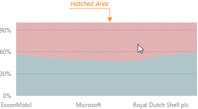
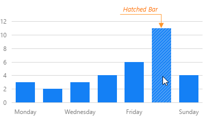
Configures hatching that applies when a user selects the series.
Hatching is filling an area or a bar (depending on the series type) with parallel diagonal lines. In the Chart UI component, it applies when a user selects a series.


 Select one or more answers