JavaScript/jQuery Gantt - contextMenu.items
Configures context menu item settings.
The context menu contains a set of default commands: 'addTask', 'taskDetails', and 'deleteTask'. Use the contextMenu property to recreate the context menu items.
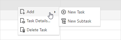
To add a predefined item to the context menu, add its name and optional settings (for example, 'visible', 'text', and 'icon') to the items collection.
jQuery
$(function () {
$("#gantt").dxGantt({
contextMenu: {
items: [
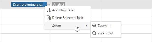
"addTask",
"deleteTask",
{
text: "Zoom",
items: [
"zoomIn",
"zoomOut"
]
}
]
}
//...
});
}); Angular
<dx-gantt ... >
    <dxo-gantt-context-menu>
        <dxi-gantt-item name="addTask"></dxi-gantt-item>
        <dxi-gantt-item name="deleteTask"></dxi-gantt-item>
        <dxi-gantt-item text="Zoom">
            <dxi-gantt-item name="zoomIn"></dxi-gantt-item>
            <dxi-gantt-item name="zoomOut"></dxi-gantt-item>
        </dxi-gantt-item>
    </dxo-gantt-context-menu>
    ...
</dx-gantt>
import { DxGanttModule } from "devextreme-angular";
// ...
export class AppComponent {
    // ...
}
@NgModule({
    imports: [
        // ...
        DxGanttModule
    ],
    // ...
})
Vue
<template>
    <DxGantt ... >
        <DxContextMenu>
            <DxItem name="addTask"/>
            <DxItem name="deleteTask"/>
            <DxItem text="Zoom">
                <DxItem name="zoomIn"/>
                <DxItem name="zoomOut"/>
            </DxItem>
        </DxContextMenu>
    </DxGantt>
</template>

<script>
import 'devextreme/dist/css/dx.light.css';

import { DxGantt, DxContextMenu } from 'devextreme-vue/gantt';

export default {
    components: {
        DxGantt,
        DxContextMenu
    },
    data() {
        return {
            // ...
        }
    }
}
</script>
React
import React from 'react';
import Gantt, { ContextMenu } from 'devextreme-react/gantt';

const App = () => {
    return (
        <Gantt...>
            <ContextMenu>
                <Item name="addTask" />
                <Item name="deleteTask" />
                <Item text="Zoom">
                    <Item name="zoomIn" />
                    <Item name="zoomOut" />
                </Item>
            </ContextMenu>
        </Gantt>
    );
};

export default App;
ASP.NET Core Controls
@(Html.DevExtreme().Gantt()
    .ContextMenu(cm => {
        cm.Items(i => {
            i.Add().Name(GanttContextMenuItem.AddTask);
            i.Add().Name(GanttContextMenuItem.DeleteTask);
            i.Add().Text("Zoom").Items(ii => {
                ii.Add.Name(GanttContextMenuItem.ZoomIn);
                ii.Add.Name(GanttContextMenuItem.ZoomOut);
            });
        });
    })
    // ...
)
ASP.NET MVC Controls
@(Html.DevExtreme().Gantt()
    .ContextMenu(cm => {
        cm.Items(i => {
            i.Add().Name(GanttContextMenuItem.AddTask);
            i.Add().Name(GanttContextMenuItem.DeleteTask);
            i.Add().Text("Zoom").Items(ii => {
                ii.Add.Name(GanttContextMenuItem.ZoomIn);
                ii.Add.Name(GanttContextMenuItem.ZoomOut);
            });
        });
    })
    // ...
)
Custom Items
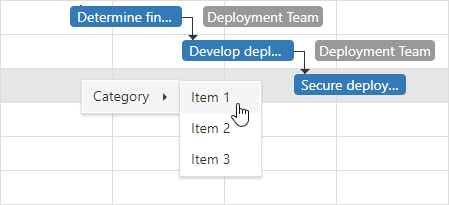
To add a custom context menu item, specify its text and optional settings (for example, name or category). Use the customCommand event to handle clicks on custom context menu items.
jQuery
$(function () {
    $("#gantt").dxGantt({
        contextMenu: {
            items: [
                {
                    text: "Category",
                    items:[
                        {
                            text: "Item 1",
                            name: "item1"
                        },
                        {
                            text: "Item 2",
                            name: "item2"
                        },
                        {
                            text: "Item 3",
                            name: "item3"
                        }
                    ]
                }
                // ...
            ]
        }
        onCustomCommand: onCustomCommandClick
        // ...
    });
});
function onCustomCommandClick(e) {
    if(e.name == 'item1') {
        // your code
    }
}
Angular
<dx-gantt (onCustomCommand)="onCustomCommand($event)" >
    <dxo-gantt-context-menu>
        <dxi-gantt-item text="Category">
            <dxi-gantt-item name="item1" text="Item 1"></dxi-gantt-item>
            <dxi-gantt-item name="item2" text="Item 2"></dxi-gantt-item>
            <dxi-gantt-item name="item3" text="Item 3"></dxi-gantt-item>
        </dxi-gantt-item>
    </dxo-gantt-context-menu>
    ...
</dx-gantt>
import { DxGanttModule } from "devextreme-angular";
// ...
export class AppComponent {
    onCustomCommand(e) {
        if(e.name == 'item1') {
            // your code
        }
    }
}
@NgModule({
    imports: [
        // ...
        DxGanttModule
    ],
    // ...
})
Vue
<template>
    <DxGantt
        @custom-command="onCustomCommand" >
        <DxContextMenu>
            <DxItem text="Category">
                <DxItem name="item1" text="Item 1" />
                <DxItem name="item2" text="Item 2" />
                <DxItem name="item3" text="Item 3" />
            </DxItem>
        </DxContextMenu>
    </DxGantt>
</template>

<script>
import 'devextreme/dist/css/dx.light.css';

import { DxGantt, DxContextMenu } from 'devextreme-vue/gantt';

export default {
    components: {
        DxGantt,
        DxContextMenu
    },
    methods: {
        onCustomCommand(e) {
            if(e.name == 'item1') {
                // your code
            }
        }
    },
    data() {
        return {
            // ...
        }
    }
}
</script>
React
import React from 'react';
import Gantt, { ContextMenu } from 'devextreme-react/gantt';

const App = () => {
    const onCustomCommand = (e) => {
        if(e.name == 'item1') {
            // your code
        }
    };

    return (
        <Gantt
            onCustomCommand={onCustomCommand} >
            <ContextMenu>
                <Item text="Category">
                    <Item name="item1" text="Item 1" />
                    <Item name="item2" text="Item 2" />
                    <Item name="item3" text="Item 3" />
                </Item>
            </ContextMenu>
        </Gantt>
    );
}

export default App;
ASP.NET MVC Controls
@(Html.DevExtreme().Gantt()
    .ContextMenu(cm => {
        cm.Items(i => {
            i.Add().Text("Category").Items(ii => {
                ii.Add.Name("item1").Text("Item 1");
                ii.Add.Name("item2").Text("Item 2");
                ii.Add.Name("item3").Text("Item 3");
            });
        });
    })
    .OnCustomCommand("gantt_customCommand_handler")
    // ...
)

<script>
    function gantt_customCommand_handler(e) {
        if(e.name == "item1") {
            // your code
        }
    }
</script>
Result:
beginGroup
Specifies whether a group separator is displayed over the item.
You can add group separators only between items in submenus.
closeMenuOnClick
Specifies if a menu is closed when a user clicks the item. Does not apply to the root items.
icon
Specifies the menu item's icon.
This property accepts one of the following:
- The icon's URL
- The icon's name if the icon is from the DevExtreme icon library
- The icon's CSS class if the icon is from an external icon library (see External Icon Libraries)
- The icon in the Base64 format
- The icon in the SVG format. Ensure that the source is reliable.
items
Specifies nested menu items.
Nested menu items should have the same structure as the first-level menu items.
name
Specifies the context menu item name.
jQuery
$(function () {
    $("#gantt").dxGantt({
        contextMenu: {
            items: [
                {
                    text: "Category",
                    items:[
                        {
                            text: "Item 1",
                            name: "item1"
                        },
                        {
                            text: "Item 2",
                            name: "item2"
                        },
                        {
                            text: "Item 3",
                            name: "item3"
                        }
                    ]
                }
                // ...
            ]
        }
        onCustomCommand: onCustomCommandClick
        // ...
    });
});
function onCustomCommandClick(e) {
    if(e.name == 'item1') {
        // your code
    }
}
Angular
<dx-gantt (onCustomCommand)="onCustomCommand($event)" >
    <dxo-gantt-context-menu>
        <dxi-gantt-item text="Category">
            <dxi-gantt-item name="item1" text="Item 1"></dxi-gantt-item>
            <dxi-gantt-item name="item2" text="Item 2"></dxi-gantt-item>
            <dxi-gantt-item name="item3" text="Item 3"></dxi-gantt-item>
        </dxi-gantt-item>
    </dxo-gantt-context-menu>
    ...
</dx-gantt>
import { DxGanttModule } from "devextreme-angular";
// ...
export class AppComponent {
    onCustomCommand(e) {
        if(e.name == 'item1') {
            // your code
        }
    }
}
@NgModule({
    imports: [
        // ...
        DxGanttModule
    ],
    // ...
})
Vue
<template>
    <DxGantt
        @custom-command="onCustomCommand" >
        <DxContextMenu>
            <DxItem text="Category">
                <DxItem name="item1" text="Item 1" />
                <DxItem name="item2" text="Item 2" />
                <DxItem name="item3" text="Item 3" />
            </DxItem>
        </DxContextMenu>
    </DxGantt>
</template>

<script>
import 'devextreme/dist/css/dx.light.css';

import { DxGantt, DxContextMenu } from 'devextreme-vue/gantt';

export default {
    components: {
        DxGantt,
        DxContextMenu
    },
    methods: {
        onCustomCommand(e) {
            if(e.name == 'item1') {
                // your code
            }
        }
    },
    data() {
        return {
            // ...
        }
    }
}
</script>
React
import React from 'react';
import Gantt, { ContextMenu } from 'devextreme-react/gantt';

const App = () => {
    const onCustomCommand = (e) => {
        if(e.name == 'item1') {
            // your code
        }
    };

    return (
        <Gantt
            onCustomCommand={onCustomCommand} >
            <ContextMenu>
                <Item text="Category">
                    <Item name="item1" text="Item 1" />
                    <Item name="item2" text="Item 2" />
                    <Item name="item3" text="Item 3" />
                </Item>
            </ContextMenu>
        </Gantt>
    );
}

export default App;
ASP.NET MVC Controls
@(Html.DevExtreme().Gantt()
    .ContextMenu(cm => {
        cm.Items(i => {
            i.Add().Text("Category").Items(ii => {
                ii.Add.Name("item1").Text("Item 1");
                ii.Add.Name("item2").Text("Item 2");
                ii.Add.Name("item3").Text("Item 3");
            });
        });
    })
    .OnCustomCommand("gantt_customCommand_handler")
    // ...
)

<script>
    function gantt_customCommand_handler(e) {
        if(e.name == "item1") {
            // your code
        }
    }
</script>
ASP.NET Core Controls
@(Html.DevExtreme().Gantt()
    .ContextMenu(cm => {
        cm.Items(i => {
            i.Add().Text("Category").Items(ii => {
                ii.Add.Name("item1").Text("Item 1");
                ii.Add.Name("item2").Text("Item 2");
                ii.Add.Name("item3").Text("Item 3");
            });
        });
    })
    .OnCustomCommand("gantt_customCommand_handler")
    // ...
)

<script>
    function gantt_customCommand_handler(e) {
        if(e.name == "item1") {
            // your code
        }
    }
</script>template
Specifies a template that should be used to render this item only.
The following types of the specified value are available.
- Assign a string containing the name of the required template.
- Assign a jQuery object of the template's container.
- Assign a DOM Node of the template's container.
- Assign a function that returns the jQuery object or a DOM Node of the template's container.
The following example adds a custom item to the component. Note that Angular and Vue use custom templates instead of the template property. In React, specify the render or component properties.
jQuery
$(function() {
    $("#ganttContainer").dxGantt({
        // ...
        contextMenu: {
            items: [
                {
                    // ...
                    template: '<div>Custom Item</div>'
                }
            ]
        }
    });
});
Angular
<dx-gantt ... >
    <dxo-gantt-context-menu>
        <dxi-gantt-item ...>
            <div *dxTemplate>
                <div>Custom Item</div>
            </div>
        </dxi-gantt-item>
    </dxo-gantt-context-menu>
</dx-gantt>
import { Component } from '@angular/core';

@Component({
    selector: 'app-root',
    templateUrl: './app.component.html',
    styleUrls: ['./app.component.css']
})
export class AppComponent {
    // ...
}
import { BrowserModule } from '@angular/platform-browser';
import { NgModule } from '@angular/core';
import { AppComponent } from './app.component';

import { DxGanttModule } from 'devextreme-angular';

@NgModule({
    declarations: [
        AppComponent
    ],
    imports: [
        BrowserModule,
        DxGanttModule
    ],
    providers: [ ],
    bootstrap: [AppComponent]
})
export class AppModule { }
Vue
<template>
    <DxGantt>
        <DxContextMenu>
            <DxItem ...>
                <div>Custom Item</div>
            </DxItem>
        </DxContextMenu>
    </DxGantt>
</template>

<script>

import DxGantt, {
    DxContextMenu, DxItem
} from 'devextreme-vue/gantt';

export default {
    components: {
        DxGantt,
        DxContextMenu,
        DxItem
    },
    // ...
}
</script>
React
import React from 'react';

import 'devextreme/dist/css/dx.light.css';

import Gantt, {
    ContextMenu, Item
} from 'devextreme-react/gantt';

const renderCustomItem = () => {
    return <div>Custom Item</div>;
}

function App() {
    return (
        <Gantt ... >
            <ContextMenu>
                <Item ...
                    render={renderCustomItem}
                >
                </Item>
            </ContextMenu>
        </Gantt>
    );
}
export default App;
See Also
text
Specifies the text inserted into the item element.
If you use both this property and a template, the template overrides the text.

 Select one or more answers