JavaScript/jQuery Drawer - Getting Started
jQuery
Angular
Vue
React
The Drawer is a dismissible or permanently visible panel used for navigation in responsive web application layouts.
jQuery
This tutorial shows how to create a Drawer that allows a user to switch between pages. The Drawer is opened and closed via a button on a toolbar.
Angular
DevExtreme supplies an application template that implements a responsive layout using the Drawer. You can use the template instead of following this tutorial.
If the template is unsuitable, follow the instructions below to create a Drawer that allows a user to switch between pages. The Drawer is opened and closed via a button on a toolbar.
Vue
DevExtreme supplies an application template that implements a responsive layout using the Drawer. You can use the template instead of following this tutorial.
If the template is unsuitable, follow the instructions below to create a Drawer that allows a user to switch between pages. The Drawer is opened and closed via a button on a toolbar.
React
DevExtreme supplies an application template that implements a responsive layout using the Drawer. You can use the template instead of following this tutorial.
If the template is unsuitable, follow the instructions below to create a Drawer that allows a user to switch between pages. The Drawer is opened and closed via a button on a toolbar.
Refer to the sections below for details on each configuration step. You can also find the full code in the GitHub repository.
Create the Drawer
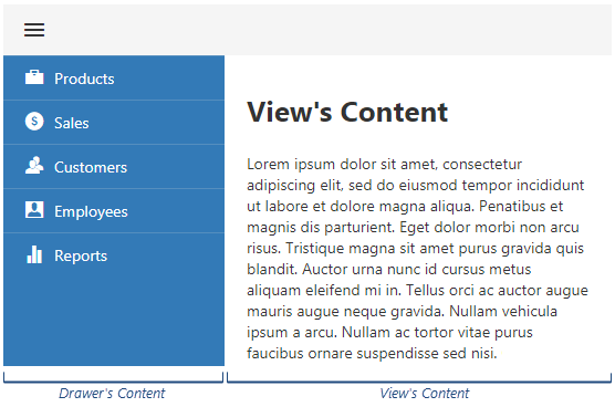
To create the Drawer component, you need to specify its content template. The image below shows the difference between Drawer and view content:
Wrap the view in the Drawer in HTML markup. Then, specify a template for the Drawer's content.
It is important to specify the Drawer's height and width. Alternatively, if you implement a UI component within the Drawer component's content, you can specify the component's width property and set the view's height. The Drawer's height automatically adjusts to the view's height in this case. Refer to the following topic for details: Implement Navigation.
This tutorial uses the width CSS property of the Drawer's nested HTML element and specifies the component's height property.
You can also specify the minSize property to make the Drawer partially visible when it is closed.
jQuery
<html>
    <head>
        <!-- ... -->
        <script type="text/javascript" src="https://code.jquery.com/jquery-3.5.1.min.js"></script>
        <link rel="stylesheet" href="https://cdn3.devexpress.com/jslib/25.2.5/css/dx.light.css">
        <link rel="stylesheet" href="index.css">
        <script type="text/javascript" src="https://cdn3.devexpress.com/jslib/25.2.5/js/dx.all.js"></script>
        <script type="text/javascript" src="index.js"></script>
    </head>
    <body>
        <div id="drawer">
            <div id="view">View content</div>
        </div>
    </body>
</html>
$(function() {
    $("#drawer").dxDrawer({
        template: function(e) {
            return $("<div style='width: 150px'>Drawer content</div>");
        },
        height: 250,
        minSize: 37
    });
});
.dx-overlay-content {
    background-color: lightgray;
}
#view {
    margin-left: 10px;
    margin-top: 10px;
}
Angular
<dx-drawer
    template="template"
    [height]="250"
    [minSize]="37">
    <div *dxTemplate="let data of 'template'">
        <div style="width: 150px">Drawer content</div>
    </div>
    <div>View content</div>
</dx-drawer>
import { Component } from "@angular/core";

@Component({
    selector: 'app-root',
    templateUrl: './app.component.html',
    styleUrls: ['./app.component.css']
})

export class AppComponent {

}
import { BrowserModule } from "@angular/platform-browser";
import { NgModule } from "@angular/core";
import { AppComponent } from "./app.component";

import { DxDrawerModule } from "devextreme-angular";

@NgModule({
    declarations: [
        AppComponent
    ],
    imports: [
        BrowserModule,
        DxDrawerModule
    ],
    providers: [],
    bootstrap: [AppComponent]
})
export class AppModule { }
::ng-deep .dx-overlay-content {
    background-color: lightgray;
}
::ng-deep #view {
    margin-left: 10px;
    margin-top: 10px;
}
Vue
<template>
    <div>
        <DxDrawer
            :minSize="37"
            :height="250"
            template="list">
            <template #list>
                <div style="width: 150px">Drawer content</div>
            </template>
            <div id="view">
                <div>View content</div>
            </div>
        </DxDrawer>
    </div>
</template>

<script>
import DxDrawer from 'devextreme-vue/drawer';

export default {
    components: {
        DxDrawer
    }
};
</script>

<style>
.dx-overlay-content {
    background-color: lightgray;
}
#view {
    margin-left: 10px;
    margin-top: 10px;
}
</style>
React
import React from "react";

import "devextreme/dist/css/dx.light.css";
import "./NavigationDrawer.css";

import { Drawer } from "devextreme-react/drawer";

function NavigationDrawer() {
    return (
        <div>
            <Drawer
                minSize={37}
                height={250}
                render={ () => <div style={{width: 150 + "px"}}>Drawer content</div> }
            >
                <div>View content</div>
            </Drawer>
        </div>
    );
}

export default NavigationDrawer;
.dx-overlay-content {
    background-color: lightgray;
}
#view {
    margin-left: 10px;
    margin-top: 10px;
}
import 'devextreme/dist/css/dx.light.css';
import './App.css';
import NavigationDrawer from "./components/NavigationDrawer";

function App() {
    return (
        <div>
            <NavigationDrawer />
        </div>
    );
}

export default App;
ASP.NET MVC Controls
@(Html.DevExtreme().Drawer()
    .ID("layout-drawer")
    .Height(250)
    .MinSize(37)
    .Template(@<text><div style="width: 150px">Drawer content</div></text>)
    .Content(@<text><div id=".drawer-view-content">View content</div></text>)
)
.dx-overlay-content {
    background-color: lightgray;
}

.drawer-view-content {
    margin-left: 10px;
    margin-top: 10px;
}
If you run the code, you can see a partially visible Drawer and a view that displays View content.
Open and Close the Drawer
Call the toggle() method or bind the opened property to a component property.
In the following code, a toolbar button outside the Drawer opens and closes it:
jQuery
$(function() {
    const drawer = $("#drawer").dxDrawer({
        // ...
    }).dxDrawer("instance");
    $("#toolbar").dxToolbar({
        items: [{
            widget: "dxButton",
            location: "before",
            options: {
                icon: "menu",
                onClick: function() {
                    drawer.toggle();
                }
            }
        }]
    });
})
<div id="toolbar"></div>
<div id="drawer">
    <div id="view">View content</div>
</div>
/* ... */
#toolbar {
    background-color: rgba(191, 191, 191, .15);
    padding: 5px 10px;
}
.dx-toolbar-button .dx-button {
    background-color: rgba(191, 191, 191, -0.15);
    border: none;
}
.dx-toolbar-button > .dx-toolbar-item-content {
    margin-left: -7px;
}
Angular
<dx-toolbar id="toolbar">
    <dxi-toolbar-item
        widget="dxButton"
        [options]="buttonOptions"
        location="before">
    </dxi-toolbar-item>
</dx-toolbar>
<dx-drawer ...
    [(opened)]="isDrawerOpen">
    <div>View content</div>
</dx-drawer>
import { Component } from "@angular/core";

@Component({
    selector: 'app-root',
    templateUrl: './app.component.html',
    styleUrls: ['./app.component.css']
})

export class AppComponent {
    isDrawerOpen: Boolean = false;
    buttonOptions: any = {
        icon: "menu",
        onClick: () => {
            this.isDrawerOpen = !this.isDrawerOpen;
        }
    }
}
// ...
import { DxDrawerModule, DxToolbarModule } from "devextreme-angular";

@NgModule({
    declarations: [
        AppComponent
    ],
    imports: [
        // ...
        DxDrawerModule,
        DxToolbarModule,
    ],
    providers: [],
    bootstrap: [AppComponent]
})
export class AppModule { }
/* ... */
::ng-deep #toolbar {
    background-color: rgba(191, 191, 191, .15);
    padding: 5px 10px;
}
::ng-deep .dx-toolbar-button .dx-button {
    background-color: rgba(191, 191, 191, -0.15);
    border: none;
}
::ng-deep .dx-toolbar-button > .dx-toolbar-item-content {
    margin-left: -7px;
}
Vue
<template>
    <div>
        <DxToolbar id="toolbar">
            <DxItem
                widget="dxButton"
                :options="buttonOptions"
                location="before"
            />
        </DxToolbar>
        <DxDrawer ...
            v-model:opened="isDrawerOpen">
            <!-- ... -->
        </DxDrawer>
    </div>
</template>

<script>
// ...
import DxToolbar, { DxItem } from 'devextreme-vue/toolbar';

export default {
    components: {
        // ...
        DxToolbar,
        DxItem
    },
    data() {
        return {
            buttonOptions: {
                icon: "menu",
                onClick: () => {
                    this.isDrawerOpen = !this.isDrawerOpen;
                }
            },
            isDrawerOpen: false
        };
    }
};
</script>

<style>
/* ... */
#toolbar {
    background-color: rgba(191, 191, 191, 0.15);
    padding: 5px 10px;
}
.dx-toolbar-button .dx-button {
    background-color: rgba(191, 191, 191, -0.15);
    border: none;
}
.dx-toolbar-button > .dx-toolbar-item-content {
    margin-left: -7px;
}
</style>
React
// ...
import React, { useState, useMemo, useCallback } from "react";
import { Drawer } from "devextreme-react/drawer";
import { Toolbar, Item } from "devextreme-react/toolbar";

function NavigationDrawer() {
    const [isOpened, setState] = useState(false);
    const buttonOptions = useMemo(() => {
        return {
            icon: "menu",
            onClick: () => {
                setState(!isOpened);
            }
        };
    }, [isOpened]);

    return (
        <div>
            <Toolbar id="toolbar">
                <Item
                    widget="dxButton"
                    options={this.buttonOptions}
                    location="before" />
            </Toolbar>
            <Drawer ...
                opened={isOpened} >
                <div>View content</div>
            </Drawer>
        </div>
    );
}

export default NavigationDrawer;
/* ... */
#toolbar {
    background-color: rgba(191, 191, 191, .15);
    padding: 5px 10px;
}
.dx-toolbar-button .dx-button {
    background-color: rgba(191, 191, 191, -0.15);
    border: none;
}
.dx-toolbar-button > .dx-toolbar-item-content {
    margin-left: -7px;
}
ASP.NET MVC Controls
@(Html.DevExtreme().Toolbar()
    .ID("layout-toolbar")
    .Items(items =>{
        items.Add().Widget(w => w.Button()
            .Icon("menu")
            .OnClick("button_clickHandler")
        ).Location(ToolbarItemLocation.Before);
    })
)
@(Html.DevExtreme().Drawer()
    .ID("layout-drawer")
    // ...
)

<script type="text/javascript">
    function button_clickHandler() {
        const drawer = $("#layout-drawer").dxDrawer("instance");
        drawer.toggle();
    }
</script>
/* ... */
#layout-toolbar {
    background-color: rgba(191, 191, 191, .15);
    padding: 5px 10px;
}

#layout-toolbar .dx-toolbar-button .dx-button {
    background-color: rgba(191, 191, 191, -0.15);
    border: none;
}

#layout-toolbar .dx-toolbar-button > .dx-toolbar-item-content {
    margin-left: -7px;
}
Implement Navigation
The Drawer is designed to contain navigation items. If they should nest other items, use the TreeView UI component to implement navigation. Otherwise, use the List, as this tutorial does.
Each list item should navigate to a different view. To implement this, follow the steps below:
jQuery
Enable item selection
Set the selectionMode to "single". If you use the TreeView, also set the selectByClick property to true.
Navigate to a view when selection is changed
In the onSelectionChanged event handler, load the new view and hide the Drawer.
$(function() {
    // Loads the initial page
    $("#view" ).load( "./pages/inbox.html" );

    const drawer = $("#drawer").dxDrawer({
        // ...
        template: function(e) {
            const $list = $("<div/>").dxList({
                items: [
                    { id: 1, text: "Inbox", icon: "message", path: "inbox" },
                    { id: 2, text: "Sent Mail", icon: "check", path: "sent-mail" },
                    { id: 3, text: "Trash", icon: "trash", path: "trash" },
                    { id: 4, text: "Spam", icon: "mention", path: "spam" }
                ],
                width: 200,
                selectionMode: "single",
                onSelectionChanged: function(e) {
                    $("#view").load( "./pages/" + e.addedItems[0].path + ".html" );
                    drawer.hide();
                }
            });
            return $list;
        }
    }).dxDrawer("instance");
})
<div id="toolbar"></div>
<div id="drawer">
    <div id="view"></div>
</div>
/* ... */
.dx-list-item-icon {
    margin-right: 10px;
}
<div>Inbox</div>
<div>Sent Mail</div>
<div>Trash</div>
<div>Spam</div>
Angular
Configure routing
Specify routes and set up the router in the
AppRountingModule.Define an itemTemplate
Specify the elements that the template should render and wrap them in an element with the RouterLink directive. In the code below, the "links" itemTemplate renders an icon and text.
Enable item selection
Set the selectionMode to "single". If you use the TreeView, also set the selectByClick property to true. In the onSelectionChanged event handler, close the Drawer.
<dx-drawer ... >
    <div *dxTemplate="let data of 'template'">
        <dx-list
            [items]="navigation"
            [width]="200"
            selectionMode="single"
            (onSelectionChanged)="this.isDrawerOpen = false"
            itemTemplate="links">
            <div *dxTemplate="let link of 'links'">
                <a [routerLink]="['/' + link.path]">
                    <div>
                        <div class="dx-list-item-icon-container">
                            <i class="dx-icon dx-list-item-icon dx-icon-{{link.icon}}"></i>
                        </div>
                        <span>{{ link.text }}</span>
                    </div>
                </a>
            </div>
        </dx-list>
    </div>
    <div id="view">
        <router-outlet></router-outlet>
    </div>
</dx-drawer>
import { Component } from "@angular/core";

@Component({
    selector: 'app-root',
    templateUrl: './app.component.html',
    styleUrls: ['./app.component.css']
})
export class AppComponent {
    navigation: any[] = [
        { id: 1, text: "Inbox", icon: "message", path: "inbox" },
        { id: 2, text: "Sent Mail", icon: "check", path: "sent-mail" },
        { id: 3, text: "Trash", icon: "trash", path: "trash" },
        { id: 4, text: "Spam", icon: "mention", path: "spam" }
    ];
    isDrawerOpen: Boolean = false;
}
/* ... */
::ng-deep .dx-list-item-icon {
    margin-right: 10px;
}
import { NgModule } from "@angular/core";
import { Routes, RouterModule } from "@angular/router";
import { InboxComponent } from "./views/inbox.component";
import { SentMailComponent } from "./views/sent-mail.component";
import { TrashComponent } from "./views/trash.component";
import { SpamComponent } from "./views/spam.component";

const routes: Routes = [
    { path: '', redirectTo: '/inbox', pathMatch: 'full' },
    { path: 'inbox', component: InboxComponent },
    { path: 'sent-mail', component: SentMailComponent },
    { path: 'trash', component: TrashComponent },
    { path: 'spam', component: SpamComponent },
];

@NgModule({
    imports: [RouterModule.forRoot(routes)],
    exports: [RouterModule],
    declarations: [
        InboxComponent,
        SentMailComponent,
        TrashComponent,
        SpamComponent
    ]
})
export class AppRoutingModule { }
import { AppRoutingModule } from "./app-routing.module";
import { DxDrawerModule, DxToolbarModule, DxListModule } from "devextreme-angular";
// ...
@NgModule({
    declarations: [
        AppComponent
    ],
    imports: [
        // ...
        AppRoutingModule,
        DxDrawerModule,
        DxToolbarModule,
        DxListModule
    ],
    providers: [],
    bootstrap: [AppComponent]
})
export class AppModule { }
import { Component } from "@angular/core";

@Component({
    selector: 'app-inbox',
    template: '<div>Inbox</div>'
})
export class InboxComponent { constructor() { } }
import { Component } from "@angular/core";

@Component({
    selector: 'app-sent-mail',
    template: '<div>Sent Mail</div>'
})
export class SentMailComponent { constructor() { } }
import { Component } from "@angular/core";

@Component({
    selector: 'app-spam',
    template: '<div>Spam</div>'
})
export class SpamComponent { constructor() { } }
import { Component } from "@angular/core";

@Component({
    selector: 'app-trash',
    template: '<div>Trash</div>'
})
export class TrashComponent { constructor() { } }
Vue
Install Vue Router
npm install vue-router
Configure routing
Specify routes and set up the router in the
main.jsfile.Define an itemTemplate
Specify the elements that the template should render and wrap them in a
<router-link>component. In the code below, the "links" itemTemplate renders an icon and text.Enable item selection
Set the selectionMode to "single". If you use the TreeView, also set the selectByClick property to true. In the onSelectionChanged event handler, close the Drawer.
<template>
    <DxList
        :width="200"
        selection-mode="single"
        :items="navigation"
        item-template="links"
        @selection-changed="navigate">
        <template #links="{ data }">
            <div>
                <router-link :to="'/' + data.path">
                    <div>
                        <div class="dx-list-item-icon-container">
                            <i class="dx-icon dx-list-item-icon" :class="'dx-icon-' + data.icon"></i>
                        </div>
                        <span>{{ data.text }}</span>
                    </div>
                </router-link>
            </div>
        </template>
    </DxList>
</template>
<script>
import { DxList } from "devextreme-vue/list";

export default {
    components: {
        DxList
    },
    data() {
        const navigation = [
            { id: 1, text: "Inbox", icon: "message", path: "inbox" },
            { id: 2, text: "Sent Mail", icon: "check", path: "sent-mail" },
            { id: 3, text: "Trash", icon: "trash", path: "trash" },
            { id: 4, text: "Spam", icon: "mention", path: "spam" }
        ];
        return {
            navigation
        };
    },
    methods: {
        navigate() {
            this.$emit('navigated');
        }
    }
}
</script>
<template>
    <div>
        <!-- ... -->
        <DxDrawer ...
            template="list">
            <template #list>
                <NavigationList
                    @navigated="isDrawerOpen = false"
                />
            </template>
            <div id="view">
                <router-view></router-view>
            </div>
        </DxDrawer>
    </div>
</template>

<script>
// ...
import NavigationList from './components/NavigationList.vue';

export default {
    components: {
        // ...
        NavigationList
    },
    // ...
};
</script>

<style>
/* ... */
.dx-list-item-icon {
    margin-right: 10px;
}
</style>
import { createApp, h } from 'vue';
import { createRouter, createWebHashHistory } from 'vue-router';
import 'devextreme/dist/css/dx.light.css';
import App from './App.vue';
import InboxItemComponent from "./components/InboxItem.vue";
import SentMailComponent from "./components/SentMail.vue";
import TrashItemComponent from "./components/TrashItem.vue";
import SpamItemComponent from "./components/SpamItem.vue";

const routes = [
    { path: "", redirect: "/inbox-item" },
    { path: "/inbox-item", component: InboxItemComponent },
    { path: "/sent-mail", component: SentMailComponent },
    { path: "/trash-item", component: TrashItemComponent },
    { path: "/spam-item", component: SpamItemComponent }
];

const router = createRouter({
    history: createWebHashHistory(),
    routes,
})

const app  = createApp({
    render: ()=>h(App)
});

app.use(router);

app.mount('#app');
<template>
    <div>Inbox</div>
</template>

<script>
export default {}
</script>
<template>
    <div>Sent mail</div>
</template>

<script>
export default {}
</script>
<template>
    <div>Spam</div>
</template>

<script>
export default {}
</script>
<template>
    <div>Trash</div>
</template>

<script>
export default {}
</script>
React
Install React Router
npm install react-router-dom
Configure routing
Wrap the entire
Appcomponent in aBrowserRouterin theindex.js. DefineRouteswithin theDrawermarkup in theNavigationDrawercomponent.Define the itemRender function
Specify the elements that the function should render and wrap them in a
Link. In the code below, therenderItemfunction renders an icon and text.Enable item selection
Set the selectionMode to "single". If you use the TreeView, also set the selectByClick property to true. In the onSelectionChanged event handler, close the Drawer.
import React from 'react';
import ReactDOM from 'react-dom/client';
import { BrowserRouter } from "react-router-dom";
import './index.css';
import App from './App';

const root = ReactDOM.createRoot(document.getElementById('root'));
root.render(
    <BrowserRouter>
        <App />
    </BrowserRouter>
);
// ...
import { Routes, Route } from 'react-router-dom';

import NavigationList from "./NavigationList";
import Inbox from "../views/Inbox";
import Trash from "../views/Trash";
import SentMail from "../views/SentMail";
import Spam from "../views/Spam";

function NavigationDrawer() {
    // ...
    const renderList = useCallback(() => {
        const stateHandler = (newState) => setState(newState);
        return (
            <NavigationList stateHandler={stateHandler} />
        );
    }, []);

    return (
        <div>
            { /* ... */ }
            <Drawer ...
                render={renderList}>
                <div id="view">
                    <Routes>
                        <Route exact path="views/inbox" element={<Inbox />} />
                        <Route path="views/sent-mail" element={<SentMail />} />
                        <Route path="views/spam" element={<Spam />} />
                        <Route path="views/trash" element={<Trash />} />
                    </Routes>
                </div>
            </Drawer>
        </div>
    );
}

export default NavigationDrawer;
import React, { useCallback } from "react";
import List from "devextreme-react/list";
import { Link } from "react-router-dom";

const navigation = [
    { id: 1, text: "Inbox", icon: "message", path: "views/inbox" },
    { id: 2, text: "Sent Mail", icon: "check", path: "views/sent-mail" },
    { id: 3, text: "Trash", icon: "trash", path: "views/trash" },
    { id: 4, text: "Spam", icon: "mention", path: "views/spam" }
];

function NavigationList(props){
    const closeDrawer = () => {
        props.stateHandler(false);
    }

    const renderItem = useCallback((data) => {
        return (
            <div>
                <Link to={'/' + data.path}>
                    <div>
                        <div className="dx-list-item-icon-container">
                            <i className={`dx-icon dx-list-item-icon dx-icon-${data.icon}`}/>
                        </div>
                        <span>{data.text}</span>
                    </div>
                </Link>
            </div>
        );
    }, []);

    return (
        <div>
            <List
                items={navigation}
                width={200}
                selectionMode="single"
                onSelectionChanged={closeDrawer}
                itemRender={renderItem}
            />
        </div>
    );

}

export default NavigationList;
/* ... */
.dx-list-item-icon {
    margin-right: 10px;
}
import React from "react";

function Inbox(){
    return (
        <div>Inbox</div>
    );
}
export default Inbox;
import React from "react";

function SentMail(){
    return (
        <div>Sent Mail</div>
    );
}
export default SentMail;
import React from "react";

function Spam(){
    return (
        <div>Spam</div>
    );
}
export default Spam;
import React from "react";

function Trash(){
    return (
        <div>Trash</div>
    );
}
export default Trash;
ASP.NET MVC Controls
Enable item selection
Set the selectionMode to "single". If you use the TreeView, also set the selectByClick property to true.
Navigate to a view when selection is changed
In the onSelectionChanged event handler, load the new view and hide the Drawer.
@(Html.DevExtreme().Toolbar()
    // ...
)
@(Html.DevExtreme().Drawer()
    .ID("layout-drawer")
    .Template(@<text>
        @(Html.DevExtreme().List()
            .Width(200)
            .OnInitialized("list_onInitialized")
            .Items(items => {
                items.Add().Text("Inbox").Icon("message").Option("path", @Url.Action("Index"));
                items.Add().Text("Sent Mail").Icon("check").Option("path", @Url.Action("Sent"));
                items.Add().Text("Deleted").Icon("trash").Option("path", @Url.Action("Deleted"));
                items.Add().Text("Spam").Icon("mention").Option("path", @Url.Action("Spam"));
            })
            .KeyExpr("path")
            .SelectionMode(ListSelectionMode.Single)
            .OnSelectionChanged("list_onSelectionChanged")
        )
    </text>)
    .Content(@<text>@RenderBody()</text>)
)

<script type="text/javascript">
    function button_clickHandler() {
        // ...
        sessionStorage.setItem("isDrawerOpen", JSON.stringify(drawer.option("opened")));
    }

    function list_onSelectionChanged(e) {
        const drawer = $("#layout-drawer").dxDrawer("instance");
        drawer.hide();
        sessionStorage.setItem("isDrawerOpen", JSON.stringify(drawer.option("opened")));
        document.location.pathname = e.addedItems[0].path;
    }

    function list_onInitialized(e) {
        const t = "@Url.Action()";
        e.component.option("selectedItemKeys", [ "@Url.Action()" ])
    }
</script>
using System.Web.Mvc;

namespace DevExtremeApp.Controllers {
    public class HomeController : Controller {
        public ActionResult Index() {
            return View();
        }

        public ActionResult Deleted() {
            return View();
        }

        public ActionResult Sent() {
            return View();
        }

        public ActionResult Spam() {
            return View();
        }
    }
}
/* ... */
#layout-toolbar .dx-list-item-icon {
    margin-right: 10px;
}
<div class="drawer-view-content">Inbox</div>
<div class="drawer-view-content">Deleted</div>
<div class="drawer-view-content">Sent</div>
<div class="drawer-view-content">Spam</div>
Run the code, open the Drawer, and click its items to change the views.
Configure the Reveal Behavior
When you open the Drawer, it can slide in or expand from the closed position. Use the revealMode property to specify this behavior.
jQuery
$(function() {
    const drawer = $("#drawer").dxDrawer({
        // ...
        revealMode: "expand"
    }).dxDrawer("instance");
})
Angular
<dx-drawer ...
    revealMode="expand">
</dx-drawer>
Vue
<template>
    <div>
        <!-- ... -->
        <DxDrawer ...
            reveal-mode="expand">
            <!-- ... -->
        </DxDrawer>
    </div>
</template>

<script>
// ...
</script>
React
// ...
function NavigationDrawer() {
    // ...
    return (
        <div>
            { /* ... */ }
            <Drawer ...
                revealMode="expand" >
            </Drawer>
        </div>
    );
}

export default NavigationDrawer;
ASP.NET MVC Controls
@(Html.DevExtreme().Drawer()
    .ID("layout-drawer")
    .RevealMode(DrawerRevealMode.Expand)
)
Run the code and open the Drawer. You should see that the UI component gets wider, but its content stays in place, creating an impression that the Drawer expands.
Configure Interaction with the View
When the Drawer opens, it can overlap, shrink, or partially displace the view, depending on the openedStateMode property:
jQuery
$(function() {
    const drawer = $("#drawer").dxDrawer({
        // ...
        openedStateMode: "overlap"
    }).dxDrawer("instance");
})
Angular
<dx-drawer ...
    openedStateMode="overlap">
</dx-drawer>
Vue
<template>
    <div>
        <!-- ... -->
        <DxDrawer ...
            opened-state-mode="overlap">
            <!-- ... -->
        </DxDrawer>
    </div>
</template>

<script>
// ...
</script>
React
// ...
function NavigationDrawer() {
    // ...
    return (
        <div>
            { /* ... */ }
            <Drawer ...
                openedStateMode="overlap" >
            </Drawer>
        </div>
    );
}

export default NavigationDrawer;
ASP.NET MVC Controls
@(Html.DevExtreme().Drawer()
    .ID("layout-drawer")
    .OpenedStateMode(DrawerOpenedStateMode.Overlap)
)
Run the code, open the Drawer and you should see that it overlaps the view's text.
Change the Position
You can use the position property to anchor the Drawer to any side of the view. In this tutorial, the Drawer is in its default position (left).
For more information about the Drawer, explore the following resources:

 Select one or more answers