JavaScript/jQuery ResponsiveBox - Overview
The ResponsiveBox UI component allows you to create an application or a website with a layout adapted to different screen sizes.
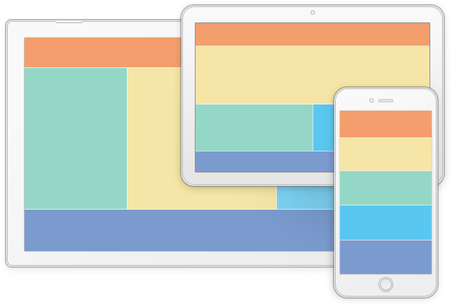
The following code creates a simple ResponsiveBox. The UI component defines an ordinary page layout: a header, a footer, content area, left- and right-side bars. On small and extra small screens, the bars are hidden to give more space to the content. Note that the height of all elements that are ancestors to the ResponsiveBox (such as <body> and <html>) is explicitly set to "100%". This makes the ResponsiveBox occupy full screen height.
jQuery
<div id="responsiveBoxContainer">
    <div class="header" data-options="dxItem: {
        location: [
            { screen: 'md lg', row: 0, col: 0, colspan: 3 },
            { screen: 'xs sm', row: 0, col: 0 }
        ]
    }"> <p>Header</p> </div>

    <div class="content" data-options="dxItem: {
        location: [
            { screen: 'md lg', row: 1, col: 1 },
            { screen: 'xs sm', row: 1, col: 0 }
        ]
    }"> <p>Content</p> </div>

    <div class="left-side-bar" data-options="dxItem: {
        location: { screen: 'md lg', row: 1, col: 0 }
    }"> <p>Left Bar</p> </div>

    <div class="right-side-bar" data-options="dxItem: {
        location: { screen: 'md lg', row: 1, col: 2 }
    }"> <p>Right Bar</p> </div>

    <div class="footer" data-options="dxItem: {
        location: [
            { screen: 'md lg', row: 2, col: 0, colspan: 3 },
            { screen: 'xs sm', row: 2, col: 0 }
        ]
    }"> <p>Footer</p> </div>
</div>
$(function() {
    $("#responsiveBoxContainer").dxResponsiveBox({
        rows: [
            { ratio: 1 },
            { ratio: 2 },
            { ratio: 0.7 }
        ],
        cols: [
            { ratio: 0.5, screen: "md lg" },
            { ratio: 2 },
            { ratio: 0.5, screen: "md lg" }
        ]
    });
});
html, body { height: 100%; }
#responsiveBoxContainer p {
    font-size: 16px;
    padding-top: 10px;
    text-align: center;
}
.header { background: #f39e6c }
.content { background: #f5e5a6 }
.left-side-bar { background: #94d7c7 }
.right-side-bar { background: #77c7e7 }
.footer { background: #7b9bcf }
Angular
<dx-responsive-box>
    <dxi-responsive-box-row [ratio]="1"></dxi-responsive-box-row>
    <dxi-responsive-box-row [ratio]="2"></dxi-responsive-box-row>
    <dxi-responsive-box-row [ratio]="0.7"></dxi-responsive-box-row>
    <dxi-responsive-box-col [ratio]="0.5" screen="md lg"></dxi-responsive-box-col>
    <dxi-responsive-box-col [ratio]="2"></dxi-responsive-box-col>
    <dxi-responsive-box-col [ratio]="0.5" screen="md lg"></dxi-responsive-box-col>

    <dxi-responsive-box-item class="header">
        <dxi-responsive-box-location screen="md lg" [row]="0" [col]="0" [colspan]="3"></dxi-responsive-box-location>
        <dxi-responsive-box-location screen="xs sm" [row]="0" [col]="0"></dxi-responsive-box-location>
        <p>Header</p>
    </dxi-responsive-box-item>

    <dxi-responsive-box-item class="content">
        <dxi-responsive-box-location screen="md lg" [row]="1" [col]="1"></dxi-responsive-box-location>
        <dxi-responsive-box-location screen="xs sm" [row]="1" [col]="0"></dxi-responsive-box-location>
        <p>Content</p>
    </dxi-responsive-box-item>

    <dxi-responsive-box-item class="left-side-bar">
        <dxi-responsive-box-location screen="md lg" [row]="1" [col]="0"></dxi-responsive-box-location>
        <p>Left Bar</p>
    </dxi-responsive-box-item>

    <dxi-responsive-box-item class="right-side-bar">
        <dxi-responsive-box-location screen="md lg" [row]="1" [col]="2"></dxi-responsive-box-location>
        <p>Right Bar</p>
    </dxi-responsive-box-item>

    <dxi-responsive-box-item class="footer">
        <dxi-responsive-box-location screen="md lg" [row]="2" [col]="0" [colspan]="3"></dxi-responsive-box-location>
        <dxi-responsive-box-location screen="xs sm" [row]="2" [col]="0"></dxi-responsive-box-location>
        <p>Footer</p>
    </dxi-responsive-box-item>
</dx-responsive-box>
import { DxResponsiveBoxModule } from 'devextreme-angular';
// ...
export class AppComponent {
    // ...
}
@NgModule({
    imports: [
        // ...
        DxResponsiveBoxModule
    ],
    // ...
})
html, body { height: 100%; }
#responsiveBox p {
    font-size: 16px;
    padding-top: 10px;
    text-align: center;
}
.header { background: #f39e6c }
.content { background: #f5e5a6 }
.left-side-bar { background: #94d7c7 }
.right-side-bar { background: #77c7e7 }
.footer { background: #7b9bcf }
Vue
<template>
    <DxResponsiveBox>
        <DxRow :ratio="1"/>
        <DxRow :ratio="2"/>
        <DxRow :ratio="0.7"/>
        <DxCol :ratio="0.5" screen="md lg"/>
        <DxCol :ratio="2"/>
        <DxCol :ratio="0.5" screen="md lg"/>

        <DxItem>
            <DxLocation screen="md lg" :row="0" :col="0" :colspan="3"/>
            <DxLocation screen="xs sm" :row="0" :col="0"/>
            <template #default>
                <div class="header">
                    <p>Header</p>
                </div>
            </template>
        </DxItem>

        <DxItem>
            <DxLocation screen="md lg" :row="1" :col="1"/>
            <DxLocation screen="xs sm" :row="1" :col="0"/>
            <template #default>
                <div class="content">
                    <p>Content</p>
                </div>
            </template>
        </DxItem>

        <DxItem>
            <DxLocation screen="md lg" :row="1" :col="0"/>
            <template #default>
                <div class="left-side-bar">
                    <p>Left Bar</p>
                </div>
            </template>
        </DxItem>

        <DxItem>
            <DxLocation screen="md lg" :row="1" :col="2"/>
            <template #default>
                <div class="right-side-bar">
                    <p>Right Bar</p>
                </div>
            </template>
        </DxItem>

        <DxItem class="footer">
            <DxLocation screen="md lg" :row="2" :col="0" :colspan="3"/>
            <DxLocation screen="xs sm" :row="2" :col="0"/>
            <template #default>
                <div class="footer">
                    <p>Footer</p>
                </div>
            </template>
        </DxItem>
    </DxResponsiveBox>
</template>
<script>
import 'devextreme/dist/css/dx.light.css';

import { DxResponsiveBox, DxItem, DxLocation, DxCol, DxRow } from 'devextreme-vue/responsive-box';

export default {
    components: {
        DxResponsiveBox,
        DxItem,
        DxLocation,
        DxCol,
        DxRow
    }
};
</script>
<style>
html, body { height: 100%; }
#responsiveBox p {
    font-size: 16px;
    padding-top: 10px;
    text-align: center;
}
.header { background: #f39e6c }
.content { background: #f5e5a6 }
.left-side-bar { background: #94d7c7 }
.right-side-bar { background: #77c7e7 }
.footer { background: #7b9bcf }
</style>
React
import React from 'react';
import 'devextreme/dist/css/dx.light.css';

import ResponsiveBox, { Row, Col, Item, Location } from 'devextreme-react/responsive-box';

class App extends React.Component {
    render() {
        return (
            <ResponsiveBox>
                <Row ratio={1}/>
                <Row ratio={2}/>
                <Row ratio={0.7}/>
                <Col ratio={0.5} screen="md lg"/>
                <Col ratio={2}/>
                <Col ratio={0.5} screen="md lg"/>

                <Item>
                    <Location screen="md lg" row={0} col={0} colspan={3}/>
                    <Location screen="xs sm" row={0} col={0}/>
                    <div className="header item">
                        <p>Header</p>
                    </div>
                </Item>

                <Item>
                    <Location screen="md lg" row={1} col={1}/>
                    <Location screen="xs sm" row={1} col={0}/>
                    <div className="content item">
                        <p>Content</p>
                    </div>
                </Item>

                <Item>
                    <Location screen="md lg" row={1} col={0}/>
                    <div className="left-side-bar item">
                        <p>Left Bar</p>
                    </div>
                </Item>

                <Item>
                    <Location screen="md lg" row={1} col={2}/>
                    <div className="right-side-bar item">
                        <p>Right Bar</p>
                    </div>
                </Item>

                <Item>
                    <Location screen="md lg" row={2} col={0} colspan={3}/>
                    <Location screen="xs sm" row={2} col={0}/>
                    <div className="footer item">
                        <p>Footer</p>
                    </div>
                </Item>
            </ResponsiveBox>
        );
    }
}

export default App;
html, body { height: 100%; }
#responsiveBox div {
    font-size: 16px;
    padding-top: 10px;
    text-align: center;
}
.item { height: 100%; }
.header { background: #f39e6c }
.content { background: #f5e5a6 }
.left-side-bar { background: #94d7c7 }
.right-side-bar { background: #77c7e7 }
.footer { background: #7b9bcf }
The ResponsiveBox elements in the code above are declared using the dxItem markup component. An object passed to this component can have the following fields.
All ResponsiveBox elements are arranged against a layout grid defined by the rows and cols arrays. For further information, see the Create the Layout Grid topic.
See Also
jQuery
Angular
Vue
React

 Select one or more answers