JavaScript/jQuery Stepper - Implement a Wizard
This tutorial uses a Stepper widget to create a wizard-like application. The created application integrates the Form and MultiView components.
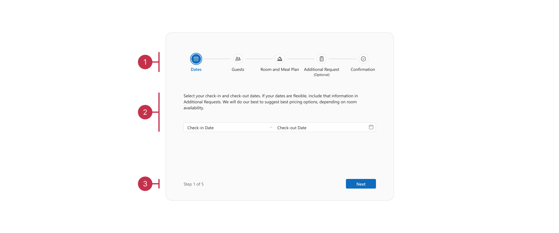
This wizard includes three key parts:
- The Stepper component.
- Step content where the MultiView component shows content for each step. Every view with input fields contains a Form.
- A navigation panel with an active step caption ("Step 1 of 5") and buttons for moving between steps ("Next" and "Back").
To view the complete code of this example, refer to the following demo:
Set Up App Layout
To get started, add a Stepper and a MultiView to your project. Create a navigation panel - a container with child items. Child items are a <div> element that displays the active step caption and two Buttons:
jQuery
<div id="stepper"></div>
<div class="content">
    <div id="stepContent"></div>
    <div class="nav-panel">
        <div class="current-step"> Step <span class="selected-index">1</span> of 5</span></div>
        <div class="nav-buttons">
            <div id="prevButton"></div>
            <div id="nextButton"></div>
        </div>
    </div>
</div>
const stepper = $('#stepper').dxStepper({
    // ...
    items: steps,
}).dxStepper('instance');

const stepContent = $('#stepContent').dxMultiView({
    // ...
    focusStateEnabled: false,
    swipeEnabled: false,
    items: multiViewItems,
}).dxMultiView('instance');

const prevButton = $('#prevButton').dxButton({
    // ...
    text: 'Back',
    visible: false,
}).dxButton('instance');

const nextButton = $('#nextButton').dxButton({
    // ...
    text: 'Next',
}).dxButton('instance');
Angular
<dx-stepper ... >
    <dxi-stepper-item ...
        *ngFor="let step of steps"
    ></dxi-stepper-item>
</dx-stepper>
<div class="content">
    <dx-multi-view ...
        [animationEnabled]="false"
        [focusStateEnabled]="false"
        [swipeEnabled]="false"
    >
    </dx-multi-view>
    <div class="nav-panel">
        <div class="current-step">
            <span ... >
                Step <span class="selected-index">1</span> of {{ steps.length }}
            </span>
        </div>
        <div class="nav-buttons">
            <dx-button ...
                id="prevButton"
                [visible]="false"
                text="Back"
            >
            </dx-button>
            <dx-button ...
                id="nextButton"
                text="Next"
            >
            </dx-button>
        </div>
    </div>
</div>
import { DxStepperModule, DxButtonModule, DxMultiViewModule, DxFormModule } from 'devextreme-angular';
import { AppService } from './app.service';
// ...
export class AppComponent {
    steps: Item[];

    constructor(private readonly appService: AppService) {
        this.steps = this.appService.getInitialSteps();
    }
}
Vue
<template>
    <DxStepper ... >
        <DxStepperItem ...
            v-for="item of steps"
        />
    </DxStepper>
    <div class="content">
        <DxMultiView ...
            :focus-state-enabled="false"
            :animation-enabled="false"
            :swipe-enabled="false"
        >
        </DxMultiView>
        <div class="nav-panel">
            <div class="current-step">
                <span ... >
                    Step <span class="selected-index">1</span> of {{ steps.length }}
                </span>
            </div>
            <div class="nav-buttons">
                <DxButton ...
                    id="prevButton"
                    :visible="false"
                    text="Back"
                />
                <DxButton ...
                    id="nextButton"
                    text="Next"
                />
            </div>
        </div>
    </div>
</template>

<script setup lang="ts">
import DxButton from 'devextreme-vue/button';
import DxMultiView, { DxItem as DxMultiViewItem } from 'devextreme-vue/multi-view';
import DxStepper, { DxItem as DxStepperItem } from 'devextreme-vue/stepper';
import type { IItemProps } from 'devextreme-react/cjs/stepper';
import { getInitialSteps } from './data.ts';

// ...
const steps = ref<IItemProps[]>(getInitialSteps());
</script>
React
import { Stepper, Item } from 'devextreme-react/stepper'
import type { IItemProps } from 'devextreme-react/stepper'
import Button from 'devextreme-react/button';
import { MultiView } from 'devextreme-react/multi-view';
import { initialSteps } from './data.ts';

// ...
export default function App () {
    const [steps, setSteps] = useState<IItemProps[]>(initialSteps);

    // ...
    return (
        <>
            <Stepper ... >
                {steps.map((step) => <Item key={step.label} {...step} />)}
            </Stepper>
            <div className="content">
                <MultiView ...
                    focusStateEnabled={false}
                    animationEnabled={false}
                    swipeEnabled={false}
                >
                </MultiView>
                <div className="nav-panel">
                    <div className="current-step">
                        Step <span className="selected-index">1</span> of {steps.length}
                    </div>
                    <div className="nav-buttons">
                        <Button ...
                            id="prevButton"
                            text="Back"
                            visible={false}
                        >
                        <Button
                            id="nextButton"
                            text="Next"
                        />
                    </div>
                </div>
            </div>
        </>
    )
}
The "Back" button is initially hidden. A later step in this tutorial implements dynamic visibility logic (see Synchronize Steps and Navigation Panel).
jQuery
Configure forms for each step with MultiView items[].template:
const multiViewItems = [
    { template: getDatesForm() },
    { template: getGuestsForm() },
    { template: getRoomAndMealForm() },
    { template: getAdditionalRequestsForm() },
    { template: getConfirmationTemplate() },
];

function getDatesForm() {
    return () => $('<div>').append(
        $('<p>').text('Select your check-in and check-out dates. If your dates are flexible, include that information in Additional Requests. We will do our best to suggest best pricing options, depending on room availability.'),
        $('<div>').dxForm({
            formData,
            items: [{
                dataField: 'dates',
                editorType: 'dxDateRangeBox',
                editorOptions: {
                    elementAttr: { id: 'datesPicker' },
                    startDatePlaceholder: 'Check-in',
                    endDatePlaceholder: 'Check-out',
                },
                label: { visible: false },
            }],
        }),
    );
}

function getGuestsForm() {
    // Configure the form
}

function getRoomAndMealForm() {
    // Configure the form
}

function getAdditionalRequestsForm() {
    // Configure the form
}

function getConfirmationTemplate() {
    // Configure the form
}
Angular
Configure forms for each step with MultiView items[].template:
<div class="content">
    <dx-multi-view ... >
        <dxi-multi-view-item>
            <div *dxTemplate>
                <dates-form ... ></dates-form>
            </div>
        </dxi-multi-view-item>
        <!-- Configure the rest of the forms -->
    </dx-multi-view>
</div>
// ...
import { DatesFormComponent } from "./dates-form/dates-form.component";
import { BookingFormData } from './app.types';

// ...
export class AppComponent {
    formData: BookingFormData;

    constructor(private readonly appService: AppService) {
        // ...
        this.formData = this.appService.getInitialFormData();
    }
}

@NgModule({
    // ...
    declarations: [
        // ...
        DatesFormComponent,
    ]
})
<dx-form ... >
    <dxi-form-item ... ></dxi-form-item>
</dx-form>
This tutorial implements custom components as MultiView item templates and a custom type for form data. For more details on how this example is configured, refer to the Stepper - Form Integration demo.
Vue
Configure forms for each step with MultiView items[].template:
<template>
    <div class="content">
        <DxMultiView ... >
            <DxMultiViewItem>
                <template #default>
                    <DatesTemplate ... />
                </template>
            </DxMultiViewItem>
            <!-- Configure the rest of the forms -->
        </DxMultiView>
    </div>
</template>

<script setup lang="ts">
import DatesTemplate from './DatesTemplate.vue';

// ...
</script>
<template>
    <DxForm ... >
        <DxSimpleItem ... />
    </DxForm>
</template>
This tutorial implements custom components as MultiView item templates and a custom type for form data. For more details on how this example is configured, refer to the Stepper - Form Integration demo.
React
Configure forms for each step with MultiView items[].render:
import DatesForm from './DatesForm.tsx';

// ...
export default function App () {
    const renderDatesForm = useCallback(() => {
        return <DatesForm ... />;
    }, [formData]);

    // ...
    return (
        <>
            <div className="content">
                <MultiView ... >
                    <Item render={renderDatesForm} />
                    <!-- Configure the rest of the forms -->
                </MultiView>
            </div>
        </>
    )
}
import { Form, SimpleItem } from 'devextreme-react/form';

// ...
const DatesForm: FC<FormProps> = memo(({ formData, validationGroup }) => (
    <>
        <Form ... >
            <SimpleItem ... />
        </Form>
    </>
));
This tutorial implements custom components as MultiView item templates and a custom type for form data. For more details on how this example is configured, refer to the Stepper - Form Integration demo.
Synchronize Steps and Navigation Panel
jQuery
To synchronize the selectedIndex properties of Stepper and MultiView, set them to a common value in a new function, setSelectedIndex. Call this function in the onSelectionChanged handler of Stepper and the onClick handlers of both navigation buttons:
const stepper = $('#stepper').dxStepper({
    // ...
    onSelectionChanged(e) {
        const selectedIndex = e.component.option('selectedIndex');

        setSelectedIndex(selectedIndex);
    },
}).dxStepper('instance');

const prevButton = $('#prevButton').dxButton({
    // ...
    onClick: () => {
        const selectedIndex = stepper.option('selectedIndex');

        setSelectedIndex(selectedIndex - 1);
    },
    visible: false,
}).dxButton('instance');

const nextButton = $('#nextButton').dxButton({
    // ...
    onClick: () => {
        const selectedIndex = stepper.option('selectedIndex');

        if (selectedIndex < steps.length - 1) {
            setSelectedIndex(selectedIndex + 1);
        }
    },
}).dxButton('instance');

function setSelectedIndex(index) {
    stepper.option('selectedIndex', index);
    stepContent.option('selectedIndex', index);
    setCurrentStepCaption(index);
    updateStepNavigationButtons(index);

    if (index === steps.length - 1) {
        stepContent.option('items[4].template', getConfirmationTemplate());
    }
}
setSelectedIndex also updates the navigation panel. It calls the following methods: updateStepNavigationButtons and setCurrentStepCaption.
On the last step, the "Next" button changes to "Confirm". The "Confirm" button submits the form and disables user interactions with the Stepper. For instructions on how to disable Stepper interactions, refer to the following help topic: Configure a Readonly Stepper.
After users submit the form, they can reset the wizard and start over.
let confirmed = false;

const nextButton = $('#nextButton').dxButton({
    onClick: () => {
        if (selectedIndex < steps.length - 1) {
            setSelectedIndex(selectedIndex + 1);
        } else if (confirmed) {
            reset();
        } else {
            confirm();
        }
    }
})

function setCurrentStepCaption(index) {
    if (confirmed) {
        $('.current-step').empty();
    } else if (!$('.current-step').text()) {
        $('.current-step').append(`Step <span class="selected-index">${index + 1}</span> of ${steps.length}`);
    } else {
        $('.selected-index').text(index + 1);
    }
}

function reset() {
    confirmed = false;
    setSelectedIndex(0);
    // ...
}

function confirm() {
    confirmed = true;
    setSelectedIndex(steps.length - 1);
    // ...
}

function updateStepNavigationButtons(index) {
    const isLastStep = index === steps.length - 1;
    const lastStepNextButtonText = confirmed ? 'Reset' : 'Confirm';
    const nextButtonText = isLastStep ? lastStepNextButtonText : 'Next';

    prevButton.option('visible', !!index && !confirmed);
    nextButton.option('text', nextButtonText);
}

function setStepperReadonly(readonly) {
    stepper.option('focusStateEnabled', !readonly);

    if (readonly) {
        stepper.option('elementAttr', { class: 'readonly' });
    } else {
        stepper.resetOption('elementAttr');
    }
}
.readonly {
    pointer-events: none;
}
Angular
Use a separate variable and two-way data binding syntax to synchronize selectedIndex properties of Stepper and MultiView:
<dx-stepper ...
    [(selectedIndex)]="selectedIndex"
>
</dx-stepper>
<div class="content">
    <dx-multi-view ...
        [(selectedIndex)]="selectedIndex"
    >
    </dx-multi-view>
</div>
// ...
export class AppComponent {
    selectedIndex: number;

    constructor(private readonly appService: AppService) {
        // ...
        this.selectedIndex = 0;
    }
}
This example utilizes the selectedIndex variable to implement navigation panel functionality:
- The
onPrevButtonClickandonNextButtonClickhandlers move to the previous/next step by modifyingselectedIndex. - The
getNextButtonTextfunction changes the text of the "Next" button to "Confirm" on the last step.
The "Confirm" button submits the form and disables user interactions with the Stepper. For details on how to disable Stepper interactions, refer to the following help topic: Configure a Readonly Stepper.
After users submit the form, they can reset the wizard and start over.
<dx-stepper ...
    [focusStateEnabled]="!isStepperReadonly"
    [class.readonly]="isStepperReadonly"
></dx-stepper>
<div class="nav-panel">
    <div class="current-step">
        <span *ngIf="!isConfirmed">
            Step <span class="selected-index">{{ selectedIndex + 1 }}</span> of {{ steps.length }}
        </span>
    </div>
    <div class="nav-buttons">
        <dx-button ...
            id="prevButton"
            [visible]="selectedIndex !== 0 && !isConfirmed"
            (onClick)="onPrevButtonClick($event)"
        ></dx-button>
        <dx-button ...
            id="nextButton"
            [text]="getNextButtonText()"
            (onClick)="onNextButtonClick($event)"
        >
        </dx-button>
    </div>
</div>
// ...
export class AppComponent {
    // ...
    isConfirmed: boolean;
    isStepperReadonly: boolean;

    constructor(private readonly appService: AppService) {
        // ...
        this.isConfirmed = false;
        this.isStepperReadonly = false;
    }

    getNextButtonText() {
        if (this.selectedIndex < this.steps.length - 1) {
            return 'Next';
        }

        return this.isConfirmed ? 'Reset' : 'Confirm';
    }

    onPrevButtonClick() {
        this.selectedIndex -= 1;
    }

    moveNext() {
        this.selectedIndex += 1;
    }

    reset(){
        this.isConfirmed = false;
        this.selectedIndex = 0;
        this.isStepperReadonly = false;
        // ...
    }

    confirm(){
        this.isConfirmed = true;
        this.isStepperReadonly = true;
    }

    onNextButtonClick() {
        if (this.selectedIndex < this.steps.length - 1) {
            this.moveNext();
        } else if (this.isConfirmed) {
            this.reset();
        } else {
            this.confirm();
        }
    }
}
::ng-deep .readonly {
    pointer-events: none;
}
Vue
Use a separate variable and the v-model directive to synchronize selectedIndex properties of Stepper and MultiView:
<template>
    <DxStepper ...
        v-model:selected-index="selectedIndex"
    >
        <DxStepperItem ... />
    </DxStepper>
    <div class="content">
        <DxMultiView ...
            v-model:selected-index="selectedIndex"
        >
        </DxMultiView>
    </div>
</template>

<script setup lang="ts">
const selectedIndex = ref(0);

// ...
</script>
This example utilizes the selectedIndex variable to implement navigation panel functionality:
- The
onPrevButtonClickandonNextButtonClickhandlers move to the previous/next step by modifyingselectedIndex. - The
nextButtonTextfunction changes the text of the "Next" button to "Confirm" on the last step.
The "Confirm" button submits the form and disables user interactions with the Stepper. For details on how to disable Stepper interactions, refer to the following help topic Configure a Readonly Stepper.
After users submit the form, they can reset the wizard and start over.
<template>
    <DxStepper ...
        :focus-state-enabled="!isStepperReadonly"
        :class="{ readonly: isStepperReadonly }"
    />
    <div class="nav-panel">
        <div class="current-step">
            <span v-if="!isConfirmed">
                Step <span class="selected-index">{{ selectedIndex + 1 }}</span> of {{ steps.length }}
            </span>
        </div>
        <div class="nav-buttons">
            <DxButton ...
                id="prevButton"
                :visible="selectedIndex !== 0 && !isConfirmed"
                @click="onPrevButtonClick"
            />
            <DxButton ...
                id="nextButton"
                :text="nextButtonText"
                @click="onNextButtonClick"
            />
        </div>
    </div>
</template>

<script setup lang="ts">
// ...
const isConfirmed = ref(false);
const isStepperReadonly = ref(false);

const nextButtonText = computed(() => {
    if (selectedIndex.value < steps.value.length - 1) {
        return 'Next';
    }

    return isConfirmed.value ? 'Reset' : 'Confirm';
});

function onPrevButtonClick() {
    selectedIndex.value -= 1;
}

const moveNext = () => {
    selectedIndex.value += 1;
};

const reset = () => {
    isConfirmed.value = false;
    selectedIndex.value = 0;
    isStepperReadonly.value = false;
    // ...
};

const confirm = () => {
    isConfirmed.value = true;
    isStepperReadonly.value = true;
};

function onNextButtonClick() {
    if (selectedIndex.value < steps.value.length - 1) {
        moveNext();
    } else if (isConfirmed.value) {
        reset();
    } else {
        confirm();
    }
}
</script>
React
To synchronize the selectedIndex properties of Stepper and MultiView, update the MultiView.selectedIndex property in the Stepper.onSelectionChanged event handler.
// ...
export default function App () {
    const [selectedIndex, setSelectedIndex] = useState(0);

    const onSelectionChanged = useCallback(({ component }: SelectionChangedEvent) => {
        setSelectedIndex(component.option('selectedIndex') ?? 0);
    }, []);

    // ...
    return (
        <>
            <Stepper ...
                selectedIndex={selectedIndex}
                onSelectionChanged={onSelectionChanged}
            >
            </Stepper>
            <div className="content">
                <MultiView ...
                    selectedIndex={selectedIndex}
                >
                </MultiView>
            </div>
        </>
    )
}
This example utilizes the selectedIndex variable to implement navigation panel functionality:
- The
onPrevButtonClickandonNextButtonClickhandlers move to the previous/next step by modifyingselectedIndex. - The
nextButtonTextfunction changes the text of the "Next" button to "Confirm" on the last step.
The "Confirm" button submits the form and disables user interactions with the Stepper. To learn how to disable Stepper interactions, refer to the following help topic: Configure a Readonly Stepper.
After users submit the form, they can reset the wizard and start over.
// ...
export default function App () {
    const [isConfirmed, setIsConfirmed] = useState(false);
    const [isStepperReadonly, setIsStepperReadonly] = useState(false);

    const nextButtonText = useMemo(() => {
        if (selectedIndex < steps.length - 1) {
            return 'Next';
        }

        if (isConfirmed) {
            return 'Reset';
        }

        return 'Confirm';
    }, [selectedIndex, isConfirmed]);

    const onPrevButtonClick = useCallback(() => {
        setSelectedIndex((prev) => prev - 1);
    }, []);

    const moveNext = useCallback(() => {
        setSelectedIndex(selectedIndex + 1);
    }, [selectedIndex]);

    const onConfirm = useCallback(() => {
        setIsConfirmed(true);
        setIsStepperReadonly(true)
    }, []);

    const onReset = useCallback(() => {
        setIsConfirmed(false);
        setSelectedIndex(0);
        setIsStepperReadonly(false);
        // ...
    }, []);

    const onNextButtonClick = useCallback(() => {
        if (selectedIndex < initialSteps.length -1) {
            moveNext();
        } else if (isConfirmed) {
            onReset();
        } else {
            onConfirm();
        }
    }, [selectedIndex, isConfirmed, onConfirm, onReset]);

    // ...
    return (
        <>
            <Stepper
                className={isStepperReadonly ? 'readonly' : ''}
                focusStateEnabled={!isStepperReadonly}
            />
            <div className="nav-panel">
                <div className="current-step">
                    {!isConfirmed && (
                    <>
                        Step <span className="selected-index">{selectedIndex + 1}</span> of {steps.length}
                    </>
                    )}
                </div>

                <div className="nav-buttons">
                    <Button ...
                        id="prevButton"
                        onClick={onPrevButtonClick}
                        visible={selectedIndex !== 0 && !isConfirmed}
                    />
                    <Button ...
                        id="nextButton"
                        text={nextButtonText}
                        onClick={onNextButtonClick}
                    />
                </div>
            </div>
        </>
    )
}
.readonly {
    pointer-events: none;
}
Implement Validation
To configure validation, assign validation groups and specify validation rules in each MultiView form that requires validation:
jQuery
const validationGroups = ['dates', 'guests', 'roomAndMealPlan'];

function getDatesForm() {
    return () => $('<div>').append(
        // ...
        $('<div>').dxForm({
            // ...
            validationGroup: validationGroups[0],
            items: [{
                // ...
                isRequired: true,
            }],
        }),
    );
}
Angular
<dx-form ...
    [validationGroup]="validationGroup"
>
    <dxi-form-item ...
        [isRequired]="true"
    ></dxi-form-item>
</dx-form>
// ...
export class DatesFormComponent {
    @Input() validationGroup: string;
}
<div class="content">
    <dx-multi-view ... >
        <dxi-multi-view-item>
            <div *dxTemplate>
                <dates-form ...
                    [validationGroup]="validationGroups[0]"
                ></dates-form>
            </div>
        </dxi-multi-view-item>
    </dx-multi-view>
</div>
// ...
export class AppComponent {
    validationGroups = ['dates', 'guests', 'roomAndMealPlan'];
}
Vue
<template>
    <DxForm ...
        :validation-group="validationGroup"
    >
        <DxSimpleItem ...
            :is-required="true"
        />
    </DxForm>
</template>

<script setup lang="ts">
import DxForm, { DxSimpleItem } from 'devextreme-vue/form';

// ...
const props = withDefaults(defineProps<{
    // ...
    validationGroup?: string;
}>(), {
    // ...
    validationGroup: () => undefined,
});
</script>
<template>
    <div class="content">
        <DxMultiView ... >
            <DxMultiViewItem>
                <template #default>
                    <DatesTemplate ...
                        :validation-group="validationGroups[0]"
                    />
                </template>
            </DxMultiViewItem>
        </DxMultiView>
    </div>
</template>

<script setup lang="ts">
const validationGroups = ['dates', 'guests', 'roomAndMealPlan'];

// ...
</script>
React
import { Form, SimpleItem } from 'devextreme-react/form';

// ...
const DatesForm: FC<FormProps> = memo(({ formData, validationGroup }) => (
    <>
        <Form ...
            validationGroup={validationGroup}
        >
            <SimpleItem ...
                isRequired
            />
        </Form>
    </>
));
// ...
const validationGroups = ['dates', 'guests', 'roomAndMealPlan'];

export default function App () {
    const renderDatesForm = useCallback(() => {
        return <DatesForm validationGroup={validationGroups[0]} ... />;
    }, [formData]);
    // ...
}
This tutorial validates steps only when users move forward. If a step fails validation, navigation operation is cancelled:
jQuery
const stepper = $('#stepper').dxStepper({
    // ...
    onSelectionChanging(args) {
        const { component, addedItems, removedItems } = args;
        const { items = [] } = component.option();

        const addedIndex = items.findIndex((item) => item === addedItems[0]);
        const removedIndex = items.findIndex((item) => item === removedItems[0]);
        const isMoveForward = addedIndex > removedIndex;

        if (isMoveForward && validateStep(removedIndex) === false) {
            args.cancel = true;
        }
    },
}).dxStepper('instance');

const nextButton = $('#nextButton').dxButton({
    // ...
    onClick: () => {
        // ...
        if (selectedIndex < steps.length - 1) {
            if (validateStep(selectedIndex)) {
                setSelectedIndex(selectedIndex + 1);
            }
        }
        // ...
    }
})

function validateStep(index) {
    const isValid = getValidationResult(index);

    stepper.option(`items[${index}].isValid`, isValid);

    return isValid;
}

function getValidationResult(index) {
    if (index >= validationGroups.length) {
        return true;
    }

    return DevExpress.validationEngine.validateGroup(validationGroups[index]).isValid;
}
Angular
<dx-stepper ...
    (onSelectionChanging)="onSelectionChanging($event)"
>
</dx-stepper>
import validationEngine from 'devextreme/ui/validation_engine';

// ...
export class AppComponent {
    onSelectionChanging(e: SelectionChangingEvent) {
        if (this.isConfirmed) {
            e.cancel = true;

            return;
        }

        const { component, addedItems, removedItems } = e;
        const { items = [] } = component.option();

        const addedIndex = items.findIndex((item: Item) => item === addedItems[0]);
        const removedIndex = items.findIndex((item: Item) => item === removedItems[0]);
        const isMoveForward = removedIndex > -1 && addedIndex > removedIndex;

        if (isMoveForward) {
            const isValid = this.getValidationResult(removedIndex);

            this.setStepValidationResult(removedIndex, isValid);

            if (isValid === false) {
                e.cancel = true;
            }
        }
    }

    moveNext() {
        const isValid = this.getValidationResult(this.selectedIndex);

        this.setStepValidationResult(this.selectedIndex, isValid);

        if (isValid) {
            this.selectedIndex += 1;
        }
    }

    getValidationResult(index: number){
        if (index >= this.validationGroups.length) {
            return true;
        }

        return validationEngine.validateGroup(this.validationGroups[index]).isValid;
    }

    setStepValidationResult(index: number, isValid: boolean | undefined){
        this.steps[index].isValid = isValid;
    }
}
Vue
<template>
    <DxStepper ...
        @selection-changing="onSelectionChanging"
    >
    </DxStepper>
</template>

<script setup lang="ts">
import validationEngine from 'devextreme/ui/validation_engine';

// ...
function onSelectionChanging(e: SelectionChangingEvent) {
    const { component, addedItems, removedItems } = e;
    const { items = [] } = component.option();

    const addedIndex = items.findIndex((item: IItemProps) => item === addedItems[0]);
    const removedIndex = items.findIndex((item: IItemProps) => item === removedItems[0]);
    const isMoveForward = addedIndex > removedIndex;

    if (isMoveForward) {
        const isValid = getValidationResult(removedIndex);

        setStepValidationResult(removedIndex, isValid);

        if (isValid === false) {
            e.cancel = true;
        }
    }
}

const moveNext = () => {
    const isValid = getValidationResult(selectedIndex.value);

    setStepValidationResult(selectedIndex.value, isValid);

    if (isValid) {
        selectedIndex.value += 1;
    }
};

const getValidationResult = (index: number) => {
    if (index >= validationGroups.length) {
        return true;
    }

    return validationEngine.validateGroup(validationGroups[index]).isValid;
};

const setStepValidationResult = (index: number, isValid: boolean | undefined) => {
    steps.value[index].isValid = isValid;
};
</script>
React
import validationEngine from 'devextreme/ui/validation_engine';

// ...
export default function App () {
    const onSelectionChanging = useCallback((args: SelectionChangingEvent) => {
        const { component, addedItems, removedItems } = args;
        const { items = [] } = component.option();

        const addedIndex = items.findIndex((item: IItemProps) => item === addedItems[0]);
        const removedIndex = items.findIndex((item: IItemProps) => item === removedItems[0]);
        const isMoveForward = addedIndex > removedIndex;

        if (isMoveForward) {
            const isValid = getValidationResult(removedIndex);

            setStepValidationResult(removedIndex, isValid);

            if (isValid === false) {
                args.cancel = true;
            }
        }
    }, [setStepValidationResult, isConfirmed]);

    const moveNext = useCallback(() => {
        const isValid = getValidationResult(selectedIndex);

        setStepValidationResult(selectedIndex, isValid);

        if (isValid){
            setSelectedIndex(selectedIndex + 1);
        }
    }, [selectedIndex]);

    const getValidationResult = useCallback((index: number) => {
        if (index >= validationGroups.length) {
            return true;
        }

        return validationEngine.validateGroup(validationGroups[index]).isValid;
    }, []);

    const setStepValidationResult = useCallback((index: number, isValid: boolean | undefined) => {
        setSteps((prev) => prev.map((step, i) => {
            if (i === index) {
                return {
                    ...step,
                    isValid,
                }
            }

            return step;
        }));
    }, []);

    return (
        <>
            <Stepper ...
                onSelectionChanging={onSelectionChanging}
            >
            </Stepper>
        </>
    )
}
Review the full code of this tutorial in the following demo:

 Select one or more answers