JavaScript/jQuery TagBox - Overview
TagBox is a UI component that allows users to select values from a list. The component displays selected items in its input area as tags. TagBox supports multiple item selection and can allow users to add new values.
This overview highlights TagBox elements, key features, and what to explore next.
Elements
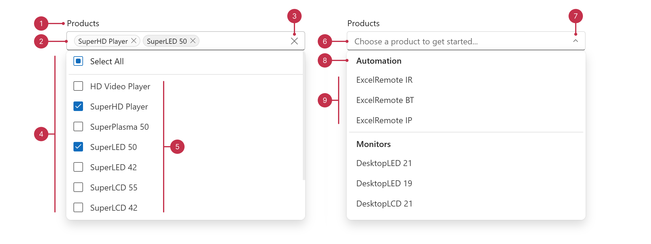
- Label
- Selected Items
- Clear Button (optional)
- Selection Controls
- Items
- Placeholder
- Dropdown Button (optional)
- Group Caption
- Grouped Items
Key Features
Data Binding
TagBox supports loading and updating data from different data source types.Tag Creation
TagBox can accept custom values. You can configure TagBox to update its data source on custom item creation or save changes temporarily.Selection Options
You can enable and configure selection functionality for the DevExtreme TagBox. You can specify the maximum number of tags the component displays and enable selection checkboxes (including a "Select All" checkbox).Searching and Filtering
The TagBox component includes configurable search functionality. You can specify a search mode, change the component search delay, and configure which item fields to search. TagBox also supports minimum and maximum search query definitions.Grouping
You can group items within the TagBox dropdown list. To enable grouping, set grouped totrueand specify DataSource.group in the component dataSource.Paging
DevExtreme TagBox supports paging within the component dropdown list. You can implement this feature to load large data sets in chunks. To enable paging, specify a DataSource instance as the TagBox dataSource and configure the paginate and pageSize properties.Form Support
TagBox is a supported editor type in the DevExtreme Form component. To integrate TagBox within a Form, set a Form item's editorType property to "dxTagBox".Accessibility and RTL
TagBox conforms to WCAG 2.x, European Accessibility Act (EAA), and Americans with Disabilities Act (ADA) standards. The component supports keyboard navigation and custom key handlers. TagBox also ships with right-to-left (RTL) representation support.Customization Settings
You can customize TagBox visual elements, including the component label and styling mode. TagBox also allows you to add input area buttons and includes two predefined options: a clear button and a dropdown button.Customization with Templates
DevExtreme TagBox supports extended visual element customization with templates. You can specify custom HTML markup for the following component elements: tags, dropdown items, the TagBox input field, and dropdown group headers.

 Select one or more answers