Angular Chart - tooltip
A tooltip is a miniature rectangle displaying values of a series point. A tooltip appears when the end-user hovers the cursor over a series point. You can enable/disable tooltips, change their appearance and format their text using fields of the tooltip configuration object.
argumentFormat
Formats the point argument before it is displayed in the tooltip. To format the point value, use the format property.
See Also
- format - provides a comprehensive overview of formatting capabilities.
- Value Formatting - shows how to apply formatting to various UI component elements.
color
Colors all tooltips.
This property supports the following colors:
- Hexadecimal colors
- RGB colors
- RGBA colors
- Predefined/cross-browser color names
- Predefined SVG colors
- Paint server address
This property sets one color for all tooltips. You can specify a particular tooltip's color in the tooltip.customizeTooltip function.
container
Specifies the container in which to draw tooltips. The default container is the HTML DOM <body> element.
contentTemplate
Specifies custom markup for tooltips
Series point data.
The tooltip's container. It is an HTML Element or a jQuery Element when you use jQuery.
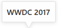
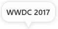
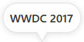
cornerRadius
Makes all the tooltip's corners rounded.
The following table demonstrates how the corner's curvature depends on the cornerRadius value:
| cornerRadius | Result |
|---|---|
cornerRadius: 0 |
 |
cornerRadius: 15 |
 |
cornerRadius: 35 |
 |
customizeTooltip
format
Formats a value before it is displayed it in a tooltip.
location
Specifies whether the tooltip must be located in the center of a series point or on its edge. Applies to bar-like and bubble series only.
opacity
Specifies tooltips' transparency.
This property accepts a value from 0 to 1, where 0 makes tooltips completely transparent, and 1 makes them opaque.
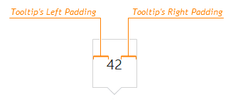
paddingLeftRight
Generates an empty space, measured in pixels, between a tooltip's left/right border and its text.
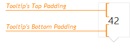
paddingTopBottom
Generates an empty space, measured in pixels, between a tooltip's top/bottom border and its text.
shared
Specifies whether the tooltip is shared across all series points with the same argument.
This property can have one of the following values:
| tooltip.shared | Description |
|---|---|
| false | The tooltip only displays information about a series point that is hovered over with the mouse pointer. |
| true | The tooltip displays information about all series points with the same argument as the point that is hovered over. If this point is included in a stack, the tooltip only displays information about points in this stack and points that do not belong to any stack (if there are any). |
See Also

 Select one or more answers