JavaScript/jQuery DataGrid - headerFilter
Configures the header filter feature.
A header filter allows a user to filter values in an individual column by including/excluding them in/from the applied filter. A click on a header filter icon invokes a popup menu with all unique values in the column. By selecting or clearing the selection of values in this menu, the user includes/excludes them in/from the filter.
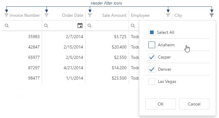
To make header filter icons visible, assign true to the headerFilter.visible property.
A header filter's popup menu lists all column values. If they are numbers or dates, you can group them using the groupInterval property in the column's headerFilter. You can also provide a custom data source for a header filter using the dataSource property.
If a column has empty cells (null, undefined, or ''), the header filter adds a "(Blanks)" item to its data source. To avoid displaying this "(Blanks)" item, implement DataSource.postProcess in the columns.headerFilter.dataSource method:
jQuery
$(function() {
    $("#dataGridContainer").dxDataGrid({
        columns: [{
            headerFilter: {
                dataSource: function (options) {
                    options.dataSource.postProcess = function (results) {
                        return results.filter((item) => item.value !== null)
                    }
                }
            }
        }]
    })
})
Angular
<dx-data-grid ... >
    <dxo-data-grid-header-filter [visible]="true"></dxo-data-grid-header-filter>
    <dxi-data-grid-column ... >
        <dxo-data-grid-header-filter ...
            [dataSource]="calculateDataSource"
        ></dxo-data-grid-header-filter>
    </dxi-data-grid-column>
</dx-data-grid>
export class AppComponent {
    calculateDataSource (options) {
        options.dataSource.postProcess = function (results) {
            return results.filter((item) => item.value !== null)
        }
    }
}
Vue
<template>
    <DxDataGrid ... >
        <DxHeaderFilter :visible="true" />
        <DxColumn ... >
            <DxHeaderFilter ...
                :data-source="calculateDataSource"
            />
        </DxColumn>
    </DxDataGrid>
</template>

<script>
import DxDataGrid, { DxColumn, DxLookup, DxHeaderFilter } from 'devextreme-vue/data-grid';

const calculateDataSource = (options) => {
    options.dataSource.postProcess = function (results) {
        return results.filter((item) => item.value !== null)
    }
}
</script>
React
import DataGrid, { Column, Lookup, HeaderFilter } from 'devextreme-react/data-grid';

function calculateDataSource(options) {
    options.dataSource.postProcess = function (results) {
        return results.filter((item) => item.value !== null)
    }
}

export default function App() {
    return (
        <DataGrid ... >
            <HeaderFilter visible={true} />
            <Column ...
                <HeaderFilter ...
                    dataSource={calculateDataSource}
                />
            </Column>
        </DataGrid>
    );
}
The user's filtering preferences are saved in the filterValues property. The header filter's Select All checkbox changes the filterType property.
See Also
allowSearch

Use DataGrid search.enabled or TreeList search.enabled instead.
Specifies whether searching is enabled in the header filter.
allowSelectAll
Specifies whether a "Select All" option is available to users.
search
Configures the header filter's search box.
jQuery
$(function(){
    $("#dataGrid").dxDataGrid({
        // ...
        headerFilter: {
            // ...
            search: {
                editorOptions: {
                    placeholder: 'Search value',
                    mode: 'text'
                },
                enabled: true,
                timeout: 700,
                mode: 'equals'
            },
        },
    })
});
Angular
<dx-data-grid ... >
    <dxo-data-grid-header-filter ... >
        <dxo-data-grid-search
            [editorOptions]="searchEditorOptions"
            [enabled]="true"
            [timeout]="700"
            mode="equals"
        ></dxo-data-grid-search>
    </dxo-data-grid-header-filter>
</dx-data-grid>
import { Component } from '@angular/core';

@Component({
    selector: 'app-root',
    templateUrl: './app.component.html',
    styleUrls: ['./app.component.css']
})

export class AppComponent {
    searchEditorOptions;
    constructor() {
        this.searchEditorOptions = {
            placeholder: 'Search value',
            mode: 'text'
        };
        // ...
    }
    // ...
}
import { BrowserModule } from '@angular/platform-browser';
import { NgModule } from '@angular/core';
import { AppComponent } from './app.component';
import { DxDataGridModule } from 'devextreme-angular';

@NgModule({
    declarations: [
        AppComponent
    ],
    imports: [
        BrowserModule,
        DxDataGridModule
    ],
    providers: [ ],
    bootstrap: [AppComponent]
})

export class AppModule { }
Vue
<template>
    <DxDataGrid ... >
        <DxHeaderFilter ... >
            <DxSearch
                :editor-options="searchEditorOptions"
                :enabled="true"
                :timeout="700"
                mode="equals"
            />
        </DxHeaderFilter>
    </DxDataGrid>
</template>

<script>
import 'devextreme/dist/css/dx.light.css';
import DxDataGrid, {
    DxHeaderFilter,
    DxSearch,
    // ...
} from 'devextreme-vue/data-grid';

export default {
    components: {
        DxDataGrid,
        DxHeaderFilter,
        DxSearch,
        // ...
    },
    data() {
        return {
            searchEditorOptions: {
                placeholder: 'Search value',
                mode: 'text'
            }
        };
    }
}
</script>
<template>
    <DxDataGrid ... >
        <DxHeaderFilter ... >
            <DxSearch
                :editor-options="searchEditorOptions"
                :enabled="true"
                :timeout="700"
                mode="equals"
            />
        </DxHeaderFilter>
    </DxDataGrid>
</template>

<script setup>
import 'devextreme/dist/css/dx.light.css';
import DxDataGrid, {
    DxHeaderFilter,
    DxSearch,
    // ...
} from 'devextreme-vue/data-grid';

const searchEditorOptions = {
    placeholder: 'Search value',
    mode: 'text'
};

// ...
</script>
React
import React from 'react';
import 'devextreme/dist/css/dx.light.css';

import DataGrid, {
    HeaderFilter,
    Search,
    // ...
} from 'devextreme-react/data-grid';

const searchEditorOptions = {
    placeholder: 'Search value',
    mode: 'text'
};

export default function App() {
    return (
        <DataGrid ... >
            <HeaderFilter ... >
                <Search
                    editorOptions={searchEditorOptions}
                    enabled={true}
                    timeout={700}
                    mode="equals"
                />
            </HeaderFilter>
        </DataGrid>
    );
} See Also
searchTimeout
Use DataGrid search.timeout or TreeList search.timeout instead.
Specifies a delay in milliseconds between when a user finishes typing in the header filter's search panel, and when the search is executed.

 Select one or more answers