JavaScript/jQuery DataGrid - columns
An array of grid columns.
By default, a column is created for each field of a data source object, but in most cases, it is redundant. To specify a set of columns to be created in a grid, assign an array specifying these columns to the columns property. Each grid column is represented in this array by an object containing column settings or by a data source field that this column is bound to. Detailed information on specifying grid columns is given in the Columns Overview article.
Column properties define the behavior and appearance of a grid column. One of the other capabilities allows you to control the sorting of column values using the allowSorting and sortOrder properties, apply a filter to grid records using the allowFiltering and filterOperations properties, and group grid records using the allowGrouping and groupIndex properties. In addition, you can change the visibility and width of a column using corresponding properties.
To get or set a property or several properties for a column at runtime, use the columnOption method with the required arguments.
See Also
ai
Configures AI options for the column.
Configure this property to integrate an AI column.
- To ensure the AI column functions correctly, specify key values in the DataGrid data source.
- If DataGrid automatically hides an AI column (when columnHidingEnabled is
true), users cannot access the AI header menu.
alignment
Aligns the content of the column.
The default alignment of the content depends on the type of data.
| dataType | alignment |
|---|---|
| 'number' | 'right' |
| 'boolean' | 'center' |
| 'string' | 'left' |
| 'date' | 'left' |
| 'datetime' | 'left' |
allowEditing
Specifies whether a user can edit values in the column at runtime. By default, inherits the value of the editing.allowUpdating property.
See Also
allowExporting
Specifies whether data from this column should be exported. Applies only if the column is visible.
Do not disable the allowExporting property if you export the DataGrid with multi-line headers.
See Also
allowFiltering
Specifies whether data can be filtered by this column.
See Also
- columns[].allowHeaderFiltering
allowFixing
Specifies whether a user can fix the column at runtime. Applies only if columnFixing.enabled is true.
See Also
- columnFixing
- columns[].fixed
allowGrouping
Specifies whether the user can group data by values of this column. Applies only when grouping is enabled.
When grouping is enabled in the UI component, the user can group data by values of any column. To prohibit a particular column from being used for grouping, set the allowGrouping property of this column to false.
See Also
allowHeaderFiltering
Specifies whether the header filter can be used to filter data by this column. Applies only if headerFilter.visible is true. By default, inherits the value of the allowFiltering property.
allowHiding
Specifies whether a user can hide the column using the column chooser at runtime. Applies only if columnChooser.enabled is true.
See Also
allowReordering
Specifies whether users can reorder this column. Overrides the allowColumnReordering property value.
allowResizing
Specifies whether a user can resize the column at runtime. Applies only if allowColumnResizing is true.
See Also
- columns[].width
- columnAutoWidth
- columnMinWidth
allowSearch
Specifies whether this column can be searched. Applies only if searchPanel.visible is true. Inherits the value of the allowFiltering property by default.
allowSorting
Specifies whether a user can sort rows by this column at runtime. Applies only if sorting.mode differs from "none".
autoExpandGroup
Specifies whether groups appear expanded or not when records are grouped by a specific column. Setting this property makes sense only when grouping is allowed for this column.
buttons[]
Allows you to customize buttons in the edit column or create a custom command column. Applies only if the column's type is "buttons".
calculateCellValue
Calculates custom cell values. Use this function to create an unbound data column.
The data of the row to which the cell belongs.
The this keyword refers to the column's configuration.
A cell's custom value.
Unlike data columns bound to a data field, unbound columns display custom values returned from the calculateCellValue function. The component executes this function multiple times for each record: when records are rendered, when users sort or filter them, and when summaries are computed. To avoid errors and enhance the UI component performance, make sure that properties of the rowData object used in calculation exist and keep calculations inside this function as simple as possible.
In the following code, the calculateCellValue function is used to create an unbound column that displays a calculated sales amount. Data objects contain the Price and UnitsSold fields used in the calculation:
jQuery
var products = [{
    ProductID: 1,
    ProductName: "Fabrikam SLR Camera 35\" X358 Blue",
    Price: 168,
    UnitsSold: 4
},
// ...
];

$(function() {
    $("#dataGridContainer").dxDataGrid({
        dataSource: products,
        columns: [{
            caption: "Sales Amount",
            calculateCellValue: function(rowData) {
                return rowData.Price * rowData.UnitsSold;
            }
        },
        // ...
        ]
    });
});
Angular
<dx-data-grid
    [dataSource]="products">
    <dxi-data-grid-column
        caption="Sales Amount"
        [calculateCellValue]="calculateSalesAmount">
    </dxi-data-grid-column>
</dx-data-grid>
import { Component } from '@angular/core';
import { Product, Service } from './app.service';

@Component({
    selector: 'app-root',
    templateUrl: './app.component.html',
    styleUrls: ['./app.component.css']
})
export class AppComponent {
    products: Product[];
    constructor(service: Service) {
        this.products = service.getProducts();
    }

    calculateSalesAmount(rowData) {
        return rowData.Price * rowData.UnitsSold;
    }
}
import { Injectable } from '@angular/core';

export class Product {
    ProductID: number,
    ProductName: string,
    Price: number,
    UnitsSold: number
}

let products: Product[] = [{
    ProductID: 1,
    ProductName: "Fabrikam SLR Camera 35\" X358 Blue",
    Price: 168,
    UnitsSold: 4
},
// ...
];

@Injectable()
export class Service {
    getProducts(): Product[] {
        return products;
    }
}
import { BrowserModule } from '@angular/platform-browser';
import { NgModule } from '@angular/core';
import { AppComponent } from './app.component';

import { DxDataGridModule } from 'devextreme-angular';
import { Service } from './app.service';

@NgModule({
    declarations: [
        AppComponent
    ],
    imports: [
        BrowserModule,
        DxDataGridModule
    ],
    providers: [
        Service
    ],
    bootstrap: [AppComponent]
})
export class AppModule { }
Vue
<template>
    <DxDataGrid
        :data-source="products">
        <DxColumn
            caption="Sales Amount"
            :calculate-cell-value="calculateSalesAmount">
        </DxColumn>
    </DxDataGrid>
</template>

<script>
import 'devextreme/dist/css/dx.fluent.blue.light.css';

import DxDataGrid, {
    DxColumn
} from 'devextreme-vue/data-grid';

import service from './data.js';

export default {
    components: {
        DxDataGrid,
        DxColumn
    },
    data() {
        const products = service.getProducts();
        return {
            products
        }
    },
    methods: {
        calculateSalesAmount(rowData) {
            return rowData.Price * rowData.UnitsSold;
        }
    }
}
</script>
const products = [{
    ProductID: 1,
    ProductName: "Fabrikam SLR Camera 35\" X358 Blue",
    Price: 168,
    UnitsSold: 4
},
// ...
];

export default {
    getProducts() {
        return products;
    }
};
React
import React from 'react';

import 'devextreme/dist/css/dx.fluent.blue.light.css';

import DataGrid, {
    Column
} from 'devextreme-react/data-grid';

import service from './data.js';

class App extends React.Component {
    constructor(props) {
        super(props);
        this.products = service.getProducts();
    }

    calculateSalesAmount(rowData) {
        return rowData.Price * rowData.UnitsSold;
    }

    render() {
        return (
            <DataGrid
                dataSource={this.products}>
                <Column
                    caption="Sales Amount"
                    calculateCellValue={this.calculateSalesAmount}
                />
            </DataGrid>
        );
    }
}
export default App;
const products = [{
    ProductID: 1,
    ProductName: "Fabrikam SLR Camera 35\" X358 Blue",
    Price: 168,
    UnitsSold: 4
},
// ...
];

export default {
    getProducts() {
        return products;
    }
};
The following features are disabled in an unbound column, but you can enable them as described in this table:
| Feature | Action that enables it |
|---|---|
| Editing | Implement the setCellValue function and specify the name property instead of dataField. |
| Sorting | Set the allowSorting property to true. |
| Filtering | Set the allowFiltering property to true. |
| Searching | Set the allowSearch property to true. |
| Grouping (DataGrid only) | Set the allowGrouping property to true. |
To invoke the default behavior, call the defaultCalculateCellValue function and return its result.
jQuery
$(function() {
    $("#dataGridContainer").dxDataGrid({
        columns: [{
            calculateCellValue: function(rowData) {
                // ...
                return this.defaultCalculateCellValue(rowData);
            }
        }]
    });
});
Angular
import { Component } from '@angular/core';

@Component({
    selector: 'app-root',
    templateUrl: './app.component.html',
    styleUrls: ['./app.component.css']
})
export class AppComponent {
    calculateCellValue(rowData) {
        // ...
        const column = this as any;
        return column.defaultCalculateCellValue(rowData);
    }
}
<dx-data-grid ... >
    <dxi-data-grid-column ...
        [calculateCellValue]="calculateCellValue">
    </dxi-data-grid-column>
</dx-data-grid>
Vue
<template>
    <DxDataGrid ... >
        <DxColumn ...
            :calculate-cell-value="calculateCellValue">
        </DxColumn>
    </DxDataGrid>
</template>

<script>
// ...
export default {
    // ...
    data() {
        return {
            calculateCellValue: function(rowData) {
                // ...
                const column = this as any;
                return column.defaultCalculateCellValue(rowData);
            }
        }
    }
}
</script>
React
// ...
class App extends React.Component {
    calculateCellValue(rowData) {
        // ...
        const column = this as any;
        return column.defaultCalculateCellValue(rowData);
    }

    render() {
        return (
            <DataGrid ... >
                <Column ...
                    calculateCellValue={this.calculateCellValue}
                />
            </DataGrid>
        );
    }
}
export default App;The
thiskeyword refers to the column's configuration.calculateCellValue is a getter. If you implement the getCombinedFilter(returnDataField) method, pass
falseto the returnDataField parameter. Alternatively, use getCombinedFilter() instead.
See Also
- columns[].customizeText
- columns[].calculateDisplayValue
calculateDisplayValue
Calculates custom display values for column cells. Requires specifying the dataField or calculateCellValue property. Used in lookup optimization.
The data of the row to which the cell belongs.
The this keyword refers to the column's configuration.
The value for the cell to display.
This property accepts the name of the data source field that provides display values...
jQuery
$(function() {
    $("#dataGridContainer").dxDataGrid({
        columns: [{
            dataField: "countryID", // provides values for editing
            calculateDisplayValue: "country" // provides display values
        }]
    });
});
Angular
<dx-data-grid ... >
    <dxi-data-grid-column
        dataField="countryID" <!-- provides values for editing -->
        calculateDisplayValue="country"> <!-- provides display values -->
    </dxi-data-grid-column>
</dx-data-grid>
import { DxDataGridModule } from "devextreme-angular";
// ...
export class AppComponent {
    // ...
}
@NgModule({
    imports: [
        // ...
        DxDataGridModule
    ],
    // ...
})
Vue
<template>
    <DxDataGrid>
        <DxColumn
            data-field="countryID" <!-- provides values for editing -->
            calculate-display-value="country"> <!-- provides display values -->
        />
    </DxDataGrid>
</template>

<script>
import 'devextreme/dist/css/dx.fluent.blue.light.css';

import DxDataGrid, {
    DxColumn
} from 'devextreme-vue/data-grid';

export default {
    components: {
        DxDataGrid,
        DxColumn
    },
    // ...
}
</script>
React
import React from 'react';

import 'devextreme/dist/css/dx.fluent.blue.light.css';

import DataGrid, {
    Column
} from 'devextreme-react/data-grid';

class App extends React.Component {
    // ...

    render() {
        return (
            <DataGrid>
                <Column
                    dataField="countryID"  <!-- provides values for editing -->
                    calculateDisplayValue="country"  <!-- provides display values -->
                />
            </DataGrid>
        );
    }
}
export default App;
ASP.NET MVC Controls
@(Html.DevExtreme().DataGrid()
    .Columns(columns => columns.Add()
        .DataField("CountryID")
        .CalculateDisplayValue("Country")
    )
)
... or a function that combines display values. Specify this function only if all data processing operations are executed on the client.
jQuery
$(function() {
    $("#dataGridContainer").dxDataGrid({
        columns: [{
            dataField: "countryID", // provides values for editing
            calculateDisplayValue: function (rowData) { // combines display values
                return rowData.capital + " (" + rowData.country + ")";
            }
        }]
    });
});
Angular
<dx-data-grid ... >
    <dxi-data-grid-column
        dataField="countryID" <!-- provides values for editing -->
        [calculateDisplayValue]="getCountryWithCapital"> <!-- combines display values -->
    </dxi-data-grid-column>
</dx-data-grid>
import { DxDataGridModule } from "devextreme-angular";
// ...
export class AppComponent {
    getCountryWithCapital(rowData) {
        return rowData.capital + " (" + rowData.country + ")";
    }
}
@NgModule({
    imports: [
        // ...
        DxDataGridModule
    ],
    // ...
})
Vue
<template>
    <DxDataGrid>
        <DxColumn
            data-field="countryID" <!-- provides values for editing -->
            :calculate-display-value="getCountryWithCapital" <!-- combines display values -->
        />
    </DxDataGrid>
</template>

<script>
import 'devextreme/dist/css/dx.fluent.blue.light.css';

import DxDataGrid, {
    DxColumn
} from 'devextreme-vue/data-grid';

export default {
    components: {
        DxDataGrid,
        DxColumn
    },
    methods: {
        getCountryWithCapital(rowData) {
            return rowData.capital + " (" + rowData.country + ")";
        }
    }
}
</script>
React
import React from 'react';

import 'devextreme/dist/css/dx.fluent.blue.light.css';

import DataGrid, {
    Column
} from 'devextreme-react/data-grid';

class App extends React.Component {
    // ...

    render() {
        return (
            <DataGrid>
                <Column
                    dataField="countryID" <!-- provides values for editing -->
                    calculateDisplayValue={this.getCountryWithCapital} <!-- combines display values -->
                />
            </DataGrid>
        );
    }

    getCountryWithCapital(rowData) {
        return rowData.capital + " (" + rowData.country + ")";
    }
}
export default App;
ASP.NET MVC Controls
@(Html.DevExtreme().DataGrid()
    .Columns(columns => columns.Add()
        .DataField("CountryID")
        .CalculateDisplayValue(new JS("getCountryWithCapital"))
    )
)

<script>
    function getCountryWithCapital(rowData) {
        return rowData.capital + " (" + rowData.country + ")";
    }
</script>

<script>
    function getCountryWithCapital(rowData) {
        return rowData.capital + " (" + rowData.country + ")";
    }
</script>
The UI component uses the specified display values in sorting, searching, and grouping (in case of DataGrid).
Do not use this property to format text in cells. Instead, use the format, customizeText, or cellTemplate property.
calculateFilterExpression
Specifies the column's custom rules to filter data.
A user input value.
Contains an array if the selectedFilterOperation is one of the following: "between", "anyof", "noneof".
A selected filter operation.
A UI element used to filter data.
Possible values: "filterRow", "headerFilter", "filterBuilder", "search".
The this keyword refers to the column's configuration.
A filter expression.
The calculateFilterExpression function should return a filter expression. A basic filter expression has the following format:
[selector, comparisonOperator, filterValue]
selector
A dataField or function that accepts arowDataproperty and returns column values. Passthis.calculateCellValueif your column contains calculated values.comparisonOperator
One of the following operators: "=", "<>", ">", ">=", "<", "<=", "startswith", "endswith", "contains", "notcontains".filterValue
A user input value. Values from theselectorare compared to this value.
A filter expression for the "between" operation has a different format:
[ [selector, ">=", startValue], "and", [selector, "<=", endValue] ]
The default "between" implementation is inclusive (filter results include the boundary values). In the following code, the calculateFilterExpression function implements an exclusive "between" operation:
jQuery
$(function() {
    $("#dataGridContainer").dxDataGrid({
        // ...
        columns: [{
            calculateFilterExpression: function (filterValue, selectedFilterOperation, target) {
                // Override implementation for the "between" filter operation
                if (selectedFilterOperation === "between" && $.isArray(filterValue)) {
                    const filterExpression = [
                        [this.dataField, ">", filterValue[0]],
                        "and",
                        [this.dataField, "<", filterValue[1]]
                    ];
                    return filterExpression;
                }
                // Invoke the default implementation for other filter operations
                if(!this.defaultCalculateFilterExpression)
                    return [this.dataField, 'contains', filterValue];
                return this.defaultCalculateFilterExpression.apply(this, arguments);
            },
            // ...
        }]
    });
});
Angular
import { DxDataGridModule } from "devextreme-angular";
import { Column } from 'devextreme/ui/data_grid';
// ...
export class AppComponent {
    calculateFilterExpression (this: Column, filterValue, selectedFilterOperation, target) {
        // Override implementation for the "between" filter operation
        if (selectedFilterOperation === "between" && Array.isArray(filterValue)) {
            const filterExpression = [
                [this.dataField, ">", filterValue[0]],
                "and",
                [this.dataField, "<", filterValue[1]]
            ];
            return filterExpression;
        }
        // Invoke the default implementation for other filter operations
        if(!this.defaultCalculateFilterExpression)
            return [this.dataField, 'contains', filterValue];
        return this.defaultCalculateFilterExpression.apply(this, arguments);
    }
}
@NgModule({
    imports: [
        // ...
        DxDataGridModule
    ],
    // ...
})
<dx-data-grid ... >
    <dxi-data-grid-column ...
        [calculateFilterExpression]="calculateFilterExpression">
    </dxi-data-grid-column>
</dx-data-grid>
Vue
<template>
    <DxDataGrid>
        <DxColumn ...
            :calculate-filter-expression="calculateFilterExpression"
        />
    </DxDataGrid>
</template>

<script>
import 'devextreme/dist/css/dx.fluent.blue.light.css';

import DxDataGrid, {
    DxColumn
} from 'devextreme-vue/data-grid';

export default {
    components: {
        DxDataGrid,
        DxColumn
    },
    data() {
        return {
            calculateFilterExpression (filterValue, selectedFilterOperation, target) {
                // Override implementation for the "between" filter operation
                if (selectedFilterOperation === "between" && Array.isArray(filterValue)) {
                    const filterExpression = [
                        [this.dataField, ">", filterValue[0]],
                        "and",
                        [this.dataField, "<", filterValue[1]]
                    ];
                    return filterExpression;
                }
                // Invoke the default implementation for other filter operations
                if(!this.defaultCalculateFilterExpression)
                    return [this.dataField, 'contains', filterValue];
                return this.defaultCalculateFilterExpression.apply(this, arguments);
            }
        }
    }
}
</script>
React
import React from 'react';
import 'devextreme/dist/css/dx.fluent.blue.light.css';

import DataGrid, {
    Column
} from 'devextreme-react/data-grid';

function calculateFilterExpression (filterValue, selectedFilterOperation, target) {
    // Override implementation for the "between" filter operation
    if (selectedFilterOperation === "between" && Array.isArray(filterValue)) {
        const filterExpression = [
            [this.dataField, ">", filterValue[0]],
            "and",
            [this.dataField, "<", filterValue[1]]
        ];
        return filterExpression;
    }
    // Invoke the default implementation for other filter operations
    if(!this.defaultCalculateFilterExpression)
        return [this.dataField, 'contains', filterValue];
    return this.defaultCalculateFilterExpression.apply(this, arguments);
}

export default function App() {
    return (
        <DataGrid>
            <Column ...
                calculateFilterExpression={calculateFilterExpression}
            />
        </DataGrid>
    );
}
To specify a function as a selector, return a property from the rowData object. You can utilize custom logic in the function to implement advanced filtering behavior. The following code snippet returns data from ColumnTwo when users filter ColumnOne data in the DataGrid filterRow:
jQuery
$(function() {
    $("#dataGridContainer").dxDataGrid({
        // ...
        columns: [{
            dataField: "ColumnOne",
            calculateFilterExpression: function (filterValue, selectedFilterOperation, target) {
                if (target === "filterRow") {
                    return [(rowData) => {
                        return rowData.ColumnTwo
                    }, selectedFilterOperation, filterValue];
                }
            },
        }]
    });
});
Angular
import { DxDataGridModule } from "devextreme-angular";
import { Column } from 'devextreme/ui/data_grid';
// ...
export class AppComponent {
    calculateFilterExpression (filterValue, selectedFilterOperation, target) {
        if (target === "filterRow") {
            return [(rowData) => {
                return rowData.ColumnTwo
            }, selectedFilterOperation, filterValue];
        }
    }
}
@NgModule({
    imports: [
        // ...
        DxDataGridModule
    ],
    // ...
})
<dx-data-grid ... >
    <dxi-data-grid-column ...
        dataField="ColumnOne"
        [calculateFilterExpression]="calculateFilterExpression">
    </dxi-data-grid-column>
</dx-data-grid>
Vue
<template>
    <DxDataGrid>
        <DxColumn ...
            data-field="ColumnOne"
            :calculate-filter-expression="calculateFilterExpression"
        />
    </DxDataGrid>
</template>

<script>
import 'devextreme/dist/css/dx.fluent.blue.light.css';

import DxDataGrid, {
    DxColumn
} from 'devextreme-vue/data-grid';

export default {
    components: {
        DxDataGrid,
        DxColumn
    },
    data() {
        return {
            calculateFilterExpression (filterValue, selectedFilterOperation, target) {
                if (target === "filterRow") {
                    return [(rowData) => {
                        return rowData.ColumnTwo
                    }, selectedFilterOperation, filterValue];
                }
            }
        }
    }
}
</script>
React
import React from 'react';
import 'devextreme/dist/css/dx.fluent.blue.light.css';

import DataGrid, {
    Column
} from 'devextreme-react/data-grid';

function calculateFilterExpression (filterValue, selectedFilterOperation, target) {
    if (target === "filterRow") {
        return [(rowData) => {
            return rowData.ColumnTwo
        }, selectedFilterOperation, filterValue];
    }
}

export default function App() {
    return (
        <DataGrid>
            <Column ...
                dataField="ColumnOne"
                calculateFilterExpression={calculateFilterExpression}
            />
        </DataGrid>
    );
}
You can also implement a function with custom filter conditions as a filter expression. Specify a function that takes an object and returns a Boolean value. The return Boolean represents whether the passed object meets your filtering conditions. The following code snippet returns ColumnOne items that are equal to the ColumnTwo item in the same row when users search for =:
jQuery
$(function() {
    $("#dataGridContainer").dxDataGrid({
        // ...
        columns: [{
            dataField: "ColumnOne",
            calculateFilterExpression: function (filterValue, selectedFilterOperation, target) {
                if (filterValue === "=") {
                    return (rowData) => {
                        return rowData.ColumnTwo === rowData.ColumnOne;
                    };
                }
            },
        }]
    });
});
Angular
import { DxDataGridModule } from "devextreme-angular";
import { Column } from 'devextreme/ui/data_grid';
// ...
export class AppComponent {
    calculateFilterExpression (filterValue, selectedFilterOperation, target) {
        if (filterValue === "=") {
            return (rowData) => {
                return rowData.ColumnTwo === rowData.ColumnOne;
            };
        }
    }
}
@NgModule({
    imports: [
        // ...
        DxDataGridModule
    ],
    // ...
})
<dx-data-grid ... >
    <dxi-data-grid-column ...
        dataField="ColumnOne"
        [calculateFilterExpression]="calculateFilterExpression">
    </dxi-data-grid-column>
</dx-data-grid>
Vue
<template>
    <DxDataGrid>
        <DxColumn ...
            data-field="ColumnOne"
            :calculate-filter-expression="calculateFilterExpression"
        />
    </DxDataGrid>
</template>

<script>
import 'devextreme/dist/css/dx.fluent.blue.light.css';

import DxDataGrid, {
    DxColumn
} from 'devextreme-vue/data-grid';

export default {
    components: {
        DxDataGrid,
        DxColumn
    },
    data() {
        return {
            calculateFilterExpression (filterValue, selectedFilterOperation, target) {
                if (filterValue === "=") {
                    return (rowData) => {
                        return rowData.ColumnTwo === rowData.ColumnOne;
                    };
                }
            }
        }
    }
}
</script>
React
import React from 'react';
import 'devextreme/dist/css/dx.fluent.blue.light.css';

import DataGrid, {
    Column
} from 'devextreme-react/data-grid';

function calculateFilterExpression (filterValue, selectedFilterOperation, target) {
    if (filterValue === "=") {
        return (rowData) => {
            return rowData.ColumnTwo === rowData.ColumnOne;
        };
    }
}

export default function App() {
    return (
        <DataGrid>
            <Column ...
                dataField="ColumnOne"
                calculateFilterExpression={calculateFilterExpression}
            />
        </DataGrid>
    );
}- If you specify a custom header filter data source, a header filter item's
valuefield can contain a single value (for example, 0) or a filter expression. If it is a filter expression, the calculateFilterExpression function does not apply. - If users filter data with the component's search panel, the selectedFilterOperation parameter returns
null.
If you use the search panel, the DataGrid may invoke the calculateFilterExpression function multiple times for lookup columns. The first call is to filter the lookup's data source, and subsequent calls are to filter the DataGrid's data source.
DataGrid uses "anyof" and "noneof" filter values for headerFilter. If you specify calculateFilterExpression for headerFilter, return an array of filterExpressions:
jQuery
$(function() {
    $("#dataGridContainer").dxDataGrid({
        // ...
        columns: [{
            calculateFilterExpression(filterValue, selectedFilterOperation, target){
                if (target == "headerFilter") {
                    // ...
                    let filterExpression = ["myDataField", "contains", customValue];
                    return [filterExpression];
                }
            }
            // ...
        }]
    });
});
Angular
import { DxDataGridModule } from "devextreme-angular";
import { Column } from 'devextreme/ui/data_grid';
// ...
export class AppComponent {
    calculateFilterExpression(this: Column, filterValue, selectedFilterOperation, target){
        if (target == "headerFilter") {
            // ...
            let filterExpression = ["myDataField", "contains", customValue];
            return [filterExpression];
        }
    }
}
@NgModule({
    imports: [
        // ...
        DxDataGridModule
    ],
    // ...
})
<dx-data-grid ... >
    <dxi-data-grid-column ...
        [calculateFilterExpression]="calculateFilterExpression">
    </dxi-data-grid-column>
</dx-data-grid>
Vue
<template>
    <DxDataGrid>
        <DxColumn ...
            :calculate-filter-expression="calculateFilterExpression"
        />
    </DxDataGrid>
</template>

<script>
import 'devextreme/dist/css/dx.fluent.blue.light.css';

import DxDataGrid, {
    DxColumn
} from 'devextreme-vue/data-grid';

export default {
    components: {
        DxDataGrid,
        DxColumn
    },
    data() {
        return {
            calculateFilterExpression(filterValue, selectedFilterOperation, target){
                if (target == "headerFilter") {
                    // ...
                    let filterExpression = ["myDataField", "contains", customValue];
                    return [filterExpression];
                }
            }
        }
    }
}
</script>
React
import React from 'react';
import 'devextreme/dist/css/dx.fluent.blue.light.css';

import DataGrid, {
    Column
} from 'devextreme-react/data-grid';

function calculateFilterExpression(filterValue, selectedFilterOperation, target){
    if (target == "headerFilter") {
        // ...
        let filterExpression = ["myDataField", "contains", customValue];
        return [filterExpression];
    }
}

export default function App() {
    return (
        <DataGrid>
            <Column ...
                calculateFilterExpression={calculateFilterExpression}
            />
        </DataGrid>
    );
}
See Also
- filterValue
- columns[].filterValue
- columns[].selectedFilterOperation
- columns[].filterValues
- columns[].filterType
- columns[].filterOperations
calculateGroupValue
Sets custom column values used to group grid records.
Current row data.
The this keyword refers to the column's configuration.
The calculated value used to create and sort groups.
This property accepts the name of the data source field that provides values used to group grid records...
jQuery
$(function() {
    $("#dataGridContainer").dxDataGrid({
        columns: [{
            dataField: "ColumnValues",
            groupIndex: 0,
            calculateGroupValue: "GroupingValues"
        }]
    });
});
Angular
<dx-data-grid ... >
    <dxi-data-grid-column
        dataField="ColumnValues"
        [groupIndex]="0"
        calculateGroupValue="GroupingValues">
    </dxi-data-grid-column>
</dx-data-grid>
import { BrowserModule } from '@angular/platform-browser';
import { NgModule } from '@angular/core';
import { AppComponent } from './app.component';
import { DxDataGridModule } from 'devextreme-angular';

@NgModule({
    declarations: [
        AppComponent
    ],
    imports: [
        BrowserModule,
        DxDataGridModule
    ],
    providers: [ ],
    bootstrap: [AppComponent]
})

export class AppModule { }
Vue
<template>
    <DxDataGrid ... >
        <DxColumn
            data-field="ColumnValues"
            :group-index="0"
            calculate-group-value="GroupingValues"
        />
    </DxDataGrid>
</template>
<script>
import { DxDataGrid, DxColumn } from 'devextreme-vue/data-grid';

export default {
    components: {
        DxDataGrid,
        DxColumn
    },
    // ...
}
</script>
React
import React from 'react';
import DataGrid, { Column } from 'devextreme-react/data-grid';

function App() {
    // ...
    return (
        <DataGrid ...>
            <Column
                dataField="ColumnValues"
                groupIndex={0}
                calculateGroupValue="GroupingValues"
            />
        </DataGrid>
    );
}

export default App();
... or a function that creates custom groups. In the code below, calculateGroupValue creates groups like Today, Yesterday, and Earlier:
jQuery
const getDayDifference = (date1, date2) => {
    const timeDiff = Math.abs(date1.getTime() - date2.getTime());
    return Math.ceil(timeDiff / (1000 * 3600 * 24));
}

$(function() {
    $("#dataGridContainer").dxDataGrid({
        columns: [
            // ...
            {
                dataField: "HireDate",
                dataType: "date",
                groupIndex: 0,
                calculateGroupValue: function(rowData) {
                    const currentHireDate = rowData.HireDate;
                    const today = new Date();
                    today.setHours(0,0,0,0);

                    const dayDifference = getDayDifference(today, currentHireDate);
                    switch (dayDifference) {
                        case 0: return "Today";
                        case 1: return "Yesterday";
                        // ...
                        default: return "Earlier";
                    }
                }
            }
        ]
    });
});
Angular
<dx-data-grid ... >
    <!-- ... -->
    <dxi-data-grid-column
        dataField="HireDate"
        [groupIndex]="0"
        [calculateGroupValue]="groupByDate"
        dataType="date">
    </dxi-data-grid-column>
</dx-data-grid>
const getDayDifference = (date1, date2) => {
    const timeDiff = Math.abs(date1.getTime() - date2.getTime());
    return Math.ceil(timeDiff / (1000 * 3600 * 24));
}

export class AppComponent {
    // ...
    groupByDate(rowData) {
        const currentHireDate = rowData.HireDate;
        const today = new Date();
        today.setHours(0,0,0,0);

        const dayDifference = getDayDifference(today, currentHireDate);
        switch (dayDifference) {
            case 0: return "Today";
            case 1: return "Yesterday";
            // ...
            default: return "Earlier";
        };
    }
}
import { BrowserModule } from '@angular/platform-browser';
import { NgModule } from '@angular/core';
import { AppComponent } from './app.component';
import { DxDataGridModule } from 'devextreme-angular';

@NgModule({
    declarations: [
        AppComponent
    ],
    imports: [
        BrowserModule,
        DxDataGridModule
    ],
    providers: [ ],
    bootstrap: [AppComponent]
})

export class AppModule { }
Vue
<template>
    <DxDataGrid ... >
        <DxColumn
            data-field="HireDate"
            data-type="date"
            :group-index="0"
            :calculate-group-value="groupByDate"
        />
    </DxDataGrid>
</template>
<script>
import { DxDataGrid, DxColumn } from 'devextreme-vue/data-grid';

const getDayDifference = (date1, date2) => {
    const timeDiff = Math.abs(date1.getTime() - date2.getTime());
    return Math.ceil(timeDiff / (1000 * 3600 * 24));
}

export default {
    components: {
        DxDataGrid,
        DxColumn
    },
    methods: {
        groupByDate(rowData) {
            const currentHireDate = rowData.HireDate;
            const today = new Date();
            today.setHours(0,0,0,0);

            const dayDifference = getDayDifference(today, currentHireDate);
            switch (dayDifference) {
                case 0: return "Today";
                case 1: return "Yesterday";
                // ...
                default: return "Earlier";
            };
        }
    }
    // ...
}
</script>
React
import React from 'react';
import DataGrid, { Column } from 'devextreme-react/data-grid';

const getDayDifference = (date1, date2) => {
    const timeDiff = Math.abs(date1.getTime() - date2.getTime());
    return Math.ceil(timeDiff / (1000 * 3600 * 24));
}

function App() {
    // ...
    const groupByDate = (rowData) => {
        const currentHireDate = rowData.HireDate;
        const today = new Date();
        today.setHours(0,0,0,0);

        const dayDifference = getDayDifference(today, currentHireDate);
        switch (dayDifference) {
            case 0: return "Today";
            case 1: return "Yesterday";
            // ...
            default: return "Earlier";
        };
    };

    return (
        <DataGrid ...>
            <Column
                dataField="HireDate"
                dataType="date"
                groupIndex={0}
                calculateGroupValue={groupByDate}
            />
        </DataGrid>
    );
}

export default App;Group captions and appearance can be customized. To do this, define the groupCellTemplate.
calculateGroupValue is also used to sort groups when grid records are grouped by this column.
this keyword refers to the column's configuration.calculateSortValue
Calculates custom values used to sort this column.
The data of the row to which the cell belongs.
The this keyword refers to the column's configuration.
The value to be used in sorting.
This property accepts the name of the data source field that provides values used to sort this column.
jQuery
$(function() {
    $("#dataGridContainer").dxDataGrid({
        columns: [{
            dataField: "Position", // provides column values
            calculateSortValue: "isOnVacation" // provides values used to sort the Position column
        }]
    });
});
Angular
<dx-data-grid ... >
    <dxi-data-grid-column
        dataField="Position" <!-- provides column values -->
        calculateSortValue="isOnVacation"> <!-- provides values used to sort the Position column -->
    </dxi-data-grid-column>
</dx-data-grid>
import { BrowserModule } from '@angular/platform-browser';
import { NgModule } from '@angular/core';
import { AppComponent } from './app.component';
import { DxDataGridModule } from 'devextreme-angular';

@NgModule({
    declarations: [
        AppComponent
    ],
    imports: [
        BrowserModule,
        DxDataGridModule
    ],
    providers: [ ],
    bootstrap: [AppComponent]
})

export class AppModule { }
Vue
<template>
    <DxDataGrid ... >
        <DxColumn
            data-field="Position" <!-- provides column values -->
            calculate-sort-value="isOnVacation" <!-- provides values used to sort the Position column -->
        />
    </DxDataGrid>
</template>
<script>
import { DxDataGrid, DxColumn } from 'devextreme-vue/data-grid';

export default {
    components: {
        DxDataGrid,
        DxColumn
    },
    // ...
}
</script>
React
import React from 'react';
import DataGrid, { Column } from 'devextreme-react/data-grid';

function App() {
    // ...
    return (
        <DataGrid ...>
            <Column
                dataField="Position" // provides column values
                calculateSortValue="isOnVacation" // provides values used to sort the Position column
            />
        </DataGrid>
    );
}

export default App;
... or a function that returns such values. In the code below, calculateSortValue concatenates the State and City column values to sort the Employee column:
jQuery
$(function() {
    var dataGrid = $("#dataGridContainer").dxDataGrid({
        columns: [{
            dataField: "Employee",
            sortOrder: "asc",
            calculateSortValue: function (rowData) {
                return rowData.State + rowData.City;
            }
        }]
    }).dxDataGrid("instance");
});
Angular
<dx-data-grid ... >
    <dxi-data-grid-column
        dataField="Employee"
        sortOrder="asc"
        [calculateSortValue]="sortByLocation">
    </dxi-data-grid-column>
</dx-data-grid>
import { DxDataGridModule } from "devextreme-angular";
// ...
export class AppComponent {
    sortByLocation (rowData) {
        return rowData.State + rowData.City;
    }
}
import { BrowserModule } from '@angular/platform-browser';
import { NgModule } from '@angular/core';
import { AppComponent } from './app.component';
import { DxDataGridModule } from 'devextreme-angular';

@NgModule({
    declarations: [
        AppComponent
    ],
    imports: [
        BrowserModule,
        DxDataGridModule
    ],
    providers: [ ],
    bootstrap: [AppComponent]
})

export class AppModule { }
Vue
<template>
    <DxDataGrid ... >
        <DxColumn
            data-field="Employee"
            :calculate-sort-value="sortByLocation"
        />
    </DxDataGrid>
</template>
<script>
import { DxDataGrid, DxColumn } from 'devextreme-vue/data-grid';

export default {
    components: {
        DxDataGrid,
        DxColumn
    },
    data() {
        return {
            // ...
            sortByLocation(rowData) {
                return rowData.State + rowData.City;
            },
        };
    },
}
</script>
React
import React from 'react';
import DataGrid, { Column } from 'devextreme-react/data-grid';

function sortByLocation(rowData){
    return rowData.State + rowData.City;
}

function App() {
    // ...
    return (
        <DataGrid ...>
            <Column
                dataField="Employee"
                calculateSortValue={sortByLocation}
            />
        </DataGrid>
    );
}

export default App;calculateSortValue does not affect DataGrid group rows. To sort them, implement calculateGroupValue in addition to calculateSortValue. You should also define the groupCellTemplate to apply a custom template for group rows.
This property only accepts strings if remote operations are enabled.
See Also
- sortingMethod
- columns[].sortOrder
caption
Specifies a caption for the column.
Use this property to display a descriptive or friendly name for the column. If this property is not set, the caption will be generated from the name of the dataField.
cellTemplate
Specifies a custom template for data cells.
| Name | Type | Description |
|---|---|---|
| column |
The column's properties. |
|
| columnIndex |
The index of the cell's column. |
|
| component |
The UI component's instance. |
|
| data |
The data of the row to which the cell belongs. |
|
| displayValue | any |
The cell's display value. Differs from the value field only when the column uses lookup or calculateDisplayValue. |
| oldValue | any |
The cell's previous raw value. Defined only if repaintChangesOnly is true. |
| row |
The cell's row. |
|
| rowIndex |
The index of the cell's row. Begins with 0 on each page. Group rows are included. |
|
| rowType |
The row's type. |
|
| text |
displayValue after applying format and customizeText. |
|
| value | any |
The cell's raw value. |
| watch |
Allows you to track a variable and respond to value changes. Applies when repaintChangesOnly is true.
|
The following details should be taken into account when you use a cellTemplate:
- When the DataGrid is exported, it omits customizations made in the template. However, you can use the customizeCell function to recreate them in the exported file using the DevExtreme ExcelJS API.
If you implement two-way data binding in your template, set twoWayBindingEnabled to false to switch off the built-in implementation of this feature.
In fixed columns, the template is initialized and rendered twice for each cell.
Template values have no effect on data operations. Implement the column's calculateCellValue or calculateDisplayValue option to transform the cell's underlying value.
jQuery
The code snippet below uses the watch function. You can test the snippet in the Real-Time Updates demo.
Note the following:
- You cannot call
watchin a cell in which you want to track data. - The data in the cell where
watchis called should remain constant.
$("#dataGridContainer").dxDataGrid({
    columns: [{
        dataField: 'ProductName',
        dataType: 'string',
        cellTemplate(container, info) {
            const getter = (data) => data.Amount;
            const handler = (newValue) => {
                container.css('background-color', newValue < 100000 ? 'red' : 'green');
            };
            info.watch(getter, handler);
            return $('<div>').text(info.data.ProductName);
        }
    }]
});See Also
columns
An array of grid columns.
Unlike normal columns, band columns do not hold data. Instead, they collect two or more columns under one column header. To set up this layout, declare the band column using a hierarchical structure. For this, assign the nested columns to the columns field of the band column. For example, the following code declares the "Address" band column and nests three columns within it.
jQuery
$(function() {
    $("#dataGridContainer").dxDataGrid({
        // ...
        columns: [{
            caption: "Address",
            columns: ["City", "Street", "Apartment"]
        }, {
            // ...
        }]
    });
});
Angular
<dx-data-grid ... >
    <dxi-data-grid-column caption="Address">
        <dxi-data-grid-column dataField="City"></dxi-data-grid-column>
        <dxi-data-grid-column dataField="Street"></dxi-data-grid-column>
        <dxi-data-grid-column dataField="Apartment"></dxi-data-grid-column>
    </dxi-data-grid-column>
</dx-data-grid>
import { DxDataGridModule } from "devextreme-angular";
// ...
export class AppComponent {
    // ...
}
@NgModule({
    imports: [
        // ...
        DxDataGridModule
    ],
    // ...
})
Vue
<template>
    <DxDataGrid ... >
        <DxColumn caption="Address">
            <DxColumn data-field="City" />
            <DxColumn data-field="Street" />
            <DxColumn data-field="Apartment" />
        </DxColumn>
    </DxDataGrid>
</template>

<script>
import 'devextreme/dist/css/dx.fluent.blue.light.css';

import DxDataGrid, {
    DxColumn
} from 'devextreme-vue/data-grid';

export default {
    components: {
        DxDataGrid,
        DxColumn
    },
    // ...
}
</script>
React
import React from 'react';
import 'devextreme/dist/css/dx.fluent.blue.light.css';

import DataGrid, {
    Column
} from 'devextreme-react/data-grid';

export default function App() {
    return (
        <DataGrid ... >
            <Column caption="Address">
                <Column dataField="City" />
                <Column dataField="Street" />
                <Column dataField="Apartment" />
            </Column>
        </DataGrid>
    );
}
A nested column has almost every property a regular column has. These properties are described in the columns section of the Reference.
For example, the following code specifies the width and sortOrder properties of the "Street" column nested within the fixed "Address" band column.
jQuery
$(function() {
    $("#dataGridContainer").dxDataGrid({
        // ...
        columns: [{
            caption: "Address",
            fixed: true,
            fixedPosition: "right",
            columns: [
                "City", {
                    dataField: "Street",
                    width: 100,
                    sortOrder: "asc"
                },
                "Apartment"
            ]
        }, {
            // ...
        }]
    });
});
Angular
<dx-data-grid ... >
    <dxi-data-grid-column
        caption="Address"
        [fixed]="true"
        fixedPosition="right">
        <dxi-data-grid-column dataField="City"></dxi-data-grid-column>
        <dxi-data-grid-column dataField="Street" [width]="100" sortOrder="asc"></dxi-data-grid-column>
        <dxi-data-grid-column dataField="Apartment"></dxi-data-grid-column>
    </dxi-data-grid-column>
</dx-data-grid>
import { DxDataGridModule } from "devextreme-angular";
// ...
export class AppComponent {
    // ...
}
@NgModule({
    imports: [
        // ...
        DxDataGridModule
    ],
    // ...
})
Vue
<template>
    <DxDataGrid ... >
        <DxColumn
            caption="Address"
            :fixed="true"
            fixed-position="right">
            <DxColumn data-field="City" />
            <DxColumn data-field="Street" :width="100" sort-order="asc" />
            <DxColumn data-field="Apartment" />
        </DxColumn>
    </DxDataGrid>
</template>

<script>
import 'devextreme/dist/css/dx.fluent.blue.light.css';

import DxDataGrid, {
    DxColumn
} from 'devextreme-vue/data-grid';

export default {
    components: {
        DxDataGrid,
        DxColumn
    },
    // ...
}
</script>
React
import React from 'react';
import 'devextreme/dist/css/dx.fluent.blue.light.css';

import DataGrid, {
    Column
} from 'devextreme-react/data-grid';

export default function App() {
    return (
        <DataGrid ... >
            <Column
                caption="Address"
                fixed={true}
                fixedPosition="right">
                <Column dataField="City" />
                <Column dataField="Street" width={100} sortOrder="asc" />
                <Column dataField="Apartment" />
            </Column>
        </DataGrid>
    );
}
Band columns support hierarchies of any nesting level. It means that the following structure is acceptable.
jQuery
$(function() {
    $("#dataGridContainer").dxDataGrid({
        // ...
        columns: [{
            caption: "A",
            columns: [ "A1", "A2", {
                caption: "A3",
                columns: ["A31", "A32", {
                    caption: "A33",
                    columns: ["A331", "A332", "A333"]
                }]
            }]
        }, {
            caption: "B",
            columns: // ...
        }]
    });
});
Angular
<dx-data-grid ... >
    <dxi-data-grid-column caption="A">
        <dxi-data-grid-column dataField="A1"></dxi-data-grid-column>
        <dxi-data-grid-column dataField="A2"></dxi-data-grid-column>
        <dxi-data-grid-column caption="A3">
            <dxi-data-grid-column dataField="A31"></dxi-data-grid-column>
            <dxi-data-grid-column dataField="A32"></dxi-data-grid-column>
            <dxi-data-grid-column caption="A33">
                <dxi-data-grid-column dataField="A331"></dxi-data-grid-column>
                <dxi-data-grid-column dataField="A332"></dxi-data-grid-column>
                <dxi-data-grid-column dataField="A333"></dxi-data-grid-column>
            </dxi-data-grid-column>
        </dxi-data-grid-column>
    </dxi-data-grid-column>
    <dxi-data-grid-column caption="B">
        ...
    </dxi-data-grid-column>
</dx-data-grid>
import { DxDataGridModule } from "devextreme-angular";
// ...
export class AppComponent {
    // ...
}
@NgModule({
    imports: [
        // ...
        DxDataGridModule
    ],
    // ...
})
Vue
<template>
    <DxDataGrid ... >
        <DxColumn caption="A">
            <DxColumn data-field="A1" />
            <DxColumn data-field="A2" />
            <DxColumn caption="A3">
                <DxColumn data-field="A31" />
                <DxColumn data-field="A32" />
                <DxColumn caption="A33">
                    <DxColumn data-field="A331" />
                    <DxColumn data-field="A332" />
                    <DxColumn data-field="A333" />
                </DxColumn>
            </DxColumn>
        </DxColumn>
        <DxColumn caption="B">
            ...
        </DxColumn>
    </DxDataGrid>
</template>

<script>
import 'devextreme/dist/css/dx.fluent.blue.light.css';

import DxDataGrid, {
    DxColumn
} from 'devextreme-vue/data-grid';

export default {
    components: {
        DxDataGrid,
        DxColumn
    },
    // ...
}
</script>
React
import React from 'react';
import 'devextreme/dist/css/dx.fluent.blue.light.css';

import DataGrid, {
    Column
} from 'devextreme-react/data-grid';

export default function App() {
    return (
        <DataGrid ... >
            <Column caption="A">
                <Column dataField="A1" />
                <Column dataField="A2" />
                <Column caption="A3">
                    <Column dataField="A31" />
                    <Column dataField="A32" />
                    <Column caption="A33">
                        <Column dataField="A331" />
                        <Column dataField="A332" />
                        <Column dataField="A333" />
                    </Column>
                </Column>
            </Column>
            <Column caption="B">
                ...
            </Column>
        </DataGrid>
    );
}
Band columns have the isBand flag. Banded columns have the ownerBand property set. Use these properties to distinguish band and banded columns from regular ones in code.
See Also
cssClass
Specifies a CSS class to be applied to the column.
In the following code, this property is assigned a cell-highlighted CSS class that customizes the position column's cell and header styles:
jQuery
$(function() {
    $("#dataGridContainer").dxDataGrid({
        dataSource: [{
            ID: 1,
            position: "CTO"
        }, // ...
        ],
        columns: [ "ID", {
            dataField: "position",
            cssClass: "cell-highlighted"
        } ],
    });
})
.dx-data-row .cell-highlighted {
    background-color: #e6e6e6;
}

.dx-header-row .cell-highlighted {
    color: gray;
    font-style: italic;
}
Angular
<dx-data-grid ...
    [dataSource]="employees">
    <dxi-data-grid-column dataField="ID"></dxi-data-grid-column>
    <dxi-data-grid-column dataField="position" cssClass="cell-highlighted"></dxi-data-grid-column>
</dx-data-grid>
import { Component } from '@angular/core';

@Component({
    selector: 'app-root',
    templateUrl: './app.component.html',
    styleUrls: ['./app.component.css']
})
export class AppComponent {
    employees = [{
        ID: 1,
        position: "CTO"
    }, // ...
    ];
}
import { BrowserModule } from '@angular/platform-browser';
import { NgModule } from '@angular/core';
import { AppComponent } from './app.component';

import { DxDataGridModule } from 'devextreme-angular';

@NgModule({
    declarations: [
        AppComponent
    ],
    imports: [
        BrowserModule,
        DxDataGridModule
    ],
    providers: [ ],
    bootstrap: [AppComponent]
})
export class AppModule { }
::ng-deep .dx-data-row .cell-highlighted {
    background-color: #e6e6e6;
}

::ng-deep .dx-header-row .cell-highlighted {
    color: gray;
    font-style: italic;
}
Vue
<template>
    <DxDataGrid ...
        :data-source="employees">
        <DxColumn data-field="ID" />
        <DxColumn data-field="position" css-class="cell-highlighted" />
    </DxDataGrid>
</template>
<script>
import 'devextreme/dist/css/dx.fluent.blue.light.css';

import { DxDataGrid, DxColumn } from 'devextreme-vue/data-grid';

const employees = [{
    ID: 1,
    position: "CTO"
}, // ...
];

export default {
    components: {
        DxDataGrid,
        DxColumn
    },
    data() {
        employees
    }
};
</script>
<style>
.dx-data-row .cell-highlighted {
    background-color: #e6e6e6;
}

.dx-header-row .cell-highlighted {
    color: gray;
    font-style: italic;
}
</style>
React
import React from 'react';

import 'devextreme/dist/css/dx.fluent.blue.light.css';

import { DataGrid, Column } from 'devextreme-react/data-grid';

const employees = [{
    ID: 1,
    position: "CTO"
}, // ...
];

class App extends React.Component {
    constructor(props) {
        super(props);
    }

    render() {
        return (
            <DataGrid ...
                dataSource={employees}>
                <Column dataField="ID" />
                <Column dataField="position" cssClass="cell-highlighted" />
            </DataGrid>
        );
    }
}
export default App;
.dx-data-row .cell-highlighted {
    background-color: #e6e6e6;
}

.dx-header-row .cell-highlighted {
    color: gray;
    font-style: italic;
}
ASP.NET MVC Controls
@(Html.DevExtreme().DataGrid()
    .DataSource(new JS("employees"))
    .Columns(c => {
        c.Add().DataField("ID");
        c.Add().DataField("position").CssClass("cell-highlighted");
    })
)
<script type="text/javascript">
    var employees = [{
        ID: 1,
        position: "CTO"
    }, // ...
    ];
</script>
.dx-data-row .cell-highlighted {
    background-color: #e6e6e6;
}

.dx-header-row .cell-highlighted {
    color: gray;
    font-style: italic;
}
customizeText
Customizes the text displayed in column cells.
Information on the current cell.
| Name | Type | Description |
|---|---|---|
| groupInterval | | |
Indicates how header filter values were combined into groups. Available if target is "headerFilter". |
| target |
The UI element where the customizeText function was called: "row", "filterRow", "headerFilter", "search", "filterPanel", or "filterBuilder". |
|
| value | any |
The cell value. |
| valueText |
The formatted value converted to a string. |
The this keyword refers to the column's configuration.
The text the cell should display.
jQuery
$(function() {
    $("#dataGridContainer").dxDataGrid({
        // ...
        columns: [{
            dataField: "Temperature",
            customizeText: function(cellInfo) {
                return cellInfo.value + " °C";
            }
        }]
    });
});
Angular
<dx-data-grid ... >
   <dxi-data-grid-column
       dataField="Temperature"
       [customizeText]="customizeText"
   ></dxi-data-grid-column>
</dx-data-grid>
import { Component } from '@angular/core';

@Component({
    selector: 'app-root',
    templateUrl: './app.component.html',
    styleUrls: ['./app.component.css']
})
export class AppComponent {
    customizeText(cellInfo) {
        return cellInfo.value + " °C";
    }
}
import { BrowserModule } from '@angular/platform-browser';
import { NgModule } from '@angular/core';
import { AppComponent } from './app.component';

import { DxDataGridModule } from 'devextreme-angular';

@NgModule({
    declarations: [
        AppComponent
    ],
    imports: [
        BrowserModule,
        DxDataGridModule
    ],
    providers: [
    ],
    bootstrap: [AppComponent]
})
export class AppModule { }
Vue
<template>
    <DxDataGrid ... >
        <DxColumn
            data-field="Temperature"
            :customize-text="customizeText"
        />
    </DxDataGrid>
</template>

<script>
import 'devextreme/dist/css/dx.fluent.blue.light.css';

import { DxDataGrid, DxColumn } from "devextreme-vue/data-grid";

export default {
    components: {
        DxDataGrid,
        DxColumn
    },
    methods: {
        customizeText(cellInfo) {
            return cellInfo.value + " °C";
        }
    }
}
</script>
React
import React from 'react';

import 'devextreme/dist/css/dx.fluent.blue.light.css';

import DataGrid, { Column } from "devextreme-react/data-grid";

class App extends React.Component {
    customizeText = (cellInfo) => {
        return cellInfo.value + " °C";
    }
    render() {
        return (
            <DataGrid ... >
                <Column dataField="Temperature" customizeText={this.customizeText} />
            </DataGrid>
        );
    }
}
export default App;
ASP.NET MVC Controls
@(Html.DevExtreme().DataGrid()
    //...
    .Columns(columns => {
        columns.Add().DataField("Temperature")
            .CustomizeText("customizeText");
    })
)

<script type="text/javascript">
    function customizeText(cellInfo) {
        return cellInfo.value + " °C";
    }
</script>You can call the customizeText function to highlight the matching text correctly when the data displayed in the column matches the search condition.
See Also
dataField
Binds the column to a dataSource field.
jQuery
To specify only the dataField property in a column, you can add data field names as strings to the columns array. The following code snippet uses this approach for four columns:
$("#data-grid-container").dxDataGrid({
    columns: [
        "CustomerID",
        { dataField: "EmployeeID", width: 200 },
        "OrderDate",
        { dataField: "Freight", format: "fixedPoint" },
        "ShipName",
        "ShipCity",
    ]
});
Angular
The following code snippet configures six columns:
<dx-data-grid ... >
    <dxi-data-grid-column dataField="CustomerID"></dxi-data-grid-column>
    <dxi-data-grid-column dataField="EmployeeID" [width]="200"></dxi-data-grid-column>
    <dxi-data-grid-column dataField="OrderDate"></dxi-data-grid-column>
    <dxi-data-grid-column dataField="Freight" format="fixedPoint"></dxi-data-grid-column>
    <dxi-data-grid-column dataField="ShipName"></dxi-data-grid-column>
    <dxi-data-grid-column dataField="ShipCity"></dxi-data-grid-column>
</dx-data-grid>
import { DxDataGridModule } from "devextreme-angular";
// ...
@NgModule({
    imports: [
        DxDataGridModule
    ],
})
Vue
The following code snippet configures six columns:
<template>
    <DxDataGrid ... >
        <DxColumn data-field="CustomerID" />
        <DxColumn data-field="EmployeeID" :width="200" />
        <DxColumn data-field="OrderDate" />
        <DxColumn data-field="Freight" format="fixedPoint" />
        <DxColumn data-field="ShipName" />
        <DxColumn data-field="ShipCity" />
    </DxDataGrid>
</template>

<script>
import { DxDataGrid, DxColumn } from 'devextreme-vue/data-grid';

</script>
React
The following code snippet configures six columns:
import { DataGrid, Column } from 'devextreme-react/data-grid';

export default function App() {
    return (
        <DataGrid ... >
            <Column dataField="CustomerID" />
            <Column dataField="EmployeeID" width={200} />
            <Column dataField="OrderDate" />
            <Column dataField="Freight" format="fixedPoint" />
            <Column dataField="ShipName" />
            <Column dataField="ShipCity" />
        </DataGrid>
    );
}Review the following notes about data binding:
If you create an unbound column (use the calculateCellValue function), specify the columns[].name property instead of dataField.
Data field names cannot be
thisor contain the following characters:.,:,[, and].The column caption is generated from the dataField value. If you want to use a custom caption, specify it in the caption property. Unlike dataField, caption can contain any characters.
Grouping operations use dataField values as unique column identifiers (instead of name values).
See Also
dataType
Casts column values to a specific data type.
If data fields contain values of one type but the UI component requires another, set the correct type in this property. The following code snippet casts the ID and hireDate column values to "number" and "date" types, respectively:
jQuery
$(function() {
    $("#dataGrid").dxDataGrid({
        // ...
        dataSource: [{
            ID: "1",
            hireDate: 1491821760000
        }, // ...
        ],
        columns: [{
            dataField: "ID",
            dataType: "number"
        }, {
            dataField: "hireDate",
            dataType: "date"
        }]
    });
})
Angular
<dx-data-grid ...
    [dataSource]="employees">
    <dxi-data-grid-column
        dataField="ID"
        dataType="number">
    </dxi-data-grid-column>
    <dxi-data-grid-column
        dataField="hireDate"
        dataType="date">
    </dxi-data-grid-column>
</dx-data-grid>
import { DxDataGridModule } from 'devextreme-angular';
// ...
export class AppComponent {
    employees = [{
        ID: "1",
        hireDate: 1491821760000
    }, // ...
    ];
}
@NgModule({
    imports: [
        // ...
        DxDataGridModule
    ],
    // ...
})
ASP.NET MVC Controls
@(Html.DevExtreme().DataGrid()
    .DataSource(new JS("employees"))
    .Columns(c => {
        c.Add()
            .DataField("ID")
            .DataType(GridColumnDataType.Number);
        c.Add()
            .DataField("hireDate")
            .DataType(GridColumnDataType.Date);
    })
)
<script>
    var employees = [{
        ID: "1",
        hireDate: 1491821760000
    }, // ...
    ];
</script>
Vue
<template>
    <DxDataGrid ...
        :data-source="employees">
        <DxColumn
            data-field="ID"
            data-type="number"
        />
        <DxColumn
            data-field="hireDate"
            data-type="date"
        />
    </DxDataGrid>
</template>
<script>
import { DxDataGrid, DxColumn } from 'devextreme-vue/data-grid';

const employees = [{
    ID: '1',
    hireDate: 1491821760000
}, // ...
];

export default {
    components: {
        DxDataGrid,
        DxColumn
    },
    data() {
        employees
    }
};
</script>
React
import React from 'react';
import { DataGrid, Column } from 'devextreme-react/data-grid';

const employees = [{
    ID: '1',
    hireDate: 1491821760000
}, // ...
];

class App extends React.Component {
    render() {
        return (
            <DataGrid ...
                dataSource={employees}>
                <Column dataField="ID" dataType="number" />
                <Column dataField="hireDate" dataType="date" />
            </DataGrid>
        );
    }
}
export default App;Note the following data type specifics:
"boolean":
- DataGrid renders DevExtreme CheckBox components in cells.
"number":
- The component aligns values and captions to the right side of columns.
"object":
- The component implements the toString() method to display fields. To integrate custom display logic, implement columns[].calculateCellValue or calculateDisplayValue.
- DataGrid does not generate filterOperations for the filterRow.
- The component's filterBuilder includes only extended filter operations: "anyof", "noneof", "isblank", and "isnotblank".
See Also
editCellTemplate
Specifies a custom template for data cells in an editing state.
| Name | Type | Description |
|---|---|---|
| column |
The settings of the column the cell belongs to. |
|
| columnIndex |
The index of the column the cell belongs to. |
|
| component |
The UI component's instance. |
|
| data |
Cell row data. |
|
| displayValue | any |
The displayed cell value. Differs from the value field only when the column uses lookup or calculateDisplayValue. |
| row |
The cell's row. |
|
| rowIndex |
The index of the row the cell belongs to. Begins with 0 on each page. Group rows are included. |
|
| rowType |
The row's type. |
|
| setValue(newValue, newText) | any |
A method called to change cell values; optionally, you can also call it to change the displayed value after the editor's value is changed. NOTE In batch editing mode, confirm that the value is changed before calling this method to ensure correct cell highlighting. |
| text |
displayValue after applying format and customizeText. |
|
| value | any |
The cell value as it is specified in the data source. |
| watch |
Allows you to track a variable and perform actions when it changes. Applies when repaintChangesOnly is true.
|
Use editCellTemplate to replace the default editor. In the template, specify replacement editor appearance and behavior.
Other properties that allow editor customization include:
columns[].editorOptions
Use it to specify default editor properties (except onValueChanged).onEditorPreparing
Use it to:- Change the editor's type.
- Override the default editor's onValueChanged handler.
- Dynamically change editor properties in the editing state.
- Implement other customization cases.
To learn how to configure dynamic columns that can handle multiple value types with editCellTemplate, refer to the following example:
Please review the following notes:
If you implement two-way data binding in your template, set twoWayBindingEnabled to false to disable this feature's default implementation.
If you specify validationRules, the editCellTemplate must contain a DevExtreme editor to which the DataGrid will apply these rules.
If a column is fixed or it is hidden with hidingPriority, the template is initialized and rendered twice for each cell.
See Also
- columns[].showEditorAlways
- Custom Templates
editorOptions
Configures the default UI component used for editing and filtering in the filter row.
In this object, you can specify the default UI component's properties (except onValueChanged, which you can specify in onEditorPreparing).
The default editor UI component depends on the column configuration. The following table illustrates the dependency:
| Column Configuration | Default Editor | |
|---|---|---|
| dataType: | "date" "datetime" |
DateBox |
| "number" | NumberBox | |
| "boolean" | CheckBox | |
| "string" "object" |
TextBox | |
| lookup is defined | SelectBox | |
Angular
Because of this dependency, editorOptions cannot be typed and are not implemented as nested configuration components. Specify editorOptions with an object.
<dx-data-grid ... >
    <dxi-data-grid-column ...
        [editorOptions]="{ format: 'currency', showClearButton: true }">
    </dxi-data-grid-column>
</dx-data-grid>
import { BrowserModule } from '@angular/platform-browser';
import { NgModule } from '@angular/core';
import { AppComponent } from './app.component';

import { DxDataGridModule } from 'devextreme-angular';

@NgModule({
    declarations: [
        AppComponent
    ],
    imports: [
        BrowserModule,
        DxDataGridModule
    ],
    providers: [ ],
    bootstrap: [AppComponent]
})
export class AppModule { }
Vue
Because of this dependency, editorOptions cannot be typed and are not implemented as nested configuration components. Specify editorOptions with an object. We recommend that you declare the object outside the configuration component to prevent possible issues caused by unnecessary re-rendering.
<template>
    <DxDataGrid ... >
        <DxColumn ...
            :editor-options="columnEditorOptions"
        />
    </DxDataGrid>
</template>

<script>
import 'devextreme/dist/css/dx.fluent.blue.light.css';

import DxDataGrid, {
    DxColumn
} from 'devextreme-vue/data-grid';

export default {
    components: {
        DxDataGrid,
        DxColumn
    },
    data() {
        return {
            columnEditorOptions: { format: 'currency', showClearButton: true }
        }
    }
}
</script>
React
Because of this dependency, editorOptions cannot be typed and are not implemented as nested configuration components. Specify editorOptions with an object. We recommend that you declare the object outside the configuration component to prevent possible issues caused by unnecessary re-rendering.
import React from 'react';

import 'devextreme/dist/css/dx.fluent.blue.light.css';

import DataGrid, {
    Column
} from 'devextreme-react/data-grid';

class App extends React.Component {
    columnEditorOptions = { format: 'currency', showClearButton: true };

    render() {
        return (
            <DataGrid ... >
                <Column ...
                    editorOptions={this.columnEditorOptions}
                />
            </DataGrid>
        );
    }
}
export default App;Other properties that allow editor customization include:
columns[].editCellTemplate
Use it to replace the default editor.onEditorPreparing
Use it to:- Change the editor type.
- Override the default editor's onValueChanged handler.
- Dynamically change editor properties in the editing state.
- Implement other customization cases.
See Also
- columns[].showEditorAlways
encodeHtml
Specifies whether HTML tags are displayed as plain text or applied to the values of the column.
When true, HTML tags are displayed as plain text; when false, they are applied to the values of the column. If you disable this property, malicious code can be executed. Refer to the following help topic for more information: Potentially Vulnerable API - encodeHtml.
When the DataGrid is exported to Excel, HTML tags are always exported as plain text.
falseText
In a boolean column, replaces all false items with a specified text. Applies only if showEditorAlways property is false.
See Also
- columns[].trueText
filterOperations
Specifies available filter operations. Applies if allowFiltering is true and the filterRow and/or filterPanel are visible.
The following table lists available filter operations by data type. Users can apply these filter operations in the filter row and nested filterBuilder component.
| dataType | filterOperations |
|---|---|
| "string" | [ "contains", "notcontains", "startswith", "endswith", "=", "<>" ] |
| "number" | [ "=", "<>", "<", ">", "<=", ">=", "between" ] |
| "date" | [ "=", "<>", "<", ">", "<=", ">=", "between" ] |
The nested filter builder also allows users to select from an extended set of operations that include "anyof", "noneof", "isblank", "isnotblank", and names of custom operations (if any).
The filterOperations property can also accept an empty array. In this case, the selectedFilterOperation applies, and users cannot change it.
See Also
- columns[].selectedFilterOperation
- columns[].filterValue
filterType
Specifies whether a user changes the current filter by including (selecting) or excluding (clearing the selection of) values. Applies only if headerFilter.visible and allowHeaderFiltering are true.
This property accepts the following values.
- include
Values in the header filter are unselected initially, and a user can select values to apply a filter. - exclude
All values in the header filter are selected initially. A user can deselect values to change the filter.
This property changes when the user clicks the Select All checkbox in the header filter (only if header filter displays plain data):
| Select All | filterType / filterValues |
|---|---|
 |
filterType: "include"filterValues: null |
 |
filterType: "exclude"filterValues: null |
See Also
- Filtering API
- columns[].filterValues
filterValue
Specifies the value to display in the filter row.
When DevExtreme loads the grid, it passes the value of the filterValue property to the selectedFilterOperation method.
Note: Convert date strings into Date objects before you pass them to the filter expression.
filterValues
Sets the values in the header filter.
Array<any>
Note: Convert date strings into Date objects before you pass them to the filter expression.
If you specify the headerFilter.groupInterval property, each member of the filterValues array indicates the beginning of a value range:
jQuery
$(function() {
    $("#dataGridContainer").dxDataGrid({
        // ...
        columns: [{
            dataField: "ID",
            dataType: "number",
            headerFilter: { groupInterval: 100 },
            filterValues: [500, 700], // Filter intervals are 500-600 and 700-800
        },
        // ...
        ]
    })
});
Angular
<dx-data-grid ... >
    <dxi-data-grid-column
        dataField="ID"
        dataType="number"
        [filterValues]="[500, 700]"> <!-- Filter intervals are 500-600 and 700-800 -->
        <dxo-data-grid-header-filter
            [groupInterval]="100">
        </dxo-data-grid-header-filter>
    </dxi-data-grid-column>
</dx-data-grid>
import { BrowserModule } from '@angular/platform-browser';
import { NgModule } from '@angular/core';
import { AppComponent } from './app.component';

import { DxDataGridModule } from 'devextreme-angular';

@NgModule({
    declarations: [
        AppComponent
    ],
    imports: [
        BrowserModule,
        DxDataGridModule
    ],
    providers: [ ],
    bootstrap: [AppComponent]
})
export class AppModule { }
Vue
<template>
    <DxDataGrid>
        <DxColumn
            data-field="ID"
            data-type="number"
            :filter-values="[500, 700]"> <!-- Filter intervals are 500-600 and 700-800 -->
            <DxHeaderFilter
                :group-interval="100"
            />
        </DxColumn>
    </DxDataGrid>
</template>

<script>
import 'devextreme/dist/css/dx.fluent.blue.light.css';

import DxDataGrid, {
    DxColumn,
    DxHeaderFilter
} from 'devextreme-vue/data-grid';

export default {
    components: {
        DxDataGrid,
        DxColumn,
        DxHeaderFilter
    },
    // ...
}
</script>
React
import React from 'react';
import 'devextreme/dist/css/dx.fluent.blue.light.css';

import DataGrid, {
    Column,
    HeaderFilter
} from 'devextreme-react/data-grid';

export default function App() {
    return (
        <DataGrid>
            <Column
                dataField="ID"
                dataType="number"
                filterValues={[500, 700]}> {/* Filter intervals are 500-600 and 700-800 */}
                <HeaderFilter
                    groupInterval={100}>
                </HeaderFilter>
            </Column>
        </DataGrid>
    );
}See Also
fixedPosition
Specifies the column position. Applies only if columns[].fixed is true.
The following values are available:
'right'
The column is fixed to the right edge of the grid.'left'
The column is fixed to the left edge of the grid.'sticky'
The column sticks to left and right edges when it reaches them.
See Also
format
Formats a value before it is displayed in a column cell.
See the format section for information on accepted values.
In the following code, the "fixedPoint" format type with a precision of 2 decimal places is applied to column values:
jQuery
$(function() {
    $("#dataGridContainer").dxDataGrid({
        // ...
        columns: [{
            // ...
            format: {
                type: "fixedPoint",
                precision: 2
            }
        }]
    });
});
Angular
<dx-data-grid ... >
    <dxi-data-grid-column ... >
        <dxo-data-grid-format
            type="fixedPoint"
            [precision]="2">
        </dxo-data-grid-format>
    </dxi-data-grid-column>
</dx-data-grid>
import { BrowserModule } from '@angular/platform-browser';
import { NgModule } from '@angular/core';
import { AppComponent } from './app.component';

import { DxDataGridModule } from 'devextreme-angular';

@NgModule({
    declarations: [
        AppComponent
    ],
    imports: [
        BrowserModule,
        DxDataGridModule
    ],
    providers: [ ],
    bootstrap: [AppComponent]
})
export class AppModule { }
Vue
<template>
    <DxDataGrid ... >
        <DxColumn ... >
            <DxFormat
                type="fixedPoint"
                :precision="2"
            />
        </DxColumn>
    </DxDataGrid>
</template>

<script>
import 'devextreme/dist/css/dx.fluent.blue.light.css';

import DxDataGrid, {
    DxColumn,
    DxFormat
} from 'devextreme-vue/data-grid';

export default {
    components: {
        DxDataGrid,
        DxColumn,
        DxFormat
    },
    data() {
        // ...
    }
}
</script>
React
import React from 'react';

import 'devextreme/dist/css/dx.fluent.blue.light.css';

import DataGrid, {
    Column,
    Format
} from 'devextreme-react/data-grid';

class App extends React.Component {
    // ...
    render() {
        return (
            <DataGrid>
                <Column ... >
                    <Format
                        type="fixedPoint"
                        precision={2}
                    />
                </Column>
            </DataGrid>
        );
    }
}
export default App;
The format property also limits user input in cells that use the DateBox UI component for editing. For cells that use the NumberBox UI component, you can specify the editorOptions.format property, as shown in the following demo:
When being exported to Excel, the specified format is converted to an Excel format as follows:
Numeric
Converted to the Number format, except for "largeNumber", which is exported without formatting.Currency
Converted to the Currency format.Date-Time
Converted to the Date or Time format, depending on the cell value.
Exceptions: "quarter" and "quarterAndYear" are exported as Short Date; "minute" and "millisecond" are exported as Long Time.Function
Cannot be converted automatically. Assign this function to the customizeText property instead of the format property.Custom format string
Cannot be converted, the cell value is exported without formatting. To export this format, return the formatted string from the customizeText callback as follows:jQuery
index.js$(function() { $("#gridContainer").dxDataGrid({ // ... columns:[{ // ... format: "0.##", customizeText: (options) => { return options.valueText; } }], export: { enabled: true } }); });Angular
app.component.htmlapp.component.tsapp.module.ts<dx-data-grid ... > <dxi-data-grid-column ... format="0.##" [customizeText]="customizeText"> </dxi-data-grid-column> <dxo-data-grid-export [enabled]="true"> </dxo-data-grid-export> </dx-data-grid>import { Component } from '@angular/core'; @Component({ selector: 'app-root', templateUrl: './app.component.html', styleUrls: ['./app.component.css'] }) export class AppComponent { customizeText(options) { return options.valueText; } }import { BrowserModule } from '@angular/platform-browser'; import { NgModule } from '@angular/core'; import { AppComponent } from './app.component'; import { DxDataGridModule } from 'devextreme-angular'; @NgModule({ declarations: [ AppComponent ], imports: [ BrowserModule, DxDataGridModule ], providers: [], bootstrap: [AppComponent] }) export class AppModule { }Vue
App.vue<template> <DxDataGrid ... > <DxColumn ... format="0.##" :customize-text="customizeText" /> <DxExport :enabled="true" /> </DxDataGrid> </template> <script> import 'devextreme/dist/css/dx.fluent.blue.light.css'; import DxDataGrid, { DxExport, DxColumn } from 'devextreme-vue/data-grid'; export default { components: { DxDataGrid, DxExport, DxColumn }, methods: { customizeText(options) { return options.valueText; } } } </script>React
App.jsimport React from 'react'; import 'devextreme/dist/css/dx.fluent.blue.light.css'; import DataGrid, { Export, Column } from 'devextreme-react/data-grid'; class App extends React.Component { render() { return ( <DataGrid ... > <Column ... format="0.##" customizeText={this.customizeText} /> <Export enabled={true} /> </DataGrid> ); } customizeText(options) { return options.valueText; } } export default App;
A column's default format depends on the data type, which is detected automatically. If you find that a format is exported incorrectly, you will need to explicitly set the column's dataType.
See Also
formItem
Configures the form item that the column produces in the editing state. Applies only if editing.mode is "form" or "popup".
In the following code, the Full_Name grid column in the editing state produces a form item that spans two form columns. The item's label is on top of the editor:
jQuery
$(function() {
    $("#dataGridContainer").dxDataGrid({
        // ...
        editing: {
            allowUpdating: true,
            mode: "form"
        },
        columns: [{
            dataField: "Full_Name",
            formItem: {
                colSpan: 2,
                label: {
                    location: "top"
                }
            }
        },
        // ...
        ]
    });
});
Angular
<dx-data-grid ... >
    <dxo-data-grid-editing
        [allowUpdating]="true"
        mode="form">
    </dxo-data-grid-editing>
    <dxi-data-grid-column dataField="Full_Name">
        <dxo-data-grid-form-item [colSpan]="2">
            <dxo-data-grid-label location="top"></dxo-data-grid-label>
        </dxo-data-grid-form-item>
    </dxi-data-grid-column>
</dx-data-grid>
import { DxDataGridModule } from "devextreme-angular";
// ...
export class AppComponent {
    // ...
}
@NgModule({
    imports: [
        // ...
        DxDataGridModule
    ],
    // ...
})
Vue
<template>
    <DxDataGrid ... >
        <DxEditing
            :allow-updating="true"
            mode="form"
        />
        <DxColumn data-field="Full_Name">
            <DxFormItem :col-span="2">
                <DxLabel location="top" />
            </DxFormItem>
        </DxColumn>
    </DxDataGrid>
</template>

<script>
import 'devextreme/dist/css/dx.fluent.blue.light.css';

import DxDataGrid, {
    DxEditing,
    DxColumn,
    DxFormItem,
    DxLabel
} from 'devextreme-vue/data-grid';

export default {
    components: {
        DxDataGrid,
        DxEditing,
        DxColumn,
        DxFormItem,
        DxLabel
    },
    // ...
}
</script>
React
import React from 'react';
import 'devextreme/dist/css/dx.fluent.blue.light.css';

import DataGrid, {
    Editing,
    Column,
    FormItem,
    Label
} from 'devextreme-react/data-grid';

export default function App() {
    return (
        <DataGrid ... >
            <Editing
                allowUpdating={true}
                mode="form"
            />
            <Column dataField="Full_Name">
                <FormItem colSpan={2}>
                    <Label location="top" />
                </FormItem>
            </Column>
        </DataGrid>
    );
}
ASP.NET MVC Controls
@(Html.DevExtreme().DataGrid()
    // ...
    .Editing(e => e
        .AllowUpdating(true)
        .Mode(GridEditMode.Form)
    )
    .Columns(cols => {
        // ...
        cols.Add().DataField("Full_Name")
            .FormItem(item => item
                .ColSpan(2)
                .Label(l => l.Location(FormLabelLocation.Top)
            )
        );
    })
)The formItem object does not allow you to specify a template. Use the column's editCellTemplate instead.
Do not use formItem to override editor's onValueChanged. Implement onEditorPreparing instead.
The component does not check validation rules in the formItem object. Use the columns.validationRules property to customize validation instead. For more information, refer to the Data Validation article.
DataGrid fails validation on default values set in formItem.editorOptions. Specify default values for new column entries in onInitNewRow.
See Also
groupCellTemplate
Specifies a custom template for group cells (group rows).
| Name | Type | Description |
|---|---|---|
| column |
The settings of the column to which the cell belongs. |
|
| columnIndex |
The index of the column the cell belongs to. |
|
| component |
The UI component's instance. |
|
| data |
An object of the following structure: Code {
key: "Group 1", // The group's name
items: [ // Data objects that fall into the group
{ ... },
{ ... },
// ...
]
} |
|
| displayValue | any |
The value displayed in the group cell. Differs from the value field only when the column to which the cell belongs uses lookup. |
| groupContinuedMessage |
Contains the grouping.groupContinuedMessage if the current group is continued from the previous page. Otherwise, this field is undefined. |
|
| groupContinuesMessage |
Contains the grouping.groupContinuesMessage if the current group continues on the next page. Otherwise, this field is undefined. |
|
| row |
The cell's row. |
|
| rowIndex |
The index of the row the cell belongs to. Begins with 0 on each page. Group rows are included. |
|
| summaryItems | Array<any> |
Group summary items displayed in the group row. Objects in this array have the structure of the group summary items extended by the value (the summary item value) and columnCaption (usually used to present a summary value) fields. |
| text |
The group cell's value with applied format. |
|
| value | any |
The group cell's value as it is specified in a data source. |
Group cells display the following data:
The caption and the value of the column by which data is grouped
groupContinuesMessage and groupContinuedMessage (if the group is spread across two or more pages)
The following example shows how to display column value only:
jQuery
$(function() {
    $("#dataGridContainer").dxDataGrid({
        // ...
        columns: [
            {
                dataField: "Country",
                groupIndex: 0,
                groupCellTemplate: function(element, options) {
                    element.text(options.value);
                }
            },
        // ...
        ]
    });
});
Angular
<dx-data-grid ... >
    <dxi-data-grid-column
        dataField="Country"
        [groupIndex]="0"
        groupCellTemplate="groupCellTemplate">
    </dxi-data-grid-column>

    <div *dxTemplate="let data of 'groupCellTemplate'">
        <div>{{data.value}}</div>
    </div>
</dx-data-grid>
Vue
<template>
    <DxDataGrid ... >
        <DxColumn
            data-field="Country"
            :group-index="0"
            group-cell-template="groupCellTemplate"
        />

        <template #groupCellTemplate="{ data }">
            <div>{{data.value}}</div>
        </template>
    </DxDataGrid>
</template>
<script>
import { DxDataGrid, DxColumn } from 'devextreme-vue/data-grid';

export default {
    components: {
        DxDataGrid,
        DxColumn
    },
    // ...
}
</script>
React
import React from 'react';
import DataGrid, { Column } from 'devextreme-react/data-grid';

const GroupCell = options => <div>{options.value}</div>;

export default function App() {
    // ...
    return (
        <DataGrid ...>
            <Column
                dataField="Country"
                defaultGroupIndex={0}
                groupCellRender={GroupCell}
            />
        </DataGrid>
    );
}
The following details should be taken into account when you use a groupCellTemplate:
When the DataGrid is exported, it omits customizations made in the template. However, you can recreate them in the exported file using the DevExtreme ExcelJS API. To do so, use the customizeCell function.
In fixed columns, the template is initialized and rendered twice for each cell.
See Also
groupIndex
Specifies the index of a column when grid records are grouped by the values of this column.
At runtime, the user can group grid records using the context menu or the group panel. But there may be cases when grid records must be grouped initially. To do this, assign an integer value to the groupIndex property of those columns that should be used for grouping grid records. For example, consider the following data source.
const dataSource = [
    { FirstName: "John", LastName: "Doe", Title: "Sales Manager" },
    { FirstName: "Michael", LastName: "King", Title: "Sales Representative" },
    // ...
];
To group these records first by the "LastName" field and then by the "FirstName" field, use the following code.
jQuery
$("#dataGridContainer").dxDataGrid({
    // ...
    columns: [
        { dataField: "FirstName", groupIndex: 1 },
        { dataField: "LastName", groupIndex: 0 },
        // ...
    ]
});
Angular
<dx-data-grid ... >
    <dxi-data-grid-column dataField="FirstName" [groupIndex]="1"></dxi-data-grid-column>
    <dxi-data-grid-column dataField="LastName" [groupIndex]="0"></dxi-data-grid-column>
</dx-data-grid>
import { DxDataGridModule } from "devextreme-angular";
// ...
export class AppComponent {
    // ...
}
@NgModule({
    imports: [
        // ...
        DxDataGridModule
    ],
    // ...
})
Vue
<template>
    <DxDataGrid ... >
        <DxColumn
            data-field="FirstName"
            :group-index="1"
        />
        <DxColumn
            data-field="LastName"
            :group-index="0"
        />
    </DxDataGrid>
</template>

<script>
import 'devextreme/dist/css/dx.fluent.blue.light.css';

import DxDataGrid, {
    DxColumn
} from 'devextreme-vue/data-grid';

export default {
    components: {
        DxDataGrid,
        DxColumn
    },
    // ...
}
</script>
React
import React from 'react';
import 'devextreme/dist/css/dx.fluent.blue.light.css';

import DataGrid, {
    Column
} from 'devextreme-react/data-grid';

export default function App() {
    return (
        <DataGrid ... >
            <Column
                dataField="FirstName"
                groupIndex={1}
            />
            <Column
                dataField="LastName"
                groupIndex={0}
            />
        </DataGrid>
    );
}See Also
headerCellTemplate
Specifies a custom template for column headers.
| Name | Type | Description |
|---|---|---|
| column |
The settings of the column to which the header belongs. |
|
| columnIndex |
The index of the column to which the header belongs. |
|
| component |
The UI component's instance. |
When the DataGrid is exported, it omits customizations made in this template. However, you can recreate them in the exported file using the DevExtreme ExcelJS API. To do so, use the customizeCell function.
See Also
headerFilter
Specifies data settings for the header filter.
hidingPriority
Specifies the order in which columns are hidden when the UI component adapts to the screen or container size. Ignored if allowColumnResizing is true and columnResizingMode is "widget".
The hidingPriority is a unique positive integer that ascends from right to left. The default starting point is 0. Columns with low hidingPriority are hidden first.
If you specify this property for at least one column, the column hiding feature is enabled and the default hiding priorities are canceled.
Fixed columns ignore the hidingPriority and allowHiding properties.
Grouped columns ignore this property.
See Also
isBand
Specifies whether the column organizes other columns into bands.
Unlike standard columns, band columns do not contain data. Instead, a band column displays two or more columns underneath its header. To create a banded layout, do one of the following:
Specify the isBand and ownerBand properties inside the customizeColumns function.
The following code uses the isBand and ownerBand properties to display the "City", "Street", and "Apartment" columns under the "Address" band:
jQuery
$(function() {
    $("#dataGridContainer").dxDataGrid({
        // ...
        customizeColumns: function(columns) {
            columns.push({ // Pushes the "Address" band column into the "columns" array
                caption: "Address",
                isBand: true
            });

            const addressFields = ["City", "Street", "Apartment"];
            for (let i = 0; i < columns.length-1; i++) {
                if (addressFields.indexOf(columns[i].dataField) > -1) // If the column belongs to "Address",
                    columns[i].ownerBand = columns.length-1; // assigns "Address" as the owner band column
            }
        }
    });
});
Angular
import { DxDataGridModule } from "devextreme-angular";
// ...
export class AppComponent {
    customizeColumns (columns) {
        columns.push({ // Pushes the "Address" band column into the "columns" array
            caption: "Address",
            isBand: true
        });

        const addressFields = ["City", "Street", "Apartment"];
        for (let i = 0; i < columns.length - 1; i++) {
            if (addressFields.indexOf(columns[i].dataField) > -1) // If the column belongs to "Address",
                columns[i].ownerBand = columns.length - 1; // assigns "Address" as the owner band column
        }
    }
}
@NgModule({
    imports: [
        // ...
        DxDataGridModule
    ],
    // ...
})
<dx-data-grid ...
    [customizeColumns]="customizeColumns">
</dx-data-grid>
Vue
<template>
    <DxDataGrid ...
        :customize-columns="customizeColumns">
        <!-- ... -->
    </DxDataGrid>
</template>

<script>
import 'devextreme/dist/css/dx.fluent.blue.light.css';

import DxDataGrid, {
    // ...
} from 'devextreme-vue/data-grid';

export default {
    components: {
        DxDataGrid,
        // ...
    },
    // ...
    methods: {
        customizeColumns (columns) {
            columns.push({ // Pushes the "Address" band column into the "columns" array
                caption: "Address",
                isBand: true
            });

            const addressFields = ["City", "Street", "Apartment"];
            for (let i = 0; i < columns.length - 1; i++) {
                if (addressFields.indexOf(columns[i].dataField) > -1) // If the column belongs to "Address",
                    columns[i].ownerBand = columns.length - 1; // assigns "Address" as the owner band column
            }
        }
    }
}
</script>
React
import React, { useCallback } from 'react';
import 'devextreme/dist/css/dx.fluent.blue.light.css';

import DataGrid, {
    // ...
} from 'devextreme-react/data-grid';

export default function App() {
    const customizeColumns = useCallback((columns) => {
        columns.push({ // Pushes the "Address" band column into the "columns" array
            caption: "Address",
            isBand: true
        });

        const addressFields = ["City", "Street", "Apartment"];
        for (let i = 0; i < columns.length - 1; i++) {
            if (addressFields.indexOf(columns[i].dataField) > -1) // If the column belongs to "Address",
                columns[i].ownerBand = columns.length - 1; // assigns "Address" as the owner band column
        }
    }, []);

    return (
        <DataGrid ...
            customizeColumns={customizeColumns}>
            {/* ... */}
        </DataGrid>
    );
}
Band columns can have the following properties only:
- alignment
- allowHiding
- allowReordering
- caption
- columns
- cssClass
- fixed
- fixedPosition
- headerCellTemplate
- name
- ownerBand
- showInColumnChooser
- visible
- visibleIndex
See Also
lookup
Specifies properties of a lookup column.
A lookup column restricts the set of values that can be chosen when a user edits or filters the column. In a lookup column, each cell is a drop-down menu. You can use a lookup column when you need to substitute displayed values with required values. For example, consider that you have two arrays of objects: drivers and buses.
const drivers = [
    { driverID: 1, firstName: "John", lastName: "Smith", busID: 2 },
    { driverID: 2, firstName: "Lizzy", lastName: "Cook", busID: 1 },
    { driverID: 3, firstName: "Brian", lastName: "Hawkins", busID: 3 }
];

const buses = [
    { busID: 1, plates: "123456" },
    { busID: 2, plates: "AB-1234" },
    { busID: 3, plates: "CD-9876" }
];
All drivers have the busID field, which refers to a bus. If drivers is the main dataSource, the Bus ID column displays bus IDs, which provides little information to a user. It will be more useful to display bus license plates instead of IDs. For this, the buses array must be set as a lookup dataSource for the Bus ID column. Then, the names of data fields must be assigned to the valueExpr and displayExpr properties. Values from the valueExpr data field will be replaced with values from the displayExpr data field.
jQuery
$(function() {
    $("#dataGridContainer").dxDataGrid({
        dataSource: drivers,
        // ...
        columns: [{
            dataField: "busID",
            lookup: {
                dataSource: buses,
                valueExpr: "busID",
                displayExpr: "plates"
            }
        }]
    });
});
Angular
<dx-data-grid [dataSource]="drivers">
    <dxi-data-grid-column dataField="busID">
        <dxo-data-grid-lookup
            [dataSource]="buses"
            valueExpr="busID"
            displayExpr="plates">
        </dxo-data-grid-lookup>
    </dxi-data-grid-column>
</dx-data-grid>
import { DxDataGridModule } from "devextreme-angular";
// ...
export class AppComponent {
    drivers = [
        { driverID: 1, firstName: "John", lastName: "Smith", busID: 2 },
        { driverID: 2, firstName: "Lizzy", lastName: "Cook", busID: 1 },
        { driverID: 3, firstName: "Brian", lastName: "Hawkins", busID: 3 }
    ];
    buses = [
        { busID: 1, plates: "123456" },
        { busID: 2, plates: "AB-1234" },
        { busID: 3, plates: "CD-9876" }
    ];
}
@NgModule({
    imports: [
        // ...
        DxDataGridModule
    ],
    // ...
})
Vue
<template>
    <DxDataGrid ...
        :data-source="drivers">
        <DxColumn data-field="busID">
            <DxLookup
                :data-source="buses"
                value-expr="busID"
                display-expr="plates"
            />
        </DxColumn>
    </DxDataGrid>
</template>

<script>
import 'devextreme/dist/css/dx.fluent.blue.light.css';

import DxDataGrid, {
    DxColumn,
    DxLookup
} from 'devextreme-vue/data-grid';

const drivers = [
    { driverID: 1, firstName: "John", lastName: "Smith", busID: 2 },
    { driverID: 2, firstName: "Lizzy", lastName: "Cook", busID: 1 },
    { driverID: 3, firstName: "Brian", lastName: "Hawkins", busID: 3 }
];

const buses = [
    { busID: 1, plates: "123456" },
    { busID: 2, plates: "AB-1234" },
    { busID: 3, plates: "CD-9876" }
];

export default {
    components: {
        DxDataGrid,
        DxColumn,
        DxLookup
    },
    data() {
        return {
            drivers,
            buses
        }
    }
}
</script>
React
import React from 'react';
import 'devextreme/dist/css/dx.fluent.blue.light.css';

import DataGrid, {
    Column,
    Lookup
} from 'devextreme-react/data-grid';

const drivers = [
    { driverID: 1, firstName: "John", lastName: "Smith", busID: 2 },
    { driverID: 2, firstName: "Lizzy", lastName: "Cook", busID: 1 },
    { driverID: 3, firstName: "Brian", lastName: "Hawkins", busID: 3 }
];

const buses = [
    { busID: 1, plates: "123456" },
    { busID: 2, plates: "AB-1234" },
    { busID: 3, plates: "CD-9876" }
];

export default function App() {
    return (
        <DataGrid ...
            dataSource={drivers}>
            <Column dataField="busID">
                <Lookup
                    dataSource={buses}
                    valueExpr="busID"
                    displayExpr="plates"
                />
            </Column>
        </DataGrid>
    );
}
With this code, the Bus ID column contains license plates instead of IDs. Moreover, the user can choose a plate number from the drop-down menu when editing cells or applying a filter to this column.
See Also
minWidth
Specifies the minimum width of the column.
See Also
name
Specifies the column's unique identifier. If undefined, this value is inherited from the column's dataField property.
Use the name value to modify column settings at runtime (for instance, using the columnOption() method).
Grouping operations do not use name values as unique column identifiers. The following properties are used instead:
ownerBand
Specifies the band column that owns the current column. Accepts the index of the band column in the columns array.
Main article: isBand
renderAsync
Specifies whether to render the column after other columns and elements. Use if column cells have a complex template. Requires the width property specified.
See Also
selectedFilterOperation
Specifies a filter operation that applies when users use the filter row to filter the column.
The following table lists default selected filter operations by data type:
| dataType | Default filter operation |
|---|---|
| "string" | "contains" |
| "number" | "=" |
| "date" | "=" |
See Also
setCellValue
Specifies a function to be invoked after the user has edited a cell value, but before it is saved in the data source.
The this keyword refers to the column's configuration.
This function allows you to process user input before it is saved to the data source. It accepts the newData, value, and currentRowData parameters. value is the user input that you should assign to one of the newData fields. Fill the empty newData object with fields whose values should be saved in the current row's data object. You can use the read-only currentRowData parameter to access the current row's data.
jQuery
$(function() {
    $("#dataGridContainer").dxDataGrid({
        // ...
        columns: [
            "Price",
            {
                dataField: "Count",
                dataType: "number",
                setCellValue: function(newData, value, currentRowData) {
                    newData.Count = value;
                    newData.TotalPrice = currentRowData.Price * value;
                }
            },
            "TotalPrice",
            // ...
        ]
    });
});
Angular
<dx-data-grid ... >
    <dxi-data-grid-column dataField="Price"></dxi-data-grid-column>
    <dxi-data-grid-column
        dataField="Count"
        dataType="number"
        [setCellValue]="setCellValue">
    </dxi-data-grid-column>
    <dxi-data-grid-column dataField="TotalPrice"></dxi-data-grid-column>
</dx-data-grid>
import { Component } from '@angular/core';

@Component({
    selector: 'app-root',
    templateUrl: './app.component.html',
    styleUrls: ['./app.component.css']
})
export class AppComponent {
    setCellValue (newData, value, currentRowData) {
        newData.Count = value;
        newData.TotalPrice = currentRowData.Price * value;
    }
}
import { BrowserModule } from '@angular/platform-browser';
import { NgModule } from '@angular/core';
import { AppComponent } from './app.component';

import { DxDataGridModule } from 'devextreme-angular';

@NgModule({
    declarations: [
        AppComponent
    ],
    imports: [
        BrowserModule,
        DxDataGridModule
    ],
    providers: [ ],
    bootstrap: [AppComponent]
})
export class AppModule { }
Vue
<template>
    <DxDataGrid ... >
        <DxColumn data-field="Price" />
        <DxColumn data-field="Count" data-type="number" :set-cell-value="setCellValue" />
        <DxColumn data-field="TotalPrice" />
    </DxDataGrid>
</template>
<script>
import 'devextreme/dist/css/dx.fluent.blue.light.css';

import { DxDataGrid, DxColumn } from 'devextreme-vue/data-grid';

export default {
    components: {
        DxDataGrid,
        DxColumn
    },
    // ...
    methods: {
        setCellValue(newData, value, currentRowData) {
            newData.Count = value;
            newData.TotalPrice = currentRowData.Price * value;
        }
    }
};
</script>
React
import React from 'react';

import 'devextreme/dist/css/dx.fluent.blue.light.css';

import { DataGrid, Column } from 'devextreme-react/data-grid';

class App extends React.Component {
    setCellValue(newData, value, currentRowData) {
        newData.Count = value;
        newData.TotalPrice = currentRowData.Price * value;
    }

    render() {
        return (
            <DataGrid ... >
                <Column dataField="Price" />
                <Column dataField="Count" dataType="number" setCellValue={this.setCellValue}/>
                <Column dataField="TotalPrice" />
            </DataGrid>
        );
    }
}
export default App;
ASP.NET MVC Controls
@(Html.DevExtreme().DataGrid()
    // ...
    .Columns(c => {
        c.Add().DataField("Price");
        c.Add().DataField("Count")
            .DataType(GridColumnDataType.Number)
            .SetCellValue(@<text>
                function(newData, value, currentRowData) {
                    newData.Count = value;
                    newData.TotalPrice = currentRowData.Price * value;
                }
            </text>);
        c.Add().DataField("TotalPrice");
    })
)
The setCellValue function forces the DataGrid component to repaint all its elements, including buttons in command columns. If elements do not behave correctly after a repaint action, set repaintChangesOnly to true so the component re-renders only fields with changed values.
To perform asynchronous operations in the setCellValue function, return a promise from it. The following code uses this technique to get the Tax value from the server when the State value is changed:
jQuery
$(function() {
    $("#dataGridContainer").dxDataGrid({
        // ...
        columns: [{
            dataField: "State",
            setCellValue: function(newData, value, currentRowData) {
                return getTaxRates(value)
                    .done(function(data) {
                        newData.State = value;
                        newData.Tax = data.Tax;
                    });
            }
        },
        "Tax",
        // ...
        ]
    });
    function getTaxRates(state) {
        var promise = $.ajax({
            // The URL returns { State: 1, Tax: 10 }
            url: "https://www.mywebsite.com/api/getTaxRates",
            dataType: "json",
            data: { State: state }
        });
        return promise;
    }
});
Angular
<dx-data-grid ... >
    <dxi-data-grid-column
        dataField="State"
        [setCellValue]="setCellValue">
    </dxi-data-grid-column>
    <dxi-data-grid-column dataField="Tax"></dxi-data-grid-column>
    <!-- ... -->
</dx-data-grid>
import { Component } from '@angular/core';
import { HttpClient, HttpParams } from '@angular/common/http';
import { lastValueFrom } from 'rxjs';

@Component({
    selector: 'app-root',
    templateUrl: './app.component.html',
    styleUrls: ['./app.component.css']
})
export class AppComponent {
    constructor(private httpClient: HttpClient) {
        this.setCellValue = this.setCellValue.bind(this);
    }

    setCellValue(newData, value, currentRowData) {
        return this.getTaxRates(value).then((data: any) => {
            newData.State = value;
            newData.Tax = data.Tax;
        });
    }
    getTaxRates(state) {
        const params = new HttpParams().set('State', state);
        return new Promise(async (resolve, reject) => {
            try {
                const data = await lastValueFrom(this.httpClient.get("https://www.mywebsite.com/api/getTaxRates", { params }));
                // "data" is { State: 1, Tax: 10 }
                resolve(data);
            } catch (error) {
                console.error("Data Loading Error", error);
                reject("Data Loading Error");
            }
        });
    }
}
import { BrowserModule } from '@angular/platform-browser';
import { NgModule } from '@angular/core';
import { AppComponent } from './app.component';
import { HttpClientModule } from '@angular/common/http';

import { DxDataGridModule } from 'devextreme-angular';

@NgModule({
    declarations: [
        AppComponent
    ],
    imports: [
        BrowserModule,
        HttpClientModule,
        DxDataGridModule
    ],
    providers: [ ],
    bootstrap: [AppComponent]
})
export class AppModule { }
Vue
<template>
    <DxDataGrid ... >
        <DxColumn data-field="State" :set-cell-value="setCellValue" />
        <DxColumn data-field="Tax" />
        <!-- ... -->
    </DxDataGrid>
</template>
<script>
import 'devextreme/dist/css/dx.fluent.blue.light.css';

import { DxDataGrid, DxColumn } from 'devextreme-vue/data-grid';
import 'whatwg-fetch';

export default {
    components: {
        DxDataGrid,
        DxColumn
    },
    // ...
    methods: {
        setCellValue(newData, value, currentRowData) {
            return this.getTaxRates(value).then(data => {
                newData.State = value;
                newData.Tax = data.Tax;
            });
        },
        getTaxRates(state) {
            let params = '?' + 'State=' + state;
            return fetch("https://www.mywebsite.com/api/getTaxRates${params}")
                .toPromise()
                .then(data => {
                    // "data" is { State: 1, Tax: 10 }
                    return data;
                })
                .catch(error => { throw "Data Loading Error" });
        }
    }
};
</script>
React
import React from 'react';

import 'devextreme/dist/css/dx.fluent.blue.light.css';

import { DataGrid, Column } from 'devextreme-react/data-grid';
import 'whatwg-fetch';

class App extends React.Component {
    constructor(props) {
        super(props);
        this.setCellValue = this.setCellValue.bind(this);
    }

    setCellValue(newData, value, currentRowData) {
        return this.getTaxRates(value).then(data => {
            newData.State = value;
            newData.Tax = data.Tax;
        });
    }
    getTaxRates(state) {
        let params = '?' + 'State=' + state;
        return fetch("https://www.mywebsite.com/api/getTaxRates${params}")
            .toPromise()
            .then(data => {
                // "data" is { State: 1, Tax: 10 }
                return data;
            })
            .catch(error => { throw "Data Loading Error" });
    }

    render() {
        return (
            <DataGrid ... >
                <Column dataField="State" setCellValue={this.setCellValue}/>
                <Column dataField="Tax" />
                {/* ... */}
            </DataGrid>
        );
    }
}
export default App;
ASP.NET MVC Controls
@(Html.DevExtreme().DataGrid()
    // ...
    .Columns(c => {
        c.Add().DataField("State")
            .SetCellValue("setCellValue");
        c.Add().DataField("Tax");
        // ...
    })
)
<script type="text/javascript">
    function setCellValue(newData, value, currentRowData) {
        return getTaxRates(value).done(function(data) {
            newData.State = value;
            newData.Tax = data.Tax;
        });
    }
    function getTaxRates(state) {
        var promise = $.ajax({
            // The URL returns { State: 1, Tax: 10 }
            url: "https://www.mywebsite.com/api/getTaxRates",
            dataType: "json",
            data: { State: state }
        });
        return promise;
    }
</script>
To invoke the default behavior, call the this.defaultSetCellValue(newData, value, currentRowData) function.
showEditorAlways
Specifies whether the column displays its values in editors.
Set the showEditorAlways property to true to display a column cell value in an editor when a user does not edit data. For example, you can use this functionality to display Boolean data as check boxes instead of the "true/false" strings.
Behavior of the editor in a cell depends on the component's edit mode:
The editing.mode property is set to "cell" or "batch". Users can edit values directly in their cells without switching the component to edit mode.
The editing.mode property is set to "row", "form" or "popup". Relevant only for Boolean values. The component displays Boolean values in read-only check boxes. Users should click the Edit button to change cell values.
jQuery
This property has the following specifics:
The default value of this property depends on the column's dataType. For Boolean columns, the default value is true; for columns of other types - false.
The editCellTemplate has higher priority over the cellTemplate if the showEditorAlways property value is true. Relevant for all data types except Boolean.
The cellInfo.setValue function does not work when showEditorAlways is true and the component is not in edit mode.
Angular
This property has the following specifics:
The default value of this property depends on the column's dataType. For Boolean columns, the default value is true; for columns of other types - false.
The editCellTemplate has higher priority over the cellTemplate if the showEditorAlways property value is true. Relevant for all data types except Boolean.
The cellInfo.setValue function does not work when showEditorAlways is true and the component is not in edit mode.
Vue
This property has the following specifics:
The default value of this property depends on the column's dataType. For Boolean columns, the default value is true; for columns of other types - false.
The editCellTemplate has higher priority over the cellTemplate if the showEditorAlways property value is true. Relevant for all data types except Boolean.
The cellInfo.setValue function does not work when showEditorAlways is true and the component is not in edit mode.
React
This property has the following specifics:
The default value of this property depends on the column's dataType. For Boolean columns, the default value is true; for columns of other types - false.
The editCellTemplate has higher priority over the cellTemplate if the showEditorAlways property value is true. Relevant for all data types except Boolean.
The cellInfo.setValue function does not work when showEditorAlways is true and the component is not in edit mode.
To ensure DataGrid initializes editors with the correct dimensions when showEditorAlways is enabled for a column, set renderAsync to
true.
The following example illustrates how this property works for the Boolean and Date data types:
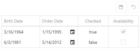
jQuery
$(function() {
    $("#dataGridContainer").dxDataGrid({
        // ...
        columns: [
            {
                dataField: "BirthDate",
                dataType: 'date'
            },
            {
                dataField: "OrderDate",
                dataType: 'date',
                showEditorAlways: true
            },
            //...
            {
                dataField: "CheckedState",
                dataType: 'boolean',
                showEditorAlways: false
            },
            {
                dataField: "AvailabilityState",
                dataType: 'boolean'
            },
            // ...
        ]
    });
});
Angular
<dx-data-grid ... >
    <dxi-data-grid-column dataField="BirthDate" dataType="date"></dxi-data-grid-column>
    <dxi-data-grid-column dataField="OrderDate" dataType="date" showEditorAlways="true"></dxi-data-grid-column>
    <dxi-data-grid-column dataField="CheckedState" dataType="boolean" showEditorAlways="false"></dxi-data-grid-column>
    <dxi-data-grid-column dataField="AvailabilityState" dataType="boolean" ></dxi-data-grid-column>
</dx-data-grid>
import { DxDataGridModule } from "devextreme-angular";
// ...
export class AppComponent {
    // ...
}
@NgModule({
    imports: [
        // ...
        DxDataGridModule
    ],
    // ...
})
Vue
<template>
    <DxDataGrid ... >
        <DxColumn
            data-field="BirthDate"
            data-type="date"
        />
        <DxColumn
            data-field="OrderDate"
            data-type="date"
            :show-editor-always="true"
        />
        <DxColumn
            data-field="CheckedState"
            data-type="boolean"
            :show-editor-always="false"
        />
        <DxColumn
            data-field="AvailabilityState"
            data-type="boolean"
        />
    </DxDataGrid>
</template>

<script>
import 'devextreme/dist/css/dx.fluent.blue.light.css';

import DxDataGrid, {
    DxColumn
} from 'devextreme-vue/data-grid';

export default {
    components: {
        DxDataGrid,
        DxColumn
    },
    // ...
}
</script>
React
import React from 'react';
import 'devextreme/dist/css/dx.fluent.blue.light.css';

import DataGrid, {
    Column
} from 'devextreme-react/data-grid';

export default function App() {
    return (
        <DataGrid ... >
            <Column
                dataField="BirthDate"
                dataType="date"
            />
            <Column
                dataField="OrderDate"
                dataType="date"
                showEditorAlways={true}
            />
            <Column
                dataField="CheckedState"
                dataType="boolean"
                showEditorAlways={false}
            />
            <Column
                dataField="AvailabilityState"
                dataType="boolean"
            />
        </DataGrid>
    );
}
See Also
- columns[].editorOptions
showInColumnChooser
Specifies whether the column chooser can contain the column header.
See Also
- columns[].visible
showWhenGrouped
Specifies whether or not to display the column when grid records are grouped by it.
Displaying a grouping column may be useful if you calculate its grouping values. Consider that you need to group records by a column that contains dates. Grouping by full dates seems inconvenient. It would be smarter to group by months or years instead. For this purpose, you calculate grouping values within the calculateGroupValue function and leave the grouping column visible by setting the showWhenGrouped property to true so that the user can view the full dates.
sortIndex
Specifies the index according to which columns participate in sorting.
This property accepts an integer specifying the index of the column in a collection of columns with applied sorting. For example, consider the following data source that can provide data for three columns.
const dataSource = [
    { firstName: "John", lastName: "Doe", title: "Sales Manager" },
    { firstName: "Michael", lastName: "King", title: "Sales Representative" },
    // ...
];
To sort data first by the "Last Name" and then by the "First Name" column, use the following code. Note that the sortOrder property should also be specified.
jQuery
$(function() {
    $("#dataGridContainer").dxDataGrid({
        // ...
        columns: [
            { dataField: "firstName", sortIndex: 1, sortOrder: "asc" },
            { dataField: "lastName", sortIndex: 0, sortOrder: "asc" },
            // ...
        ]
    });
});
Angular
<dx-data-grid ... >
    <dxi-data-grid-column dataField="firstName" [sortIndex]="1" sortOrder="asc"></dxi-data-grid-column>
    <dxi-data-grid-column dataField="lastName" [sortIndex]="0" sortOrder="asc"></dxi-data-grid-column>
</dx-data-grid>
import { DxDataGridModule } from "devextreme-angular";
// ...
export class AppComponent {
    // ...
}
@NgModule({
    imports: [
        // ...
        DxDataGridModule
    ],
    // ...
})
Vue
<template>
    <DxDataGrid ... >
        <DxColumn
            data-field="firstName"
            :sort-index="1"
            sort-order="asc"
        />
        <DxColumn
            data-field="lastName"
            :sort-index="0"
            sort-order="asc"
        />
    </DxDataGrid>
</template>

<script>
import 'devextreme/dist/css/dx.fluent.blue.light.css';

import DxDataGrid, {
    DxColumn
} from 'devextreme-vue/data-grid';

export default {
    components: {
        DxDataGrid,
        DxColumn
    },
    // ...
}
</script>
React
import React from 'react';
import 'devextreme/dist/css/dx.fluent.blue.light.css';

import DataGrid, {
    Column
} from 'devextreme-react/data-grid';

export default function App() {
    return (
        <DataGrid ... >
            <Column
                dataField="firstName"
                sortIndex={1}
                sortOrder="asc"
            />
            <Column
                dataField="lastName"
                sortIndex={0}
                sortOrder="asc"
            />
        </DataGrid>
    );
}
You can set the sortIndex property at design time to specify initial sorting, or change this property using the columnOption method to sort at runtime.
sortingMethod
Specifies a custom comparison function for sorting. Applies only when sorting is performed on the client.
A value to be compared.
A value to be compared.
The this keyword refers to the column's configuration.
Specifies whether value1 goes before value2.
This function accepts two cell values and should return a number indicating their sort order:
- Less than zero
value1 goes before value2. - Zero
value1 and value2 remain unchanged relative to each other. - Greater than zero
value1 goes after value2.
The string comparison is culture-insensitive by default. Use the following code to make it culture-sensitive:
jQuery
$(function () {
    $("#dataGridContainer").dxDataGrid({
        // ...
        columns: [{
            dataField: "fieldName",
            sortingMethod: function (value1, value2) {
                // Handling null values
                if(!value1 && value2) return -1;
                if(!value1 && !value2) return 0;
                if(value1 && !value2) return 1;
                // Determines whether two strings are equivalent in the current locale
                return value1.localeCompare(value2);
            }
        }]
    });
});
Angular
import { DxDataGridModule } from "devextreme-angular";
// ...
export class AppComponent {
    sortStringsConsideringCulture (value1, value2) {
        // Handling null values
        if(!value1 && value2) return -1;
        if(!value1 && !value2) return 0;
        if(value1 && !value2) return 1;
        // Determines whether two strings are equivalent in the current locale
        return value1.localeCompare(value2);
    }
}
@NgModule({
    imports: [
        // ...
        DxDataGridModule
    ],
    // ...
})
<dx-data-grid ... >
    <dxi-data-grid-column
        dataField="fieldName"
        [sortingMethod]="sortStringsConsideringCulture">
    </dxi-data-grid-column>
</dx-data-grid>
Vue
<template>
    <DxDataGrid ... >
        <DxColumn
            data-field="fieldName"
            :sorting-method="sortStringsConsideringCulture"
        />
    </DxDataGrid>
</template>

<script>
import 'devextreme/dist/css/dx.fluent.blue.light.css';

import DxDataGrid, {
    DxColumn
} from 'devextreme-vue/data-grid';

export default {
    components: {
        DxDataGrid,
        DxColumn
    },
    // ...
    methods: {
        sortStringsConsideringCulture (value1, value2) {
            // Handling null values
            if(!value1 && value2) return -1;
            if(!value1 && !value2) return 0;
            if(value1 && !value2) return 1;
            // Determines whether two strings are equivalent in the current locale
            return value1.localeCompare(value2);
        }
    }
}
</script>
React
import React from 'react';
import 'devextreme/dist/css/dx.fluent.blue.light.css';

import DataGrid, {
    Column
} from 'devextreme-react/data-grid';

function sortStringsConsideringCulture (value1, value2) {
    // Handling null values
    if(!value1 && value2) return -1;
    if(!value1 && !value2) return 0;
    if(value1 && !value2) return 1;
    // Determines whether two strings are equivalent in the current locale
    return value1.localeCompare(value2);
}

export default function App() {
    return (
        <DataGrid ... >
            <Column
                dataField="fieldName"
                sortingMethod={sortStringsConsideringCulture}
            />
        </DataGrid>
    );
}sortOrder
Specifies the sort order of column values.
By default, rows are sorted according to the data source. To sort rows in an ascending or descending order, set the sortOrder property to "asc" or "desc". If you need to sort by multiple columns, specify the sortIndex. Otherwise, each sorted column will get a sort index according to its position in the columns array.
See Also
trueText
In a boolean column, replaces all true items with a specified text. Applies only if showEditorAlways property is false.
See Also
- columns[].falseText
validationRules
Specifies validation rules to be checked when cell values are updated.
Array<RequiredRule | NumericRule | RangeRule | StringLengthRule | CustomRule | CompareRule | PatternRule | EmailRule | AsyncRule>
visibleIndex
Specifies the position of the column regarding other columns in the resulting UI component.
Visible indexes are normalized after the UI component's creation: the leftmost column is assigned an index of 0; the rightmost column's index becomes equal to the number of visible columns minus 1; other columns get the indexes in between.
See Also
width
Specifies the column's width in pixels or as a percentage. Ignored if it is less than minWidth.
The property supports the following types of values:
- Number
The column's width in pixels. String
A CSS-accepted column width measurement (for example, "55px", "80%" and "auto") except relative units such as em, ch, vh, etc.NOTEFixed columns ignore widths specified as a percentage.
See Also

 Select one or more answers