JavaScript/jQuery DataGrid - pager
Configures the pager.
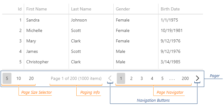
The pager is an element that allows users to navigate through pages and change their size at runtime. The pager consists of the page navigator and several optional elements: the page size selector, navigation buttons, and page information.
See Also
allowedPageSizes
Specifies the available page sizes in the page size selector.
Set this property to an array of numbers that specify available page sizes. If you want to allow users to display all records on a single page, add the "all" value to this array. When the property is set to "auto" (the default value), the component automatically calculates the available page sizes based on the current page size.
displayMode
Specifies the pager's display mode.
The following table illustrates "full" and "compact" display modes:
| displayMode | Pager appearance |
|---|---|
"full" |
 |
"compact" |
 |
The "adaptive" display mode switches between these two modes based on the component width.
infoText
Specifies the page information text.
You can use the following position markers in this text:
- {0} - shows the current page number.
- {1} - shows the total page count.
- {2} - shows the total row count.
See Also
showPageSizeSelector
Specifies page size selector visibility.
visible
Specifies whether the pager is visible.
The pager is only visible if paging is enabled and the total row count is greater than the pageSize property. If you choose a large page size (for example "All" supported in allowedPageSizes) and the data does not increase (for example, with state storing enabled), the pager is hidden permanently.

 Select one or more answers