JavaScript/jQuery DataGrid - loadPanel
Configures the load panel.
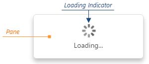
The load panel is displayed while the UI component loads data. It consists of a loading indicator and text, both placed on a pane.
Since the load panel is, in fact, the DevExtreme LoadPanel UI component, the loadPanel object can contain any properties of this UI component along with properties described here.
See Also
enabled
Enables displaying the load panel automatically.
Displaying the load panel is enabled for remote data and disabled for local data by default. Set this property to true to always enable displaying or false to never show the load panel.
indicatorSrc

Use the indicatorOptions property instead.
Specifies the path to a custom load indicator image.
Use a .gif image to implement an animated load indicator.
shading
Specifies whether to shade the UI component when the load panel is shown.
Enable this property to prevent interaction with the component while loading is in progress.
shadingColor
Specifies the shading color. Applies only if shading is true.
This property supports the following colors:
- Hexadecimal colors
- RGB colors
- RGBA colors
- Predefined/cross-browser color names
- Predefined SVG colors
- Paint server address

 Select one or more answers