JavaScript/jQuery PivotGrid Options
This section describes the configuration properties of the PivotGrid UI component.
See Also
allowExpandAll
Allows users to expand/collapse all header items within the same header level. Ignored if the PivotGridDataSource's paginate property is true.
With this property enabled, an end user can right-click a header level and choose the corresponding context menu item to expand or collapse all header items within this level.
allowFiltering
Allows a user to filter fields by selecting or deselecting values in the popup menu.
A user can click a filter icon in the field chooser or field panel when this property is set to true to invoke a popup menu.
allowSorting
Allows an end user to change sorting properties.
With this property enabled, an end user can sort data by clicking the arrow icons in the field chooser or on the field panel.
allowSortingBySummary
Allows users to sort the pivot grid by summary values instead of field values. Ignored if the PivotGridDataSource's paginate property is true.
With this property enabled, an end user can use the context menu of a column or row header to apply sorting by summary values.
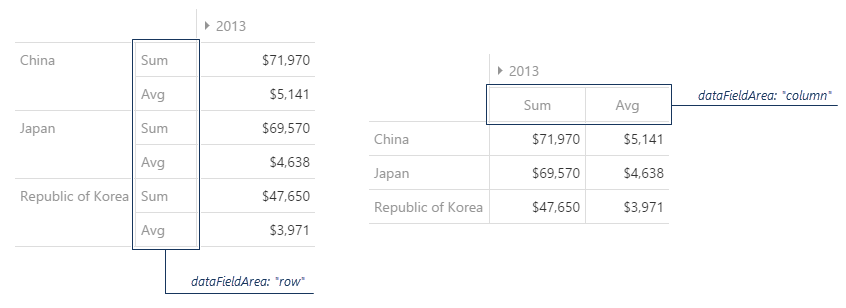
dataFieldArea
Specifies the area to which data field headers must belong.
Data field headers appear only when more than one data field is present. See the following image to spot the difference between the two settings of this property:
dataSource
Binds the UI component to data.
The PivotGrid is bound to data via the PivotGridDataSource, a component that allows you to sort, filter, group, and perform other data shaping operations. The PivotGridDataSource's underlying data access logic is isolated in the store. You use different store types for different data sources.
To bind the PivotGrid to data, assign a PivotGridDataSource to the UI component's dataSource property. In the PivotGridDataSource, specify the store property depending on your data source as shown in the following list. In each case, also specify the fields[] array to configure pivot grid fields.
Data Array
Assign the array to the store property. View DemoWeb API and MongoDB
Use one of the following extensions to enable the server to process data according to the protocol DevExtreme UI components use:Then, use the createStore method to configure access to the server on the client as shown below. This method is part of DevExtreme.AspNet.Data.
jQuery
JavaScript$(function() { let serviceUrl = "https://url/to/my/service"; $("#pivotGridContainer").dxPivotGrid({ // ... dataSource: new DevExpress.data.PivotGridDataSource({ store: DevExpress.data.AspNet.createStore({ key: "ID", loadUrl: serviceUrl + "/GetAction" }) }) }) });Angular
app.component.tsapp.component.htmlapp.module.tsimport { Component } from '@angular/core'; import CustomStore from 'devextreme/data/custom_store'; import PivotGridDataSource from 'devextreme/ui/pivot_grid/data_source'; import { createStore } from 'devextreme-aspnet-data-nojquery'; @Component({ selector: 'app-root', templateUrl: './app.component.html', styleUrls: ['./app.component.css'] }) export class AppComponent { store: CustomStore; constructor() { let serviceUrl = "https://url/to/my/service"; this.pivotGridDataSource = new PivotGridDataSource({ store: createStore({ key: "ID", loadUrl: serviceUrl + "/GetAction" }) }) } }<dx-pivot-grid ... [dataSource]="pivotGridDataSource"> </dx-pivot-grid>import { BrowserModule } from '@angular/platform-browser'; import { NgModule } from '@angular/core'; import { AppComponent } from './app.component'; import { DxPivotGridModule } from 'devextreme-angular'; @NgModule({ declarations: [ AppComponent ], imports: [ BrowserModule, DxPivotGridModule ], providers: [], bootstrap: [AppComponent] }) export class AppModule { }Vue
App.vue<template> <DxPivotGrid ... :data-source="pivotGridDataSource" /> </template> <script> import 'devextreme/dist/css/dx.fluent.blue.light.css'; import CustomStore from 'devextreme/data/custom_store'; import { createStore } from 'devextreme-aspnet-data-nojquery'; import PivotGridDataSource from 'devextreme/ui/pivot_grid/data_source'; import { DxPivotGrid } from 'devextreme-vue/pivot-grid'; export default { components: { DxPivotGrid }, data() { const serviceUrl = "https://url/to/my/service"; const pivotGridDataSource = new PivotGridDataSource({ store: createStore({ key: "ID", loadUrl: serviceUrl + "/GetAction" }) }); return { pivotGridDataSource } } } </script>React
App.jsimport React from 'react'; import 'devextreme/dist/css/dx.fluent.blue.light.css'; import CustomStore from 'devextreme/data/custom_store'; import PivotGridDataSource from 'devextreme/ui/pivot_grid/data_source'; import { createStore } from 'devextreme-aspnet-data-nojquery'; import PivotGrid from 'devextreme-react/pivot-grid'; const serviceUrl = "https://url/to/my/service"; const pivotGridDataSource = new PivotGridDataSource({ store: createStore({ key: "ID", loadUrl: serviceUrl + "/GetAction" }) }); class App extends React.Component { render() { return ( <PivotGrid ... dataSource={pivotGridDataSource} /> ); } } export default App;Any other data source
Implement a CustomStore.
You can call the getDataSource() method to access the PivotGridDataSource instance associated with the PivotGrid.
Review the following notes about data binding:
If the PivotGrid UI component gets data from a server, enable remoteOperations to notify the UI component that the server processes data.
Data field names cannot be equal to
thisand should not contain the following characters:.,:,[, and].
jQuery
- The stores are immutable. You cannot change their configurations at runtime. Instead, create a new store or DataSource and assign it to the dataSource property as shown in the following help topic: Get and Set Properties.
Angular
- The stores are immutable. You cannot change their configurations at runtime. Instead, create a new store or DataSource and assign it to the dataSource property as shown in the following help topic: Two-Way Property Binding.
Vue
- The stores are immutable. You cannot change their configurations at runtime. Instead, create a new store or DataSource and assign it to the dataSource property as shown in the following help topic: Two-Way Property Binding.
React
- The stores are immutable. You cannot change their configurations at runtime. Instead, create a new store or DataSource and assign it to the dataSource property as shown in the following help topic: Controlled Mode.
disabled
Specifies whether the UI component responds to user interaction.
elementAttr
Specifies the global attributes to be attached to the UI component's container element.
jQuery
$(function(){
    $("#pivotGridContainer").dxPivotGrid({
        // ...
        elementAttr: {
            id: "elementId",
            class: "class-name"
        }
    });
});
Angular
<dx-pivot-grid ...
    [elementAttr]="{ id: 'elementId', class: 'class-name' }">
</dx-pivot-grid>
import { DxPivotGridModule } from "devextreme-angular";
// ...
export class AppComponent {
    // ...
}
@NgModule({
    imports: [
        // ...
        DxPivotGridModule
    ],
    // ...
})
Vue
<template>
    <DxPivotGrid ...
        :element-attr="pivotGridAttributes">
    </DxPivotGrid>
</template>

<script>
import DxPivotGrid from 'devextreme-vue/pivot-grid';

export default {
    components: {
        DxPivotGrid
    },
    data() {
        return {
            pivotGridAttributes: {
                id: 'elementId',
                class: 'class-name'
            }
        }
    }
}
</script>
React
import React from 'react';

import PivotGrid from 'devextreme-react/pivot-grid';

class App extends React.Component {
    pivotGridAttributes = {
        id: 'elementId',
        class: 'class-name'
    }

    render() {
        return (
            <PivotGrid ...
                elementAttr={this.pivotGridAttributes}>
            </PivotGrid>
        );
    }
}
export default App;
encodeHtml
Specifies whether HTML tags are displayed as plain text or applied to cell values.
When true, the component displays HTML tags as plain text; when false, the component applies them to cell values. If you disable this property, malicious code can be executed. Refer to the following help topic for more information: Potentially Vulnerable API - encodeHtml.
export
Configures client-side exporting.
A user can click the Export button to save an Excel file with the exported data. Data types, sort, filter, and group settings are maintained.
The following instructions show how to enable and configure client-side export:
Install or reference the required libraries
This feature requires DevExtreme ExcelJS v4.4.1+ and FileSaver v2.0.2+. If you apply CSP rules, refer to the ExcelJS CSP Treats section to read more about potential vulnerabilities.jQuery
HTML<head> <!-- ... --> <script src="https://cdnjs.cloudflare.com/ajax/libs/babel-polyfill/7.4.0/polyfill.min.js"></script> <script src="https://cdn.jsdelivr.net/npm/devextreme-exceljs-fork@4.4.1/dist/dx-exceljs-fork.min.js"></script> <script src="https://cdnjs.cloudflare.com/ajax/libs/FileSaver.js/2.0.2/FileSaver.min.js"></script> <!-- reference the DevExtreme sources here --> </head>Angular
Installation commandnpm install --save devextreme-exceljs-fork file-saver
Vue
Codenpm install --save devextreme-exceljs-fork file-saver
React
Codenpm install --save devextreme-exceljs-fork file-saver
Enable the export UI
Set the export.enabled property to true:jQuery
JavaScript$(function () { $("#pivotGridContainer").dxPivotGrid({ export: { enabled: true } }); });Angular
app.component.htmlapp.component.tsapp.module.ts<dx-pivot-grid ... > <dxo-pivot-grid-export [enabled]="true"></dxo-pivot-grid-export> </dx-pivot-grid>import { Component } from '@angular/core'; @Component({ selector: 'app-root', templateUrl: './app.component.html', styleUrls: ['./app.component.css'] }) export class AppComponent { // ... }import { BrowserModule } from '@angular/platform-browser'; import { NgModule } from '@angular/core'; import { AppComponent } from './app.component'; import { DxPivotGridModule } from 'devextreme-angular'; @NgModule({ declarations: [ AppComponent ], imports: [ BrowserModule, DxPivotGridModule ], providers: [ ], bootstrap: [AppComponent] }) export class AppModule { }Vue
App.vue<template> <DxPivotGrid ... > <DxExport :enabled="true" /> </DxPivotGrid> </template> <script> import 'devextreme/dist/css/dx.fluent.blue.light.css'; import { DxPivotGrid, DxExport, DxColumn } from 'devextreme-vue/pivot-grid'; export default { components: { DxPivotGrid, DxExport, DxColumn } } </script>React
App.jsimport React from 'react'; import 'devextreme/dist/css/dx.fluent.blue.light.css'; import PivotGrid, { Export, Column } from 'devextreme-react/pivot-grid'; export default function App() { return ( <PivotGrid ... > <Export enabled={true} /> </PivotGrid> ); }Export the PivotGrid
Implement the onExporting handler and call the exportPivotGrid(options) method in it. In the code below, this method exports the PivotGrid as is, but you can use PivotGridExportOptions to configure export settings, including cell customization. The PivotGrid is exported to an Excel worksheet that is created using the DevExtreme ExcelJS API. To save the Excel document, call the FileSaver's saveAs method.jQuery
index.js$('#gridContainer').dxPivotGrid({ export: { enabled: true }, onExporting: function(e) { var workbook = new ExcelJS.Workbook(); var worksheet = workbook.addWorksheet('Main sheet'); DevExpress.excelExporter.exportPivotGrid({ worksheet: worksheet, component: e.component, customizeCell: function(options) { var excelCell = options; excelCell.font = { name: 'Arial', size: 12 }; excelCell.alignment = { horizontal: 'left' }; } }).then(function() { workbook.xlsx.writeBuffer().then(function(buffer) { saveAs(new Blob([buffer], { type: 'application/octet-stream' }), 'PivotGrid.xlsx'); }); }); } });Angular
app.component.htmlapp.component.tsapp.module.ts<dx-pivot-grid ... (onExporting)="onExporting($event)"> <dxo-pivot-grid-export [enabled]="true"></dxo-pivot-grid-export> </dx-pivot-grid>import { Component } from '@angular/core'; import { exportPivotGrid } from 'devextreme/excel_exporter'; import { Workbook } from 'devextreme-exceljs-fork'; import saveAs from 'file-saver'; @Component({ selector: 'app-root', templateUrl: './app.component.html', styleUrls: ['./app.component.css'] }) export class AppComponent { onExporting(e) { const workbook = new Workbook(); const worksheet = workbook.addWorksheet('Main sheet'); exportPivotGrid({ component: e.component, worksheet: worksheet, customizeCell: function(options) { const excelCell = options; excelCell.font = { name: 'Arial', size: 12 }; excelCell.alignment = { horizontal: 'left' }; } }).then(function() { workbook.xlsx.writeBuffer() .then(function(buffer: BlobPart) { saveAs(new Blob([buffer], { type: 'application/octet-stream' }), 'PivotGrid.xlsx'); }); }); } }import { BrowserModule } from '@angular/platform-browser'; import { NgModule } from '@angular/core'; import { AppComponent } from './app.component'; import { DxPivotGridModule } from 'devextreme-angular'; @NgModule({ declarations: [ AppComponent ], imports: [ BrowserModule, DxPivotGridModule ], providers: [ ], bootstrap: [AppComponent] }) export class AppModule { }Vue
App.vue<template> <DxPivotGrid ... @exporting="onExporting"> <DxExport :enabled="true" /> </DxPivotGrid> </template> <script> import 'devextreme/dist/css/dx.fluent.blue.light.css'; import { DxPivotGrid, DxExport } from 'devextreme-vue/pivot-grid'; import { exportPivotGrid } from 'devextreme/excel_exporter'; import { Workbook } from 'devextreme-exceljs-fork'; import saveAs from 'file-saver'; export default { components: { DxPivotGrid, DxExport }, methods: { onExporting(e) { const workbook = new Workbook(); const worksheet = workbook.addWorksheet('Main sheet'); exportPivotGrid({ component: e.component, worksheet: worksheet, customizeCell: function(options) { const excelCell = options; excelCell.font = { name: 'Arial', size: 12 }; excelCell.alignment = { horizontal: 'left' }; } }).then(function() { workbook.xlsx.writeBuffer() .then(function(buffer) { saveAs(new Blob([buffer], { type: 'application/octet-stream' }), 'PivotGrid.xlsx'); }); }); } } } </script>React
App.jsimport React from 'react'; import 'devextreme/dist/css/dx.fluent.blue.light.css'; import { Workbook } from 'devextreme-exceljs-fork'; import saveAs from 'file-saver'; import PivotGrid, { Export } from 'devextreme-react/pivot-grid'; import { exportPivotGrid } from 'devextreme/excel_exporter'; export default function App() { return ( <PivotGrid ... onExporting={onExporting}> <Export enabled={true} /> </PivotGrid> ); } function onExporting(e) { const workbook = new Workbook(); const worksheet = workbook.addWorksheet('Main sheet'); exportPivotGrid({ component: e.component, worksheet: worksheet, customizeCell: function(options) { const excelCell = options; excelCell.font = { name: 'Arial', size: 12 }; excelCell.alignment = { horizontal: 'left' }; } }).then(function() { workbook.xlsx.writeBuffer() .then(function(buffer) { saveAs(new Blob([buffer], { type: 'application/octet-stream' }), 'PivotGrid.xlsx'); }); }); }
The following restrictions apply when users export PivotGrid:
- Only XLSX files are supported out of the box. To export PivotGrid to CSV, call the exportPivotGrid(options) method as shown in the following ticket: Export PivotGrid into CSV file.
- Only visible rows and columns are exported.
fieldChooser
The Field Chooser configuration properties.
A field chooser is a pivot grid element that allows an end user to configure data displayed in the pivot grid. To invoke the field chooser, right-click any pivot grid header and select the Show Field Chooser item. You can also display PivotGridFieldChooser as a separate UI component.
fieldPanel
Configures the field panel.
The field panel is a component that displays the fields involved in the calculation of grid summaries. It consists of four field areas: column, row, data and filter. Each area holds fields of the corresponding type.
By default, the field panel is hidden. To make it visible, assign true to the visible property. To control the visibility of an individual field area, change the showColumnFields, showRowFields, showDataFields or showFilterFields property respectively.
The field panel partially covers the functionality provided by the field chooser. For example, the user can reorder fields within a single field area or even between them. This capability is controlled by the value of the allowFieldDragging property.
In addition, if the allowSorting and allowFiltering properties are true, the user can apply sorting and filtering to fields directly from the field panel.
headerFilter
Configures the header filter feature.
A header filter allows a user to filter individual field's values by including or excluding them from the applied filter. Clicking a header filter icon in the field chooser or the field panel invokes a popup menu displaying all the unique field values.
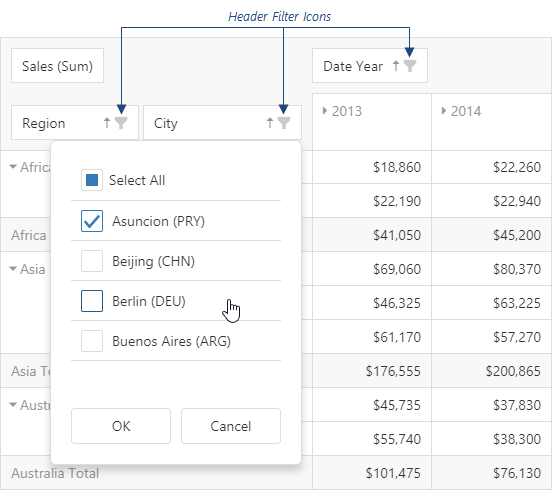
Assign true to the allowFiltering property to make the icons visible. To customize a specific field's header filter, use the field's headerFilter object.
The user's filtering preferences are saved in the filterValues property. The header filter's Select All checkbox changes the filterType property.
See Also
height
Specifies the UI component's height.
This property accepts a value of one of the following types:
Number
The height in pixels.String
A CSS-accepted measurement of height. For example,"55px","20vh","80%","inherit".
hideEmptySummaryCells
Specifies whether or not to hide rows and columns with no data.
This property applies only if PivotGridDataSource calculateSummaryValue or summaryDisplayMode are not empty.
hint
Specifies text for a hint that appears when a user pauses on the UI component.
loadPanel
Specifies properties configuring the load panel.
When PivotGrid operates with a large number of records or uses a remote storage as a data source, loading data takes time. As data is being prepared, PivotGrid displays a load panel.
The load panel consists of a pane, a loading indicator and a text. You can specify whether the pane or loading indicator must be displayed using the showPane or showIndicator properties respectively. The text displayed by the load panel can be specified using the text property. Also, you can change the height or width of the load panel using the corresponding properties of the loadPanel configuration object.
Since the grid load panel is practically the DevExtreme LoadPanel UI component, you can specify any property belonging to this UI component in the loadPanel object.
onCellClick
A function that is executed when a pivot grid cell is clicked or tapped.
Information about the event.
| Name | Type | Description |
|---|---|---|
| area |
The area to which the clicked cell belongs. |
|
| cancel |
Allows you to cancel field expansion. |
|
| cell |
The cell properties. This field is read-only. |
|
| cellElement |
The cell's container. It is an HTML Element or a jQuery Element when you use jQuery. |
|
| columnFields |
The column area's fields. |
|
| columnIndex |
The index of the column to which the clicked cell belongs. |
|
| component |
The UI component instance. |
|
| dataFields |
The data area's fields. |
|
| element |
The UI component's container. It is an HTML Element or a jQuery Element when you use jQuery. |
|
| event | Event (jQuery or EventObject) |
The event that caused the function to execute. It is an EventObject or a jQuery.Event when you use jQuery. |
| rowFields |
The row area's fields. |
|
| rowIndex |
The index of the row to which the clicked cell belongs. |
onCellPrepared
A function that is executed after a pivot grid cell is created.
Information about the event.
| Name | Type | Description |
|---|---|---|
| area |
The area to which the prepared cell belongs. |
|
| cell |
The cell properties. This field is read-only. |
|
| cellElement |
The prepared cell's container. It is an HTML Element or a jQuery Element when you use jQuery. |
|
| columnIndex |
The position of a cell's column. |
|
| component |
The UI component instance. |
|
| element |
The UI component's container. It is an HTML Element or a jQuery Element when you use jQuery. |
|
| rowIndex |
The position of a cell's row. |
This function allows you to customize cells and modify their content. Common use-cases are as follows:
Use CSS to apply styles to a cellElement. The code below customizes font in a separate cell:
jQuery
index.js$(function() { $("#pivotGridContainer").dxPivotGrid({ // ... onCellPrepared: (e) => { if(e.cell.rowPath && e.cell.rowPath[0] === "Africa" && e.cell.columnPath && e.cell.columnPath[0] === 2014) { e.cellElement.css("font-size", "14px"); e.cellElement.css("font-weight", "bold"); } } }); });Angular
app.component.htmlapp.component.tsapp.module.ts<dx-pivot-grid ... (onCellPrepared)="onCellPrepared($event)"> </dx-pivot-grid>import { Component } from '@angular/core'; @Component({ selector: 'app-root', templateUrl: './app.component.html', styleUrls: ['./app.component.css'] }) export class AppComponent { onCellPrepared(e) { if(e.cell.rowPath && e.cell.rowPath[0] === "Africa" && e.cell.columnPath && e.cell.columnPath[0] === 2014) { e.cellElement.style.fontSize = '14px'; e.cellElement.style.fontWeight = 'bold'; } }import { BrowserModule } from '@angular/platform-browser'; import { NgModule } from '@angular/core'; import { AppComponent } from './app.component'; import { DxPivotGridModule } from 'devextreme-angular'; @NgModule({ declarations: [ AppComponent ], imports: [ BrowserModule, DxPivotGridModule ], bootstrap: [AppComponent] }) export class AppModule { }Vue
App.vue<template> <DxPivotGrid ... @cell-prepared="onCellPrepared" /> </template> <script> import 'devextreme/dist/css/dx.fluent.blue.light.css'; import DxPivotGrid from 'devextreme-vue/pivot-grid'; export default { components: { DxPivotGrid }, methods: { onCellPrepared(e) { if(e.cell.rowPath && e.cell.rowPath[0] === "Africa" && e.cell.columnPath && e.cell.columnPath[0] === 2014) { e.cellElement.style.fontSize = '14px'; e.cellElement.style.fontWeight = 'bold'; } } } } </script>React
App.jsimport React, { useCallback } from 'react'; import 'devextreme/dist/css/dx.fluent.blue.light.css'; import PivotGrid from 'devextreme-react/pivot-grid'; export default function App() { const customizeCells = useCallback((e) { if(e.cell.rowPath && e.cell.rowPath[0] === "Africa" && e.cell.columnPath && e.cell.columnPath[0] === 2014) { e.cellElement.style.fontSize = '14px'; e.cellElement.style.fontWeight = 'bold'; } }, []); return ( <PivotGrid ... onCellPrepared={customizeCells} /> ); }Add a class to a cellElement. The following code adds a custom class to cells in the Grand Total row and column. This code also adds another class to all cells in the "row" and "column" areas:
jQuery
index.js$(function() { $("#pivotGridContainer").dxPivotGrid({ // ... onCellPrepared: function(e) { if(e.cell.columnType === "GT" || e.cell.rowType === "GT") e.cellElement.addClass("your-custom-class"); if(e.area === "row" || e.area === "column") e.cellElement.addClass("another-custom-class"); } }); });Angular
app.component.htmlapp.component.tsapp.module.ts<dx-pivot-grid ... (onCellPrepared)="onCellPrepared($event)"> </dx-pivot-grid>import { Component } from '@angular/core'; @Component({ selector: 'app-root', templateUrl: './app.component.html', styleUrls: ['./app.component.css'] }) export class AppComponent { onCellPrepared(e) { if(e.cell.columnType === 'GT' || e.cell.rowType === 'GT') e.cellElement.classList.add('your-custom-class'); if(e.area === 'row' || e.area === 'column') e.cellElement.classList.add("another-custom-class"); }import { BrowserModule } from '@angular/platform-browser'; import { NgModule } from '@angular/core'; import { AppComponent } from './app.component'; import { DxPivotGridModule } from 'devextreme-angular'; @NgModule({ declarations: [ AppComponent ], imports: [ BrowserModule, DxPivotGridModule ], bootstrap: [AppComponent] }) export class AppModule { }Vue
App.vue<template> <DxPivotGrid ... @cell-prepared="onCellPrepared" /> </template> <script> import 'devextreme/dist/css/dx.fluent.blue.light.css'; import DxPivotGrid from 'devextreme-vue/pivot-grid'; export default { components: { DxPivotGrid }, methods: { onCellPrepared(e) { if(e.cell.columnType === 'GT' || e.cell.rowType === 'GT') e.cellElement.classList.add('your-custom-class'); if(e.area === 'row' || e.area === 'column') e.cellElement.classList.add('another-custom-class'); } } } </script>React
App.jsimport React, { useCallback } from 'react'; import 'devextreme/dist/css/dx.fluent.blue.light.css'; import PivotGrid from 'devextreme-react/pivot-grid'; export default function App() { const customizeCells = useCallback((e) { if(e.cell.columnType === 'GT' || e.cell.rowType === 'GT') e.cellElement.classList.add('your-custom-class'); if(e.area === 'row' || e.area === 'column') e.cellElement.classList.add('another-custom-class'); }, []); return ( <PivotGrid ... onCellPrepared={customizeCells} /> ); }
onContentReady
A function that is executed when the UI component is rendered and each time the component is repainted.
Information about the event.
| Name | Type | Description |
|---|---|---|
| element |
The UI component's container. It is an HTML Element or a jQuery Element when you use jQuery. |
|
| component |
The UI component's instance. |
onContextMenuPreparing
A function that is executed before the context menu is rendered.
Information about the event.
| Name | Type | Description |
|---|---|---|
| area |
The clicked area's type. |
|
| cell |
The cell that has been clicked to invoke the context menu. |
|
| cellElement |
The clicked cell's container. It is an HTML Element or a jQuery Element when you use jQuery. Unavailable for fields in the field panel. |
|
| columnFields |
Fields in the "column" area. |
|
| columnIndex |
The index of the column to which the clicked cell belongs. |
|
| component |
The UI component's instance. |
|
| dataFields |
Fields in the "data" area. |
|
| element |
The UI component's container. It is an HTML Element or a jQuery Element when you use jQuery. |
|
| field |
This field's configuration. |
|
| items |
An array of items to be displayed by the context menu. Their structure is described in the items property description. |
|
| rowFields |
Fields in the "row" area. |
|
| rowIndex |
The index of the row to which the clicked cell belongs. |
In the following code, the onContextMenuPreparing function adds a custom item to the context menu invoked when a user right-clicks any column header:
jQuery
$(function() {
$("#pivotGridContainer").dxPivotGrid({
// ...
onContextMenuPreparing: function(e) {
// e.items can be undefined
if (!e.items) e.items = [];
if (e.field && e.field.dataField === 'amount') {
// Add a custom menu item
e.items.push({
text: 'test name',
value: '1',
onItemClick() {
console.log('value is ' + e.itemData.value);
}
});
}
}
});
});Angular
<dx-pivot-grid ...
(onContextMenuPreparing)="addMenuItems($event)">
</dx-pivot-grid>
import { Component } from '@angular/core';
@Component({
selector: 'app-root',
templateUrl: './app.component.html',
styleUrls: ['./app.component.css']
})
export class AppComponent {
addMenuItems(e) {
// e.items can be undefined
if (!e.items) e.items = [];
if (e.field && e.field.dataField === 'amount') {
// Add a custom menu item
e.items.push({
text: 'test name',
value: '1',
onItemClick() {
console.log('value is ' + e.itemData.value);
}
});
}
}
}
import { BrowserModule } from '@angular/platform-browser';
import { NgModule } from '@angular/core';
import { AppComponent } from './app.component';

import { DxPivotGridModule } from 'devextreme-angular';

@NgModule({
    declarations: [
        AppComponent
    ],
    imports: [
        BrowserModule,
        DxPivotGridModule
    ],
    providers: [ ],
    bootstrap: [AppComponent]
})
export class AppModule { }
Vue
<template>
<DxPivotGrid ...
@context-menu-preparing="addMenuItems">
</DxPivotGrid>
</template>
<script>
import 'devextreme/dist/css/dx.fluent.blue.light.css';
import DxPivotGrid from 'devextreme-vue/pivot-grid';
export default {
components: {
DxPivotGrid
},
data() {
return {
// ...
}
},
methods: {
addMenuItems(e) {
// e.items can be undefined
if (!e.items) e.items = [];
if (e.field && e.field.dataField === 'amount') {
// Add a custom menu item
e.items.push({
text: 'test name',
value: '1',
onItemClick() {
console.log('value is ' + e.itemData.value);
}
});
}
}
}
}
</script>React
import React from 'react';
import 'devextreme/dist/css/dx.fluent.blue.light.css';
import PivotGrid from 'devextreme-react/pivot-grid';
class App extends React.Component {
addMenuItems(e) {
// e.items can be undefined
if (!e.items) e.items = [];
if (e.field && e.field.dataField === 'amount') {
// Add a custom menu item
e.items.push({
text: 'test name',
value: '1',
onItemClick() {
console.log('value is ' + e.itemData.value);
}
});
}
}
render() {
return (
<PivotGrid ...
onContextMenuPreparing={this.addMenuItems}>
</PivotGrid>
);
}
}
export default App;onDisposing
A function that is executed before the UI component is disposed of.
Information about the event.
| Name | Type | Description |
|---|---|---|
| element |
The UI component's container. It is an HTML Element or a jQuery Element when you use jQuery. |
|
| component |
The UI component's instance. |
onExporting
A function that is executed before data is exported.
Information about the event.
| Name | Type | Description |
|---|---|---|
| cancel |
Deprecated. |
|
| component |
The UI component's instance. |
|
| element |
The UI component's container. It is an HTML Element or a jQuery Element when you use jQuery. |
|
| fileName |
Deprecated. |
onInitialized
A function used in JavaScript frameworks to save the UI component instance.
Information about the event.
| Name | Type | Description |
|---|---|---|
| element |
The UI component's container. It is an HTML Element or a jQuery Element when you use jQuery. |
|
| component |
The UI component's instance. |
Angular
<dx-pivot-grid ...
(onInitialized)="saveInstance($event)">
</dx-pivot-grid>
import { Component } from "@angular/core";
import PivotGrid from "devextreme/ui/data_grid";
// ...
export class AppComponent {
pivotGridInstance: PivotGrid;
saveInstance (e) {
this.pivotGridInstance = e.component;
}
}Vue
<template>
<div>
<DxPivotGrid ...
@initialized="saveInstance">
</DxPivotGrid>
</div>
</template>
<script>
import DxPivotGrid from 'devextreme-vue/pivot-grid';
export default {
components: {
DxPivotGrid
},
data: function() {
return {
pivotGridInstance: null
};
},
methods: {
saveInstance: function(e) {
this.pivotGridInstance = e.component;
}
}
};
</script>
<template>
<div>
<DxPivotGrid ...
@initialized="saveInstance">
</DxPivotGrid>
</div>
</template>
<script setup>
import DxPivotGrid from 'devextreme-vue/pivot-grid';
let pivotGridInstance = null;
const saveInstance = (e) => {
pivotGridInstance = e.component;
}
</script>React
import PivotGrid from 'devextreme-react/pivot-grid';
class App extends React.Component {
constructor(props) {
super(props);
this.saveInstance = this.saveInstance.bind(this);
}
saveInstance(e) {
this.pivotGridInstance = e.component;
}
render() {
return (
<div>
<PivotGrid onInitialized={this.saveInstance} />
</div>
);
}
}See Also
onOptionChanged
A function that is executed after a UI component property is changed.
Information about the event.
| Name | Type | Description |
|---|---|---|
| value | any |
The modified property's new value. |
| previousValue | any |
The UI component's previous value. |
| name |
The modified property if it belongs to the first level. Otherwise, the first-level property it is nested into. |
|
| fullName |
The path to the modified property that includes all parent properties. |
|
| element |
The UI component's container. It is an HTML Element or a jQuery Element when you use jQuery. |
|
| component |
The UI component's instance. |
The following example shows how to subscribe to component property changes:
jQuery
$(function() {
$("#pivotGridContainer").dxPivotGrid({
// ...
onOptionChanged: function(e) {
if(e.name === "changedProperty") {
// handle the property change here
}
}
});
});Angular
<dx-pivot-grid ...
(onOptionChanged)="handlePropertyChange($event)">
</dx-pivot-grid>
import { Component } from '@angular/core';
@Component({
selector: 'app-root',
templateUrl: './app.component.html',
styleUrls: ['./app.component.css']
})
export class AppComponent {
// ...
handlePropertyChange(e) {
if(e.name === "changedProperty") {
// handle the property change here
}
}
}
import { BrowserModule } from '@angular/platform-browser';
import { NgModule } from '@angular/core';
import { AppComponent } from './app.component';
import { DxPivotGridModule } from 'devextreme-angular';

@NgModule({
    declarations: [
        AppComponent
    ],
    imports: [
        BrowserModule,
        DxPivotGridModule
    ],
    providers: [ ],
    bootstrap: [AppComponent]
})
export class AppModule { }
Vue
<template>
    <DxPivotGrid ...
        @option-changed="handlePropertyChange"
    />
</template>

<script>
import 'devextreme/dist/css/dx.fluent.blue.light.css';
import DxPivotGrid from 'devextreme-vue/pivot-grid';

export default {
    components: {
        DxPivotGrid
    },
    // ...
    methods: {
        handlePropertyChange: function(e) {
            if(e.name === "changedProperty") {
                // handle the property change here
            }
        }
    }
}
</script>
React
import React from 'react';
import 'devextreme/dist/css/dx.fluent.blue.light.css';

import PivotGrid from 'devextreme-react/pivot-grid';

const handlePropertyChange = (e) => {
    if(e.name === "changedProperty") {
        // handle the property change here
    }
}

export default function App() {
    return (
        <PivotGrid ...
            onOptionChanged={handlePropertyChange}
        />
    );
}
rowHeaderLayout
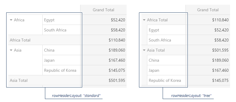
Specifies the layout of items in the row header.
Frequently, items in the row header have a hierarchical structure. By default, these items are arranged in a line occupying a significant amount of space. If the area assigned to PivotGrid is limited, use a more compact tree layout. The image below illustrates the difference between standard and tree layouts.
rtlEnabled
Switches the UI component to a right-to-left representation.
When this property is set to true, the UI component text flows from right to left, and the layout of elements is reversed. To switch the entire application/site to the right-to-left representation, assign true to the rtlEnabled field of the object passed to the DevExpress.config(config) method.
DevExpress.config({
    rtlEnabled: true
});scrolling
A configuration object specifying scrolling properties.
The PivotGrid UI component enables an end user to scroll grid records. To specify required scrolling behavior, use the mode property of the scrolling configuration object.
showBorders
Specifies whether the outer borders of the grid are visible or not.
showColumnGrandTotals
Specifies whether to display the Grand Total column.
Grand Total column displays the summary values of an entire row.
showColumnTotals
Specifies whether to display the Total columns.
Total columns show the summary values calculated for all previous hierarchy levels starting with the deepest expanded one.
showRowGrandTotals
Specifies whether to display the Grand Total row.
Grand Total row displays the summary values of an entire column.
showRowTotals
Specifies whether to display the Total rows. Applies only if rowHeaderLayout is "standard".
Total rows show the summary values calculated for all previous hierarchy levels starting with the deepest expanded one.
showTotalsPrior
Specifies where to show the total rows or columns.
PivotGrid displays total rows and columns after data (columns at the right side, rows at the bottom). You can use this property to place total rows, total columns, or both before data.
stateStoring
A configuration object specifying properties related to state storing.
State storing enables the UI component to save applied settings and restore them the next time the UI component is loaded. Assign true to the stateStoring.enabled property to enable this functionality.
The state is saved with a specified storage key.
State storing saves the following properties:
To specify the time in milliseconds between automatic state saves, set the savingTimeout property. To specify the lifetime of the saved state, set the storage type.
Use the PivotGridDataSource's state method to manage the PivotGrid's state at runtime.
tabIndex
Specifies the number of the element when the Tab key is used for navigating.
The value of this property will be passed to the tabindex attribute of the HTML element that underlies the UI component.
width
Specifies the UI component's width.
This property accepts a value of one of the following types:
Number
The width in pixels.String
A CSS-accepted measurement of width. For example,"55px","20vw","80%","auto","inherit".
wordWrapEnabled
Specifies whether long text in header items should be wrapped.
See Also
- PivotGridDataSource.fields.wordWrapEnabled - applies word wrap to a specific field.

 Select one or more answers