JavaScript/jQuery PivotGrid Options
This section describes the configuration options of the PivotGrid widget.
allowExpandAll
Allows an end-user to expand/collapse all header items within a header level.
With this option enabled, an end-user can right-click a header level and choose the corresponding context menu item to expand or collapse all header items within this level.
allowFiltering
Allows a user to filter fields by selecting or deselecting values in the popup menu.
A user can click a filter icon in the field chooser or field panel when this option is set to true to invoke a popup menu.
allowSorting
Allows an end-user to change sorting options.
With this option enabled, an end user can sort data by clicking the arrow icons in the field chooser or on the field panel.
allowSortingBySummary
Allows an end-user to sort columns by summary values.
With this option enabled, an end-user can use the context menu of a column or row header to apply sorting by summary values.
dataFieldArea
Specifies the area to which data field headers must belong.
Data field headers appear only when more than one data field is visible. See the following image to spot the difference between the two settings of this option.

When using the widget as an ASP.NET MVC Control, specify this option using the PivotGridDataFieldArea enum. This enum accepts the following values: Row and Column.
dataSource
Specifies a data source for the pivot grid.
To provide data for a pivot grid, use the dataSource option. This option takes on one of the following.
An array of objects
The fields of each object will be used to provide data for corresponding pivot grid fields.A PivotGridDataSource or its Configuration Object
The DataSource is an object that includes options for data sorting, grouping and filtering. The DataSource's underlying data access logic is isolated in a Store. Unlike the DataSource, a Store is a stateless object implementing a universal interface for reading and modifying data. If the Store type is not XmlaStore, the PivotGridDataSource also describes pivot grid fields.
., ,, :, [, and ]. Their presence may cause issues in the widget's operation.For more information on how to implement a data source and bind it to your pivot grid, refer to the Data Binding topic.
elementAttr
Specifies the attributes to be attached to the widget's root element.
You can configure this option in an ASP.NET MVC Control as follows:
@(Html.DevExtreme().WidgetName()
    .ElementAttr("class", "class-name")
    // ===== or =====
    .ElementAttr(new {
        @id = "elementId",
        @class = "class-name"
    })
    // ===== or =====
    .ElementAttr(new Dictionary<string, object>() {
        { "id", "elementId" },
        { "class", "class-name" }
    })

)
@(Html.DevExtreme().WidgetName() _
.ElementAttr("class", "class-name")
' ===== or =====
.ElementAttr(New With {
.id = "elementId",
.class = "class-name"
})
' ===== or =====
.ElementAttr(New Dictionary(Of String, Object) From {
{ "id", "elementId" },
{ "class", "class-name" }
})
)export
Configures client-side exporting.
When exporting is enabled, the new 'Export to Excel file' entity is added to the context menu. You can specify exporting options using this object.
fieldChooser
The Field Chooser configuration options.
A field chooser is a pivot grid element that allows an end-user to configure data displayed in the pivot grid. To invoke the field chooser, right-click any pivot grid header and select the Show Field Chooser item. You can also display PivotGridFieldChooser as a separate widget.
fieldPanel
Configures the field panel.
The field panel is a component that displays the fields involved in the calculation of grid summaries. It consists of four field areas: column, row, data and filter. Each area holds fields of the corresponding type.
By default, the field panel is hidden. To make it visible, assign true to the visible property. To control the visibility of an individual field area, change the showColumnFields, showRowFields, showDataFields or showFilterFields property respectively.
The field panel partially covers the functionality provided by the field chooser. For example, the user can reorder fields within a single field area or even between them. This capability is controlled by the value of the allowFieldDragging property.
In addition, if the allowSorting and allowFiltering options are true, the user can apply sorting and filtering to fields directly from the field panel.
headerFilter
Configures the header filter feature.
A header filter allows a user to filter individual field's values by including or excluding them from the applied filter. Clicking a header filter icon in the field chooser or the field panel invokes a popup menu displaying all the unique field values.
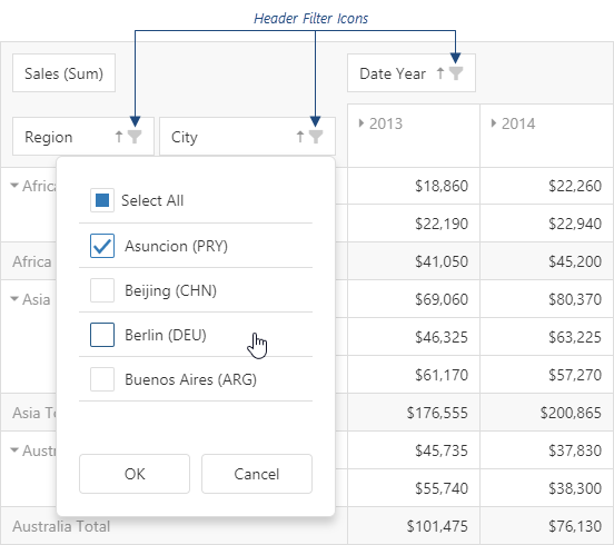
Assign true to the allowFiltering option to make the icons visible. Specify the fields[].headerFilter object to customize the specific field's header filter.
See Also
height
Specifies the widget's height.
This option accepts a value of one of the following types:
Number
The height in pixels.String
A CSS-accepted measurement of height. For example,"55px","80%","auto","inherit".Function
A function returning either of the above. For example:JavaScriptheight: function() { return window.innerHeight / 1.5; }
hideEmptySummaryCells
Specifies whether or not to hide rows and columns with no data.
hint
Specifies text for a hint that appears when a user pauses on the widget.
loadPanel
Specifies options configuring the load panel.
When PivotGrid operates with a large number of records or uses a remote storage as a data source, loading data takes time. As data is being prepared, PivotGrid displays a load panel.
The load panel consists of a pane, a loading indicator and a text. You can specify whether the pane or loading indicator must be displayed using the showPane or showIndicator options respectively. The text displayed by the load panel can be specified using the text option. Also, you can change the height or width of the load panel using the corresponding options of the loadPanel configuration object.
Since the grid load panel is practically the DevExtreme LoadPanel widget, you can specify any option belonging to this widget in the loadPanel object.
onCellClick
A handler for the cellClick event.
Information about the event.
| Name | Type | Description |
|---|---|---|
| component |
The widget instance. |
|
| element |
The widget's container. It is an HTML Element or a jQuery Element when you use jQuery. |
|
| model |
The model data. Available only if Knockout is used. |
|
| area |
The area to which the clicked cell belongs. |
|
| cellElement |
The cell's container. It is an HTML Element or a jQuery Element when you use jQuery. |
|
| cell |
The cell properties. |
|
| rowIndex |
The index of the row to which the clicked cell belongs. |
|
| columnIndex |
The index of the column to which the clicked cell belongs. |
|
| columnFields |
The column area's fields. |
|
| rowFields |
The row area's fields. |
|
| dataFields |
The data area's fields. |
|
| jQueryEvent |
Use 'event' instead. The jQuery event that caused the handler execution. Deprecated in favor of the event field. |
|
| event | Event (jQuery or EventObject) |
The event that caused the handler execution. It is a dxEvent or a jQuery.Event when you use jQuery. |
| cancel |
Allows you to cancel field expansion. |
The cellClick event fires when a user clicks a pivot grid cell. When implementing a handling function for this event, use the object passed to this function as its parameter. Among the fields of this object, you can find data relating to the clicked cell.
onCellPrepared
A handler for the cellPrepared event.
Information about the event.
| Name | Type | Description |
|---|---|---|
| component |
The widget instance. |
|
| element |
The widget's container. It is an HTML Element or a jQuery Element when you use jQuery. |
|
| model |
The model data. Available only if Knockout is used. |
|
| area |
The area to which the prepared cell belongs. |
|
| cellElement |
The prepared cell's container. It is an HTML Element or a jQuery Element when you use jQuery. |
|
| cell |
The cell properties. |
|
| rowIndex |
The position of a cell's row. |
|
| columnIndex |
The position of a cell's column. |
The cellPrepared event fires after a cell has been rendered. When implementing a handling function for this event, use the object passed to this function as its parameter. Among the fields of this object, you can find data relating to the prepared cell.
onContentReady
A handler for the contentReady event. Executed when the widget's content is ready. This handler may be executed multiple times during the widget's lifetime depending on the number of times its content changes.
Information about the event.
| Name | Type | Description |
|---|---|---|
| component |
The widget's instance. |
|
| element |
The widget's container. It is an HTML Element or a jQuery Element when you use jQuery. |
|
| model |
The model data. Available only when using Knockout. |
onContextMenuPreparing
A handler for the contextMenuPreparing event.
Information about the event.
| Name | Type | Description |
|---|---|---|
| component |
The widget's instance. |
|
| element |
The widget's container. It is an HTML Element or a jQuery Element when you use jQuery. |
|
| model |
The model data. Available only if Knockout is used. |
|
| items |
An array of items to be displayed by the context menu. The item objects must have the fields that are used by the ContextMenu default item template. |
|
| area |
The clicked area's type. |
|
| cell |
The cell that has been clicked to invoke the context menu. |
|
| cellElement |
The clicked cell's container. It is an HTML Element or a jQuery Element when you use jQuery. |
|
| columnIndex |
The index of the column to which the clicked cell belongs. |
|
| rowIndex |
The index of the row to which the clicked cell belongs. |
|
| dataFields |
Fields in the 'data' area. |
|
| rowFields |
Fields in the 'row' area. |
|
| columnFields |
Fields in the 'column' area. |
|
| field |
This field's configuration. |
Assign a function to perform a custom action before a context menu is displayed in the grid. For instance, you can change the set of items in the menu.
onDisposing
A handler for the disposing event. Executed when the widget is removed from the DOM using the remove(), empty(), or html() jQuery methods only.
Information about the event.
| Name | Type | Description |
|---|---|---|
| component |
The widget's instance. |
|
| element |
The widget's container. It is an HTML Element or a jQuery Element when you use jQuery. |
|
| model |
The model data. Available only if you use Knockout. |
onExported
A handler for the exported event.
Information about the event.
| Name | Type | Description |
|---|---|---|
| component |
The widget's instance. |
|
| element |
The widget's container. It is an HTML Element or a jQuery Element when you use jQuery. |
|
| model |
The model data. Available only if Knockout is used. |
Assign a function to perform a custom action after the exporting of grid data is completed.
onExporting
A handler for the exporting event.
Information about the event.
| Name | Type | Description |
|---|---|---|
| component |
The widget's instance. |
|
| element |
The widget's container. It is an HTML Element or a jQuery Element when you use jQuery. |
|
| model |
The model data. Available only if Knockout is used. |
|
| fileName |
The name of the file to which data is about to be exported. |
|
| cancel |
Allows you to cancel exporting. |
Assign a function to perform a custom action before exporting grid data.
onFileSaving
A handler for the fileSaving event.
Information about the event.
| Name | Type | Description |
|---|---|---|
| component |
The widget's instance. |
|
| element |
The widget's container. It is an HTML Element or a jQuery Element when you use jQuery. |
|
| fileName |
The name of the file to be saved. |
|
| format |
The format of the file to be saved. Equals 'EXCEL' for an Excel file. |
|
| data |
Exported data as a BLOB. |
|
| cancel |
Allows you to cancel file saving. |
Assign a function to perform a custom action before an Excel file with exported data will be saved on the user's local storage.
onInitialized
A handler for the initialized event. Executed only once, after the widget is initialized.
Information about the event.
| Name | Type | Description |
|---|---|---|
| component |
The widget's instance. |
|
| element |
The widget's container. It is an HTML Element or a jQuery Element when you use jQuery. |
You cannot access widget elements in this handler because it is executed before they are ready. Use the onContentReady handler instead.
onOptionChanged
A handler for the optionChanged event. Executed after an option of the widget is changed.
Information about the event.
| Name | Type | Description |
|---|---|---|
| name |
The option's short name. |
|
| model |
The model data. Available only if you use Knockout. |
|
| element |
The widget's container. It is an HTML Element or a jQuery Element when you use jQuery. |
|
| component |
The widget's instance. |
|
| fullName |
The option's full name. |
|
| value | any |
The option's new value. |
rowHeaderLayout
Specifies the layout of items in the row header.
Frequently, items in the row header have a hierarchical structure. By default, these items are arranged in a line occupying a significant amount of space. If the area assigned to PivotGrid is limited, use a more compact tree layout. The image below illustrates the difference between standard and tree layouts.

When using the widget as an ASP.NET MVC Control, specify this option using the PivotGridRowHeadersLayout enum. This enum accepts the following values: Standard and Tree.
rtlEnabled
Switches the widget to a right-to-left representation.
When this option is set to true, the widget text flows from right to left, and the layout of elements is reversed. To switch the entire application/site to the right-to-left representation, assign true to the rtlEnabled field of the object passed to the DevExpress.config(config) method.
DevExpress.config({
    rtlEnabled: true
});
See Also
- Right-to-Left Support Demo: DataGrid | Navigation Widgets | Editors
showBorders
Specifies whether the outer borders of the grid are visible or not.
showColumnGrandTotals
Specifies whether to display the Grand Total column.
Grand Total column displays the summary values of an entire row.
showColumnTotals
Specifies whether to display the Total columns.
Total columns show the summary values calculated for all previous hierarchy levels starting with the deepest expanded one.
showRowGrandTotals
Specifies whether to display the Grand Total row.
Grand Total row displays the summary values of an entire column.
showRowTotals
Specifies whether to display the Total rows. Applies only if rowHeaderLayout is "standard".
Total rows show the summary values calculated for all previous hierarchy levels starting with the deepest expanded one.
showTotalsPrior
Specifies where to show the total rows or columns. Applies only if rowHeaderLayout is "standard".
By default, total rows and columns are shown after data (columns at the right side, rows at the bottom). You can place total rows, total columns or both before data using this option.
When using the widget as an ASP.NET MVC Control, specify this option using the PivotGridTotalsDisplayMode enum. This enum accepts the following values: Rows, Columns, Both and None.
stateStoring
A configuration object specifying options related to state storing.
At runtime, end-users may adjust pivot grid settings to their needs. By default, these settings disappear when the pivot grid disposes (for example, on page reload) and the pivot grid appears in its original configuration. If user settings need to be saved and then restored, enable client-side state storing for the grid by setting the stateStoring.enabled option to true. The pivot grid state will be saved under a specified storage key. The saving operation is conducted after a certain amount of time has passed since the last change of the state. To specify the amount of time in milliseconds, use the savingTimeout option.
PivotGrid supports various types of state storing. The type of storage that will suit your needs best depends on the supposed lifetime of user-specified pivot grid settings. For more information about state storing types, refer to the type option description.
The PivotGridDataSource provides the state method. Use it to get or change the pivot grid state at runtime. Call this method without arguments to obtain the pivot grid state. When you need to set the pivot grid state, call this method with the state object as its argument. You can also return the widget to its default state by calling the state method with the empty object or null argument.
tabIndex
Specifies the number of the element when the Tab key is used for navigating.
The value of this option will be passed to the tabindex attribute of the HTML element that underlies the widget.
width
Specifies the widget's width.
This option accepts a value of one of the following types:
Number
The width in pixels.String
A CSS-accepted measurement of width. For example,"55px","80%","auto","inherit".Function
A function returning either of the above. For example:JavaScriptwidth: function() { return window.innerWidth / 1.5; }
wordWrapEnabled
Specifies whether long text in header items should be wrapped.
See Also
- PivotGridDataSource.fields.wordWrapEnabled - applies word wrap to a specific field.

 Select one or more answers