React Chart - series.hoverStyle
Configures the appearance adopted by the series when a user points to it.
Declared in commonSeriesSettings, hoverStyle applies to all series in the chart. Declared in a series configuration object, hoverStyle applies to this particular series only. The series-specific hoverStyle overrides the common one.
border
Configures the appearance adopted by the series border (in area-like series) or the series point border (in bar-like and bubble series) when a user points to the series.
color
Specifies the color of the series in the hovered state.
This property supports the following colors:
- Hexadecimal colors
- RGB colors
- RGBA colors
- Predefined/cross-browser color names
- Predefined SVG colors
- Paint server address
You can also specify a custom pattern or gradient instead of a plain color. Call the registerPattern() or registerGradient() method to obtain a fill ID. Assign that value to the fillId field.
This functionality is available for the following Chart series:
- Area
- Stacked area
- Full-stacked area
- Spline area
- Stacked spline area
- Full-stacked spline area
- Range area
- Step area
- Bar
- Stacked bar
- Full-stacked bar
- Range bar
- Bubble
jQuery
$(function(){
    $("#chartContainer").dxChart({
        // ...
        series: {
            // ...
            hoverStyle: {
                color: {
                    fillId: customPatternId
                }
            }
        }
    });
});
Angular
<dx-chart ... >
    <dxi-chart-series ... >
        <dxo-chart-hover-style
            [color]="fill"
        ></dxo-chart-hover-style>
    </dxi-chart-series>
</dx-chart>
// ...

export class AppComponent {
    // ...

    fill = {
        fillId: this.customPatternId
    };
}
Vue
<template>
    <DxChart ... >
        <DxSeries ... >
            <DxHoverStyle :color="fill" />
        </DxSeries>
    </DxChart>
</template>

<script>
import DxChart, { DxSeries, DxHoverStyle } from 'devextreme-vue/chart';
// ...

export default {
    components: {
        DxChart,
        DxSeries,
        DxHoverStyle
    },
    data() {
        return {
            // ...
            fill: {
                fillId: this.customPatternId
            }
        }
    }
}
</script>
<template>
    <DxChart ... >
        <DxSeries ... >
            <DxHoverStyle :color="fill" />
        </DxSeries>
    </DxChart>
</template>

<script setup>
import DxChart, { DxSeries, DxHoverStyle } from 'devextreme-vue/chart';
// ...

const fill = {
    fillId: customPatternId
};
</script>
React
import React from 'react';
import Chart, { Series, HoverStyle } from 'devextreme-react/chart';

// ...
const fill = {
    fillId: customPatternId
};

export default function App() {
    return (
        <Chart ... >
            <Series ... >
                <HoverStyle color={fill} />
            </Series>
        </Chart>
    );
}
dashStyle
Specifies the dash style of the series line when the series is in the hovered state. Applies only to line-like series.
The following dash styles are available:
solid
The border is a solid, continuous line.longDash
The border is displayed using long dashes.dash
The border is displayed using dashes.dot
The border is displayed using dots.Any combination of 'longDash', 'dash' and 'dot'
The border is displayed by repeating the specified combination. For instance, 'dashdotdash'.
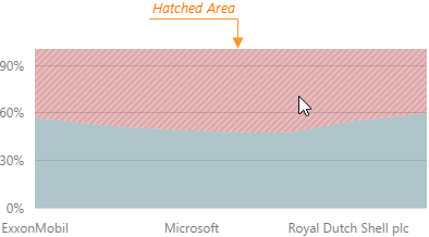
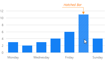
hatching
Configures hatching that applies when a user points to the series.
Hatching is filling an area or a bar (depending on the series type) with parallel diagonal lines. In the Chart UI component, it applies when a user points to a series.
highlight
Specifies whether to lighten the series when a user hovers the mouse pointer over it.

 Select one or more answers