React DataGrid - Customize Cells
For a live example of cell customization, refer to the following demo:
Customize the Value and Text
Use the customizeText function to customize the text displayed in cells. Note that this text is not used to sort, filter, and group data or calculate summaries.
jQuery
$(function() {
    $("#dataGridContainer").dxDataGrid({
        // ...
        columns: [{
            dataField: "Price",
            customizeText: function(cellInfo) {
                return cellInfo.value + "$";
            }
        }]
    });
});
Angular
import { DxDataGridModule } from "devextreme-angular";
// ...
export class AppComponent {
    constructor() {
        // Uncomment the line below if the function should be executed in the component's context
        // this.priceColumn_customizeText = this.priceColumn_customizeText.bind(this);
    }

    priceColumn_customizeText (cellInfo) {
        return cellInfo.value + "$";
    }
}
@NgModule({
    imports: [
        // ...
        DxDataGridModule
    ],
    // ...
})
<dx-data-grid ... >
    <dxi-data-grid-column dataField="Price" [customizeText]="priceColumn_customizeText"></dxi-data-grid-column>
</dx-data-grid>
Vue
<template>
    <DxDataGrid ... >
        <DxColumn
            data-field="Price"
            :customize-text="priceColumn_customizeText"
        />
    </DxDataGrid>
</template>

<script>
import 'devextreme/dist/css/dx.fluent.blue.light.css';

import DxDataGrid, {
    DxColumn
} from 'devextreme-vue/data-grid';

export default {
    components: {
        DxDataGrid,
        DxColumn
    },
    methods: {
        priceColumn_customizeText(cellInfo) {
            return cellInfo.value + '$';
        }
    }
}
</script>
React
import React from 'react';

import 'devextreme/dist/css/dx.fluent.blue.light.css';

import DataGrid, {
    Column
} from 'devextreme-react/data-grid';

class App extends React.Component {
    constructor(props) {
        super(props);

        // Uncomment the line below if the function should be executed in the component's context
        // this.priceColumn_customizeText = this.priceColumn_customizeText.bind(this);
    }

    priceColumn_customizeText(cellInfo) {
        return cellInfo.value + '$';
    }

    render() {
        return (
            <DataGrid ... >
                <Column
                    dataField="Price"
                    customizeText={priceColumn_customizeText}
                />
            </DataGrid>
        );
    }
}
export default App;
To use the text displayed in cells in those data processing operations, specify the calculateCellValue function instead. It populates a column with custom values and allows you to create unbound columns - columns that are not bound to any individual data field. In the following example, this function combines full names using data from the firstName and lastName fields:
jQuery
$(function() {
    $("#dataGridContainer").dxDataGrid({
        // ...
        columns: [{
            caption: "Full Name",
            calculateCellValue: function (rowData) {
                return rowData.firstName + " " + rowData.lastName;
            }
        }]
    });
});
Angular
import { DxDataGridModule } from "devextreme-angular";
// ...
export class AppComponent {
    constructor() {
        // Uncomment the line below if the function should be executed in the component's context
        // this.fullNameColumn_calculateCellValue = this.fullNameColumn_calculateCellValue.bind(this);
    }

    fullNameColumn_calculateCellValue (rowData) {
        return rowData.firstName + " " + rowData.lastName;
    }
}
@NgModule({
    imports: [
        // ...
        DxDataGridModule
    ],
    // ...
})
<dx-data-grid ... >
    <dxi-data-grid-column caption="Full Name" [calculateCellValue]="fullNameColumn_calculateCellValue"></dxi-data-grid-column>
</dx-data-grid>
Vue
<template>
    <DxDataGrid ... >
        <DxColumn
            caption="Full Name"
            :calculate-cell-value="fullNameColumn_calculateCellValue"
        />
    </DxDataGrid>
</template>

<script>
import 'devextreme/dist/css/dx.fluent.blue.light.css';

import DxDataGrid, {
    DxColumn
} from 'devextreme-vue/data-grid';

export default {
    components: {
        DxDataGrid,
        DxColumn
    },
    methods: {
        fullNameColumn_calculateCellValue(rowData) {
            return rowData.firstName + ' ' + rowData.lastName;
        }
    }
}
</script>
React
import React from 'react';

import 'devextreme/dist/css/dx.fluent.blue.light.css';

import DataGrid, {
    Column
} from 'devextreme-react/data-grid';

class App extends React.Component {
    constructor(props) {
        super(props);

        // Uncomment the line below if the function should be executed in the component's context
        // this.fullNameColumn_calculateCellValue = this.fullNameColumn_calculateCellValue.bind(this);
    }

    fullNameColumn_calculateCellValue(rowData) {
        return rowData.firstName + ' ' + rowData.lastName;
    }

    render() {
        return (
            <DataGrid ... >
                <Column
                    caption="Full Name"
                    calculateCellValue={fullNameColumn_calculateCellValue}
                />
            </DataGrid>
        );
    }
}
export default App;Some features are disabled in columns with calculated values. Refer to the calculateCellValue description for a list of disabled features and the properties that enable them.
Customize Cell Appearance
Apply a Style to All Cells in a Column
You can use CSS rules and assign a class to the columns.cssClass property to apply styles to all the cells in a column.
Apply a Style to Individual Cells or Rows (Conditional Formatting)
Implement the onCellPrepared function. It allows you to customize the entire cell's markup after the layout is generated.
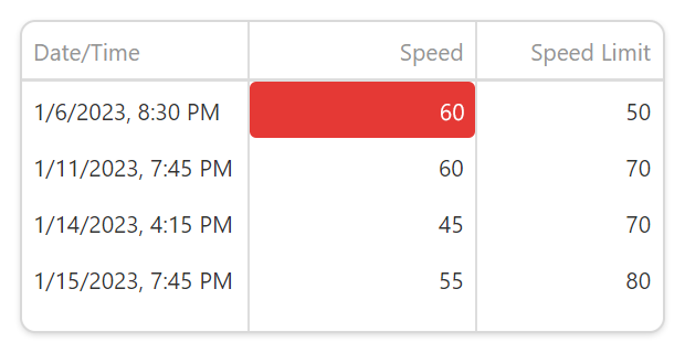
The following example demonstrates how to use the onCellPrepared function to conditionally change the cell color. As a result, the DataGrid component paints the cells red where the speed exceeds the speed limit.
Remove the e.column.dataField === "Speed" condition to apply the appearance to all the cells in a row.
jQuery
$(function() {
    $("#dataGridContainer").dxDataGrid({
        // ...
        onCellPrepared: function(e) {
            if (e.rowType === "data") {
                if (e.column.dataField === "Speed" && e.data.Speed > e.data.SpeedLimit) {
                    e.cellElement.css({"color":"white", "background-color":"red"});
                    // or
                    e.cellElement.addClass("my-class");
                }
            }
        }
    });
});
Angular
<dx-data-grid
    (onCellPrepared)="onCellPrepared($event)">
</dx-data-grid>
// ...
export class AppComponent {
    onCellPrepared (e) {
        if (e.rowType === "data") {
            if (e.column.dataField === "Speed" && e.data.Speed > e.data.SpeedLimit) {
                e.cellElement.style.cssText = "color: white; background-color: red";
                // or
                e.cellElement.classList.add("my-class");
            }
        }
    }
}
Vue
<template>
    <DxDataGrid ...
        @cell-prepared="onCellPrepared">
    </DxDataGrid>
</template>

<script>
import 'devextreme/dist/css/dx.fluent.blue.light.css';

import DxDataGrid from 'devextreme-vue/data-grid';

export default {
    components: {
        DxDataGrid
    },
    methods: {
        onCellPrepared(e) {
            if (e.rowType === "data") {
                if (e.column.dataField === "Speed" && e.data.Speed > e.data.SpeedLimit) {
                    e.cellElement.style.cssText = "color: white; background-color: red";
                    // or
                    e.cellElement.classList.add("my-class");
                }
            }
        }
    }
}
</script>
React
import React from 'react';

import 'devextreme/dist/css/dx.fluent.blue.light.css';

import DataGrid from 'devextreme-react/data-grid';

const cellPrepared = (e) => {
    if (e.rowType === "data") {
        if (e.column.dataField === "Speed" && e.data.Speed > e.data.SpeedLimit) {
            e.cellElement.style.cssText = "color: white; background-color: red";
            // or
            e.cellElement.classList.add("my-class");
        }
    }
}

function App() {
    return (
        <DataGrid ...
            onCellPrepared={cellPrepared}>
        </DataGrid>
    );
}

export default App;
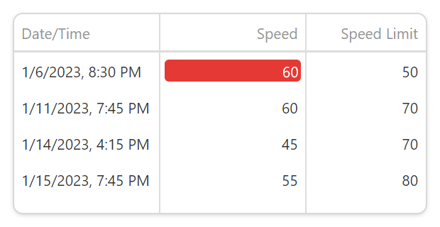
You can also specify the columns.cellTemplate property. It allows you to replace cell content with custom markup, but does not give you access to the entire cell element.
The example below shows how to use the columns.cellTemplate property to implement the same functionality.
jQuery
$(function() {
    $("#dataGridContainer").dxDataGrid({
        // ...
        columns: [{
            dataField: 'Speed',
            cellTemplate: function(container, cellInfo) {
                const valueDiv = $("<div>").text(cellInfo.value);
                if (cellInfo.data.Speed > cellInfo.data.SpeedLimit) {
                    valueDiv.css({"color":"white", "background-color":"red"});
                }
                return valueDiv;
            }
        }]
    });
});
Angular
<dx-data-grid ... >
    <dxi-data-grid-column
        dataField="Speed"
        cellTemplate="limitTemplate"
    ></dxi-data-grid-column>
    <div *dxTemplate="let cellInfo of 'limitTemplate'">
        <div [ngClass]="{'my-class': cellInfo.data.Speed > cellInfo.data.SpeedLimit}">
            {{cellInfo.value}}
        </div>
    </div>
</dx-data-grid>
.my-class {
    background-color: red;
    color: white;
}
Vue
<template>
    <DxDataGrid ... >
        <DxColumn
            data-field="Speed"
            cell-template="grid-cell"
        />
        <template #grid-cell="{ data }">
            <div
                :class="{
                    'my-class': cellInfo.data.Speed > cellInfo.data.SpeedLimit,
                }"
            >{{data.value}}</div>
        </template>
    </DxDataGrid>
</template>

<script>
import 'devextreme/dist/css/dx.fluent.blue.light.css';

import DxDataGrid, {
    DxColumn
} from 'devextreme-vue/data-grid';

export default {
    components: {
        DxDataGrid,
        DxColumn
    },
    // ...
}
</script>

<style>
    .my-class {
        background-color: red;
        color: white;
    }
</style>
React
import React from 'react';

import 'devextreme/dist/css/dx.fluent.blue.light.css';

import DataGrid, {
    Column
} from 'devextreme-react/data-grid';

const renderGridCell = (data) => {
    let className = '';
    if (cellInfo.data.Speed > cellInfo.data.SpeedLimit) {
        className += 'my-class';
    }
    return <div className={className}>{cellInfo.value}</div>;
}

function App() {
    return (
        <DataGrid ... >
            <Column
                dataField="Speed"
                cellRender={renderGridCell}
            />
        </DataGrid>
    );
}
export default App;
.my-class {
    background-color: red;
    color: white;
}
If the changes are not applied immediately, use the repaint() method to repaint DataGrid or the repaintRows(rowIndexes) method to repaint specific rows only.
See Also
Customize Row Appearance
Change Style Based on Row State (Selected, Focused, Hovered)
To change row selection color, use the following CSS rules:
.dx-datagrid-rowsview .dx-selection.dx-row:not(.dx-row-focused):not(.dx-row-removed) > td {
    background-color: red;
    color: unset;
}
Set the focusedRowEnabled and/or hoverStateEnabled properties to true to enable focused row and hover features. Specify the following CSS rules to change row color:
.dx-datagrid-rowsview .dx-row-focused.dx-data-row .dx-command-edit:not(.dx-focused) .dx-link,
.dx-datagrid-rowsview .dx-row-focused.dx-data-row > td:not(.dx-focused),
.dx-datagrid-rowsview .dx-row-focused.dx-data-row > tr > td:not(.dx-focused) {
    background-color: red !important;
    color: #fff !important;
}
.dx-data-row.dx-state-hover:not(.dx-selection):not(.dx-row-inserted):not(.dx-row-removed):not(.dx-edit-row) > td:not(.dx-focused) {
    background-color: orange !important;
    color: unset !important;
}
Change Style Based on Row Data (Conditional Formatting)
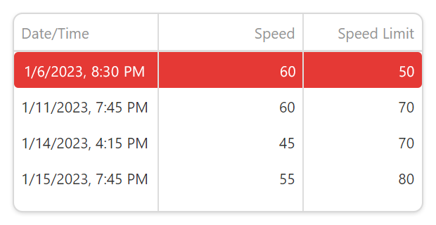
To customize the existing row appearance, implement the onRowPrepared event handler. This handler allows you to customize the existing row layout after it is generated. If a customization is not immediately applied, use the repaintRows(rowIndexes) method to repaint DataGrid rows.
The following example demonstrates how to use the onRowPrepared function to conditionally change the cell color. As a result, the DataGrid component paints the rows red where the speed exceeds the speed limit.
jQuery
$(function() {
    $("#dataGridContainer").dxDataGrid({
        // ...
        onRowPrepared: function(e) {
            if (e.rowType === "data") {
                if (e.data.Speed > e.data.SpeedLimit) {
                    e.rowElement.css({"color":"white", "background-color":"red"});
                    // or
                    e.rowElement.addClass("my-class");
                    // To override alternation color
                    e.rowElement.removeClass("dx-row-alt");
                }
            }
        }
    });
});
Angular
<dx-data-grid
    (onRowPrepared)="onRowPrepared($event)">
</dx-data-grid>
// ...
export class AppComponent {
    onRowPrepared(e) {
        if (e.rowType === "data") {
            if (e.data.Speed > e.data.SpeedLimit) {
                e.cellElement.style.cssText = "color: white; background-color: red";
                // or
                e.rowElement.classList.add("my-class");
                // To override alternation color
                e.rowElement.className = e.rowElement.className.replace("dx-row-alt", "");
            }
        }
    }
}
Vue
<template>
    <DxDataGrid ...
        @row-prepared="onRowPrepared">
    </DxDataGrid>
</template>

<script>
import 'devextreme/dist/css/dx.fluent.blue.light.css';

import DxDataGrid from 'devextreme-vue/data-grid';

export default {
    components: {
        DxDataGrid
    },
    methods: {
        onRowPrepared(e) {
            if (e.rowType === "data") {
                if (e.data.Speed > e.data.SpeedLimit) {
                    e.cellElement.style.cssText = "color: white; background-color: red";
                    // or
                    e.rowElement.classList.add("my-class");
                    // To override alternation color
                    e.rowElement.className = e.rowElement.className.replace("dx-row-alt", "");
                }
            }
        }
    }
}
</script>
React
import React from 'react';

import 'devextreme/dist/css/dx.fluent.blue.light.css';

import DataGrid from 'devextreme-react/data-grid';

const rowPrepared = (e) => {
    if (e.rowType === "data") {
        if (e.data.Speed > e.data.SpeedLimit) {
            e.cellElement.style.cssText = "color: white; background-color: red";
            // or
            e.rowElement.classList.add("my-class");
            // To override alternation color
            e.rowElement.className = e.rowElement.className.replace("dx-row-alt", "");
        }
    }
}

function App() {
    return (
        <DataGrid ...
            onRowPrepared={rowPrepared}>
        </DataGrid>
    );
}

export default App;
You can also use the dataRowTemplate property to customize row appearance.

 Select one or more answers