User Interaction
Users can add, delete, and update grid data. To enable these operations, assign true to the corresponding fields of the editing object. You can set a column's allowEditing property to false if its data should not be edited.
Grid data can be edited in several modes. Set the editing.mode property to specify the mode.
jQuery
$(function() {
    $("#dataGridContainer").dxDataGrid({
        // ...
        editing: {
            allowUpdating: true,
            allowAdding: true,
            allowDeleting: true,
            mode: 'row' // 'batch' | 'cell' | 'form' | 'popup'
        },
        columns: [
            { dataField: 'id', allowEditing: false },
            // ...
        ]
    });
});
Angular
<dx-data-grid ... >
    <dxo-data-grid-editing
        [allowUpdating]="true"
        [allowAdding]="true"
        [allowDeleting]="true"
        mode="row"> <!-- 'batch' | 'cell' | 'form' | 'popup' -->
    </dxo-data-grid-editing>
    <dxi-data-grid-column dataField="id" [allowEditing]="false"></dxi-data-grid-column>
</dx-data-grid>
import { DxDataGridModule } from "devextreme-angular";
// ...
export class AppComponent {
    // ...
}
@NgModule({
    imports: [
        // ...
        DxDataGridModule
    ],
    // ...
})
Vue
<template>
    <DxDataGrid ... >
        <DxEditing
            :allow-updating="true"
            :allow-adding="true"
            :allow-deleting="true"
            mode="row" /> <!-- 'batch' | 'cell' | 'form' | 'popup' -->
        <DxColumn data-field="id" :allow-editing="false" />
    </DxDataGrid>
</template>

<script>
import 'devextreme/dist/css/dx.light.css';

import DxDataGrid, {
    DxEditing,
    DxColumn
} from 'devextreme-vue/data-grid';

export default {
    components: {
        DxDataGrid,
        DxEditing,
        DxColumn
    }
}
</script>
React
import React from 'react';

import 'devextreme/dist/css/dx.light.css';

import DataGrid, {
    Editing,
    Column
} from 'devextreme-react/data-grid';

class App extends React.Component {
    render() {
        return (
            <DataGrid ... >
                <Editing
                    allowUpdating={true}
                    allowAdding={true}
                    allowDeleting={true}
                    mode="row" /> {/* 'batch' | 'cell' | 'form' | 'popup' */}
                <Column dataField="id" allowEditing={false} />
            </DataGrid>
        );
    }
}
export default App;
The following sections detail the DataGrid's appearance and behavior in each editing mode.
Row Mode
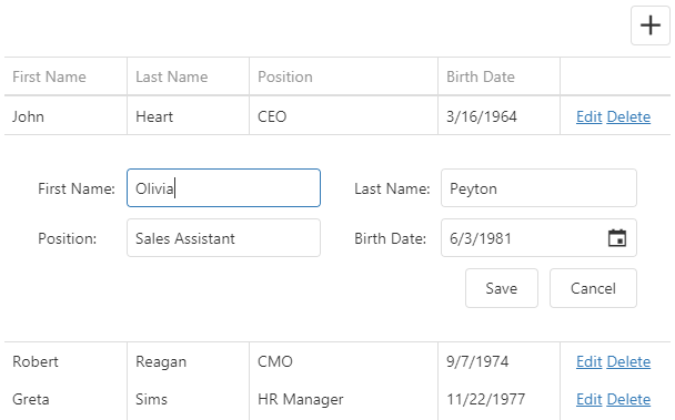
In this mode a user edits data row by row. When a user clicks an "Edit" button, the corresponding row enters the editing state, and the "Save" and "Cancel" buttons appear in the edit column. The UI component saves changes only if the "Save" button is clicked. If a user starts editing another row, sorts or filters data, it discards the changes.
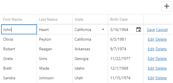
Clicking the "Delete" button invokes the confirmation dialog that allows a user to cancel row deletion. confirmDelete property to hide this dialog.
jQuery
$(function() {
    $("#dataGridContainer").dxDataGrid({
        // ...
        editing: {
            // ...
            mode: 'row',
            allowDeleting: true,
            confirmDelete: false
        }
    });
});
Angular
<dx-data-grid ... >
    <dxo-data-grid-editing
        mode="row"
        [allowDeleting]="true"
        [confirmDelete]="false">
    </dxo-data-grid-editing>
</dx-data-grid>
import { DxDataGridModule } from "devextreme-angular";
// ...
export class AppComponent {
    // ...
}
@NgModule({
    imports: [
        // ...
        DxDataGridModule
    ],
    // ...
})
Vue
<template>
    <DxDataGrid ... >
        <DxEditing
            mode="row"
            :allow-deleting="true"
            :confirm-delete="false"
        />
    </DxDataGrid>
</template>

<script>
import { DxDataGrid, DxEditing } from 'devextreme-vue/data-grid';

export default {
    components: {
        DxDataGrid,
        DxEditing
    },
    data() {}
}
</script>
React
import React from 'react';

import { DataGrid, Editing } from 'devextreme-react/data-grid';

class App extends React.Component {
    render() {
        return (
            <DataGrid ... >
                <Editing
                    mode="row"
                    confirmDelete={false}
                    allowDeleting={true}
                />
            </DataGrid>
        );
    }
}
export default App; See Also
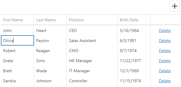
Cell Mode
In the cell mode, a user edits data cell by cell. Changes are saved once a cell loses the focus, or discarded if a user presses Esc. An added row is saved only when the focus is shifted from it. Choose this mode if any changes should be saved to the data source immediately.
If you validate data, a cell is locked in the editing state until a user enters a valid value or clicks the "Cancel Changes" button.
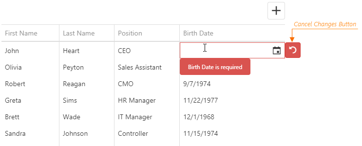
The "Cancel Changes" button also appears after users modify lookup column values.
Clicking the "Delete" button invokes the confirmation dialog that allows a user to cancel row deletion. Use the confirmDelete property to hide this dialog.
jQuery
$(function() {
    $("#dataGridContainer").dxDataGrid({
        // ...
        editing: {
            mode: 'cell',
            confirmDelete: false
        }
    });
});
Angular
<dx-data-grid ... >
    <dxo-data-grid-editing
        mode="cell"
        [allowDeleting]="true"
        [confirmDelete]="false">
    </dxo-data-grid-editing>
</dx-data-grid>
import { DxDataGridModule } from "devextreme-angular";
// ...
export class AppComponent {
    // ...
}
@NgModule({
    imports: [
        // ...
        DxDataGridModule
    ],
    // ...
})
Vue
<template>
    <DxDataGrid ... >
        <DxEditing
            mode="row"
            :allow-deleting="true"
            :confirm-delete="false"
        />
    </DxDataGrid>
</template>

<script>
import { DxDataGrid, DxEditing } from 'devextreme-vue/data-grid';

export default {
    components: {
        DxDataGrid,
        DxEditing
    },
    data() {}
}
</script>
React
import React from 'react';

import { DataGrid, Editing } from 'devextreme-react/data-grid';

class App extends React.Component {
    render() {
        return (
            <DataGrid ... >
                <Editing
                    mode="row"
                    confirmDelete={false}
                    allowDeleting={true}
                />
            </DataGrid>
        );
    }
}
export default App;true to enable checkbox interactions while another editor is active.See Also
Batch Mode
In the batch mode, like in the cell mode, a user edits data cell by cell. However, in this mode, the UI component stores changes in a buffer until a user clicks the global "Save" button instead of saving them immediately. This mode is useful when you need to defer saving multiple changes.
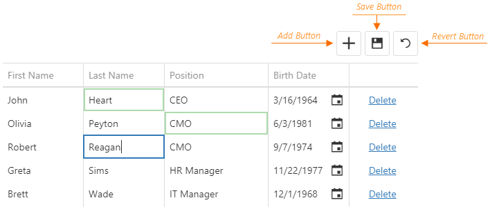
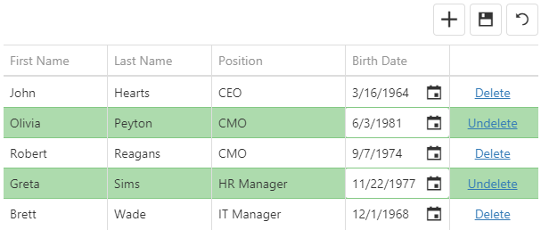
When a user clicks a row's "Delete" button, the UI component only marks the row as deleted. Users can restore this row by clicking the "Undelete" button if they have not saved the changes yet. They can also discard all unsaved changes by clicking the "Revert" button.
true to enable checkbox interactions while another editor is active.See Also
Form Mode
In form edit mode, row cells become editable form fields. Form fields are sorted like columns in the columns array.
The DataGrid uses the DevExtreme Form UI component. To configure the form, specify any Form properties in the editing.form object except properties mentioned in the description of this object. Refer to the following help topic for more information about form customization: Customize Edit Form.
For example, you can specify groups, tabs, or leave items ungrouped.
In the following code, the items with the specified dataField are simple items. Identical dataFields connect a simple item with a column:
jQuery
$(function() {
    $("#dataGridContainer").dxDataGrid({
        // ...
        editing: {
            allowUpdating: true,
            mode: "form",
            form: {
                items: [{
                    itemType: "group",
                    caption: "Personal Data",
                    items: [
                        { dataField: "Prefix" },
                        { dataField: "Full_Name" },
                        { dataField: "Position" },
                        { dataField: "Duties", editorType: "dxTextArea" }
                    ]
                    // or just
                    // items: ["Prefix", "Full_Name", "Position"]
                }, {
                    itemType: "group",
                    caption: "Contacts",
                    items: ["Email", "Skype"]
                }]
            }
        },
        columns: [
            { dataField: "Full_Name" },
            { dataField: "Prefix" },
            { dataField: "Position" },
            { dataField: "Duties" },
            { dataField: "Email" },
            { dataField: "Skype" }
        ]
    });
});
Angular
<dx-data-grid ... >
    <dxo-data-grid-editing
        [allowUpdating]="true"
        mode="form">
        <dxo-data-grid-form>
            <dxi-data-grid-item itemType="group" caption="Personal Data">
                <dxi-data-grid-item dataField="Prefix"></dxi-data-grid-item>
                <dxi-data-grid-item dataField="Full_Name"></dxi-data-grid-item>
                <dxi-data-grid-item dataField="Position"></dxi-data-grid-item>
                <dxi-data-grid-item dataField="Duties" editorType="dxTextArea"></dxi-data-grid-item>
            </dxi-data-grid-item>
            <dxi-data-grid-item itemType="group" caption="Contacts">
                <dxi-data-grid-item dataField="Email"></dxi-data-grid-item>
                <dxi-data-grid-item dataField="Skype"></dxi-data-grid-item>
            </dxi-data-grid-item>
        </dxo-data-grid-form>
    </dxo-data-grid-editing>
    <dxi-data-grid-column dataField="Full_Name"></dxi-data-grid-column>
    <dxi-data-grid-column dataField="Prefix"></dxi-data-grid-column>
    <dxi-data-grid-column dataField="Position"></dxi-data-grid-column>
    <dxi-data-grid-column dataField="Duties"></dxi-data-grid-column>
    <dxi-data-grid-column dataField="Email"></dxi-data-grid-column>
    <dxi-data-grid-column dataField="Skype"></dxi-data-grid-column>
</dx-data-grid>
import { DxDataGridModule } from "devextreme-angular";
// ...
export class AppComponent {
    // ...
}
@NgModule({
    imports: [
        // ...
        DxDataGridModule
    ],
    // ...
})
Vue
<template>
    <DxDataGrid ... >
        <DxEditing
            :allow-updating="true"
            mode="form">
            <DxForm>
                <DxGroupItem caption="Personal Data">
                    <DxSimpleItem data-field="Prefix" />
                    <DxSimpleItem data-field="Full_Name" />
                    <DxSimpleItem data-field="Position" />
                    <DxSimpleItem data-field="Duties" editor-type="dxTextArea" />
                </DxGroupItem>
                <DxGroupItem caption="Contacts">
                    <DxSimpleItem data-field="Email" />
                    <DxSimpleItem data-field="Skype" />
                </DxGroupItem>
            </DxForm>
        </DxEditing>
        <DxColumn data-field="Full_Name" />
        <DxColumn data-field="Prefix" />
        <DxColumn data-field="Position" />
        <DxColumn data-field="Duties" />
        <DxColumn data-field="Email" />
        <DxColumn data-field="Skype" />
    </DxDataGrid>
</template>

<script>
import 'devextreme/dist/css/dx.light.css';

import DxDataGrid, {
    DxEditing,
    DxForm,
    DxColumn
} from 'devextreme-vue/data-grid';

import {
    DxSimpleItem,
    DxGroupItem
} from 'devextreme-vue/form';

import 'devextreme-vue/text-area';

export default {
    components: {
        DxDataGrid,
        DxEditing,
        DxForm,
        DxColumn,
        DxSimpleItem,
        DxGroupItem
    }
}
</script>
React
import React from 'react';

import 'devextreme/dist/css/dx.light.css';

import DataGrid, {
    Editing,
    Form,
    Column
} from 'devextreme-react/data-grid';

import {
    SimpleItem,
    GroupItem
} from 'devextreme-react/form';

import 'devextreme-react/text-area';

class App extends React.Component {
    render() {
        return (
            <DataGrid ... >
                <Editing
                    allowUpdating={true}
                    mode="form">
                    <Form>
                        <GroupItem caption="Personal Data">
                            <SimpleItem dataField="Prefix" />
                            <SimpleItem dataField="Full_Name" />
                            <SimpleItem dataField="Position" />
                            <SimpleItem dataField="Duties" editorType="dxTextArea" />
                        </GroupItem>
                        <GroupItem caption="Contacts">
                            <SimpleItem dataField="Email" />
                            <SimpleItem dataField="Skype" />
                        </GroupItem>
                    </Form>
                </Editing>
                <Column dataField="Full_Name" />
                <Column dataField="Prefix" />
                <Column dataField="Position" />
                <Column dataField="Duties" />
                <Column dataField="Email" />
                <Column dataField="Skype" />
            </DataGrid>
        );
    }
}
export default App;
ASP.NET MVC Controls
@(Html.DevExtreme().DataGrid()
    // ...
    .Editing(e => e
        .AllowUpdating(true)
        .Mode(GridEditMode.Form)
        .Form(f => f
            .Items(i => {
                i.AddGroup()
                    .Caption("Personal Data")
                    .Items(groupItems => {
                        groupItems.AddSimple().DataField("Prefix");
                        groupItems.AddSimple().DataField("Full_Name");
                        groupItems.AddSimple().DataField("Position");
                        groupItems.AddSimple().DataField("Duties")
                            .Editor(e => e.TextArea());
                    });
                i.AddGroup()
                    .Caption("Contacts")
                    .Items(groupItems => {
                        groupItems.AddSimple().DataField("Email");
                        groupItems.AddSimple().DataField("Skype");
                    });
            })
        )
    )
    .Columns(cols => {
        cols.Add().DataField("Full_Name");
        cols.Add().DataField("Prefix");
        cols.Add().DataField("Position");
        cols.Add().DataField("Duties");
        cols.Add().DataField("Email");
        cols.Add().DataField("Skype");
    })
)
You can use a column's formItem object to customize an individual simple item. See an example in its description.
If you need to validate form values, specify validation rules as described in the Data Validation article.
See Also
Popup Mode
The popup mode is the form mode with the form placed in a popup window.
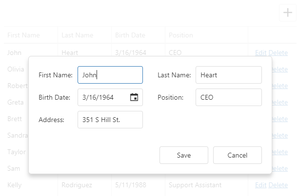
Use the editing.popup object to customize the popup window. This object can contain the Popup UI component's fields. However, you should refer to the popup object's description for information on restrictions that apply.
jQuery
$(function() {
    $("#dataGridContainer").dxDataGrid({
        // ...
        editing: {
            allowUpdating: true,
            mode: "popup",
            form: {
                labelLocation: "top"
            },
            popup: {
                showTitle: true,
                title: "Row in the editing state"
            }
        }
    });
});
Angular
<dx-data-grid ... >
    <dxo-data-grid-editing
        [allowUpdating]="true"
        mode="popup">
        <dxo-data-grid-form labelLocation="top"></dxo-data-grid-form>
        <dxo-data-grid-popup [showTitle]="true" title="Row in the editing state"></dxo-data-grid-popup>
    </dxo-data-grid-editing>
</dx-data-grid>
import { DxDataGridModule } from "devextreme-angular";
// ...
export class AppComponent {
    // ...
}
@NgModule({
    imports: [
        // ...
        DxDataGridModule
    ],
    // ...
})
Vue
<template>
    <DxDataGrid ... >
        <DxEditing
            :allow-updating="true"
            mode="popup">
            <DxForm
                label-location="top"
            />
            <DxPopup
                :show-title="true"
                title="Row in the editing state"
            />
        </DxEditing>
    </DxDataGrid>
</template>

<script>
import 'devextreme/dist/css/dx.light.css';

import DxDataGrid, {
    DxEditing,
    DxForm,
    DxPopup
} from 'devextreme-vue/data-grid';

export default {
    components: {
        DxDataGrid,
        DxEditing,
        DxForm,
        DxPopup
    }
}
</script>
React
import React from 'react';

import 'devextreme/dist/css/dx.light.css';

import DataGrid, {
    Editing,
    Form,
    Popup
} from 'devextreme-react/data-grid';

class App extends React.Component {
    render() {
        return (
            <DataGrid ... >
                <Editing
                    allowUpdating={true}
                    mode="popup">
                    <Form
                        labelLocation="top"
                    />
                    <Popup
                        showTitle={true}
                        title="Row in the editing state"
                    />
                </Editing>
            </DataGrid>
        );
    }
}
export default App;
Since the popup and form modes are very similar, you can use the same columns.formItem and editing.form properties to customize items and layout in both modes. See the Form Mode topic for more details on form customization.
The built-in form of the Popup and Form modes has limited functionality. If you want to further customize the form (add custom labels and buttons, apply advanced validation rules and masks, etc.), implement the Form component inside Popup.
See Also
Add
Use the addRow() method to add an empty row.
jQuery
$("#dataGridContainer").dxDataGrid("addRow");Angular
import { ..., ViewChild } from "@angular/core";
import { DxDataGridModule, DxDataGridComponent } from "devextreme-angular";
// ...
export class AppComponent {
    @ViewChild(DxDataGridComponent, { static: false }) dataGrid: DxDataGridComponent;
    // Prior to Angular 8
    // @ViewChild(DxDataGridComponent) dataGrid: DxDataGridComponent;
    addRow () {
       this.dataGrid.instance.addRow();
    }
}
@NgModule({
    imports: [
        // ...
        DxDataGridModule
    ],
    // ...
})
Vue
<template>
    <DxDataGrid ...
        ref="myDataGrid">
    </DxDataGrid>
</template>

<script>
import 'devextreme/dist/css/dx.light.css';

import DxDataGrid from 'devextreme-vue/data-grid';

export default {
    components: {
        DxDataGrid
    },
    methods: {
        addNewRow() {
            this.$refs['myDataGrid'].instance.addRow();
        }
    }
}
</script>
React
import React from 'react';

import 'devextreme/dist/css/dx.light.css';

import DataGrid from 'devextreme-react/data-grid';

class App extends React.Component {
    constructor(props) {
        super(props);
        this.dataGridRef = React.createRef();
        this.addNewRow = this.addNewRow.bind(this);
    }

    addNewRow() {
        this.dataGridRef.current.instance().addRow();
    }

    render() {
        return (
            <DataGrid ...
                ref={this.dataGridRef}>
            </DataGrid>
        );
    }
}
export default App;
You can specify initial values for a newly added row in the onInitNewRow event handler.
jQuery
$(function() {
    $("#dataGridContainer").dxDataGrid({
        // ...
        columns: [{
            dataField: "Hire_Date",
            dataType: "date"
        },
            // ...
        ],
        onInitNewRow: function(e) {
            e.data.Hire_Date = new Date();
        }
    });
});
Angular
<dx-data-grid ...
    (onInitNewRow)="onInitNewRow($event)">
    <dxi-data-grid-column dataField="Hire_Date" dataType="date"></dxi-data-grid-column>
</dx-data-grid>
import { DxDataGridModule } from "devextreme-angular";
// ...
export class AppComponent {
    onInitNewRow (e) {
        e.data.Hire_Date = new Date();
    }
}
@NgModule({
    imports: [
        // ...
        DxDataGridModule
    ],
    // ...
})
Vue
<template>
    <DxDataGrid ...
        @init-new-row="setHireDate">
        <DxColumn data-field="Hire_Date" data-type="date" />
    </DxDataGrid>
</template>

<script>
import 'devextreme/dist/css/dx.light.css';

import DxDataGrid, {
    DxColumn
} from 'devextreme-vue/data-grid';

export default {
    components: {
        DxDataGrid,
        DxColumn
    },
    methods: {
        setHireDate(e) {
            e.data.Hire_Date = new Date();
        }
    }
}
</script>
React
import React from 'react';

import 'devextreme/dist/css/dx.light.css';

import DataGrid, {
    Column
} from 'devextreme-react/data-grid';

class App extends React.Component {
    setHireDate(e) {
        e.data.Hire_Date = new Date();
    }

    render() {
        return (
            <DataGrid ...
                onInitNewRow={this.setHireDate}>
                <Column dataField="Hire_Date" dataType="date" />
            </DataGrid>
        );
    }
}
export default App;
See Also
Update
The cellValue(rowIndex, visibleColumnIndex, value) method updates a cell's value. This cell can be located using its row and column indexes. If the cell's data field is known, you can pass it instead of the column index. After a value is updated, save it to the data source by calling the saveEditData() method.
jQuery
$(function() {
    $("#dataGridContainer").dxDataGrid({ ... });

    $("#updateCellButton").dxButton({
        text: "Update Cell",
        onClick: function() {
            $("#dataGridContainer").dxDataGrid("cellValue", 1, "Position", "CTO");
            $("#dataGridContainer").dxDataGrid("saveEditData");
        }
    });
});
Angular
import { DxDataGridModule, DxButtonModule } from "devextreme-angular";
// ...
export class AppComponent {
    @ViewChild(DxDataGridComponent, { static: false }) dataGrid: DxDataGridComponent;
    // Prior to Angular 8
    // @ViewChild(DxDataGridComponent) dataGrid: DxDataGridComponent;
    updateCell () {
        this.dataGrid.instance.cellValue(1, "Position", "CTO");
        this.dataGrid.instance.saveEditData();
    }
}
@NgModule({
    imports: [
        // ...
        DxDataGridModule,
        DxButtonModule
    ],
    // ...
})
<dx-data-grid ... ></dx-data-grid>
<dx-button
    text="Update Cell"
    (onClick)="updateCell()">
</dx-button>
Vue
<template>
    <div>
        <DxDataGrid ...
            :ref="dataGridRefKey">
        </DxDataGrid>
        <DxButton
            text="Update Cell"
            @click="updateCell"
        />
    </div>
</template>

<script>
import 'devextreme/dist/css/dx.light.css';

import DxDataGrid from 'devextreme-vue/data-grid';
import DxButton from 'devextreme-vue/button';

const dataGridRefKey = 'myDataGrid';

export default {
    components: {
        DxDataGrid,
        DxButton
    },
    data: function() {
        return {
            dataGridRefKey
        }
    },
    methods: {
        updateCell() {
            this.dataGrid.cellValue(1, "Position", "CTO");
            this.dataGrid.saveEditData();
        }
    },
    computed: {
        dataGrid: function() {
            return this.$refs[dataGridRefKey].instance;
        }
    }
}
</script>
React
import React from 'react';

import 'devextreme/dist/css/dx.light.css';

import DataGrid from 'devextreme-react/data-grid';
import Button from 'devextreme-react/button';

class App extends React.Component {
    constructor(props) {
        super(props);
        this.dataGridRef = React.createRef();
        this.updateCell = this.updateCell.bind(this);
    }

    get dataGrid() {
        return this.dataGridRef.current.instance();
    }

    updateCell() {
        this.dataGrid.cellValue(1, "Position", "CTO");
        this.dataGrid.saveEditData();
    }

    render() {
        return (
            <React.Fragment>
                <DataGrid ...
                    ref={this.dataGridRef}>
                </DataGrid>
                <Button
                    text="Update Cell"
                    onClick={this.updateCell}
                />
            </React.Fragment>
        );
    }
}
export default App;
To process an updated cell value before saving it to the data source, implement the columns.setCellValue function. Refer to the function's description for an example.
You can check if there are any unsaved changes by calling the hasEditData() method. Use the saveEditData() or cancelEditData() method to save or cancel them, respectively.
jQuery
$(function() {
    $("#dataGridContainer").dxDataGrid({ ... });

    $("#saveChangesButton").dxButton({
        text: "Save changes",
        onClick: function() {
            var dataGrid = $("#dataGridContainer").dxDataGrid("instance");
            if(dataGrid.hasEditData()) {
                dataGrid.saveEditData().then(() => {
                    if(!dataGrid.hasEditData()) {
                        // Saved successfully
                    } else {
                        // Saving failed
                    }
                });
            }
        }
    });
});
Angular
import { DxDataGridModule, DxButtonModule } from "devextreme-angular";
// ...
export class AppComponent {
    @ViewChild(DxDataGridComponent, { static: false }) dataGrid: DxDataGridComponent;
    // Prior to Angular 8
    // @ViewChild(DxDataGridComponent) dataGrid: DxDataGridComponent;
    saveEditData() {
        if(this.dataGrid.instance.hasEditData()) {
            this.dataGrid.instance.saveEditData().then(() => {
                if(!this.dataGrid.instance.hasEditData()) {
                    // Saved successfully
                } else {
                    // Saving failed
                }
            });
        }
    }
}
@NgModule({
    imports: [
        // ...
        DxDataGridModule,
        DxButtonModule
    ],
    // ...
})
<dx-data-grid ... ></dx-data-grid>
<dx-button
    text="Save changes"
    (onClick)="saveEditData()">
</dx-button>
Vue
<template>
    <div>
        <DxDataGrid ...
            :ref="dataGridRefKey">
        </DxDataGrid>
        <DxButton
            text="Save changes"
            @click="saveChanges"
        />
    </div>
</template>

<script>
import 'devextreme/dist/css/dx.light.css';

import DxDataGrid from 'devextreme-vue/data-grid';
import DxButton from 'devextreme-vue/button';

const dataGridRefKey = 'myDataGrid';

export default {
    components: {
        DxDataGrid,
        DxButton
    },
    data: function() {
        return {
            dataGridRefKey
        }
    },
    methods: {
        saveChanges() {
            if(this.dataGrid.hasEditData()) {
                this.dataGrid.saveEditData().then(() => {
                    if(!this.dataGrid.hasEditData()) {
                        // Saved successfully
                    } else {
                        // Saving failed
                    }
                });
            }
        }
    },
    computed: {
        dataGrid: function() {
            return this.$refs[dataGridRefKey].instance;
        }
    }
}
</script>
React
import React from 'react';

import 'devextreme/dist/css/dx.light.css';

import DataGrid from 'devextreme-react/data-grid';
import Button from 'devextreme-react/button';

class App extends React.Component {
    constructor(props) {
        super(props);
        this.dataGridRef = React.createRef();
        this.saveChanges = this.saveChanges.bind(this);
    }

    get dataGrid() {
        return this.dataGridRef.current.instance();
    }

    saveChanges() {
        if(this.dataGrid.hasEditData()) {
            this.dataGrid.saveEditData().then(() => {
                if(!this.dataGrid.hasEditData()) {
                    // Saved successfully
                } else {
                    // Saving failed
                }
            });
        }
    }

    render() {
        return (
            <React.Fragment>
                <DataGrid ...
                    ref={this.dataGridRef}>
                </DataGrid>
                <Button
                    text="Save changes"
                    onClick={this.saveChanges}
                />
            </React.Fragment>
        );
    }
}
export default App;
See Also
Delete
Call the deleteRow(rowIndex) method to delete a specific row from the data source. This method invokes a confirmation dialog that allows a user to cancel deletion. The confirmDelete property allows you to hide this dialog instantly deleting the selected row from the data source.
jQuery
$(function() {
    var dataGrid = $("#dataGridContainer").dxDataGrid({
        // ...
        editing: {
            mode: "row",
            allowDeleting: true,
            confirmDelete: false
        }
    }).dxDataGrid("instance");

    $("#deleteRowButton").dxButton({
        text: "Delete Row",
        onClick: function() {
            // Deletes the second row
            dataGrid.deleteRow(1);
        }
    });
});
Angular
<dx-data-grid>
    <dxo-data-grid-editing
        mode="row"
        [allowDeleting]="true"
        [confirmDelete]="false">
    </dxo-data-grid-editing>
</dx-data-grid>
<dx-button
    text="Delete Row"
    (onClick)="deleteRow()">
</dx-button>
import { DxDataGridModule, DxButtonModule } from "devextreme-angular";
// ...
export class AppComponent {
    @ViewChild(DxDataGridComponent, { static: false }) dataGrid: DxDataGridComponent;
    // Prior to Angular 8
    // @ViewChild(DxDataGridComponent) dataGrid: DxDataGridComponent;
    deleteRow () {
        // Deletes the second row
        this.dataGrid.instance.deleteRow(1);
    }
}
@NgModule({
    imports: [
        // ...
        DxDataGridModule,
        DxButtonModule
    ],
    // ...
})
Vue
<template>
    <DxDataGrid
        ref="dataGrid">
        <DxEditing
            mode="row"
            :allow-deleting="true"
            :confirm-delete="false"
        />
    </DxDataGrid>
    <DxButton
        text="Delete Row"
        @click="deleteRow"
    />
</template>

<script>
import { DxDataGrid, DxEditing } from 'devextreme-vue/data-grid';

import DxButton from 'devextreme-vue/button';

export default {
    components: {
        DxDataGrid,
        DxEditing,
        DxButton
    },
    methods: {
        deleteRow() {
            this.$refs.dataGrid.instance.deleteRow(1);
        }
    },
    data() {}
}
</script>
React
import React from 'react';

import { DataGrid, Editing } from 'devextreme-react/data-grid';
import Button from 'devextreme-react/button';

class App extends React.Component {
    constructor(props) {
        super(props);

        this.dataGridRef = React.createRef();
        this.deleteRow = this.deleteRow.bind(this);
    }
    get dataGrid() {
        return this.dataGridRef.current.instance();
    }

    deleteRow() {
        this.dataGrid.deleteRow(1);
    }

    render() {
        return (
            <DataGrid
                ref={this.dataGridRef}>
                <Editing
                    mode="row"
                    confirmDelete={false}
                    allowDeleting={true}
                />
            </DataGrid>
            <Button
                text="Delete Row"
                onClick={this.deleteRow}
            />
        );
    }
}
export default App;
Note that in batch mode a row is only marked as deleted. To save changes, call the saveEditData() method. Calling the undeleteRow(rowIndex) method cancels row deletion.
jQuery
$("#dataGridContainer").dxDataGrid("undeleteRow", 1);Angular
import { DxDataGridModule } from "devextreme-angular";
// ...
export class AppComponent {
    @ViewChild(DxDataGridComponent, { static: false }) dataGrid: DxDataGridComponent;
    // Prior to Angular 8
    // @ViewChild(DxDataGridComponent) dataGrid: DxDataGridComponent;
    undeleteRow () {
        this.dataGrid.instance.undeleteRow(1);
    }
}
@NgModule({
    imports: [
        // ...
        DxDataGridModule
    ],
    // ...
})
Vue
<template>
    <DxDataGrid
        ref="dataGrid">
    </DxDataGrid>
</template>

<script>
import { DxDataGrid } from 'devextreme-vue/data-grid';

export default {
    components: {
        DxDataGrid
    },
    methods: {
        undeleteRow() {
            this.$refs.dataGrid.instance.undeleteRow(1);
        }
    },
    data() {}
}
</script>
React
import React from 'react';

import { DataGrid } from 'devextreme-react/data-grid';

class App extends React.Component {
    constructor(props) {
        super(props);

        this.dataGridRef = React.createRef();
        this.undeleteRow = this.undeleteRow.bind(this);
    }
    get dataGrid() {
        return this.dataGridRef.current.instance();
    }

    undeleteRow() {
        this.dataGrid.undeleteRow(1);
    }

    render() {
        return (
            <DataGrid
                ref={this.dataGridRef}
            />
        );
    }
}
export default App;
See Also
Get Current Cell Values
To get current cell values (saved or unsaved), call cellValue(rowIndex, dataField).
The method takes a row index parameter. To get row indexes, you can utilize getRowIndexByKey(key). To get the key value of the row being edited, call option(optionName) with the 'editing.editRowKey' parameter.
The following code snippet demonstrates how to implement getRowIndexByKey, cellValue, and option to get edited cell values:
jQuery
$(function() {
    const dataGridInstance = $('#dataGridContainer').dxDataGrid({ ... }).dxDataGrid('instance');

    function getCellValue() {
        const editRowKey = dataGridInstance.option('editing.editRowKey');
        const editRowIndex = dataGridInstance.getRowIndexByKey(editRowKey);

        if (editRowIndex >= 0){
            return dataGridInstance.cellValue(editRowIndex, dataField);
        }

        return null;
    }
});
Angular
import { Component, ViewChild } from "@angular/core";
import { DxDataGridComponent } from "devextreme-angular";

export class AppComponent {
    @ViewChild(DxDataGridComponent, { static: false }) dataGrid!: DxDataGridComponent;

    getCellValue() {
        const editRowKey = this.dataGrid.instance.option('editing.editRowKey');
        const editRowIndex = this.dataGrid.instance.getRowIndexByKey(editRowKey);

        if (editRowIndex >= 0) {
            return this.dataGrid.instance.cellValue(editRowIndex, dataField);
        }

        return null;
    }
}
Vue
<template>
    <DxDataGrid ...
        ref="dataGridRef"
    />
</template>

<script>
import { ref } from 'vue';
import { DxDataGrid } from 'devextreme-vue/data-grid';

const dataGridRef = ref(null);

function getCellValue() {
    const editRowKey = dataGridRef.value.instance.option('editing.editRowKey');
    const editRowIndex = dataGridRef.value.instance.getRowIndexByKey(editRowKey);

    if (editRowIndex >= 0) {
        return dataGridRef.value.instance.cellValue(editRowIndex, dataField);
    }

    return null;
}
</script>
React
import React, { useRef, useCallback } from 'react';
import { DataGrid } from 'devextreme-react/data-grid';

function App(): JSX.Element {
    const dataGridRef = useRef(null);

    const getCellValue = useCallback(() => {
        const editRowKey = dataGridRef.current.instance().option('editing.editRowKey');
        const editRowIndex = dataGridRef.current.instance().getRowIndexByKey(editRowKey);

        if (editRowIndex >= 0) {
            return dataGridRef.current.instance().cellValue(editRowIndex, dataField);
        }

        return null;
    }, [])

    return (
        <DataGrid ...
            ref={dataGridRef}
        />
    )
}See Also
Events
The DataGrid UI component raises events before and after a row is inserted, updated or removed from the data source. If the event handlers are going to remain unchanged during the UI component's lifetime, assign them to corresponding onEventName properties:
jQuery
$(function(){
    $("#dataGridContainer").dxDataGrid({
        // ...
        onRowInserting: function(e) {
            // Handler of the "rowInserting" event
        }
    });
});
Angular
<dx-data-grid ...
    (onRowInserting)="onRowInserting($event)">
</dx-data-grid>
import { DxDataGridModule } from "devextreme-angular";
// ...
export class AppComponent {
    onRowInserting (e) {
        // Handler of the "rowInserting" event
    }
}
@NgModule({
    imports: [
        // ...
        DxDataGridModule
    ],
    // ...
})
Vue
<template>
    <DxDataGrid ...
        @row-inserting="onRowInserting">
    </DxDataGrid>
</template>

<script>
import 'devextreme/dist/css/dx.light.css';

import DxDataGrid from 'devextreme-vue/data-grid';

export default {
    components: {
        DxDataGrid
    },
    methods: {
        onRowInserting(e) {
            // Handler of the "rowInserting" event
        }
    }
}
</script>
React
import React from 'react';

import 'devextreme/dist/css/dx.light.css';

import DataGrid from 'devextreme-react/data-grid';

class App extends React.Component {
    onRowInserting(e) {
        // Handler of the "rowInserting" event
    }

    render() {
        return (
            <DataGrid ...
                onRowInserting={this.onRowInserting}>
            </DataGrid>
        );
    }
}
export default App;
jQuery
If you are going to change the event handlers at runtime, or if you need to attach several handlers to a single event, subscribe to this event using the on(eventName, eventHandler) method.
var rowUpdatingEventHandler1 = function(e) {
    // First handler of the "rowUpdating" event
};

var rowUpdatingEventHandler2 = function(e) {
    // Second handler of the "rowUpdating" event
};

$("#dataGridContainer").dxDataGrid("instance")
    .on("rowUpdating", rowUpdatingEventHandler1)
    .on("rowUpdating", rowUpdatingEventHandler2);
In addition, the DataGrid raises the initNewRow event when a new row is added and the editingStart event when a row enters the editing state. These events can be handled just like others - using the onEventName property or the on(eventName, eventHandler) method. In the following example, the onInitNewRow event handler specifies initial values for an added row:
jQuery
$(function () {
    $("#dataGridContainer").dxDataGrid({
        // ...
        onInitNewRow: function(e) { // Handler of the "initNewRow" event
            // Sets an initial value for the "Hire_Date" field
            e.data.Hire_Date = new Date();
        }
    });
});
Angular
<dx-data-grid ...
    (onInitNewRow)="onInitNewRow($event)">
</dx-data-grid>
import { DxDataGridModule } from "devextreme-angular";
// ...
export class AppComponent {
    onInitNewRow (e) { // Handler of the "initNewRow" event
        // Sets an initial value for the "Hire_Date" field
        e.data.Hire_Date = new Date();
    }
}
@NgModule({
    imports: [
        // ...
        DxDataGridModule
    ],
    // ...
})
Vue
<template>
    <DxDataGrid ...
        @init-new-row="onInitNewRow">
    </DxDataGrid>
</template>

<script>
import 'devextreme/dist/css/dx.light.css';

import DxDataGrid from 'devextreme-vue/data-grid';

export default {
    components: {
        DxDataGrid
    },
    methods: {
        onInitNewRow(e) { // Handler of the "initNewRow" event
            // Sets an initial value for the "Hire_Date" field
            e.data.Hire_Date = new Date();
        }
    }
}
</script>
React
import React from 'react';

import 'devextreme/dist/css/dx.light.css';

import DataGrid from 'devextreme-react/data-grid';

class App extends React.Component {
    onInitNewRow(e) { // Handler of the "initNewRow" event
        // Sets an initial value for the "Hire_Date" field
        e.data.Hire_Date = new Date();
    }

    render() {
        return (
            <DataGrid ...
                onInitNewRow={this.onInitNewRow}>
            </DataGrid>
        );
    }
}
export default App;
See Also
Customize Editors
The columns's dataType defines a cell's editor that can be configured using the editorOptions object. However, this object cannot be used to change the editor's type or onValueChanged event handler. Instead, use the onEditorPreparing function as shown in the following code. The function's parameter provides the editorName and editorOptions fields for changing the used editor and its configuration.
jQuery
$(function() {
    $("#dataGridContainer").dxDataGrid({
        // ...
        columns: [{
            dataField: "Note",
            editorOptions: {
                height: 200
            }
        }, // ...
        ],
        onEditorPreparing: function(e) {
            if (e.dataField == "Note" && e.parentType === "dataRow") {
                const defaultValueChangeHandler = e.editorOptions.onValueChanged;
                e.editorName = "dxTextArea"; // Change the editor's type
                e.editorOptions.onValueChanged = function (args) {  // Override the default handler
                    // ...
                    // Custom commands go here
                    // ...
                    // If you want to modify the editor value, call the setValue function:
                    // e.setValue(newValue);
                    // Otherwise, call the default handler:
                    defaultValueChangeHandler(args);
                }
            }
        }
    });
});
Angular
<dx-data-grid ...
    (onEditorPreparing)="onEditorPreparing($event)">
    <dxi-data-grid-column
        dataField="Note"
        [editorOptions]="{ height: 200 }">
    </dxi-data-grid-column>
</dx-data-grid>
import { DxDataGridModule, DxTextAreaModule } from "devextreme-angular";
// ...
export class AppComponent {
    onEditorPreparing (e) {
        if (e.dataField == "Note" && e.parentType === "dataRow") {
            const defaultValueChangeHandler = e.editorOptions.onValueChanged;
            e.editorName = "dxTextArea"; // Change the editor's type
            e.editorOptions.onValueChanged = function (args) {  // Override the default handler
                // ...
                // Custom commands go here
                // ...
                // If you want to modify the editor value, call the setValue function:
                // e.setValue(newValue);
                // Otherwise, call the default handler:
                defaultValueChangeHandler(args);
            }
        }
    }
}
@NgModule({
    imports: [
        // ...
        DxDataGridModule,
        DxTextAreaModule
    ],
    // ...
})
Vue
<template>
    <DxDataGrid ...
        @editor-preparing="onEditorPreparing">
        <DxColumn
            data-field="Note"
            :editor-options="textAreaOptions"
        />
    </DxDataGrid>
</template>

<script>
import 'devextreme/dist/css/dx.light.css';

import DxDataGrid, {
    DxColumn
} from 'devextreme-vue/data-grid';
import 'devextreme-vue/text-area';

export default {
    components: {
        DxDataGrid,
        DxColumn
    },
    data() {
        return {
            textAreaOptions: { height: 200 }
        }
    },
    methods: {
        onEditorPreparing(e) {
            if(e.dataField == "Note" && e.parentType === "dataRow") {
                const defaultValueChangeHandler = e.editorOptions.onValueChanged;
                e.editorName = "dxTextArea"; // Change the editor's type
                e.editorOptions.onValueChanged = function (args) {  // Override the default handler
                    // ...
                    // Custom commands go here
                    // ...
                    // If you want to modify the editor value, call the setValue function:
                    // e.setValue(newValue);
                    // Otherwise, call the default handler:
                    defaultValueChangeHandler(args);
                }
            }
        }
    }
}
</script>
React
import React from 'react';

import 'devextreme/dist/css/dx.light.css';

import DataGrid, {
    Column
} from 'devextreme-react/data-grid';
import 'devextreme-react/text-area';

class App extends React.Component {
    textAreaOptions = { height: 200 };
    onEditorPreparing(e) {
        if(e.dataField == "Note" && e.parentType === "dataRow") {
            const defaultValueChangeHandler = e.editorOptions.onValueChanged;
            e.editorName = "dxTextArea"; // Change the editor's type
            e.editorOptions.onValueChanged = function (args) {  // Override the default handler
                // ...
                // Custom commands go here
                // ...
                // If you want to modify the editor value, call the setValue function:
                // e.setValue(newValue);
                // Otherwise, call the default handler:
                defaultValueChangeHandler(args);
            }
        }
    }

    render() {
        return (
            <DataGrid ...
                onEditorPreparing={this.onEditorPreparing}>
                <Column
                    dataField="Note"
                    editorOptions={this.textAreaOptions}
                />
            </DataGrid>
        );
    }
}
export default App;
ASP.NET MVC Controls
@(Html.DevExtreme().DataGrid()
    // ...
    .Columns(cols => {
        // ...
        cols.Add().DataField("Note")
            .EditorOptions(new { height = 200 });
    })
    .OnEditorPreparing("dataGrid_editorPreparing")
)

<script type="text/javascript">
    function dataGrid_editorPreparing(e) {
        if (e.dataField == "Note" && e.parentType === "dataRow") {
            const defaultValueChangeHandler = e.editorOptions.onValueChanged;
            e.editorName = "dxTextArea"; // Change the editor's type
            e.editorOptions.onValueChanged = function (args) {  // Override the default handler
                // ...
                // Custom commands go here
                // ...
                // If you want to modify the editor value, call the setValue function:
                // e.setValue(newValue);
                // Otherwise, call the default handler:
                defaultValueChangeHandler(args);
            }
        }
    }
</script>
Implement the column's editCellTemplate for more extensive customization. In this template, you should specify your custom component's appearance and behavior in full. The following code uses the template to substitute the Switch UI component for a default editor.
jQuery
$(function() {
    $("#dataGridContainer").dxDataGrid({
        // ...
        columns: [{
            dataField: "isChecked",
            editCellTemplate: function(cellElement, cellInfo) {
                $("<div />").dxSwitch({
                    width: 50,
                    switchedOnText: "YES",
                    switchedOffText: "NO",
                    value: cellInfo.value,
                    onValueChanged: function(e) {
                        cellInfo.setValue(e.value);
                    }
                }).appendTo(cellElement);
            }
        }],
        editing: {
            mode: "batch",
            allowUpdating: true
        }
    });
});
Angular
<dx-data-grid ... >
    <dxi-data-grid-column
        dataField="isChecked"
        editCellTemplate="editCellTemplate">
    </dxi-data-grid-column>
    <div *dxTemplate="let cellInfo of 'editCellTemplate'">
        <dx-switch
            [width]="50"
            switchedOnText="YES"
            switchedOffText="NO"
            [(value)]="cellInfo.value"
            (onValueChanged)="setEditedValue($event, cellInfo)">
        </dx-switch>
    </div>
    <dxo-data-grid-editing mode="batch" [allowUpdating]="true"></dxo-data-grid-editing>
</dx-data-grid>
import { DxDataGridModule, DxSwitchModule } from "devextreme-angular";
// ...
export class AppComponent {
    setEditedValue (valueChangedEventArg, cellInfo) {
        cellInfo.setValue(valueChangedEventArg.value);
    }
}
@NgModule({
    imports: [
        // ...
        DxDataGridModule,
        DxSwitchModule
    ],
    // ...
})
Vue
<template>
    <DxDataGrid ... >
        <DxColumn
            data-field="isChecked"
            edit-cell-template="switch"
        />
        <template #switch="{ data }">
            <DxSwitch
                :width="50"
                switched-on-text="YES"
                switched-off-text="NO"
                :value="data.value"
                @value-changed="setEditedValue($event, data)"
            />
        </template>
        <DxEditing
            mode="batch"
            :allow-updating="true"
        />
    </DxDataGrid>
</template>

<script>
import 'devextreme/dist/css/dx.light.css';

import DxDataGrid, {
    DxColumn,
    DxEditing
} from 'devextreme-vue/data-grid';

import DxSwitch from 'devextreme-vue/switch';

export default {
    components: {
        DxDataGrid,
        DxColumn,
        DxEditing,
        DxSwitch
    },
    methods: {
        setEditedValue(valueChangedEventArg, cellInfo) {
            cellInfo.setValue(valueChangedEventArg.value);
        }
    }
}
</script>
React
import React from 'react';

import 'devextreme/dist/css/dx.light.css';

import DataGrid, {
    Column,
    Editing
} from 'devextreme-react/data-grid';

import Switch from 'devextreme-react/switch';

class App extends React.Component {
    renderSwitch(cellInfo) {
        const setEditedValue = valueChangedEventArg => {
            cellInfo.setValue(valueChangedEventArg.value);
        }
        return (
            <Switch
                width={50}
                switchedOnText="YES"
                switchedOffText="NO"
                defaultValue={cellInfo.value}
                onValueChanged={setEditedValue}
            />
        )
    }

    render() {
        return (
            <DataGrid ... >
                <Column
                    dataField="isChecked"
                    editCellRender={this.renderSwitch}
                />
                <Editing
                    mode="batch"
                    allowUpdating={true}
                />
            </DataGrid>
        );
    }
}
export default App;
ASP.NET MVC Controls
@(Html.DevExtreme().DataGrid()
    // ...
    .Columns(cols => {
        // ...
        cols.Add().DataField("isChecked")
            .EditCellTemplate(new TemplateName("edit-cells"));
    })
    .Editing(m => m.Mode(GridEditMode.Batch).AllowUpdating(true))
)

@using (Html.DevExtreme().NamedTemplate("edit-cells")) {
    @(Html.DevExtreme().Switch()
        .Width(50)
        .SwitchedOnText("YES")
        .SwitchedOffText("NO")
        .Value(new JS("value"))
        .OnValueChanged("function(e) { setValue(e.value) }")
    )
}
Editors are displayed in cells in the normal state too if you set the columns.showEditorAlways property to true.
jQuery
$(function() {
    $("#dataGridContainer").dxDataGrid({
        // ...
        columns: [{
            dataField: "Hidden",
            dataType: "boolean",
            showEditorAlways: true
        }]
    });
});
Angular
<dx-data-grid ... >
    <dxi-data-grid-column
        dataField="Hidden"
        dataType="boolean"
        [showEditorAlways]="true">
    </dxi-data-grid-column>
</dx-data-grid>
import { DxDataGridModule } from "devextreme-angular";
// ...
export class AppComponent {
    // ...
}
@NgModule({
    imports: [
        // ...
        DxDataGridModule
    ],
    // ...
})
Vue
<template>
    <DxDataGrid ... >
        <DxColumn
            data-field="Hidden"
            data-type="boolean"
            :show-editor-always="true"
        />
    </DxDataGrid>
</template>

<script>
import 'devextreme/dist/css/dx.light.css';

import DxDataGrid, {
    DxColumn
} from 'devextreme-vue/data-grid';

export default {
    components: {
        DxDataGrid,
        DxColumn
    }
}
</script>
React
import React from 'react';

import 'devextreme/dist/css/dx.light.css';

import DataGrid, {
    Column
} from 'devextreme-react/data-grid';

class App extends React.Component {
    render() {
        return (
            <DataGrid ... >
                <Column
                    dataField="Hidden"
                    dataType="boolean"
                    showEditorAlways={true}
                />
            </DataGrid>
        );
    }
}
export default App;
ASP.NET MVC Controls
@(Html.DevExtreme().DataGrid()
    // ...
    .Columns(cols => {
        // ...
        cols.Add().DataField("Hidden")
            .DataType(GridColumnDataType.Boolean)
            .ShowEditorAlways(true);
    })
)See Also
Appearance and Editing
In the topics below you can find recommendations on how to customize the edit form in a most efficient way.
Form Layout Customization
This section demonstrates how to configure a form item's style and arrange items. We do not recommend that you use the options mentioned in this section to change the default editor's behavior. To customize the default editor, refer to the following section: Editor Customization.
If you need to implement minor changes (for example, apply a style to a form item, change item visibility, configure labels, specify a number of columns spanned by an item, etc.), use the columns[].formItem property.
jQuery
$(function() {
    $("#dataGridContainer").dxDataGrid({
        // ...
        editing: {
            allowUpdating: true,
            mode: "form"
        },
        columns: [
            {
                dataField: "ID",
                formItem: {
                    visible: false
                }
            }, {
                dataField: "Notes",
                formItem: {
                    colSpan: 2,
                    cssClass: "custom-class",
                    editorType: 'dxTextArea',
                    label: {
                        location: "top"
                    },
                    editorOptions: {
                        height: 100,
                    },
                    ...
                }
            },
            // ...
        ]
    });
});
Angular
<dx-data-grid ... >
    <dxo-data-grid-editing
        [allowUpdating]="true"
        mode="form"
    >
    </dxo-data-grid-editing>
    <dxi-data-grid-column dataField="ID">
        <dxo-data-grid-form-item [visible]="false">
        </dxo-data-grid-form-item>
    </dxi-data-grid-column>
    <dxi-data-grid-column dataField="Notes">
        <dxo-data-grid-form-item
            [colSpan] = "2"
            cssClass = "custom-class"
            editorType = "dxTextArea"
            [editorOptions] = "{ height: 100 }"
        >
            <dxo-data-grid-label location="top"></dxo-data-grid-label>
        </dxo-data-grid-form-item>
    </dxi-data-grid-column>
</dx-data-grid>
import { BrowserModule } from '@angular/platform-browser';
import { NgModule } from '@angular/core';
import { AppComponent } from './app.component';

import { DxDataGridModule } from 'devextreme-angular';

@NgModule({
    declarations: [
        AppComponent
    ],
    imports: [
        BrowserModule,
        DxDataGridModule
    ],
    providers: [ ],
    bootstrap: [AppComponent]
})
export class AppModule { }
Vue
<template>
    <DxDataGrid ... >
        <DxEditing
            :allow-updating="true"
            mode="form"
        />
        <DxColumn data-field="ID">
            <DxFormItem :visible="false">
            </DxFormItem>
        </DxColumn>
        <DxColumn data-field="Notes">
            <DxFormItem
                :col-span="2"
                css-class = "custom-class"
                editor-type = "dxTextArea"
                :editor-options = "columnEditorOptions"
            >
                <DxLabel location="top" />
            </DxFormItem>
        </DxColumn>
    </DxDataGrid>
</template>

<script>
import 'devextreme/dist/css/dx.light.css';

import DxDataGrid, {
    DxEditing,
    DxColumn,
    DxFormItem,
    DxLabel
} from 'devextreme-vue/data-grid';

export default {
    components: {
        DxDataGrid,
        DxEditing,
        DxColumn,
        DxFormItem,
        DxLabel
    },
    data() {
        return {
            columnEditorOptions: { height: 100 }
        }
    }
    // ...
}
</script>
React
import React from 'react';
import 'devextreme/dist/css/dx.light.css';

import DataGrid, {
    Editing,
    Column,
    FormItem,
    Label
} from 'devextreme-react/data-grid';

const defaultEditorOptions = { height: 100 }

export default function App() {
    return (
        <DataGrid ... >
            <Editing
                allowUpdating={true}
                mode="form"
            />
            <Column dataField="ID">
                <FormItem visible={false} />
            </Column>
            <Column dataField="Notes">
                <FormItem
                    colSpan={2}
                    cssClass="custom-class"
                    editorType="dxTextArea"
                    editorOptions="{ defaultEditorOptions }"
                >
                    <Label location="top" />
                </FormItem>
            </Column>
        </DataGrid>
    );
}
If you need to implement major changes (for example, arrange items and groups), use the editing.form property. Declare all items for a column object and specify the dataField property.
DataGrid automatically generates editors with the corresponding event handlers for form items based on column settings and other DataGrid options like onEditorPrepared. Do not use the editorOptions property for items that are bound to dataField in the editing.form configuration. You can add unbound items in the same way as regular Form components. Do not use editCellTemplate for unbound items.
You can refer to the following topic for information on how to arrange items in the Form component: Organize Simple Items. You can use the same technique to arrange items in the DataGrid editing form. Note that you should leave the formData property unspecified because DataGrid uses a built-in mechanism to manage edited data.
See Also
Editor Customization
DataGrid generates editors based on the columns[].dataType property. This section demonstrates how to change the default editor settings, configure built-in editors, or create your custom editor.
If you want to change the predefined editor properties, specify the columns[].editorOptions property that also affects filter row editors. Omit the onValueChanged handler in this property because the internal DataGrid implementation overrides it. The columns[].formItem.editorOptions property affects form items only.
You can override the onValueChanged handler of the predefined editor and change its type. To accomplish this goal, handle the onEditorPreparing event.
jQuery
$(function() {
    $("#dataGridContainer").dxDataGrid({
        // ...
        onEditorPreparing: function(e) {
            if (e.dataField === "Notes" && e.parentType === "dataRow") {
                e.editorName = "dxTextArea";
            }
            if (e.dataField === "requiredDataField" && e.parentType === "dataRow") {
                const defaultValueChangeHandler = e.editorOptions.onValueChanged;
                e.editorOptions.onValueChanged = function(args) { // override the default handler
                    if (someCondition(e, args)) doSomething(e, args);
                    defaultValueChangeHandler(args);
                }
            }
        }
    });
});
Angular
<dx-data-grid ...
    (onEditorPreparing)="overrideOnValueChanged($event)">
</dx-data-grid>
import { Component } from '@angular/core';

@Component({
    selector: 'app-root',
    templateUrl: './app.component.html',
    styleUrls: ['./app.component.css']
})

export class AppComponent {
    overrideOnValueChanged(e) {
        if (e.dataField === "Notes" && e.parentType === "dataRow") {
            e.editorName = "dxTextArea";
        }
        if (e.dataField === "requiredDataField" && e.parentType === "dataRow") {
            const defaultValueChangeHandler = e.editorOptions.onValueChanged;
            e.editorOptions.onValueChanged = function(args) { // override the default handler
                if (someCondition(e, args)) doSomething(e, args);
                defaultValueChangeHandler(args);
            }
        }
    }
}
import { BrowserModule } from '@angular/platform-browser';
import { NgModule } from '@angular/core';
import { AppComponent } from './app.component';

import { DxDataGridModule } from 'devextreme-angular';

@NgModule({
    declarations: [
        AppComponent
    ],
    imports: [
        BrowserModule,
        DxDataGridModule
    ],
    providers: [],
    bootstrap: [AppComponent]
})

export class AppModule { }
Vue
<template>
    <DxDataGrid ...
        @editor-preparing="overrideOnValueChanged">
    </DxDataGrid>
</template>

<script>
import 'devextreme/dist/css/dx.light.css';

import DxDataGrid from 'devextreme-vue/data-grid';

export default {
    components: {
        DxDataGrid
    },
    // ...
    methods: {
        overrideOnValueChanged(e) {
            if (e.dataField === "Notes" && e.parentType === "dataRow") {
                e.editorName = "dxTextArea";
            }
            if (e.dataField === "requiredDataField" && e.parentType === "dataRow") {
                const defaultValueChangeHandler = e.editorOptions.onValueChanged;
                e.editorOptions.onValueChanged = function(args) { // override the default handler
                    if (someCondition(e, args)) doSomething(e, args);
                    defaultValueChangeHandler(args);
                }
            }
        }
    }
}
</script>
React
import React from 'react';

import 'devextreme/dist/css/dx.light.css';

import DataGrid from 'devextreme-react/data-grid';

const overrideOnValueChanged = (e) => {
    if (e.dataField === "Notes" && e.parentType === "dataRow") {
        e.editorName = "dxTextArea";
    }
    if (e.dataField === "requiredDataField" && e.parentType === "dataRow") {
        const defaultValueChangeHandler = e.editorOptions.onValueChanged;
        e.editorOptions.onValueChanged = function(args) { // override the default handler
            if (someCondition(e, args)) doSomething(e, args);
            defaultValueChangeHandler(args);
        }
    }
}

export default function App() {
    return (
        <DataGrid ...
            onEditorPreparing={overrideOnValueChanged}
        >
        </DataGrid>
    );
}
If you need to implement a custom editor for a specific data type (array, object, etc.), use the columns[].editCellTemplate property. It is important to allow users to input or change the column value. Handle this value change and use the setValue template parameter to change the corresponding cell value. The editCellTemplate property specifies one template for all editing modes.
If you want to further customize the form (add custom labels and buttons, apply advanced validation rules and masks, etc.), implement the Form component inside Popup.
See Also
Validation
DataGrid validation is based on validation rules in all edit modes. Refer to the following topic for more details about DataGrid validation: Data Validation.
DataGrid automatically applies rules defined for columns to editors in an edit form. If you define form items in the edit form, do not assign validation rules directly to form items since validation may work incorrectly. Do not specify FormItem.isRequired as DataGrid automatically specifies this property for all form items whose corresponding columns include RequiredRule.
jQuery
$("#dataGridContainer").dxDataGrid({
    columns: [{
        dataField: "Full_Name",
        validationRules: [{ type: "required" }] // correct
    }
    // ...
    ],
    editing: {
        form: {
            items: [{
                dataField: "Full_Name",
                validationRules: [{type: 'required'}] // incorrect
            }]
        }
    }
});
Angular
<dx-data-grid ... >
    <dxi-data-grid-column dataField="Full_Name">
        <!-- correct -->
        <dxi-data-grid-validation-rule type="required"></dxi-data-grid-validation-rule>
    </dxi-data-grid-column>
    <dxo-data-grid-editing>
        <dxo-data-grid-form>
            <dxi-data-grid-item dataField="Full_Name">
                <!-- incorrect -->
                <dxi-data-grid-validation-rule type="required">
            </dxi-data-grid-item>
        </dxo-data-grid-form>
    </dxo-data-grid-editing>
</dx-data-grid>
Vue
<DxDataGrid ... >
    <DxColumn data-field="Full_Name">
        <!-- correct -->
        <DxRequiredRule />
    </DxColumn>
    <DxEditing>
        <DxForm>
            <DxItem dataField="Full_Name">
                <!-- incorrect -->
                <DxRequiredRule />
            </DxItem>
        </DxForm>
    </DxEditing>
</DxDataGrid>
React
<DataGrid ... >
    <Column dataField="Full_Name">
        <!-- correct -->
        <RequiredRule />
    </Column>
    <Editing>
        <Form>
            <Item dataField="Full_Name" >
                <!-- incorrect -->
                <RequiredRule />
            </Item>
        </Form>
    </Editing>
</DataGrid>
To display the validation summary, enable the form.showValidationSummary property.
If your form layout contains tabs, disable TabbedItem.tabPanelOptions.deferRendering so DataGrid can validate all editors in all tabs. Otherwise, validation rules are not executed for items under non-initialized tabs.
jQuery
$("#dataGridContainer").dxDataGrid({
    editing: {
        form: {
            items: [{
                itemType: "tabbed",
                tabPanelOptions: {
                    deferRendering: false,
                },
                tabs: [...]
            }]
        }
    }
});
Angular
<dx-data-grid ... >
    <dxo-data-grid-editing>
        <dxo-data-grid-form>
            <dxi-data-grid-item itemType="tabbed">
                <dxo-tab-panel-options [deferRendering]="false">
                </dxo-tab-panel-options>
                <dxi-tab></dxi-tab>
            </dxi-data-grid-item>
        </dxo-data-grid-form>
    </dxo-data-grid-editing>
</dx-data-grid>
Vue
<DxDataGrid ... >
    <DxEditing>
        <DxForm>
            <DxTabbedItem>
                <DxTabPanelOptions
                    :defer-rendering="false"
                />
                <DxTab></DxTab>
            </DxTabbedItem>
        </DxForm>
    </DxEditing>
</DxDataGrid>
React
<DataGrid ... >
    <Editing>
        <Form>
            <TabbedItem>
                <TabPanelOptions deferRendering={false} />
                <Tab></Tab>
            </Item>
        </Form>
    </Editing>
</DataGrid>
Save, Cancel, and Custom Buttons
Form and popup edit modes include built-in Save and Cancel buttons. If you want to execute custom code on a click on either button, specify the onSaving or onEditCanceling event handler, respectively. Assign true to the e.cancel parameter to cancel a pending Save or Cancel operation and keep the form or pop-up window open.
Specify editing.texts.cancelRowChanges and editing.texts.saveRowChanges properties to change Save and Cancel button captions.
To customize Save and Cancel buttons, you need to redefine them:
Popup edit mode
Add the editing.popup object to the DataGrid configuration object and declare Save, Cancel, and custom buttons in the popup.toolbarItems array.Form edit mode
Add the editing.form object to the DataGrid configuration object and use the form.items array to arrange all items you want to display in the edit form. Then, add a simple item with a template containing a standalone Toolbar component. Declare buttons in this toolbar. Use the following CSS to hide built-in Save and Cancel buttons:#gridForm .dx-datagrid-form-buttons-container { display: none }
Finally, handle the button onClick event to call saveEditData and cancelEditData methods, respectively.
Refer to the following example to learn more:
Dynamically Change Editor or Form Item Properties
The following articles include step-by-step instructions on how to dynamically modify editor or form item properties, hide form items, and disable editors based on another field’s value:
Advanced Customization
If you want to completely redesign the edit form or change its behavior, replace the edit form with a standalone Popup containing Form. See the following example for implementation details:
If you want to configure the edit form with components that can display their own overlays, refer to the following example:
Edit Form Limitations
Do not specify the following properties in the form object:
readOnly
Use column.allowEditing instead.template for items that have a data field
Use column.editCellTemplate instead.Any event handler (properties whose name starts with "on")
validationRules for items that have a data field
Assign validation rules to DataGrid columns.formData
DataGrid uses internal binding logic for the edit form. You can call the cellValue method to get and set values.jQuery
index.jsconst grid = $("#data-grid-container").dxDataGrid("instance"); const key = grid.option("editing.editRowKey"); index = grid.getRowIndexByKey(key); value = grid.cellValue(index, "CompanyName"); // get grid.cellValue(index, "CompanyName", "new value"); //set
Disable Editing
DataGrid includes API that allows you to disable data editing within certain columns or rows, or within individual cells. The following sections demonstrate how you can use that API.
Column
Set a column's allowEditing property to false to disable data editing within a specific column.
jQuery
$(function() {
    $("#dataGrid").dxDataGrid({
        // ...
        columns: [
            {
                allowEditing: false,
                // ...
            }
        ]
    });
});
Angular
<dx-data-grid ... >
    <!-- ... -->
    <dxi-data-grid-column [allowEditing]="false" ></dxi-data-grid-column>
</dx-data-grid>
import { DxDataGridModule } from "devextreme-angular";
// ...
export class AppComponent { ... }
@NgModule({
    imports: [
        // ...
        DxDataGridModule
    ],
    // ...
})
Vue
<template>
    <DxDataGrid ... >
        <DxColumn :allowEditing="false" />
    </DxDataGrid>
</template>

<script>
import {
    DxDataGrid,
    DxColumn,
    // ...
} from 'devextreme-vue/data-grid';

export default {
    components: {
        DxDataGrid,
        DxColumn,
        // ...
    },
    // ...
}
</script>
React
import React from 'react';
import 'devextreme/dist/css/dx.light.css';

import DataGrid, { Column } from 'devextreme-react/data-grid';

function App() {
    return (
        <DataGrid ... >
            {/* ... */}
            <Column allowEditing={false} />
        </DataGrid>
    );
}

export default App;
Row
To disable data editing within a specific row, follow the steps below:
- Handle the DataGrid's onEditingStart event.
- Check the data parameter's values. If you want don't want users to edit this row, assign true to e.cancel.
jQuery
$(function() {
    $("#dataGrid").dxDataGrid({
        // ...
        onEditingStart(e) {
            e.cancel = e.data.Position === "CEO";
        }
    });
});
Angular
<dx-data-grid
    // ...
    (onEditingStart)="onEditingStart($event)"
>
</dx-data-grid>
import { DxDataGridModule } from "devextreme-angular";
// ...
export class AppComponent {
    onEditingStart(e) {
        e.cancel = e.data.Position === "CEO";
    }
}
@NgModule({
    imports: [
        // ...
        DxDataGridModule
    ],
    // ...
})
Vue
<template>
    <DxDataGrid
        @editing-start="onEditingStart"
    >
    </DxDataGrid>
</template>

<script>
import {
    DxDataGrid,
    // ...
} from 'devextreme-vue/data-grid';

export default {
    components: {
        DxDataGrid,
        // ...
    },
    methods: {
        onEditingStart(e) {
            e.cancel = e.data.Position === "CEO";
        }
    }
    // ...
}
</script>
React
import React, { useCallback } from "react";
import 'devextreme/dist/css/dx.light.css';

import { DataGrid } from 'devextreme-react/data-grid';

function App() {
    // ...
    const onEditingStart = useCallback((e) => {
       e.cancel = e.data.Position === "CEO";
    }, []);

    return (
        <DataGrid
            onEditingStart={onEditingStart}
        >
        </DataGrid>
    );
}

export default App;
DataGrid's editing mode defines whether to display an Edit button opposite every row. To hide this button, use the button's visible property. Assign a callback to this property and check row data within this function.
jQuery
$(function() {
    $("#dataGrid").dxDataGrid({
        // ...
        columns: [{
            type: "buttons",
            buttons: [{
                name: "edit",
                visible: function(e) {
                    return e.row.data.Position !== "CEO";
                }
            }, "delete"]
        }],
    });
});
Angular
<dx-data-grid ... >
    <dxi-data-grid-column type="buttons">
        <dxi-data-grid-button name="edit" [visible]="hideEditButton" ></dxi-data-grid-button>
        <dxi-data-grid-button name="delete"></dxi-data-grid-button>
    </dxi-data-grid-column>
</dx-data-grid>
import { DxDataGridModule } from "devextreme-angular";
// ...
export class AppComponent {
    hideEditButton(e) {
        return e.row.data.Position !== "CEO";
    }
}
@NgModule({
    imports: [
        // ...
        DxDataGridModule
    ],
    // ...
})
Vue
<template>
    <DxDataGrid ... >
        <DxColumn type="buttons">
            <DxButton name="edit" :visible="hideEditButton" />
            <DxButton name="delete" />
        </DxColumn>
    </DxDataGrid>
</template>

<script>
import {
    DxDataGrid,
    // ...
} from 'devextreme-vue/data-grid';

export default {
    components: {
        DxDataGrid,
        DxColumn,
        DxButton,
        // ...
    },
    methods: {
        hideEditButton(e) {
            return e.row.data.Position !== "CEO";
        }
    }
    // ...
}
</script>
React
import React, { useCallback } from "react";
import 'devextreme/dist/css/dx.light.css';

import DataGrid, { Column, Button } from 'devextreme-react/data-grid';

function App() {
    // ...
    const hideEditButton = useCallback((e) => {
       return e.row.data.Position !== "CEO";
    }, []);

    return (
        <DataGrid ... >
            <Column type="buttons">
                <Button name="edit" visible={hideEditButton} />
                <Button name="delete" />
            </Column>
        </DataGrid>
    );
}

export default App;
See Also
Cell
Handle the DataGrid's onEditorPreparing event. Check the following parameters and set editorOptions.disabled as required:
- parentType: the row type - "dataRow" or "filterRow"
- dataField: the corresponding column
- row.data: row data values
- row.isNewRow:
true, if the user is adding a new row
jQuery
$(function() {
    $("#dataGrid").dxDataGrid({
        // ...
        onEditorPreparing(e) {
            if (e.dataField === "LastName" && e.parentType === "dataRow") {
                e.editorOptions.disabled = e.row.data && e.row.data.FirstName === "";
            }
        }
    });
});
Angular
<dx-data-grid
    // ...
    (onEditorPreparing)="onEditorPreparing($event)"
>
</dx-data-grid>
import { DxDataGridModule } from "devextreme-angular";
// ...
export class AppComponent {
    onEditorPreparing(e) {
        if (e.dataField === "LastName" && e.parentType === "dataRow") {
            e.editorOptions.disabled = e.row.data && e.row.data.FirstName === "";
        }
    }
}
@NgModule({
    imports: [
        // ...
        DxDataGridModule
    ],
    // ...
})
Vue
<template>
    <DxDataGrid
        @editor-preparing="onEditorPreparing"
    >
    </DxDataGrid>
</template>

<script>
import {
    DxDataGrid,
    // ...
} from 'devextreme-vue/data-grid';

export default {
    components: {
        DxDataGrid,
        // ...
    },
    methods: {
        onEditorPreparing(e) {
            if (e.dataField === "LastName" && e.parentType === "dataRow") {
                e.editorOptions.disabled = e.row.data && e.row.data.FirstName === "";
            }
        }
    }
    // ...
}
</script>
React
import React, { useCallback } from "react";
import 'devextreme/dist/css/dx.light.css';

import { DataGrid } from 'devextreme-react/data-grid';

function App() {
    // ...
    const onEditorPreparing = useCallback((e) => {
        if (e.dataField === "LastName" && e.parentType === "dataRow") {
            e.editorOptions.disabled = e.row.data && e.row.data.FirstName === "";
        }
    }, []);

    return (
        <DataGrid
            onEditorPreparing={onEditorPreparing}
        >
        </DataGrid>
    );
}

export default App;
You may need an extra implementation step if the control uses an edit mode that activate multiple editors at once (such as the "Row" edit mode). Specify a setCellValue callback for the column whose values specify editor availability in other columns. That callback helps you refresh the editors - disable or enable them as needed - and keep the control in edit mode. Refer to the following topic for additional information: Dynamically Change Editor Properties in the Editing State.
Data Validation
User input is validated against a set of validation rules. You can configure them in a column's validationRules array. Validation rules are attached to the editors and do not depend on the current edit mode.
jQuery
$(function() {
    $("#dataGridContainer").dxDataGrid({
        // ...
        columns: [{
            dataField: "Full_Name",
            validationRules: [{ type: "required" }]
        }, {
            dataField: "Login",
            validationRules: [{
                type: "stringLength",
                min: 3,
                message: "Login should be at least 3 symbols long"
            }]
        },
        // ...
        ]
    });
});
Angular
<dx-data-grid ... >
    <dxi-data-grid-column dataField="Full_Name">
        <dxi-data-grid-validation-rule type="required"></dxi-data-grid-validation-rule>
    </dxi-data-grid-column>
    <dxi-data-grid-column dataField="Login">
        <dxi-data-grid-validation-rule
            type="stringLength"
            [min]="3"
            message="Login should be at least 3 symbols long" >
        </dxi-data-grid-validation-rule>
    </dxi-data-grid-column>
</dx-data-grid>
import { DxDataGridModule } from "devextreme-angular";
// ...
export class AppComponent {
    // ...
}
@NgModule({
    imports: [
        // ...
        DxDataGridModule
    ],
    // ...
})
Vue
<template>
    <DxDataGrid ... >
        <DxColumn data-field="Full_Name">
            <DxRequiredRule />
        </DxColumn>
        <DxColumn data-field="Login">
            <DxStringLengthRule
                :min="3"
                message="Login should be at least 3 symbols long"
            />
        </DxColumn>
    </DxDataGrid>
</template>

<script>
import 'devextreme/dist/css/dx.light.css';

import DxDataGrid, {
    DxColumn,
    DxRequiredRule,
    DxStringLengthRule
} from 'devextreme-vue/data-grid';

export default {
    components: {
        DxDataGrid,
        DxColumn,
        DxRequiredRule,
        DxStringLengthRule
    }
}
</script>
React
import React from 'react';

import 'devextreme/dist/css/dx.light.css';

import DataGrid, {
    Column,
    RequiredRule,
    StringLengthRule
} from 'devextreme-react/data-grid';

class App extends React.Component {
    render() {
        return (
            <DataGrid ... >
                <Column dataField="Full_Name">
                    <RequiredRule />
                </Column>
                <Column dataField="Login">
                    <StringLengthRule
                        min={3}
                        message="Login should be at least 3 symbols long"
                    />
                </Column>
            </DataGrid>
        );
    }
}
export default App;
The onRowValidating handler allows you to perform an action before a notification that a validation rule has been broken is displayed. For instance, you can perform additional checks in this handler and change the validation result by changing the handler parameter's isValid field.
jQuery
$(function() {
    $("#dataGridContainer").dxDataGrid({
        // ...
        onRowValidating: function (e) {
            if (e.isValid && e.newData.Login === "Administrator") {
                e.isValid = false;
                e.errorText = "You cannot log in as Administrator";
            }
        }
    });
});
Angular
import { DxDataGridModule } from "devextreme-angular";
// ...
export class AppComponent {
    denyAdminLogin (e) {
        if (e.isValid && e.newData.Login === "Administrator") {
            e.isValid = false;
            e.errorText = "You cannot log in as Administrator";
        }
    }
}
@NgModule({
    imports: [
        // ...
        DxDataGridModule
    ],
    // ...
})
<dx-data-grid ...
    (onRowValidating)="denyAdminLogin($event)">
</dx-data-grid>
Vue
<template>
    <DxDataGrid ...
        @row-validating="denyAdminLogin">
    </DxDataGrid>
</template>

<script>
import 'devextreme/dist/css/dx.light.css';

import DxDataGrid from 'devextreme-vue/data-grid';

export default {
    components: {
        DxDataGrid
    },
    methods: {
        denyAdminLogin(e) {
            if(e.isValid && e.newData.Login === "Administrator") {
                e.isValid = false;
                e.errorText = "You cannot log in as Administrator";
            }
        }
    }
}
</script>
React
import React from 'react';

import 'devextreme/dist/css/dx.light.css';

import DataGrid from 'devextreme-react/data-grid';

class App extends React.Component {
    denyAdminLogin(e) {
        if(e.isValid && e.newData.Login === "Administrator") {
            e.isValid = false;
            e.errorText = "You cannot log in as Administrator";
        }
    }

    render() {
        return (
            <DataGrid ...
                onRowValidating={this.denyAdminLogin}>
            </DataGrid>
        );
    }
}
export default App;See Also

 Select one or more answers