React PolarChart - Series Types
Topics in this section describe the series types that come with the PolarChart UI component. Each topic gives an overview of a series type purpose, and details ways to enable and tune it to your needs.
Area
The area series type is useful when you need to emphasize a change in values. With this series type, data is displayed by a line that joins points, and the shaded area between this line and the zero value. This line is a border and is invisible by default.
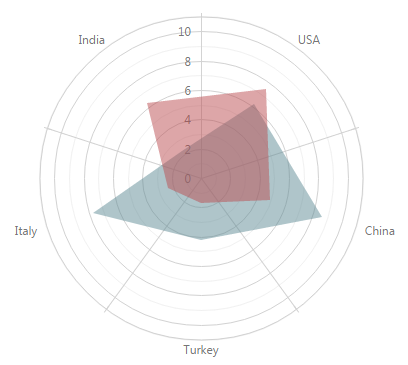
To understand how polar charts are built, imagine how a chart in a rectangular coordinate system is transformed by rounding its argument axis.
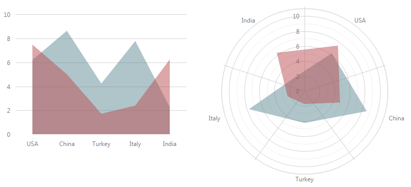
To use the area series type, assign 'area' to the type property of the series configuration object.
var polarChartOptions = {
    // ...
    series: {
        type: 'area'
    }
};
To learn how to specify data for a series, refer to the Data Binding topic. Note that you can use DateTime and Numeric types for points in the data source, as well as the String type. By default, the data of the DateTime and Numeric types is displayed on continuous axes, while string values are displayed on discrete axes (you can manage the axes types using their type property). When continuous axes are used in the UI component, the area chart is displayed using a smooth border line.
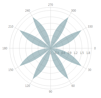
When either the argument or value axis is discrete, the area chart joins data points by straight lines.
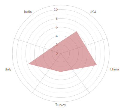
Note that you can use a spider web for polar charts displaying discrete data. For this purpose, set the UI component's useSpiderWeb property to true.
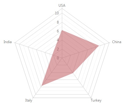
To change the series default appearance, set the properties of the series configuration object. For instance, you can change the following.
Area Color
A color from the chart's palette is used by default. Set a custom color using the series' color property. This color will be used for the series' border. The color of the series area will be the same, but a specified capacity will be applied.Border Properties
Make a border visible by setting the visible property of the series' border object. When the border is visible, you can change its width and color, using the width, color and dashStyle properties of the series' border object. In addition, you can change the border settings when the series is hovered or selected. To do this, set the properties of the border object within the series' hoverStyle or selectionStyle configuration object.Point Properties
Make points visible by setting the visible property of the series' point object. For details on other point properties, refer to the Series Points topic.Point Label Properties
Make point labels visible by setting the visible property of the series' label object. For details on other label properties, refer to the Series Point Labels topic.
These and other properties that can be set for series of the area type are explained in the AreaSeries Reference section. Set the required series properties within the series object of the chart's configuration object.
Bar
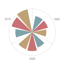
In the bar series type, data is displayed as sets of rectangular bars with lengths proportional to the values that they represent. Often, bar series are used to compare values in different discrete categories such as months, countries, age, etc. When there are several bar series, bars for each argument are displayed side-by-side. If you need to show bars for each series stacked on each other, use the stackedBar series type (see Stacked Bar).
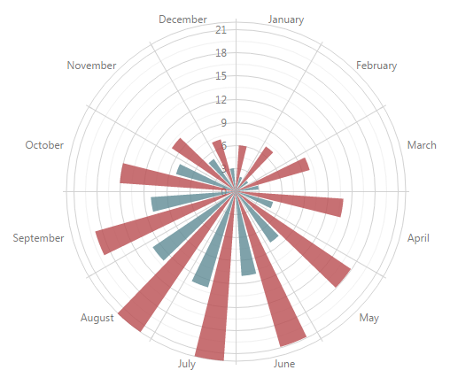
To understand how polar charts are built, imagine how a chart in a rectangular coordinate system is transformed by rounding its argument axis.
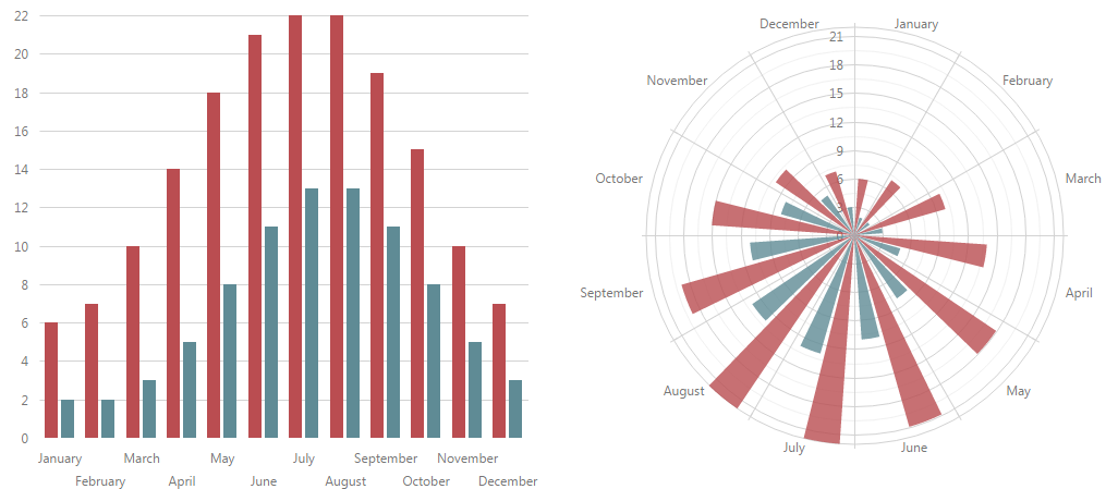
To use the bar series type, assign 'bar' to the type property of the series configuration object.
var polarChartOptions = {
    // ...
    series: {
        type: 'bar'
    }
};
To learn how to specify data for a series, refer to the Data Binding topic.
To change the series default appearance, set the properties of the series configuration object. For instance, you can change the following.
Bar Color
A color from the chart's palette is used by default. Set a custom color using the series' color property.Bar Border Properties
Make a border visible by setting the visible property of the series' border object. When the border is visible, you can change its width, style and color using the width, dashStyle and color properties of the series' border object. In addition, you can change the border settings when the series is hovered or selected. To do this, set the properties of the border object within the series' hoverStyle or selectionStyle configuration object.Corner Radius
Set a corner radius for bars using the series' cornerRadius property. This is helpful if you need rounded corners in bars.Bar Label Properties
Make bar labels visible by setting the visible property of the series' label object. For details on other label properties, refer to the Series Point Labels topic.
These and other properties that can be set for bar series are explained in the BarSeries Reference section. Set the required series properties within the series object of the chart's configuration object.
Specify the Bar Width
You can specify individual series' angular bar width. In multi-series charts, different series' bars with the same argument are collected in groups with a customizable angular width. You can use fixed (that is, degrees) or relative units to set both these widths. Use relative units if the width should adapt to the UI component or container size. Fixed width takes precedence over relative width if both are specified.
Relative Bar Width
Regulating the empty space on a bar's sides controls the relative angular bar width. Use the barPadding property to specify how much of the available sector should be empty. For example, a barPadding of 0.1 leaves 10% of the available sector empty giving the rest to the bar.
jQuery
$(function () {
    $("#polarChartContainer").dxPolarChart({
        series: [{
            // ...
            barPadding: 0.1 // for an individual series
        }, {
            // ...
        }],
        commonSeriesSettings: {
            // ...
            barPadding: 0.1 // for all series in the chart
        }
    });
});
Angular
<dx-polar-chart ... >
    <dxi-polar-chart-series
        [barPadding]="0.1"> <!-- for an individual series -->
    </dxi-polar-chart-series>
    <dxi-polar-chart-series ... ></dxi-polar-chart-series>
    ...
    <dxo-polar-chart-common-series-settings
        [barPadding]="0.1"> <!-- for all series in the chart -->
    </dxo-polar-chart-common-series-settings>
</dx-polar-chart>
import { DxPolarChartModule } from "devextreme-angular";
// ...
export class AppComponent {
    // ...
}
@NgModule({
    imports: [
        // ...
        DxPolarChartModule
    ],
    // ...
})
Vue
<template>
    <DxPolarChart ... >
        <DxSeries :bar-padding="0.1"/> <!-- for an individual series -->
        <DxSeries ... />
        ...
        <DxCommonSeriesSettings :bar-padding="0.1"/> <!-- for all series in the chart -->
    </DxPolarChart>
</template>

<script>
import DxPolarChart, {
    DxSeries,
    DxCommonSeriesSettings
} from 'devextreme-vue/polar-chart';

export default {
    components: {
        DxPolarChart,
        DxSeries,
        DxCommonSeriesSettings
    }
}
</script>
React
import React from 'react';
import PolarChart, {
    Series,
    CommonSeriesSettings
} from 'devextreme-react/polar-chart';

class App extends React.Component {
    render() {
        return (
            <PolarChart ... >
                <Series barPadding={0.1} /> {/* for an individual series */}
                <Series ... />
                ...
                <CommonSeriesSettings barPadding={0.1}/> {/* for all series in the chart */}
            </PolarChart>
        );
    }
}

export default App;
In single-series charts, the available sector equals the interval between two major ticks. In multi-series charts, it depends on the number of bars in the parent group and the group's angular width.
The parent group's width can be specified using the barGroupPadding property. It works like barPadding, dividing the available sector between the bar group and an empty space. For example, a barGroupPadding of 0.2 leaves 20% of the sector empty. The available sector is the interval between two major ticks. Unlike barPadding, which can be specified for each series individually, barGroupPadding applies to the whole chart.
jQuery
$(function () {
    $("#polarChartContainer").dxPolarChart({
        // ...
        barGroupPadding: 0.2
    });
});
Angular
<dx-polar-chart ...
    [barGroupPadding]="0.2">
    <!-- ... -->
</dx-polar-chart>
import { DxPolarChartModule } from "devextreme-angular";
// ...
export class AppComponent {
    // ...
}
@NgModule({
    imports: [
        // ...
        DxPolarChartModule
    ],
    // ...
})
Vue
<template>
    <DxPolarChart ...
        :bar-group-padding="0.2">
    </DxPolarChart>
</template>

<script>
import DxPolarChart from 'devextreme-vue/polar-chart';

export default {
    components: {
        DxPolarChart
    }
}
</script>
React
import React from 'react';
import PolarChart from 'devextreme-react/polar-chart';

class App extends React.Component {
    render() {
        return (
            <PolarChart ...
                barGroupPadding={0.2}>
            </PolarChart>
        );
    }
}

export default App;
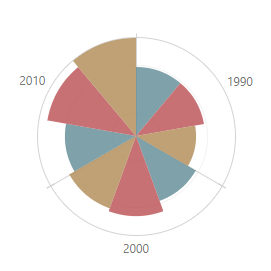
The following images illustrate how different barPadding and barGroupPadding values change a chart's appearance. In this example, all series have the same barPadding.
| barGroupPadding: 0 barPadding: 0 |
barGroupPadding: 0.2 barPadding: 0 |
barGroupPadding: 0.2 barPadding: 0.1 |
|---|---|---|
 |
 |
 |
Fixed Bar Width
The barWidth property specifies fixed angular bar width in degrees. This property is available for each series.
jQuery
$(function () {
    $("#polarChartContainer").dxPolarChart({
        series: [{
            // ...
            barWidth: 20 // for an individual series
        }, {
            // ...
        }],
        commonSeriesSettings: {
            // ...
            barWidth: 20 // for all series in the chart
        }
    });
});
Angular
<dx-polar-chart ... >
    <dxi-polar-chart-series
        [barWidth]="20"> <!-- for an individual series -->
    </dxi-polar-chart-series>
    <dxi-polar-chart-series ... ></dxi-polar-chart-series>
    ...
    <dxo-polar-chart-common-series-settings
        [barWidth]="20"> <!-- for all series in the chart -->
    </dxo-polar-chart-common-series-settings>
</dx-polar-chart>
import { DxPolarChartModule } from "devextreme-angular";
// ...
export class AppComponent {
    // ...
}
@NgModule({
    imports: [
        // ...
        DxPolarChartModule
    ],
    // ...
})
Vue
<template>
    <DxPolarChart ... >
        <DxSeries :bar-width="20"/> <!-- for an individual series -->
        <DxSeries ... />
        ...
        <DxCommonSeriesSettings :bar-width="20"/> <!-- for all series in the chart -->
    </DxPolarChart>
</template>

<script>
import DxPolarChart, {
    DxSeries,
    DxCommonSeriesSettings
} from 'devextreme-vue/polar-chart';

export default {
    components: {
        DxPolarChart,
        DxSeries,
        DxCommonSeriesSettings
    }
}
</script>
React
import React from 'react';
import PolarChart, {
    Series,
    CommonSeriesSettings
} from 'devextreme-react/polar-chart';

class App extends React.Component {
    render() {
        return (
            <PolarChart ... >
                <Series barWidth={20} /> {/* for an individual series */}
                <Series ... />
                ...
                <CommonSeriesSettings barWidth={20}/> {/* for all series in the chart */}
            </PolarChart>
        );
    }
}

export default App;
A bar's maximum angular width is limited. In single-series charts, it cannot be greater than the interval between two major ticks. In multi-series charts, it depends on the number of bars in the parent group and this group's actual angular width.
Bar groups' angular width can be changed using the barGroupWidth property. Like barWidth, it accepts values in degrees, but unlike it, applies to the entire chart. The groups' maximum angular width is the interval between two major ticks.
jQuery
$(function () {
    $("#polarChartContainer").dxPolarChart({
        // ...
        barGroupWidth: 45
    });
});
Angular
<dx-polar-chart ...
    [barGroupWidth]="45">
    <!-- ... -->
</dx-polar-chart>
import { DxPolarChartModule } from "devextreme-angular";
// ...
export class AppComponent {
    // ...
}
@NgModule({
    imports: [
        // ...
        DxPolarChartModule
    ],
    // ...
})
Vue
<template>
    <DxPolarChart ...
        :bar-group-width="45">
    </DxPolarChart>
</template>

<script>
import DxPolarChart from 'devextreme-vue/polar-chart';

export default {
    components: {
        DxPolarChart
    }
}
</script>
React
import React from 'react';
import PolarChart from 'devextreme-react/polar-chart';

class App extends React.Component {
    render() {
        return (
            <PolarChart ...
                barGroupWidth={45}>
            </PolarChart>
        );
    }
}

export default App;
Line
With the line series type, data is displayed as points joined by a line. This series type is useful when you need to visualize a trend in data over intervals.
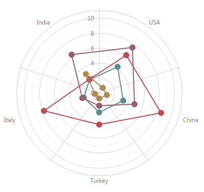
To understand how polar charts are built, imagine how a chart in a rectangular coordinate system is transformed by rounding its argument axis.
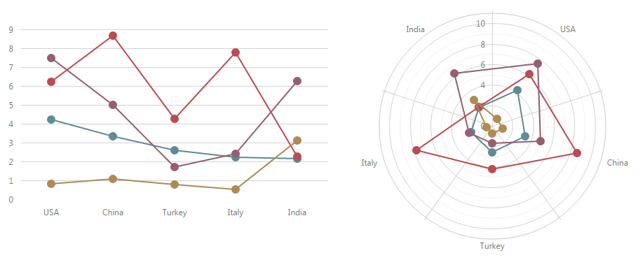
To use the 'line' series type, assign 'line' to the type property of the series configuration object.
var polarChartOptions = {
    // ...
    series: {
        type: 'line'
    }
};
To learn how to specify data for a series, refer to the Data Binding topic. Note that, you can use DateTime and Numeric types for points in the data source, as well as the String type. By default, the data of the DateTime and Numeric types is displayed on continuous axes, while string values are displayed on discrete axes (you can manage the axes types using their type property). When continuous axes are used in the UI component, the line chart is displayed using a smooth curve.
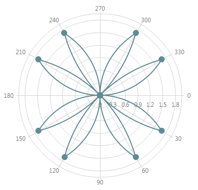
When either argument or value axis is discrete, the line chart joins data points by straight lines.
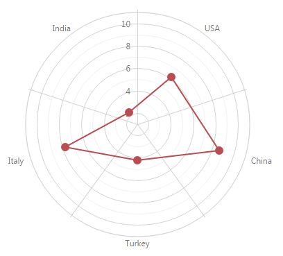
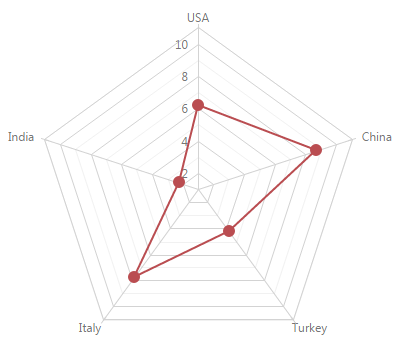
Note that you can use a spider web for polar charts displaying discrete data. For this purpose, set the UI component's useSpiderWeb property to true.
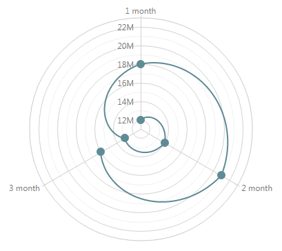
Line polar charts are appropriate for data whose values span cyclically repeating arguments. In this instance, set the argumentAxis.period property.
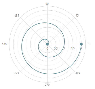
In some scenarios, you may need to close the line chart by joining the first point and the last point. For this purpose, set the series' closed property.
To change the series default appearance, set the properties of the series configuration object. For instance, you can change the following.
Line Width
Change the line width using the series' width property. To set a line width when the line is hovered or selected, set the width property of the hoverStyle or selectionStyle object defined within the series configuration object.Line Color
A color from the chart's palette is used by default. Set a custom color using the series' color property.Line Dash Style
Set the line's style using the series' dashStyle property. To set a dash style when the line is hovered or selected, set the dashStyle property of the hoverStyle or selectionStyle object defined within the series configuration object.Line Point Properties
Set up the series' point object (see the Series Points topic).Point Label Properties
Make point labels visible by setting the visible property of the series' label object. For details on other label properties, refer to the Series Point Labels topic.
These and other properties that can be set for series of the line type are explained in the LineSeries Reference section. Set the required series properties within the series object of the chart's configuration object.
Scatter
With the scatter series type, data is displayed as a collection of points. This series type is often used to display radar points.
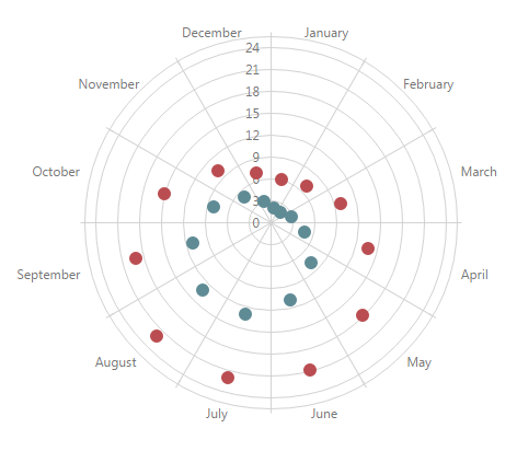
To understand how polar charts are built, imagine how a chart in a rectangular coordinate system is transformed by rounding its argument axis.
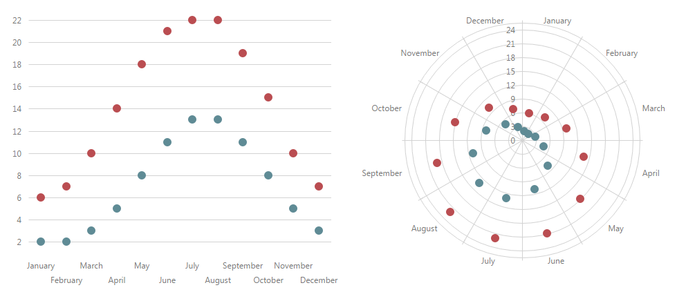
PolarChart uses the scatter series type by default. But in some cases, you may need to specify this series type explicitly. For this purpose, assign 'scatter' to the type property of the series configuration object.
var polarChartOptions = {
    // ...
    series: {
        type: 'scatter'
    }
};
To learn how to specify data for a chart series, refer to the Data Binding topic.
Note that you can use a spider web for polar charts displaying discrete data. For this purpose, set the UI component's useSpiderWeb property to true.
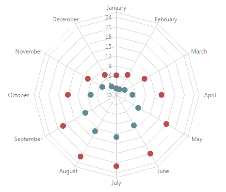
You can change the default appearance using series properties. For instance, you can change the following.
Point Color
A color from the chart's palette is used by default. Set a custom color using the series' color property.Point Properties
Set up the series' point object (see the Series Points topic).Point Labels
Make point labels visible by setting the visible property of the series' label object. For details on other label properties, refer to the Series Point Labels topic.
These and other properties that can be set for series of the scatter type are explained in the ScatterSeries Reference section. Set the required series properties within the series object of the chart's configuration object.
Stacked Bar
The stackedBar series type is used when there are several series that represent values for discrete categories. With this series type, data is displayed as triangular bars with lengths proportional to the values that they represent. Bars of each subsequent series are stacked on top of the bars of the previous series. The height of the resulting bar shows the combined result of a category.
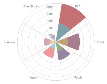
To understand how polar charts are built, imagine how a chart in a rectangular coordinate system is transformed by rounding its argument axis.

To use the stackedBar series type, assign 'stackedbar' to the type property of the series configuration object.
var polarChartOptions = {
    // ...
    series: {
        type: 'stackedbar'
    }
};
To learn how to specify data for a series, refer to the Data Binding topic.
To change the series default appearance, set the properties of the series configuration object. For instance, you can change the following.
Bar Color
A color from the chart's palette is used by default. Set a custom color using the series' color property.Bar Border Properties
Make a border visible by setting the visible property of the series' border object. When the border is visible, you can change its width, line style and color, using the width, dashStyle and color properties of the series' border object. In addition, you can change the border settings when the series is hovered or selected. To do this, set the properties of the border object within the series' hoverStyle or selectionStyle configuration object.Corner Radius
Set a corner radius for bars using the series' cornerRadius property. This is helpful if you need rounded corners in bars.Stack
Series values can be located in more than one stack for each argument value. Set the appropriate stack for a series using the stack property. This is helpful if you need to divide series between the required number of logical stacks (e.g., 'men' and 'women' stacks).Bar Label Properties
Make bar labels visible by setting the visible property of the series' label object. For details on other label properties, refer to the Series Point Labels topic.
These and other properties that can be set for a series of the stackedBar type are explained in the StackedBarSeries Reference section. Set the required series properties within the series object of the chart's configuration object.

 Select one or more answers