DevExtreme React - What’s New in v21.2
Data Grid and Tree List
API Enhancements
New Toolbar Customization API
You can now customize our DataGrid/TreeList Toolbar on-the-fly:
- You can alter Toolbar items dynamically, at any time (in the past, you could only do so once when the Toolbar was created).
- When using our DataGrid/TreeList within a React, Angular or Vue app, you can customize the toolbar declaratively without direct DOM manipulation.
We added a new toolbar property that allows you to customize toolbar items in much the same way as a standalone Toolbar. Each DataGrid/TreeList Toolbar item can be specified as an object with the same structure as a standalone Toolbar. In addition, you can specify an item using a predefined string name from the list of built-in DataGrid/TreeList commands (such as 'addRowButton', 'applyFilterButton','columnChooserButton', 'exportButton', 'groupPanel', 'revertButton', 'saveButton', 'searchPanel').
Disable Command Buttons
You can now disable certain command buttons for specific rows using the new disabled column button's property.
Extended navigateToRow API
Our navigateToRow method now returns a Promise object. You can now be notified when a background operation has finished.
Virtual Scrolling Enhancements
We reworked our DataGrid/TreeList's Virtual Scrolling engine and introduced the following enhancements:
- Optimized our row rendering algorithm to increase overall FPS.
- Optimized our data loading algorithm to reduce the number of remote data requests.
- Introduced a new scrolling.renderAsync property so you can render rows synchronously or asynchronously.
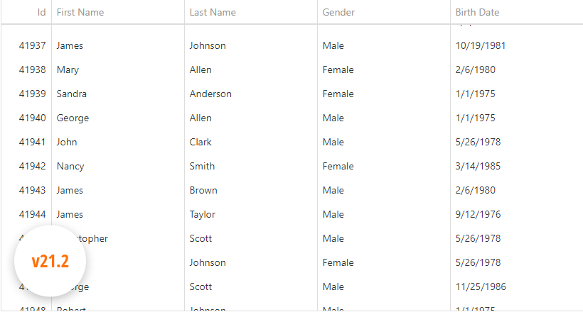
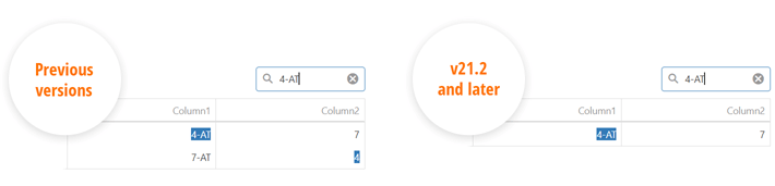
Improved Search
We reduced false-positive matches when users search for numbers within the DataGrid's Search Panel. Our DataGrid now matches search string with both original and formatted cell values, respecting column formatting.
For instance, if your numeric column uses a $#.# format and a cell displays '$12,000.1', you can locate the record by either '12000.1' or '$12,000.1'. Conversely, '12000.1m' doesn't match a '12000.1' number cell value as it did previously.
The following image illustrates the difference between our previous/current implementation.
Data Grid
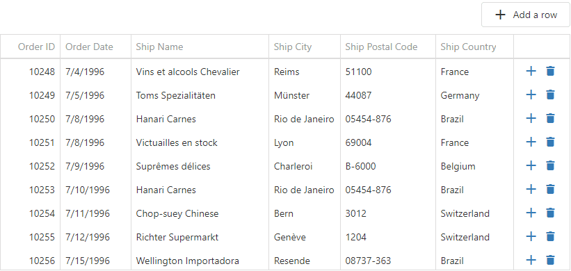
Add New Row at a Specified Position
You can now specify where to insert a new row when using insertBeforeKey or insertAfterKey properties. Both properties accept a key for the row before/after which to insert the new row. For popular use cases, we added a newRowPosition property with a set of shortcut values:
- "first"/"last" - Insert a new row at the beginning/end of the dataset.
- "pageTop"/"pageBottom" - Insert a new row at the top/bottom of the current page.
- "viewportTop"/"viewportBottom" - Insert a new row at the top/bottom of the viewport.
HTML/Markdown Editor
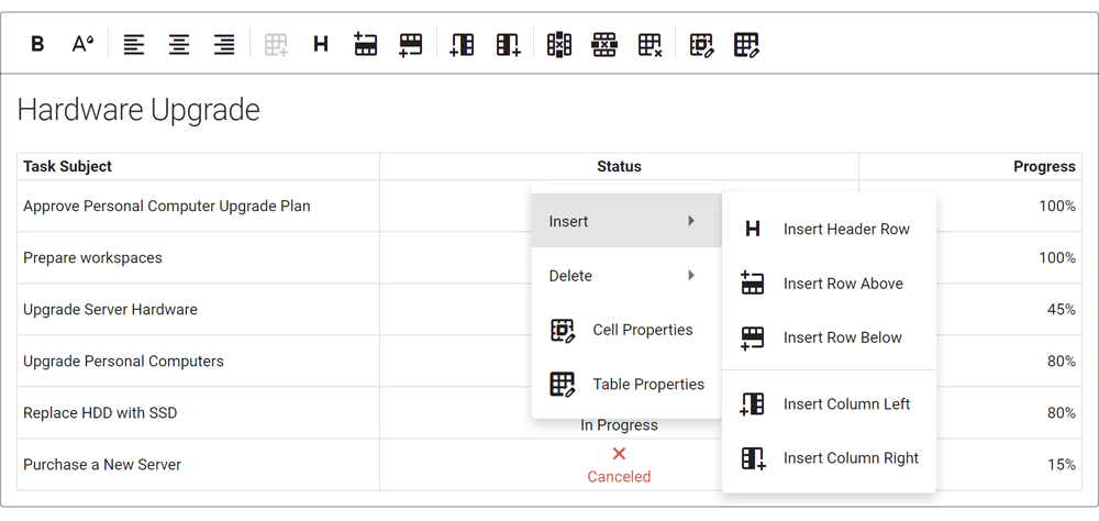
Table Management
This update includes the following table-related features:
- Support for the 'thead' HTML tag (table headers).
- Support for table and column resize operations via our new tableResizing configuration option.
- Context menu for table-related operations. To enable the menu, activate the tableContextMenu setting.
- Multiple paragraph support (
tag) within a table cell.
- Table Context Menu customization.
- Manage table/cell properties via built-in dialogs.
Soft Line Breaks
Our HTML/Markdown Editor includes a new allowSoftLineBreak configuration option. When enabled, users can break text within a single block element into multiple lines (via the <br> tag using the new Shift+Enter keyboard shortcut). This feature allows you to break a list item (<li>) into multiple lines or add multiline cells.
Diagram
Touch Support Enhancement
We improved touch screen support in Chromium-based browsers (Google Chrome, Microsoft Edge, Opera).
Gantt
Visible Date Range
You can now specify the visible data range using the startDateRange and endDateRange properties.
Sorting
You can now sort tasks by one or more columns. Use our new sorting option to configure corresponding UI elements and their behavior.
Export to PDF
You can now export Gantt data to PDF. Export options allow you to set document size and page orientation; limit data export to a specific date range; specify whether to export only chart area, tree list area, or the entire Gantt component.

Filtering
Our Gantt control now supports filtering. End-users can filter tasks using the header filter or filter row. To filter tasks in code, use the following API:

New API to Expand/Collapse Tasks
Task-related (expand/collapse) API enhancements include:
- expandAll - Expands all tasks.
- collapseAll - Collapses all tasks.
- expandAllToLevel - Expands all tasks up to the specified level (the root task has depth zero).
- expandToTask - Expands all tasks to make the specified task visible.
- collapseTask - Collapses the specified task.
- expandTask - Expands the specified task.
API Enhancements
Gantt control API enhancements include:
- showDependencies - Specifies whether dependencies are visible in the chart area.
- showResources and showDependencies - Shows/hides corresponding UI elements.
- scaleTypeRange - Allows you to limit zoom range.
- refresh - Reloads data and redraws the entire component.
File Manager
New API
Our File Manager ships with the following new API:
- Create a directory (directoryCreating and directoryCreated).
- Upload a file (fileUploading and fileUploaded).
- Copy a file or directory (itemCopying and itemCopied).
- Delete a file or directory (itemDeleting and itemDeleted).
- Download a file (itemDownloading).
- Move a file or directory (itemMoving and itemMoved).
- Rename a file or directory (itemRenaming and itemRenamed).
UI Components
Overlay and Popup Enhancements
- New onShowing and onHiding events allow you to manage the display of a popup.
- The new wrapperAttr property allows you to add custom HTML attributes to the popup root element.
- Popup can now automatically adjust its position when its content changes.
- The new hideOnParentScroll property allows you to close the popup when a user scrolls its container.
- The new dragAndResizeArea property specifies boundaries for drag and resize operations.
- The new dragOutsideBoundary property specifies whether the Popup can overlap container (and window) boundaries during drag operations.
- The new restorePosition property specifies whether the Popup restores its initial position or whether the Popup maintains its position after drag/resize operations.
CheckBox, TagBox, List Enhancements
CheckBox enhancements include the following:
- blur method: Removes focus from the component.
- iconSize setting: Specifies desired icon size.
- You can now assign a 'null' value to the CheckBox value property (to set an indeterminate state).
- CheckBox text is now automatically centered by its icon.
The new selectAllText property allows you to specify custom text displayed within the "Select All" switch in our List and TagBox components.
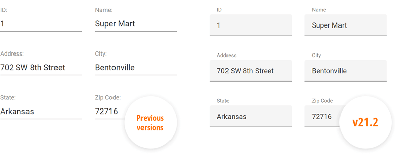
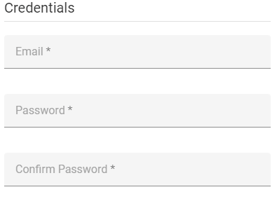
Floating Labels
Text input/placeholders now support the use of floating labels (conforms to Google's Material Design guidelines) so you can eliminate field labels from all your forms.
Miscellaneous Widgets Enhancements
-
PivotGrid - Export Merged Cells to Excel
Our new MergeColumnFieldValues and MergeRowFieldValues properties allow you to disable/enable cell merge while exporting. -
TreeView
The DevExtreme TreeView widget ships with native scrolling support. Call the UseNativeScrolling property to 'true' to enable this feature. -
ScrollView - RTL Support
ScrollView fully supports RTL rendering mode.
-
Button Group - New Selection Mode
Our ButtonGroup ships with a new selection mode - 'none'. In this mode, group buttons are not selected on click.
Material Theme Enhancements
We applied changes to our product libraries to mirror some of Google’s most recent Material Design Guidelines. For instance, Google deprecated the ‘underlined’ styling mode for inputs and elected to use ‘filled’ mode by default. We preserved both modes and you can switch back to the previous display style when necessary.