Vue Tabs Props
An object defining configuration properties for the Tabs UI component.
See Also
accessKey
Specifies the shortcut key that sets focus on the UI component.
The value of this property will be passed to the accesskey attribute of the HTML element that underlies the UI component.
dataSource
Binds the UI component to data.
Array<String | dxTabsItem | any>
| | | | nullThe Tabs works with collections of string values or objects.
Depending on your data source, bind Tabs to data as follows. If the data source provides objects, also specify the itemTemplate. You can skip this part if the objects contain fields described in the items section.
Data Array
Assign the array to the dataSource option.Read-Only Data in JSON Format
Set the dataSource property to the URL of a JSON file or service that returns JSON data.OData
Implement an ODataStore.Web API and MongoDB
Use one of the following extensions to enable the server to process data according to the protocol DevExtreme UI components use:Then, use the createStore method to configure access to the server on the client as shown below. This method is part of DevExtreme.AspNet.Data.
jQuery
JavaScript$(function() { let serviceUrl = "https://url/to/my/service"; $("#tabsContainer").dxTabs({ // ... dataSource: DevExpress.data.AspNet.createStore({ key: "ID", loadUrl: serviceUrl + "/GetAction", insertUrl: serviceUrl + "/InsertAction", updateUrl: serviceUrl + "/UpdateAction", deleteUrl: serviceUrl + "/DeleteAction" }) }) });Angular
app.component.tsapp.component.htmlapp.module.tsimport { Component } from '@angular/core'; import CustomStore from 'devextreme/data/custom_store'; import { createStore } from 'devextreme-aspnet-data-nojquery'; @Component({ selector: 'app-root', templateUrl: './app.component.html', styleUrls: ['./app.component.css'] }) export class AppComponent { store: CustomStore; constructor() { let serviceUrl = "https://url/to/my/service"; this.store = createStore({ key: "ID", loadUrl: serviceUrl + "/GetAction", insertUrl: serviceUrl + "/InsertAction", updateUrl: serviceUrl + "/UpdateAction", deleteUrl: serviceUrl + "/DeleteAction" }) } }<dx-tabs ... [dataSource]="store"> </dx-tabs>import { BrowserModule } from '@angular/platform-browser'; import { NgModule } from '@angular/core'; import { AppComponent } from './app.component'; import { DxTabsModule } from 'devextreme-angular'; @NgModule({ declarations: [ AppComponent ], imports: [ BrowserModule, DxTabsModule ], providers: [], bootstrap: [AppComponent] }) export class AppModule { }Vue
App.vue<template> <DxTabs ... :data-source="store" /> </template> <script> import 'devextreme/dist/css/dx.fluent.blue.light.css'; import CustomStore from 'devextreme/data/custom_store'; import { createStore } from 'devextreme-aspnet-data-nojquery'; import { DxTabs } from 'devextreme-vue/tabs'; export default { components: { DxTabs }, data() { const serviceUrl = "https://url/to/my/service"; const store = createStore({ key: "ID", loadUrl: serviceUrl + "/GetAction", insertUrl: serviceUrl + "/InsertAction", updateUrl: serviceUrl + "/UpdateAction", deleteUrl: serviceUrl + "/DeleteAction" }); return { store } } } </script>React
App.jsimport React from 'react'; import 'devextreme/dist/css/dx.fluent.blue.light.css'; import CustomStore from 'devextreme/data/custom_store'; import { createStore } from 'devextreme-aspnet-data-nojquery'; import Tabs from 'devextreme-react/tabs'; const serviceUrl = "https://url/to/my/service"; const store = createStore({ key: "ID", loadUrl: serviceUrl + "/GetAction", insertUrl: serviceUrl + "/InsertAction", updateUrl: serviceUrl + "/UpdateAction", deleteUrl: serviceUrl + "/DeleteAction" }); class App extends React.Component { render() { return ( <Tabs ... dataSource={store} /> ); } } export default App;Any other data source
Implement a CustomStore.
Regardless of the data source on the input, the Tabs always wraps it in the DataSource object. This object allows you to sort, filter, group, and perform other data shaping operations. To get its instance, call the getDataSource() method.
Review the following notes about data binding:
Do not specify the items property if you specified the dataSource, and vice versa.
Field names cannot be equal to
thisand should not contain the following characters:.,:,[, and].Tabs does not execute dataSource.sort functions. To implement custom sorting logic, implement columns[].calculateSortValue.
jQuery
- The stores are immutable. You cannot change their configurations at runtime. Instead, create a new store or DataSource and assign it to the dataSource property as shown in the following help topic: Get and Set Properties.
Angular
- The stores are immutable. You cannot change their configurations at runtime. Instead, create a new store or DataSource and assign it to the dataSource property as shown in the following help topic: Two-Way Property Binding.
Vue
- The stores are immutable. You cannot change their configurations at runtime. Instead, create a new store or DataSource and assign it to the dataSource property as shown in the following help topic: Two-Way Property Binding.
React
- The stores are immutable. You cannot change their configurations at runtime. Instead, create a new store or DataSource and assign it to the dataSource property as shown in the following help topic: Controlled Mode.
disabled
Specifies whether the UI component responds to user interaction.
elementAttr
Specifies the global attributes to be attached to the UI component's container element.
jQuery
$(function(){
    $("#tabsContainer").dxTabs({
        // ...
        elementAttr: {
            id: "elementId",
            class: "class-name"
        }
    });
});
Angular
<dx-tabs ...
    [elementAttr]="{ id: 'elementId', class: 'class-name' }">
</dx-tabs>
import { DxTabsModule } from "devextreme-angular";
// ...
export class AppComponent {
    // ...
}
@NgModule({
    imports: [
        // ...
        DxTabsModule
    ],
    // ...
})
Vue
<template>
    <DxTabs ...
        :element-attr="tabsAttributes">
    </DxTabs>
</template>

<script>
import DxTabs from 'devextreme-vue/tabs';

export default {
    components: {
        DxTabs
    },
    data() {
        return {
            tabsAttributes: {
                id: 'elementId',
                class: 'class-name'
            }
        }
    }
}
</script>
React
import React from 'react';

import Tabs from 'devextreme-react/tabs';

class App extends React.Component {
    tabsAttributes = {
        id: 'elementId',
        class: 'class-name'
    }

    render() {
        return (
            <Tabs ...
                elementAttr={this.tabsAttributes}>
            </Tabs>
        );
    }
}
export default App;
focusStateEnabled
Specifies whether the UI component can be focused using keyboard navigation.
height
Specifies the UI component's height.
This property accepts a value of one of the following types:
Number
The height in pixels.String
A CSS-accepted measurement of height. For example,"55px","20vh","80%","inherit".
hint
Specifies text for a hint that appears when a user pauses on the UI component.
hoverStateEnabled
Specifies whether the UI component changes its state when a user pauses on it.
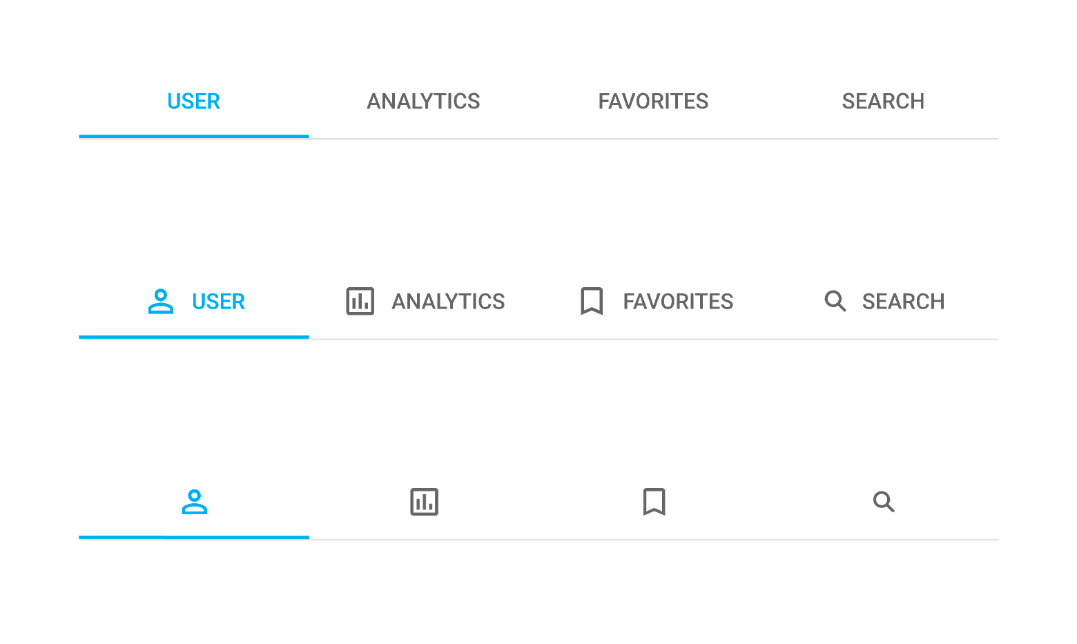
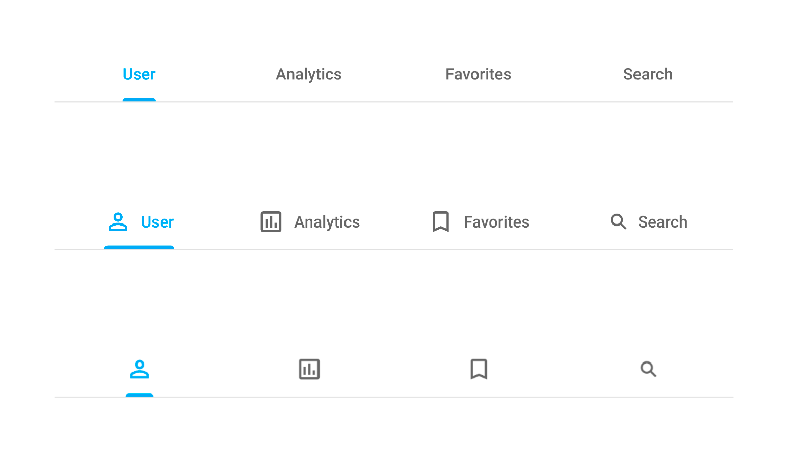
iconPosition
Specifies icon position relative to the text inside the tab.
The following values are available:
'start'
The icon appears before the text.'end'
The icon appears after the text.'top'
The icon appears above the text.'bottom'
The icon appears below the text.
The alignment of content in a tab item directly depends on the iconPosition value. If a tab item has an icon and iconPosition: 'top' or iconPosition: 'bottom', the content alignment is centered. If you set iconPosition: 'start' or iconPosition: 'end', the content is aligned to the edge of the tab.
The same applies if items do not include icons: content is aligned equally in all tab items.
itemHoldTimeout
The time period in milliseconds before the onItemHold event is raised.
items[]
An array of items displayed by the UI component.
Array<String | dxTabsItem | any>
The items array can contain:
- Strings
- Objects with fields described in this section. If you want use other fields, specify the itemTemplate.
If you need to update the UI component items, reassign the items array as shown in the following example:
tabsInstance.option('items', newItems);true.As an alternative to items, you can use the dataSource property. It accepts the DataSource object, whose underlying stores provide an API that allows you to update individual items without reassigning the entire item collection.
keyExpr
Specifies the key property that provides key values to access data items. Each key value must be unique.
noDataText
Specifies the text or HTML markup displayed by the UI component if the item collection is empty.
The Tabs component evaluates the noDataText property's value. This evaluation, however, makes the Tabs potentially vulnerable to XSS attacks. To guard against these attacks, encode the HTML markup before you assign it to the noDataText property. Refer to the following help topic for more information: Potentially Vulnerable API - noDataText.
onContentReady
A function that is executed when the UI component is rendered and each time the component is repainted.
Information about the event.
| Name | Type | Description |
|---|---|---|
| element |
The UI component's container. It is an HTML Element or a jQuery Element when you use jQuery. |
|
| component |
The UI component's instance. |
onDisposing
A function that is executed before the UI component is disposed of.
Information about the event.
| Name | Type | Description |
|---|---|---|
| element |
The UI component's container. It is an HTML Element or a jQuery Element when you use jQuery. |
|
| component |
The UI component's instance. |
onInitialized
A function used in JavaScript frameworks to save the UI component instance.
Information about the event.
| Name | Type | Description |
|---|---|---|
| element |
The UI component's container. It is an HTML Element or a jQuery Element when you use jQuery. |
|
| component |
The UI component's instance. |
Angular
<dx-tabs ...
    (onInitialized)="saveInstance($event)">
</dx-tabs>
import { Component } from "@angular/core";
import Tabs from "devextreme/ui/data_grid";
// ...
export class AppComponent {
    tabsInstance: Tabs;
    saveInstance (e) {
        this.tabsInstance = e.component;
    }
}
Vue
<template>
    <div>
        <DxTabs ...
            @initialized="saveInstance">
        </DxTabs>
    </div>
</template>

<script>
import DxTabs from 'devextreme-vue/tabs';

export default {
    components: {
        DxTabs
    },
    data: function() {
        return {
            tabsInstance: null
        };
    },
    methods: {
        saveInstance: function(e) {
            this.tabsInstance = e.component;
        }
    }
};
</script>
<template>
    <div>
        <DxTabs ...
            @initialized="saveInstance">
        </DxTabs>
    </div>
</template>

<script setup>
import DxTabs from 'devextreme-vue/tabs';

let tabsInstance = null;

const saveInstance = (e) => {
    tabsInstance = e.component;
}
</script>
React
import Tabs from 'devextreme-react/tabs';

class App extends React.Component {
    constructor(props) {
        super(props);

        this.saveInstance = this.saveInstance.bind(this);
    }

    saveInstance(e) {
        this.tabsInstance = e.component;
    }

    render() {
        return (
            <div>
                <Tabs onInitialized={this.saveInstance} />
            </div>
        );
    }
}
See Also
onItemClick
A function that is executed when a collection item is clicked or tapped.
Information about the event.
| Name | Type | Description |
|---|---|---|
| itemIndex |
The clicked item's index. |
|
| itemElement |
The item's container. It is an HTML Element or a jQuery Element when you use jQuery. |
|
| itemData |
The clicked item's data. |
|
| event | Event (jQuery or EventObject) |
The event that caused the function to execute. It is an EventObject or a jQuery.Event when you use jQuery. |
| element |
The UI component's container. |
|
| component |
The UI component's instance. |
onItemContextMenu
A function that is executed when a collection item is right-clicked or pressed.
Information about the event.
| Name | Type | Description |
|---|---|---|
| itemIndex |
The item's index. |
|
| itemElement |
The item's container. It is an HTML Element or a jQuery Element when you use jQuery. |
|
| itemData |
The item's data. |
|
| event | Event (jQuery or EventObject) |
The event that caused the function to execute. It is an EventObject or a jQuery.Event when you use jQuery. |
| element |
The UI component's container. It is an HTML Element or a jQuery Element when you use jQuery. |
|
| component |
The UI component's instance. |
onItemHold
A function that is executed when a collection item has been held for a specified period.
Information about the event.
| Name | Type | Description |
|---|---|---|
| itemIndex |
The item's index. |
|
| itemElement |
The item's container. It is an HTML Element or a jQuery Element when you use jQuery. |
|
| itemData |
The data of the item being held. |
|
| event | Event (jQuery or EventObject) |
The event that caused the function to execute. It is an EventObject or a jQuery.Event when you use jQuery. |
| element |
The UI component's container. It is an HTML Element or a jQuery Element when you use jQuery. |
|
| component |
The UI component's instance. |
onItemRendered
A function that is executed after a collection item is rendered.
Information about the event.
| Name | Type | Description |
|---|---|---|
| itemIndex |
The current item's index. |
|
| itemElement |
The item's container. It is an HTML Element or a jQuery Element when you use jQuery. |
|
| itemData |
The current item's data. |
|
| element |
The UI component's container. It is an HTML Element or a jQuery Element when you use jQuery. |
|
| component |
The UI component's instance. |
onOptionChanged
A function that is executed after a UI component property is changed.
Information about the event.
| Name | Type | Description |
|---|---|---|
| value | any |
The modified property's new value. |
| previousValue | any |
The UI component's previous value. |
| name |
The modified property if it belongs to the first level. Otherwise, the first-level property it is nested into. |
|
| fullName |
The path to the modified property that includes all parent properties. |
|
| element |
The UI component's container. It is an HTML Element or a jQuery Element when you use jQuery. |
|
| component |
The UI component's instance. |
The following example shows how to subscribe to component property changes:
jQuery
$(function() {
    $("#tabsContainer").dxTabs({
        // ...
        onOptionChanged: function(e) {
            if(e.name === "changedProperty") {
                // handle the property change here
            }
        }
    });
});
Angular
<dx-tabs ...
    (onOptionChanged)="handlePropertyChange($event)">
</dx-tabs>
import { Component } from '@angular/core';

@Component({
    selector: 'app-root',
    templateUrl: './app.component.html',
    styleUrls: ['./app.component.css']
})

export class AppComponent {
    // ...
    handlePropertyChange(e) {
        if(e.name === "changedProperty") {
            // handle the property change here
        }
    }
}
import { BrowserModule } from '@angular/platform-browser';
import { NgModule } from '@angular/core';
import { AppComponent } from './app.component';
import { DxTabsModule } from 'devextreme-angular';

@NgModule({
    declarations: [
        AppComponent
    ],
    imports: [
        BrowserModule,
        DxTabsModule
    ],
    providers: [ ],
    bootstrap: [AppComponent]
})

export class AppModule { }
Vue
<template>
    <DxTabs ...
        @option-changed="handlePropertyChange"
    />
</template>

<script>
import 'devextreme/dist/css/dx.fluent.blue.light.css';
import DxTabs from 'devextreme-vue/tabs';

export default {
    components: {
        DxTabs
    },
    // ...
    methods: {
        handlePropertyChange: function(e) {
            if(e.name === "changedProperty") {
                // handle the property change here
            }
        }
    }
}
</script>
React
import React from 'react';
import 'devextreme/dist/css/dx.fluent.blue.light.css';

import Tabs from 'devextreme-react/tabs';

const handlePropertyChange = (e) => {
    if(e.name === "changedProperty") {
        // handle the property change here
    }
}

export default function App() {
    return (
        <Tabs ...
            onOptionChanged={handlePropertyChange}
        />
    );
}
onSelectionChanged
A function that is called after selection changes.
Information about the event.
| Name | Type | Description |
|---|---|---|
| removedItems | Array<any> |
The data of the items removed from selection. |
| element |
The UI component's container. It is an HTML Element or a jQuery Element when you use jQuery. |
|
| component |
The UI component's instance. |
|
| addedItems | Array<any> |
The data of the selected items. |
onSelectionChanging
A function that is called before selection changes.
Information about the event.
| Name | Type | Description |
|---|---|---|
| removedItems | Array<any> |
The data of the items removed from selection. |
| element |
The UI component's container. It is an HTML Element or a jQuery Element when you use jQuery. |
|
| component |
The UI component's instance. |
|
| cancel | | |
Allows you to cancel selection. |
| addedItems | Array<any> |
The data of the selected items. |
repaintChangesOnly
Specifies whether to repaint only those elements whose data changed.
See Also
- push(changes) in: ArrayStore | CustomStore | LocalStore | ODataStore
- DataSource.reshapeOnPush
rtlEnabled
Switches the UI component to a right-to-left representation.
When this property is set to true, the UI component text flows from right to left, and the layout of elements is reversed. To switch the entire application/site to the right-to-left representation, assign true to the rtlEnabled field of the object passed to the DevExpress.config(config) method.
DevExpress.config({
    rtlEnabled: true
});scrollByContent
Specifies whether or not an end user can scroll tabs by swiping.
selectedItemKeys
Specifies an array of currently selected item keys.
Array<any>
The item keys can be specified using the keyExpr property or the key property within the underlying Store.
See Also
- key in ArrayStore | CustomStore | LocalStore | ODataStore
selectedItems
An array of currently selected item objects.
Array<any>
selectionMode
Specifies whether the UI component enables an end user to select only a single item or multiple items.
showNavButtons
Specifies whether navigation buttons should be available when tabs exceed the UI component's width.
stylingMode
Specifies the styling mode for the active tab.
The following styling modes are available:
'primary'
The width of the underline is fixed.
'secondary'
The width of the underline depends on tab content.
tabIndex
Specifies the number of the element when the Tab key is used for navigating.
The value of this property will be passed to the tabindex attribute of the HTML element that underlies the UI component.

 Select one or more answers