DevExtreme Vue - What’s New in v25.1
Your Feedback Matters
We thank you for your continued support. Once you’ve reviewed the features/capabilities introduced in our v25.1 release cycle,
please take a moment to complete our online survey.
Your comments will help us refine our development plans for our v25.2 release set for release in 2025.
New CardView Component
DevExtreme v25.1 ships with a new CardView UI component - an elegant alternative to traditional data grids.
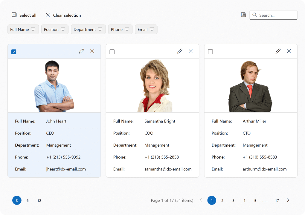
As you'd expect, our CardView UI component presents business data/information using a "card" layout, making it an ideal option for employee directories, contact lists, product catalogs, or task boards (Card views tend to be more engaging when compared to a standard table, particularly when image visualization is crucial).
Each card includes the following built-in UI elements: toolbar, cover image, card content (card's field data), footer. Each of these elements can be customized using public APIs.
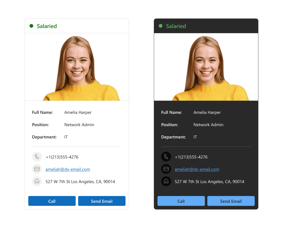
CardView card layouts are fully responsive, support multiple screen sizes, and ship with two layout options:
- Automatic Layout: The CardView determines the optimal number of cards per row and associated size. When resized, the CardView dynamically modifies its layout, recalculating the number of cards per row and associated dimensions.
- Fixed Number of Cards per Row: You can specify the exact number of cards displayed within a layout. When resized, card sizes change but the number of cards per row remains the same.
Our goal is to apply all DevExtreme DataGrid data management capabilities to the DevExtreme CardView (and deliver identical data-related functionality/flexibility). As you'll discover, our implementation allows either component to handle the same data set across multiple usage scenarios, such as varying screen resolutions. DevExtreme CardView v25.1 supports the following data management capabilities:
- Sorting: Both single and multi-sort operations are supported.
- Paging: Built-in pager.
- Column reordering: You can allow users to reorder columns (card fields). You can also enable/disable reordering for a specific column.
- Column visibility control: Like DataGrid, CardView includes a Column Chooser and allows users to control column visibility.
- Editing: The editing setting allows you to add, update, and delete cards. Click the edit button to activate a popup with fields, make edits, run validation and save changes.
- Filtering: Available as Column Header Filter and Filter Panel. The resulting filter value depends on all applied filters. The synchronization of these filters is controlled by the filterSyncEnabled property.
- Searching: CardView includes a search panel that works just like our DataGrid.
- Card selection: CardView supports both single and multi-card selection modes. In multi selection mode, the toolbar displays Select all and Clear selection buttons. You can configure how these buttons work — either to target all pages or simply the current page.
Header Panel
Header Panel is a visual element in the CardView, similar in purpose to column headers in our DataGrid.
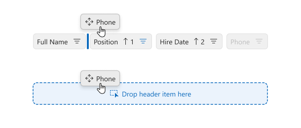
This panel allows users to execute the following actions:
- Sorting. Click on the header panel item to sort cards.
- Reordering. You can drag header panel items to reorder fields in cards. The dragging indicator displays which drop areas are valid and which are not.
- Filtering.Click the filter icon to access a dropdown for value selection.
- Column visibility control. You can control card field visibility by dragging header panel items into the Column Chooser (when using drag-and-drop mode).
New Stepper Component
Our v25.1 release includes a new Stepper UI component. DevExtreme Stepper displays progress as users move through multi-step processes and forms. The component is ideal for checkouts, onboarding forms, set-up wizards, and more.

Stepper ships with the following capabilities:
- DataSource integration: You can bind data to the Stepper component with a dataSource or an items collection.
- Horizontal and vertical layouts: Set the orientation property to specify if steps are positioned left-to-right or top-to-bottom.
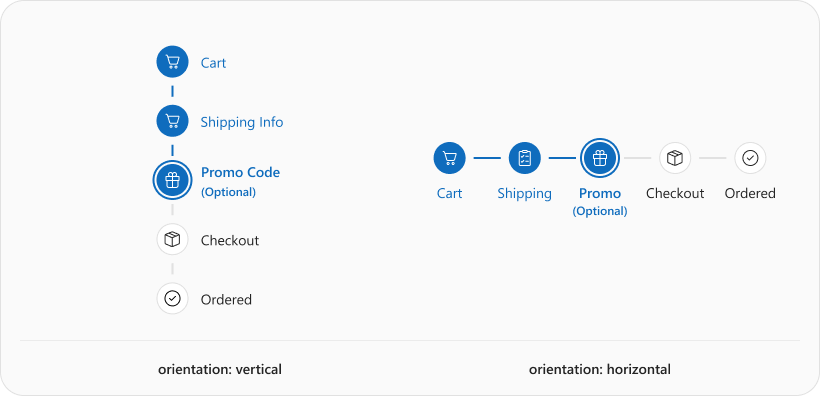
- Two navigation modes: Use the linear property to specify whether users navigate steps sequentially. The default value (true) does not allow users to skip steps.
- Pre-selected steps: Specify the selectedIndex property to set which step is initially selected.
- Customizable step indicators: Step indicators display sequential numbers by default. Define icon or text inside a step object to customize step indicator content.
- Step labels: Set the label step property to display labels below step indicators.
- Step templates: You can fully customize step appearance and indicator shape using item templates. Define itemTemplate for all steps or items[].template for an individual step.
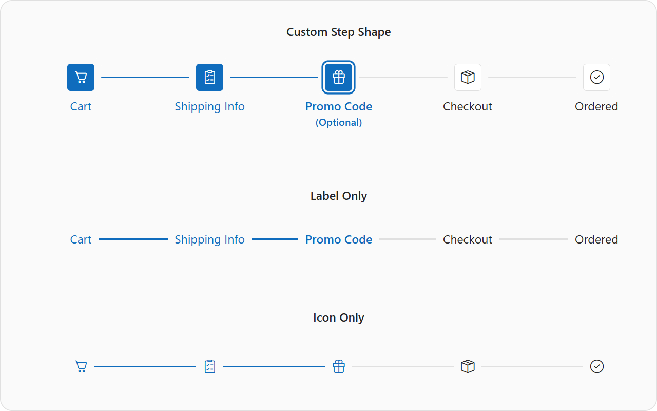
- Visual step validation: Set the label step property to display labels below step indicatorsMark steps as valid/invalid using the isValid property.
- Optional and disabled steps: Mark steps as optional/disabled.
- Keyboard navigation: When interacting with the Stepper using a keyboard, the selected step changes with the focus. Set selectOnFocus to false to prevent this automatic selection. After shifting focus, press Space or Enter to select the step. DevExtreme Stepper also supports shortcuts.
- Internationalization: Set rtlEnabled to true to change step progression to right-to-left (RTL). A vertical Stepper continues to progress top-to-bottom in RTL mode, but switches label position.
Each step offers multiple customization options using the following properties:
- icon: Icon inside a step indicator. Stepper prioritizes icons over the text property.
- text: Text inside a step indicator.
- label: Step caption displayed next to the indicator.
- optional: Adds an (Optional) label to the step.
- isValid: Indicates that user input generated validation errors.
- disabled: Disabled steps cannot be selected by any end-user actions.
- hint: Tooltip text for the step.
- template:Customizes the step. This property overrides step content entirely.
Please note that isValid, optional, and disabled are visual UI options. You need to implement your own logic for step validation and for navigating between steps based on associated state (for instance, using onSelectionChanging).

The following code defines a simple Stepper:
Note: If using Angular to implement Stepper, you must use our new configuration components.
 <template>
    <DxStepper>
        <DxItem
          title="Cart"
          icon="cart"
        />
        <DxItem
          title="Promo Code"
          icon="gift"
          :optional="true"
        />
        <DxItem
          title="Checkout"
          icon="packagebox"
        />
    </DxStepper>
 </template>
HTML Editor - AI-powered Text Editing
With v25.1, users can now apply predefined and custom AI prompts to selected text or entire content.
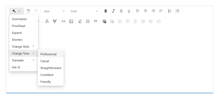
Our "ai" toolbar item includes the following predefined commands:
- Summarize
- Proofread
- Expand
- Shorten
- Change style
- Change tone
- Translate
- Ask AI assistant
Once a user selects a command, an AI Assistant dialog appears on-screen. Users can then copy generated text, insert it directly into the editor, rerun generation if issues arise, run a different command without leaving the dialog window, or choose another option for the command.
The Ask AI assistant command allows users to run their own prompts to alter HTML Editor content.
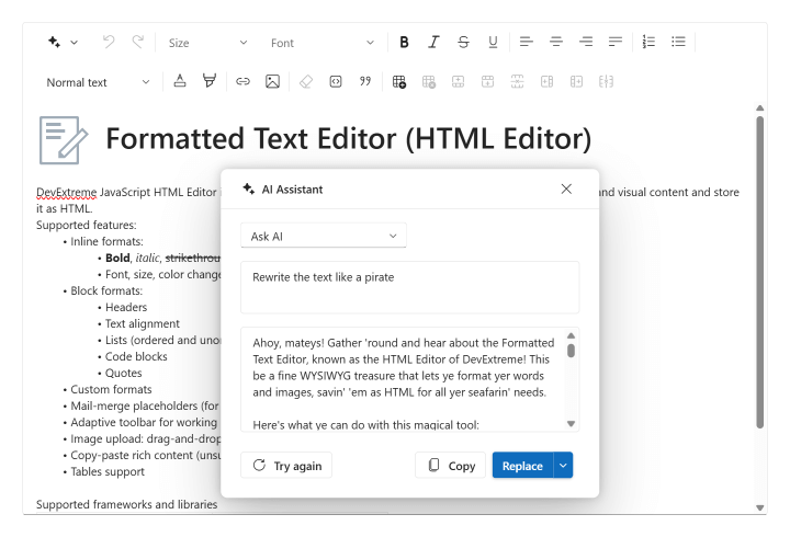
To set up AI-powered text editing within your DevExtreme-powered app:
- Link the HTML Editor to an AI service through the aiIntegration option.
- Specify the "ai" toolbar item in the toolbar configuration.
The full set of predefined AI item commands will be available for use after set up. You can also specify which predefined commands you wish to include in the "ai" item and customize default options (for example, by setting a custom list of target languages for translation). Additionally, you can add a new custom command to the AI item by specifying your own prompt.
Note: If using Angular to implement this capability, you must use our new configuration components when working with toolbar items.
<template>
    <DxHtmlEditor :ai-integration="aiIntegration">
        <DxToolbar>
            <DxItem name="ai" :commands="aiCommands" />
        </DxToolbar>
    </DxHtmlEditor>
</template>
<script setup lang="ts">
    import { AIIntegration } from 'devextreme-vue/common/ai-integration';
    const aiIntegration = new AIIntegration(provider);
    const aiCommands = {
        "summarize",
        {
            name: "translate",
            text: "Translate",
            options: ["Arabic", "Chinese", "English", "French", "German", "Japanese", "Spanish"]
        }
    };
</script>
DataGrid and TreeList Enhancements
As part of our broader commitment to full standard compliance and delivering the best possible user experience for everyone, we focused on multiple accessibility enhancements during our v25.1 release cycle.
Cell and row navigation shortcuts
Both the DevExtreme DataGrid and TreeList support new shortcuts for quick navigation through cells and rows:
- Home (Fn+Left): moves focus to the first cell in the current row.
- End (Fn+Right): moves focus to the last cell in the current row.
- Control+Home (Fn+Ctrl+Left): moves focus to the first cell in the first row.
- Control+End (Fn+Ctrl+Right): moves focus to the last cell in the last row.
Column reordering
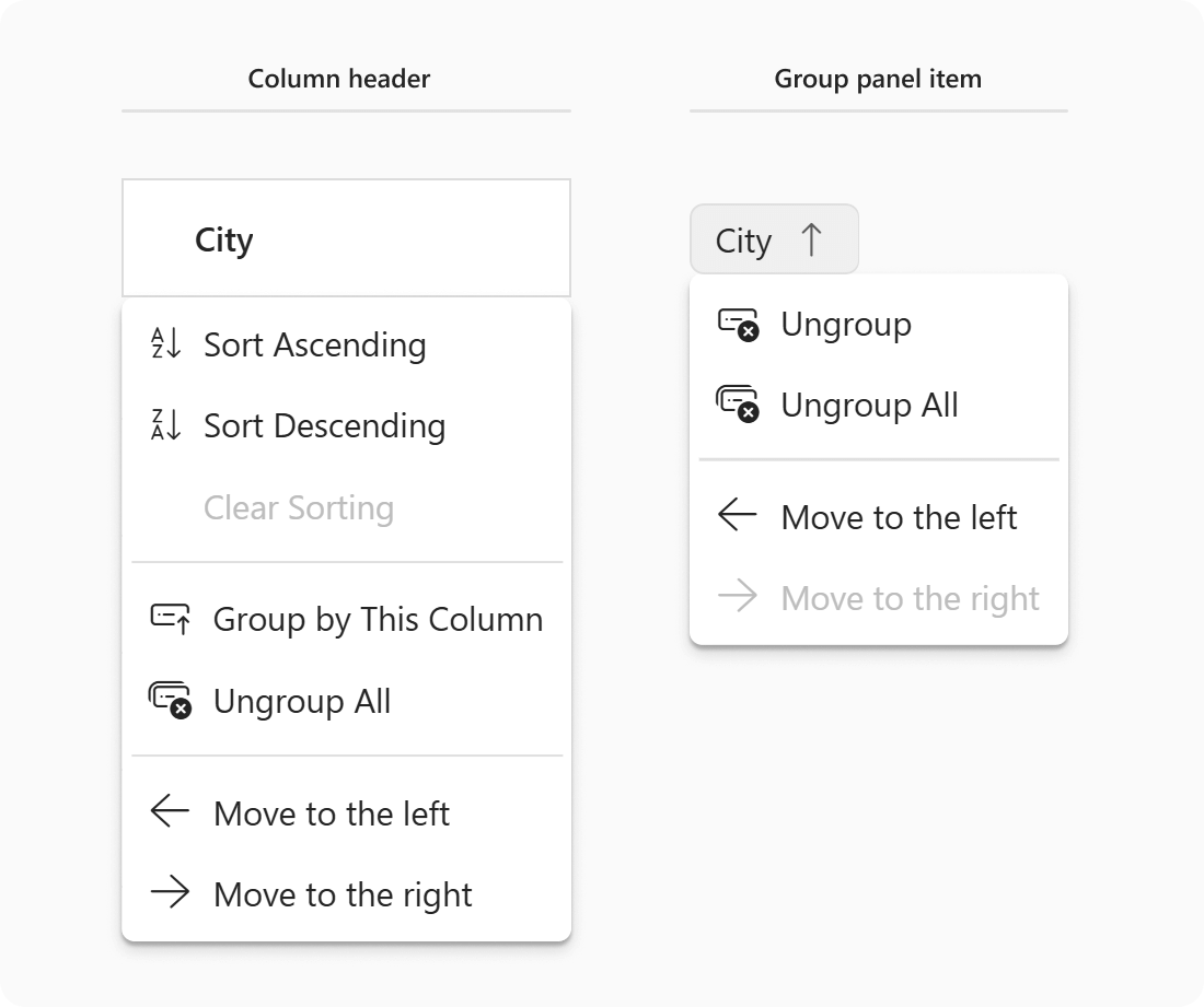
You can now move DataGrid/TreeList column to the left or right of its current position using context menu items or corresponding shortcuts:
- Ctrl+Left (Cmd+Left): move column to the left.
- Ctrl+Right (Cmd+Right): move column to the right.
Grouping/Ungrouping
Our DataGrid now supports column grouping/ungrouping using context menu items or corresponding shortcuts:
- Ctrl+G: groups data by the current column.
- Ctrl+Shift+G: ungroups data by the current column.
- Backspace / Delete: ungroup data by the corresponding column (if pressed while a group panel item is focused).
- Shift+Alt+G (Shift + Option + G): ungroups all columns.
You can also change grouping order using the following shortcuts (if a group panel item is focused):
- Ctrl+Left (Cmd+Left): moves the selected grouping column to the left, increasing hierarchy priority.
- Ctrl+Right (Cmd+Right): moves the selected grouping column to the right, decreasing hierarchy priority.
Chat Enhancements
Editing and Deleting Messages
v25.1 introduces message editing/deleting capabilities.
The Chat instance owners (chat.user) can edit and delete his or her own messages but cannot modify those of others.
To modify a message, right-click it or long tap on a mobile device. A context menu with "Edit" and "Delete" buttons will appear on-screen. When editing, message content appears in the input field. To simplify edit operations, a preview above the input is used to display the original message.

A cancel button is also available in the same area. You can make desired changes and resend the message. Edited messages display a label in the Chat UI confirming modification.

To delete a message, select "Delete" from the menu. A confirmation dialog is displayed before deletion. In addition to the built-in dialog, you can implement your own custom dialog. After deletion, an icon with "This message was deleted" replaces the original text.

Enable message editing and deletion with allowUpdating and allowDeleting options. These options can accept true, false, or a function that returns a Boolean value for advanced settings.
The Chat component doesn't automatically update its message collection or its data source. For full data management control (when messages are edited or deleted), DevExtreme v25.1 ships with the following events:
- onMessageEditingStart
- onMessageUpdating
- onMessageUpdated
- onMessageEditCanceled
- onMessageDeleting
- onMessageDeleted
Mark edited and deleted messages with isDeleted and isEdited properties respectively.

Image Rendering
Configuring image display within messages is now simpler than ever. You no longer need to use a template to programmatically display an image inside a message.
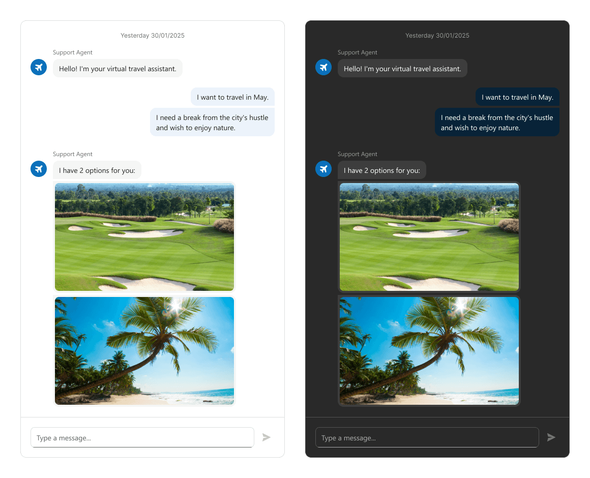
To render an image within a message programmatically, simply set message type to "image" and specify the src for the image.
Scheduler - Toolbar Customization
v25.1 adds a fully customizable toolbar to the DevExtreme Scheduler. Configuration options include:
- Predefined Elements: Select and arrange built-in elements.
- DevExtreme Components: Add components such as Button or Checkbox.
- Custom Elements: Define templates for custom items.
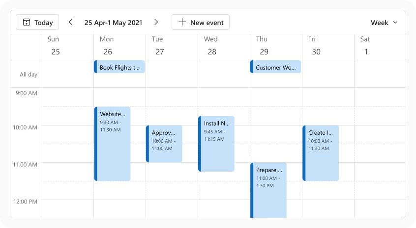
Use the new toolbar property to define the layout and behavior of each item. Available settings include:
- cssClass: CSS class for the item.
- disabled: Toggles user interaction.
- locateInMenu: Determines overflow menu presence.
- location: Placement on the toolbar (before, after, center).
- menuItemTemplate: Template for menu item rendering.
- options: Settings for DevExtreme UI component.
- template: Template for item rendering.
- text: Display text for the item.
- visible: Display toggle for the item.
- widget: UI component for the item, configured via options.
- name: Predefined item name.
Scheduler includes the following predefined items
- "today": A "Today" button (focuses the current date).
- "dateNavigator": Includes arrows and a date interval button for switching dates. You can customize the elements to display on-screen and associated order within the date navigator.
- "viewSwitcher": Switches between views like day, month, and week.
Note: If using Angular to implement this capability, you must use our new configuration components when working with toolbar items.
<template>
    <DxScheduler>
         <DxToolbar>
            <DxItem
                name="today"
                location="before"
            >
            <DxItem
                name="dateNavigator"
                location="before"
            >
            <DxItem
                name="viewSwitcher"
                location="after"
                locate-in-menu="auto"
            >
         </DxToolbar>
    </DxScheduler>
</template>
If you do not explicitly specify the toolbar, a default toolbar with "dateNavigator" on the left and "viewSwitcher" on the right will be displayed on-screen.
Map - Custom Route Modes
With this update, DevExtreme Map allows you to set custom route options for multiple transportation modes.
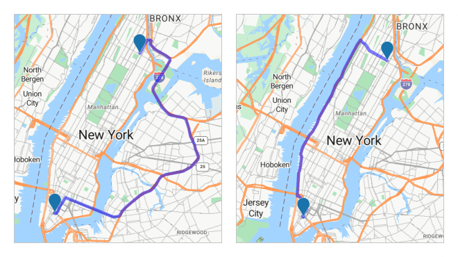
Note that each Map provider (Azure, Google, Bing) offers its own set of route modes. Pass a string with the desired route name to the routes[].mode property to use this feature within your DevExtreme-powered web app. For instance, you can switch default 'car' route type in Azure maps to a custom route mode like 'bicycle' or 'truck'.
Accessibility
DevExtreme Scheduler ships with the following accessibility-related enhancements:
- Improved Status messages: When you focus the Scheduler, it now reads the component name, current view, visible date range, and whether the time indicator is present. This change allows screen readers to communicate component state changes to users.
- Screen readers can now pronounce resources for Scheduler appointments.
- Improved appointment editing window. Screen readers can now pronounce all elements within the window.
Your Feedback Matters
We thank you for your continued support. Once you’ve reviewed the features/capabilities introduced in our v25.1 release cycle,
please take a moment to complete our online survey.
Your comments will help us refine our development plans for our v25.2 release set for release in 2025.