DevExtreme jQuery - What’s New in v23.1
Your Feedback Matters
We thank you for your continued support. Once you’ve reviewed the features/capabilities introduced in our v23.1 release cycle,
please take a moment to complete our online survey.
Your comments will help us refine our development plans for our v23.2 release set for release in December 2023.
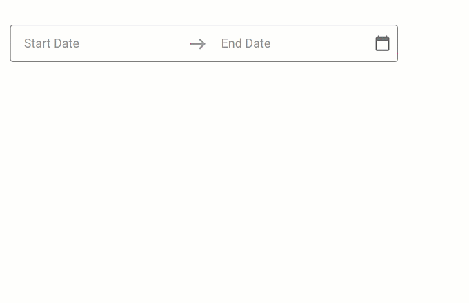
New DateRangeBox Component
The DateRangeBox component for jQuery allows you to select a date range. Features include:
- Masked Input
- Popup and Calendar Customization
- Input Label and Styling Modes
- Value Mode
- Input Validation
Data Grid and Tree List
Column Chooser Customization
Our new selection property allows you to configure selection options within the Column Chooser window. Available options include:
- Recursive selection
- Select all
- Select a column by clicking its label.
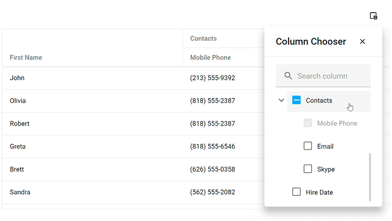
You can specify a search configuration object to customize search within the Column Chooser.
Our new position property allows you to specify the display location of the Column Chooser.
Data Filtering - UI Customization
Header Filter Customization in DataGrid, PivotGrid, TreeList, Gantt
You can now customize search options and the appearance of the search box in column header filters. You can set up the search box as a TextBox component, specify comparison rules, and timeout/delay (in milliseconds).
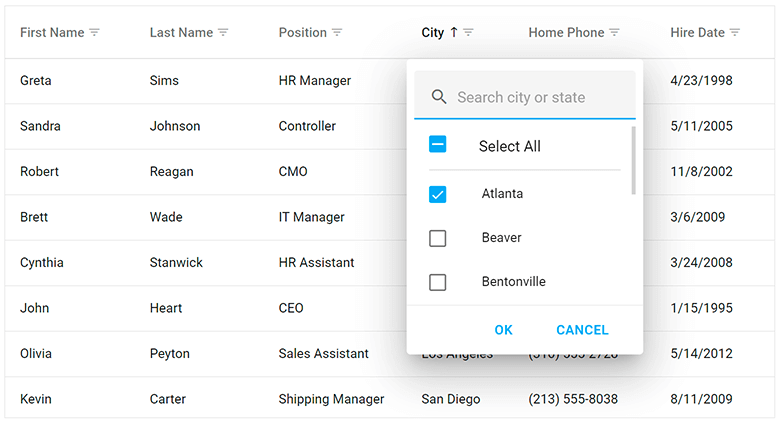
Use the search configuration object to globally configure search settings, or use the columns[].headerFilter.search configuration object to make changes to individual columns. Use the fields[].headerFilter.search property to configure search settings in the Pivot Grid.
Data Visualization
Charts — Color Gradients and Patterns
You can now customize styles and apply gradients, patterns, and images to DevExpress Charts.
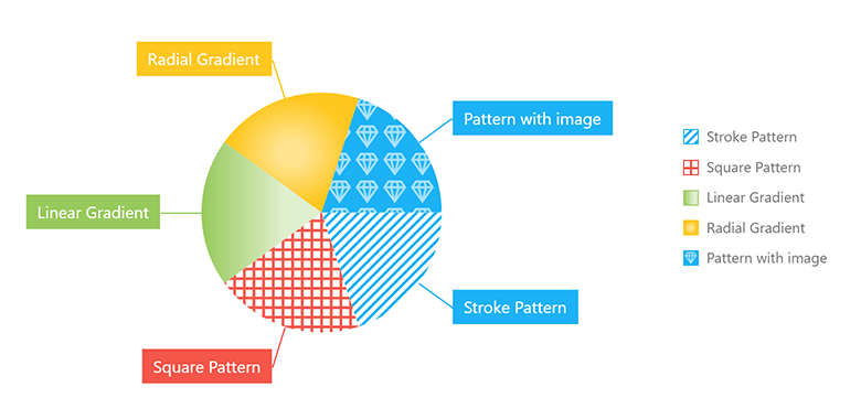
Use the registerGradient() method to declare linear and radial gradient styles, and the registerPattern() method to declare pattern and image styles. These methods return a unique id for declared styles. In the series/point color object, specify the base color for labels and connectors and apply the generated id to the fillId
You can also use the highlight option to highlight series on hover and selection.
Charts — Customize Label Position in Series
Our new shift(x,y) method allows you to display series labels at a specified offset from their default position.
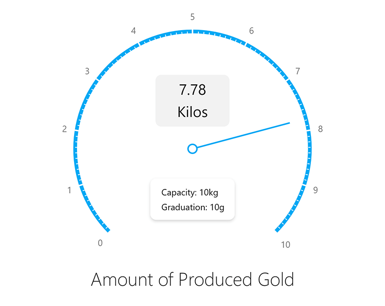
Gauge — Display Custom SVG Content
Use our new centerTemplate property to display custom SVG content inside our Gauge component.
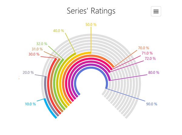
BarGauge — Support 'Shift' Mode to Address Overlapping Labels
If BarGauge displays multiple values next to each other, corresponding labels may overlap. Use the resolveLabelOverlapping property to specify how the BarGauge component modifies the position or visibility of labels. Available options include:
- Shift
- Hide
- None
In shift mode, the BarGauge automatically shifts labels when necessary.
UI Components
Overlay Components — Native Scrolling
Our Popup, Popover, and Tooltip components now support native scrolling, which improves usability on mobile devices.
If content height is greater than the height of the overlay component, the component displays the browser’s native scrollbar. With this new enhancement, you do not need to wrap content into our ScrollView component.
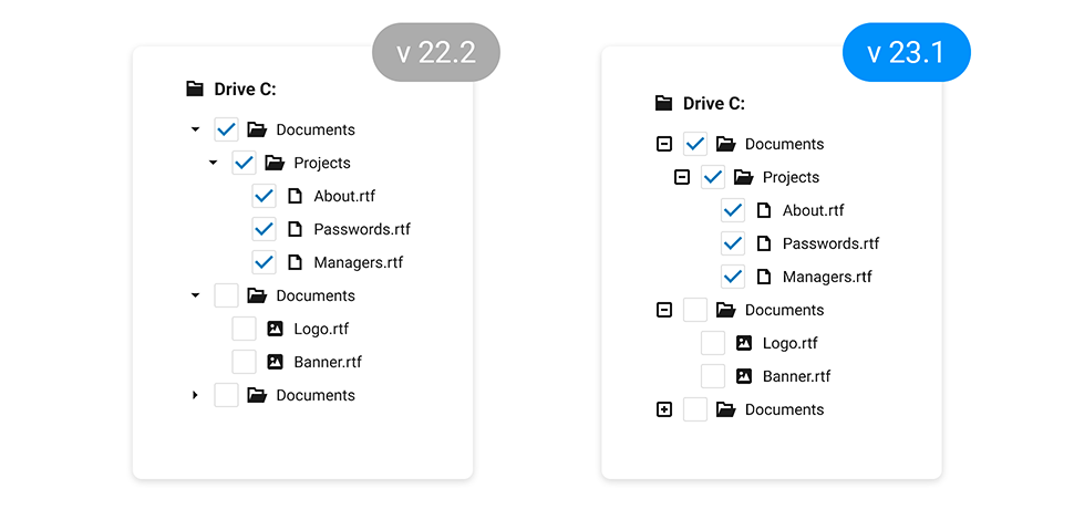
TreeView — Display Custom Expand/Collapse Icons
TreeView nodes can now display custom expand/collapse icons.
Use the collapseIcon and expandIcon properties to specify node icons. You can load icons from URLs, specify icons in CSS class (if working with external libraries), or display DevExtreme icons.
List — Select Items on Click
Our new selectByClick setting specifies whether to select an item when the user clicks its caption.
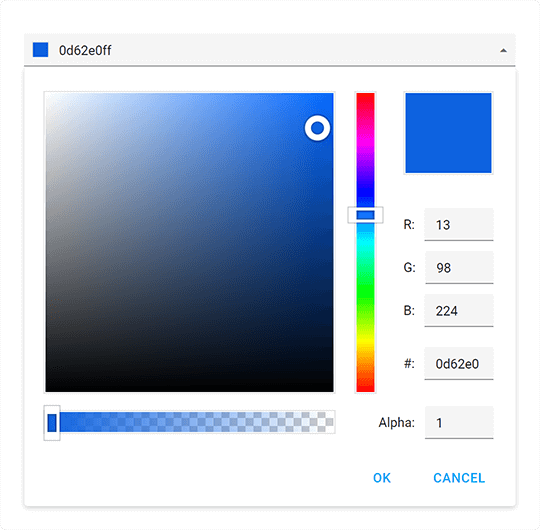
ColorBox — Hexadecimal 8-digit RGBA Format Support
You can now specify colors in hexadecimal 8-digit RGBA format. Our ColorBox component accepts the following color formats:
-
4- and 8-digit (
#F00F#FF0000FF -
3- and 6-digit Hexadecimal (
#F00#FF0000 -
RGB (
rgb(255, 0, 0) -
RGBA (
rgba(255, 0, 0, 1) - Color Names
Menu — Add the 'url' Option for Items
We added a new url option for Menu items. With this enhancement, you do not have to implement complicated onItemClick
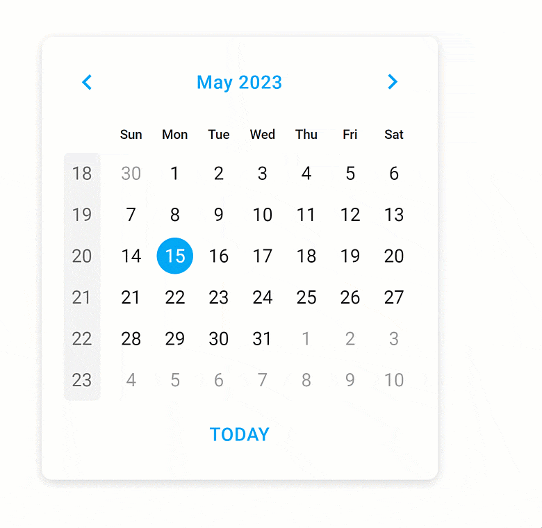
Improved Calendar Design
UI/UX enhancements include:
- 'Prev' and 'Next' arrows are now fully customizable Button components.
- We visually enhanced selection in different calendar views.
- The week number column has now a completely new look and feel.
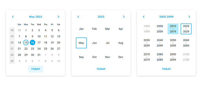
Improved adaptivity allows you to deliver elegant and responsive web applications for desktops, tablets, and phones alike.
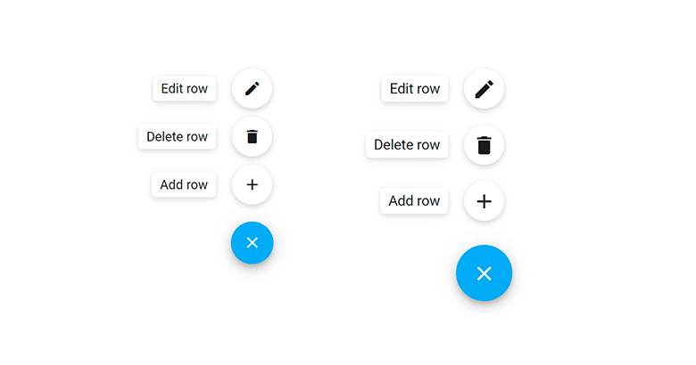
Floating Action Button — Compact Mode Support
We added a compact mode to our Floating Action Button component.
Data Layer
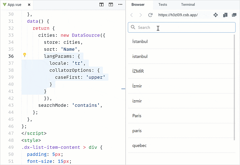
DataSource — Sort and Filter by Locale
The DataSource can now sort and filter data by locale with special characters (for example, symbols with diacritics). Specify locale and collator options in the langParams
Accessibility
We extended the following accessibility-related capabilities:
-
Focus disabled UI elements
Switching focus between accessible and disabled (unavailable) UI elements in our components now complies with the WAI-ARIA standard. Screen readers can now report a disabled element when the user focuses on it. Any other interaction with disabled UI elements is not allowed. -
Keyboard navigation in TreeView
We improved the tab navigation (Tab key) between item checkboxes and 'selectAll' checkbox. -
Keyboard navigation in Calendar
Users can focus the Today button and press Enter to navigate to the today date. Enable theshowTodayButton -
Global rework of
aria-*attributes
This enhancement allowed us to better support screen readers in all UI components. -
Tabs and TabPanel — Design improvements in Material and Generic themes
We added new visual states for our Tabs and Tab Panel components. And yes, we also improved existing states: hover, active, disabled, focused, and selected. -
Charts — Pattern and Image fill
With this new customization option, you can edit styles, apply images and SVG patterns to DevExpress Charts, making them accessibile to visually impaired people.
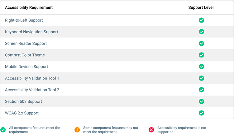
We also improved the documentation of our DataGrid, TreeList, and dropdown editors. The documentation now includes help topics about accessibility support. Each help topic includes a table with the features and standards supported by the component (for example, Autocomplete Accessibility). We use Lighthouse, WAVE, and Axe accessibility tools to test our components and display results in the table. Review this information to learn about accessibility support and to see if your application is configured to meet accessibility standards.
And yes, we will continue to enhance accessibility support in future releases.
Security
Content Security Policy (CSP) Support
The DevExtreme UI library now supports Content Security Policy (CSP) integration and introduces advanced security features to help you detect and mitigate certain types of security risks, including Cross-Site Scripting (XSS) and data injection attacks. To make certain DevExtreme UI components support CSP, we run them through unit tests.
TypeScript Enhancements
-
React component props now fully support types. TypeScript hints on errors in code, and IntelliSense to avoid them.
-
You can now import all required types from framework specific packages. In previous versions, you had to import certain types from a separate
devextremedevextreme-angular Our documentation now includes over 500 topics related to types.
We Want to Hear from You
Don’t forget to share your thoughts on this release with us. Your feedback will help us refine our development plans for our next major update (v23.2 – set for release in December 2023). Note: You will need a DevExpress account to submit survey feedback.