Angular PolarChart - valueAxis
Specifies value axis options for the PolarChart widget.
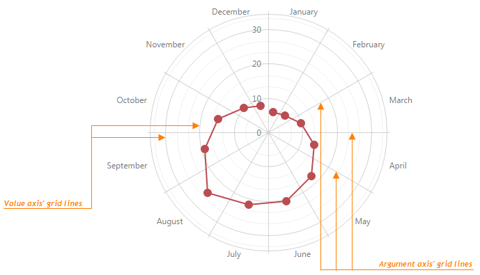
For charting, the polar coordinate system is used to determine each point uniquely on a plane through two numbers, the argument and the value of the point. A circular and straight lines (the axis of arguments and the axis of values) are specified to define the coordinates. To define the argument axis, use the argumentAxis configuration object. To define the value axis, use the valueAxis configuration object.
To set the properties of all axes to a common value, use the commonAxisSettings configuration object. It exposes properties that can be specified for all axes simultaneously. Note that the value specified for an axis individually (in the argumentAxis or valueAxis object) overrides the value that specified in the commonAxisSettings object.
allowDecimals
Specifies whether to allow decimal values on the axis. When false, the axis contains integer values only.
axisDivisionFactor
Specifies a coefficient for dividing the value axis.
The value axis is divided automatically by default. If you need to make the axis tick interval larger or smaller, use the axisDivisionFactor property. This property value is a coefficient used internally to calculate the distance between axis labels. This allows you to set axis division without knowledge of the actual axis values.
categories
Specifies the order in which discrete values are arranged on the value axis.
If you specify the chart's data using a common array of objects, these objects may be displayed in a random order. If you set the chart's data for each series individually, the order in which the series are positioned in the series array can also be random. In these instances, the resulting value order on the discrete value axis may not be appropriate. To specify the order of categories (values on a discrete value axis), assign an array of category names to the categories property.
color
Specifies the color of the line that represents an axis.
This option supports the following colors:
- Hexadecimal colors
- RGB colors
- RGBA colors
- Predefined/cross-browser color names
- Predefined SVG colors
constantLines[]
Defines an array of the value axis constant lines.
A constant line is a straight line that can be used to display, for example, an asymptote of a graph. To display constant lines on a chart, assign an array of objects specifying the options of each constant line to the constantLines field. It is necessary to set the value option within these objects. The other options can be set if required.
You can customize the appearance of all the value axis constant lines at once. For this purpose, use the valueAxis.constantLineStyle configuration object. Note that the options that are set within the valueAxis.constantLine object override the corresponding options that are set within the valueAxis.constantLineStyle object.
constantLineStyle
Specifies the appearance of all the widget's constant lines.
Use this object to set the appearance options for the constant lines of both the argument and value axes. For example, you can change the color, dash style and width of the line using corresponding options or define the look of the labels using the label object.
To specify styles for the constant lines of the argument and value axis separately, use the constantLineStyle object within the argumentAxis or valueAxis configuration object correspondingly. Note that the options that are set within these objects override the corresponding options that are set within the commonAxisSettings.constantLineStyle object.
In addition, you can define the appearance of each constant line individually. For more information, refer to the argumentAxis.constantLines or valueAxis.constantLines object description.
discreteAxisDivisionMode
Specifies whether ticks/grid lines of a discrete axis are located between labels or cross the labels.
When a discrete axis is divided, its ticks/grid lines are located between labels by default. If this is not appropriate, use the discreteAxisDivisionMode property to set the required mode for positioning ticks and grid lines on a discrete axis.
Use the DiscreteAxisDivisionMode enum to specify this option when the widget is used as an ASP.NET MVC Control. This enum accepts the following values: BetweenLabels and CrossLabels.
grid
An object defining the configuration options for the grid lines of an axis in the PolarChart widget.
Grid lines are the reference lines used to improve the readability of a chart's visual data. The grid object exposes the properties that allow you to specify visibility and appearance settings for axis grid lines. To learn more about axis grid lines and their options, refer to the Grid topic.

inverted
Indicates whether or not an axis is inverted.
When an axis is inverted, the maximum and minimum values are reversed. As a result, the axis values increase in a direction that is opposite to the initial direction. The chart series are also inverted.
label
Specifies options for value axis labels.
Axis labels represent textual values for axis ticks, which are not visible by default. To specify custom settings for the value axis labels, use the label configuration object. If you need to set a common value for labels on all axes, use the commonAxisSettings.label configuration object. This object exposes the properties that can be specified for labels on all axes simultaneously. Note that a value specified for the value axis individually (in the valueAxis.label object) overrides the value that is specified in the commonAxisSettings.label object.
logarithmBase
Specifies the value to be raised to a power when generating ticks for a logarithmic axis.
By default, ticks on a logarithmic axis are generated on a base of 10, i.e., 0.1, 1, 10, 100, 1000, etc. But you can specify a base you require using the logarithmBase option. For example, if you set this option to 5, the following ticks will be generated: 0.5, 5, 25, 125, 625, etc.
maxValueMargin
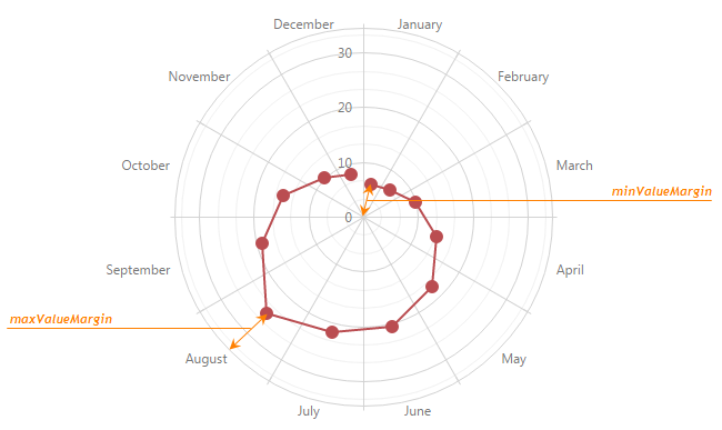
Specifies a coefficient that determines the spacing between the maximum series point and the axis.
When margins are enabled in a chart, the value axis extends slightly beyond its start and end values. It is required for preventing the cutting off of parts of the minimum and maximum series points.
By default, margins are calculated automatically and equal to half of an axis' tick interval. If you need to specify custom margins, use the minValueMargin and maxValueMargin options. These options accept coefficients that are used to calculate the actual start and end values for an axis with applied margins using the following formulas:
startAxisValue = minDataValue - (maxDataValue - minDataValue) * minValueMargin
endAxisValue = maxDataValue + (maxDataValue - minDataValue) * maxValueMargin
For example, consider that minDataValue is 1960 and maxDataValue is 2010. If you set the minValueMargin and maxValueMargin options to 0.1, the axis will start in 1955 and end in 2015.
startAxisValue = 1960 - (2010 - 1960) * 0.1 = 1960 - 50 * 0.1 = 1960 - 5 = 1955
endAxisValue = 2010 + (2010 - 1960) * 0.1 = 2010 + 50 * 0.1 = 2010 + 5 = 2015

minorGrid
Specifies the options of the minor grid.
In addition to the major grid built on major ticks, the PolarChart widget provides the minor grid that is built on minor ticks. The lines of the minor grid extend from the minor ticks throughout the entire chart's plot.
To specify the appearance of grid lines, use the options of the minorGrid object. Declared within the commonAxisSettings object, the minorGrid object changes the appearance of value and argument axes simultaneously. To change the appearance of the value or argument axis individually, declare the minorGrid object in the argumentAxis or valueAxis object respectively. Settings specified individually override those that are set in the commonAxisSettings object.
To make the minor grid visible, set the visible option of the minorGrid object to true. Additionally, you can change the color, opacity and width of the grid lines using the corresponding options.
minorTick
Specifies the options of the minor ticks.
In addition to major ticks, the PolarChart widget provides the capability to draw minor ticks. Minor ticks divide an axis segment that lies between two neighboring major ticks. To specify how to generate minor ticks, use the minorTickInterval or minorTickCount options.
To configure the appearance of minor ticks, use the options of the minorTick object. Declared within the commonAxisSettings object, the minorTick object sets options for all minor ticks. To change the appearance of the minor ticks that belong to the argument or value axis individually, declare the minorTick object in the argumentAxis or valueAxis object respectively. Settings specified individually override those that are set in the commonAxisSettings object.
By default, minor ticks are hidden. To make them visible, assign true to the visible option of the minorTick object. Additionally, you can change the color, opacity and width of the minor ticks using the corresponding options.
minorTickCount
Specifies the number of minor ticks between two neighboring major ticks.
minorTickInterval
Specifies the interval between minor ticks.
To divide a lengthy chart axis into shorter segments, major and minor ticks are used. Between each pair of neighboring major ticks, several minor ticks reside. Minor ticks are required when major ticks are far from each other. To set a custom minor tick interval, use the minorTickInterval option. If this option is not set, minor ticks are arranged automatically.
In case your axis displays numbers, assign a numeric value to this option. If the axis displays dates, assign one of the predefined string values. To set the interval to several days, hours, etc., assign an object with the corresponding field specified (days, hours or another field). Note that this object must contain only one of the fields described in this section.
When using the widget as an ASP.NET MVC Control, specify this option using the VizTimeInterval enum. This enum accepts the same values, but they start with an upper-case letter, for example, 'day' becomes Day.
minValueMargin
Specifies a coefficient that determines the spacing between the minimum series point and the axis.
When margins are enabled in a chart, an axis extends slightly beyond its start and end values. It is required for preventing the cutting off of parts of the minimum and maximum series points.
By default, margins are calculated automatically and equal to half of an axis' tick interval. If you need to specify custom margins, use the minValueMargin and maxValueMargin options. These options accept coefficients that are used to calculate the actual start and end values for an axis with applied margin susing the following formulas:
startAxisValue = minDataValue - (maxDataValue - minDataValue) * minValueMargin
endAxisValue = maxDataValue + (maxDataValue - minDataValue) * maxValueMargin
For example, consider that minDataValue is 1960 and maxDataValue is 2010. If you set the minValueMargin and maxValueMargin options to 0.1, the axis will start in 1955 and end in 2015.
startAxisValue = 1960 - (2010 - 1960) * 0.1 = 1960 - 50 * 0.1 = 1960 - 5 = 1955
endAxisValue = 2010 + (2010 - 1960) * 0.1 = 2010 + 50 * 0.1 = 2010 + 5 = 2015

showZero
Specifies whether or not to indicate a zero value on the value axis.
When this option is not defined, value axis behaves differently depending on the type of the series that it displays. When the value axis displays an area or bar series, it has the zero value indicated. Otherwise, it does not.
You can force the value axis to indicate the zero value no matter what type of series it displays by setting the showZero option to true.
When this option is set to false, the zero value is not indicated until it is included in the displayed series.
strips[]
Specifies options for value axis strips.
Strips are the highlighted areas in a chart within the defined range of values (minimum and maximum) for an axis to which they belong. In general, strips are used to visually represent a range of values behind a series to trace whether the series points' values fall in or out of that range. For more details on strips, refer to the Strips topic.
To define strips for the value axis, use the strips array. When a strip's startValue, endValue and color properties are specified, the strip is displayed in a chart. In addition, you can show a label with descriptive information on a strip. To set the text for a label, use the strip's label object.
If you need to set similar values for all strips of all axes, use the commonAxisSettings.stripStyle configuration object. It exposes the properties that can be specified for strips of all axes at once. Note that the values specified for the value axis individually (in the valueAxis.strips object) override the values that are specified for all axes (in the commonAxisSettings.stripStyle object).
stripStyle
An object defining configuration options for strip style.
Strips are the highlighted areas of a chart within a defined range of values (maximum and minimum) for an axis to which they belong. In general, strips are used to visually represent a range of values behind a series, to trace whether the series point values fall in or out of that range. For more details on strips, refer to the Strips topic.
To set options for configuring strip style, define the stripStyle object within the argumentAxis or valueAxis configuration object. To set common options for all strips in a chart, define the stripStyle object within the commonAxisSettings configuration object. Note that the values that are set for an individual axis override the corresponding common values.
tick
An object defining the configuration options for axis ticks.
Ticks divide an axis into equal sections by a step whose value is determined automatically, or by the tickInterval and axisDivisionFactor options of an axis. Ticks improve the readability of charts, but are not visible in the PolarChart widget by default. To set up tick configuration options, define the tick object within the argumentAxis or valueAxis configuration object. To set common options for all ticks in a chart, define the tick object within the commonAxisSettings configuration object. Note that the values that are set for an individual axis override the corresponding common values.
tickInterval
Specifies an interval between axis ticks/grid lines.
Use this option to divide the scale by ticks in a specified interval from each other. If this option is not set, ticks are automatically arranged so that their labels do not overlap each other.
In case of a continuous or a logarithmic axis, assign a numeric value to this option.
If the axis is of the date-time type, assign one of the predefined string values or an object to this option. The object's fields specify the number of days, hours etc.
When you use a logarithmic axis, ticks are generated on a base of powers. For example, assume that the logarithm base is 10. Then, if the tick interval is 1, ticks are generated at 0.01, 0.1, 1, 10, 100, 1000, 10000, etc. If the tick interval is 2, ticks are generated at 0.1, 10, 1000, etc.
To set the tickInterval option for several axis at once, use the commonAxisSettings configuration object. To set this option for an individual axis, use the argumentAxis or valueAxis configuration object.
When using the widget as an ASP.NET MVC Control, specify this option using the VizTimeInterval enum. This enum accepts the same values, but they start with an upper-case letter, for example, 'day' becomes Day.
type
Specifies the required type of the value axis.
The 'discrete' type is set when string values are specified in the data source of the chart's series. The discrete value axis is divided by the values (called categories) that are specified in a series' data source. The categories order can be specified by the categories property if the order used in the data source is not appropriate.
The 'continuous' type is set when numeric or date-time values are specified in the series data source. The continuous axis is divided automatically.
The 'logarithmic' type can be set when numeric values are specified in the series data source. The logarithmic axis is useful when you visualize a dataset of rapidly-growing values. Each axis tick represents a particular value that is raised to the next power in turn. This particular value is specified by the logarithmBase option. For example, if you set this option to 5, the following ticks will be generated: 50, 51, 52, 53, etc.
On continuous and logarithmic axes, ticks and grid lines are generated automatically. In addition, you can set a custom tick interval (the tickInterval or axisDivisionFactor options).
Use the AxisScaleType enum to specify this option when the widget is used as an ASP.NET MVC Control. This enum accepts the following values: Discrete, Continuous, and Logarithmic.
valueMarginsEnabled
Indicates whether to display series with indents from axis boundaries.
Additionally, if you use a continuous axis, you can specify how far to extend the axis from its maximum and minimum values. Use the axis' minValueMargin and maxValueMargin properties to do this.
valueType
Specifies the desired type of axis values.
The type of the axis values is determined based on the type of the values specified in the corresponding data source field of the chart's series. If numeric values are specified in the series data source, the axis values will also be of the numeric type. The same logic is used when string or date-time values are specified in the data source.
In some scenarios, you may need the type of the values that are specified in the data source to be converted to another type. In this instance, specify the desired type for the axis values using the valueType property.
Use the ChartDataType enum to specify this option when the widget is used as an ASP.NET MVC Control. This enum accepts the following values: Numeric, DateTime, and String.
visible
Indicates whether or not the line that represents an axis in a chart is visible.

 Select one or more answers