Angular Calendar Properties
An object defining configuration properties for the Calendar UI component.
See Also
accessKey
Specifies the shortcut key that sets focus on the UI component.
The value of this property will be passed to the accesskey attribute of the HTML element that underlies the UI component.
activeStateEnabled
Specifies whether the UI component changes its visual state as a result of user interaction.
The UI component switches to the active state when users press down the primary mouse button. When this property is set to true, the CSS rules for the active state apply. You can change these rules to customize the component.
Use this property when you display the component on a platform whose guidelines include the active state change for UI components.
cellTemplate
Specifies a custom template for calendar cells.
If a cell is a week number, the date field value is undefined.
See Also
dateSerializationFormat
Specifies the date-time value serialization format.
Date-time serialization involves date-time value conversion into a string format for storage or transmission. To ensure proper format detection, specify this property.
Use LDML patterns to pass custom format strings to this property.
For instance, you can specify the following patterns:
"yyyy-MM-dd"
A date."yyyy-MM-ddTHH:mm:ss"
Local date and time."yyyy-MM-ddTHH:mm:ssZ"
Date and time in UTC."yyyy-MM-ddTHH:mm:ssx","yyyy-MM-ddTHH:mm:ssxx","yyyy-MM-ddTHH:mm:ssxxx"
Date and time with a timezone.
You can use this property only if you do not specify the initial value. dateSerializationFormat is calculated automatically if you pass a value in the initial configuration.
If you specify this property, the value will be a string, not a Date object.
If you use API to change the value, make sure that the value has the same format that you specified in this property.
This property takes effect only if the forceIsoDateParsing field is set to true in the global configuration object.
See Also
disabled
Specifies whether the UI component responds to user interaction.
disabledDates
Specifies dates that users cannot select.
Information about the checked date.
true if the date should be disabled; otherwise false.
This property accepts an array of dates:
jQuery
$(function() {
    $("#calendarContainer").dxCalendar({
        // ...
        disabledDates: [
            new Date("07/1/2017"),
            new Date("07/2/2017"),
            new Date("07/3/2017")
        ]
    });
});
Angular
<dx-calendar ...
    [disabledDates]="disabledDates">
</dx-calendar>
import { Component } from '@angular/core';

@Component({
    selector: 'app-root',
    templateUrl: './app.component.html',
    styleUrls: ['./app.component.css']
})
export class AppComponent {
    disabledDates: Date[] = [
        new Date("07/1/2017"),
        new Date("07/2/2017"),
        new Date("07/3/2017")
    ];
}
import { BrowserModule } from '@angular/platform-browser';
import { NgModule } from '@angular/core';
import { AppComponent } from './app.component';

import { DxCalendarModule } from 'devextreme-angular';

@NgModule({
    declarations: [
        AppComponent
    ],
    imports: [
        BrowserModule,
        DxCalendarModule
    ],
    providers: [ ],
    bootstrap: [AppComponent]
})
export class AppModule { }
Vue
<template>
    <DxCalendar ...
        :disabled-dates="disabledDates"
    />
</template>

<script>
import 'devextreme/dist/css/dx.light.css';

import DxCalendar from 'devextreme-vue/calendar';

export default {
    components: {
        DxCalendar
    },
    data() {
        return {
            disabledDates: [
                new Date("07/1/2017"),
                new Date("07/2/2017"),
                new Date("07/3/2017")
            ]
        }
    }
}
</script>
React
import React from 'react';

import 'devextreme/dist/css/dx.light.css';

import Calendar from 'devextreme-react/calendar';

class App extends React.Component {
    constructor() {
        this.disabledDates = [
            new Date("07/1/2017"),
            new Date("07/2/2017"),
            new Date("07/3/2017")
        ];
    }
    render() {
        return (
            <Calendar ...
                disabledDates={this.disabledDates}
            />
        );
    }
}
export default App;Alternatively, pass a function to disabledDates. This function should define the rules that determine whether the checked date is disabled. A separate set of rules should target every view individually.
jQuery
$(function() {
    $("#calendarContainer").dxCalendar({
        // ...
        disabledDates: function(args) {
            const dayOfWeek = args.date.getDay();
            const month = args.date.getMonth();
            const isWeekend = args.view === "month" && (dayOfWeek === 0 || dayOfWeek === 6 );
            const isMarch = (args.view === "year" || args.view === "month") && month === 2;

            return isWeekend || isMarch;
        }
    });
});
Angular
<dx-calendar ...
    [disabledDates]="disableDates">
</dx-calendar>
import { Component } from '@angular/core';

@Component({
    selector: 'app-root',
    templateUrl: './app.component.html',
    styleUrls: ['./app.component.css']
})
export class AppComponent {
    disableDates(args) {
        const dayOfWeek = args.date.getDay();
        const month = args.date.getMonth();
        const isWeekend = args.view === "month" && (dayOfWeek === 0 || dayOfWeek === 6 );
        const isMarch = (args.view === "year" || args.view === "month") && month === 2;

        return isWeekend || isMarch;
    }
}
import { BrowserModule } from '@angular/platform-browser';
import { NgModule } from '@angular/core';
import { AppComponent } from './app.component';

import { DxCalendarModule } from 'devextreme-angular';

@NgModule({
    declarations: [
        AppComponent
    ],
    imports: [
        BrowserModule,
        DxCalendarModule
    ],
    providers: [ ],
    bootstrap: [AppComponent]
})
export class AppModule { }
Vue
<template>
    <DxCalendar ...
        :disabled-dates="disableDates"
    />
</template>

<script>
import 'devextreme/dist/css/dx.light.css';

import DxCalendar from 'devextreme-vue/calendar';

export default {
    components: {
        DxCalendar
    },
    methods: {
        disableDates(args) {
            const dayOfWeek = args.date.getDay();
            const month = args.date.getMonth();
            const isWeekend = args.view === "month" && (dayOfWeek === 0 || dayOfWeek === 6 );
            const isMarch = (args.view === "year" || args.view === "month") && month === 2;

            return isWeekend || isMarch;
        }
    }
}
</script>
React
import React from 'react';

import 'devextreme/dist/css/dx.light.css';

import Calendar from 'devextreme-react/calendar';

class App extends React.Component {
    disableDates(args) {
        const dayOfWeek = args.date.getDay();
        const month = args.date.getMonth();
        const isWeekend = args.view === "month" && (dayOfWeek === 0 || dayOfWeek === 6 );
        const isMarch = (args.view === "year" || args.view === "month") && month === 2;

        return isWeekend || isMarch;
    }
    render() {
        return (
            <Calendar ...
                disabledDates={this.disableDates}
            />
        );
    }
}
export default App;In cases of 'multiple' and 'range' selection modes, the behavior of disabled dates in Calendar is the following:
If you specify the value property programmatically, disabled dates are selected in the values array.
If you use UI to change selection (clicks on dates or weeks, the Enter key), you cannot select disabled dates in 'multiple' mode. In 'range' mode, disabled dates cannot start or end a range, but can be included in the middle.
See Also
elementAttr
Specifies the global attributes to be attached to the UI component's container element.
jQuery
$(function(){
    $("#calendarContainer").dxCalendar({
        // ...
        elementAttr: {
            id: "elementId",
            class: "class-name"
        }
    });
});
Angular
<dx-calendar ...
    [elementAttr]="{ id: 'elementId', class: 'class-name' }">
</dx-calendar>
import { DxCalendarModule } from "devextreme-angular";
// ...
export class AppComponent {
    // ...
}
@NgModule({
    imports: [
        // ...
        DxCalendarModule
    ],
    // ...
})
Vue
<template>
    <DxCalendar ...
        :element-attr="calendarAttributes">
    </DxCalendar>
</template>

<script>
import DxCalendar from 'devextreme-vue/calendar';

export default {
    components: {
        DxCalendar
    },
    data() {
        return {
            calendarAttributes: {
                id: 'elementId',
                class: 'class-name'
            }
        }
    }
}
</script>
React
import React from 'react';

import Calendar from 'devextreme-react/calendar';

class App extends React.Component {
    calendarAttributes = {
        id: 'elementId',
        class: 'class-name'
    }

    render() {
        return (
            <Calendar ...
                elementAttr={this.calendarAttributes}>
            </Calendar>
        );
    }
}
export default App;
firstDayOfWeek
Specifies the first day of a week.
The property can take on a value from 0 to 6.
- 0 - Sunday
- 1 - Monday
- 2 - Tuesday
- 3 - Wednesday
- 4 - Thursday
- 5 - Friday
- 6 - Saturday
By default, the value provided by the culture settings is used.
focusStateEnabled
Specifies whether the UI component can be focused using keyboard navigation.
height
Specifies the UI component's height.
This property accepts a value of one of the following types:
Number
The height in pixels.String
A CSS-accepted measurement of height. For example,"55px","20vh","80%","inherit".
hint
Specifies text for a hint that appears when a user pauses on the UI component.
hoverStateEnabled
Specifies whether the UI component changes its state when a user pauses on it.
isDirty
Specifies whether the component's current value differs from the initial value.
This property is a read-only flag. You can use it to check if the editor value changed.
jQuery
$(() => {
    const calendar = $('#calendar').dxCalendar({
        // ...
    }).dxCalendar('instance');

    $('#button').dxButton({
        // ...
        onClick () {
            if (calendar.option('isDirty')) {
                DevExpress.ui.notify("Do not forget to save changes", "warning", 500);
            }
        }
    });
});
Angular
import { Component, ViewChild } from '@angular/core';
import { DxCalendarComponent, DxButtonModule } from 'devextreme-angular';
import notify from 'devextreme/ui/notify';

@Component({
    selector: 'app-root',
    templateUrl: './app.component.html',
    styleUrls: ['./app.component.css']
})
export class AppComponent {
    @ViewChild('calendarRef', { static: false }) calendar: DxCalendarComponent;

    onClick () {
        if (this.calendar.instance.option('isDirty')) {
            notify("Do not forget to save changes", "warning", 500);
        }
    }
}
<dx-calendar ...
    #calendarRef
>
</dx-calendar>
<dx-button ...
    (onClick)="onClick($event)"
>
</dx-button>
Vue
<template>
    <DxCalendar ...
        :ref="calendarRef"
    >
    </DxCalendar>
    <DxButton ...
        @click="onClick"
    />
</template>

<script>
import 'devextreme/dist/css/dx.light.css';
import DxCalendar from 'devextreme-vue/calendar';
import DxButton from 'devextreme-vue/button';
import notify from 'devextreme/ui/notify';

export default {
    components: {
        DxCalendar,
        DxButton
    },

    data() {
        return {
            calendarRef
        }
    },

    methods: {
        onClick () {
            if (this.calendar.option('isDirty')) {
                notify("Do not forget to save changes", "warning", 500);
            }
        }
    },

    computed: {
        calendar: function() {
            return this.$refs[calendarRef].instance;
        }
    }
}
</script>
React
import React, { useRef } from 'react';
import Calendar from 'devextreme-react/calendar';
import Button from 'devextreme-react/button';
import 'devextreme/dist/css/dx.light.css';

const App = () => {
    const calendarRef = useRef(null);

    const onClick = () => {
        if (this.calendarRef.current.instance().option('isDirty')) {
            notify("Do not forget to save changes", "warning", 500);
        }
    };

    return (
        <Calendar ...
            ref={calendarRef}
        >
        </Calendar>
        <Button ...
            onClick={onClick}
        />
    );
};

export default App;
See Also
isValid
Specifies or indicates whether the editor's value is valid.
See Also
maxZoomLevel
Specifies the maximum zoom level of the calendar.
See Also
minZoomLevel
Specifies the minimum zoom level of the calendar.
See Also
name
The value to be assigned to the name attribute of the underlying HTML element.
Specify this property if the UI component lies within an HTML form that will be submitted.
onDisposing
A function that is executed before the UI component is disposed of.
Information about the event.
| Name | Type | Description |
|---|---|---|
| element |
The UI component's container. It is an HTML Element or a jQuery Element when you use jQuery. |
|
| component |
The UI component's instance. |
onInitialized
A function used in JavaScript frameworks to save the UI component instance.
Information about the event.
| Name | Type | Description |
|---|---|---|
| element |
The UI component's container. It is an HTML Element or a jQuery Element when you use jQuery. |
|
| component |
The UI component's instance. |
Angular
<dx-calendar ...
    (onInitialized)="saveInstance($event)">
</dx-calendar>
import { Component } from "@angular/core";
import Calendar from "devextreme/ui/data_grid";
// ...
export class AppComponent {
    calendarInstance: Calendar;
    saveInstance (e) {
        this.calendarInstance = e.component;
    }
}
Vue
<template>
    <div>
        <DxCalendar ...
            @initialized="saveInstance">
        </DxCalendar>
    </div>
</template>

<script>
import DxCalendar from 'devextreme-vue/calendar';

export default {
    components: {
        DxCalendar
    },
    data: function() {
        return {
            calendarInstance: null
        };
    },
    methods: {
        saveInstance: function(e) {
            this.calendarInstance = e.component;
        }
    }
};
</script>
<template>
    <div>
        <DxCalendar ...
            @initialized="saveInstance">
        </DxCalendar>
    </div>
</template>

<script setup>
import DxCalendar from 'devextreme-vue/calendar';

let calendarInstance = null;

const saveInstance = (e) => {
    calendarInstance = e.component;
}
</script>
React
import Calendar from 'devextreme-react/calendar';

class App extends React.Component {
    constructor(props) {
        super(props);

        this.saveInstance = this.saveInstance.bind(this);
    }

    saveInstance(e) {
        this.calendarInstance = e.component;
    }

    render() {
        return (
            <div>
                <Calendar onInitialized={this.saveInstance} />
            </div>
        );
    }
}
See Also
onOptionChanged
A function that is executed after a UI component property is changed.
Information about the event.
| Name | Type | Description |
|---|---|---|
| value | any |
The modified property's new value. |
| previousValue | any |
The UI component's previous value. |
| name |
The modified property if it belongs to the first level. Otherwise, the first-level property it is nested into. |
|
| fullName |
The path to the modified property that includes all parent properties. |
|
| element |
The UI component's container. It is an HTML Element or a jQuery Element when you use jQuery. |
|
| component |
The UI component's instance. |
The following example shows how to subscribe to component property changes:
jQuery
$(function() {
    $("#calendarContainer").dxCalendar({
        // ...
        onOptionChanged: function(e) {
            if(e.name === "changedProperty") {
                // handle the property change here
            }
        }
    });
});
Angular
<dx-calendar ...
    (onOptionChanged)="handlePropertyChange($event)">
</dx-calendar>
import { Component } from '@angular/core';

@Component({
    selector: 'app-root',
    templateUrl: './app.component.html',
    styleUrls: ['./app.component.css']
})

export class AppComponent {
    // ...
    handlePropertyChange(e) {
        if(e.name === "changedProperty") {
            // handle the property change here
        }
    }
}
import { BrowserModule } from '@angular/platform-browser';
import { NgModule } from '@angular/core';
import { AppComponent } from './app.component';
import { DxCalendarModule } from 'devextreme-angular';

@NgModule({
    declarations: [
        AppComponent
    ],
    imports: [
        BrowserModule,
        DxCalendarModule
    ],
    providers: [ ],
    bootstrap: [AppComponent]
})

export class AppModule { }
Vue
<template>
    <DxCalendar ...
        @option-changed="handlePropertyChange"
    />
</template>

<script>
import 'devextreme/dist/css/dx.light.css';
import DxCalendar from 'devextreme-vue/calendar';

export default {
    components: {
        DxCalendar
    },
    // ...
    methods: {
        handlePropertyChange: function(e) {
            if(e.name === "changedProperty") {
                // handle the property change here
            }
        }
    }
}
</script>
React
import React from 'react';
import 'devextreme/dist/css/dx.light.css';

import Calendar from 'devextreme-react/calendar';

const handlePropertyChange = (e) => {
    if(e.name === "changedProperty") {
        // handle the property change here
    }
}

export default function App() {
    return (
        <Calendar ...
            onOptionChanged={handlePropertyChange}
        />
    );
}
onValueChanged
A function that is executed after the UI component's value is changed.
Information about the event.
| Name | Type | Description |
|---|---|---|
| value |
The UI component's new value. |
|
| previousValue |
The UI component's previous value. |
|
| event | Event (jQuery or EventObject) |
The event that caused the function to execute. It is an EventObject or a jQuery.Event when you use jQuery. This field is undefined if the value is changed programmatically. |
| element |
The UI component's container. It is an HTML Element or a jQuery Element when you use jQuery. |
|
| component |
The UI component's instance. |
rtlEnabled
Switches the UI component to a right-to-left representation.
When this property is set to true, the UI component text flows from right to left, and the layout of elements is reversed. To switch the entire application/site to the right-to-left representation, assign true to the rtlEnabled field of the object passed to the DevExpress.config(config) method.
DevExpress.config({
    rtlEnabled: true
});selectionMode
Specifies one of three selection modes: single, multiple, or range.
The selected value or values are stored in the value property. The following selection modes are available:
'single'
A user can select only one date at a time.'multiple'
A user can select multiple dates at a time.'range'
A user can select a range of dates. The first and the last date in the range are stored in the value property.
selectWeekOnClick
Specifies whether a user can select a week by clicking on a week number.
This property is in effect if showWeekNumbers is enabled and selectionMode is 'multiple' or 'range'.
showTodayButton
Specifies whether or not the UI component displays a button that selects the current date.
showWeekNumbers
Specifies whether to display a column with week numbers.
See Also
tabIndex
Specifies the number of the element when the Tab key is used for navigating.
The value of this property will be passed to the tabindex attribute of the HTML element that underlies the UI component.
validationError
Information on the broken validation rule. Contains the first item from the validationErrors array.
See Also
validationErrors
An array of validation errors.
Array<any>
Calendar updates this property automatically as it validates values. You can also update validationErrors manually to display custom errors and implement custom validation logic. The following code snippet demonstrates how to define items in this array:
jQuery
$('#calendar').dxCalendar({
    isValid: false,
    validationErrors: [{ message: "Custom validation error" }],
})
Angular
<dx-calendar
    [isValid]="false"
    [validationErrors]="validationErrors"
></dx-calendar>
import { DxCalendarComponent } from 'devextreme-angular/ui/calendar'

export class AppComponent {
    validationErrors = [
        { message: 'Custom validation error' }
    ];
}
Vue
<script setup lang="ts">
import { DxCalendar } from 'devextreme-vue/calendar';

const validationErrors = [
    { message: 'Custom validation error' }
];
</script>

<template>
    <DxCalendar
        :is-valid="false"
        :validation-errors="validationErrors"
    />
</template>
React
import { Calendar } from 'devextreme-react/calendar';

const validationErrors = [
    { message: 'Custom validation error' }
];

function App(): JSX.Element {
    return (
        <Calendar
            isValid={false}
            validationErrors={validationErrors}
        />
    )
}
validationMessageMode
Specifies how the message about the validation rules that are not satisfied by this editor's value is displayed.
The following property values are possible:
- auto
The tooltip with the message is displayed when the editor is in focus. - always
The tooltip with the message is not hidden when the editor loses focus.
validationMessagePosition
Specifies the position of a validation message relative to the component. The validation message describes the validation rules that this component's value does not satisfy.
The following example positions a validation message at the component's right:
jQuery
$(function() {
    $("#calendarContainer").dxCalendar({
        // ...
        validationMessagePosition: 'right'
    }).dxValidator({
        validationRules: [{
            type: 'required',
            message: 'Required',
        }],
    });
});
Angular
<dx-calendar ...
    validationMessagePosition="right">
    <dx-validator>
        <dxi-validator-validation-rule
            type="required"
            message="Required"
        >
        </dxi-validator-validation-rule>
    </dx-validator>
</dx-calendar>
Vue
<template>
    <DxCalendar ...
        validation-message-position="right"
    >
        <DxValidator>
            <DxRequiredRule message="Required" />
        </DxValidator>
    </DxCalendar>
</template>

<script>
    // ...
</script>
React
import React from 'react';
// ...

function App() {
    return (
        <Calendar ...
            validationMessagePosition="right"
        >
            <Validator>
                <RequiredRule message="Required" />
            </Validator>
        </Calendar>
    );

};
export default App;
validationStatus
Indicates or specifies the current validation status.
The following table illustrates the validation status indicators:
| validationStatus | Indicator |
|---|---|
"pending" |
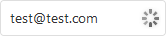 |
"valid" |
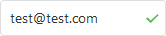 |
"invalid" |
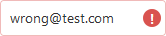 |
When you assign "invalid" to validationStatus, you can also use the validationErrors array to set an error message as shown below:
jQuery
$(function() {
    const calendar = $("#calendarContainer").dxCalendar({
        // ...
    }).dxCalendar("instance");

    function setInvalidStatus(message) {
        calendar.option({
            validationStatus: "invalid",
            validationErrors: [{ message: message }]
        });
    }
});
Angular
<dx-calendar
    [validationStatus]="validationStatus"
    [validationErrors]="validationErrors">
</dx-calendar>
// ...
export class AppComponent {
    validationStatus: string = "valid";
    validationErrors: any;
    // ...
    setInvalidStatus(message) {
        this.validationStatus = "invalid";
        this.validationErrors = [{ message: message }];
    }
}
Vue
<template>
    <DxCalendar ...
        :validation-status="validationStatus"
        :validation-errors="validationErrors"
    />
</template>

<script>
    // ...
    export default {
        // ...
        data() {
            return {
                validationStatus: "valid",
                validationErrors: []
            }
        },
        methods: {
            setInvalidStatus(message) {
                this.validationStatus = "invalid";
                this.validationErrors = [{ message: message }];
            }
        }
    }
</script>
React
import React, { useState } from 'react';
// ...

function App() {
    const [validationStatus, setValidationStatus] = useState("valid");
    const [validationErrors, setValidationErrors] = useState([]);

    const setInvalidStatus = message => {
        setValidationStatus("invalid");
        setValidationErrors([{ message: message }]);
    }

    return (
        <Calendar
            validationStatus={validationStatus}
            validationErrors={validationErrors}
        />
    );

};
export default App;
value
An object or a value that specifies the date and time selected in the calendar.
You can use the following date formats:
Date
Specifies the date directly.Number
Specifies the date with a timestamp (total milliseconds since 1970/01/01).String
Specifies the date with a string value. The UI component supports the following formats of a date string:- "yyyy-MM-dd" (for example, "2017-03-06")
- "yyyy-MM-ddTHH:mm:ss" (for example, "2017-03-27T16:54:48")
- "yyyy-MM-ddTHH:mm:ssZ" (for example, "2017-03-27T13:55:41Z")
- "yyyy-MM-ddTHH:mm:ssx" (for example, "2017-03-27T16:54:10+03")
Array of the formats mentioned before
Available only for 'multiple' and 'range' selection modes. The array includes all selected dates.
If the UI component value is changed by a user, the new value is saved in the same format as the initial value.
weekNumberRule
Specifies a week number calculation rule.
This property can take on one of the following values:
firstDay
The first week of a year is the week that contains January 1.firstFourDays
The first week of a year is the week that starts on one of the first four weekdays: Monday, Tuesday, Wednesday, or Thursday. This rule is defined by the ISO 8601 standard. If the first week of the year begins on a Friday, Saturday, or Sunday, this week is considered the last week of the previous year.fullWeek
The first week of a year is the week that begins with a day that matches the firstDayOfWeek option value.auto(default)
The week calculation rule depends on the locale. If a week starts on Monday, thefirstFourDaysrule is applied. Otherwise, thefirstDayrule is in effect.
If you want to implement your own week number calculation rule, use the cellTemplate function:
jQuery
$(function() {
    let lastDateOfWeek;

    function getWeekNumber(date, firstDayOfWeek) {
        // Implement your own week calculation logic
    }

    function getCellTemplate(data) {
        if (data.view === 'month') {
            if (!data.date) {
                cssClass = 'week-number';
                data.text = getWeekNumber(lastDateOfWeek, 0).toString();
            }
            else {
                lastDateOfWeek = data.date;
            }
        }
        return `<span>${data.text}</span>`;
    }

    $('#calendar-container').dxCalendar({
        value: new Date(2000, 0, 1),
        showWeekNumbers: true,
        cellTemplate: getCellTemplate
    });
});
Angular
<dx-calendar
    [value]="currentValue"
    [showWeekNumbers]="true"
    (cellTemplate)="custom"
>
    <span
        *dxTemplate="let cell of 'custom'"
        [ngClass]="getCellCssClass(cell)"
    >
        {{ cell.text }}
    </span>
</dx-calendar>
// ...
export class AppComponent {
    lastDateOfWeek: Number;
    currentValue: Date = new Date(2000, 0, 1);

    getWeekNumber(date, firstDayOfWeek) {
        // Implement your own week calculation logic
    }

    getCellCssClass({ date, view, text }) {
        let cssClass = '';
        if (view === 'month') {
            if (!date) {
                cssClass = 'week-number';
                text = getWeekNumber(this.lastDateOfWeek, 0).toString();
            }
            else {
                this.lastDateOfWeek = date;
            }
        }
        return cssClass;
    }
}
Vue
<template>
    <DxCalendar
        :value="currentValue"
        :show-week-numbers="true"
        cell-template="custom"
    >
        <template #custom="{ data: cell }">
            <span :class="getCellCssClass(cell)">
                {{ cell.text }}
            </span>
        </template>
    </DxCalendar>
</template>

<script>
// ...
function getWeekNumber(date, firstDayOfWeek) {
    // Implement your own week calculation logic
}

export default {
    // ...
    data() {
        return {
            currentValue: new Date(2000, 0, 1),
            lastDateOfWeek: 0
        }
    }
    methods: {
        getCellCssClass({ date, view, text }) {
            let cssClass = '';
            if (view === 'month') {
                if (!date) {
                    cssClass = 'week-number';
                    text = getWeekNumber(this.lastDateOfWeek, 0).toString();
                }
                else {
                    this.lastDateOfWeek = date;
                }
            }
            return cssClass;
        }
    }
}
</script>
React
// ...
let lastDateOfWeek;
const currentValue = new Date(2000, 0, 1);

const getWeekNumber(date, firstDayOfWeek) {
        // Implement your own week calculation logic
    }

const getCellCssClass({ date, view, text }) {
    let cssClass = '';
    if (view === 'month') {
        if (!date) {
            cssClass = 'week-number';
            text = getWeekNumber(lastDateOfWeek, 0).toString();
        }
        else {
            lastDateOfWeek = date;
        }
    }
    return cssClass;
}

const customCell = (cell) => {
    const { text, } = cell;
    const className = getCellCssClass(cell);
    return (
        <span className={className}>
            { text }
        </span>
    );
}

function App() {
    return (
        <Calendar
            value={currentValue}
            showWeekNumbers={true}
            cellRender={customCell}
        >
        </Calendar>
    );
};

export default App;
width
Specifies the UI component's width.
This property accepts a value of one of the following types:
Number
The width in pixels.String
A CSS-accepted measurement of width. For example,"55px","20vw","80%","auto","inherit".

 Select one or more answers