Angular Chart - Legend
Specifies the properties of a chart's legend.
backgroundColor
Colors the legend's background.
This property supports the following colors:
- Hexadecimal colors
- RGB colors
- RGBA colors
- Predefined/cross-browser color names
- Predefined SVG colors
- Paint server address
columnCount
Arranges legend items into several columns.
Use this property when the legend is oriented vertically. Otherwise, use rowCount.
See Also
- legend.columnItemSpacing
customizeHint
Specifies the text for a hint that appears when a user hovers the mouse pointer over a legend item.
Information on the series.
| Name | Type | Description |
|---|---|---|
| seriesColor |
The series' color. |
|
| seriesIndex |
The index of the series in the series array. To get the Series object by this index, call the getSeriesByPos(seriesIndex) method. |
|
| seriesName | any |
The series' name. To get the Series object by this name, call the getSeriesByName(seriesName) method. |
The text for the hint to display.
customizeItems
Allows you to change only the order, text, and visibility of legend items.
Legend items before customizations.
Legend items after customizations.
customizeText
Specifies a callback function that returns the text to be displayed by a legend item.
The text for the legend item to display.
horizontalAlignment
Along with verticalAlignment, specifies the legend's position.
See Also
- legend.orientation
hoverMode
Specifies what series elements to highlight when a corresponding item in the legend is hovered over.
itemsAlignment
Aligns items in the last column or row (depending on the legend's orientation). Applies when legend items are not divided into columns or rows equally.
itemTextPosition
Specifies the text's position relative to the marker in a legend item.
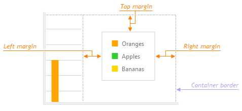
margin
Generates an empty space, measured in pixels, around the legend.
When set to a number, this property applies to all the legend's sides. The object allows you to control each side individually.

markerTemplate
Specifies an SVG element that serves as a custom legend item marker.
One of the following:
- Template name
- SVG markup as a string
- SVGElement
- jQuery element that contains an SVGElement
orientation
Arranges legend items vertically (in a column) or horizontally (in a row). The default value is "horizontal" if the legend.horizontalAlignment is "center". Otherwise, it is "vertical".
See Also
- legend.verticalAlignment
- legend.horizontalAlignment
paddingLeftRight
Generates an empty space, measured in pixels, between the legend's left/right border and its items.

paddingTopBottom
Generates an empty space, measured in pixels, between the legend's top/bottom border and its items.

position
Specifies whether the legend is located outside or inside the chart's plot.
rowCount
Arranges legend items in several rows.
Use this property when the legend is oriented horizontally. Otherwise, use columnCount.
See Also
- legend.rowItemSpacing
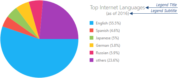
title
Configures the legend title.

To specify only the title's text, assign it directly to this property. Otherwise, set this property to an object with the text and other fields specified.
The title can be accompanied by a subtitle. Assign it to the title.subtitle property.
verticalAlignment
Along with horizontalAlignment, specifies the legend's position.
See Also
- legend.orientation

 Select one or more answers